本例中所有调用np.random 使用123456做种子
我们使用标准约定来引用matplotlib API:
import pandas as pdimport numpy as npimport matplotlib.pyplot as pltnp.random.seed(123456)plt.close('all') # 关闭所有 figure windowsplt.show()
Basic plotting: plot
这里只展示基础知识,高级用法请查阅cookbook,这里只调用 plt.plot()将plot方法用于Series 和 DataFrame
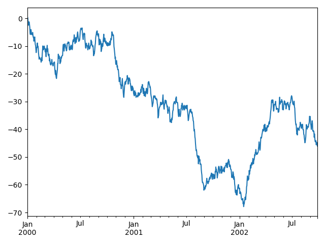
import pandas as pdimport numpy as npimport matplotlib.pyplot as pltnp.random.seed(123456)ts = pd.Series(np.random.randn(1000),index=pd.date_range('1/1/2000', periods=1000))ts = ts.cumsum()ts.plot() # AxesSubplot(0.125,0.11;0.775x0.77)plt.show()
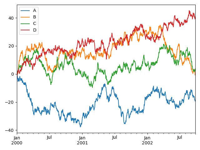
如果行索引包含日期,将调用gcf().autofmt_xdate()去格式化x轴,在DataFrame中, plot()可以方便的绘制全部列索引标签
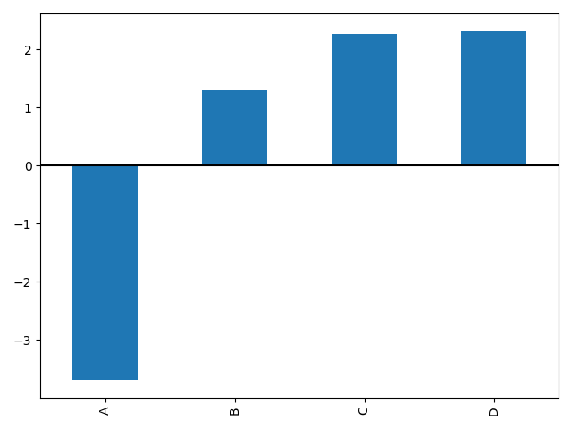
df = pd.DataFrame(np.random.randn(1000, 4),index=ts.index, columns=list('ABCD'))df = df.cumsum() # cumsum()是累加plt.figure()df.plot()plt.show()
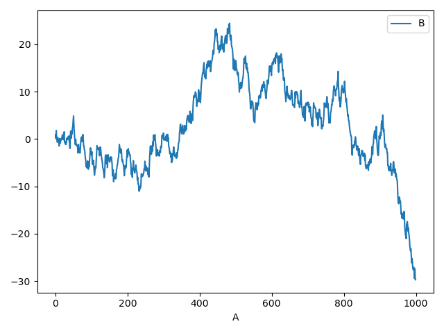
可以在 plot() 中使用 x 和 y 关键字绘制一列与另一列的比较:
df3 = pd.DataFrame(np.random.randn(1000, 2), columns=['B', 'C']).cumsum() # cumsum()是累加df3['A'] = pd.Series(list(range(len(df))))df3.plot(x='A', y='B')plt.show()
Other plots
plot()方法允许处理区别与线型图的不同的绘制风格,使用方法是在[plot()](https://pandas.pydata.org/docs/reference/api/pandas.DataFrame.plot.html#pandas.DataFrame.plot)中提供kind关键字参数,主要包括以下几种:
- ‘bar’ or ‘barh’ 柱型图
- ‘hist’ 直方图
- ‘box’ 箱线图
- ‘kde’ or ‘density’ 核基密度图
- ‘area’ 面积图
- ‘scatter’散点图
- ‘hexbin’ 蜂窝六角图
- ‘pie’ 饼图
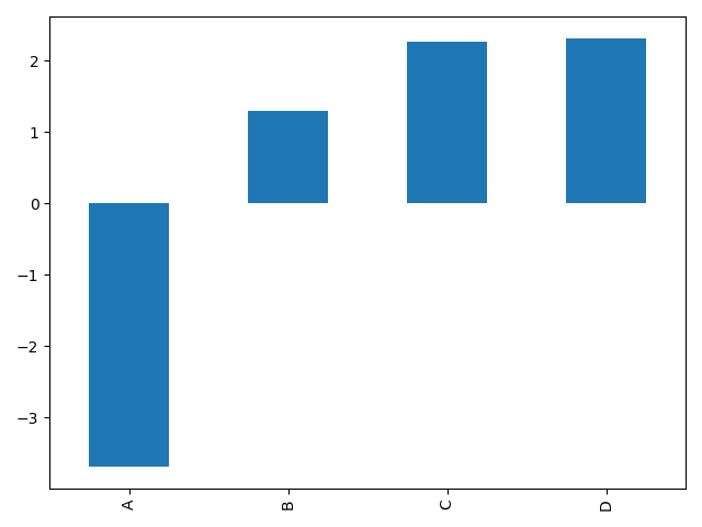
例如,可以通过以下方式创建一个柱形图
plt.figure()df.iloc[5].plot(kind='bar')plt.show()
你也可以利用DataFrame.plot.<kind>方法代替提供kind 关键字创建其他图型,这种方法使发现绘制方法及其应用的参数更简单。
kind可用的方法包括:
df.plot.area df.plot.barh df.plot.density df.plot.hist df.plot.line df.plot.scatter
df.plot.bar df.plot.box df.plot.hexbin df.plot.kde df.plot.pie
而且,在这些类型中,还有分别用于不同接口的DataFrame.hist(), and DataFrame.boxplot()方法
最后,pandas.plotting中还有一些绘图函数接收一个 Series 或 DataFrame 为参数,包括:
- Scatter Matrix
- Andrews Curves
- Parallel Coordinates
- Lag Plot
- Autocorrelation Plot
- Bootstrap Plot
- RadViz
还可以对绘制加误差条或表格进行修饰
Bar plots
对于非时间序列的数据,你可能会希望产生 一个带标签的柱形图
plt.figure()df.iloc[5].plot.bar()plt.axhline(0, color='k')plt.show()
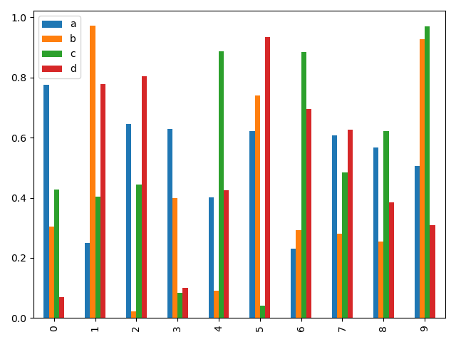
调用DataFrame的 plot.bar()方法生产一个多柱形图
df2 = pd.DataFrame(np.random.rand(10, 4), columns=['a', 'b', 'c', 'd'])df2.plot.bar()plt.show()
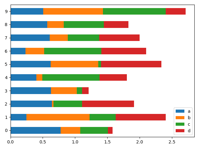
设置 stacked=True 可绘制堆叠柱形图
df2 = pd.DataFrame(np.random.rand(10, 4), columns=['a', 'b', 'c', 'd'])df2.plot.bar(stacked=True) # 堆叠效果plt.show()
通过barh 方法获得水平排列
df2 = pd.DataFrame(np.random.rand(10, 4), columns=['a', 'b', 'c', 'd'])df2.plot.barh(stacked=True) # 水平效果plt.show()
Histograms
Histograms can be drawn by using the DataFrame.plot.hist() and Series.plot.hist() methods.
直方图
可以使用 DataFrame.plot.hist() 和 Series.plot.hist() 方法绘制直方图
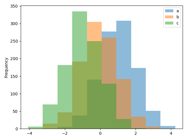
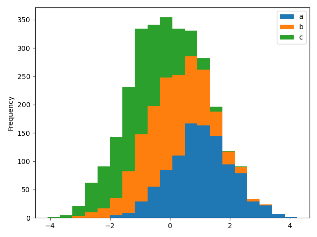
# 直方图df4 = pd.DataFrame({'a': np.random.randn(1000) + 1, 'b': np.random.randn(1000),'c': np.random.randn(1000) - 1}, columns=['a', 'b', 'c'])plt.figure()df4.plot.hist(alpha=0.5)plt.show()
直方图中设置stacked=True可以设置堆叠效果,修改bins值还可以设置分箱数量
# 堆叠直方图df4 = pd.DataFrame({'a': np.random.randn(1000) + 1, 'b': np.random.randn(1000),'c': np.random.randn(1000) - 1}, columns=['a', 'b', 'c'])plt.figure()df4.plot.hist(stacked=True, bins=20) # 堆叠效果,分箱数量20个plt.show()
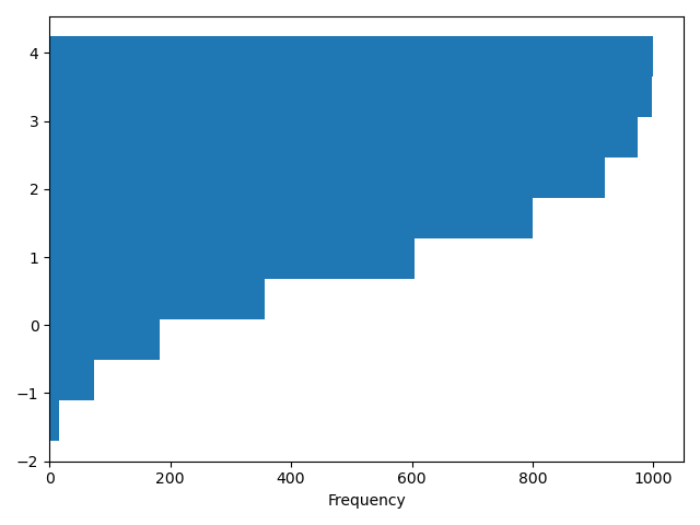
可以传递 matplotlib hist 中提供支持的其他关键字,例如,水平和堆叠直方图可以通过设置参数orientation='horizontal' 和 cumulative=True.
# 水平直方图df4 = pd.DataFrame({'a': np.random.randn(1000) + 1, 'b': np.random.randn(1000),'c': np.random.randn(1000) - 1}, columns=['a', 'b', 'c'])plt.figure()df4['a'].plot.hist(orientation='horizontal', cumulative=True)plt.show()
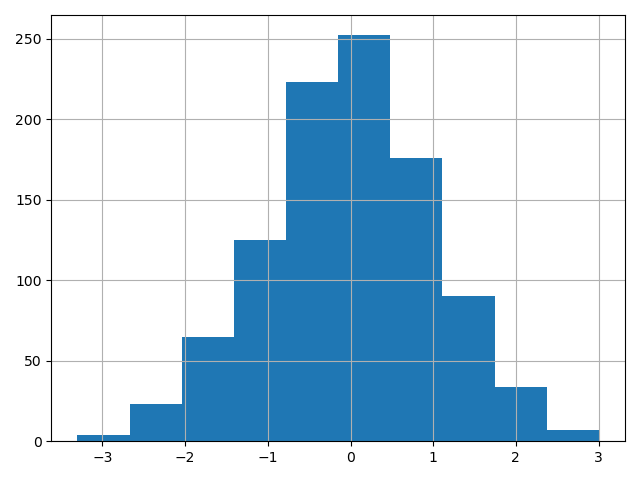
利用现存的接口 DataFrame.hist 绘制直方图的方法仍然可用
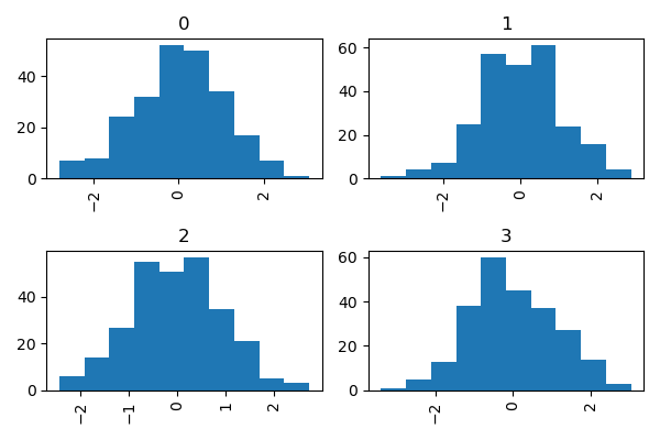
# 直方图df4 = pd.DataFrame({'a': np.random.randn(1000) + 1, 'b': np.random.randn(1000),'c': np.random.randn(1000) - 1}, columns=['a', 'b', 'c'])plt.figure()df['A'].diff().hist()plt.show()
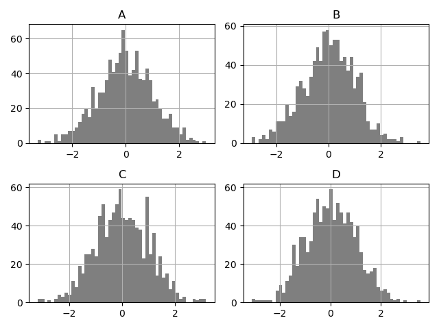
<br />DataFrame.hist() 可以将不同列绘制在多子图中
df4 = pd.DataFrame({'a': np.random.randn(1000) + 1, 'b': np.random.randn(1000),'c': np.random.randn(1000) - 1}, columns=['a', 'b', 'c'])plt.figure()df.diff().hist(color='k', alpha=0.5, bins=50)plt.show()
by 关键 字可用于将直方图分组绘制
data = pd.Series(np.random.randn(1000))data.hist(by=np.random.randint(0, 4, 1000), figsize=(6, 4))plt.show()
Box plots
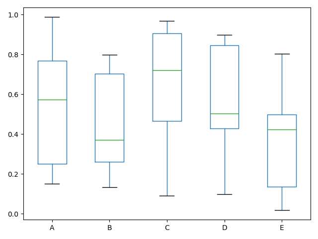
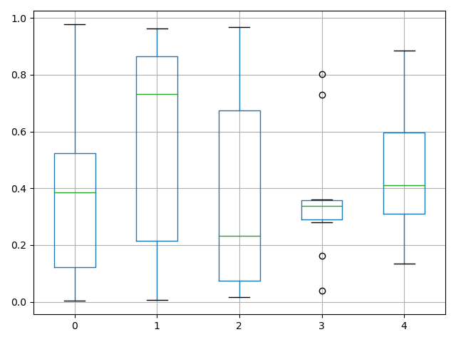
箱线图可以调用 Series.plot.box() 和 DataFrame.plot.box()绘制,也可以调用 DataFrame.boxplot() 绘制。表明每列数据的值的分布
实例是一个10组[0,1] 之间的随机变量的5次实验结果展示:
# Box plotsdf = pd.DataFrame(np.random.rand(10, 5), columns=['A', 'B', 'C', 'D', 'E'])df.plot.box()plt.show()
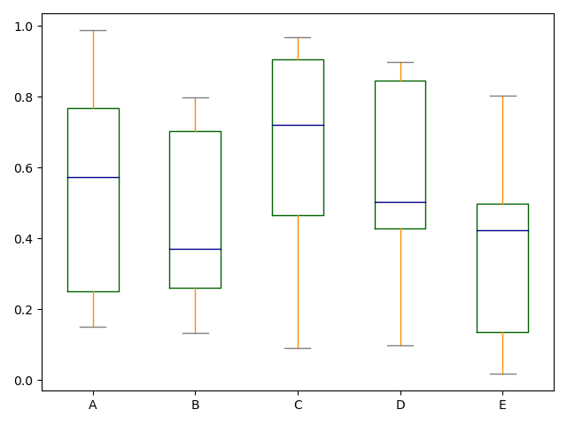
color参数可以指定颜色,传递一个以boxes, whiskers, medians 和 caps.为键的字典
Boxplot可以通过传递color关键字来着色。你可以通过一个字典,它的keys是boxes, whiskers, medians 和caps。如果dict中缺失一些键,则相应的绘制将使用默认颜色。另外,boxplot有sym关键字来指定fliers样式。
通过color关键字传递其他类型的参数时,它将直接传递给matplotlib,用于所有的boxes, whiskers, medians 和 caps 的着色。
颜色应用于要绘制的每个框。如果您想要更复杂的着色,您可以通过传递return_type获得。
# Box plotsdf = pd.DataFrame(np.random.rand(10, 5), columns=['A', 'B', 'C', 'D', 'E'])color = {'boxes': 'DarkGreen', 'whiskers': 'DarkOrange','medians': 'DarkBlue', 'caps': 'Gray'}df.plot.box(color=color, sym='r+')plt.show()
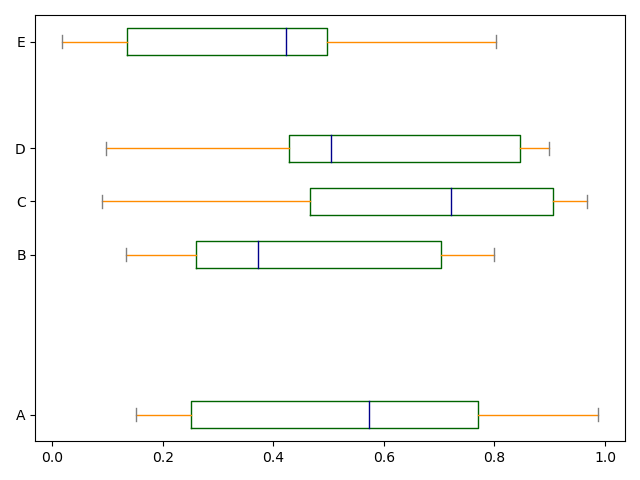
同样可以传递 matplotlib boxplot 支持的关键字参数,例如,可以用 vert=False and positions 指定水平和堆叠
# Box plotsdf = pd.DataFrame(np.random.rand(10, 5), columns=['A', 'B', 'C', 'D', 'E'])color = {'boxes': 'DarkGreen', 'whiskers': 'DarkOrange','medians': 'DarkBlue', 'caps': 'Gray'}df.plot.box(color=color, vert=False, positions=[1, 4, 5, 6, 8])plt.show()
DataFrame.boxplot方法仍可用于绘制箱线图
# Box plots
df = pd.DataFrame(np.random.rand(10, 5))
plt.figure()
bp = df.boxplot()
plt.show()
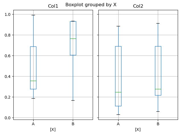
可以通过使用by 关键字创建分组箱线图
df['X'] = pd.Series(['A', 'A', 'A', 'A', 'A', 'B', 'B', 'B', 'B', 'B'])
plt.figure()
bp = df.boxplot(by='X')
plt.show()
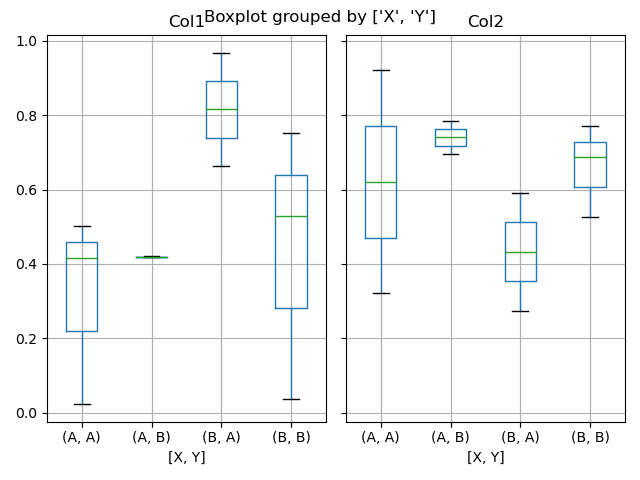
也可以将每列的绘制放入一个子图中
df = pd.DataFrame(np.random.rand(10, 3), columns=['Col1', 'Col2', 'Col3'])
df['X'] = pd.Series(['A', 'A', 'A', 'A', 'A', 'B', 'B', 'B', 'B', 'B'])
df['Y'] = pd.Series(['A', 'B', 'A', 'B', 'A', 'B', 'A', 'B', 'A', 'B'])
plt.figure()
bp = df.boxplot(column=['Col1', 'Col2'], by=['X', 'Y'])
plt.show()
在boxplot中,返回类型可以由return type关键字控制。有效的选择包括{“axis”、“dict”、“both”,None}。使用by关键字创建的DataFrame.boxplot进行分类处理,将影响输出类型等:
return_type= |
Faceted | Output type |
|---|---|---|
None |
No | axes |
None |
Yes | 2-D ndarray of axes |
'axes' |
No | axes |
'axes' |
Yes | Series of axes |
'dict' |
No | dict of artists |
'dict' |
Yes | Series of dicts of artists |
'both' |
No | namedtuple |
'both' |
Yes | Series of namedtuples |
Groupby.boxplot 返回值总是return_type的 Series .
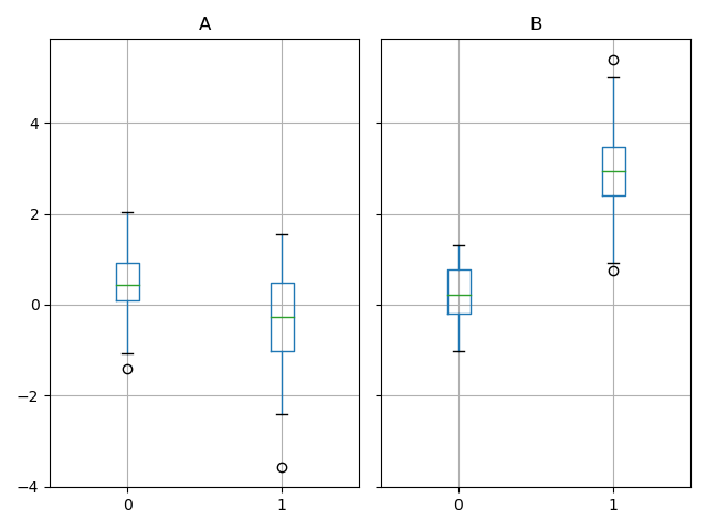
np.random.seed(1234)
df_box = pd.DataFrame(np.random.randn(50, 2))
df_box['g'] = np.random.choice(['A', 'B'], size=50)
df_box.loc[df_box['g'] == 'B', 1] += 3
bp = df_box.boxplot(by='g')
plt.show()
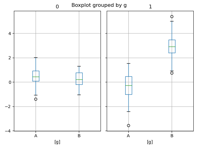
上面的子图首先被数字列分割,然后是g列的值。下面的子图首先被g的值分割,然后被数字列分割。
np.random.seed(1234)
df_box = pd.DataFrame(np.random.randn(50, 2))
df_box['g'] = np.random.choice(['A', 'B'], size=50)
df_box.loc[df_box['g'] == 'B', 1] += 3
bp = df_box.groupby('g').boxplot()
plt.show()

若有收获,就点个赞吧
0 人点赞
