9.7 饼图

pyplot.pie(x, explode=None, labels=None, colors=None,autopct=None, pctdistance=0.6, shadow=False,labeldistance=1.1, startangle=0, radius=1,counterclock=True, wedgeprops=None,textprops=None, center=(0, 0), frame=False,rotatelabels=False, *, normalize=True, data=None)

import matplotlib.pyplot as pltdef read_txt(filename):"""接收文件名为参数,读取文件中的数据到二维列表中,返回二维列表。"""with open(filename, 'r', encoding='utf-8') as fr:data_lst = [line.strip().split(',') for line in fr] # 数据转列表return data_lstdef pie_of_programs(data_lst):rank = [float(x[1]) for x in data_lst] # 百分比的列表plt.pie(rank)if __name__ == '__main__':file = 'tiobe.txt'data = read_txt(file)pie_of_programs(data)plt.show()
加标签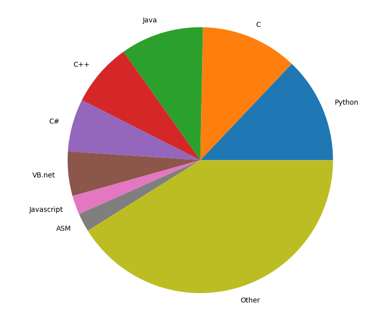
def pie_of_programs(data_lst):prog_name = [x[0] for x in data_lst] # 语言名列表rank = [float(x[1]) for x in data_lst] # 百分比的列表plt.pie(rank, labels=prog_name)

def pie_of_programs(data_lst, program): # program = 'Python'plt.axes(aspect=1) # 设置参数为1使饼图是圆的prog_name = [x[0] for x in data_lst] # 语言名列表rank = [float(x[1]) for x in data_lst] # 百分比的列表exp = [0] * len(prog_name) # 获得长度数据数量相同,元素为0的列表num = prog_name.index(program) # 获得数据python的序号exp[num] = 0.1 # 数据python突出显示plt.pie(rank, explode=exp, labels=prog_name, labeldistance=1.1,autopct='%2.1f%%', shadow=True, startangle=90,pctdistance=0.8)plt.legend(loc='lower right', bbox_to_anchor=(1.3, 0)) # 右下角例
9.8 直方图
pyplot.hist(x, bins=None, range=None, density=False, weights=None,cumulative=False, bottom=None, histtype='bar', align='mid',orientation='vertical', rwidth=None, log=False, color=None,label=None, stacked=False, *, data=None, **kwargs)
x: (n,) array or sequence of (n,) arrays 数组或序列的数组
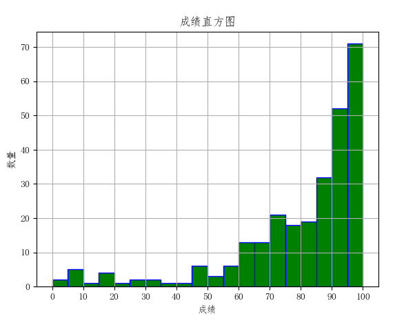
9.9 his.txt
9568.259910094989784.584.592897774.5......9485.588
import matplotlib.pyplot as pltimport numpy as npplt.rcParams['font.sans-serif'] = ['FangSong'] # 支持中文显示plt.rcParams['axes.unicode_minus'] = Falsedef read_csv(filename):"""接收文件名为参数,读取文件中的数据到二维列表中,返回二维列表。"""with open(filename, 'r', encoding='utf-8') as fr:amount = [float(line) for line in fr]return amountdef draw_hist(amount):"""接收二维列表为参数,绘制数据曲线。"""amount_array = np.array(amount) # 列表amount转数组plt.hist(amount_array)if __name__ == '__main__':file = '9.9 his.txt'score_lst = read_csv(file)draw_hist(score_lst)plt.show()
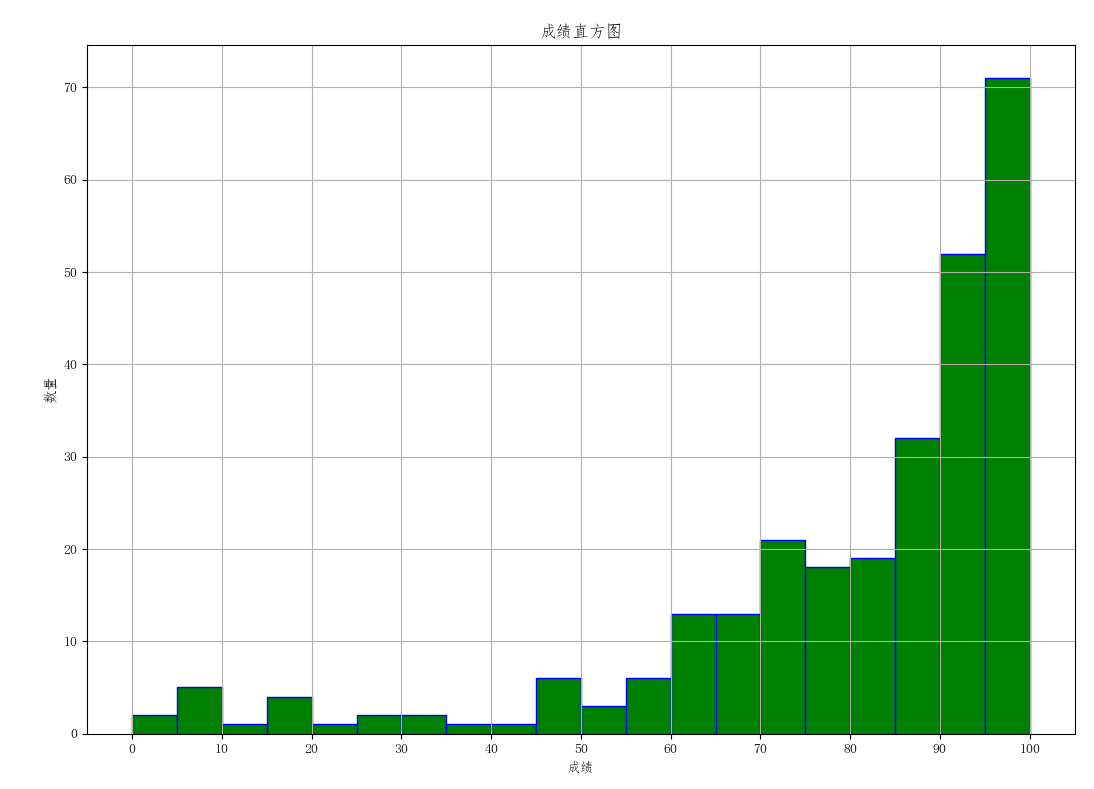
import matplotlib.pyplot as pltimport numpy as npplt.rcParams['font.sans-serif'] = ['FangSong'] # 支持中文显示plt.rcParams['axes.unicode_minus'] = Falsedef read_csv(filename):"""接收文件名为参数,读取文件中的数据到二维列表中,返回二维列表。"""with open(filename, 'r', encoding='utf-8') as fr:amount = [float(line) for line in fr]return amountdef draw_hist(amount):"""接收二维列表为参数,绘制数据曲线。"""amount_array = np.array(amount) # 列表amount转数组plt.hist(amount_array, 20, color='g', edgecolor='b')def draw_label(): # 加图名和轴标签plt.xlabel('成绩')plt.title('成绩直方图')plt.ylabel('数量')plt.xticks(np.arange(0, 101, 10)) # X轴刻度plt.grid() # 显示网格线if __name__ == '__main__':file = '9.9 his.txt'score_lst = read_csv(file)draw_hist(score_lst)draw_label()plt.show()
9.9 散点图
pyplot.scatter(x, y, s=None, c=None, marker=None, cmap=None,norm=None, vmin=None, vmax=None, alpha=None,linewidths=None, *, edgecolors=None,plotnonfinite=False, data=None, **kwargs)
x, yfloat or array-like, shape (n, )数据位置
import matplotlib.pyplot as plt

def read_file(file):
    with open(file, 'r') as f:
        ls = [x.strip().split(',') for x in f]  # 读逗号分隔数据
    return ls


def plot_scatter(ls):
    # 分别取出男生身高和体重两列数据
    boy_height = [float(x[1]) for x in ls if int(x[0]) == 1]  # 男生身高数据
    boy_weight = [float(x[2]) for x in ls if int(x[0]) == 1]  # 男生体重数据
    plt.scatter(boy_height, boy_weight)


if __name__ == '__main__':
    filename = '9.11 health.csv'
    data_lst = read_file(filename)
    plot_scatter(data_lst)
    plt.show()
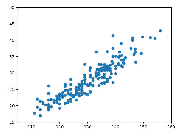
def plot_scatter(ls):
    # 分别取出男生身高和体重两列数据
    boy_height = [float(x[1]) for x in ls if int(x[0]) == 1]  # 男生身高数据
    boy_weight = [float(x[2]) for x in ls if int(x[0]) == 1]  # 男生体重数据
    plt.scatter(boy_height, boy_weight)
    plt.xlim(105, 160)  # x取值范围设置
    plt.ylim(15, 50)    # y取值范围设置
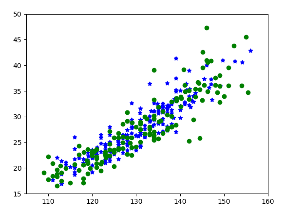
def plot_scatter(ls):
    # 分别取出男生身高和体重两列数据
    boy_height = [float(x[1]) for x in ls if int(x[0]) == 1]   # 男生身高数据
    boy_weight = [float(x[2]) for x in ls if int(x[0]) == 1]   # 男生体重数据
    plt.scatter(boy_height, boy_weight, c='b', marker=(5, 1))  # 蓝颜色,五角星,同*
    girl_height = [float(x[1]) for x in ls if int(x[0]) == 2]  # 女生身高数据
    girl_weight = [float(x[2]) for x in ls if int(x[0]) == 2]  # 女生体重数据
    plt.scatter(girl_height, girl_weight, c='g')               # 绿颜色,默认圆点
    plt.xlim(105, 160)  # x取值范围设置
    plt.ylim(15, 50)    # y取值范围设置
9.10 等值线图
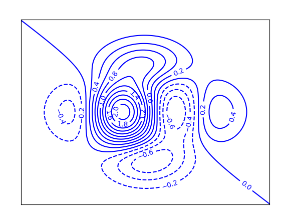
pyplot.contour(*args, data=None, **kwargs)
X, Yarray-like, optional类似数组的数据
用于获取 Z值的2D坐标.
Z(M, N) array-like 类似数组的数据
import matplotlib.pyplot as plt
import numpy as np


def f(x, y):
    """接受两个数值类型数据为参数,计算表达式结果并返回。"""
    return (1 - 7 * x / 2 + x ** 5 + y ** 5) * np.exp(-x ** 2 - y ** 2)


def plot_contour():
    x0 = np.linspace(-3, 3, 256)
    y0 = np.linspace(-3, 3, 256)
    m, n = np.meshgrid(x0, y0)
    C = plt.contour(m, n, f(m, n), 18, colors='blue')  # 绘制等值线,蓝色
    plt.clabel(C, inline=1, fontsize=10)  # 在等高线上绘制高程值
    plt.xticks([])  # 设定x轴无刻度
    plt.yticks([])  # 设定y轴无刻度
    plt.show()


if __name__ == '__main__':
    plot_contour()
    plt.show()
9.11 曲线拟合
scipy.optimize.curve_fit(f,xdata,ydata,p0=None,sigma=None,
                         absolute_sigma=False,check_finite=True,
                         bounds=(-inf,inf),method=None,jac=None,**kwargs)
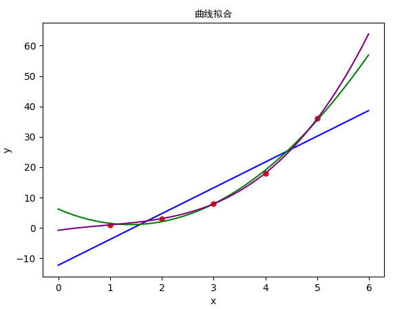
# 曲线拟合
import numpy as np
import matplotlib.pyplot as plt
from scipy import optimize


# 直线方程函数
def fun1(x, A, B):
    return A * x + B


# 二次曲线方程
def fun2(x, A, B, C):
    return A * x * x + B * x + C


# 三次曲线方程
def fun3(x, A, B, C, D):
    return A * x * x * x + B * x * x + C * x + D


def plot_scatter():
    plt.scatter(x0[:], y0[:], 25, "red")  # 绘制散点


def linear_fit():    # 直线拟合与绘制
    A1, B1 = optimize.curve_fit(fun1, x0, y0)[0]
    x1 = np.arange(0, 6, 0.01)
    y1 = A1 * x1 + B1
    plt.plot(x1, y1, "blue")


def quadratic_fit():    # 二次曲线拟合与绘制
    A2, B2, C2 = optimize.curve_fit(fun2, x0, y0)[0]
    x2 = np.arange(0, 6, 0.01)
    y2 = A2 * x2 * x2 + B2 * x2 + C2
    plt.plot(x2, y2, "green")


def cubic_fit():    # 三次曲线拟合与绘制
    A3, B3, C3, D3 = optimize.curve_fit(fun3, x0, y0)[0]
    x3 = np.arange(0, 6, 0.01)
    y3 = A3 * x3 * x3 * x3 + B3 * x3 * x3 + C3 * x3 + D3
    plt.plot(x3, y3, "purple")


def add_label():
    plt.title("曲线拟合", fontproperties="SimHei")
    plt.xlabel('x')
    plt.ylabel('y')


if __name__ == '__main__':
    x0 = [1, 2, 3, 4, 5]
    y0 = [1, 3, 8, 18, 36]
    plot_scatter()
    linear_fit()
    quadratic_fit()
    cubic_fit()
    add_label()
    plt.show()
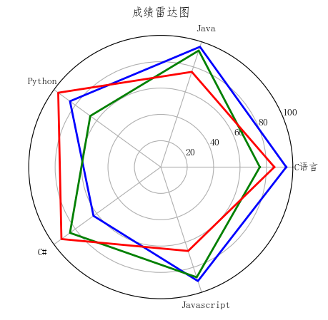
9.12 雷达图
import matplotlib.pyplot as plt
import numpy as np
# 支持中文显示
plt.rcParams['font.sans-serif'] = ['FangSong'] # 仿宋
plt.rcParams['axes.unicode_minus'] = False
def read_csv(file): # 读文件为列表类型
with open(file, 'r', encoding='utf-8') as data:
ls = [line.strip().split('\t') for line in data]
return ls
def plot_radar(score):
"""接收二维列表为参数,绘制雷达图曲线。"""
labels = np.array(score)[0, 1:] # 序号0的行中序号1以后的列作标签
data_lenth = 5 # 数据个数
cl = ['b', 'g', 'r'] # 线条颜色
angles = np.linspace(0, 2 * np.pi, data_lenth, endpoint=False) # [0,2]分5份
angles = np.append(angles, [angles[0]]) # 加上起点,闭合折线
fig = plt.figure() # 创建画布
ax = fig.add_subplot(111, polar=True) # 创建子图,极坐标
for i in range(1, 4): # 逐条绘制各专业曲线
score_new = np.array(score[i][1:]).astype(int) # 第i个专业成绩
data = np.append(score_new, [score_new[0]]) # 闭合曲线
ax.plot(angles, data, color=cl[i - 1], linewidth=2) # 画线
ax.set_thetagrids(angles[:-1] * 180 / np.pi, labels)
ax.set_title("成绩雷达图", va='bottom')
ax.set_rlim(0, 100) # 径向刻度标签
ax.grid(True) # 显示网格线
if __name__ == '__main__':
file = '9.10 scoreRadar.txt'
score_lst = read_csv(file)
plot_radar(score_lst)
plt.show()
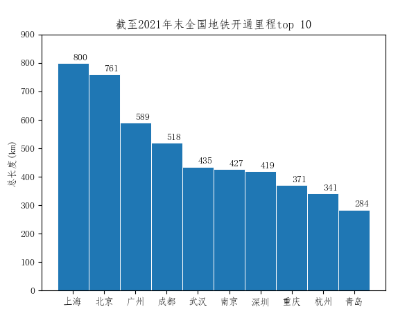
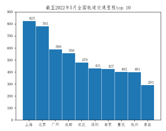
9.13 柱形图
2021年末全国地铁里程排名
import matplotlib.pyplot as plt

plt.rcParams['font.sans-serif'] = ['FangSong']  # 支持中文显示
plt.rcParams['axes.unicode_minus'] = False
metro = {'上海': 825, '北京': 783, '广州': 590, '成都': 558, '武汉': 479, '深圳': 431, '南京': 427, '重庆': 402, '杭州': 401, '青岛': 293}

x = list(metro.keys())
y = list(metro.values())
plt.bar(x, y, width=1, edgecolor="white", linewidth=0.7)
plt.xticks(x)
plt.yticks(range(0, 950, 100))
for x, y in metro.items():
    plt.text(x, y + 10, "%s" % y)
plt.title('截至2022年5月全国轨道交通里程top 10')
plt.show()

若有收获,就点个赞吧
0 人点赞
