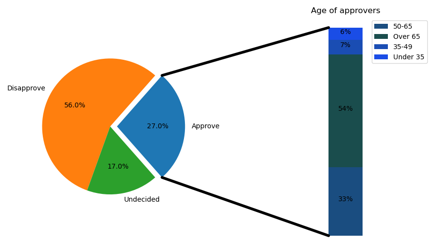
制作一个“条形饼图”,其中饼的第一块被“分解”成条形图,并进一步细分所述切片的特征。该示例演示如何使用具有多个轴集的图形,以及如何使用“轴面片”列表添加两个连接面片来链接子面片图表。
add_subplot(self, args, *kwargs)添加子图
说明、参数、返回值
作为子图布置的一部分,将坐标轴添加到图中。
Call signatures:如何调用:
add_subplot(nrows, ncols, index, **kwargs)
add_subplot(pos, **kwargs)
add_subplot(ax)
方法说明位于:
参数
* ARGS
3位整数或3个单独的整数来描述子图的位置。 如果三个整数是* nrows *,* ncols *和* index *的顺序,子图将采用 nrows * ncols 的网格上的* index *位置。* index *从左上角的1开始,并向右增加。* pos *是一个三位整数,其中第一个数字是行数,第二个数字是列数和第三个数字是子图的索引。 即fig.add_subplot(235)与fig.add_subplot(2,3,5)相同,使用这种方法时要求所有整数必须小于10。
举个栗子,如果nrows = 2,ncols = 3,那么这个网格(grid)大小为2 * 3,即总共有6个格子。
Index从左上角的1开始(不是零),依次向右增加。可以参考如下表格:
| (2,3,1)或(231) | (2,3,2)或(232) | (2,3,3)或(233) |
|---|---|---|
| (2,3,4)或(234) | (2,3,5)或(235) | (2,3,6)或(236) |
表格中的数字代表index,以下两句代码是等效的
add_subplot(2, 3, 1) # 推荐此种写法
add_subplot(231) # 数字都小于10时可用,不推荐
ax1 = fig.add_subplot(121) # 设置1行2列子图,ax1占第1列ax2 = fig.add_subplot(122) # 设置1行2列子图,ax2占第2列
subplots_adjust
说明、参数
Adjusting the spacing of margins and subplots调整边距和子图的间距
subplots_adjust(self, left=None, bottom=None, right=None, top=None, wspace=None, hspace=None)
函数作用是调整子图布局,其主要参数含义和默认值为:
left = 0.125 # 图片中子图的左侧
right = 0.9 # 图片中子图的右侧
bottom = 0.1 # 图片中子图的底部
top = 0.9 # 图片中子图的顶部
wspace = 0.2 #为子图之间的空间保留的宽度,平均轴宽的一部分
hspace = 0.2 #为子图之间的空间保留的高度,平均轴高度的一部分
加了这个语句,子图会稍变小,因为空间也占用坐标轴的一部分
fig.subplots_adjust(wspace=0.5,hspace=0.5)
# 制作画布和设置轴对象fig = plt.figure(figsize=(9, 5))ax1 = fig.add_subplot(121) # 设置1行2列子图,ax1占第1列ax2 = fig.add_subplot(122) # 设置1行2列子图,ax2占第2列fig.subplots_adjust(wspace=0) # 子图间不留空
import matplotlib.pyplot as pltfrom matplotlib.patches import ConnectionPatchimport numpy as np# 制作画布和设置轴对象fig = plt.figure(figsize=(9, 5))ax1 = fig.add_subplot(121) # 设置1行2列子图,ax1占第1列ax2 = fig.add_subplot(122) # 设置1行2列子图,ax2占第2列fig.subplots_adjust(wspace=0) # 子图间不留空# 基本饼图参数ratios = [.27, .56, .17]labels = ['Approve', 'Disapprove', 'Undecided']explode = [0.1, 0, 0]# 旋转角度使第一项正好被 x 轴平分angle = -180 * ratios[0]ax1.pie(ratios, autopct='%1.1f%%', startangle=angle,labels=labels, explode=explode)# 设置第形图参数xpos = 0bottom = 0ratios = [.33, .54, .07, .06]width = .2colors = [[.1, .3, .5], [.1, .3, .3], [.1, .3, .7], [.1, .3, .9]]for j in range(len(ratios)):height = ratios[j]ax2.bar(xpos, height, width, bottom=bottom, color=colors[j])ypos = bottom + ax2.patches[j].get_height() / 2bottom += heightax2.text(xpos, ypos, "%d%%" % (ax2.patches[j].get_height() * 100),ha='center')ax2.set_title('Age of approvers')ax2.legend(('50-65', 'Over 65', '35-49', 'Under 35'))ax2.axis('off')ax2.set_xlim(- 2.5 * width, 2.5 * width)# 使用 ConnectionPatch 在两个子图间画线# 获取比例数据theta1, theta2 = ax1.patches[0].theta1, ax1.patches[0].theta2center, r = ax1.patches[0].center, ax1.patches[0].rbar_height = sum([item.get_height() for item in ax2.patches])# 画顶部连接线x = r * np.cos(np.pi / 180 * theta2) + center[0]y = np.sin(np.pi / 180 * theta2) + center[1]con = ConnectionPatch(xyA=(-width / 2, bar_height), coordsA=ax2.transData,xyB=(x, y), coordsB=ax1.transData)con.set_color([0, 0, 0])con.set_linewidth(4)ax2.add_artist(con)# 画底部连接线x = r * np.cos(np.pi / 180 * theta1) + center[0]y = np.sin(np.pi / 180 * theta1) + center[1]con = ConnectionPatch(xyA=(-width / 2, 0), coordsA=ax2.transData,xyB=(x, y), coordsB=ax1.transData)con.set_color([0, 0, 0])ax2.add_artist(con)con.set_linewidth(4)plt.show()

若有收获,就点个赞吧
0 人点赞
