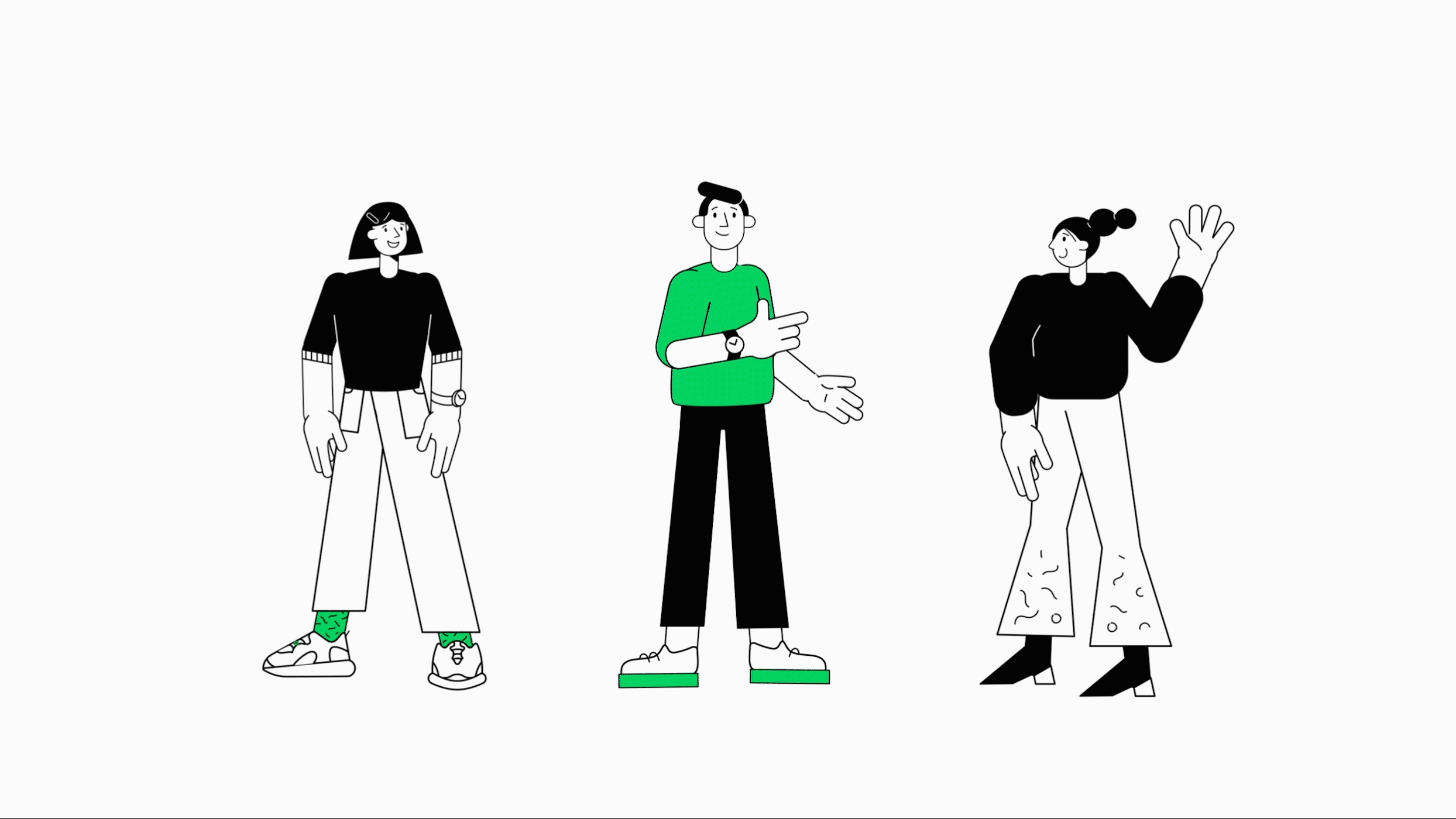
 I magine: you create illustrations to be a part of a company’s branding. You define a style, give it a direction, and create more and more illustrations necessary for the whole project. But what do you do when you’re not a lonely island? What if there are other illustrators on board? Add to that the team of 60 designers and the entire marketing department who will sometimes also need to use your illustrative skills.
Our solution: the Illustration Guidelines and Smart Library.
Why Did We Create the Illustration Guidelines?
It’s very risky for a design agency to outsource illustrations to someone else. If a style is created and the illustrator retains the right to reproduce it only for himself, the company is limited to using only a few illustrations created during the assignment.
At Netguru, we create a lot of content for social media where illustrations play an important role. Did you know there are 600 people at Netguru, 60 designers, and only 3 illustrators on board? Yeah! And we are usually booked for projects. So, how can we help our team to build internal illustrations easier and faster while maintaining a consistent style? Sounds impossible!
How can we prevent these problems and make sure that our aim, which is consistency of the style, is maintained?
How Did We Create the Style?
Contrary to appearances, it wasn’t that easy. We already had some guidelines, our style had a direction in some way, but many things were so divergent that we decided to be inspired only by our old materials… And so, having somewhere in the back of our heads the style that appeared earlier, we decided to build something new and fresh. Agnieszka Koniuszek brought a lot to this style, thunderous applause for her. We made a list of required illustrations and started thinking about the definition of our style.
So, how to define our style?
We focused on our brand values, mission, and vision.
One of the new guidelines’ advantages is that they enable people with different skills to create compositions. Every illustration based on these guidelines must be consistent with this style and our brand book.
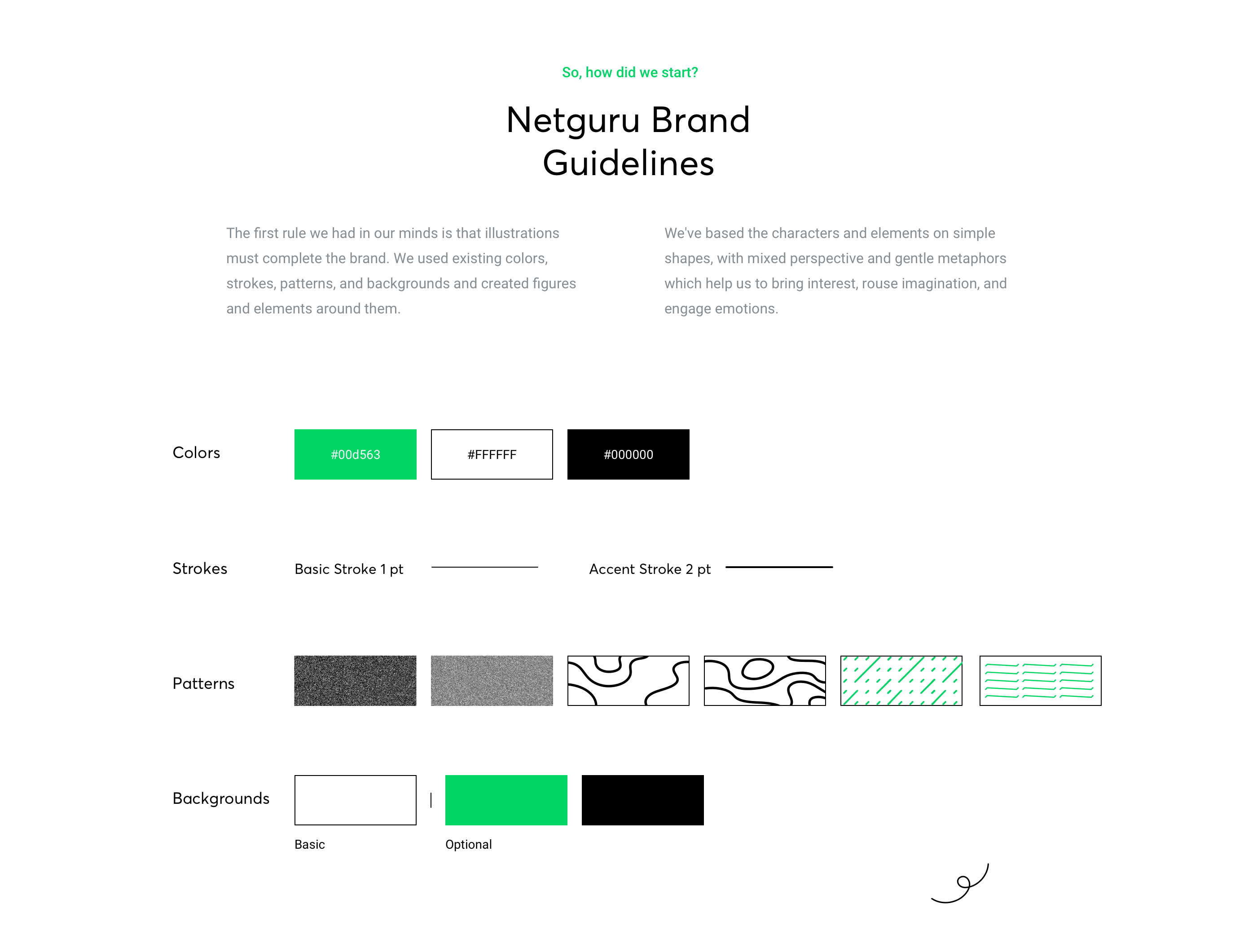
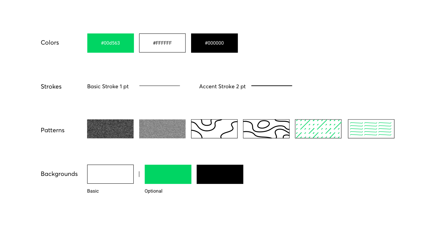
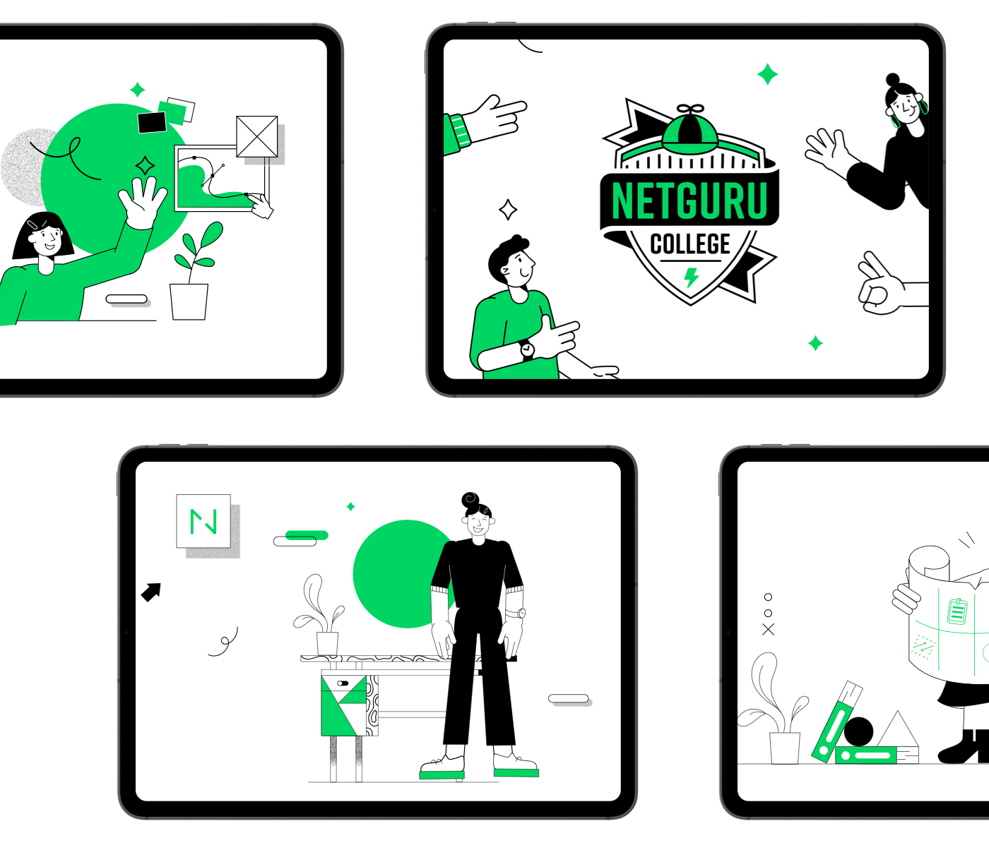
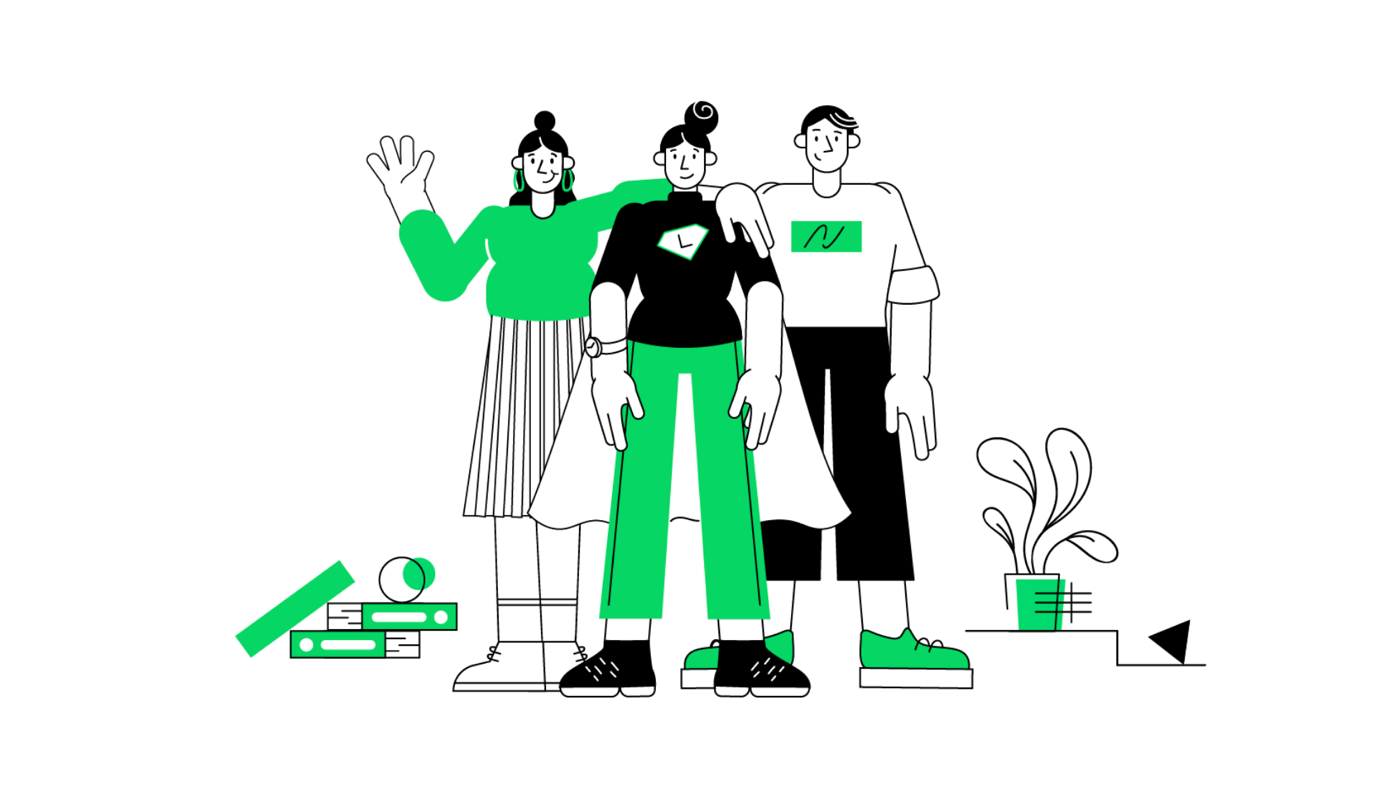
Our style essentials are simple, geometric forms supported by fresh textures and three colors — green, black, and white.
First things first: Set the guidelines
Illustration Guidelines
We started with the most popular solution, which is Illustration Guidelines. Describing the rules seems to be quite simple. And so it is, if you already have a specific style. We wanted to create illustrations and rules at the same time. But when we were creating the style, we changed a lot of things and defined them so that our guidelines were constantly evolving and changing their face.
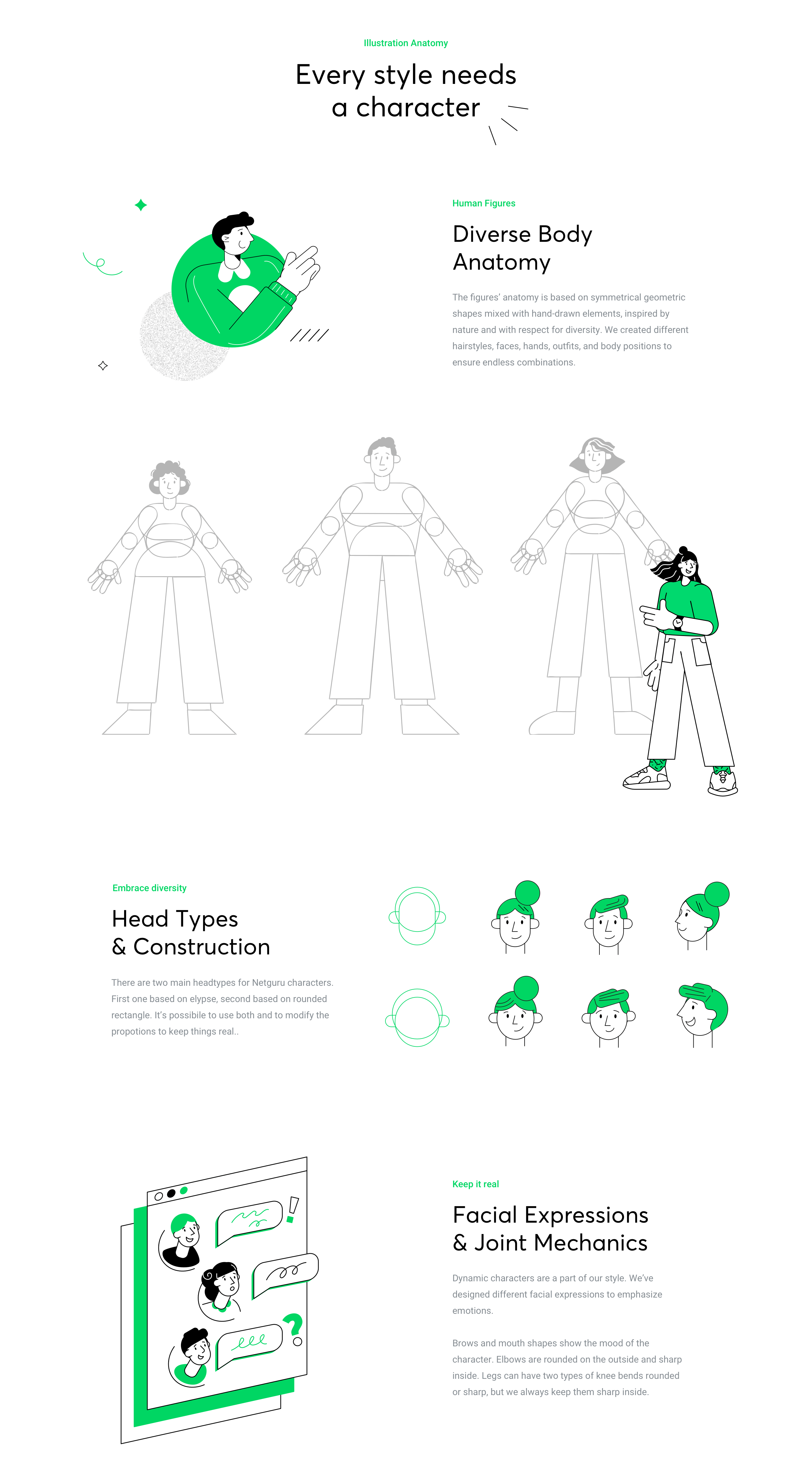
We have closed the rules in a 30-page document, and here are some examples of what it contains:
But we didn’t stop there… time for innovation!
At this stage, our problem was already partially solved, but it was not the end. We could have left our guidelines and allowed others to create illustrations based on our written guidelines, but it causes a lot of inconsistencies and generates a lot of questions and concerns. Especially when there is no illustrator available to do the illustrations. However, the time has come for an innovation that still gives me a thrill.
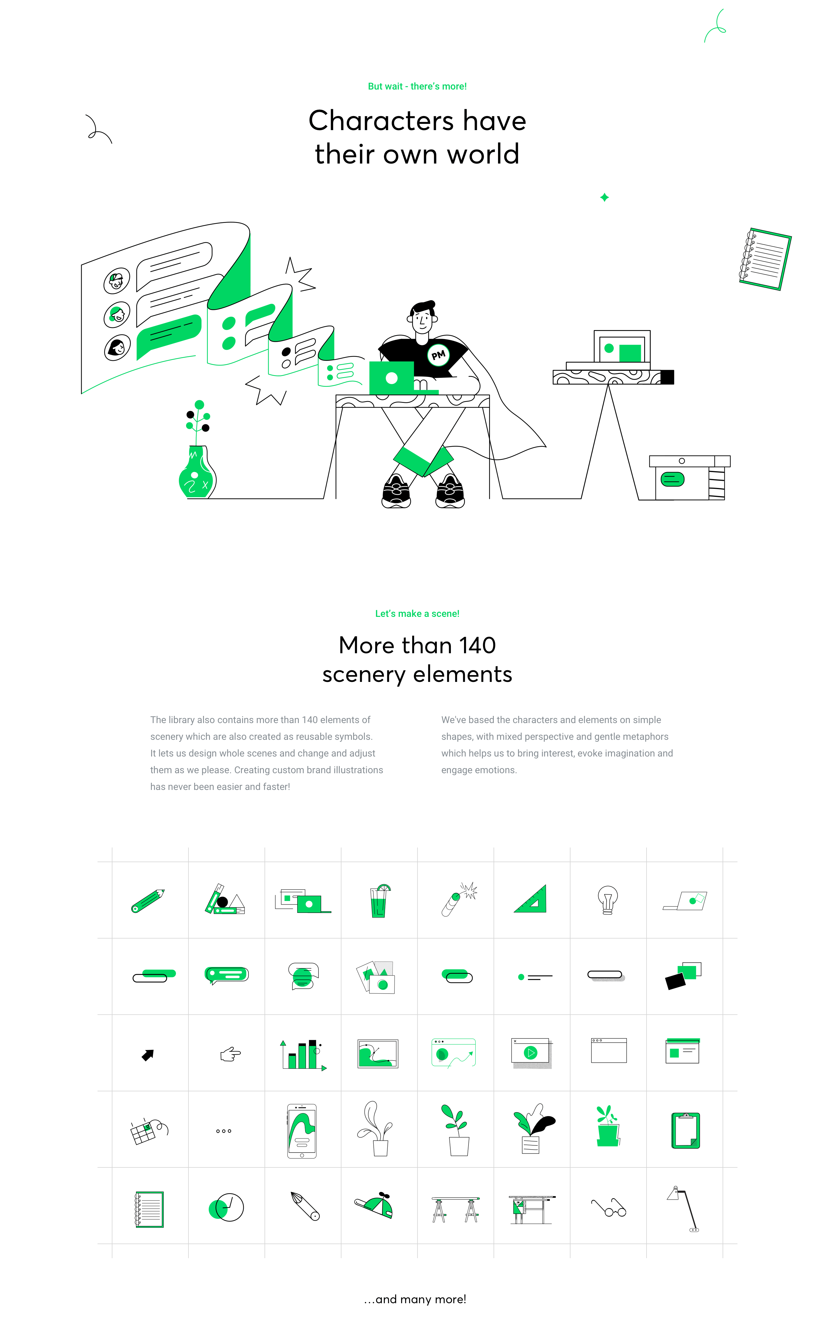
The idea was to create illustrative modules which, like puzzles, can be used for composing new illustrations.
Having many illustrations made by Agnieszka Koniuszek and Iryna Koshak, I started to break them down into first parts. Inspired by Pablo Stanley and Humaaans library, I sorted all the elements into categories and decided to use them to build our smart library.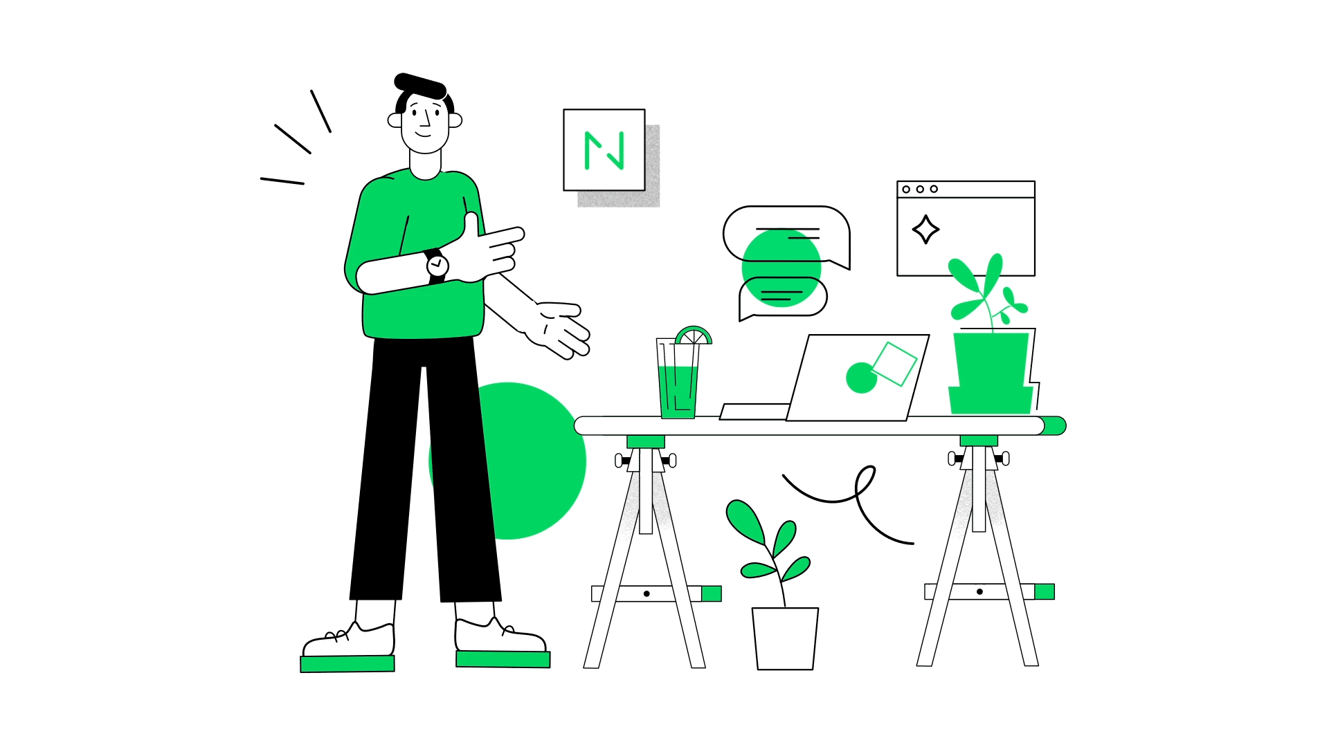
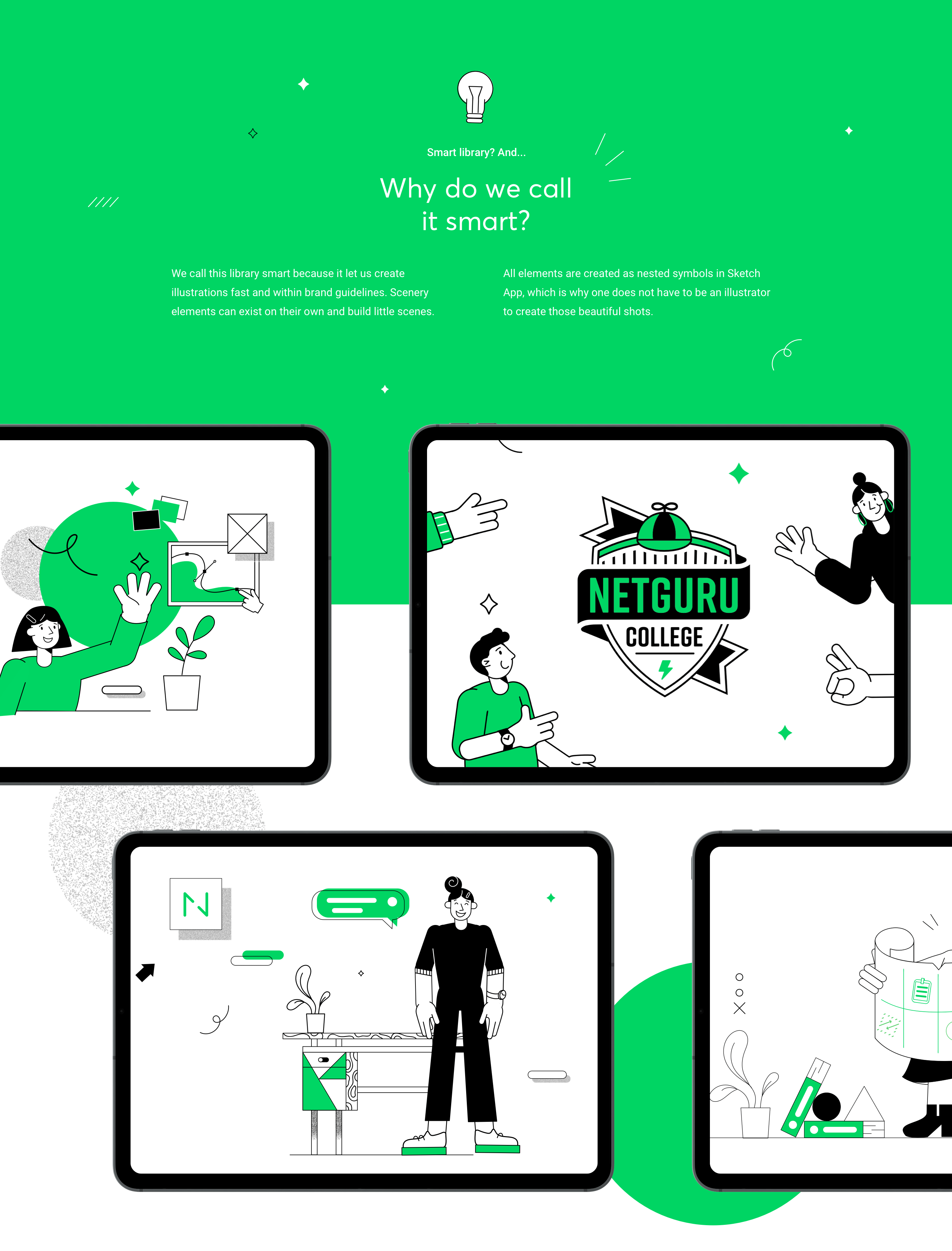
What is the Smart Library? And why do we call it Smart?
Our system can be used by any designer who is able to use Sketch at a basic level. (And even if they can’t, they’ll always be able to read the tutorial contained in the library). A smart library is like a collection of blocks or puzzles from which you can create new illustrations, depending on what kind of illustration you need. Templates are prepared for specific dimensions, which you can use, copy, and replace.
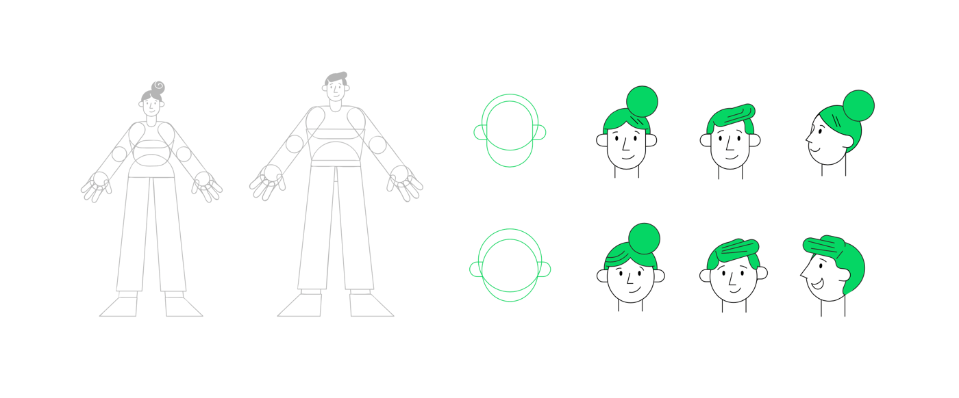
One of the important elements of the library are the characters. These were the most troublesome ones, but now you can build new characters with great ease, as in Pablo Stanley’s Humaaans.
How to use the library
There is a small tutorial in the library that shows you how to use it. It calls the user from the “read me first” card. It is a good practice to make even those who know the program familiar with the options in the library. This tutorial shows how to work with characters, how to scale to avoid spoiling proportions or lines, and how to use styles. All this, simply presented on a few cards, leads us to the “Templates” page where everyone can create and export their own compositions.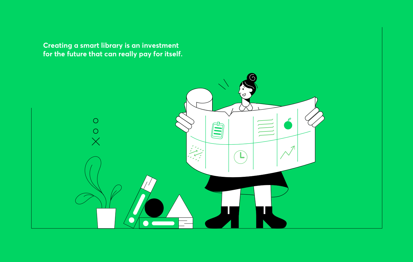
Problem-solver
This innovation solves many problems and, after the first tests, we know that it was a good investment of time. The process of creating our illustrations became automated. Tasks do not have to wait for an illustrator who is currently free, on the contrary — they can be immediately prepared by a designer who is not currently in the project and no matter if s/he is a junior, a regular, a product designer, a UX designer, a UI designer, or a unicorn — everyone can create illustrations using the library.
It is also a huge benefit for the marketing department. Illustrations can be created much faster thanks to the library. They are custom and consistent in their style. (And we all know very well what can happen with style when a lot of materials are made.)
In addition to the benefits of automation, we also have satisfied designers who can now feel like illustrators and create compositions based on our guidelines with ease.
I see a huge potential in this for businesses that think more seriously about their branding. Creating brand books, design systems, and illustrative guidelines is a very good step towards brand development. However, if you want to approach it innovatively and save time and money, it is worth thinking about creating a unique and customized library of illustrations which will be able to function on many levels.
Summary
Netguru is growing, but it doesn’t mean that we’re losing our identity. These illustration guidelines will help our illustrators and designers keep the Netguru style consistent. We believe that it’s a great solution and we love solving problems!
Such a solution is beneficial for any brand that thinks seriously about its development.
Custom business illustration is a great opportunity to make a unique picture of the company.
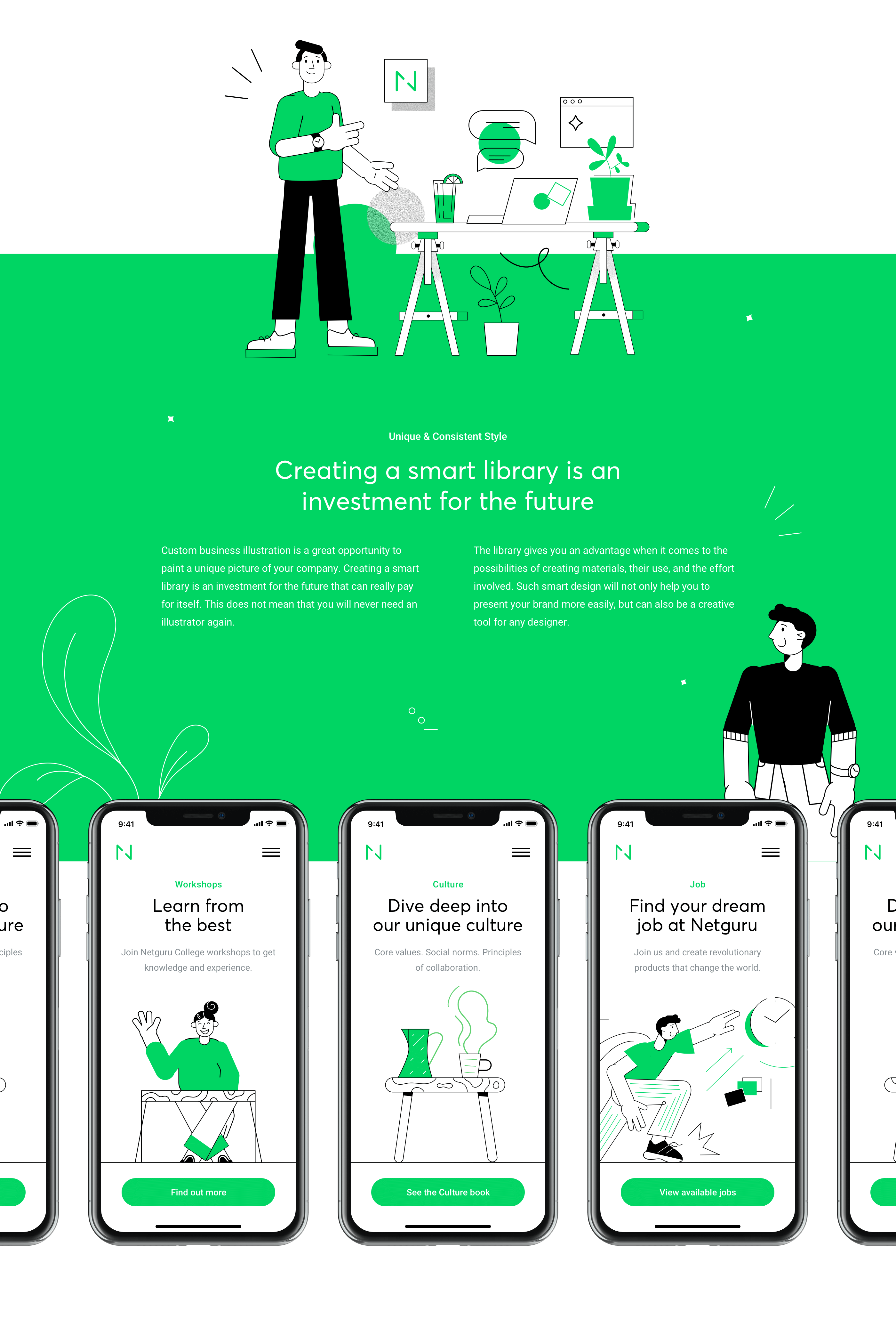
Creating a smart library is an investment for the future that can really pay for itself. This does not mean that you will never need an illustrator again. However, the library gives you an advantage when it comes to the possibilities of creating materials, their use, and building commitment. Such smart design will not only help you to present your brand more easily, but can also be a creative tool for any designer.

https://www.behance.net/gallery/83841655/Netguru-Smart-Illustration-System
