图资源
上
- 根据图片大小来定.map盒子大小
- .map 要居中显示
- 图片是透明的,需要在定义body的背景颜色,颜色用#333吧
- 在.map里弄个.city盒子,盒子内容先写个1
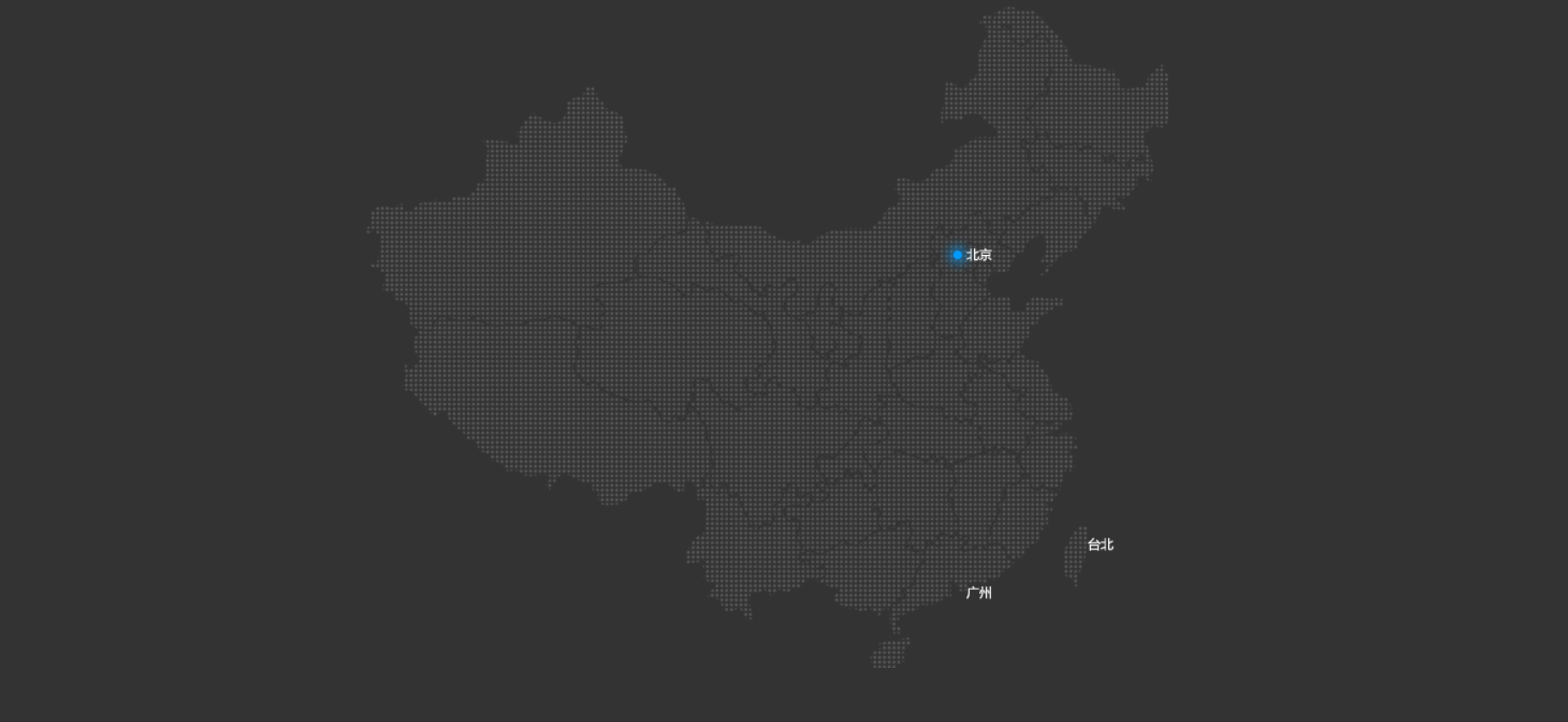
- .city盒子用定位,再用chrome调试,把1定到北京,复制一下top,和right,替换代码里的top和right
- 删掉1,在.city盒子里,写四个盒子,一个是中心点.dotted盒子,其他三个是pulse1,2,3盒子
- .dotted设置宽高,并用border-radius变圆,再用chrome调试.city盒子,让圆点定到北京,复制替换掉代码里的
- 用属性选择器.city div[class^=”pulse”],宽高和.dotted一样就好,设置阴影box-shadow,用绝对定位加transform:translate(-50%,-50%),定到圆点的中央
<!DOCTYPE html><html lang="en"><head><meta charset="UTF-8"><meta http-equiv="X-UA-Compatible" content="IE=edge"><meta name="viewport" content="width=device-width, initial-scale=1.0"><title>Document</title><style>body {background-color: #333;}.map {position: relative;width: 747px;height: 617px;margin: auto;background: url(media/map.png) no-repeat;}.city {position: absolute;top: 228px;right: 192px;}.dotted {width: 8px;height: 8px;background-color: #09f;border-radius: 50%;}.city div[class^="pulse"] {position: absolute;top: 50%;left: 50%;transform: translate(-50%, -50%);/* 以上是为了子在父中央 */width: 8px;height: 8px;box-shadow: 0 0 12px #009dfd;border-radius: 50%;}</style></head><body><div class="map"><div class="city"><div class="dotted"></div><div class="pulse1"></div><div class="pulse2"></div><div class="pulse3"></div></div></div></body></html>
下
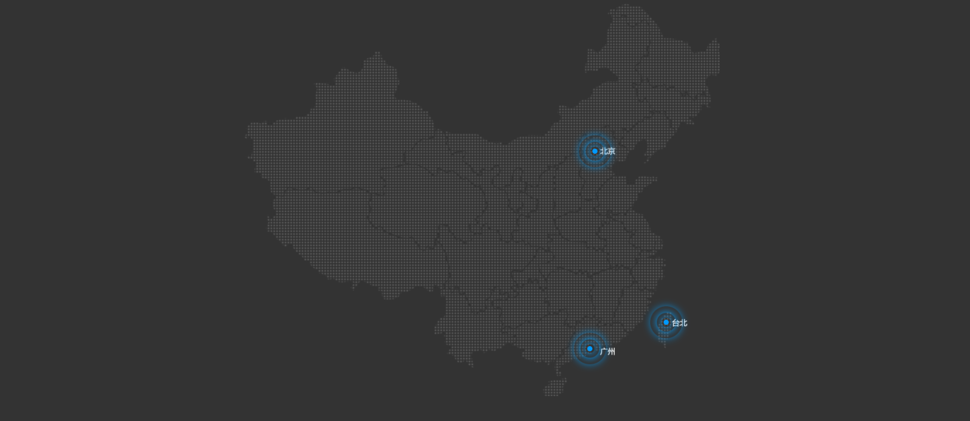
- 定义动画pulse,0%空,70%设置width,height,opacity为1,100%设置width,height,opacity为0.
- 给.city div[class^=”pulse”] 用下动画 animation: pulse 1.8s linear infinite;
- 一共用时1.8s,用速度曲线用 linear 匀速,infinite 无限,一直循环下去
- 这样还不行,这样三个pulse都叠在一块了,得用延迟来把它们分开
- .city div.pulse2 { animation-delay: .6s; } .city div.pulse3 { animation-delay: 1.2s; } 这里得注意权重的问题,权重比.city div[class^=”pulse”]小的话,就没用了。 ```html <!DOCTYPE html>
```

若有收获,就点个赞吧
0 人点赞
