盒子居中
<body><div class="searchFixed"></div></body>
// 页面元素rem计算公式:页面元素的px / html 字体大小 font-size
// searchFixed
@baseFont: 50;
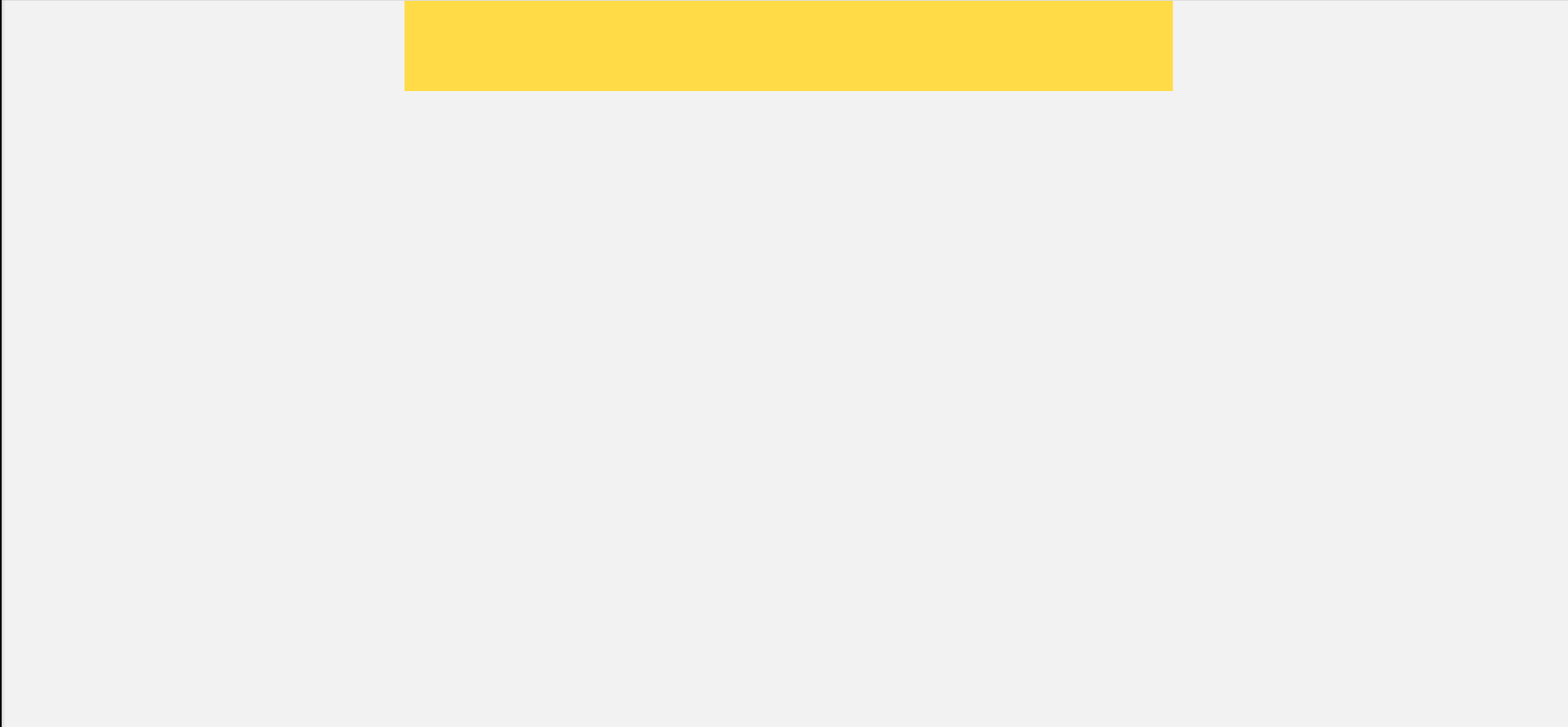
.searchFixed {
position: fixed;
left: 50%;
transform: translateX(-50%);
height: 0;
width: (750rem / @baseFont);
height: (88rem / @baseFont);
background-color: #ffdb47;
}
@baseFont是为了方便,不用每次都除50
固定定位居中:离左50%,这时盒子是左边边缘离左50%,还有一半盒子在右边,这时要用transform水平向左移动50%,盒子就刚好居中了
三个盒子分布
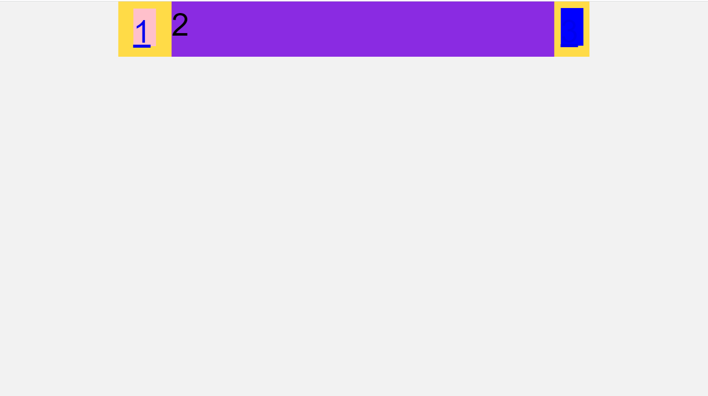
<div class="searchFixed">
  <a href="#" class="classify">1</a>
  <div class="search">2</div>
  <a href="#" class="login">3</a>
</div>
.searchFixed {
  display: flex;
  position: fixed;
  left: 50%;
  transform: translateX(-50%);
  height: 0;
  width: (750rem / @baseFont);
  height: (88rem / @baseFont);
  background-color: #ffdb47;

  .classify {
    width: (36rem / @baseFont);
    height: (60rem / @baseFont);
    background-color: pink;
    margin: (11rem / @baseFont) (25rem /@baseFont) (7rem / @baseFont) (24rem / @baseFont);
  }

  .search {
    flex: 1;
    background-color: blueviolet;
  }

  .login {
    width: (36rem / @baseFont);
    height: (60rem / @baseFont);
    background-color: blue;
    margin: (10rem / @baseFont);
  }
}
中间盒子用flex:1,直接分割成一份,相当于不分割,自动相两边挤,不用给width和height
中间搜索input
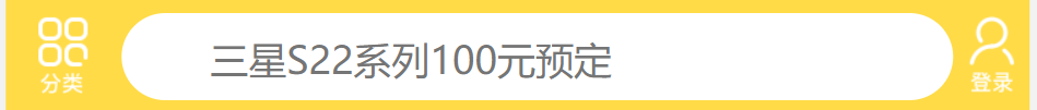
<div class="searchFixed">
  <a href="#" class="classify"></a>
  <div class="search">
    <form action="">
      <input type="search" placeholder="三星S22系列100元预定">
    </form>
  </div>
  <a href="#" class="login"></a>
  </div>
.search {
  flex: 1;

  input {
    height: (64rem / @baseFont);
    width: 100%;
    margin-top: (12rem / @baseFont);
    border-radius: (32rem / @baseFont);
    border: 0;
    outline: none;
    color: #999999;
    padding: (3rem / @baseFont) (20rem / @baseFont) 0 (65rem / @baseFont );
    font-size: (28rem / @baseFont);
  }
  }

若有收获,就点个赞吧
0 人点赞
