实现的效果
模仿小米:https://www.mi.com/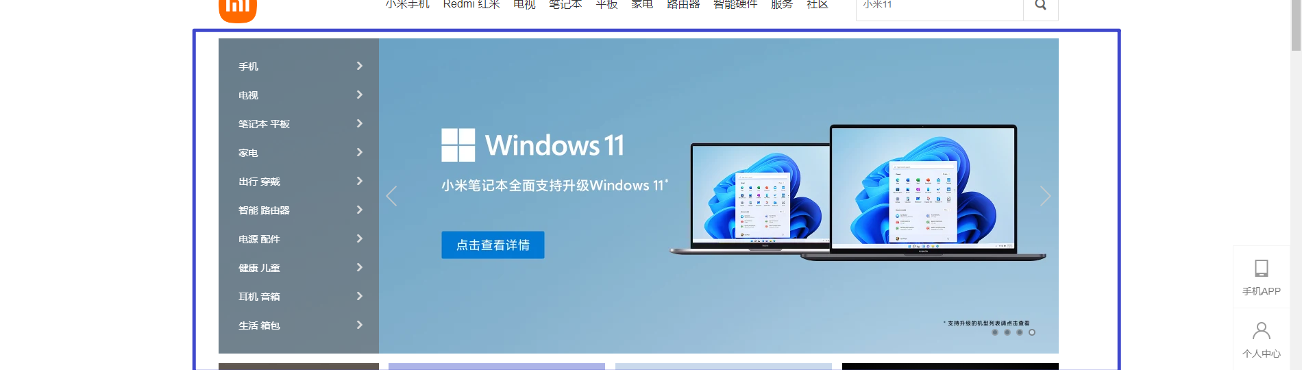
1
先布局好模块就可以了,内容前面写过。
<!DOCTYPE html><html lang="en"><head><meta charset="UTF-8"><meta http-equiv="X-UA-Compatible" content="IE=edge"><meta name="viewport" content="width=device-width, initial-scale=1.0"><title>Document</title><style>* {margin: 0;padding: 0;}.father {width: 1225px;height: 460px;margin: 10px auto;}.left {float: left;width: 235px;height: 460px;background-color: #6b7f8c;}.right {float: left;height: 460px;width: 990px;background-color: #90b9d2;}</style></head><body><div class="father"><div class="left"></div><div class="right"></div></div></body></html>

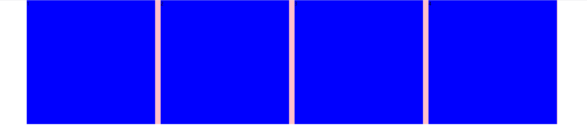
2
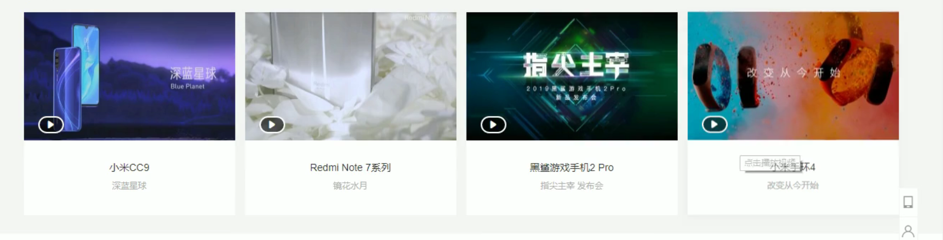
这种有空隙的布局可以用margin-right,最后一个不用。
<!DOCTYPE html>
<html lang="en">

<head>
  <meta charset="UTF-8">
  <meta http-equiv="X-UA-Compatible" content="IE=edge">
  <meta name="viewport" content="width=device-width, initial-scale=1.0">
  <title>Document</title>

  <style>
    * {
      margin: 0;
      padding: 0;
    }

    div {
      width: 1728px;
      height: 405px;
      background-color: pink;
      margin: 0 auto;
    }

    li {
      list-style: none;
    }

    ul li {
      float: left;
      width: 418px;
      height: 405px;
      background-color: blue;
      margin-right: 18px;
    }

    ul .last {
      margin-right: 0;
    }
  </style>
</head>

<body>
  <div>
    <ul>
      <li>1</li>
      <li>2</li>
      <li>3</li>
      <li class="last">4</li>
    </ul>
  </div>
</body>

</html>
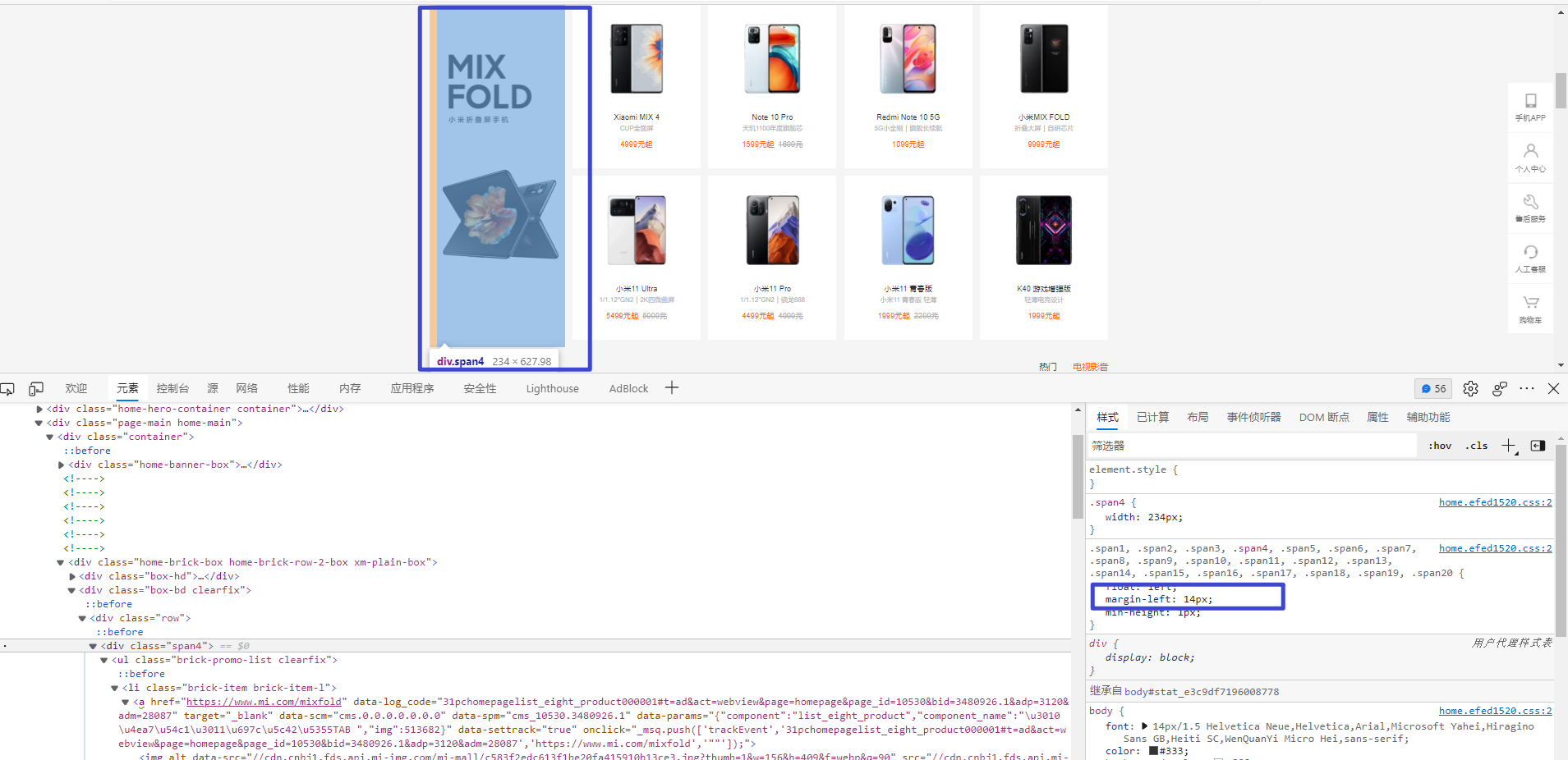
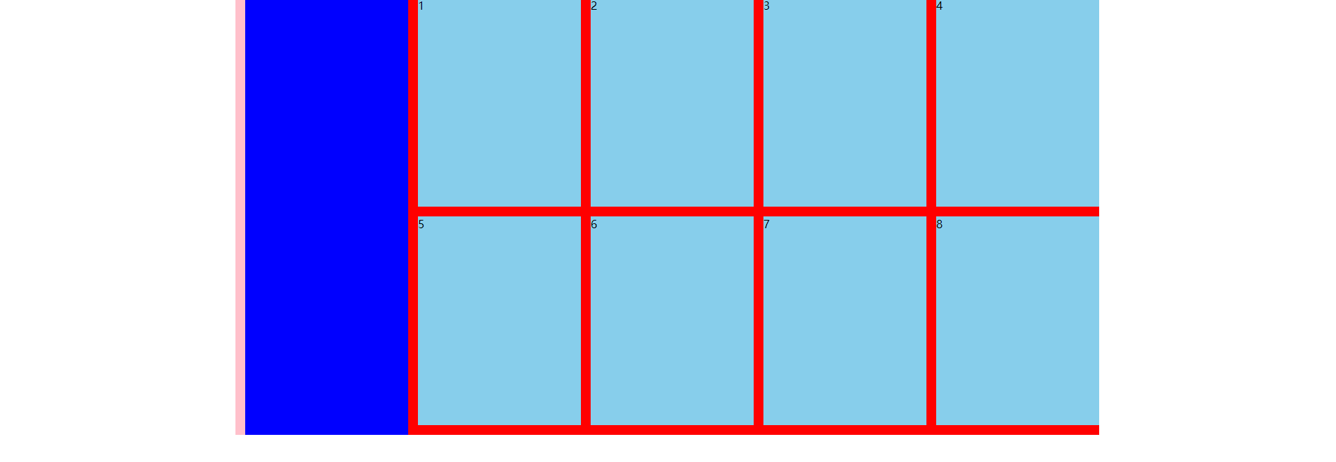
手机模块(上)
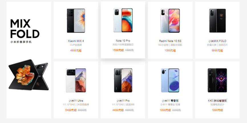
做这个模块布局。
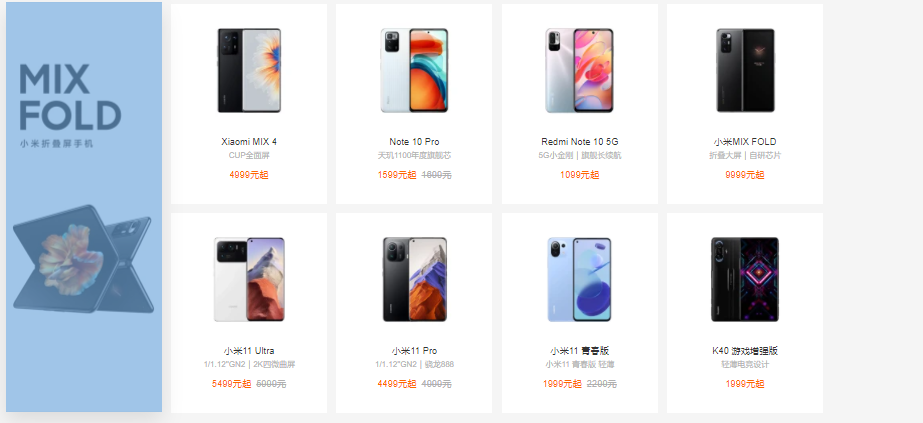
所以:一个大的div包两个子div
右div包8个子盒子。用div也行,用ul li也行。
<!DOCTYPE html>
<html lang="en">

<head>
  <meta charset="UTF-8">
  <meta http-equiv="X-UA-Compatible" content="IE=edge">
  <meta name="viewport" content="width=device-width, initial-scale=1.0">
  <title>Document</title>

  <style>
    * {
      margin: 0;
      padding: 0;
    }

    .box {
      width: 1240px;
      height: 628px;
      background-color: pink;
      margin: 0 auto;
    }

    .left {
      float: left;
      margin-left: 14px;
      width: 234px;
      height: 628px;
      background-color: blue;
    }

    .right {
      float: left;
      margin-left: 14px;
      width: 992px;
      height: 628px;
      background-color: red;
    }
  </style>
</head>

<body>

  <div class="box">
    <div class="left"></div>
    <div class="right"></div>
  </div>
</body>

</html>
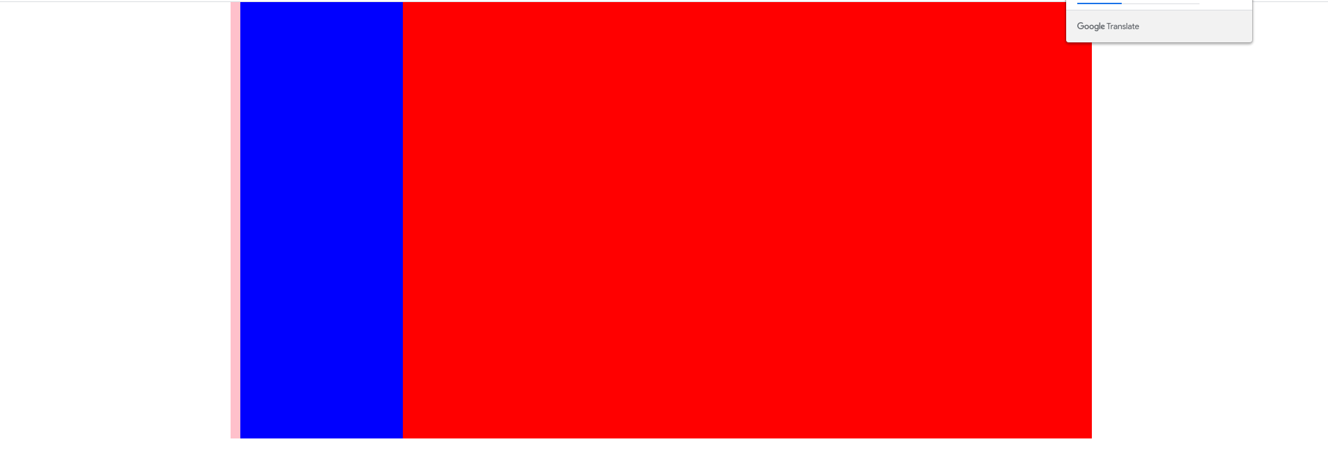
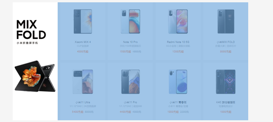
手机模块(下)
<!DOCTYPE html>
<html lang="en">

<head>
  <meta charset="UTF-8">
  <meta http-equiv="X-UA-Compatible" content="IE=edge">
  <meta name="viewport" content="width=device-width, initial-scale=1.0">
  <title>Document</title>

  <style>
    * {
      margin: 0;
      padding: 0;
    }

    .box {
      width: 1240px;
      height: 628px;
      background-color: pink;
      margin: 0 auto;
    }

    .left {
      float: left;
      margin-left: 14px;
      width: 234px;
      height: 628px;
      background-color: blue;
    }

    .right {
      float: left;
      width: 992px;
      height: 628px;
      background-color: red;
    }

    .right div {
      float: left;
      width: 234px;
      height: 300px;
      background-color: skyblue;
      margin-left: 14px;
      margin-bottom: 14px;
    }
  </style>
</head>

<body>

  <div class="box">
    <div class="left"></div>
    <div class="right">
      <div>1</div>
      <div>2</div>
      <div>3</div>
      <div>4</div>
      <div>5</div>
      <div>6</div>
      <div>7</div>
      <div>8</div>
    </div>
  </div>
</body>

</html>
    .right div {
      float: left;
      width: 234px;
      height: 300px;
      background-color: skyblue;
      margin-left: 14px;
      margin-bottom: 14px;
    }

若有收获,就点个赞吧
0 人点赞
