头部左边
index.html
<!-- 销售模块 --><div class="sales"><div class="sales-hd"><h2>热门活动</h2><a href="#">123</a></div><div class="sales-bd"></div></div>
index.css
/* 销售模块 */
.sales {
  margin: 3px 5px 0;
  background-color: #fff;
  border-radius: 10px;
}

.sales-hd {
  height: 46px;
  border-top: 1px solid #bbb;
  border-bottom: 1px solid #ccc;
}

.sales-hd h2 {
  position: relative;
  text-indent: -99999px;
  overflow: hidden;
}

.sales-hd h2::after {
  content: "";
  position: absolute;
  top: 0px;
  left: 8px;
  width: 79px;
  height: 20px;
  /* background-color: rebeccapurple; */
  background: url(../images/hot.png) no-repeat 0 -18px;
  background-size: 79px auto;
}
头部右边

- 用绝对定位
- a不用设置宽高,用文字挤开,背景颜色用渐变
- 小三角用css,边框加旋转实现
- 左右加padding值
index.html
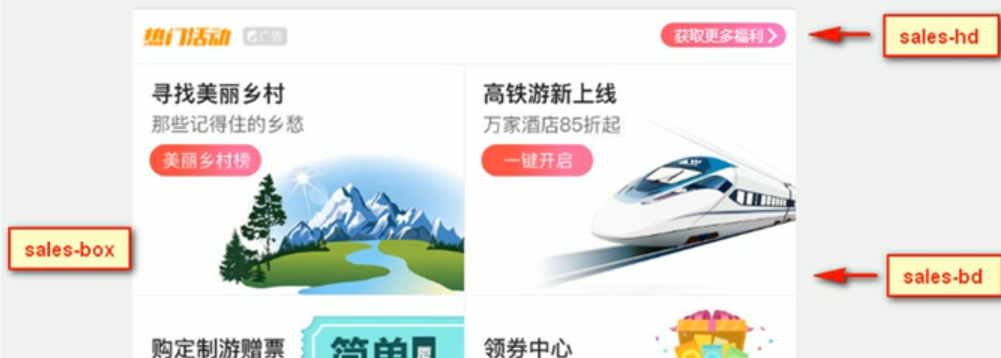
  <!-- 销售模块 -->
  <div class="sales">
    <div class="sales-hd">
      <h2>热门活动</h2>
      <a href="#">获取更多福利</a>
    </div>
    <div class="sales-bd"></div>
  </div>
index.css
/* 销售模块 */
.sales {
  overflow: hidden;
  margin: 3px 5px 0;
  background-color: #fff;
  border-radius: 10px;
}

.sales-hd {
  position: relative;
  height: 46px;
  border-top: 1px solid #bbb;
  border-bottom: 1px solid #ccc;
  overflow: hidden;

}

.sales-hd h2 {
  position: relative;
  text-indent: -999px;
}

.sales-hd h2::after {
  content: "";
  position: absolute;
  top: -4px;
  left: 8px;
  width: 79px;
  height: 20px;
  /* background-color: rebeccapurple; */
  background: url(../images/hot.png) no-repeat 0 -18px;
  background-size: 79px auto;
}

.sales-hd a {
  position: absolute;
  top: 10px;
  right: 8px;
  background: -webkit-linear-gradient(left, #FF516B, #FF6AC3);
  padding: 0 20px 0 10px;
  border-radius: 10px;
  color: #fff;
}

.sales-hd a::after {
  position: absolute;
  content: "";
  width: 7px;
  height: 7px;
  top: 7px;
  right: 10px;
  border-top: 1px solid #fff;
  border-right: 1px solid #fff;
  /* background-color: #fff; */
  transform: rotate(45deg);
}
body部分

- .row盒子三个,
- 用flex布局
-
index.html
<!-- 销售模块 -->
<div class="sales">
  <div class="sales-hd">
    <h2>热门活动</h2>
    <a href="#">获取更多福利</a>
  </div>
  <div class="sales-bd">
    <div class="row">
      <a href="#">
        <img src="upload/pic1.jpg" alt="">

      </a>
      <a href="#">
        <img src="upload/pic2.jpg" alt="">
      </a>
    </div>
    <div class="row">
      <a href="#">
        <img src="upload/pic3.jpg" alt="">

      </a>
      <a href="#">
        <img src="upload/pic4.jpg" alt="">
      </a>
    </div>
    <div class="row">
      <a href="#">
        <img src="upload/pic5.jpg" alt="">

      </a>
      <a href="#">
        <img src="upload/pic6.jpg" alt="">
      </a>
    </div>
  </div>
</div>
index.css
```css x .row { display: flex; }
.row a { flex: 1; border-bottom: 1px solid #ccc; }
.row a:nth-child(1) { border-right: 1px solid #eee; }
.row a img { width: 100%; } ```

若有收获,就点个赞吧
0 人点赞
