layout: post # 使用的布局(不需要改)title: Python可视化之matplotlib # 标题
subtitle: 利用matplotlib对数据进行可视化 #副标题
date: 2018-11-11 # 时间
author: NSX # 作者
header-img: img/post-bg-2015.jpg #这篇文章标题背景图片
catalog: true # 是否归档
tags: #标签
- 技术
- 教程
利用matplotlib对数据进行可视化
import numpy as npimport matplotlibimport matplotlib.mlab as mlabimport matplotlib.pyplot as pltimport matplotlib.font_manager as fm
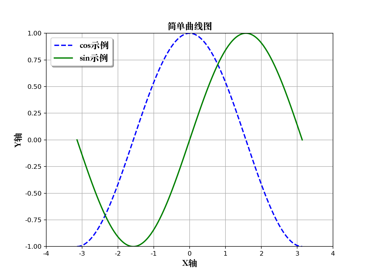
1、简单曲线图
def simple_plot():"""simple plot"""# 生成测试数据x = np.linspace(-np.pi, np.pi, 256, endpoint=True)y_cos, y_sin = np.cos(x), np.sin(x)# 生成画布,并设定标题plt.figure(figsize=(8, 6), dpi=80)plt.title("简单曲线图", fontproperties=myfont)plt.grid(True)# 设置X轴plt.xlabel("X轴", fontproperties=myfont)plt.xlim(-4.0, 4.0)plt.xticks(np.linspace(-4, 4, 9, endpoint=True))# 设置Y轴plt.ylabel("Y轴", fontproperties=myfont)plt.ylim(-1.0, 1.0)plt.yticks(np.linspace(-1, 1, 9, endpoint=True))# 画两条曲线plt.plot(x, y_cos, "b--", linewidth=2.0, label="cos示例")plt.plot(x, y_sin, "g-", linewidth=2.0, label="sin示例")# 设置图例位置,loc可以为[upper, lower, left, right, center]plt.legend(loc="upper left", prop=myfont, shadow=True)# 图形显示plt.show()return
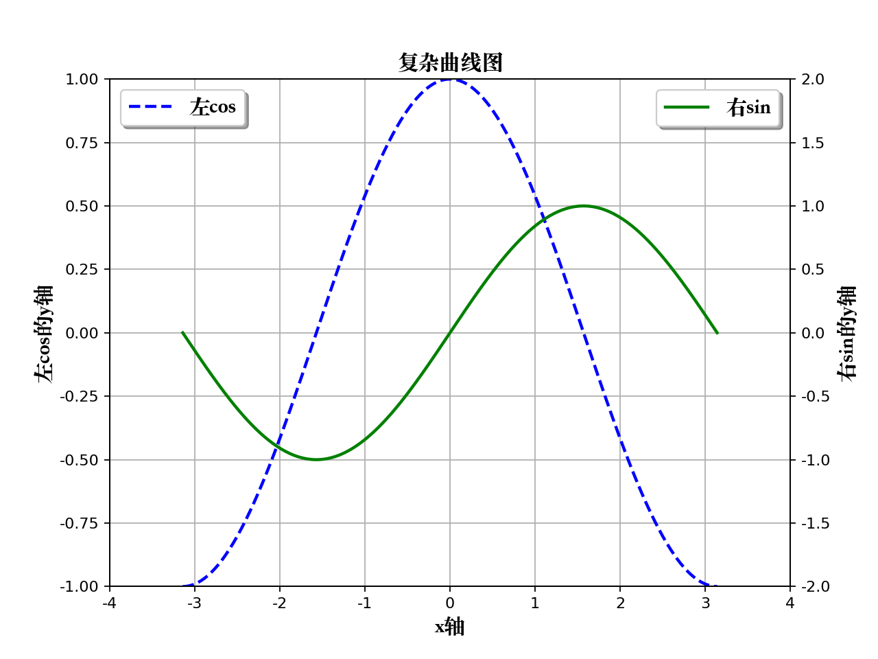
2、复杂曲线图
def simple_advanced_plot():"""simple advanced plot"""# 生成测试数据x = np.linspace(-np.pi, np.pi, 256, endpoint=True)y_cos, y_sin = np.cos(x), np.sin(x)# 生成画布, 并设定标题plt.figure(figsize=(8, 6), dpi=80)plt.title("复杂曲线图", fontproperties=myfont)plt.grid(True)# 画图的另外一种方式ax_1 = plt.subplot(111)ax_1.plot(x, y_cos, color="blue", linewidth=2.0, linestyle="--", label="左cos")ax_1.legend(loc="upper left", prop=myfont, shadow=True)# 设置Y轴(左边)ax_1.set_ylabel("左cos的y轴", fontproperties=myfont)ax_1.set_ylim(-1.0, 1.0)ax_1.set_yticks(np.linspace(-1, 1, 9, endpoint=True))# 画图的另外一种方式ax_2 = ax_1.twinx()ax_2.plot(x, y_sin, color="green", linewidth=2.0, linestyle="-", label="右sin")ax_2.legend(loc="upper right", prop=myfont, shadow=True)# 设置Y轴(右边)ax_2.set_ylabel("右sin的y轴", fontproperties=myfont)ax_2.set_ylim(-2.0, 2.0)ax_2.set_yticks(np.linspace(-2, 2, 9, endpoint=True))# 设置X轴(共同)ax_1.set_xlabel("x轴", fontproperties=myfont)ax_1.set_xlim(-4.0, 4.0)ax_1.set_xticks(np.linspace(-4, 4, 9, endpoint=True))# 图形显示plt.show()return
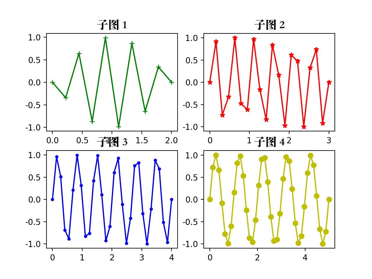
3、子图
def subplot_plot():"""subplot plot"""# 子图的style列表style_list = ["g+-", "r*-", "b.-", "yo-"]# 依次画图for num in range(4):# 生成测试数据x = np.linspace(0.0, 2+num, num=10*(num+1))y = np.sin((5-num) * np.pi * x)# 子图的生成方式plt.subplot(2, 2, num+1)plt.title("子图 %d" % (num+1), fontproperties=myfont)plt.plot(x, y, style_list[num])# 图形显示plt.show()return
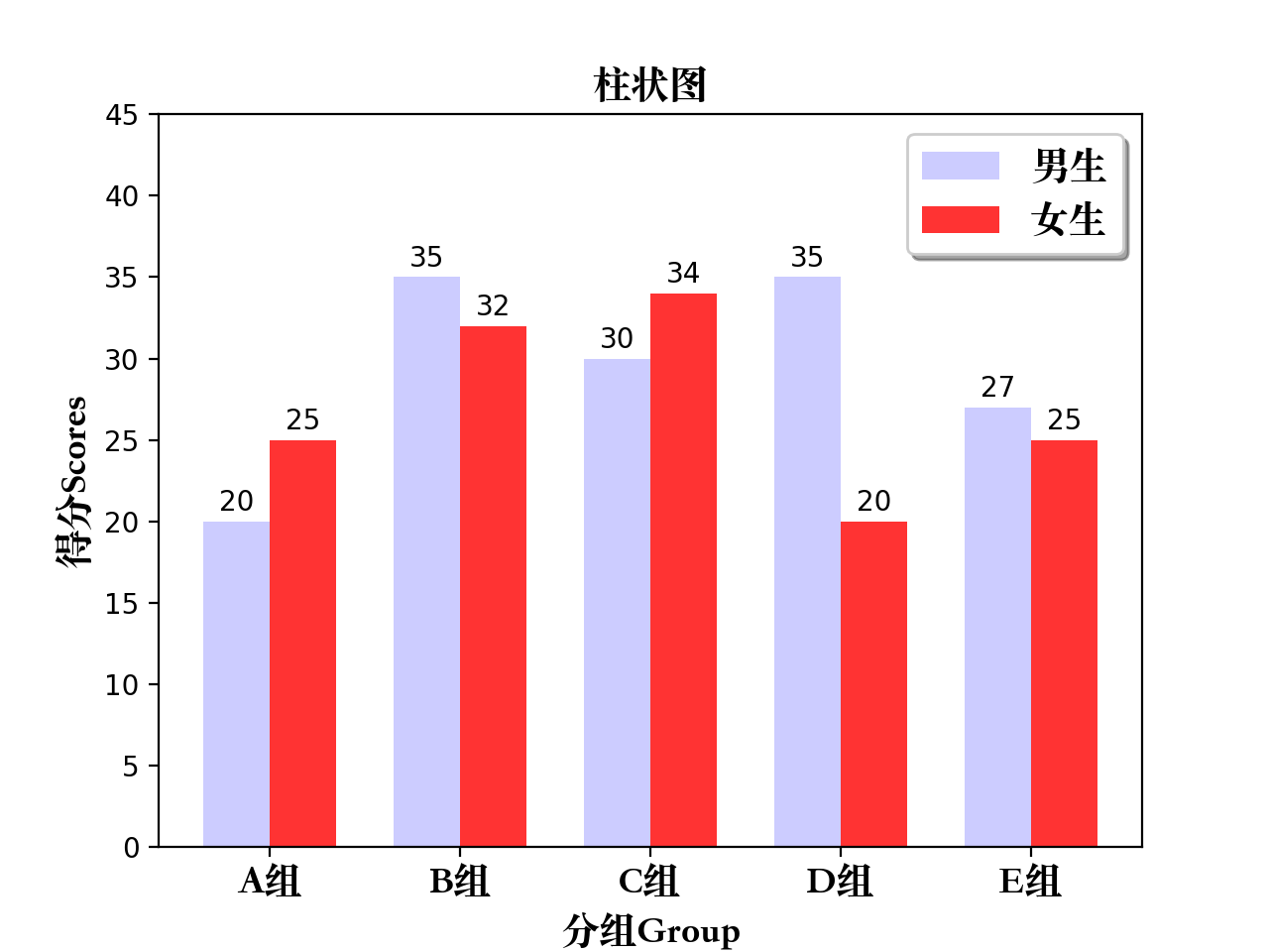
4、柱状图
def bar_plot():"""bar plot"""# 生成测试数据means_men = (20, 35, 30, 35, 27)means_women = (25, 32, 34, 20, 25)# 设置标题plt.title("柱状图", fontproperties=myfont)# 设置相关参数index = np.arange(len(means_men))bar_width = 0.35# 画柱状图plt.bar(index, means_men, width=bar_width, alpha=0.2, color="b", label="男生")plt.bar(index+bar_width, means_women, width=bar_width, alpha=0.8, color="r", label="女生")plt.legend(loc="upper right", prop=myfont, shadow=True)# 设置柱状图标示for x, y in zip(index, means_men):plt.text(x, y+0.3, y, ha="center", va="bottom")for x, y in zip(index, means_women):plt.text(x+bar_width, y+0.3, y, ha="center", va="bottom")# 设置刻度范围/坐标轴名称等plt.ylim(0, 45)plt.xlabel("分组Group", fontproperties=myfont)plt.ylabel("得分Scores", fontproperties=myfont)plt.xticks(index+(bar_width/2), ("A组", "B组", "C组", "D组", "E组"), fontproperties=myfont)# 图形显示plt.show()return
5、横向柱状图
def barh_plot():"""barh plot"""# 生成测试数据means_men = (20, 35, 30, 35, 27)means_women = (25, 32, 34, 20, 25)# 设置标题plt.title("横向柱状图", fontproperties=myfont)# 设置相关参数index = np.arange(len(means_men))bar_height = 0.35# 画柱状图(水平方向)plt.barh(index, means_men, height=bar_height, alpha=0.2, color="b", label="Men")plt.barh(index+bar_height, means_women, height=bar_height, alpha=0.8, color="r", label="Women")plt.legend(loc="upper right", shadow=True)# 设置柱状图标示for x, y in zip(index, means_men):plt.text(y+0.3, x, y, ha="left", va="center")for x, y in zip(index, means_women):plt.text(y+0.3, x+bar_height, y, ha="left", va="center")# 设置刻度范围/坐标轴名称等plt.xlim(0, 45)plt.xlabel("Scores")plt.ylabel("Group")plt.yticks(index+(bar_height/2), ("A", "B", "C", "D", "E"))# 图形显示plt.show()return

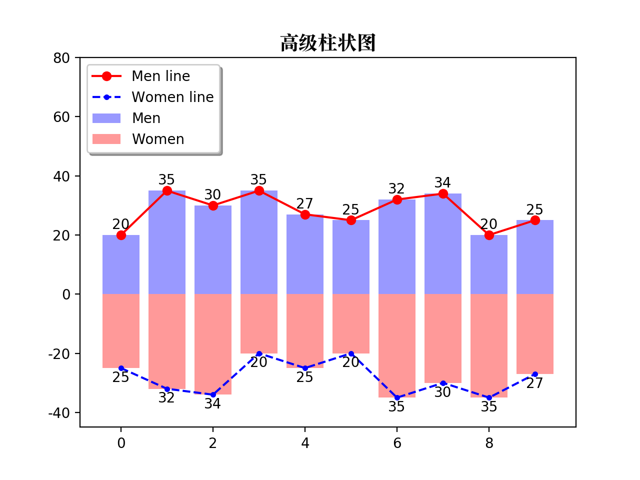
6、高级柱状图
def bar_advanced_plot():"""bar advanced plot"""# 生成测试数据means_men = np.array((20, 35, 30, 35, 27, 25, 32, 34, 20, 25))means_women = np.array((25, 32, 34, 20, 25, 20, 35, 30, 35, 27))# 设置标题plt.title("高级柱状图", fontproperties=myfont)# 设置相关参数index = np.arange(len(means_men))bar_width = 0.8# 画柱状图(两种:X轴以上/X轴以下)plt.bar(index, means_men, width=bar_width, alpha=0.4, color="b", label="Men")plt.bar(index, -means_women, width=bar_width, alpha=0.4, color="r", label="Women")# 画折线图(两种,和柱状图对应)plt.plot(index, means_men, marker="o", linestyle="-", color="r", label="Men line")plt.plot(index, -means_women, marker=".", linestyle="--", color="b", label="Women line")# 设置图形标示(两种,和柱状图对应)for x, y in zip(index, means_men):plt.text(x, y+1, y, ha="center", va="bottom")for x, y in zip(index, means_women):plt.text(x, -y-1, y, ha="center", va="top")# 设置Y轴和图例位置plt.ylim(-45, 80)plt.legend(loc="upper left", shadow=True)# 图形显示plt.show()return
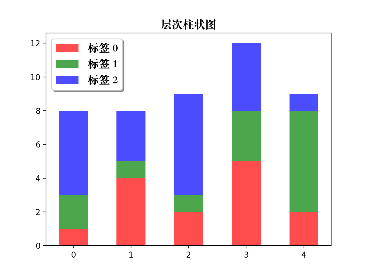
7、层次柱状图
def table_plot():"""table plot"""# 生成测试数据data = np.array([[1, 4, 2, 5, 2],[2, 1, 1, 3, 6],[5, 3, 6, 4, 1]])# 设置标题plt.title("层次柱状图", fontproperties=myfont)# 设置相关参数index = np.arange(len(data[0]))color_index = ["r", "g", "b"]# 声明底部位置bottom = np.array([0, 0, 0, 0, 0])# 依次画图,并更新底部位置for i in range(len(data)):plt.bar(index, data[i], width=0.5, color=color_index[i], bottom=bottom, alpha=0.7, label="标签 %d" % i)bottom += data[i]# 设置图例位置plt.legend(loc="upper left", prop=myfont, shadow=True)# 图形显示plt.show()return
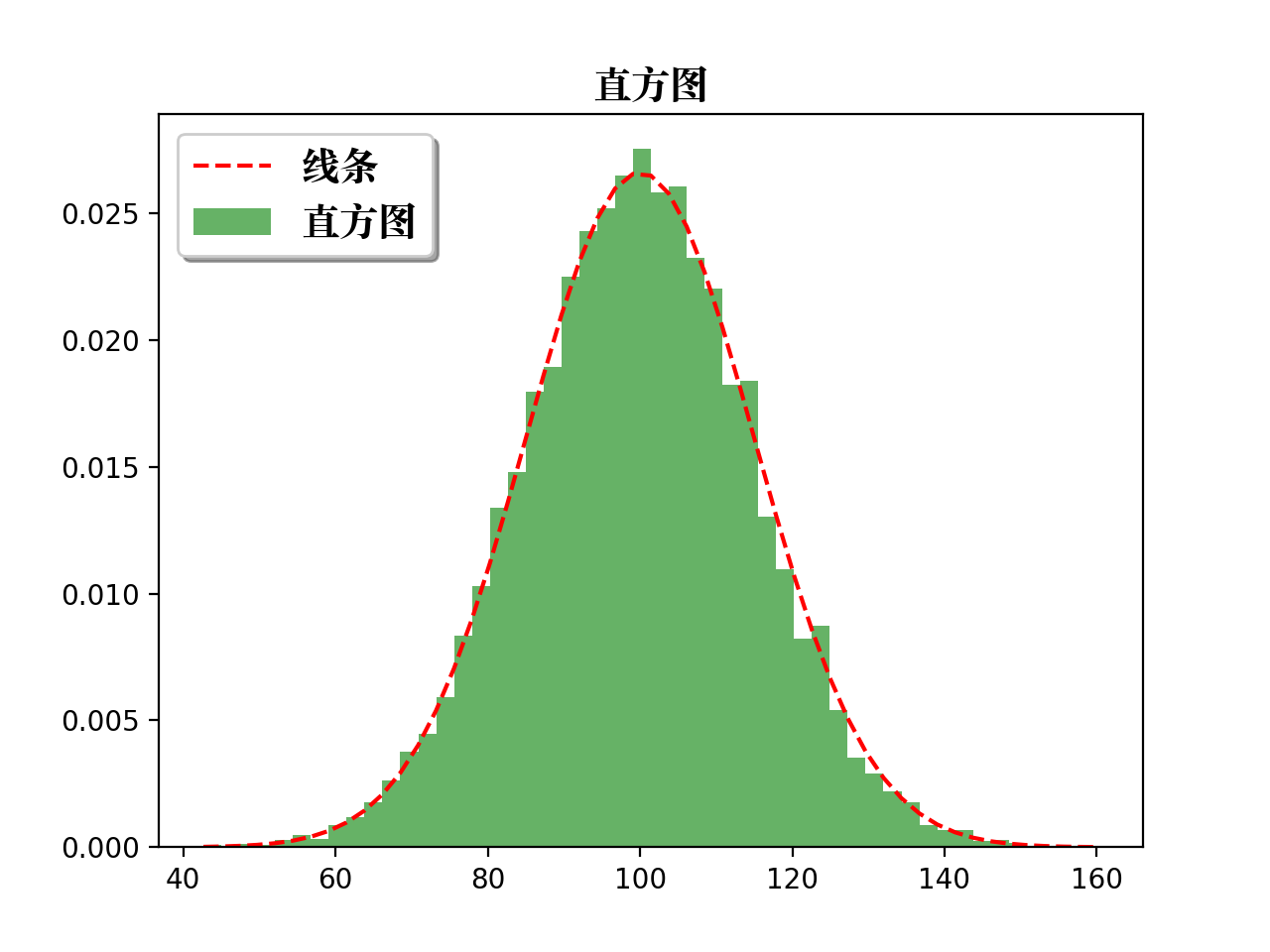
8、直方图
def histograms_plot():"""histograms plot"""# 生成测试数据mu, sigma = 100, 15x = mu + sigma * np.random.randn(10000)# 设置标题plt.title("直方图", fontproperties=myfont)# 画直方图, 并返回相关结果n, bins, patches = plt.hist(x, bins=50, normed=1, cumulative=False, color="green", alpha=0.6, label="直方图")# 根据直方图返回的结果, 画折线图y = mlab.normpdf(bins, mu, sigma)plt.plot(bins, y, "r--", label="线条")# 设置图例位置plt.legend(loc="upper left", prop=myfont, shadow=True)# 图形显示plt.show()return
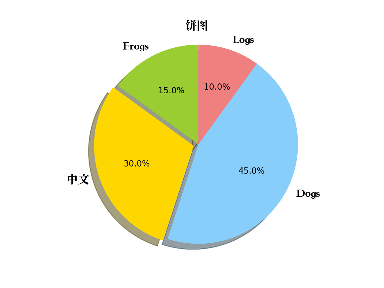
9、饼图
def pie_plot():"""pie plot"""# 生成测试数据sizes = [15, 30, 45, 10]labels = ["Frogs", "中文", "Dogs", "Logs"]colors = ["yellowgreen", "gold", "lightskyblue", "lightcoral"]# 设置标题plt.title("饼图", fontproperties=myfont)# 设置突出参数explode = [0, 0.05, 0, 0]# 画饼状图patches, l_text, p_text = plt.pie(sizes, explode=explode, labels=labels, colors=colors, autopct="%1.1f%%", shadow=True, startangle=90)for text in l_text:text.set_fontproperties(myfont)plt.axis("equal")# 图形显示plt.show()return
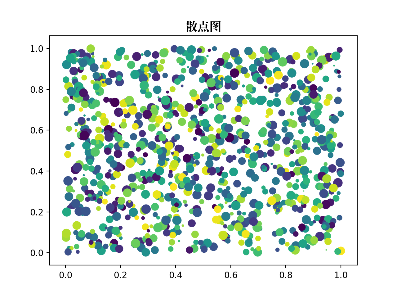
10、散点图
def scatter_plot():"""scatter plot"""# 生成测试数据point_count = 1000x_index = np.random.random(point_count)y_index = np.random.random(point_count)# 设置标题plt.title("散点图", fontproperties=myfont)# 设置相关参数color_list = np.random.random(point_count)scale_list = np.random.random(point_count) * 100# 画散点图plt.scatter(x_index, y_index, s=scale_list, c=color_list, marker="o")# 图形显示plt.show()return
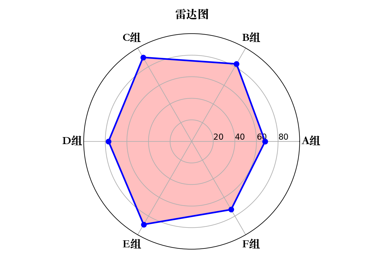
11、雷达图
def radar_plot():"""radar plot"""# 生成测试数据labels = np.array(["A组", "B组", "C组", "D组", "E组", "F组"])data = np.array([68, 83, 90, 77, 89, 73])theta = np.linspace(0, 2*np.pi, len(data), endpoint=False)# 数据预处理data = np.concatenate((data, [data[0]]))theta = np.concatenate((theta, [theta[0]]))# 画图方式plt.subplot(111, polar=True)plt.title("雷达图", fontproperties=myfont)# 设置"theta grid"/"radar grid"plt.thetagrids(theta*(180/np.pi), labels=labels, fontproperties=myfont)plt.rgrids(np.arange(20, 100, 20), labels=np.arange(20, 100, 20), angle=0)plt.ylim(0, 100)# 画雷达图,并填充雷达图内部区域plt.plot(theta, data, "bo-", linewidth=2)plt.fill(theta, data, color="red", alpha=0.25)# 图形显示plt.show()return
数据可视化的库推荐
这里推荐几个比较常用的:
- Matplotlib
- Plotly
- Seaborn 教程
- Ggplot
- Bokeh
- Pyechart
- Pygal

若有收获,就点个赞吧
0 人点赞
