relative
汇总
absolute是与第一个父级定位元素的相对定位,html也是父级
relative是与之前的自己的相对位置
第一种用法
absolute找父级进行绝对定位,作为abnsolute的父级元素
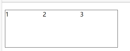
top、left都是0,加position: relative,并不是为了设置元素位置,而是为了它的子元素去相对定位
<style>.box {position: relative;/*两个作用:相对父级进行绝对定位*/width: 100px;height: 100px;background-color: #000;}.box1 {position: absolute;top: 20px;right: 10px;width: 50px;}</style><div class="box"><div class="box1"></div></div>

第二种用法
<style>.box1 {width: 100px;height: 100px;background-color: #000;}.box2 {width: 100px;height: 100px;background-color: orange;}</style><div class="box1"></div><div class="box2"></div>

<style>.box1 {position: absolute;width: 100px;height: 100px;background-color: #000;}.box2 {width: 100px;height: 100px;background-color: orange;}</style><div class="box1"></div><div class="box2"></div>

当上面元素是定位元素,下面元素是非定位元素时。
定位元素脱离文档流,新开图层,会腾出位置,之后的非定位元素会向上移动,非定位元素侦测不到上层的定位元素,定位元素图层比非定位高,会覆盖非定位元素
<style>.box1 {position: absolute;width: 100px;height: 100px;background-color: #000;}.box2 {width: 100px;height: 100px;background-color: orange;opacity: .8;}</style><div class="box1"></div><div class="box2"></div>

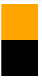
<style>.box1 {position: absolute;/* z-index: 1; *//*就变成黑色的了*/width: 100px;height: 100px;background-color: #000;}.box2 {position: relative;width: 100px;height: 100px;background-color: orange;/* opacity: .8; */}</style><div class="box1"></div><div class="box2"></div>

box2为relative,box2就上来了
因为box1绝对定位,脱离文档流,box2相对定位,但还会计算到文档流的位置中,因为box1脱离了文档流,所以box2占据之前本应该box1占据的位置,这两个后面覆盖前面的,图层是同一优先级
因为box2相对定位,会计算到文档流中
<style>.box1 {position: absolute;/* z-index: 1; *//*就变成黑色的了*/width: 100px;height: 100px;background-color: #000;}.box2 {position: relative;top: 30px;left: 30px;width: 100px;height: 100px;background-color: orange;/* opacity: .8; */}</style><div class="box1"></div><div class="box2"></div>

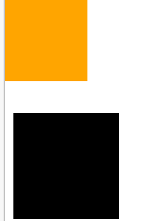
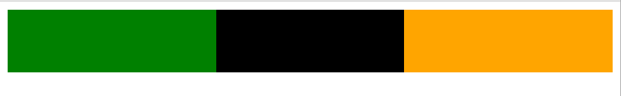
<style>.box1 {position: absolute;width: 100px;height: 100px;background-color: #000;}.box2 {position: relative;width: 100px;height: 100px;background-color: orange;/* opacity: .8; */}</style><div class="box2"></div><div class="box1"></div>
box2相对定位,但会占据之前的位置,box1绝对定位,受之前的影响
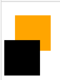
<style>.box1 {position: absolute;width: 100px;height: 100px;background-color: #000;}.box2 {position: relative;top: -30px;left: -30px;width: 100px;height: 100px;background-color: orange;/* opacity: .8; */}</style><div class="box2"></div><div class="box1"></div>
即使相对定位元素位置变了,也会占据之前的空间,因为相对定位是新的图层,只是占据老图层的位置,之后在新图层上操作位置,老图层只记录之前的位置,不记录在新图层上的变化,计算布局是老图层计算
<style>.box1 {position: absolute;width: 100px;height: 100px;background-color: #000;}.box2 {position: relative;top: 30px;left: 30px;width: 100px;height: 100px;background-color: orange;/* opacity: .8; */}</style><div class="box2"></div><div class="box1"></div>
两栏设计
<style>html,body {height: 100%;margin: 0;overflow-y: hidden;/* 溢出隐藏 */}div{height: 100%;}/* .left {height: 100%;margin-right: 300px;background-color: green;}.right {position: absolute;right: 0;top: 0;width: 300px;height: 100%;background-color: orange;} */.left {position: absolute;left: 0;top: 0;width: 300px;height: 100%;background-color: green;}.right{height: 100%;margin-left: 300px;background-color: orange;}</style><div class="left"></div><div class="right"></div>
侧边栏大小不变,内容大小随浏览器大小变化而变化
背下来了就好了
浮动float
一开始用法
<style>img{float: right;width: 150px;border: 1px solid #000;}</style><img src="https://www.baidu.com/img/PCtm_d9c8750bed0b3c7d089fa7d55720d6cf.png" alt="" srcset="">盼望着,盼望着,东风来了,春天的脚步近了。一切都像刚睡醒的样子,欣欣然张开了眼。山朗润起来了,水涨起来了,太阳的脸红起来了。小草偷偷地从土里钻出来,嫩嫩的,绿绿的。园子里,田野里,瞧去,一大片一大片满是的。坐着,躺着,打两个滚,踢几脚球,赛几趟跑,捉几回迷藏。风轻悄悄的,草软绵绵的。桃树、杏树、梨树,你不让我,我不让你,都开满了花赶趟儿。红的像火,粉的像霞,白的像雪。花里带着甜味儿;闭了眼,树上仿佛已经满是桃儿、杏儿、梨儿。花下成千成百的蜜蜂嗡嗡地闹着,大小的蝴蝶飞来飞去。野花遍地是:杂样儿,有名字的,没名字的,散在草丛里,像眼睛,像星星,还眨呀眨的。“吹面不寒杨柳风”,不错的,像母亲的手抚摸着你。 <img src="https://www.baidu.com/img/PCtm_d9c8750bed0b3c7d089fa7d55720d6cf.png" alt="" srcset="">风里带来些新翻的泥土的气息,混着青草味儿,还有各种花的香,都在微微润湿的空气里酝酿。鸟儿将窠巢安在繁花嫩叶当中,高兴起来了,呼朋引伴地卖弄清脆的喉咙,唱出宛转的曲子,与轻风流水应和着。牛背上牧童的短笛,这时候也成天在嘹亮地响。雨是最寻常的,一下就是三两天。可别恼。看,像牛毛,像花针,像细丝,密密地斜织着,人家屋顶上全笼着一层薄烟。树叶子却绿得发亮,小草也青得逼你的眼。傍晚时候,上灯了,一点点黄晕的光,烘托出一片安静而和平的夜。乡下去,小路上,石桥边,有撑起伞慢慢走着的人;还有地里工作的农夫,披着蓑,戴着笠的。他们的草屋,稀稀疏疏的,在雨里静默着。天上风筝渐渐多了,地上孩子也多了。城里乡下,家家户户,老老小小,他们也赶趟儿似的,一个个都出来了。舒活舒活筋骨,抖擞抖擞精神,各做各的一份事去。“一年之计在于春”,刚起头儿,有的是工夫,有的是希望。春天像刚落地的娃娃,从头到脚都是新的,他生长着.春天像小姑娘,花枝招展的,笑着,走着。春天像健壮的青年,有铁一般的胳膊和腰脚,他领着我们上前去。
图片嵌入文本,文本对齐
用法2
<style>.box1{float: left;width: 100px;height: 100px;background-color: green;}.box2{width: 200px;height: 200px;background-color: orange;}</style><div class="box1"></div><div class="box2"></div><!-- 浮动流,块级元素无法识别浮动流元素的位置 ,并没有新建图层,不像定位position一样-->
内联、内联块、浮动、溢出隐藏、纯文本都可以识别浮动元素的位置
除了块级元素
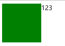
<style>.box1{float: left;width: 100px;height: 100px;background-color: green;}.box2{width: 200px;height: 200px;background-color: orange;}</style><div class="box1"></div><span>123</span>
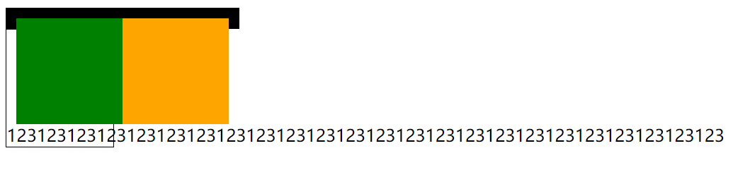
塌陷
<style>.box{width: 200px;border: 10px solid #000;}.box .inner-box{float: left;width: 100px;height: 100px;}.box .inner-box.box1{/* width: 100px;height: 100px; */background-color: green;}.box .box2{/* width: 100px;height: 100px; */background-color:orange ;}.text-box{width: 100px;border: 1px solid #000;}</style><div class="box"><div class="inner-box box1"></div><div class="inner-box box2"></div></div><div class="text-box">123123123123123123123123123123123123123123123123123123123123123123123123</div>
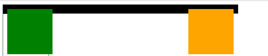
在父级元素中定位左右
<style>.box{width: 500px;border: 10px solid #000;}.box .inner-box{float: left;width: 100px;height: 100px;}.box .inner-box.box1{/* width: 100px;height: 100px; */background-color: green;}.box .box2{/* width: 100px;height: 100px; */background-color:orange ;float: right;}.text-box{width: 100px;border: 1px solid #000;}</style><div class="box"><div class="inner-box box1"></div><div class="inner-box box2"></div></div>1
<style>.box{width: 200px;border: 10px solid #000;}.box .inner-box{float: left;width: 100px;height: 100px;}.box .inner-box.box1{/* width: 100px;height: 100px; */background-color: green;}.box .box2{/* width: 100px;height: 100px; */background-color:orange ;}.text-box{width: 100px;border: 1px solid #000;}.clearfix{clear: both;}</style><div class="box"><div class="inner-box box1"></div><div class="inner-box box2"></div><p class="clearfix"></p></div><div class="text-box">1231231231231231231231231231231231231 2312312312312312312312312 3123123123</div>
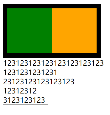
必须是块级元素,比如p才行
<style>ul {/*去除圆点*/padding: 0;margin: 0;list-style: none;}ul {width: 300px;margin-top: 20px;border: 1px solid #000;}ul li {float: left;width: 100px;height: 100px;}.clearfix {clear: both;}</style><ul><li>1</li><li>2</li><li>3</li><p class="clearfix"></p></ul>
float以后,元素就变成内联块级元素了
块级元素float以后就变成内联块元素了
<style>.header{width: 100%;height: 60px;background-color: #000;}.header .left{float: left;width: 200px;height: 100%;background-color: green;}.header .right{float: right;width: 200px;height: 100%;background-color: orange;}</style><div class="header"><div class="left"></div><div class="right"></div></div>
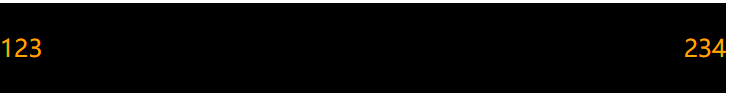
left right想在一行,都要把它们变成内联块级元素,都要加float,根据父级元素定位
<style>.header{width: 100%;height: 60px;line-height: 60px;color: orange;background-color: #000;}.header .left{}.header .right{float: right;}</style><div class="header"><span class="left">123</span><span class="right">234</span></div>
伪类伪元素
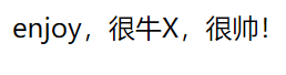
<style>p:before{content: "enjoy,";}p:after{content: "很帅!";}</style><!-- :before :after --><p>很牛X,</p>
w3c规范:
一个冒号:是伪类
两个冒号::是伪元素
其实不分那么细致,一个冒号:也可以是伪元素
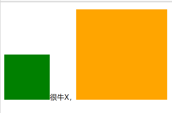
<style>p::before{/* 必须加content */content: "";display: inline-block;width: 100px;height: 100px;background-color: green;}p::after{content: "";display: inline-block;width: 200px;height: 200px;background-color: orange;}</style><p>很牛X,</p>
清除浮动最佳方法
给标签设置after伪类
<style>/* 清除浮动最佳方法 */ul::after,div::after {content: "";display: block;clear: both;}.box {width: 200px;border: 10px solid #000;}/* .box::after {content: "";display: block;clear: both;} */.box1 {float: left;width: 100px;height: 100px;background-color: green;}.box2 {float: left;width: 100px;height: 100px;background-color: orange;}</style><div class="box"><div class="box1"></div><div class="box2"></div></div>

::after伪元素相当于之前的p元素
把div、ul后面设置after伪元素,就相当于自动设置了一个p元素

若有收获,就点个赞吧
0 人点赞
