option配置
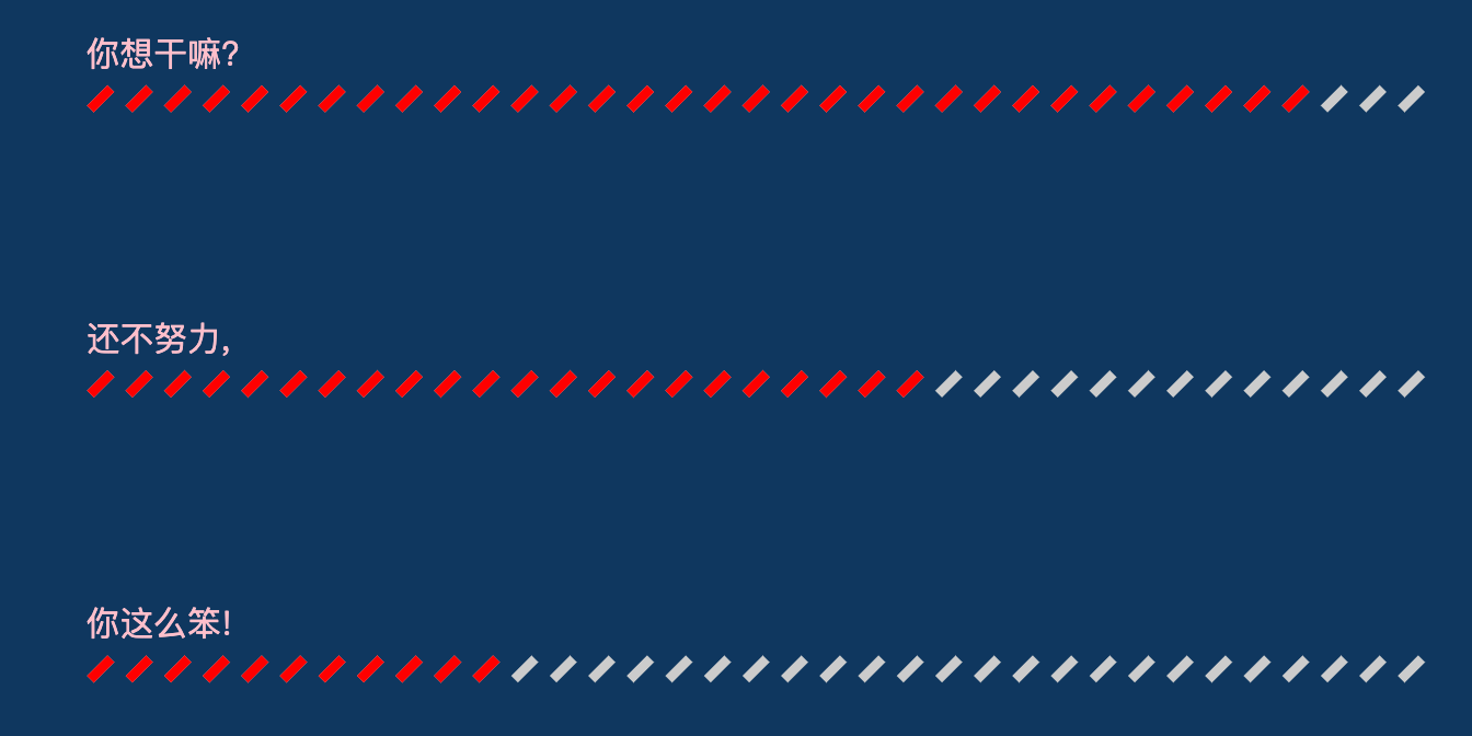
var chartData = [100, 200, 300] // 数据var yMax = '' // 最大值for (var i = 0;i < chartData.length;i += 1) {yMax = chartData[i]}yMax += yMax / 10var yMaxArr = [] // 全部都是最大值, 做图形的底部灰色打底for (var i = 0;i < chartData.length;i += 1) {yMaxArr.push(yMax)}var chartName = ['你这么笨!', '还不努力,', '你想干嘛?']//4.制定图标的配置项和数据option = {backgroundColor: '#0f375f',tooltip: {trigger: 'axis',axisPointer: {type: 'none', // 去除鼠标移入的时候的阴影/竖线等},backgroundColor: '#ccc', // 浮层的文本背景textStyle: {color: 'red', // 浮层的文本颜色},formatter: '{a}:{c}', //浮层内容格式 a: series中的name c 数据值},legend: {},xAxis: {type: 'value',axisLine: {lineStyle: {color: '#ccc'}},show: false,splitLine: {show: false},},yAxis: [{type: 'category',data: chartName,splitLine: {show: false},show: false,axisLine: {lineStyle: {color: '#ccc'}}}, { // 第二个y轴 为了让数据在右侧末尾显示show: true,inverse: true,data: chartData,nameTextStyle: {},// 坐标轴名称的文字样式。 官网上是这样的解释, 但是 我试了这个并不能改变坐标轴的文字样式axisLabel: {textStyle: {fontSize: 12, //坐标轴名称的大小color: 'blue', // 坐标轴名称的颜色},},axisLine: {show: false},splitLine: {show: false},axisTick: {show: false},}],series: [{name: '我是打底',type: 'pictorialBar',symbol: 'rect', // 类型yAxisIndex: 0,barWidth: 10,itemStyle: {normal: {barBorderRadius: 5,color: '#ccc',}},label: {normal: {position: 'right',}},symbolRepeat: true,symbolRotate: '45',symbolSize: [12, 4],symbolMargin: 2,data: yMaxArr,}, {name: '我是上层方块',type: 'pictorialBar',symbol: 'rect',itemStyle: {normal: {color: 'red'}},label: {normal: {// show: true, // 数据大小的显示, 100 200 300textStyle: {color: '#000000', // 颜色},position: 'right',},},barWidth: 10,symbolRepeat: true,symbolRotate: '45',symbolSize: [12, 4],symbolMargin: 2,data: [100, 200, 300],},// 数据条--------------------我是分割线君------------------------------//{show: true,type: 'bar',// xAxisIndex: 1, //代表使用第二个X轴刻度barGap: '-100%',barWidth: '10%',itemStyle: {normal: {barBorderRadius: 200,// color: 'yellow',color: 'transparent', //rgba(22,203,115,0.05) 数据条柱状图的填充颜色,, 一开始我的有一点点背景颜色}},label: {normal: {show: true,position: [0, '-20'],textStyle: {fontSize: 14,color: 'pink',},formatter: function (data) {return chartName[data.dataIndex]}}},data: chartData}]}

若有收获,就点个赞吧
0 人点赞
