Progress
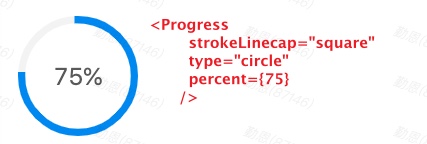
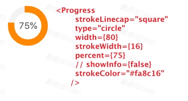
antd Progress进度圆环图 https://ant.design/components/progress-cn
import React, { memo } from 'react'import PropTypes from 'prop-types'import { Progress } from 'antd'CircleRing.propTypes = {value: PropTypes.number,color: PropTypes.string,}/*** @param { value, color } props* @description 圆环图参数*/function CircleRing(props) {const { value, color } = propsreturn (<ProgressstrokeLinecap="square"type="circle"width={80}strokeWidth={16}showInfo={false}percent={value}strokeColor={color}/>)}export default memo(CircleRing)
react-circle
在线demo https://zzarcon.github.io/react-circle
github 文档 https://github.com/zzarcon/react-circle
yarn add react-circlenpm install react-circle
使用
import Circle from 'react-circle'<Circleanimate={true}animationDuration="1s"responsive={false}size="100"lineWidth="40"progress="36"progressColor="rgb(76, 154, 255)"bgColor="#ecedf0"textColor="#6b778c"percentSpacing={10}roundedStroke={false}showPercentage={true}showPercentageSymbol={true}/>
react-circle参数说明
// All avaliable props for customization(illustrated by default values):// Details are ordered as: `<Type>: <Description>`<Circleanimate={true} // Boolean: Animated/Static progressanimationDuration="1s" // String: Length of animationresponsive={false} // Boolean: Make SVG adapt to parent sizesize="100" // String: Defines the size of the circle.lineWidth="25" // String: Defines the thickness of the circle's stroke.progress="0" // String: Update to change the progress and percentage.progressColor="rgb(76, 154, 255)" // String: Color of "progress" portion of circle.bgColor="#ecedf0" // String: Color of "empty" portion of circle.textColor="#6b778c" // String: Color of percentage text color.textStyle={{font: 'bold 4rem Helvetica, Arial, sans-serif' // CSSProperties: Custom styling for percentage.}}percentSpacing={10} // Number: Adjust spacing of "%" symbol and number.roundedStroke={false} // Boolean: Rounded/Flat line endsshowPercentage={true} // Boolean: Show/hide percentage.showPercentageSymbol={true} // Boolean: Show/hide only the "%" symbol./>
svg边缘被剪切bug
设置 svg的 overflow: visible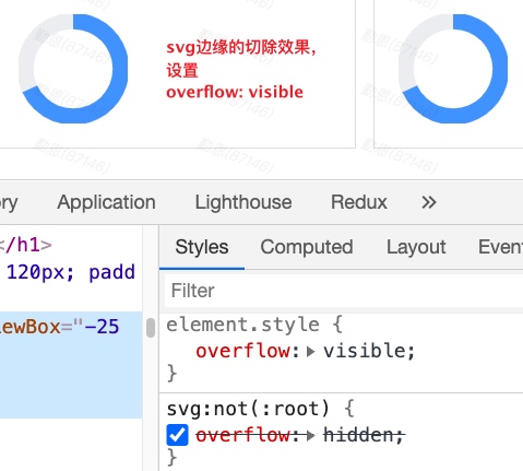
svg {overflow: visible;}/* 默认的样式 */svg:not(:root) {overflow: hidden;}
SVG溢出
SVG视图溢出:隐藏/裁剪
让viewBox外的任何东西都不可见

若有收获,就点个赞吧
0 人点赞
