https://echarts.apache.org/examples/zh/editor.html?c=custom-profile
图表选择
- 如果用堆叠条形图,则每种状态在每一个网口对应的图形中只能出现一次
- 自定义图标实现设备区间状态
技术点
- 显示图例的方法,使用空的条形图来显示图例
- 在series里面配置了条形图并配置name后,echart会自动根据 name的值去 legend的配置中匹配对应的图例名字并显示。
options
series中的 custom,data字段
data: [{itemStyle: { normal: { color: color[0] } },name: '正常',value: [0, 0, 10],}]
- itemStyle: 所渲染的矩形的样式
- name: 该矩形的状态名
- value: 第0项代表 yAxis类别标识,
- 例如0就代表 ECS的,1就是 RDS的;
- 第1和第2项代表该矩形区域对应的x坐标范围开始于0,结束于1
options配置
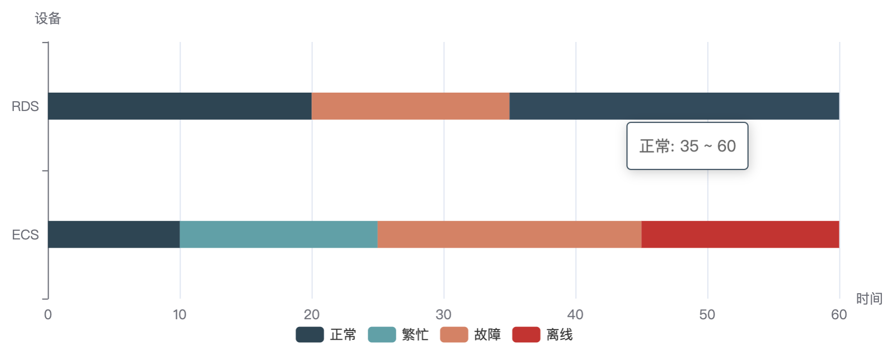
/*** Description: 用条形图的不同颜色,来表示不同时间区间段的状态* y轴用于展示各网口* x轴用于展示时间(分钟)* 以 ECS为例* 图中则表示了0~10分钟为正常,10~25分钟为繁忙,25~45分钟为故障,45~60分钟为离线*/import * as echarts from 'echarts/core';// 各状态的颜色const color = ['#2f4554', '#61a0a8', '#d48265', '#c23531'];// 四种状态const state = ['正常', '繁忙', '故障', '离线'];// import { getColor } from '@/components';export function getOption({data, xData, length, theme}) {return {color,grid: {top: length === 1 ? 24 : 40,left: 24,right: 40,bottom: 32,containLabel: true,},xAxis: {name: '时间',min: 0, // x轴零刻度对应的实际值},yAxis: {name: '设备',data: ['ECS', 'RDS'],},series: [// 用空bar来显示四个图例{ name: state[0], type: 'bar', data: [] },{ name: state[1], type: 'bar', data: [] },{ name: state[2], type: 'bar', data: [] },{ name: state[3], type: 'bar', data: [] },{type: 'custom',renderItem: function (params, api) {const categoryIndex = api.value(0)const start = api.coord([api.value(1), categoryIndex])const end = api.coord([api.value(2), categoryIndex])const height = 24return {type: 'rect',shape: echarts.graphic.clipRectByRect({x: start[0],y: start[1] - height / 2,width: end[0] - start[0],height: height,},{x: params.coordSys.x,y: params.coordSys.y,width: params.coordSys.width,height: params.coordSys.height,}),style: api.style(),}},encode: {x: [1, 2],y: 0,},data: [{itemStyle: { normal: { color: color[0] } },name: '正常',value: [0, 0, 10],},{itemStyle: { normal: { color: color[1] } },name: '繁忙',value: [0, 10, 25],},{itemStyle: { normal: { color: color[2] } },name: '故障',value: [0, 25, 45],},{itemStyle: { normal: { color: color[3] } },name: '离线',value: [0, 45, 60],},// 第二个数据 1 代表第二个数据{itemStyle: { normal: { color: color[0] } },name: '正常',value: [1, 0, 20],},// {// itemStyle: { normal: { color: color[1] } },// name: '繁忙',// value: [1, 15, 20],// },{itemStyle: { normal: { color: color[2] } },name: '故障',value: [1, 20, 35],},// {// itemStyle: { normal: { color: color[3] } },// name: '离线',// value: [1, 35, 40],// },{itemStyle: { normal: { color: color[0] } },name: '正常',value: [1, 35, 60],},// {// itemStyle: { normal: { color: color[3] } },// name: '离线',// value: [1, 45, 60],// },],},],tooltip: {formatter: (params) => {const { name, value} = params;return `${name}: ${value[1]} ~ ${value[2]}`;},},legend: {data: state,bottom: 8,selectedMode: false, // 图例设为不可点击textStyle: {color: theme === 'dark' ? '#fff' : '#333',},},};}

若有收获,就点个赞吧
0 人点赞
