width
语义在box-sizing: content-box/border-box控制下,width属性具有不同的上下文语义。
属性值
:绝对值。 :基于包容盒的宽度。 auto:表示浏览器将自动计算值。
fit-content:元素宽度收缩为内容宽度
例子实现水平居中
<style type="text/css">.wrap{height: 50px;background-color: pink;}.text{width: fit-content;margin: 0 auto;}</style><body><div class="wrap"><div class="text"><span>我要居中</span></div></div></body>
输出结果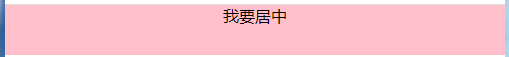
- fill-available:撑满父盒子提供的整个空间。多个盒子可以实现等高布局。
例子
<style type="text/css">
  .wrap{
    height: 50px;
    background-color: pink;
  }
  .text{
    height: -webkit-fill-available;
    margin: 0 auto;
  }
</style>

<body>
    <div class="wrap">
        <div class="text">
            我要充满整个高度
        </div>
    </div>
</body>
输出结果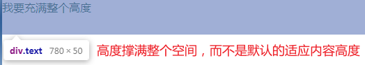
- min-content
语义表示不同类型的内容最小宽度的最大值。内容包括有图片、中文、英文。图片的最小宽度是图片的宽,中文的最小宽度是单个字的宽度,英文的最小宽度是句子中的最长单词宽度。
例子
<style type="text/css">
  .wrap{
    height: 50px;
    background-color: pink;
  }
  .text{
    width: min-content;
    margin: 0 auto;
  }
</style>

<body>
    <div class="wrap">
        <div class="text">
           <div>最小宽度</div>
           <div>whichIsMinWidth</div>
        </div>
    </div>
</body>
输出结果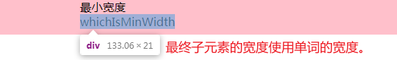
- max-content
语义表示采用内部元素宽度值最大的那个元素的宽度作为最终容器的宽度

若有收获,就点个赞吧
0 人点赞
