本教程中,我们将学习使用Seurat包进行数据可视化的常用方法。
加载所需的R包和数据集
library(Seurat)library(ggplot2)library(patchwork)# 这里我们依旧使用之前分析过的PBMC的数据集pbmc <- readRDS(file = "../data/pbmc3k_final.rds")# 添加分组信息pbmc$groups <- sample(c("group1", "group2"), size = ncol(pbmc), replace = TRUE)pbmc## An object of class Seurat## 13714 features across 2638 samples within 1 assay## Active assay: RNA (13714 features)## 2 dimensional reductions calculated: pca, umap# 选定用于可视化的marker基因features <- c("LYZ", "CCL5", "IL32", "PTPRCAP", "FCGR3A", "PF4")
五种常规的Marker基因表达可视化类型
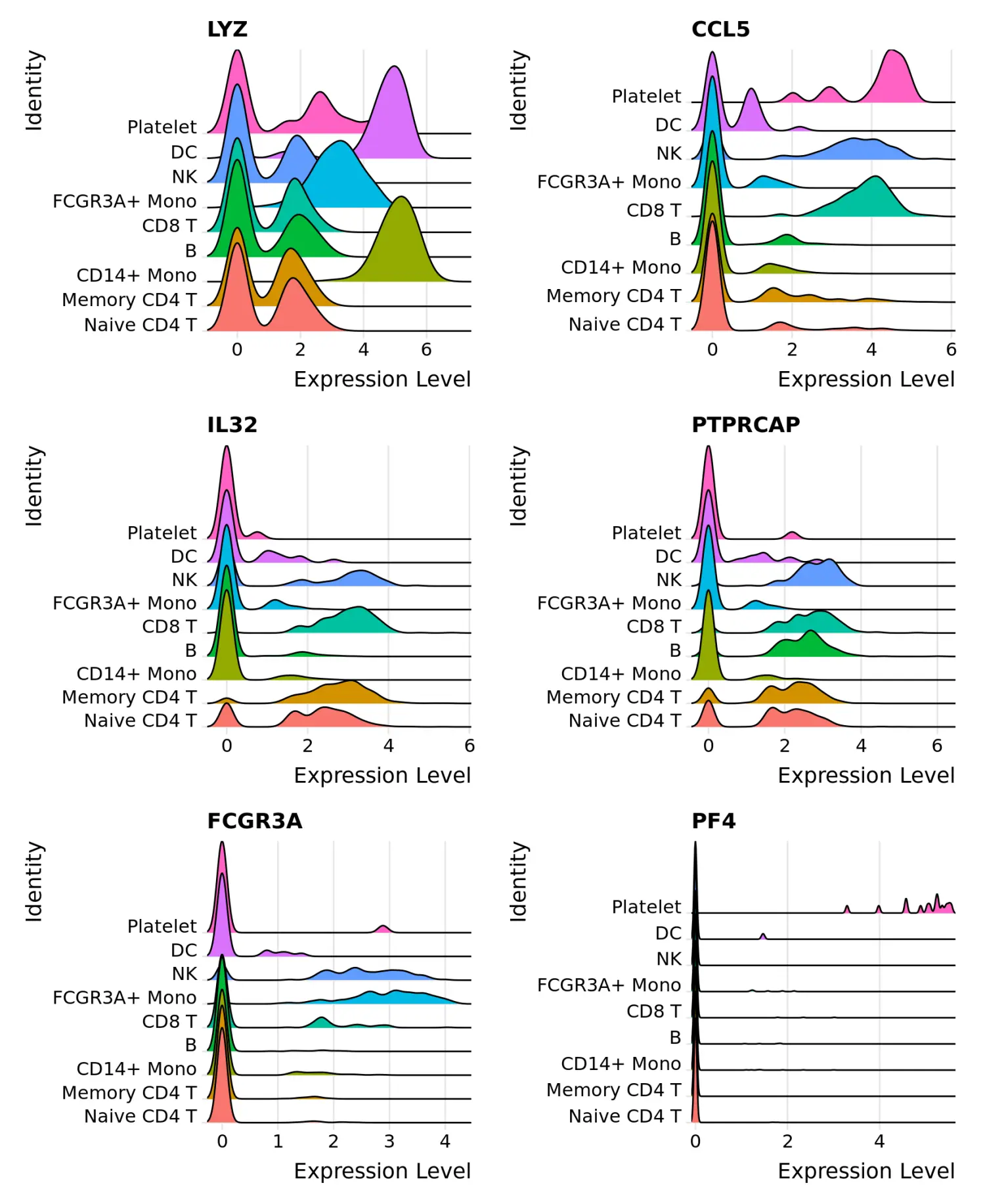
# Ridge plots - from ggridges. Visualize single cell expression distributions in each cluster
# 峰峦图(RidgePlot)可视化marker基因的表达
RidgePlot(pbmc, features = features, ncol = 2)
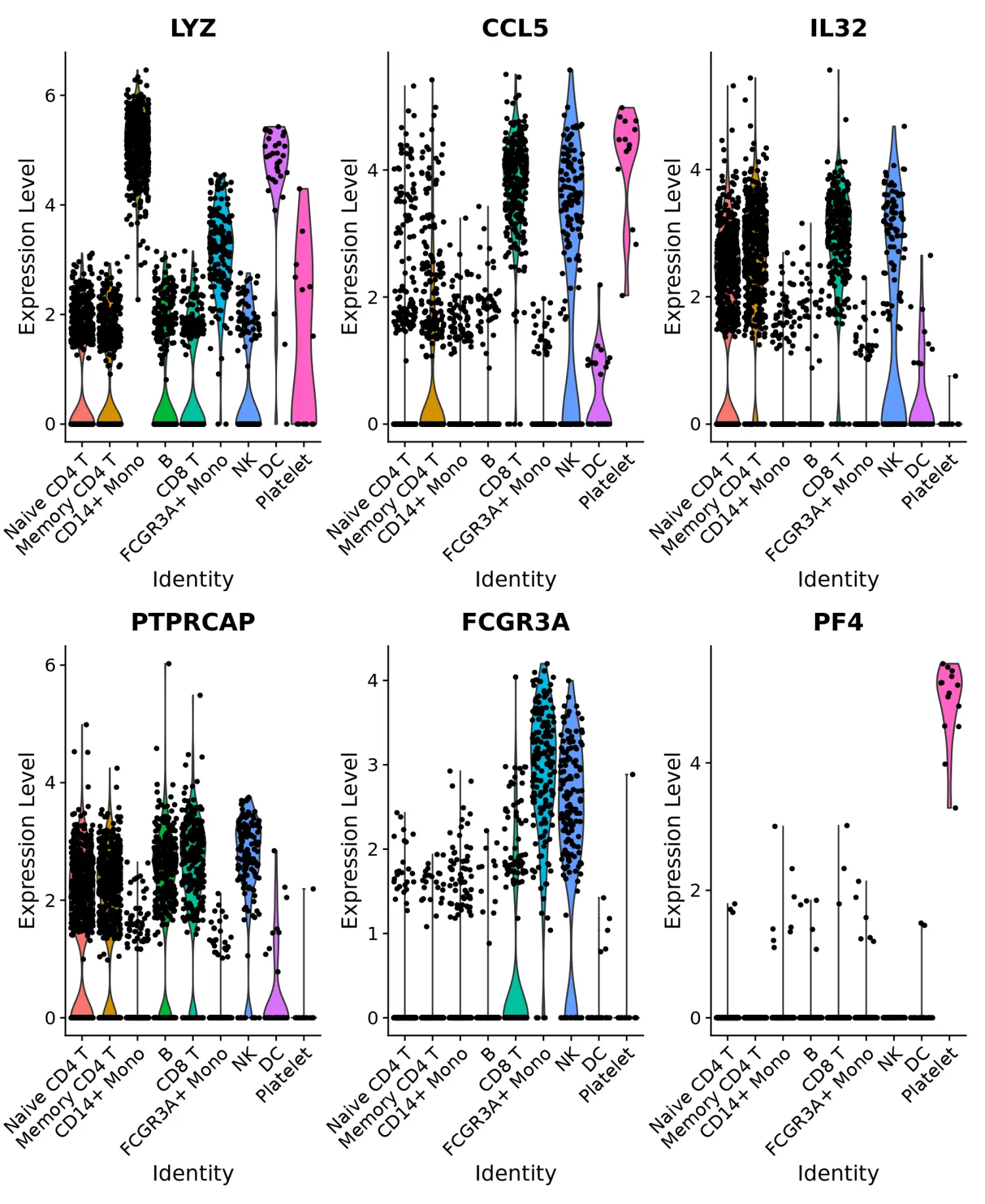
# Violin plot - Visualize single cell expression distributions in each cluster
# 小提琴图(VlnPlot)可视化marker基因的表达
VlnPlot(pbmc, features = features)
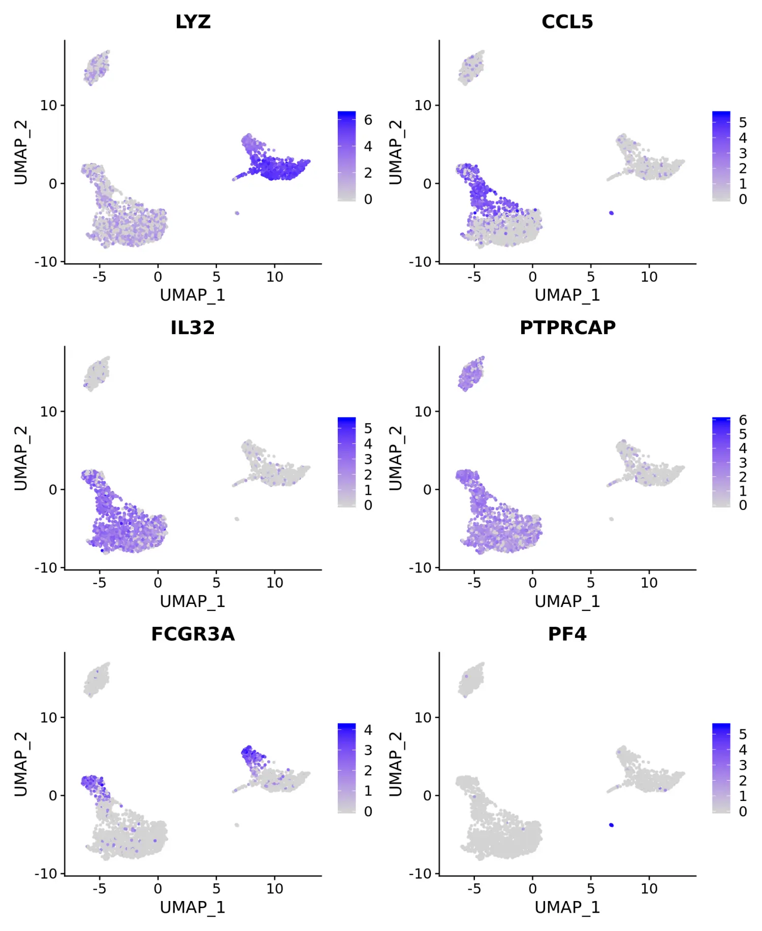
# Feature plot - visualize feature expression in low-dimensional space
# 散点图(FeaturePlot)可视化marker基因的表达
FeaturePlot(pbmc, features = features)
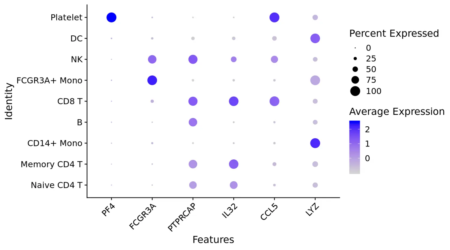
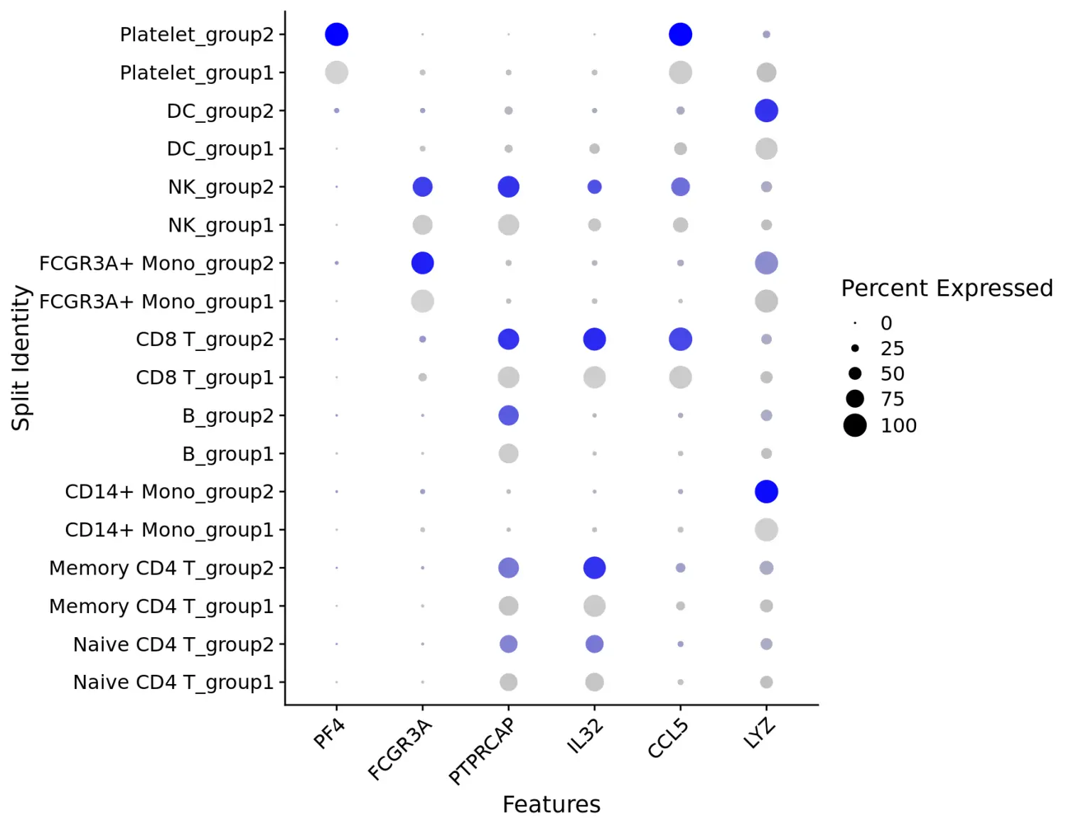
# Dot plots - the size of the dot corresponds to the percentage of cells expressing the feature in each cluster. The color represents the average expression level
# 点图(DotPlot)可视化marker基因的表达
DotPlot(pbmc, features = features) + RotatedAxis()
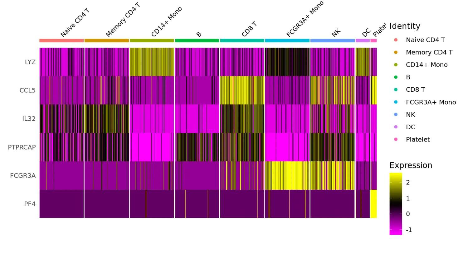
# Single cell heatmap of feature expression
# 热图(DoHeatmap)可视化marker基因的表达
DoHeatmap(subset(pbmc, downsample = 100), features = features, size = 3)
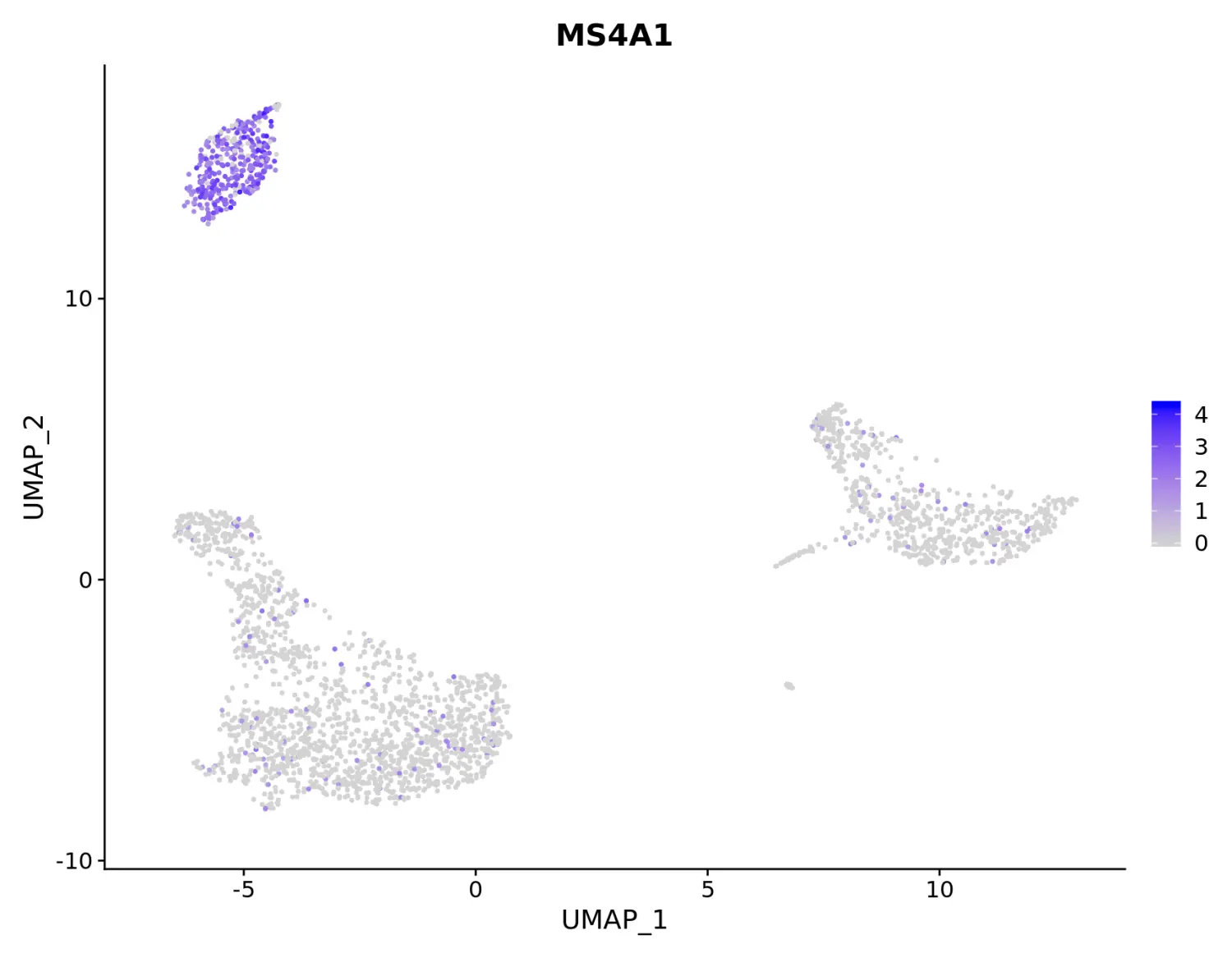
New additions to FeaturePlot
# Plot a legend to map colors to expression levels
FeaturePlot(pbmc, features = "MS4A1")
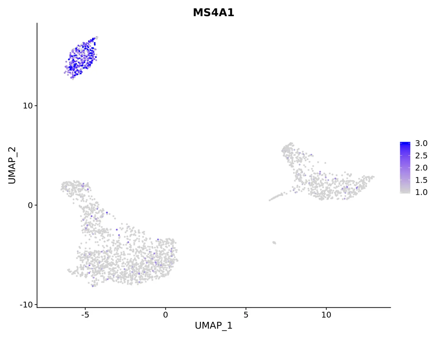
# Adjust the contrast in the plot
# 使用min.cutoff = 1, max.cutoff = 3参数调整图例的范围
FeaturePlot(pbmc, features = "MS4A1", min.cutoff = 1, max.cutoff = 3)
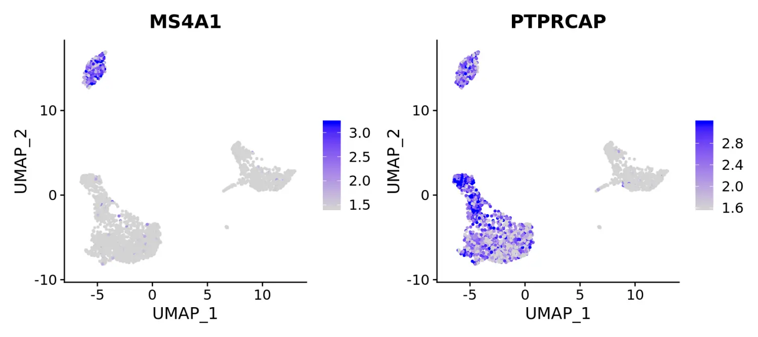
# Calculate feature-specific contrast levels based on quantiles of non-zero expression.
# Particularly useful when plotting multiple markers
FeaturePlot(pbmc, features = c("MS4A1", "PTPRCAP"), min.cutoff = "q10", max.cutoff = "q90")
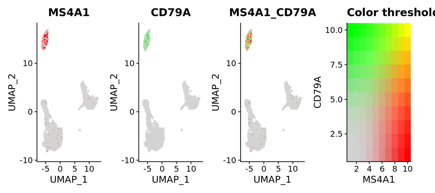
# Visualize co-expression of two features simultaneously
FeaturePlot(pbmc, features = c("MS4A1", "CD79A"), blend = TRUE)
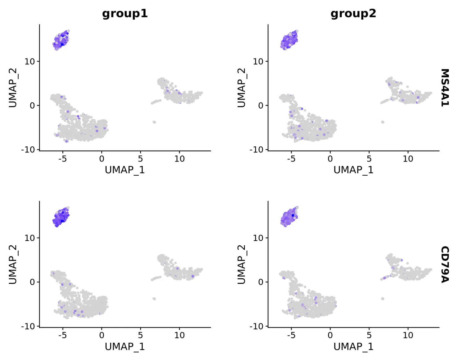
# Split visualization to view expression by groups (replaces FeatureHeatmap)
FeaturePlot(pbmc, features = c("MS4A1", "CD79A"), split.by = "groups")
Updated and expanded visualization functions
In addition to changes to FeaturePlot, several other plotting functions have been updated and expanded with new features and taking over the role of now-deprecated functions
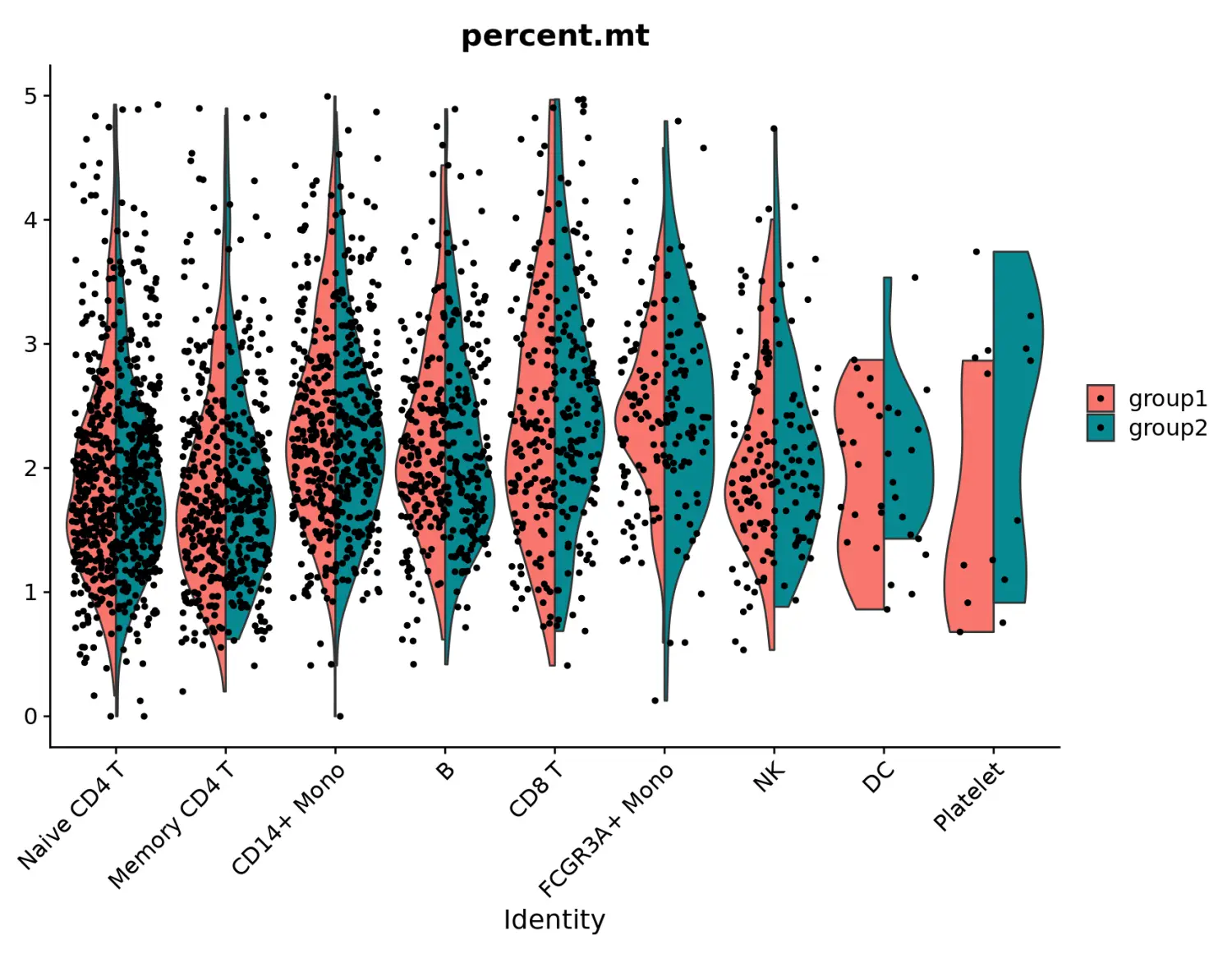
# Violin plots can also be split on some variable. Simply add the splitting variable to object metadata and pass it to the split.by argument
VlnPlot(pbmc, features = "percent.mt", split.by = "groups")
# SplitDotPlotGG has been replaced with the `split.by` parameter for DotPlot
DotPlot(pbmc, features = features, split.by = "groups") + RotatedAxis()
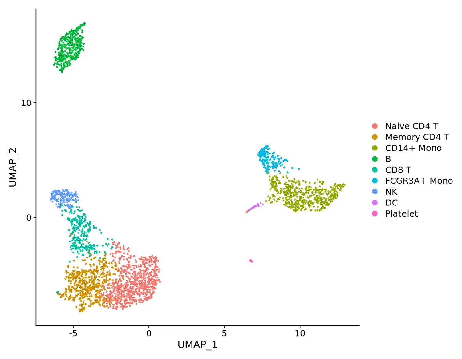
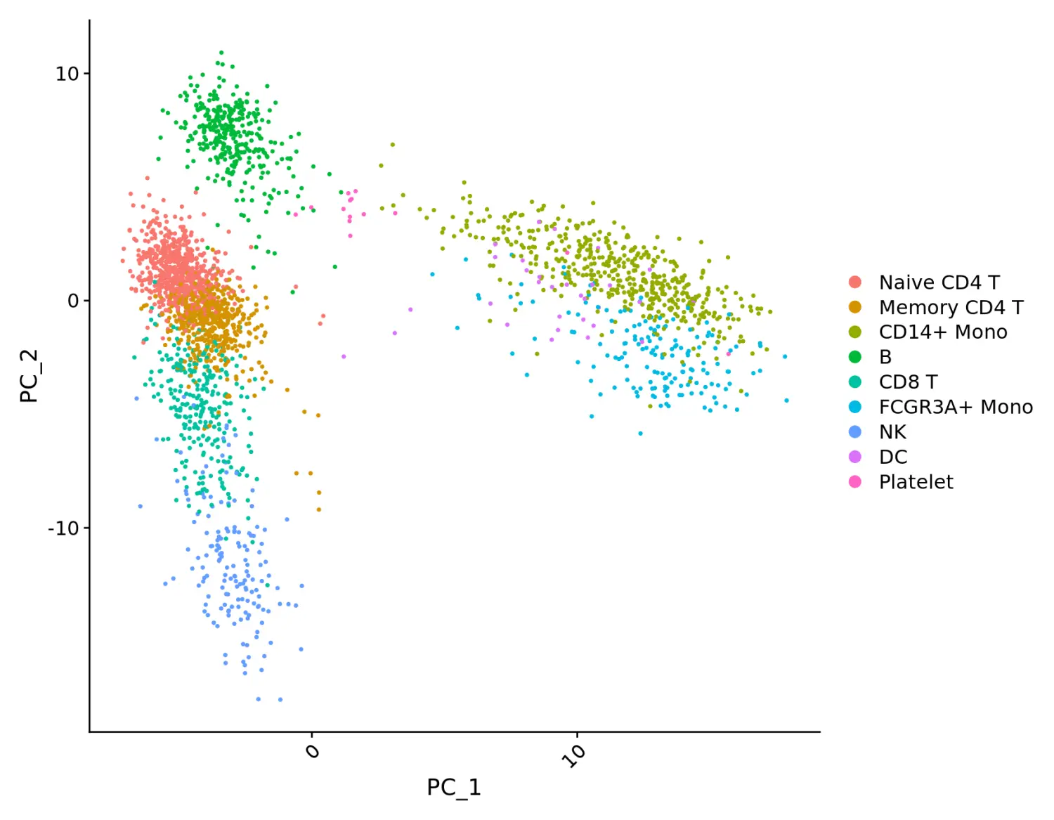
# DimPlot replaces TSNEPlot, PCAPlot, etc. In addition, it will plot either 'umap', 'tsne', or 'pca' by default, in that order
DimPlot(pbmc)
pbmc.no.umap <- pbmc
pbmc.no.umap[["umap"]] <- NULL
DimPlot(pbmc.no.umap) + RotatedAxis()
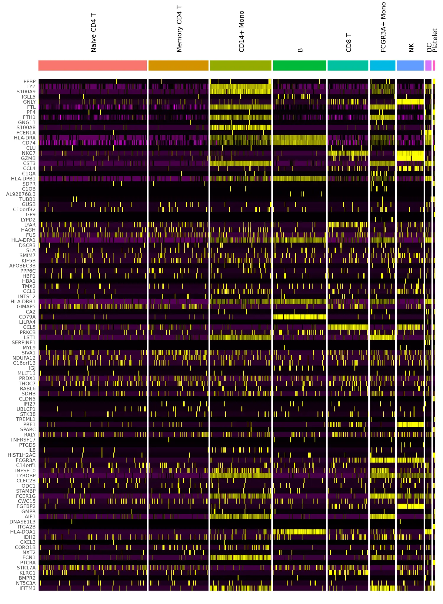
# DoHeatmap now shows a grouping bar, splitting the heatmap into groups or clusters. This can be changed with the `group.by` parameter
DoHeatmap(pbmc, features = VariableFeatures(pbmc)[1:100], cells = 1:500, size = 4, angle = 90) + NoLegend()
Applying themes to plots
With Seurat v3.0, all plotting functions return ggplot2-based plots by default, allowing one to easily capture and manipulate plots just like any other ggplot2-based plot.
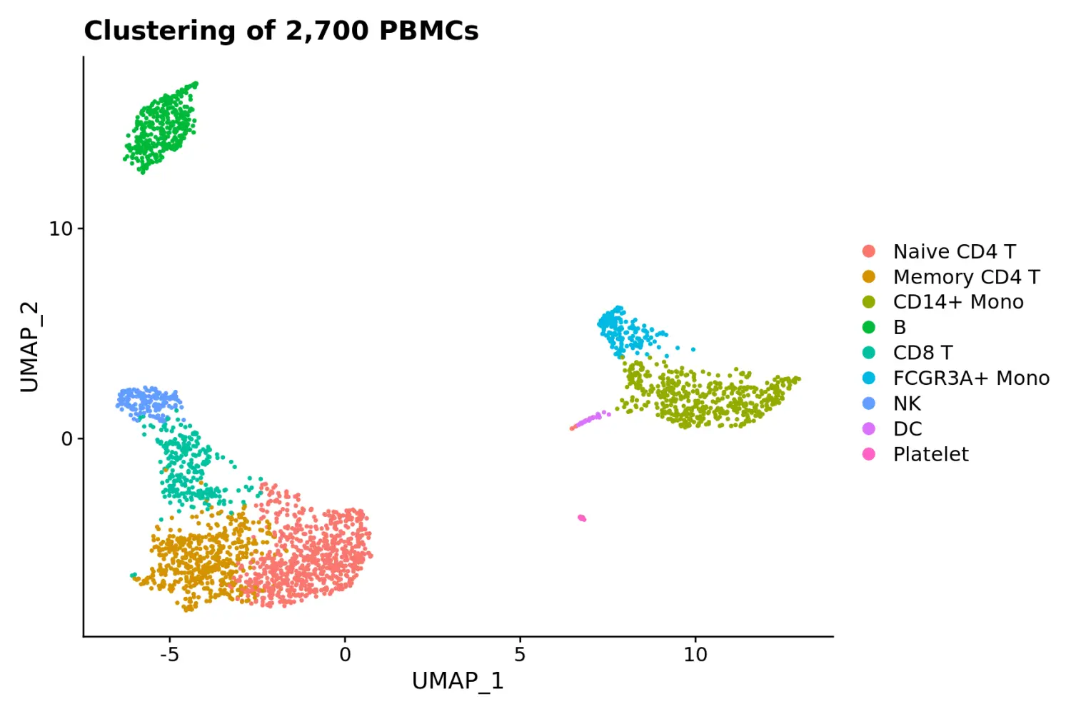
baseplot <- DimPlot(pbmc, reduction = "umap")
# Add custom labels and titles
# 添加标题
baseplot + labs(title = "Clustering of 2,700 PBMCs")
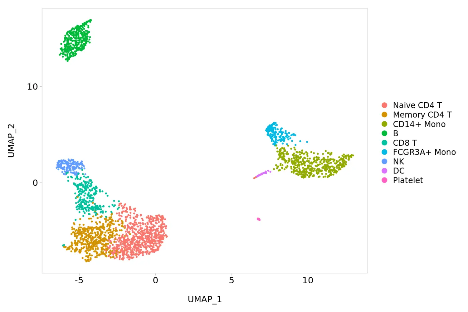
# Use community-created themes, overwriting the default Seurat-applied theme Install ggmin with devtools::install_github('sjessa/ggmin')
# 更换图片背景主题为theme_powerpoint()
baseplot + ggmin::theme_powerpoint()
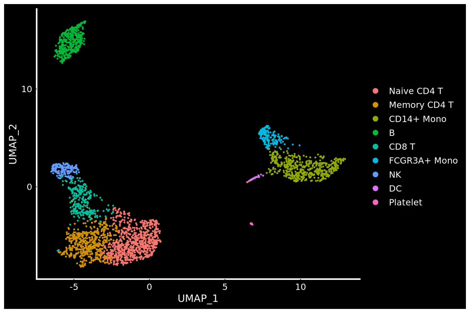
# Seurat also provides several built-in themes, such as DarkTheme; for more details see ?SeuratTheme
# 更换图片背景主题为Seurat自带的DarkTheme()
baseplot + DarkTheme()
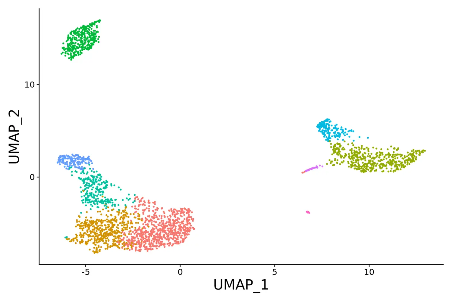
# Chain themes together
# 调整坐标轴字体大小
baseplot + FontSize(x.title = 20, y.title = 20) + NoLegend()
Interactive plotting features 交互式可视化
Seurat调用R的
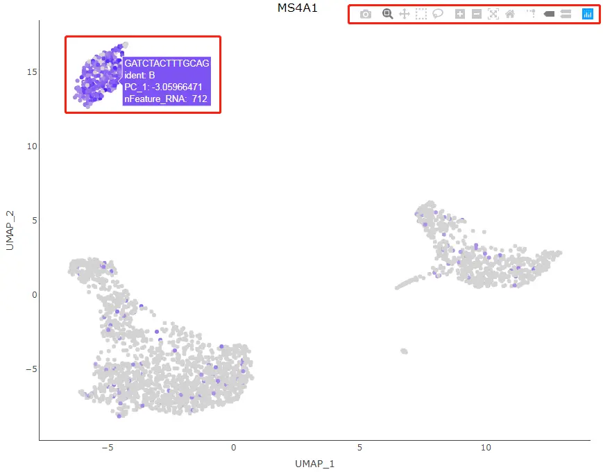
plotly包进行交互式可视化,这种交互式特性可以用于任何基于ggplot2散点图绘制的图形(需要使用geom_point图层)。在Seurat中,我们可以使用HoverLocator函数对基于ggplot2散点图可视化的函数(如DimPlot和FeaturePlot)进行交互式可视化处理。
# Include additional data to display alongside cell names by passing in a data frame of information Works well when using FetchData
plot <- FeaturePlot(pbmc, features = "MS4A1")
# 使用information参数设置想要展示的数据类型
HoverLocator(plot = plot, information = FetchData(pbmc, vars = c("ident", "PC_1", "nFeature_RNA")))
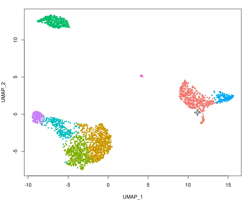
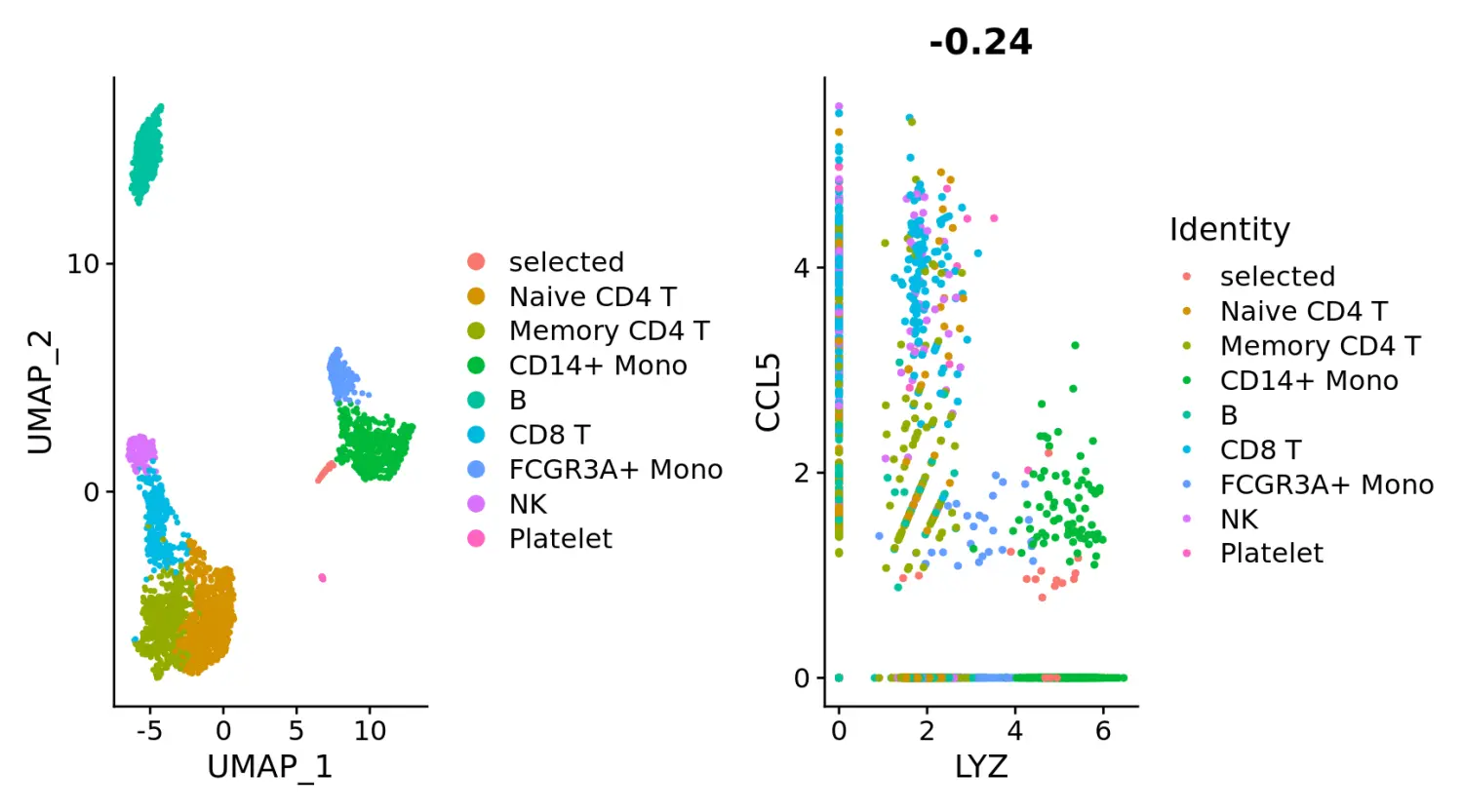
Seurat提供的另一个交互式功能是能够手动选择一些细胞以进行进一步的研究。我们可以通过CellSelector函数对已经创建好的基于ggplot2散点图绘制的图形(如DimPlot或FeaturePlot)选择想要的细胞所在的点。CellSelector将返回一个包含所选的点对应的细胞名称的向量,这样我们就可以对这些细胞重新命名为一个群体,并对其进行差异表达分析。
pbmc <- RenameIdents(pbmc, DC = "CD14+ Mono")
plot <- DimPlot(pbmc, reduction = "umap")
select.cells <- CellSelector(plot = plot)

然后,我们可以使用SetIdent函数将选定的细胞设定成一个新的小型类群。
head(select.cells)
## [1] "AAGATTACCGCCTT" "AAGCCATGAACTGC" "AATTACGAATTCCT" "ACCCGTTGCTTCTA"
## [5] "ACGAGGGACAGGAG" "ACGTGATGCCATGA"
Idents(pbmc, cells = select.cells) <- "NewCells"
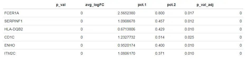
# Now, we find markers that are specific to the new cells, and find clear DC markers
newcells.markers <- FindMarkers(pbmc, ident.1 = "NewCells", ident.2 = "CD14+ Mono", min.diff.pct = 0.3, only.pos = TRUE)
head(newcells.markers)
使用CellSelector手动的命名细胞类群
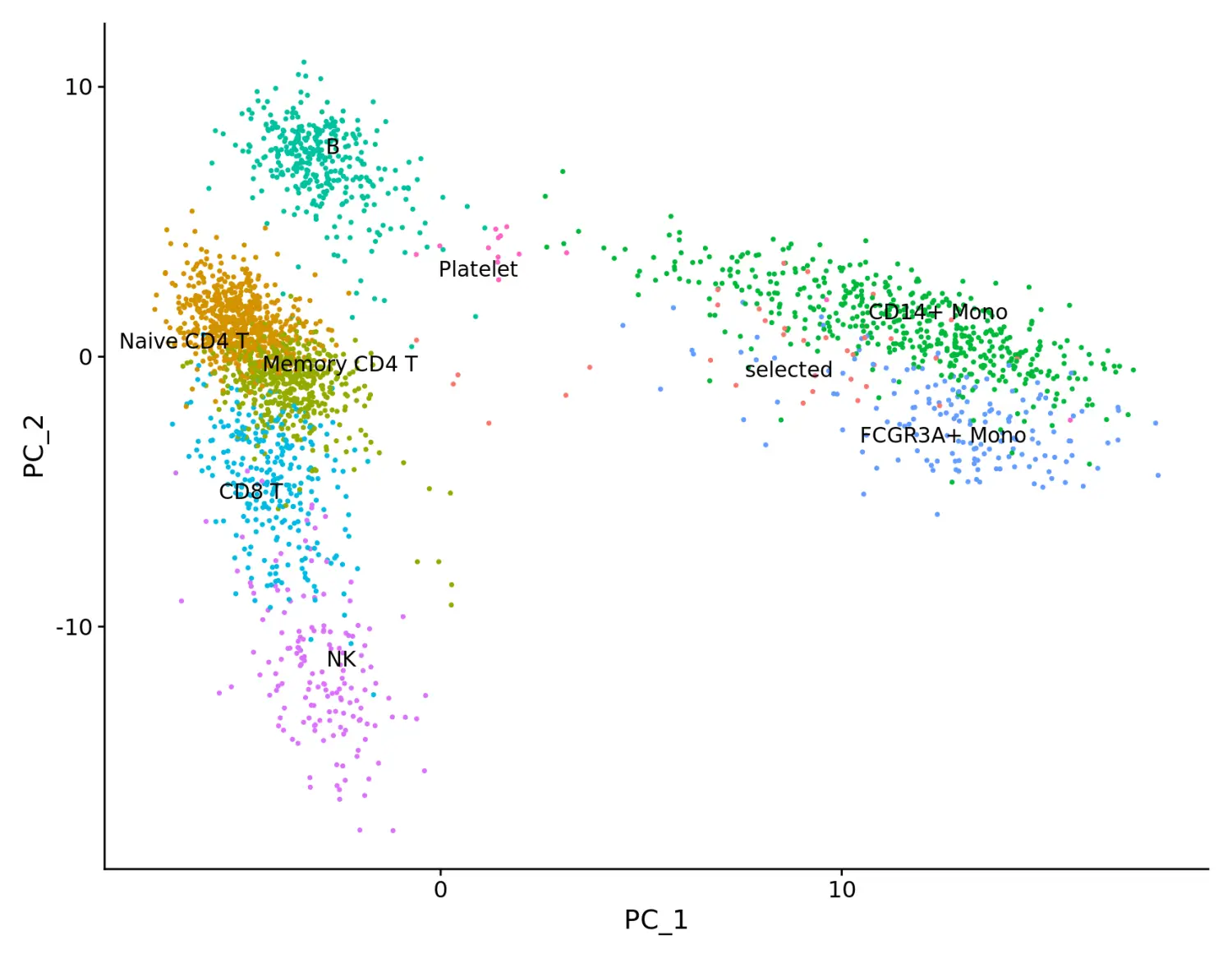
除了返回所选定细胞的名称组成的向量外,CellSelector还可以获取选定的细胞并为其分配新的标识,返回一个具有新设置标识的Seurat对象。例如,我们选择与之前相同的一组细胞,并将其重新标识为“ selected”类。
pbmc <- CellSelector(plot = plot, object = pbmc, ident = "selected")
levels(pbmc)
## [1] "selected"     "Naive CD4 T"  "Memory CD4 T" "CD14+ Mono"   "B"
## [6] "CD8 T"        "FCGR3A+ Mono" "NK"           "Platelet"
Plotting Accessories 绘图配件
除了增加的一些新功能和交互式可视化之外,Seurat还提供了一些用于处理和合并图像的新附件功能。
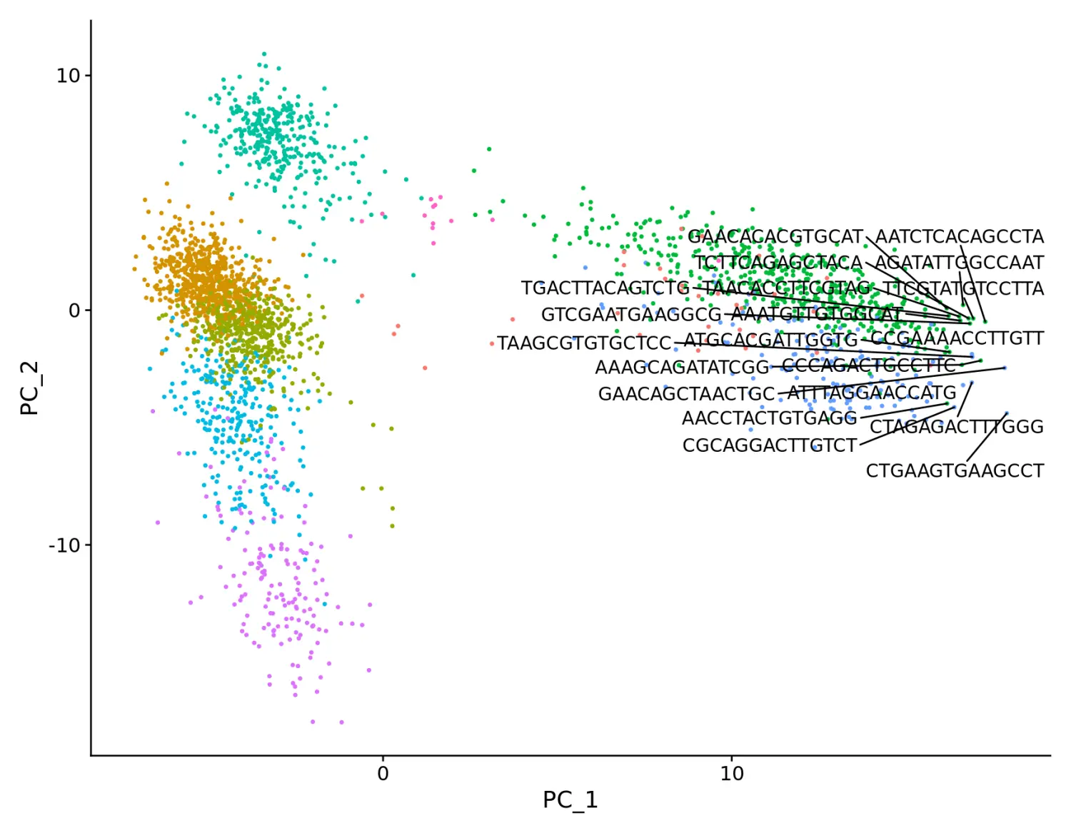
使用LabelClusters函数添加分群的类名
# LabelClusters and LabelPoints will label clusters (a coloring variable) or individual points on a ggplot2-based scatter plot
plot <- DimPlot(pbmc, reduction = "pca") + NoLegend()
LabelClusters(plot = plot, id = "ident")
使用LabelPoints函数添加指定细胞的名称
# Both functions support `repel`, which will intelligently stagger labels and draw connecting lines from the labels to the points or clusters
LabelPoints(plot = plot, points = TopCells(object = pbmc[["pca"]]), repel = TRUE)
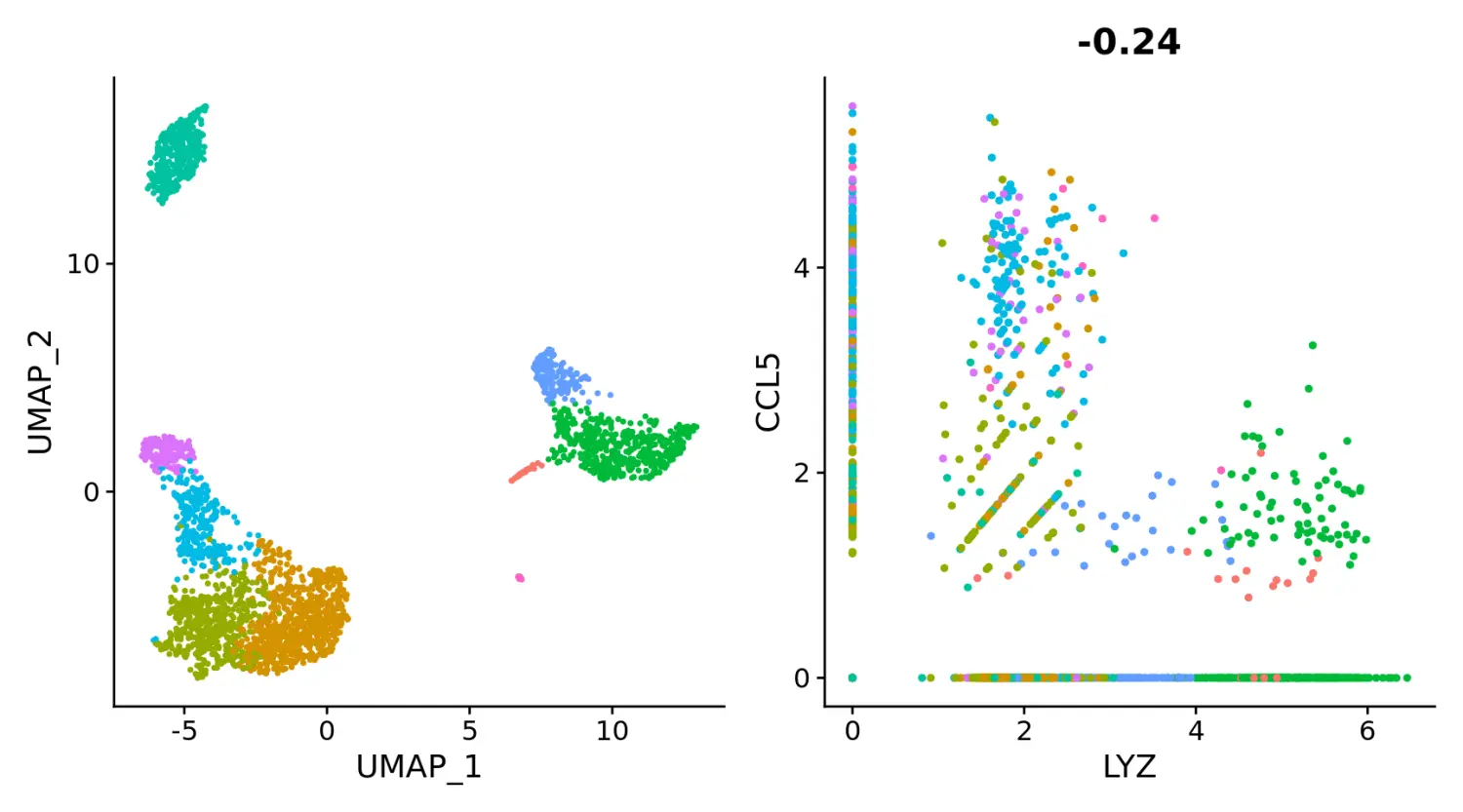
尽管CombinePlot函数可以将多个图形绘制在一起,但我们不赞成使用此功能,而建议使用pathwork包的组合图功能。
plot1 <- DimPlot(pbmc)
plot2 <- FeatureScatter(pbmc, feature1 = "LYZ", feature2 = "CCL5")
# Combine two plots
plot1 + plot2
# Remove the legend from all plots
(plot1 + plot2) & NoLegend()
参考来源:https://satijalab.org/seurat/v3.1/visualization_vignette.html

若有收获,就点个赞吧
0 人点赞
