Dialogs inform users about a task and can contain critical information, require decisions, or involve multiple tasks.
Usage
A dialog is a type of modal window that appears in front of app content to provide critical information or ask for a decision. Dialogs disable all app functionality when they appear, and remain on screen until confirmed, dismissed, or a required action has been taken.
Dialogs are purposefully interruptive, so they should be used sparingly.
设计原则
Focused
Dialogs focus user attention to ensure their content is addressed.
Direct
Dialogs should be direct in communicating information and dedicated to completing a task.
Helpful
Dialogs should appear in response to a user task or an action, with relevant or contextual information.
使用时机
Dialogs should be used for:
- Errors that block an app’s normal operation
- Critical information that requires a specific user task, decision, or acknowledgement | Component | Priority | User action | | —- | —- | —- | | Snackbar | Low priority | Optional: Snackbars disappear automatically | | Banner | Prominent, medium priority | Optional: Banners remain until dismissed by the user, or if the state that caused the banner is resolved | | Dialog | Highest priority | Required: Dialogs block app usage until the user takes a dialog action or exits the dialog (if available) |
分类
Alert dialog
Alert dialogs interrupt users with urgent information, details, or actions.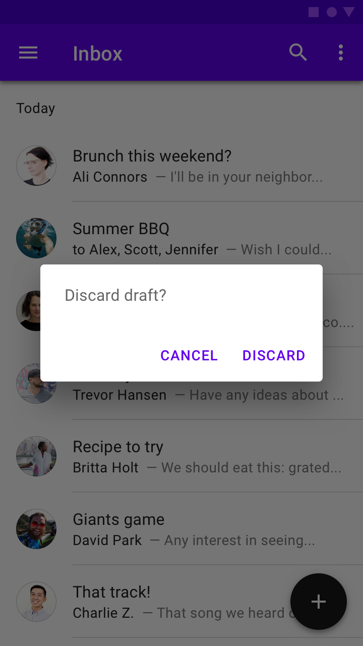
Simple dialog
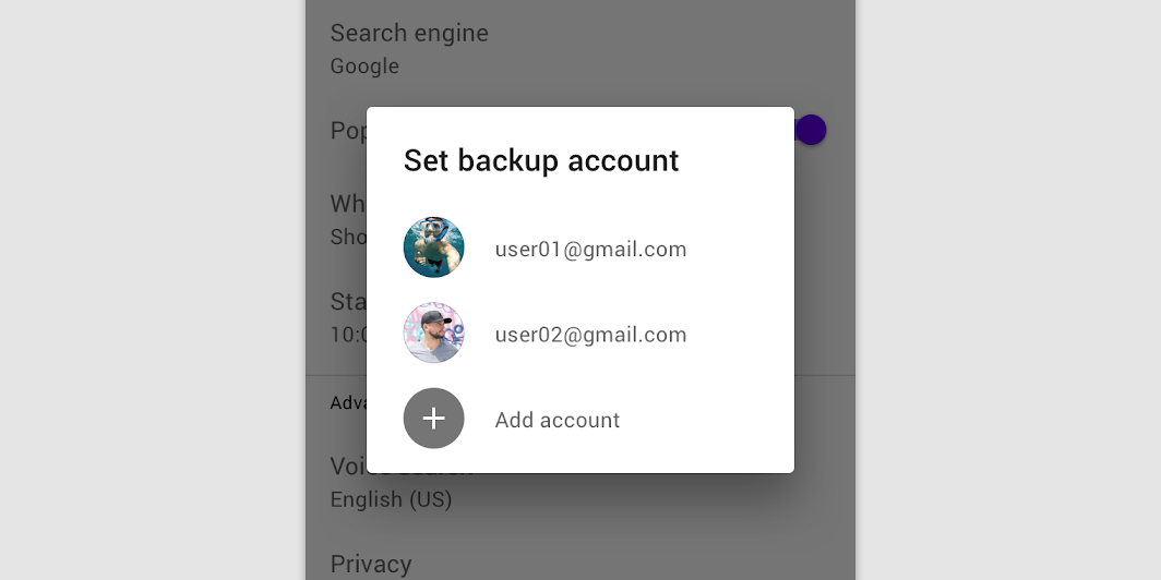
Simple dialogs display a list of items that take immediate effect when selected.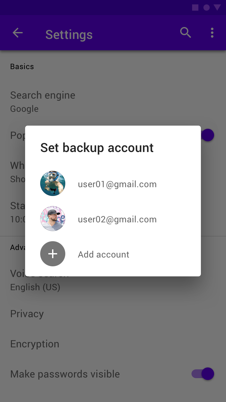
Confirmation dialog
Confirmation dialogs require users to confirm a choice before the dialog is dismissed.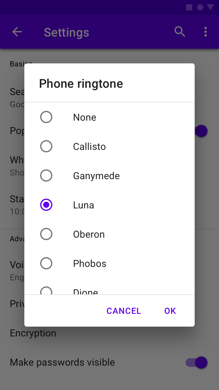
Full-screen dialog
Full-screen dialogs fill the entire screen, containing actions that require a series of tasks to complete.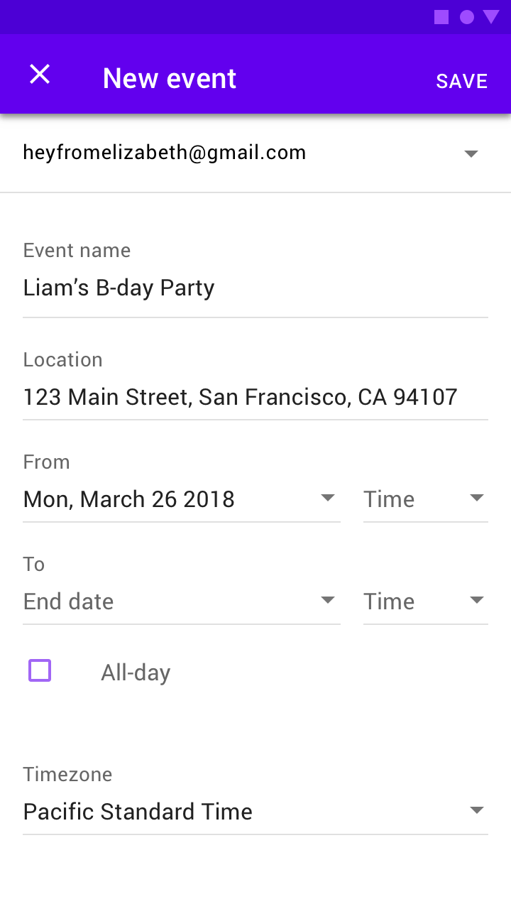
Cross-platform adaptations
On iOS there are components that perform similar functions to dialogs on Android, such as alerts and action sheets. Look at the number of actions and their text length to decide which component (Alert or Action Sheet) to use when adapting a dialog component to iOS.
Use Alerts when there are two actions with short text labels that fit horizontally.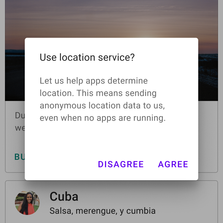
Android
Use a simple dialog when displaying two actions.
iOS
You have the option to use an alert when displaying two actions.

When there are three or more actions with long text labels in a Material dialog, products may use iOS action sheets or bottom sheets.
Android
Stack actions if a text label is long.

iOS
Products may use an iOS action sheet if there are three or more actions.

iOS
Products may use a bottom sheet if there are three or more actions.

解析
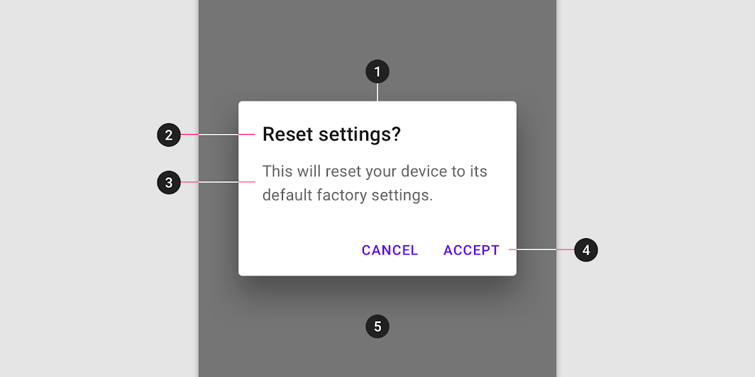
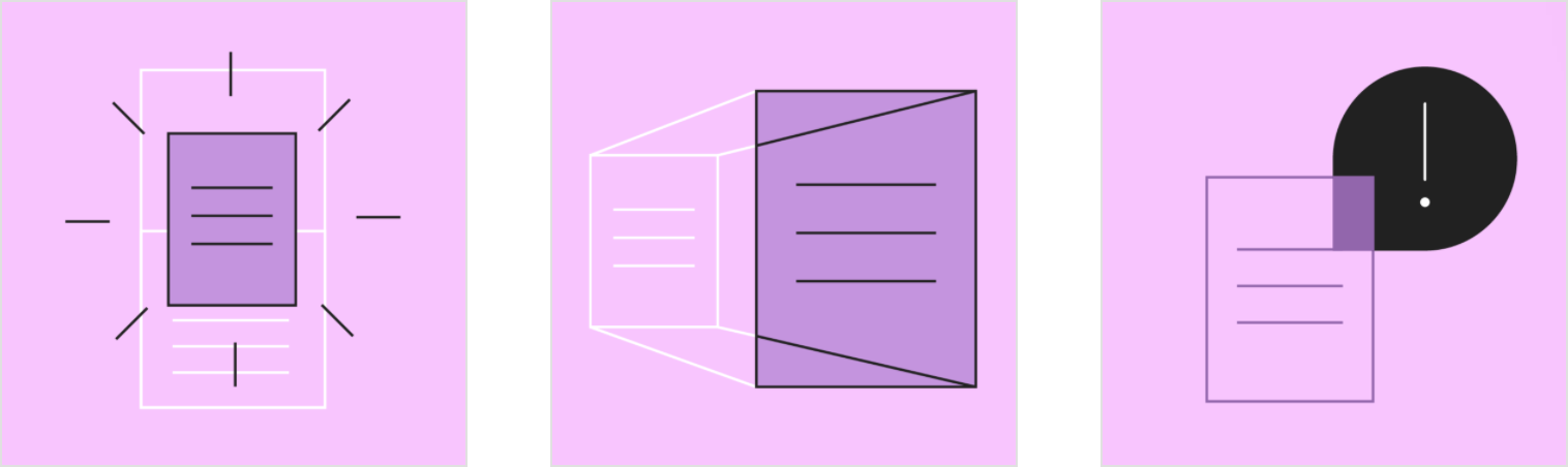
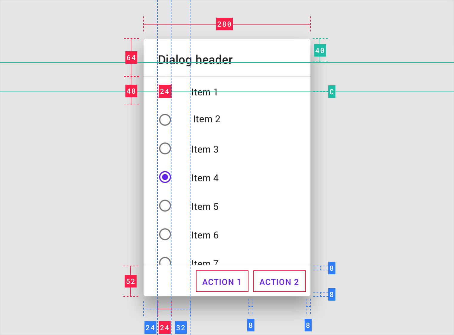
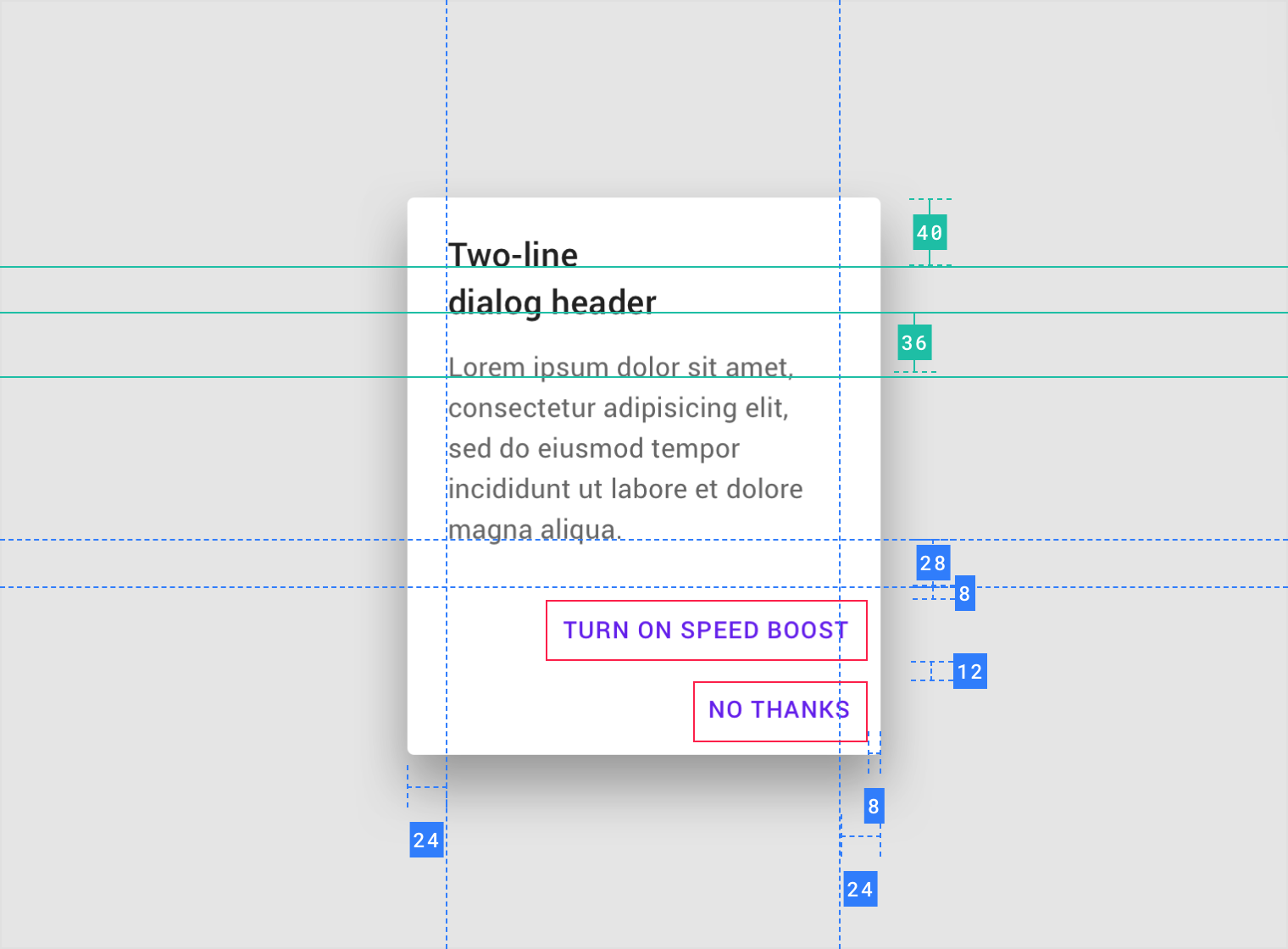
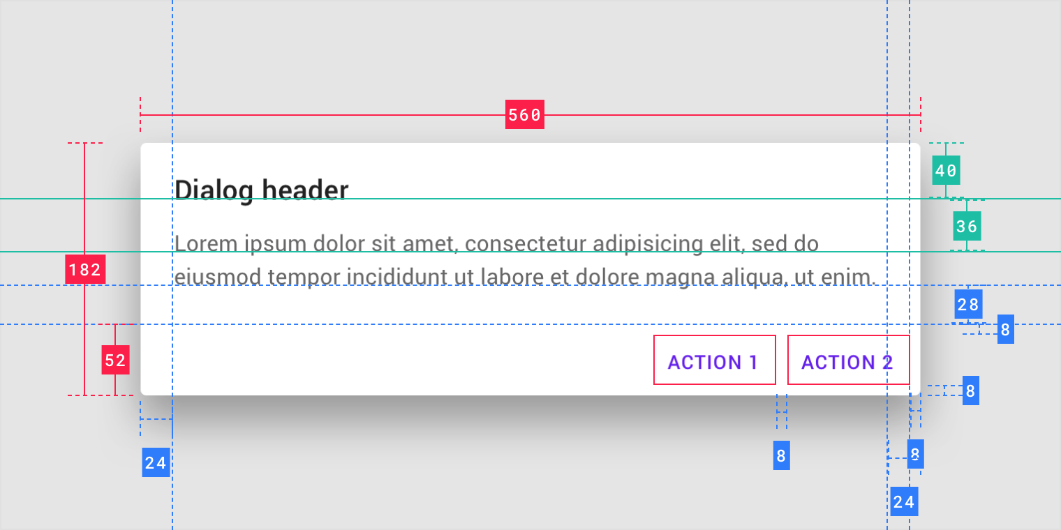
- Container
- Title (optional)
- Supporting text
- Buttons
- Scrim
Dialog box and scrim
A dialog is a type of modal window. Access to the rest of the UI is disabled until the modal is addressed. All modal surfaces are interruptive by design – their purpose is to have the user focus on content on a surface that appears in front of all other surfaces.
To express that the rest of the app is inaccessible, and to focus attention on the dialog, surfaces behind the dialog are scrimmed. A scrim is a temporary treatment that can be applied to Material surfaces for the purpose of making content on the surface less prominent.
Title
A dialog’s purpose should be communicated by its title and button text.
Titles should:
- Contain a brief, clear statement or question
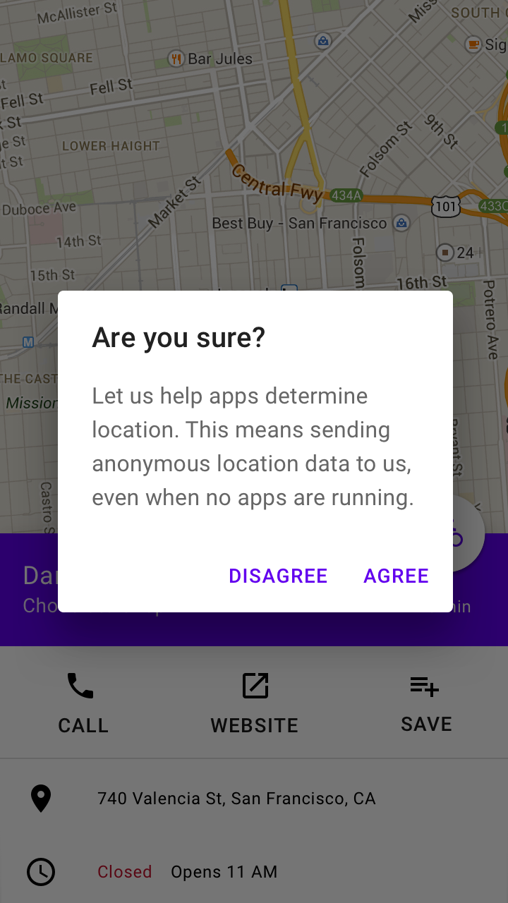
- Avoid apologies (“Sorry for the interruption”), alarm (“Warning!”), or ambiguity (“Are you sure?”)

Do
This dialog title poses a specific question, concisely explains what’s involved in the request, and provides clear actions.

Don’t
Don’t use dialog titles that pose an ambiguous question.
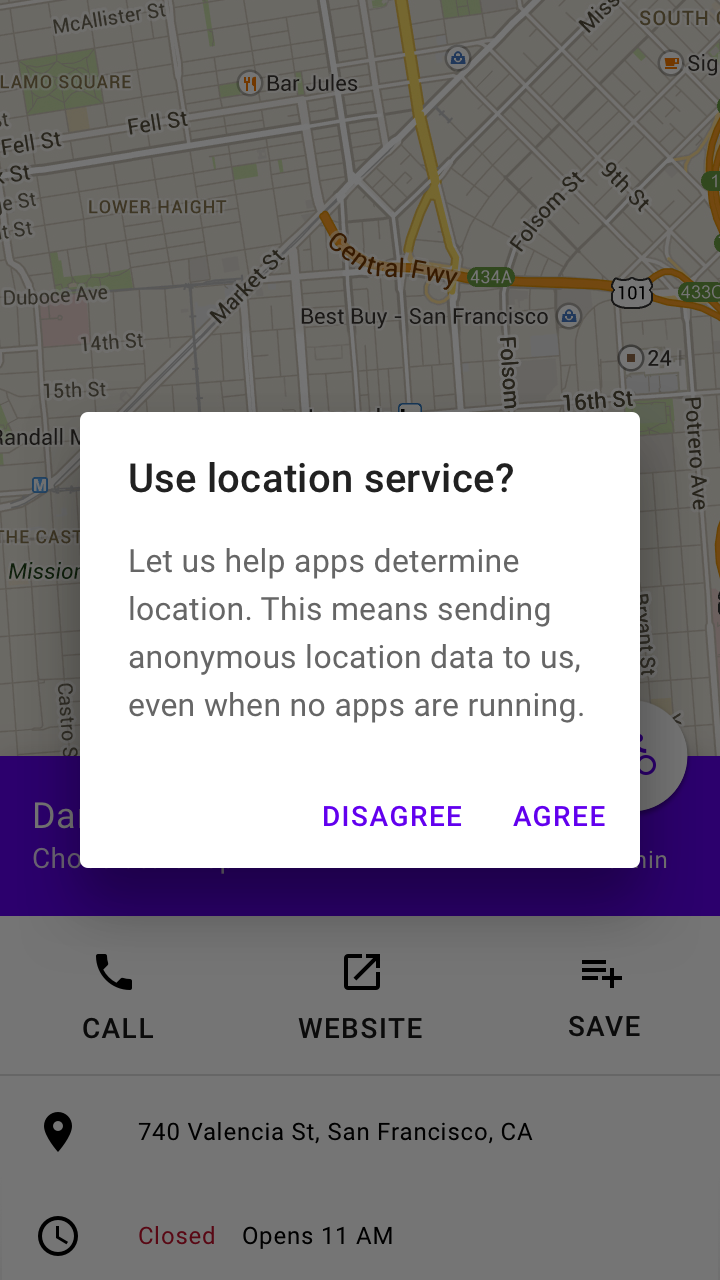
Buttons
Side-by-side buttons (Recommended)
Side-by-side buttons display two text buttons next to one another.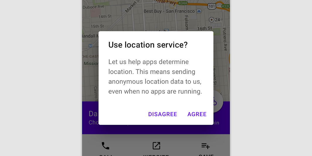
These side-by-side buttons display buttons provide the actions of “Disagree” and “Agree” as options.
Stacked full-width buttons
Stacked buttons accommodate longer button text. Confirming actions appear above dismissive actions.
Stacked full-width buttons
Elevation
Dialogs are displayed at 24dp elevation and can display a shadow. They appear above other content and typically have a scrim below them that covers all app content.
Behavior
Interaction
Dialogs appear without warning, requiring users to stop their current task. They should be used sparingly, as not every choice or setting warrants interruption.
Position
Dialogs retain focus until dismissed or an action has been taken, such as choosing a setting. They shouldn’t be obscured by other elements or appear partially on screen, with the exception of full-screen dialogs.
Scrolling
Most dialog content should avoid scrolling. When scrolling is required, the dialog title is pinned at the top, with buttons pinned at the bottom. This ensures selected content remains visible alongside the title and buttons, even upon scroll.
Dialogs don’t scroll with elements outside of the dialog, such as the background.
 When viewing a scrollable list of options, the dialog title and buttons remain fixed.
Dismissing dialogs
Dialogs may be dismissed by:
- Tapping a “cancel” button, if one is shown
- Pressing the keyboard Escape key
- Tapping the scrim (Android, iOS)
- Tapping the Android system “back” button
- Using another standard “cancel” or “escape” action, such as iOS’ VoiceOver escape gesture
If the user’s ability to dismiss a dialog is disabled, the user must choose a dialog action to proceed.
Transitions
Dialogs enter and exit the screen using a fade transition pattern.
Dialog entering and exiting the screen using a fade transition.
Scaling and adaptation
When scaling layouts for larger screens, adjust a dialog’s visual presentation by setting minimum and maximum values for margins, padding, and container dimensions.
Dialogs should maintain a minimum 48dp distance from the leading and trailing edges of a screen. On small screens, dialogs scale vertically until reaching 48dp from the screen’s top and bottom edge. On larger displays, dialogs can increase in size to a maximum width of 560dp. When a dialog reaches the maximum width, it expands or contracts vertically to support content, up to a maximum height of 560dp.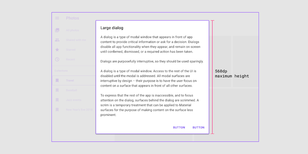
Dialogs can reach a maximum height and width of 560dp on large screens.
Dialogs can also swap types as a screen size changes. For example, a full-screen dialog can change into a simple dialog at larger breakpoints.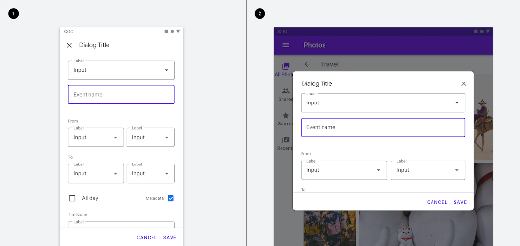
1. Full screen dialog on mobile. 2. Simple dialog on a tablet.
Actions
Types of actions
Dialogs present a distinct choice to users through their title, content, and actions. Dialog actions are represented as buttons and allow users confirm or dismiss something.
There are three types of dialog actions:
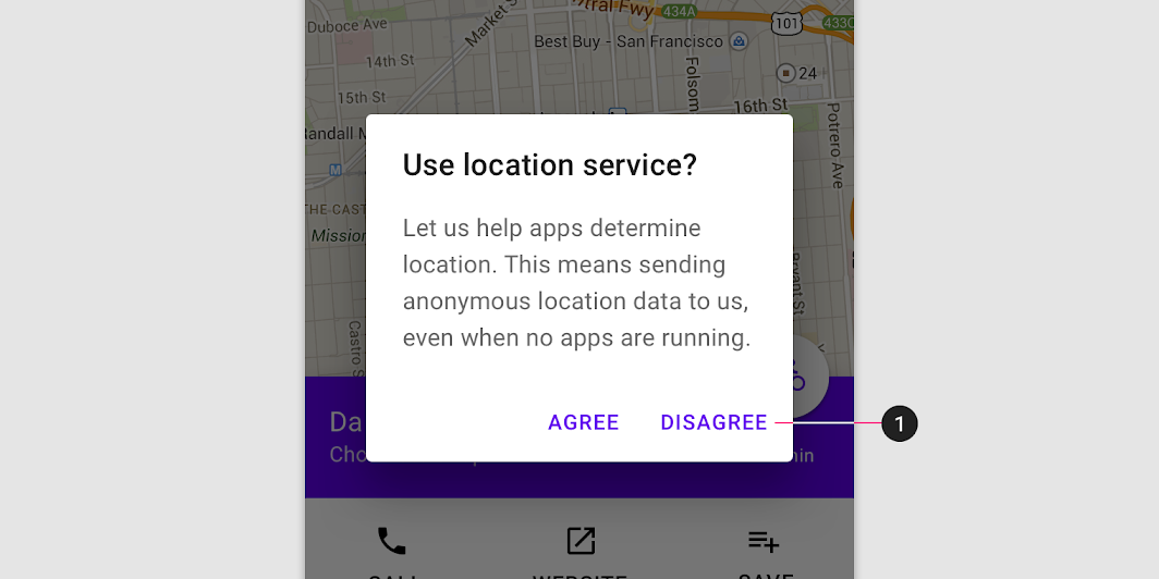
Confirming actions
To resolve what triggered the dialog, confirming actions confirm a proposed action. These actions can involve removing something, such as “Delete” or “Remove,” if it suits the context. They are placed on the right side of the screen.
Dismissive actions
Dismissive actions dismiss a proposed action, and return the user to the originating screen or step. They are placed directly to the left of a confirming action.
Acknowledgement actions
When user acknowledgement is required to proceed, a single action may be presented. Alternatively, use a snackbar to communicate this type of information.

Do
Disable confirming actions (1) until a choice is made. Dismissive actions are never disabled.

Don’t
Dismissive actions (1) are placed to the left of confirming actions.
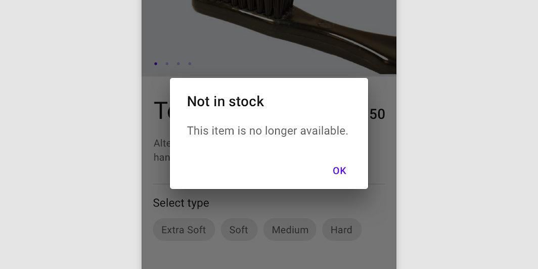

Do
A single action may be provided only if it’s an acknowledgement.


Don’t
Avoid presenting users with unclear choices. “Cancel” doesn’t make sense here because no clear action is proposed.
Number of actions
Dialogs should contain a maximum of two actions.
- If a single action is provided, it must be an acknowledgement action.
- If two actions are provided, one must be a confirming action, and the other a dismissing action.
- Providing a third action such as “Learn more” is not recommended as it navigates the user away from the dialog, leaving the dialog task unfinished.
Rather than adding a third action, an inline expansion can display more information. If more extensive information is needed, provide it prior to entering the dialog.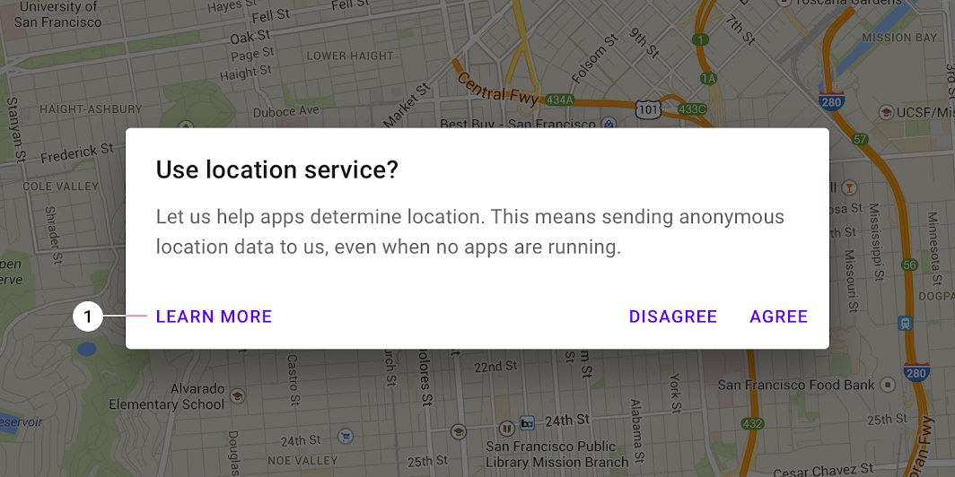

Don’t
The “Learn more” action (1) navigates away from this dialog, potentially leaving it in an indeterminate state.
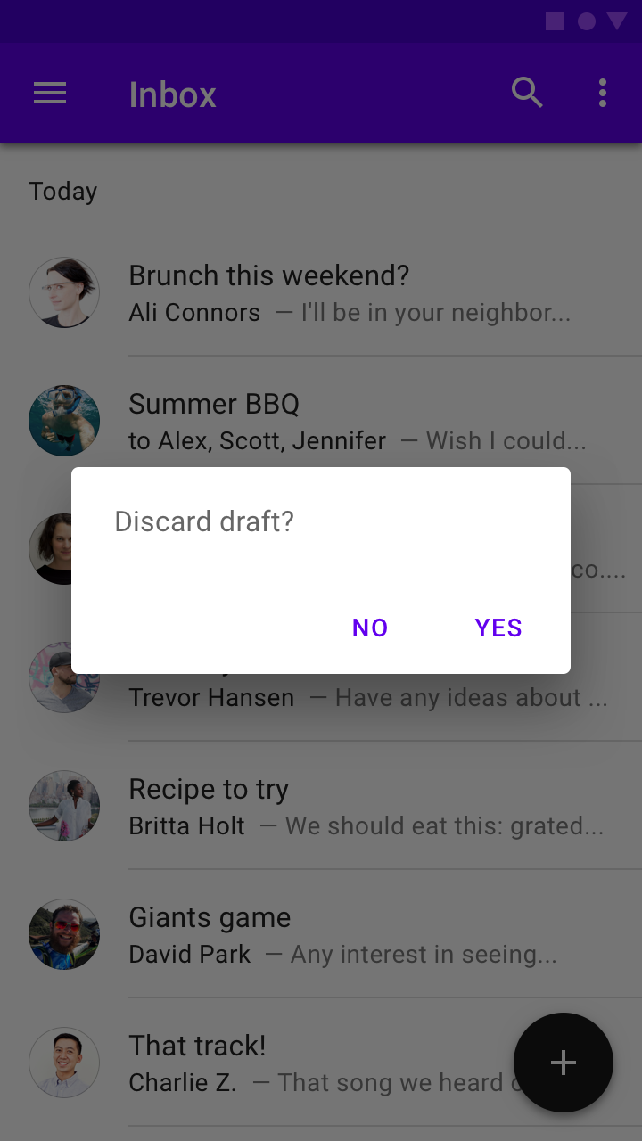
Alert dialog
Usage
Alert dialogs interrupt users with urgent information, details, or actions.
Behavior
To close an alert dialog, one of its actions must be selected.

Do
The action “Discard” indicates the outcome of the decision.

Don’t
Don’t use action text that fails to indicate what the selection will do. “Cancel” and “Delete” better indicate what will occur in this dialog.
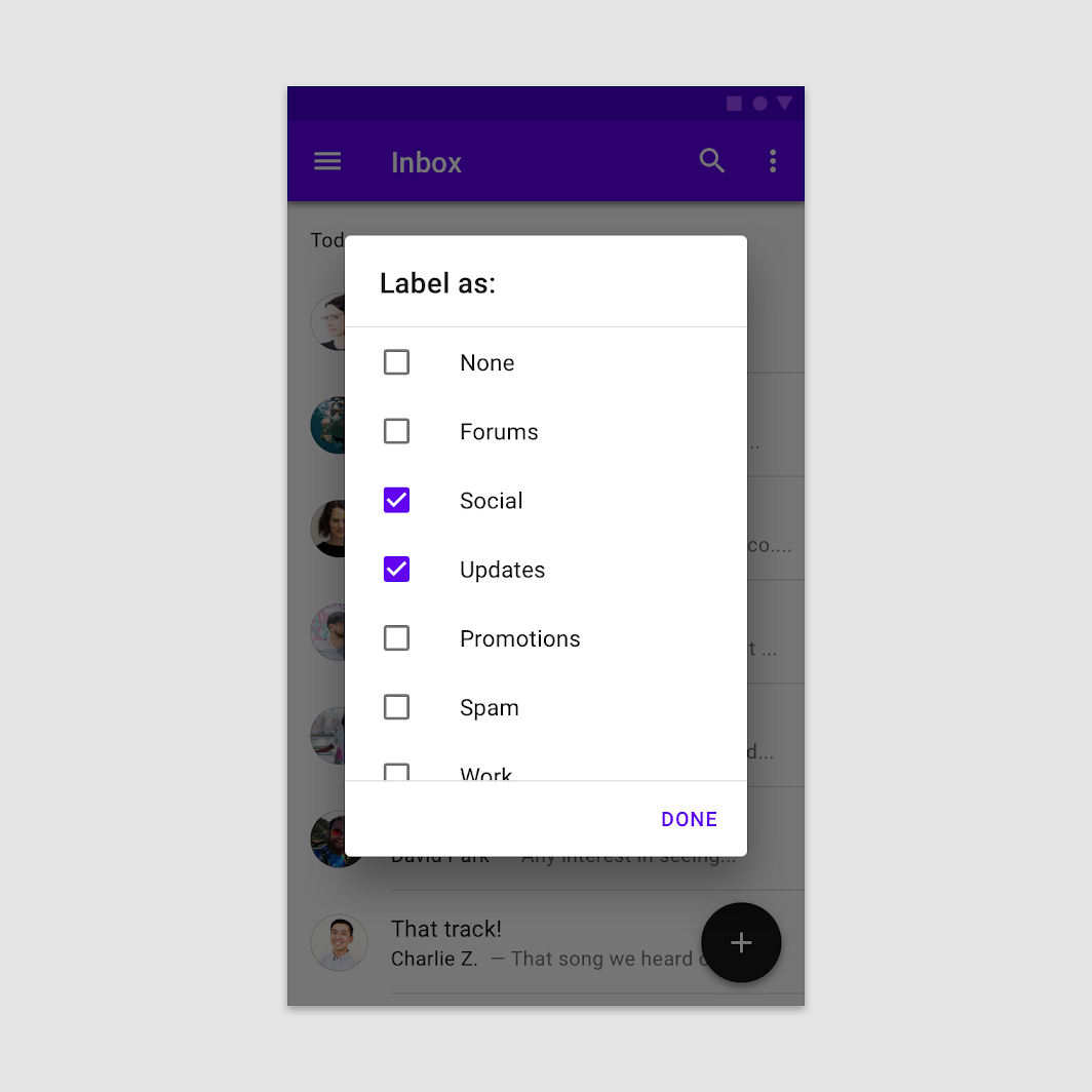
Simple dialog
Usage
Simple dialogs can display items that are immediately actionable when selected. They don’t have text buttons.
As simple dialogs are interruptive, they should be used sparingly. Alternatively, dropdown menus provide options in a non-modal, less disruptive way.
Behavior
A simple dialog allows the following interactions:
- Tap an action to choose it and close the dialog
- Tap outside the dialog to close the dialog without taking an action
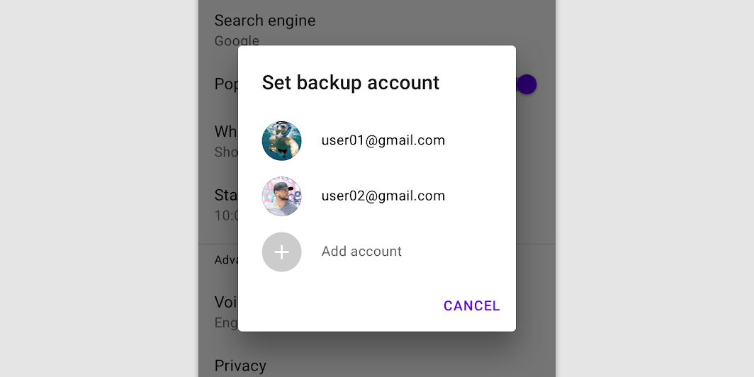
A simple dialog
Simple dialogs without actions
Simple dialogs allow users to act on selected elements, without action text. For example, users can simply select a list item to take action on it.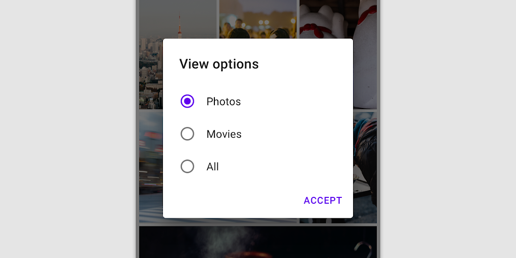

Don’t
Don’t display text buttons in simple dialogs. The choice itself is actionable when tapped.

Don’t
Don’t include dismissive actions like “Cancel” in a simple dialog. Users can tap anywhere outside the dialog to close it.
Confirmation dialog
Usage
Confirmation dialogs give users the ability to provide final confirmation of a choice before committing to it, so they have a chance to change their minds if necessary.
If the user confirms a choice, it’s carried out. Otherwise, the user can dismiss the dialog. For example, users can listen to multiple ringtones but only make a final selection upon tapping “OK.”
Behavior
To confirm a choice, the user taps a confirmation action. To cancel, the user taps a dismissive action.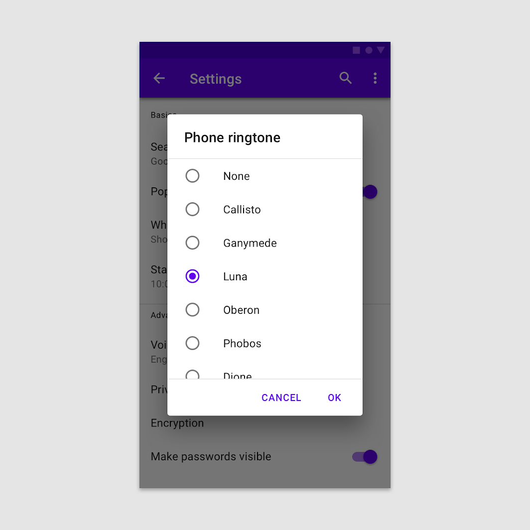
The user must either confirm a choice or dismiss the dialog before proceeding.
Placement
Confirmation dialogs typically appear as lists, but can appear in a variety of layouts and components, including lists, date pickers, and time pickers.
Confirmation dialog in a list
The user taps a selection and confirms by tapping “OK.”
Confirmation dialog in a date picker
The user selects by tapping a date, then confirms by tapping “OK.”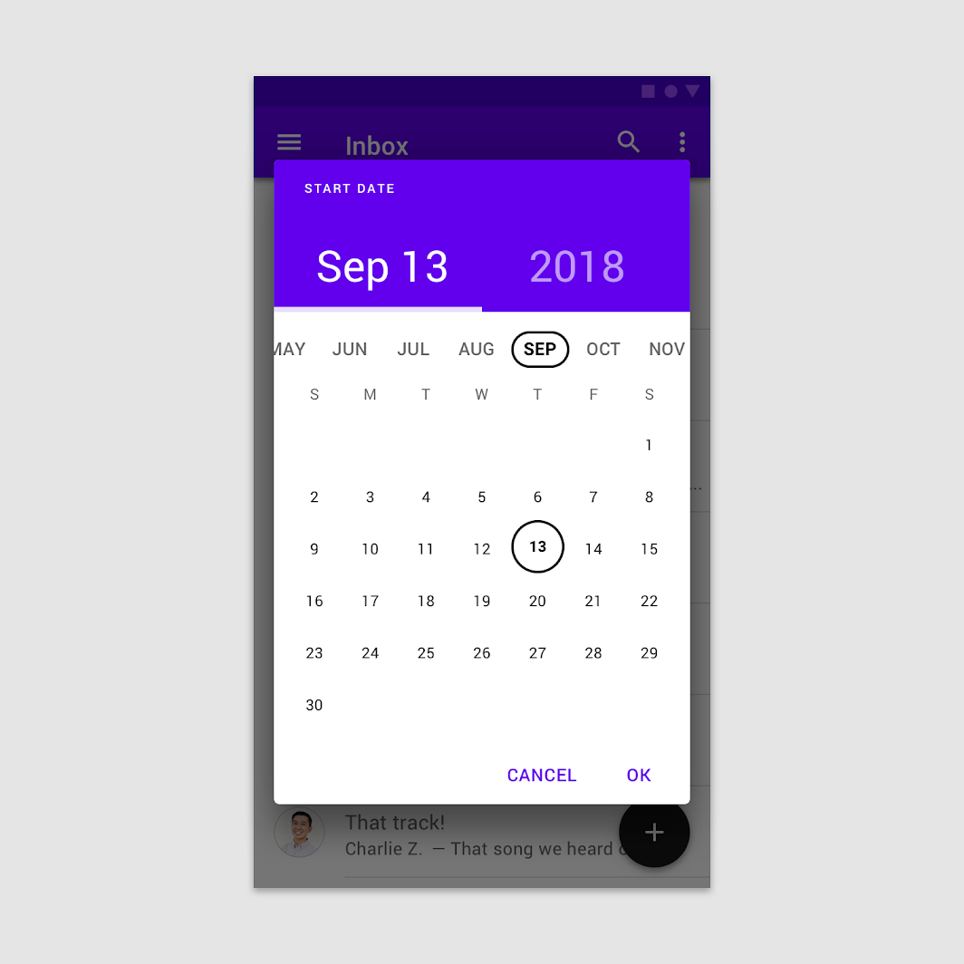
Confirmation dialog in a time picker
The user selects by moving the clock hand and then confirms by tapping “OK.”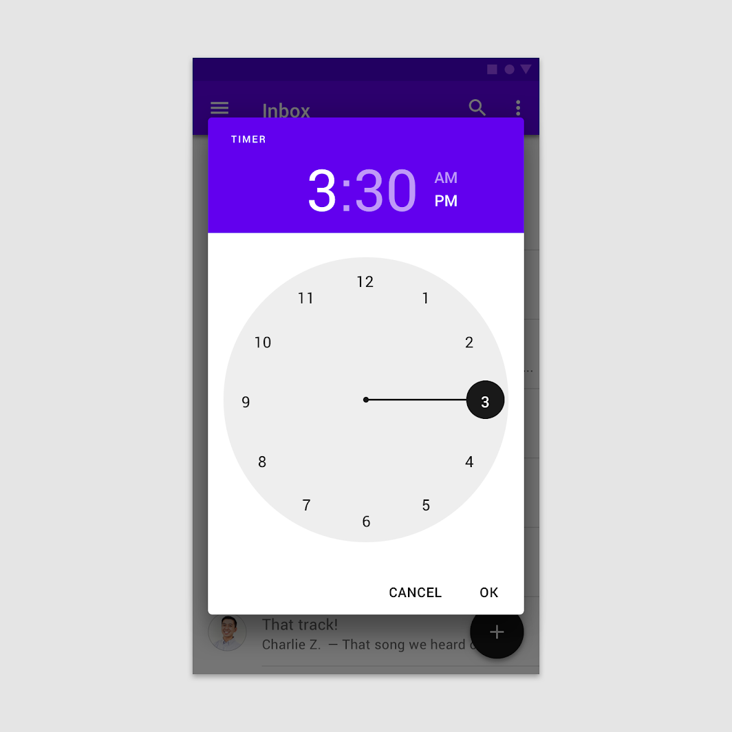
Buttons
Confirmation dialogs provide both confirmation and cancel buttons. After a confirmation button is tapped, a selection is confirmed. If the cancel button is tapped, or the area outside the dialog, the action is cancelled.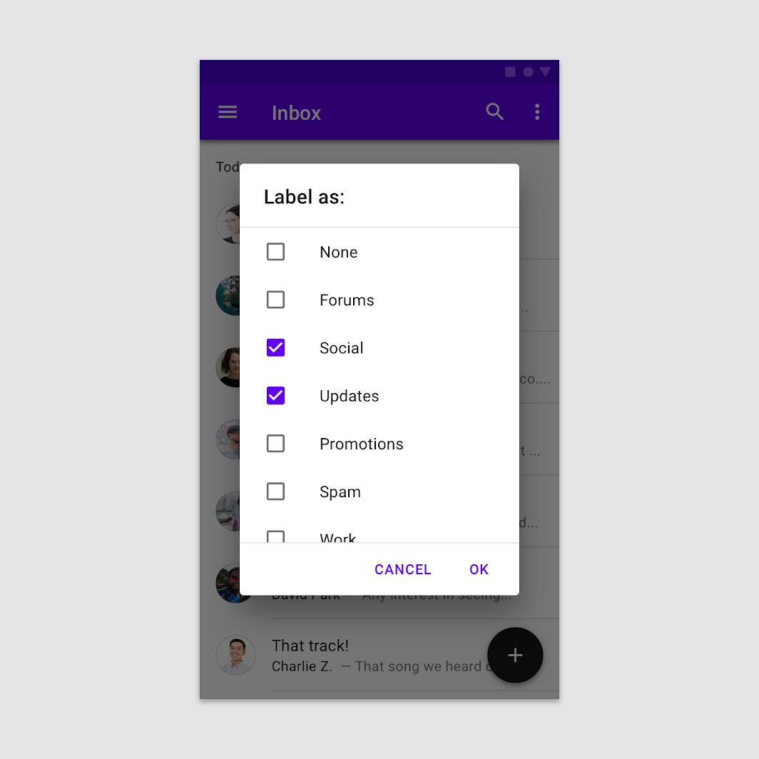

Do
Provide confirmation and dismissive buttons.

Don’t
Don’t provide a single action, as it’s unclear how to dismiss the dialog.
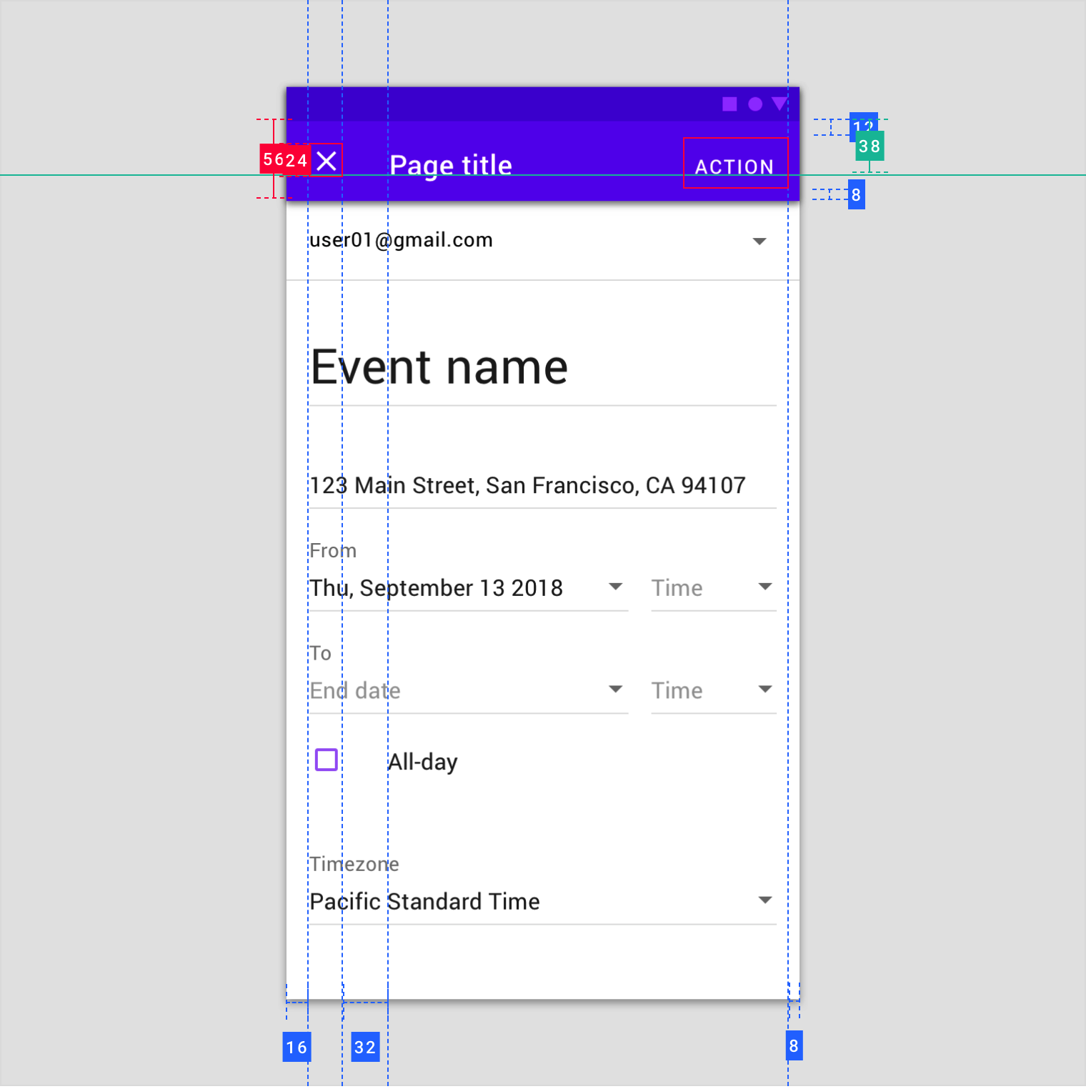
Full-screen dialog
Usage
Full-screen dialogs group a series of tasks, such as creating a calendar entry with the event title, date, location, and time. Because they take up the entire screen, full-screen dialogs are the only dialogs over which other dialogs can appear.
A calendar app launching a full-screen dialog
Full-screen dialogs may be used for content or tasks that meet any of these criteria:
- Dialogs that include components which require keyboard input, such as form fields
- When changes aren’t saved instantly
- When components within the dialog open additional dialogs
Full-screen dialogs are for mobile devices only. For tablet or desktop, use a modal dialog.
Behavior
Saving selections
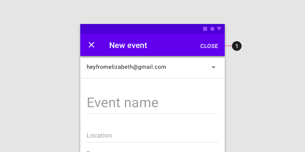
To save a selection in a full-screen dialog, the user taps “Save.” To discard all changes and exit, the user taps the “X” icon or “Back” button.
Confirmation
The confirmation action is disabled until all mandatory fields are filled. Use descriptive verbs such as “Save,” “Send,” “Share,” “Update,” or “Create.” Don’t use vague terms such as “Done,” “OK” or “Close.”
- If no changes have been made, the dialog closes and no discard confirmation is required
- If the user has made changes, the user is prompted to confirm the discard action

Don’t
A “Close” button (1) is vague because it does not indicate whether changes will be saved or discarded.
Dialog windows
Launching a full-screen dialog temporarily resets the app’s perceived elevation, allowing simple menus or dialogs to appear above the full-screen dialog.
A calendar app launching a full-screen dialog, which launches a confirmation dialog, and alert dialog.
Layout
Full-screen dialogs cover the screen and don’t appear as a floating modal window.
Actions
Place confirmation and dismissive actions in the top app bar.
Navigation
Because full-screen dialogs can only be completed, dismissed, or closed, only use the close “X” navigation button.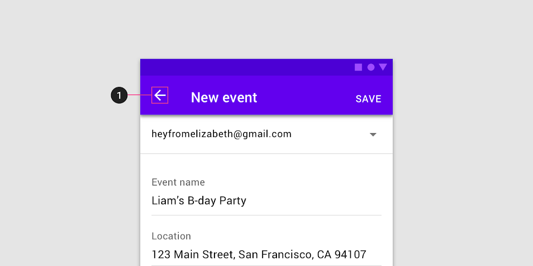

Don’t
Avoid any navigation icon other than “X.” The up arrow (1) indicates the view’s state is being saved, which isn’t the case in a full-screen dialog.
Titles
Titles should be succinct. They can wrap to a second line if necessary, and be truncated. If there are long titles, or titles of variable lengths (such as translations), place them in the content area instead of the app bar.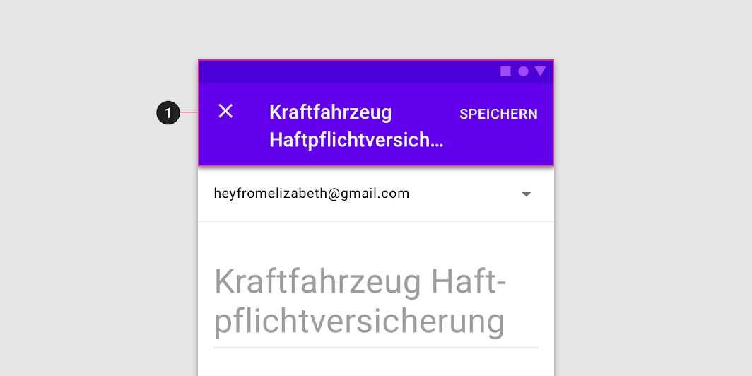

Caution
Avoid placing long titles in a dialog’s top app bar (1), as the truncated text may lead to misunderstanding.
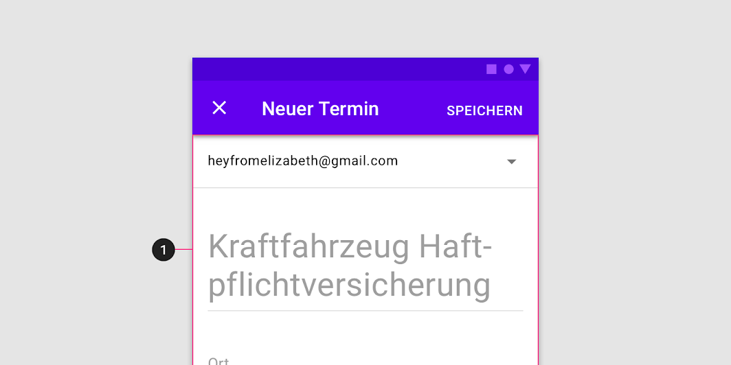

Do
Find ways to shorten app bar text, and place longer titles into the content area (1) of a full-screen dialog.
Theming
Crane Material theme
This travel app’s dialogs have been customized using Material Theming. Areas of customization include color, typography, and shape.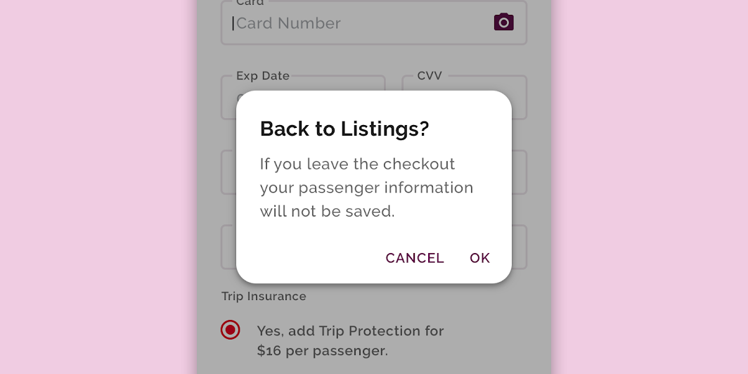
Crane’s customized dialogs
Color
Crane’s dialogs use custom color on five elements: the container, title text, supporting text, button text, and scrim.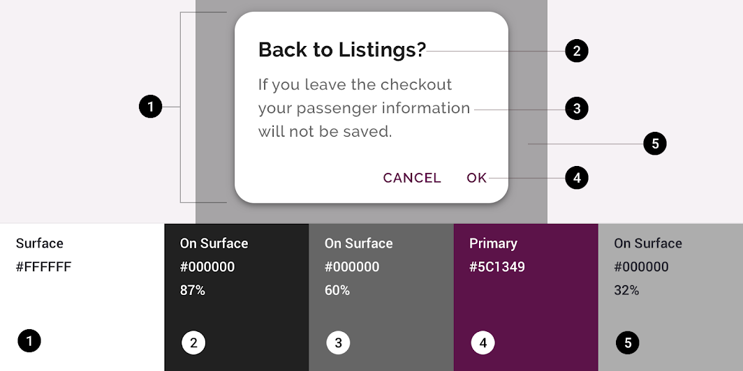
| Element | Category | Attribute | Value |
|---|---|---|---|
| Container | Surface | Color Opacity |
#FFFFFF 100% |
| Title text | On Surface | Color Opacity |
#000000 87% |
| Supporting text | On Surface | Color Opacity |
#000000 60% |
| Button text | Primary | Color Opacity |
#5C1349 100% |
| Scrim | On Surface | Color Opacity |
#000000 32% |
Typography
Crane’s dialogs use custom typography for title text, supporting text, and button text.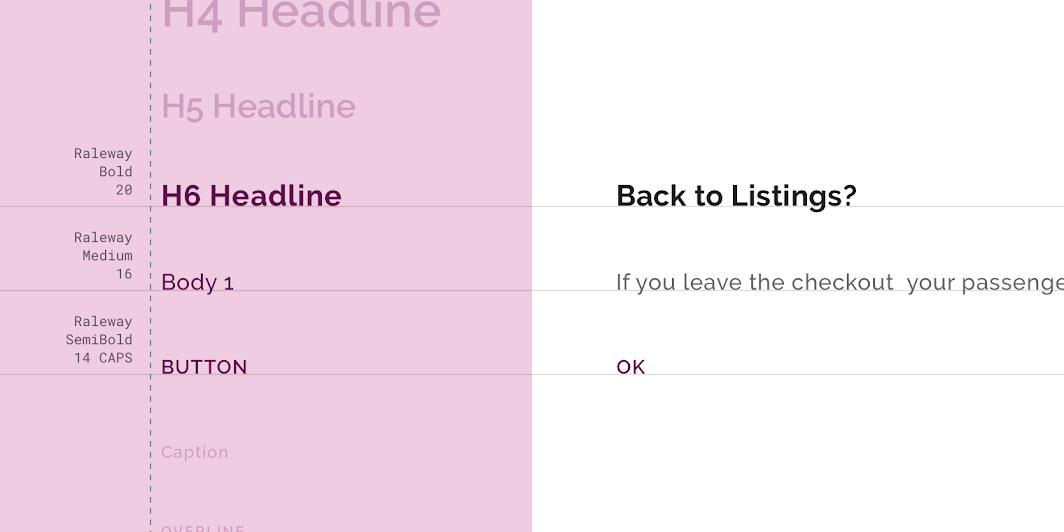
| Element | Category | Attribute | Value |
|---|---|---|---|
| Title text | H6 | Typeface Font Size Case |
Raleway Bold 20 Title case |
| Supporting text | Body 1 | Typeface Font Size Case |
Raleway Medium 16 Sentence case |
| Button text | Button | Typeface Font Size Case |
Raleway SemiBold 14 All caps |
Shape
Crane’s dialog boxes have custom corner shapes.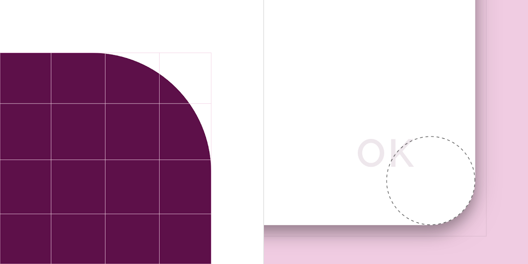
| Element | Category | Value |
|---|---|---|
| Container | Top left corner Top right corner Bottom right corner Bottom left corner |
Rounded 16dp Rounded 16dp Rounded 16dp Rounded 16dp |
Reply Material theme
This email app’s dialogs have been customized using Material Theming. Areas of customization include color, typography, and shape.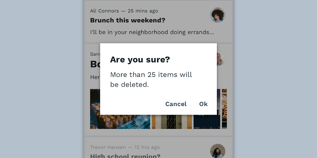
Reply’s customized dialogs
Color
Reply’s dialogs use custom color on five elements: the dialog box, title text, supporting text, button text, and scrim.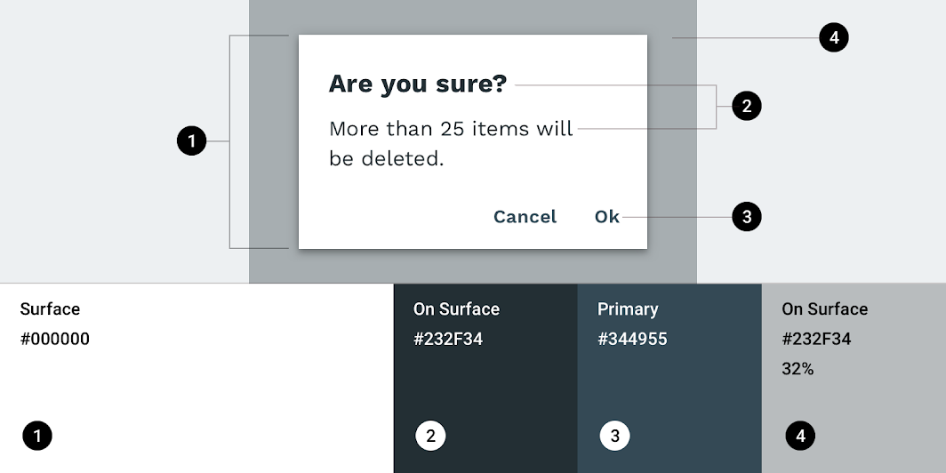
| Element | Category | Attribute | Value |
|---|---|---|---|
| Container | Surface | Color Opacity |
#000000 100% |
| Title text | On Surface | Color Opacity |
#232F34 100% |
| Supporting text | On Surface | Color Opacity |
#232F34 100% |
| Button text | Primary | Color Opacity |
#344955 100% |
| Scrim | On Surface | Color Opacity |
#232F34 32% |
Typography
Reply’s dialogs use custom typography for title text, supporting text, and button text.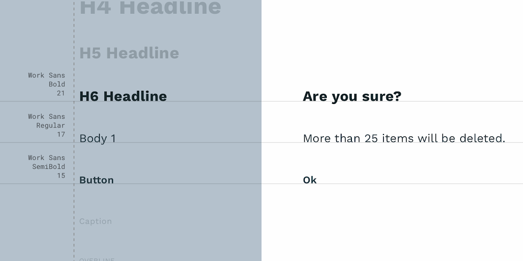
| Element | Category | Attribute | Value |
|---|---|---|---|
| Title text | H6 | Typeface Font Size Case |
Work Sans Bold 21 Sentence case |
| Supporting text | Body 1 | Typeface Font Size Case |
Work Sans Regular 16 Sentence case |
| Button text | Button | Typeface Font Size Case |
Work Sans SemiBold 15 Sentence case |
Shape
Reply’s dialog boxes have custom corner shapes.
| Element | Category | Attribute | Value |
|---|---|---|---|
| Container | Medium component | Family Size |
Cut 0;0;0;0dp |
Specs
Mobile
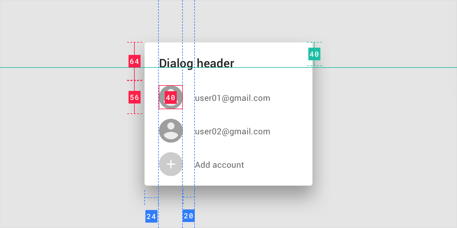
Simple dialog
Alert dialog
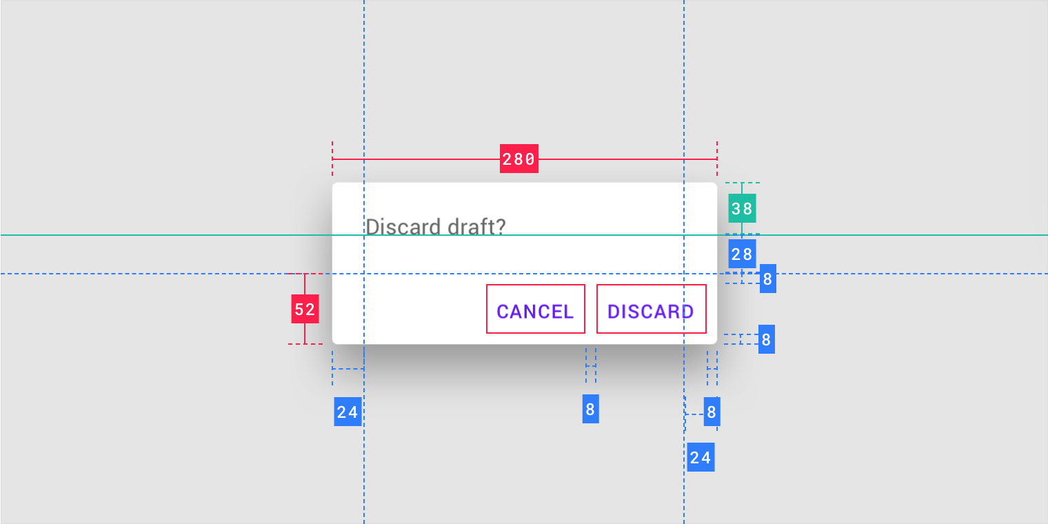
Confirmation dialog

Confirmation dialog (scrolling)
Confirmation dialog with long actions
Full-screen dialog
Desktop
Mobile alert

若有收获,就点个赞吧
0 人点赞
