Material Design 颜色系统可以根据品牌或风格来创建相应的颜色主题。
The Material Design color system can help you create a color theme that reflects your brand or style.
色彩应用以及调色
Material Design 色彩系统 使用有组织的方法将色彩应用到 UI 中。
在这个系统中,通常会选择一种主色和一种辅色来表达您的品牌特性。每种颜色的深色和浅色变体都可以以不同的方式应用于您的用户界面。
The Material Design color system helps you apply color to your UI in a meaningful way. In this system, you select a primary and a secondary color to represent your brand. Dark and light variants of each color can then be applied to your UI in different ways.
颜色和主题
您的应用的主色和辅色以及它们的变体有助于创建色彩和谐的主题,确保文本的可读性,并可以区分 UI 中的各种元素和页面。
要选择主色和辅色,并生成每种颜色的明暗变体,请使用 “Material Design” 调色板,“主题编辑器”或“2014 - Material Design” 调色板。
Color themes are designed to be harmonious, ensure accessible text, and distinguish UI elements and surfaces from one another.
The Material Design palette tool or 2014 Material Design palettes are available to help you select colors.
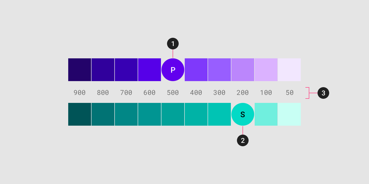
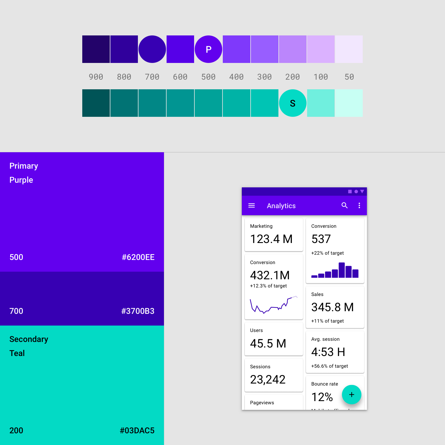
1.主色;2.辅色;3.明暗变体。
A sample primary and secondary palette
- Primary color
2. Secondary color
3. Light and dark variants
原则
- 层级
用户能够根据颜色判断哪些元素是可以互动的,它们与其他元素的关系以及它们的突出程度。重要的元素应该被设计者用主色进行强调。 Color indicates which elements are interactive, how they relate to other elements, and their level of prominence. Important elements should stand out the most.
- 清晰
文字和重要元素(如图标)应在所有屏幕和设备类型中出现在彩色背景上时,符合易读性标准。Text and important elements, like icons, should meet legibility standards when appearing on colored backgrounds.
- 表现
在适当的时机展示品牌颜色,强化品牌风格,增强品牌形象。Show brand colors at memorable moments that reinforce your brand’s style.
创建色彩主题
基本主题
材料设计的设计具有可直接使用的内置的基本主题,可以直接使用。
这套基本主题包括主色,辅色及其各种变体的默认颜色。还包括定义 UI 的其他颜色,例如背景,页面底色,错误提示,文本和图像的颜色。
所有这些颜色都可以为您的应用进行私人定制。
Material Design comes designed with a built-in, baseline theme that can be used as-is, straight out of the proverbial box.
This includes default colors for:
- Primary and secondary colors
- Variants of primary and secondary colors
- Additional UI colors, such as colors for backgrounds, surfaces, errors, typography, and iconography.
All of these colors can be customized for your app.
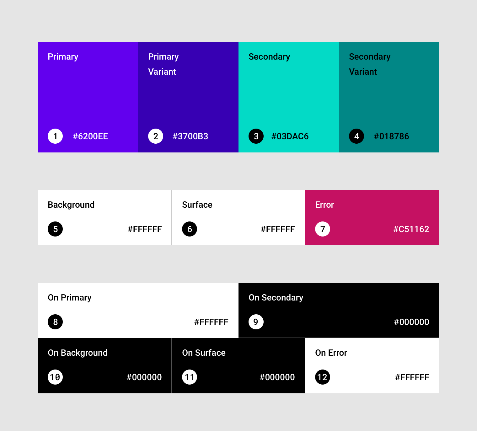
The baseline Material color theme.
主色
主要颜色是在应用程序的页面和组件中显示频率最高的颜色。
如果你没有辅色,主色也可以用来对元素进行强调。
A primary color is the color displayed most frequently across your app’s screens and components.
明暗变体
您可以使用主色及其明暗变体为应用制作颜色主题。
Your primary color can be used to make a color theme for your app, including dark and light primary color variants.
区分 UI 元素
要对不同的 UI 元素进行分离,例如区分顶部应用程序栏和系统栏,可以在每个元素上使用主色的明暗变体。
您还可以使用变体来区分组件内的元素,例如浮动操作按钮容器上使用的不同变体以及其中的图标。
To create contrast between UI elements, such as a top app bar from a system bar, you can use light or dark variants of your primary colors. You can also use these to distinguish elements within a component, such as the icon of a floating action button from its circular container.
 主色的明暗变体被用来区分顶部应用程序栏和系统栏。
A top app bar uses light and dark primary color variants to distinguish it from a system bar.
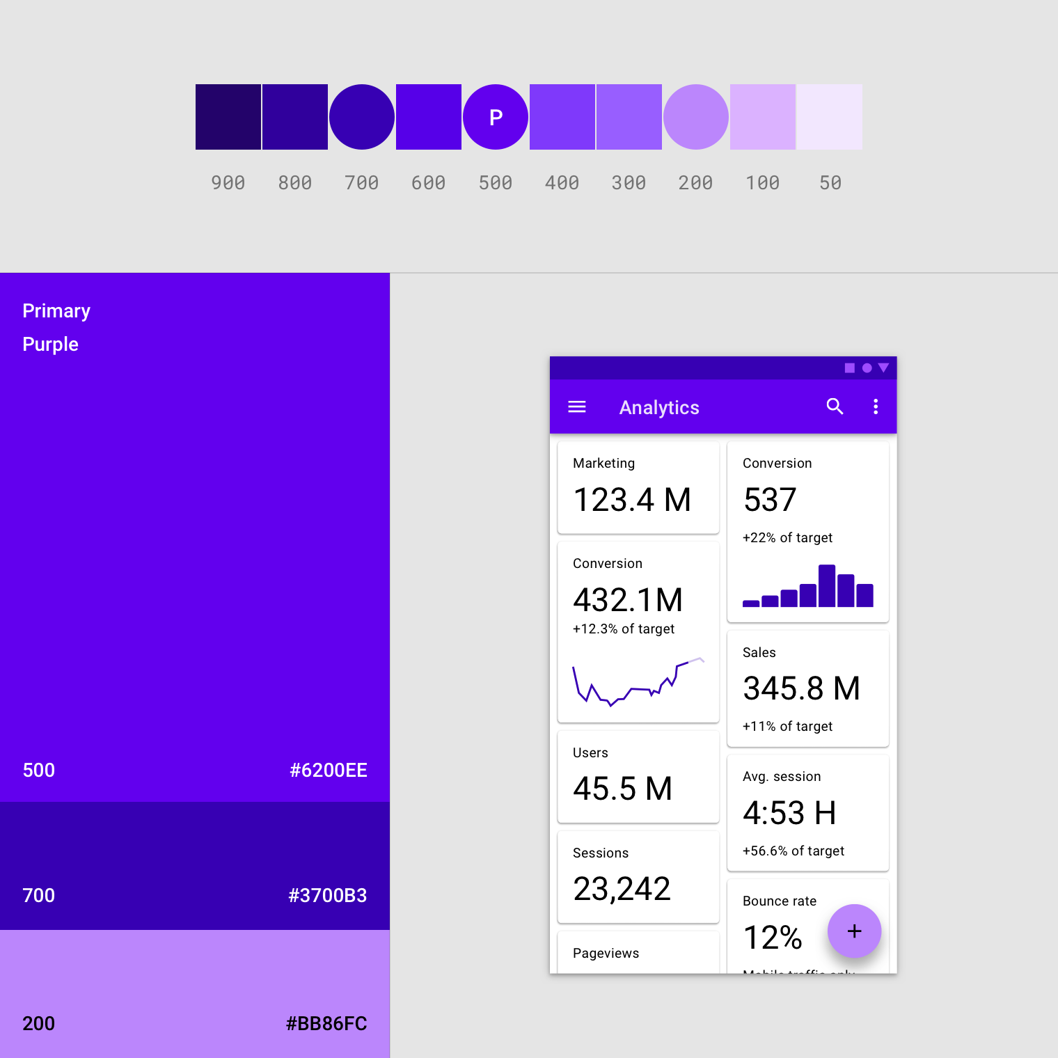
此 UI 使用主色和与其对应的两个变体。
This UI uses a primary color and two primary variants.
辅色
辅色提供了更多方法来突出您的产品特色,与其他品牌进行区分。辅色是可选的,在使用辅色对某些元素进行强调时应该十分谨慎。
A secondary color provides more ways to accent and distinguish your product. Having a secondary color is optional, and should be applied sparingly to accent select parts of your UI.
If you don’t have a secondary color, your primary color can also be used to accent elements.
应用场景:
- 浮动动作按钮(FAB)
- 选择控件,如滑块和开关
- 突出显示所选文本
- 进度条
- 链接和标题
Secondary colors are best for:
- Floating action buttons
- Selection controls, like sliders and switches
- Highlighting selected text
- Progress bars
- Links and headlines
辅色的明暗变体
就像主色一样,辅色也可以有明暗变体。主色与辅色的明暗变体构成了颜色主题。
Just like the primary color, your secondary color can have dark and light variants. A color theme can use your primary color, secondary color, and dark and light variants of each color.
主色与辅色的明暗变体。
Dark and light variants of primary and secondary colors
此 UI 使用了主色、主色对应的明暗变体以及辅色创建了一套颜色主题。
This UI uses a color theme with a primary color, a primary variant, and a secondary color.
组件平面、背景和异常色
组件平面、背景和异常色通常与品牌颜色主题无关:
- 平面的颜色会影响到组件的易读性,例如卡片,表格和菜单。
- 背景颜色出现在可滚动内容之后。基线背景和组件平面颜色为#FFFFFF。
- 异常色代表组件出现异常,例如文本字段。基线错误颜色为#B00020。
Surface, background, and error colors typically don’t represent brand:
- Surface colors affect surfaces of components, such as cards, sheets, and menus.
- The background color appears behind scrollable content. The baseline background and surface color is #FFFFFF.
- Error color indicates errors in components, such as invalid text in a text field. The baseline error color is #B00020.
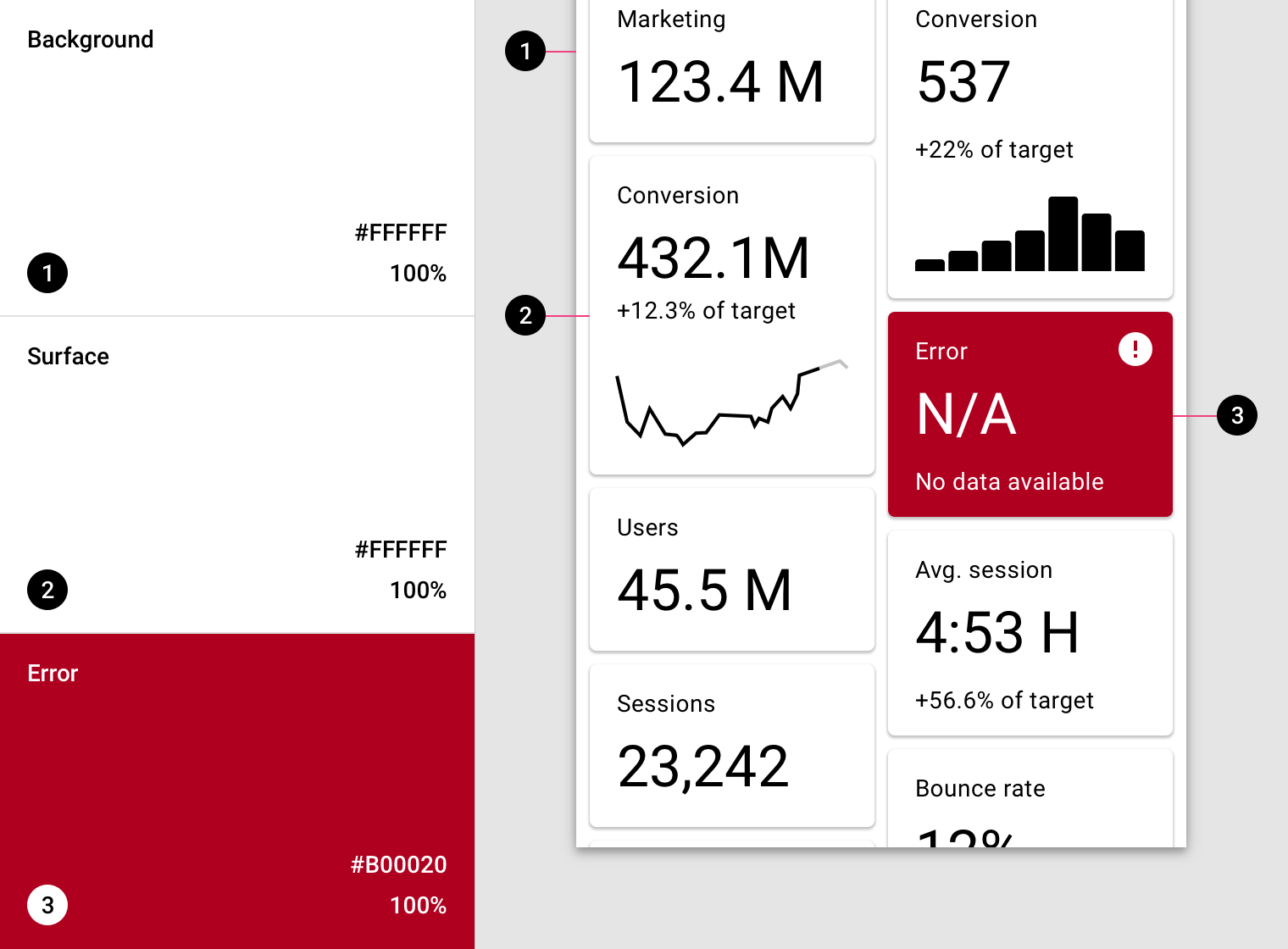
示例 UI 中组件平面、背景和异常色的基本颜色。
A UI showcasing the baseline colors for background, surface, and error color:
- Baseline background color: #FFFFFF
2. Baseline surface color: #FFFFFF
3. Baseline error color: #B00020
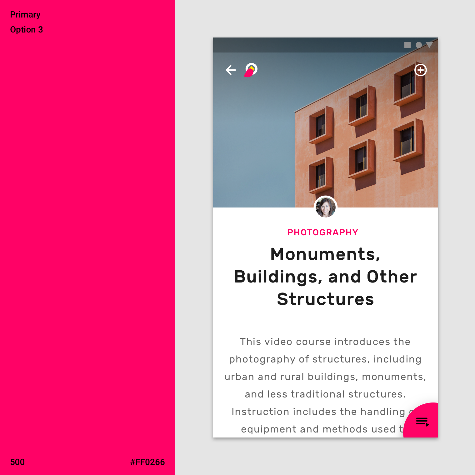
文本与图表的颜色
“On” 颜色
应用程序中的元素使用调色板中特定类别的颜色,例如主色。每当其他的元素(如文本或图标)出现在使用这些颜色的平面前方时,这些元素应使用专门设计的颜色,以清晰易读地对着它们后面的颜色。
App surfaces use colors from specific categories in your color palette, such as a primary color. Whenever elements, such as text or icons, appear in front of those surfaces, those elements should use colors designed to be clear and legible against the colors behind them.
这种颜色被称为 “On” 颜色,指的是当应用程序对放置在使用主色,辅色,组件表色,背景色或异常色的 “顶部”元素进行着色。
这些标签使用原始类别名称(例如使用主要颜色的元素的上方的颜色称为:“On Primary colors”),前缀为“on”。
This category of colors is called “on” colors, referring to the fact that they color elements that appear “on” top of surfaces that use the following colors: a primary color, secondary color, surface color, background color, or error color. When a color appears “on” top of a primary color, it’s called an “on primary color.” They are labelled using the original color category (such as primary color) with the prefix “on.”
“On” 的颜色主要应用于文本与图标。
“On” colors are primarily applied to text, iconography, and strokes. Sometimes, they are applied to surfaces.
The default values for “on” colors are #FFFFFF and #000000.
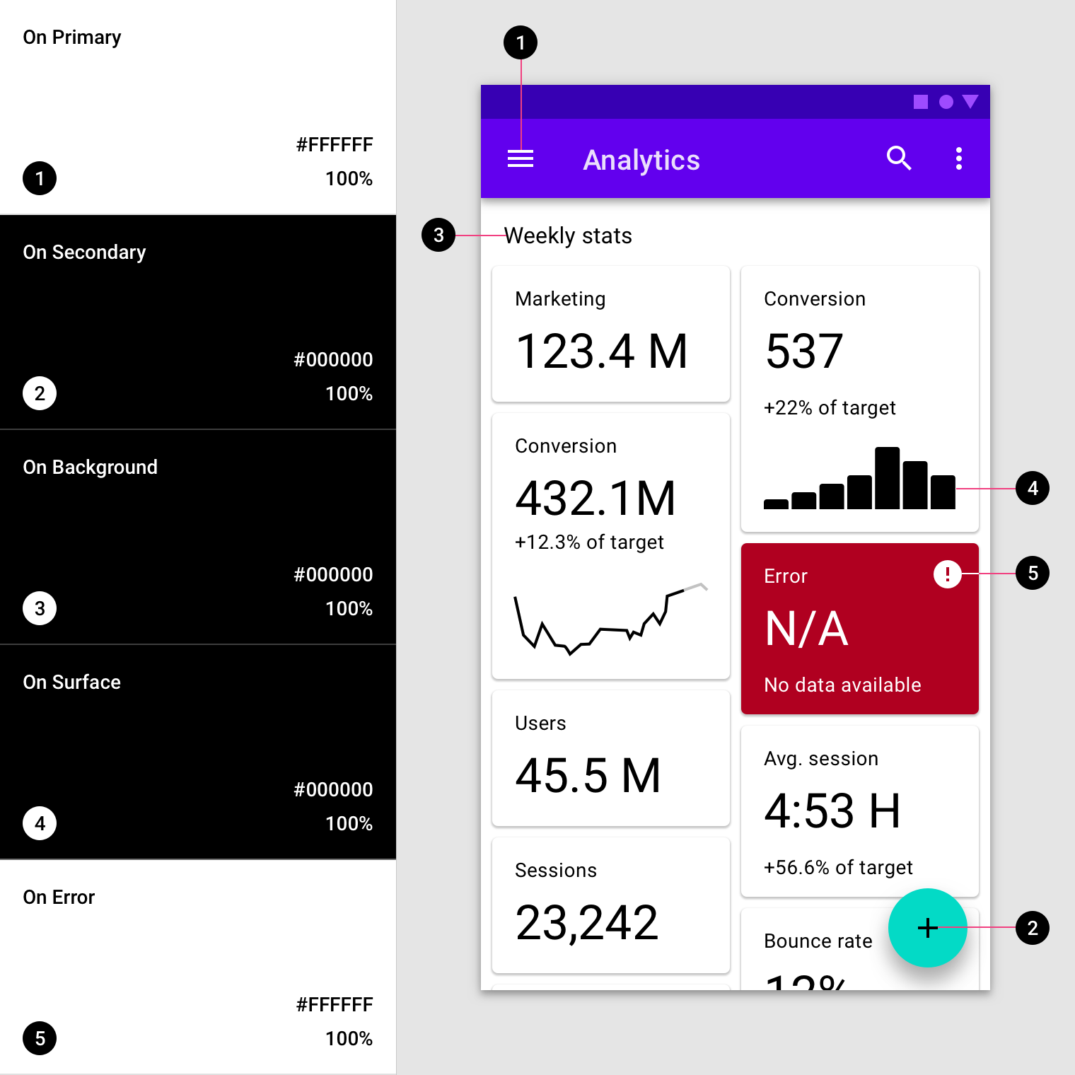
示例 UI 中文本和图标的基本颜色。
A UI showcases the baseline colors for text and iconography:
- Baseline on primary color #FFFFFF
2. Baseline on secondary color #FFFFFF
3. Baseline on background color #B00020
4. Baseline on surface color #B00020
5. Baseline on error color #B00020
颜色的无障碍设计
为了保证不同背景上的浅色或深色文字可读性,您可以使用主色和辅色的明暗变体。
或者,这些颜色可以用于出现在浅色和黑色背景前面的印刷。
To ensure an accessible background behind light or dark text, your background can use light or dark variants of your primary and secondary colors.
Alternatively, these colors can be used for typography that appears in front of light and dark backgrounds.
调色板
调色板列出了同一系列中各种相似的颜色。
A swatch is a sample of a color chosen from a range of similar colors.
在调色板上挑选能够在背景前清晰可辨的颜色:
- 浅色背景上使用深色文本;
- 深色背景上使用浅色文本。
p
Check marks indicate whether a text color is legible in front of a background:
• A white check mark indicates when white text is legible on a background color
• A black check mark indicates when black text is legible on a background color
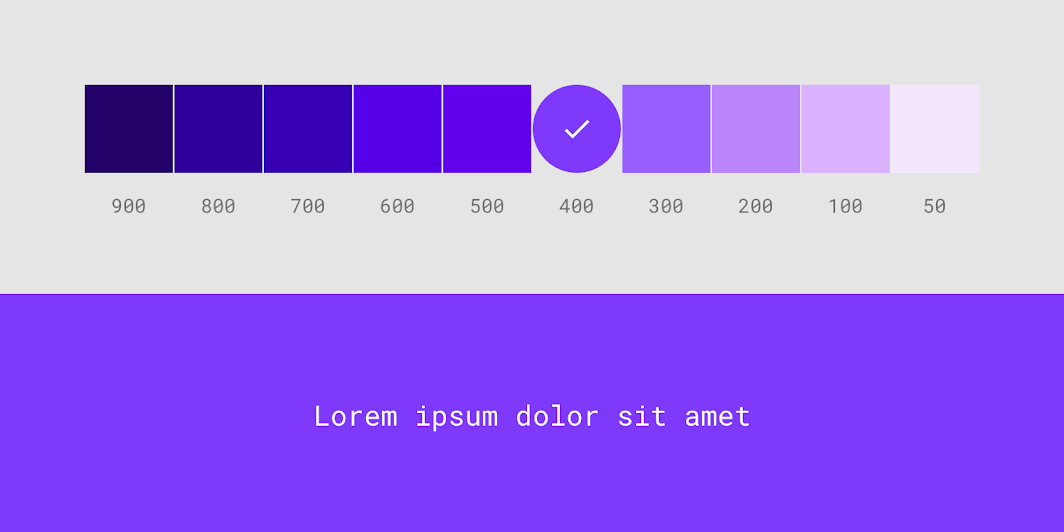
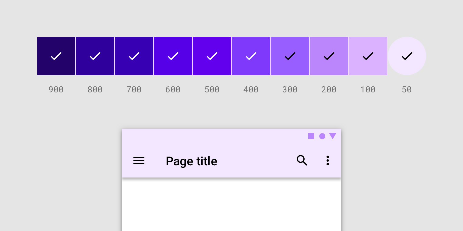
对于使用浅色文字的应用程序,必须使用深色背景才能保证其易读性。UI 中使用了 400 颜色样本。
Apps that use white text must have backgrounds that are accessible against white text. These white check marks indicate when white text is accessible against various background color swatches. The 400 color swatch is applied to this UI.
对于使用深色文字的应用程序,必须使用浅色背景才能保证其易读性。UI 中使用了 50 颜色样本。
Apps that use black text must have backgrounds that are accessible against black. These black check marks indicate when black text is accessible against various background color swatches. The 50 color swatch is applied to this UI.
替补色
“Material Design” 中的颜色系统支持替补色。在某些特殊情况,这些颜色用于替换品牌主要和次要颜色(它们构成主题的附加颜色)。应用可以使用其他颜色来建立分区。
The Material Design color system supports alternative colors, which are colors used as alternatives to your brand’s primary and secondary colors (they constitute additional colors to your theme). Alternative colors can be used to distinguish different sections of a UI.
替补色的适用情况:
- 具有明暗主题的应用程序
- 不同的模块中主题不同的应用程序
- 具有额外功能模块的的应用程序
很难保证替补色与已有颜色主题能够风格统一,所以需要谨慎使用替补色。
Alternative colors are best for:
- Apps with light and dark themes
- Apps with different themes in different sections
- Apps that are part of a suite of products
Alternative colors should be used cautiously, because they can be challenging to implement cohesively with existing color themes.
日间 & 夜间主题
Some apps have both light and dark themes. To maintain visibility of elements and legibility of text, you can adapt the different color schemes for dark and light themes.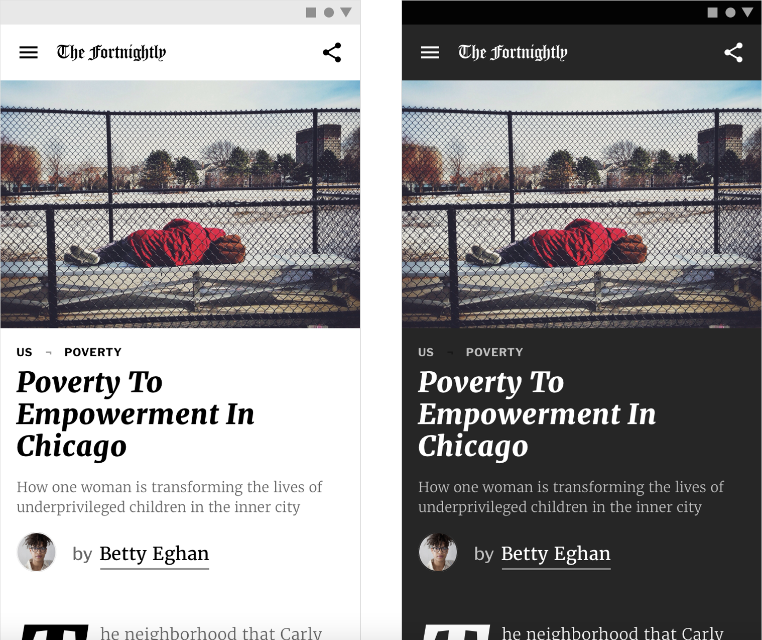
- A news app in a light theme uses a primary and secondary scheme.
- The same news app in dark theme uses a different color scheme to maintain legibility.
替补色学习样例
不同的模块中主题不同的应用程序需要替补色。
Alternative colors can be used to theme different parts of an app.
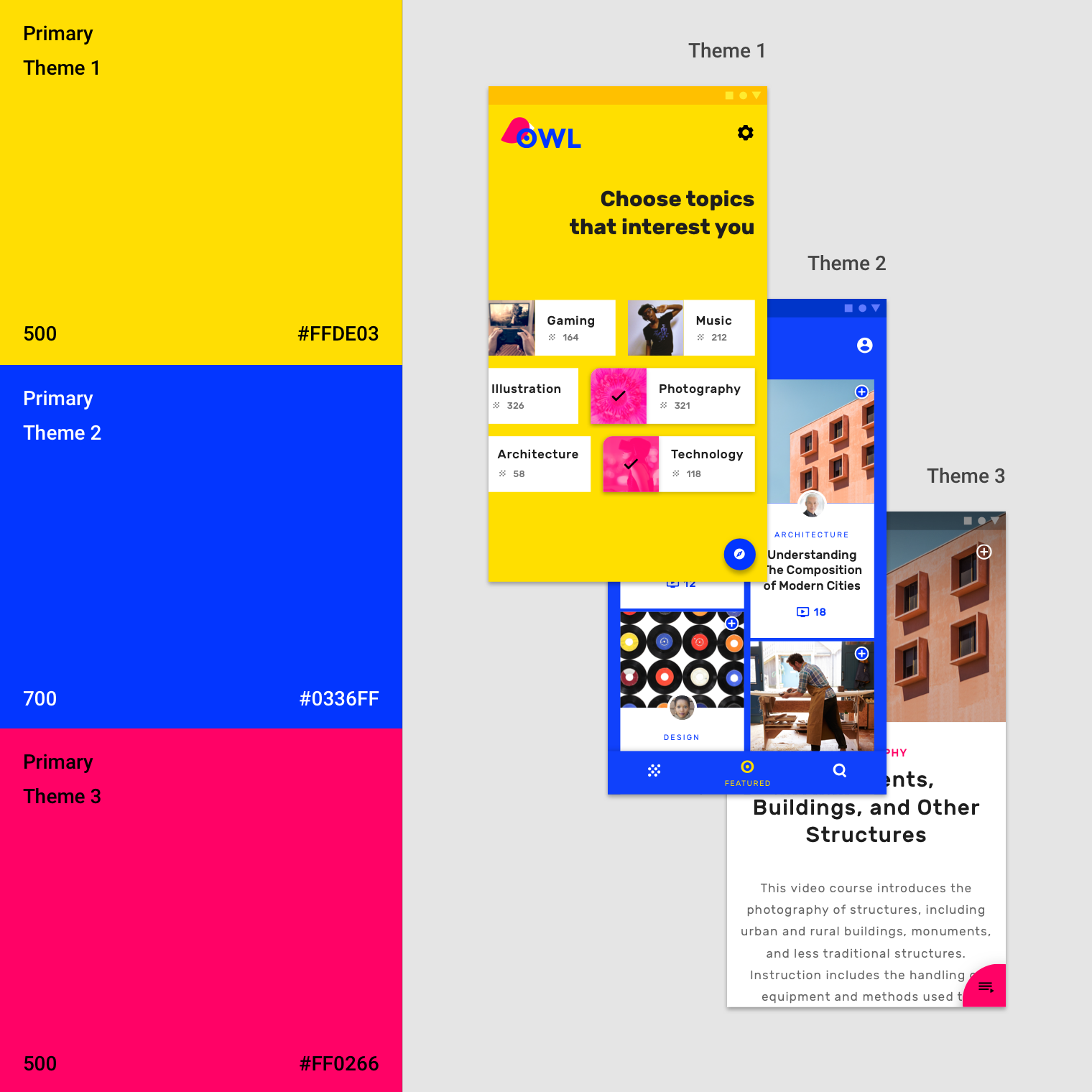
样例中有三种主色。应用程序的不同模块使用了不同的主题,使用户可以随时能够知道自己在应用中的位置。
This app has three primary colors. Distinct themes are used in different parts of the app, allowing users to better locate themselves within it.
主题一
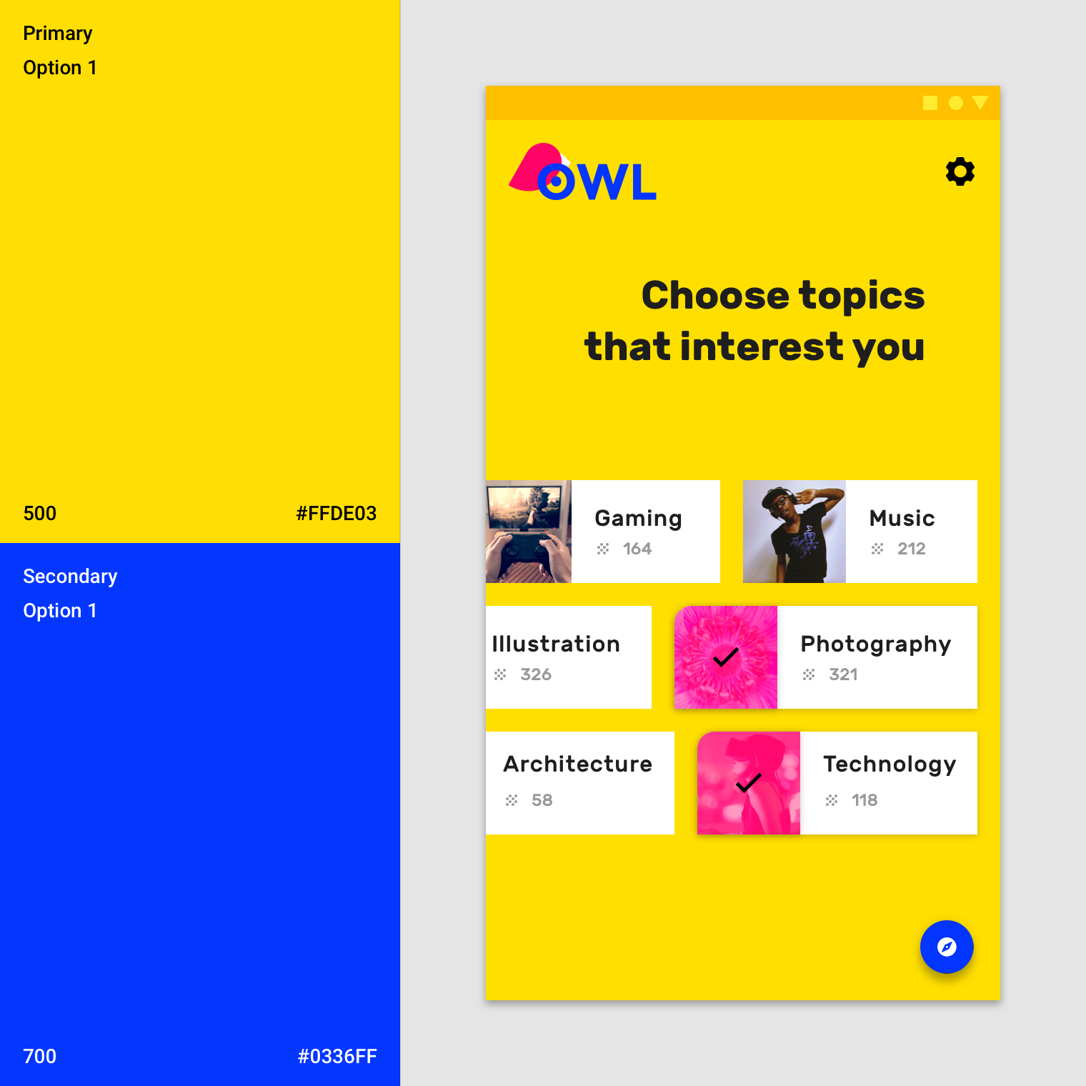
诸如起始页、兴趣选择 等区域选用 黄色 作为主色。
Yellow is used as the primary color for areas such as onboarding and choosing content of interest.
主题二
与用户个人帐户相关的区域选用 蓝色 作为主色,例如选定的元素。
Blue is used as the primary color for areas of the app that relate to the user’s personal account, such as selected courses.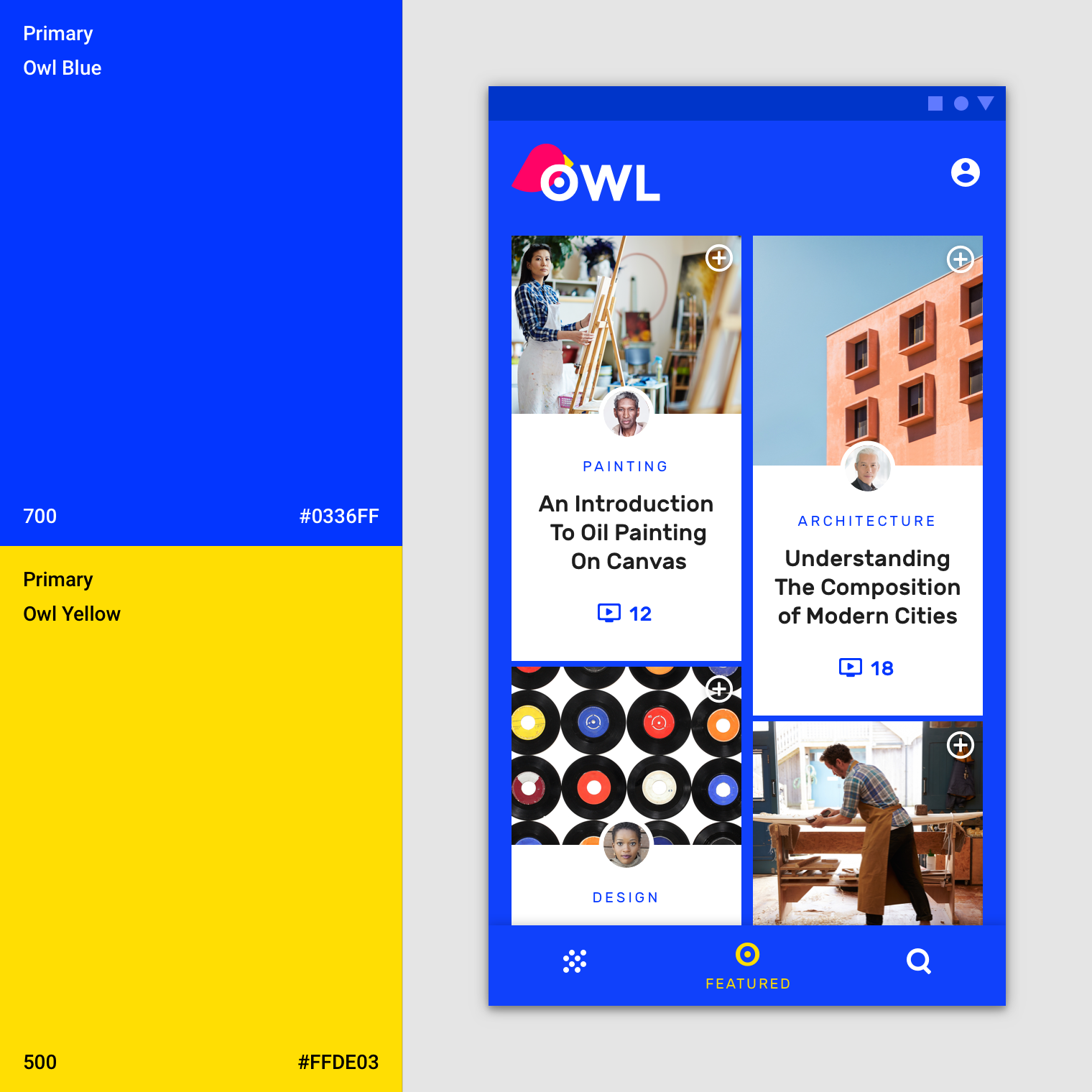
主题三
内容页选用 粉色 作为主色。
Pink is used as the primary color for courses.
数据可视化中的附加色
必要的时候应用可以使用颜色主题以外的颜色。
Apps can use additional colors to convey categories that are outside of your main color theme. They are still a part of your full color palette.
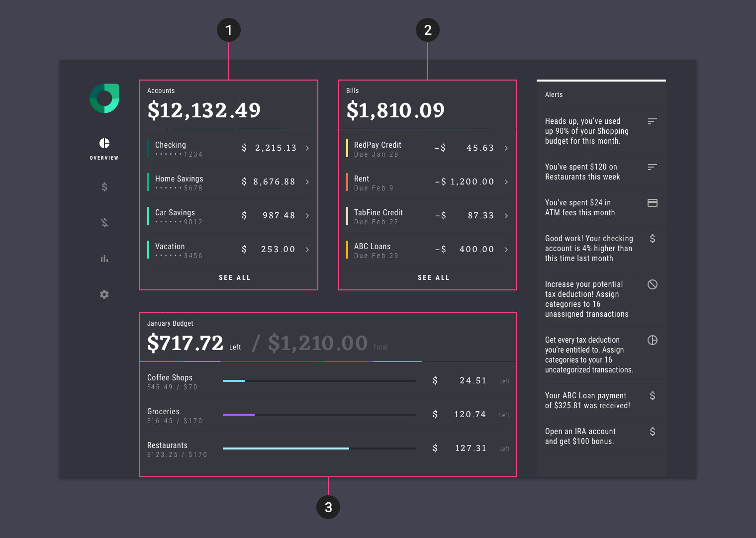
此应用程序的颜色主题具有五种附加色。当在同一页面上显示多个可视化数据时,会使用以下几种颜色:
- 帐户部分使用绿色
- 票据部分使用橙色和黄色
- 预算部分使用紫色和蓝色
This app has a color theme with five additional colors, which it uses when multiple data visualizations are shown on the same page.
- The Accounts section uses green
2. The Bills section uses orange and yellow
3. The Budget section uses purple and blue
(Scaled down to 50%)
配色工具
Material 调色板生成器
调色板生成器可以根据用户输入的颜色生成相应的调色板。根据算法调整色调,色度和亮度,创造出既实用又美观的调色板。
The Material palette generator can be used to generate a palette for any color you input. Hue, chroma, and lightness are adjusted by an algorithm that creates palettes that are usable and aesthetically pleasing.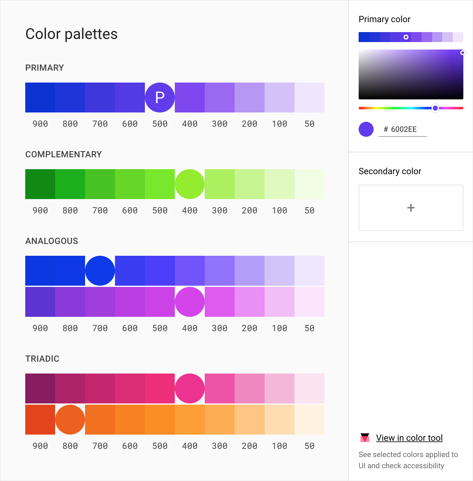
工具地址:https://material.io/resources/color/#!/?view.left=0&view.right=0&primary.color=6002ee
输入颜色
用户能够根据自己的需求(所需的调色板是否与主色相关,相辅相成或相反)输入主色后能够生成相应调色板。同时,该工具可以为任何主要和辅助颜色生成扩展调色板。
Color palettes can be generated based on the primary input color, and whether the desired palette should be analogous, complementary, or triadic in relation to the primary color.
Alternatively, the tool can generate expanded palettes, based on any primary and secondary color.
颜色变体的易读性
这些调色板通过提供明暗变体,确保颜色主题符合无障碍标准。
These palettes provide additional ways to use your primary and secondary colors. They include lighter and darker options to separate surfaces and provide colors that meet accessibility standards.
2014 “Material Design” 调色板
这些调色板最初由Material Design于2014年创建。应用程序即使没有自己的品牌色,使用这些调色板也能够保证其拥有统一的颜色主题。
要生成具有品牌特色的调色板,请使用 调色板生成工具 或 “Material” 主题编辑器。
These color palettes, originally created by Material Design in 2014, are comprised of colors designed to work together harmoniously, and can be used to develop your brand palette.
To generate your own harmonious palettes, use the palette generation tool.

若有收获,就点个赞吧
0 人点赞
