Bottom sheets are surfaces containing supplementary content that are anchored to the bottom of the screen.
Usage
Bottom sheets are supplementary surfaces primarily used on mobile. There are three types suitable for different use cases:
- Standard bottom sheets display content that complements the screen’s primary content. They remain visible while users interact with the primary content.
- Modal bottom sheets are an alternative to inline menus or simple dialogs on mobile and provide room for additional items, longer descriptions, and iconography. They must be dismissed in order to interact with the underlying content.
- Expanding bottom sheets provide a small, collapsed surface that can be expanded by the user to access a key feature or task. They offer the persistent access of a standard sheet with the space and focus of a modal sheet.
Standard bottom sheet
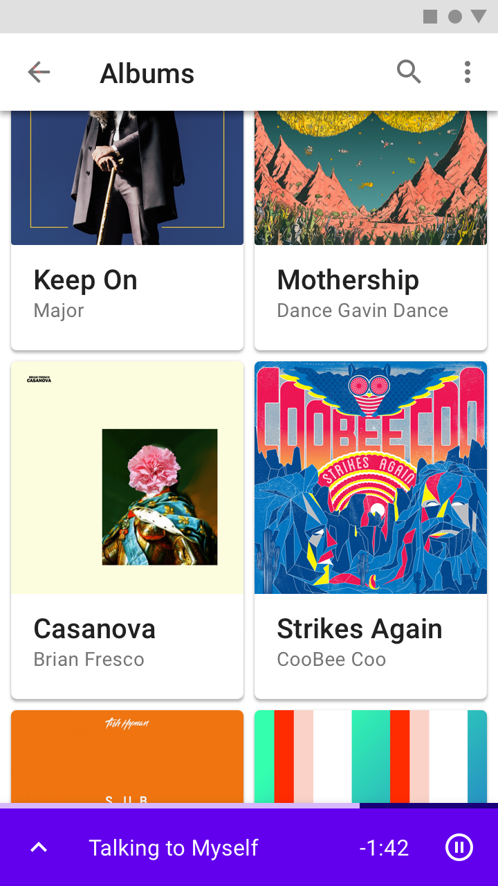
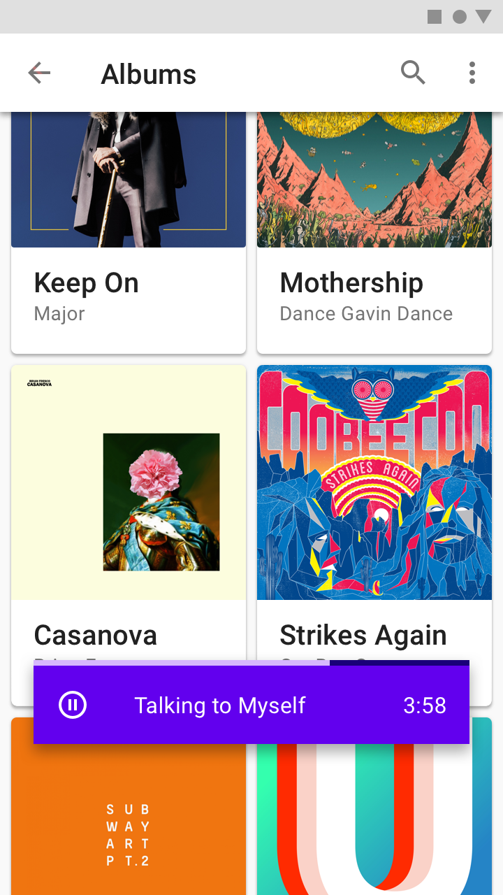
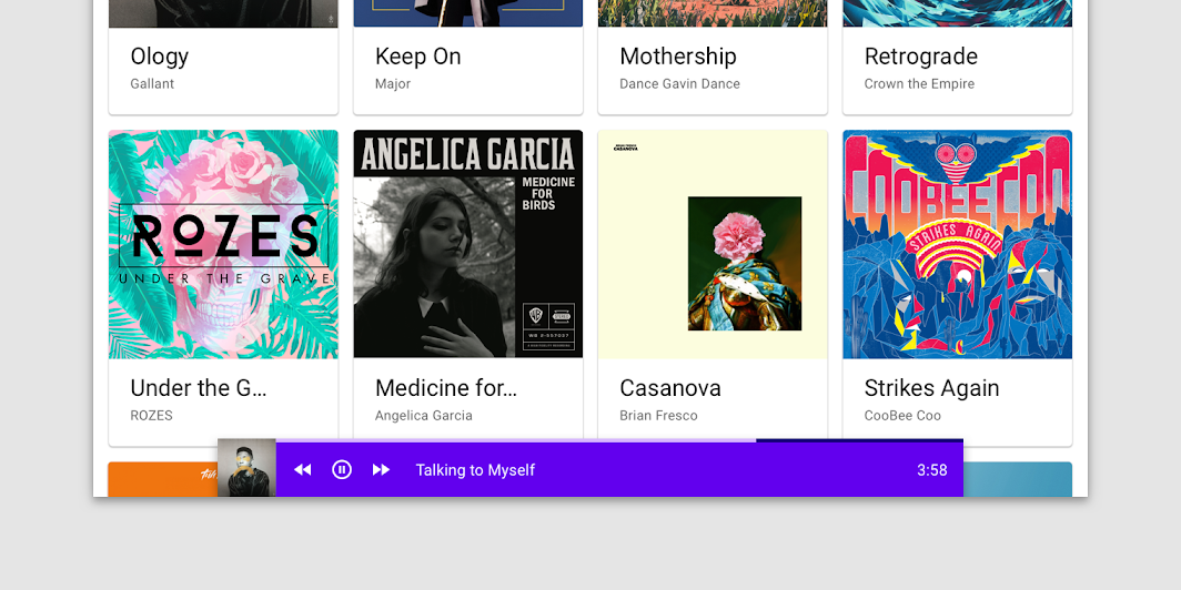
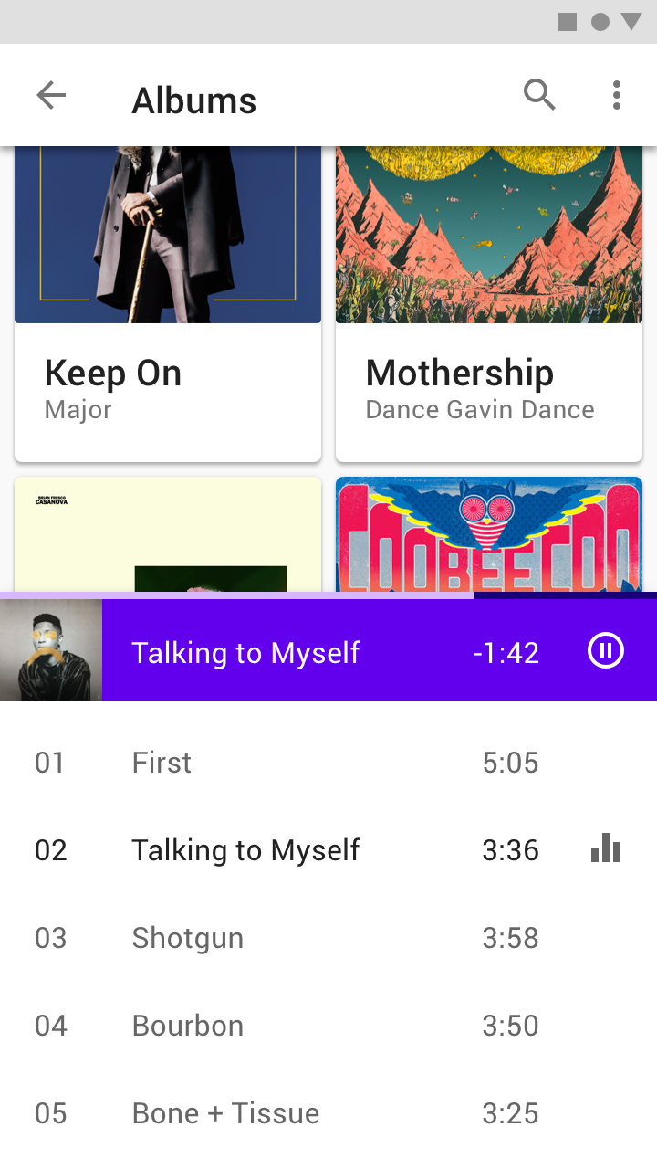
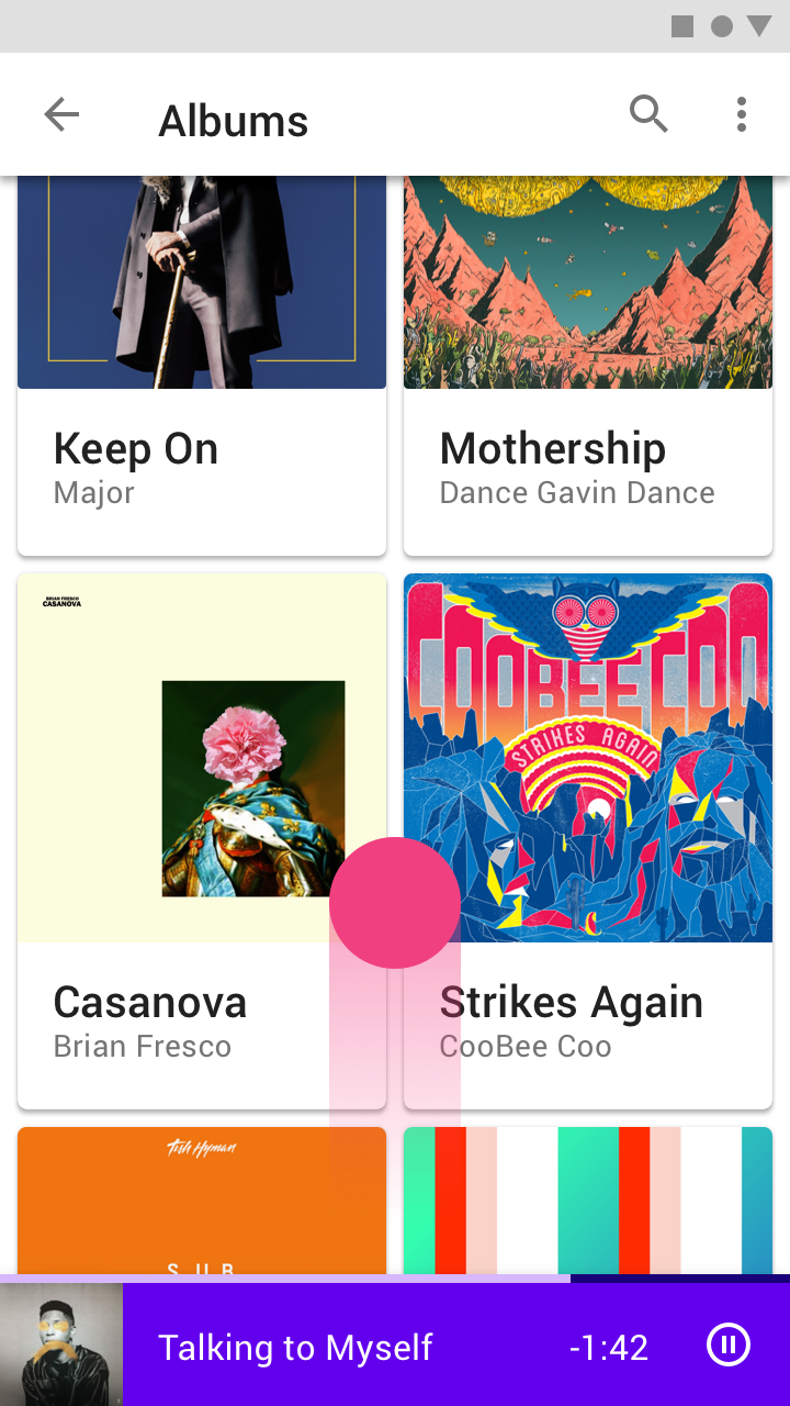
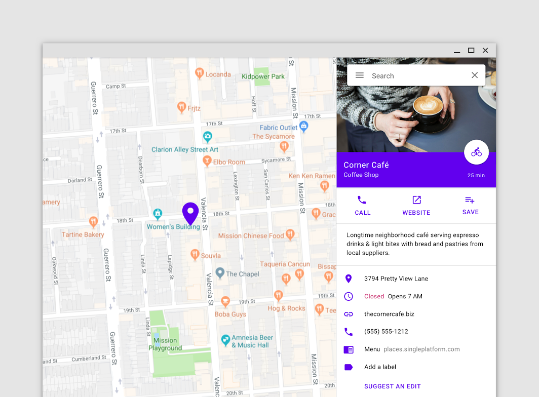
A user can view and interact with a standard bottom sheet and the rest of the screen, useful for multi-tasking. The music player in this standard bottom sheet allows users to control their music while browsing albums.
Modal bottom sheet
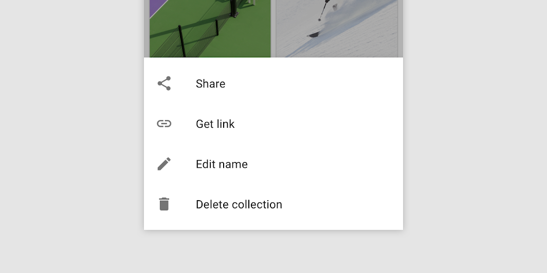
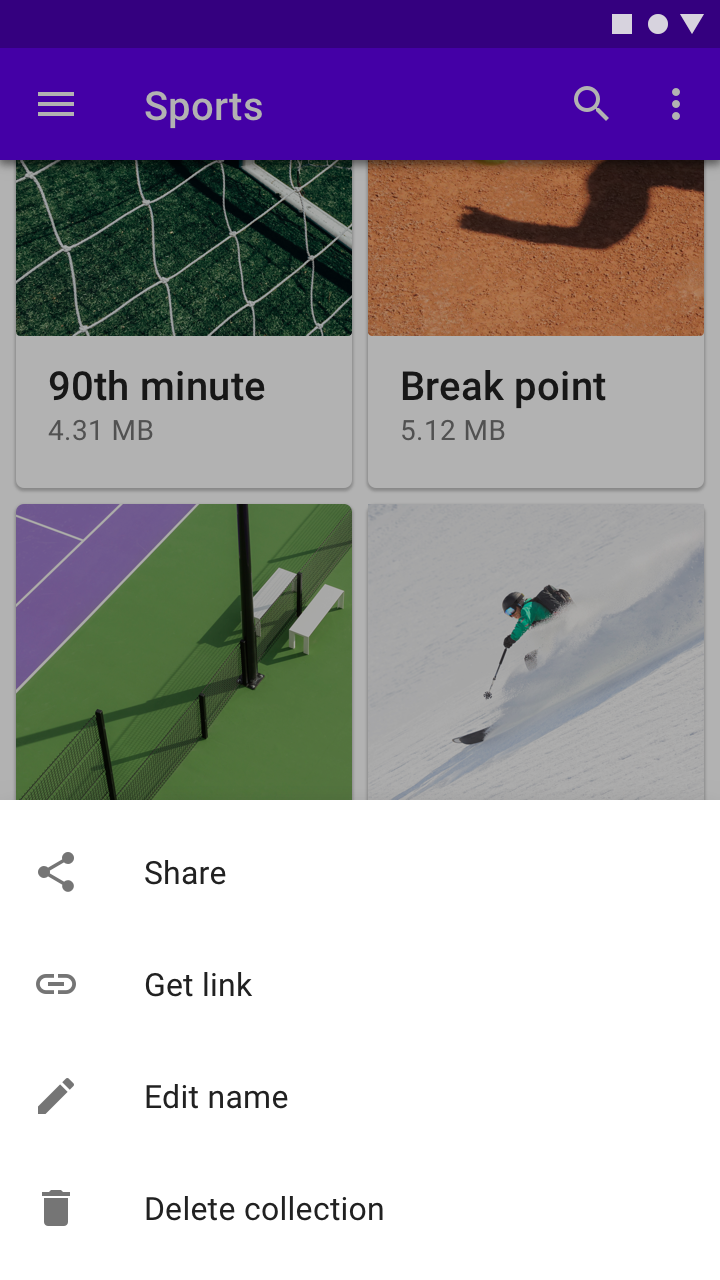
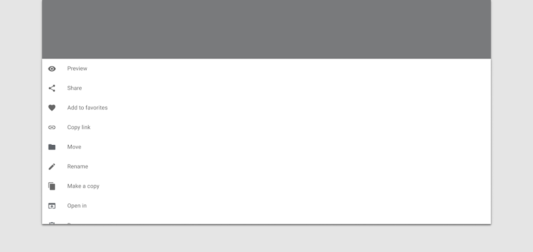
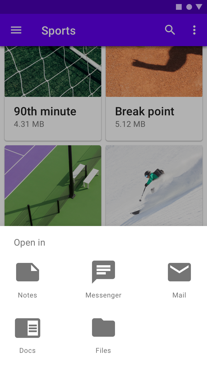
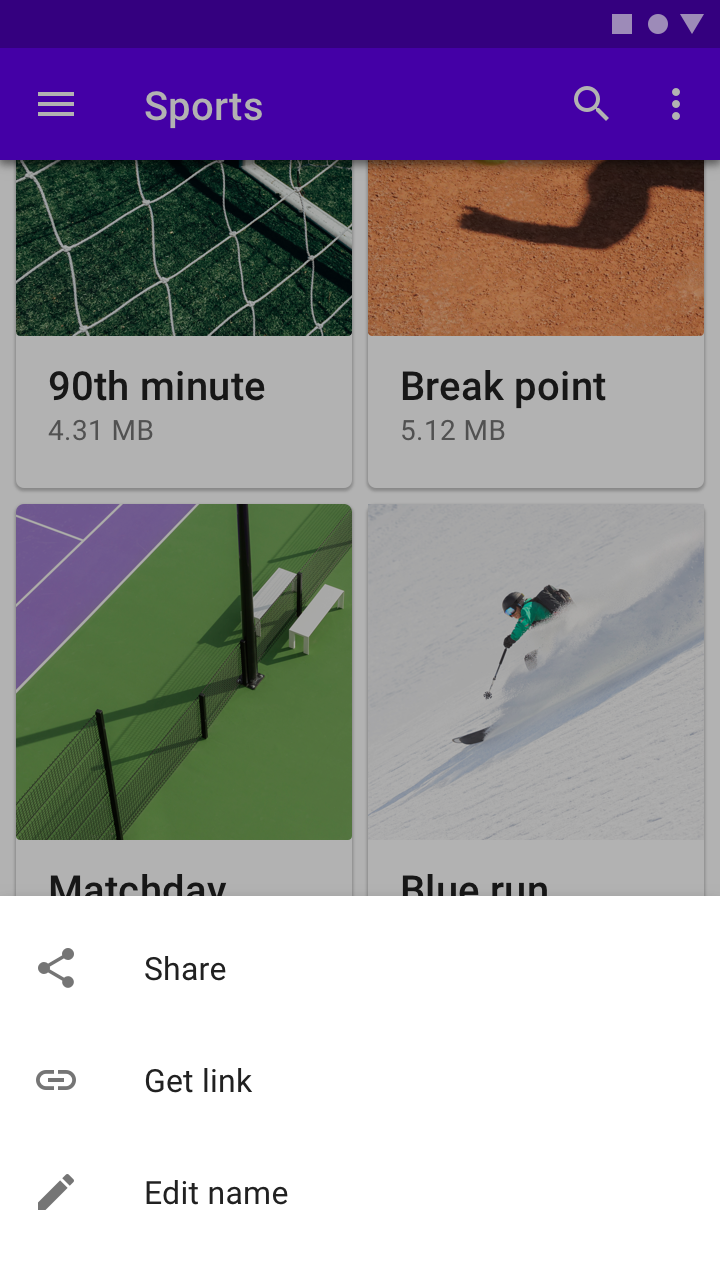
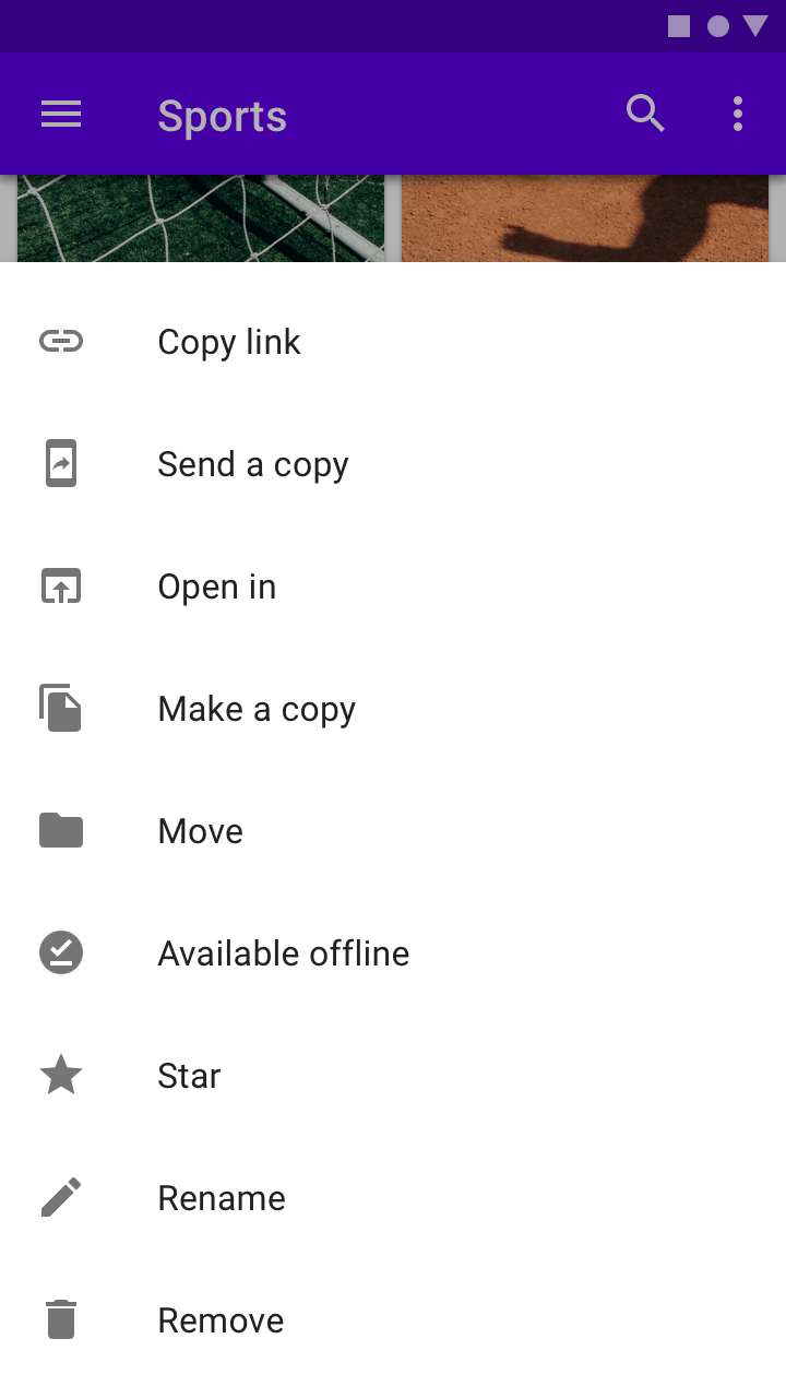
A user must interact with or dismiss a modal bottom sheet. Their blocking behavior make them suitable for menus, such as in this files app, to help users focus on their available choices.
Expanding bottom sheet
A user can tap an expanding bottom sheet when needed to access its full contents. The collapsed state can be used an indicator of the feature’s current status, such as the number of selected items or unread messages.
设计原则
Supporting
Bottom sheets contain content that supplements the screen’s primary UI region.
Flexible
Bottom sheets can display a wide variety of content and layouts.
Ergonomic
Bottom sheets are easy to reach on a mobile device.
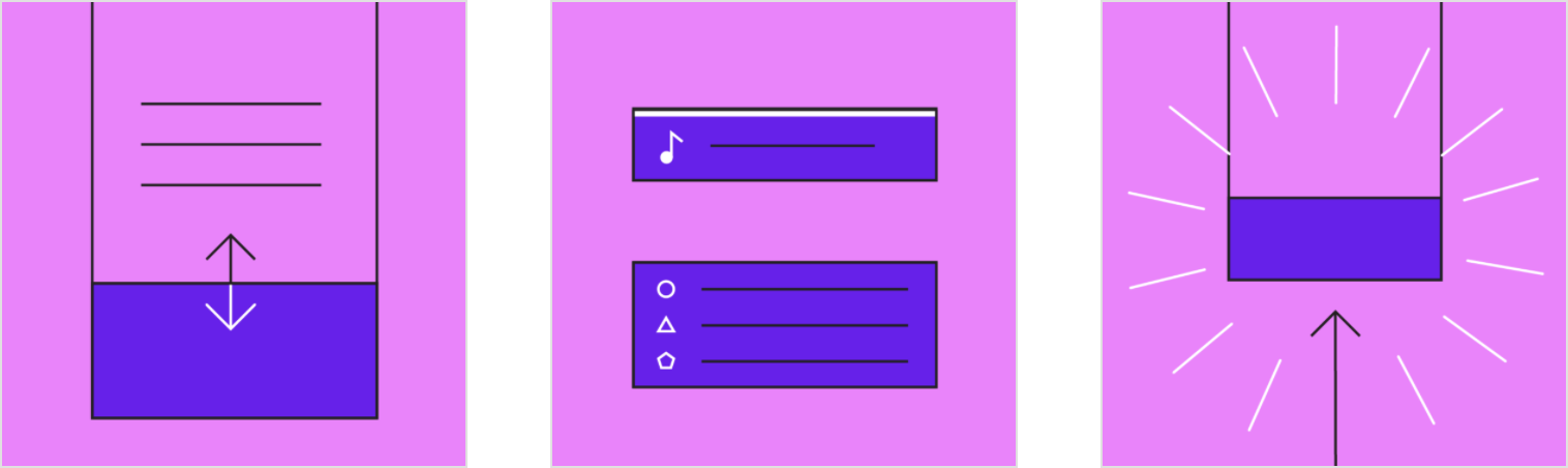
Anatomy
1.Sheet
2.Contents
3.Scrim (Modal only)
Sheet
Bottom sheets are anchored to the bottom edge of the screen and appear in front of other UI elements. Standard and modal bottom sheets are full-width on mobile and can be inset or full-width on tablet or desktop.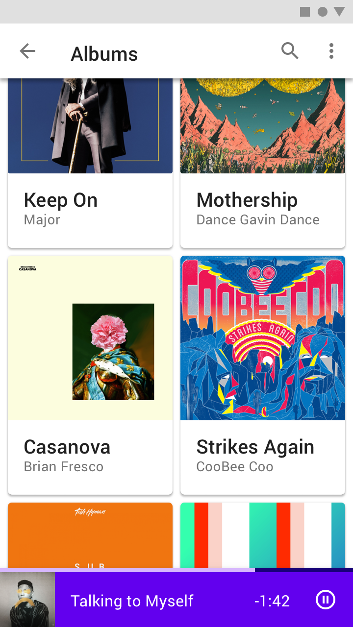

Do
A bottom sheet is anchored to the bottom edge of the screen.

Don’t
Don’t inset all sides of a bottom sheet from screen edges. This can make it hard to see and allow it to be confused for other components, such as snackbars.
Standard bottom sheet inset on desktop
Contents
Bottom sheets can display a wide variety of content and layouts, ranging from menu items (in list and grid layouts), to supplemental content laid out according to the layout grid.
Content from a bottom sheet that initially appears below the screen edge can become visible when the sheet is dragged into view.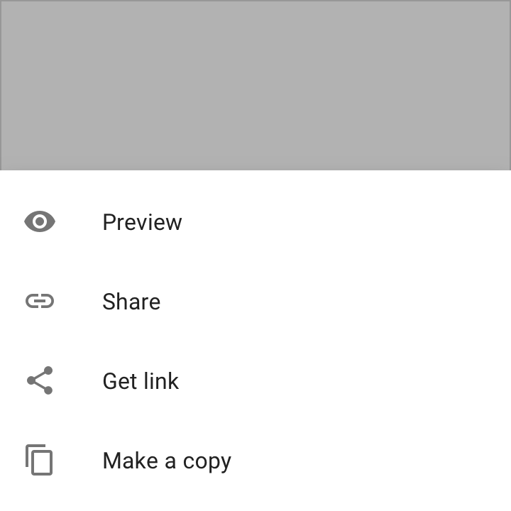
Menu of actions (in a list) inside a modal bottom sheet
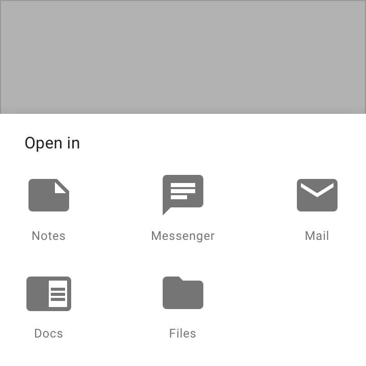
Menu of apps (in a grid layout) inside a modal bottom sheet
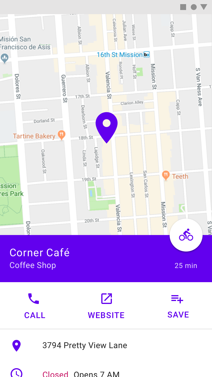
The location information in this standard bottom sheet initially extends below the screen edge. It can be dragged into view.
This music player has been made fully visible to reveal a track list beneath the player.
Behavior
Visibility
Initial appearance
When bottom sheets initially appear on screen, they may contain content that extends below the bottom of the screen. They can be swiped or dragged up to become full-screen. Depending on the content, bottom sheets can also become full-screen by tapping on their surface or an expand icon.
Full-screen
When full-screen, bottom sheets can be internally scrolled to reveal additional content. A toolbar should be used to provide a collapse or close affordance to exit this view.


Do
Partially visible bottom sheets can be dragged to full-screen view and scroll internally.

Do
Include a close affordance in a full-height modal bottom sheet to dismiss the sheet.
Scaling and adaptation
On mobile devices, bottom sheets extend across the width of a screen and are elevated above the primary content. Bottom sheets should scale to fit larger screens in one of three ways:
- Setting a maximum width
- Switching to a floating sheet
- Switching to a side sheet to reduce the amount of space occupied on larger screens.

Don’t
Don’t use full-width bottom sheets in large screen layouts.
On large screens, bottom sheets that contain a set of actions can become a context menu to preserve the intent and context of the primary content.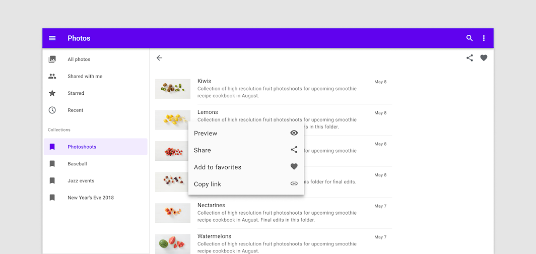

Do
When adapting for larger screens, a bottom sheet can become a context menu.

Do
Swap the bottom sheet for a side sheet in landscape layouts.
Standard bottom sheet
Usage
Standard bottom sheets co-exist with the screen’s main UI region and allow for simultaneously viewing and interacting with both regions. They are commonly used to keep a feature or secondary content visible on screen when content in main UI region is frequently scrolled or panned.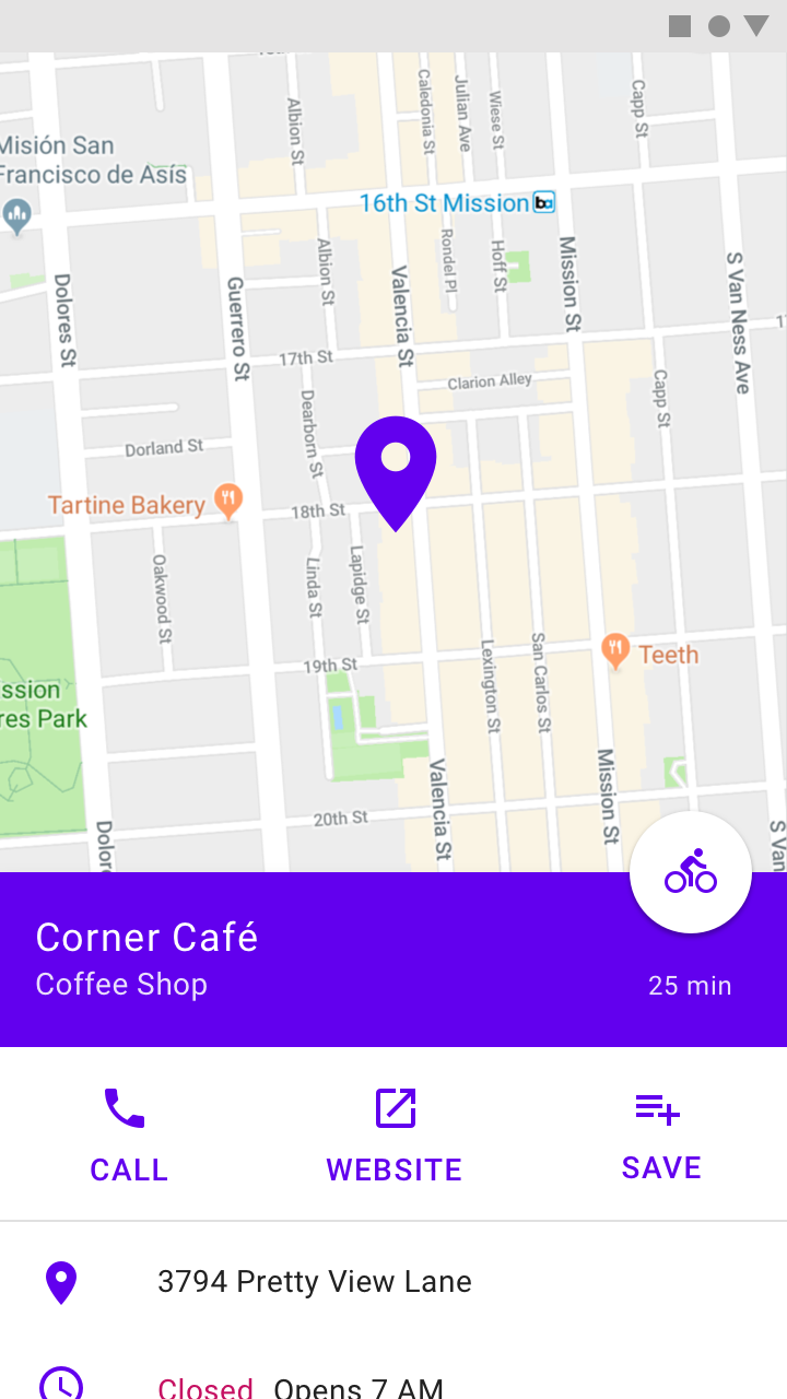

Do
Standard bottom sheets can contain supplementary content that continues below the screen, such as location information over a map.


Do
Use a standard bottom sheet to persist an important feature such as media controls in a music app.
Behavior
Interaction
Standard bottom sheets remain on-screen when a user interacts with the main UI region or the sheet itself. They have a default elevation of 8dp, which allows content in the main UI region behind to scroll or pan and for the sheet to temporarily cover the main UI region when made full-screen. At full-screen height, they should contain a collapse icon in an app bar to return to their initial position.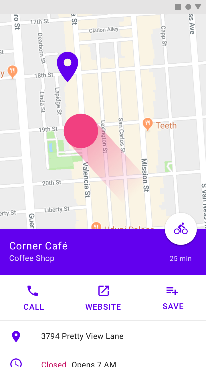

Do
Standard bottom sheets are elevated above the main UI region so their visibility is not affected by panning or scrolling.

Do
This music player in a standard bottom sheet remains on-screen as the user browses available music.
Placement
The contents of standard bottom sheets on mobile can be moved into side sheets on larger screen sizes given the additional horizontal space.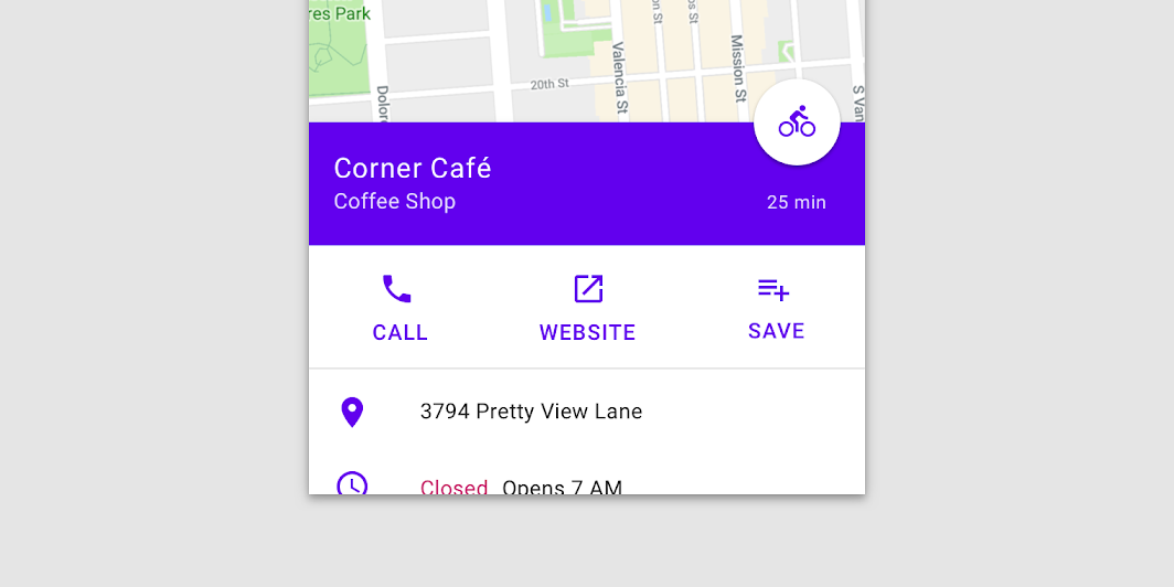
On mobile, the location information for this map is displayed in a standard bottom sheet due to limited screen width.
On desktop, the location information for this map is displayed in side sheet because screen widths are larger than screen heights.
Modal bottom sheet
Usage
Modal bottom sheets present a set of choices while blocking interaction with the rest of the screen. They are an alternative to inline menus and simple dialogs on mobile, providing additional room for content, iconography, and actions.
Modal bottom sheets are used in mobile apps only.


Do
Modal bottom sheets can be used instead of menus to present additional screen actions.

Do
Use a modal bottom sheet to provide deep links to another app.
Behavior
Elevation and scrim
Modal bottom sheets have a default elevation of 16dp. This elevation allows them to appear over most UI elements and allows them to be pulled up in front of the entire UI to display more options.
A modal bottom sheet causes all content and UI elements behind it to display a scrim, which indicates that they will not respond to user interaction. Tapping the scrim dismisses both the modal bottom sheet and scrim from view.

Do
Use a visible scrim with modal bottom sheets to inform users they cannot interact with the rest of the screen.

Don’t
Don’t use an invisible scrim for modal bottom sheets. This can mislead users about their ability to interact with the rest of the screen.
Visibility
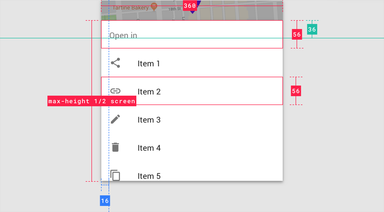
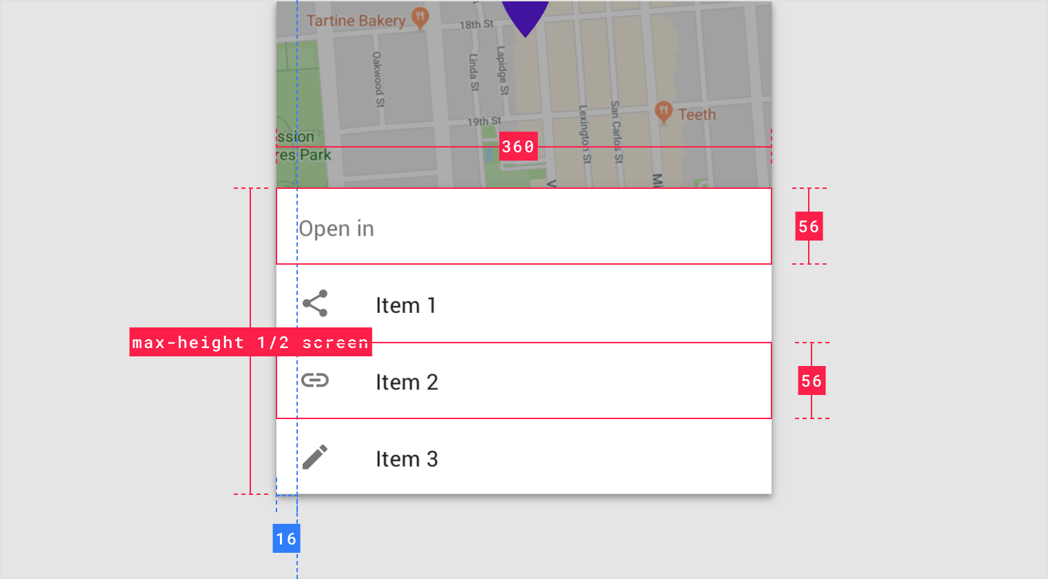
To provide initial access to its top actions, the initial vertical position of modal bottom sheets is capped at 50% of the screen height.
Modal bottom sheets whose contents exceed 50% of the screen height can then be pulled across the full screen, scrolling internally to access their remaining items.
| Sheet height | Visibility and behavior |
|---|---|
| Under 50% of screen height | Visible at full height |
| 50 to 100% of screen height | Partially visibility at 50% of screen height. On scroll or surface tap, reveal full sheet. |
| Greater than or equal to 100% of screen height | Partially visible at 50% of screen height. On scroll or container tap, move to top of screen and scroll contents internally. Add internal action to close. |

Do
Modal bottom sheets with few items are fully visible upon opening.

Don’t
Don’t make tall bottom sheets full-screen upon opening. This places the top content immediately out of reach for users on mobile devices.
Control
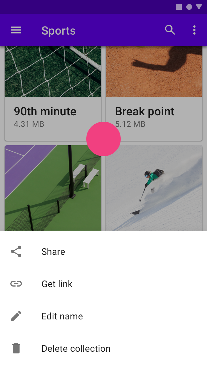
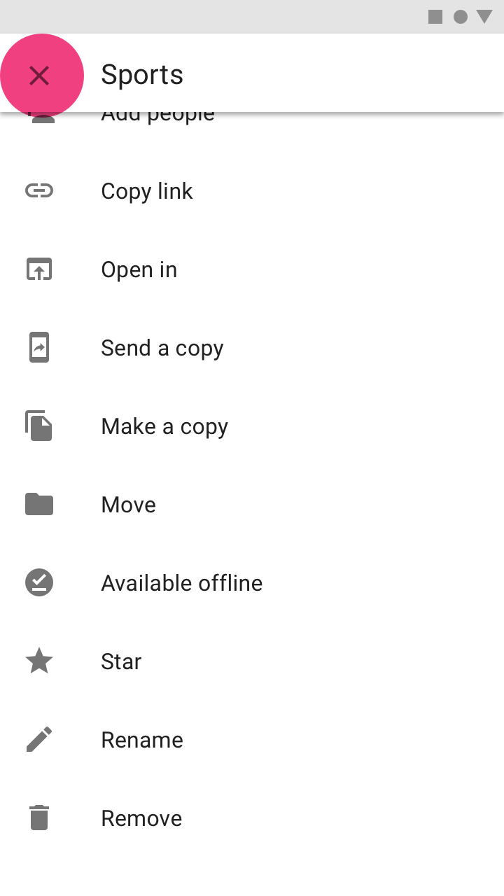
Modal bottom sheets appear when triggered by a user action, such as tapping a button or an overflow icon. They can be dismissed by:
- Tapping a menu item or action within the bottom sheet
- Tapping the scrim
- Swiping the sheet down
- Using a close affordance within the bottom sheet’s top app bar, if available

Do
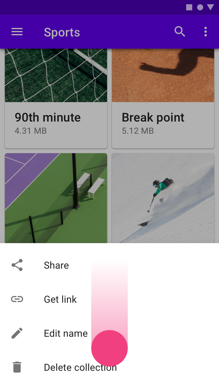
Tapping the scrim dismisses a modal bottom sheet.

Do
A modal bottom sheet can be dismissed by swiping the sheet down.

Do
Display a close affordance in a full-screen modal bottom sheet.
Placement
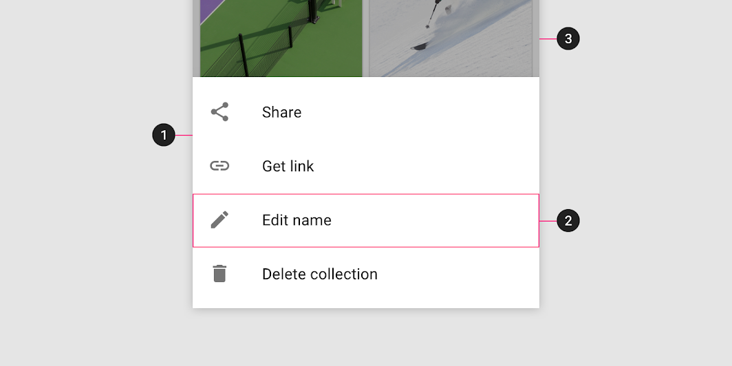
Modal bottom sheets are most effective on small screens.
On larger screens, use menus or dialogs to create clear visual connections to the triggering UI element.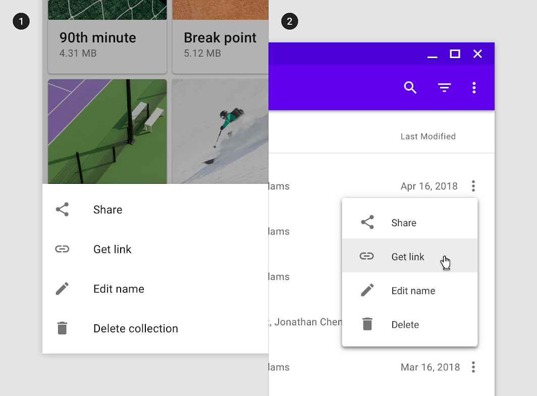
An overflow menu using a bottom sheet on mobile (1) and an inline menu on desktop (2).
Expanding bottom sheet
Usage
An expanding bottom sheet is a surface anchored to the bottom of the screen that users can expand to access a feature or task. It can be used for:
- Persistently displaying a cross-app feature, such as a shopping cart
- Collecting and acting on user selections from a set of items, such as photos in a gallery
- Supporting tasks, such as chat and comments
- Indirect navigation between items, such as videos in a playlist
Expanding bottom sheets are recommended for use on mobile and tablet.

Do
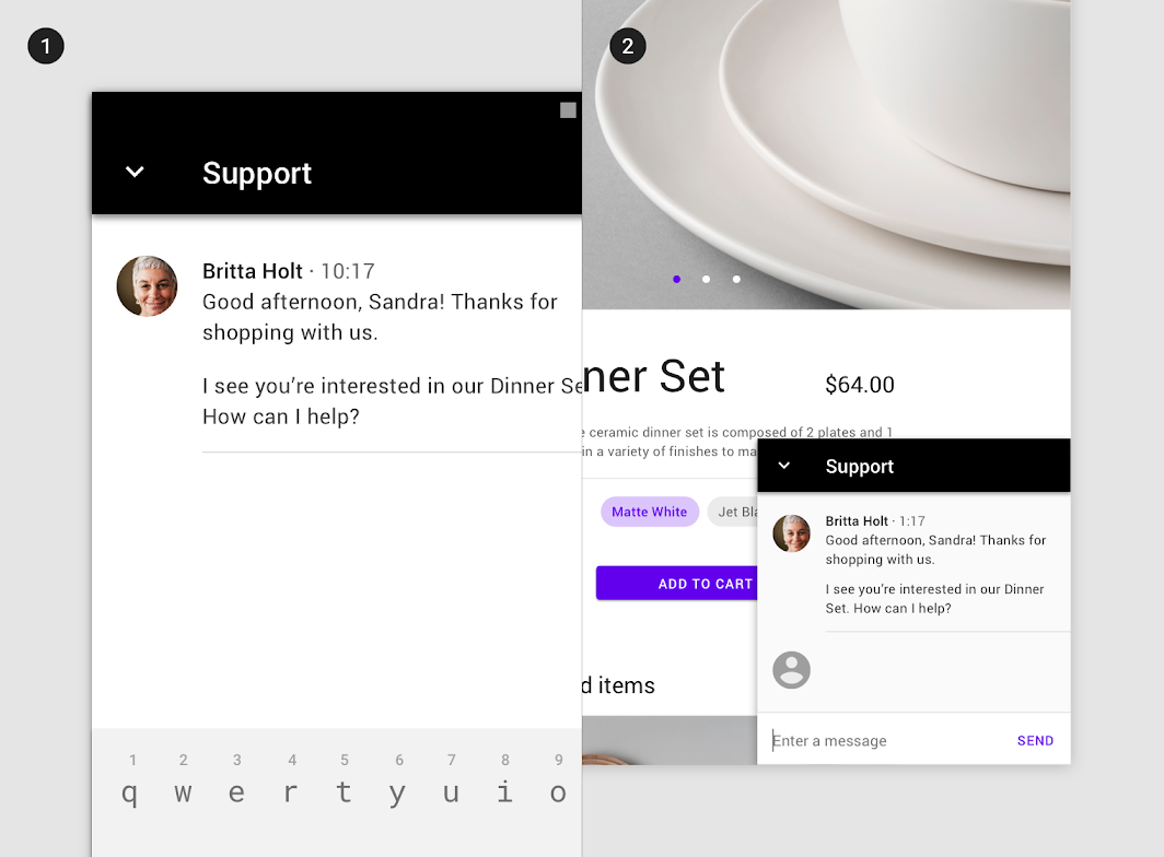
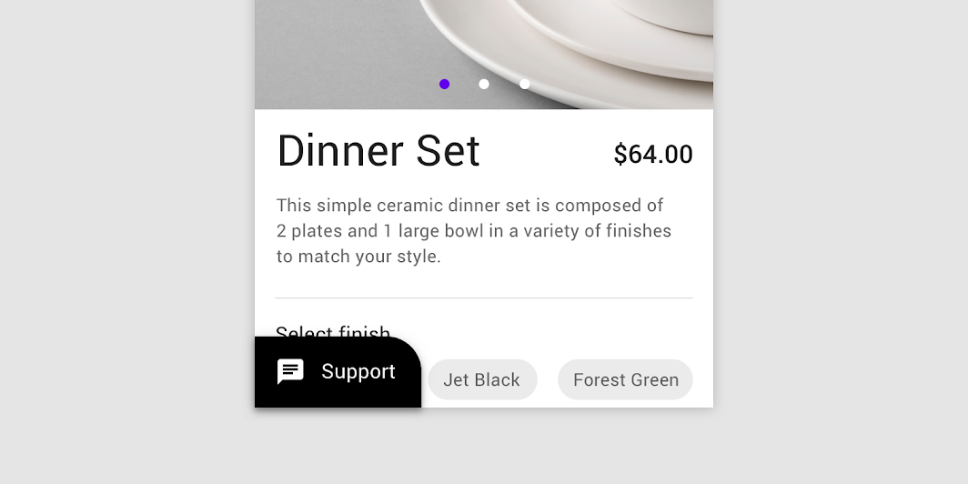
Place supporting features, such as chat, in an expanding bottom sheet. In this example, an expanding bottom sheet allows users to switch between viewing a product and contacting customer service.

Do
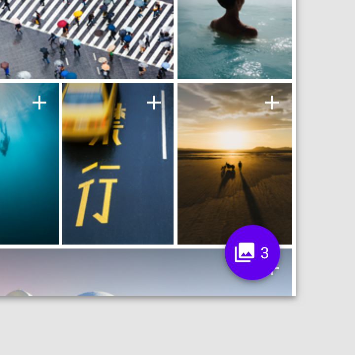
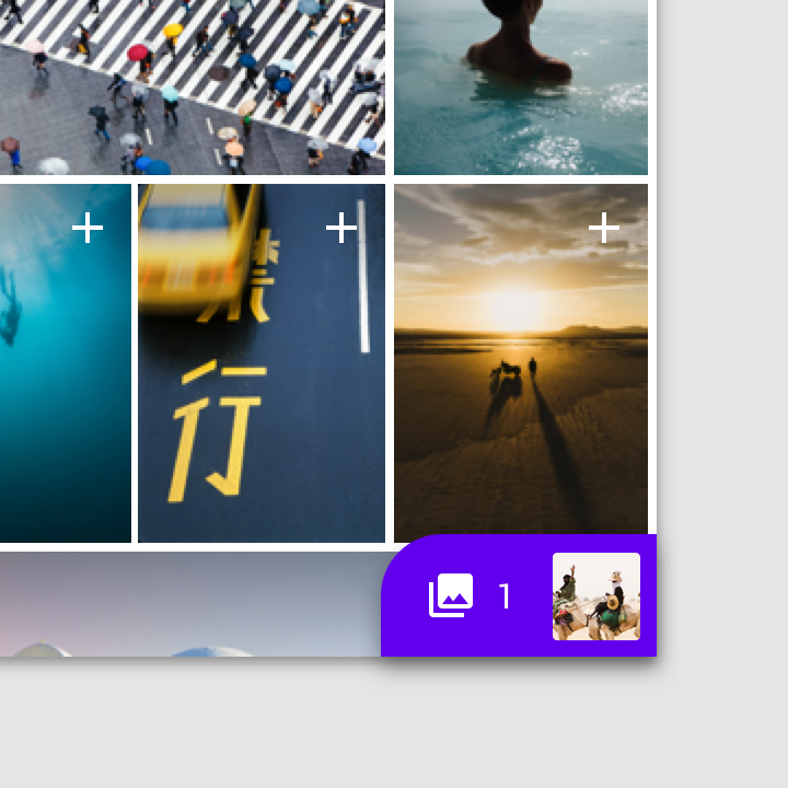
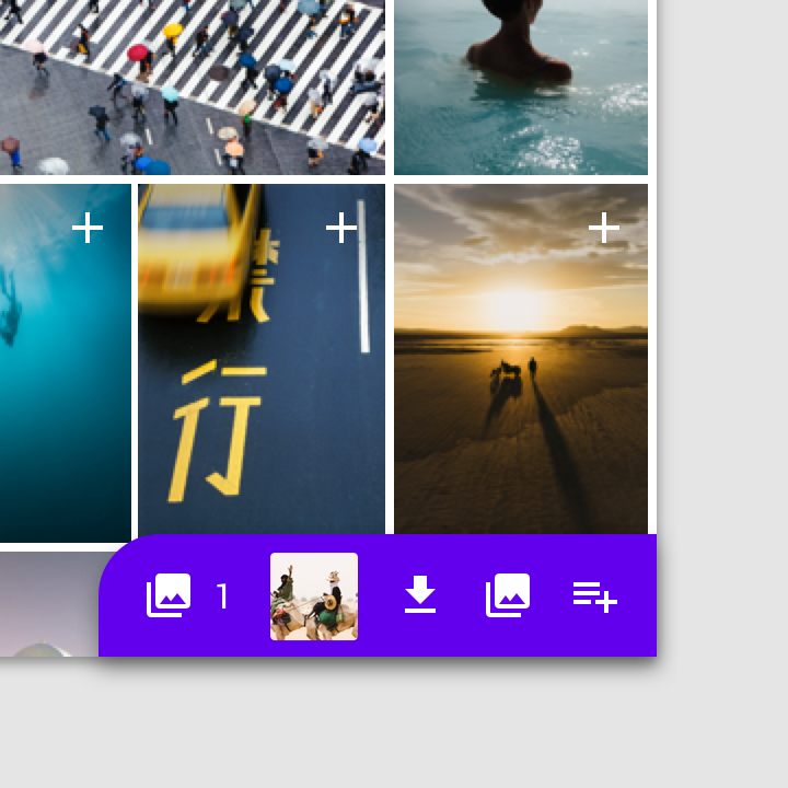
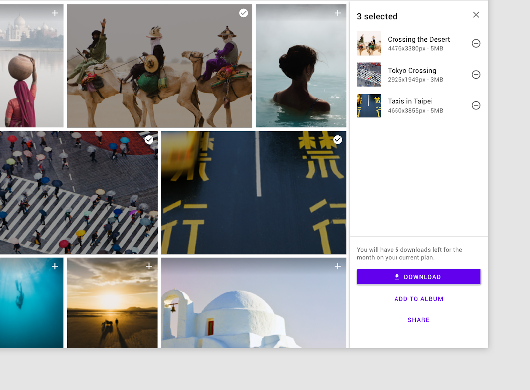
Use an expanding bottom sheet for advanced item selection. In this photos app, the expanded sheet allows users to review and take action on selected images.
Expanding bottom sheets and floating action buttons shouldn’t be used for the same purposes.
- Floating action buttons are used for actions only, and they don’t respond to a user’s interaction with the rest of the screen. They can transform into larger surfaces to allow a user to complete an action.
- Expanding bottom sheets transform into larger surfaces and can update their content to reflect user interactions.


Do
Use an expanding bottom sheet to give access to a feature. It can also display updates on the status of that feature.

Don’t
Don’t use a floating action button in place of an expanding bottom sheet. Floating action buttons are meant for actions only.
Anatomy
Expanding bottom sheets are anchored to the bottom corner of the screen. They have two states: a small, collapsed state and a larger, expanded state.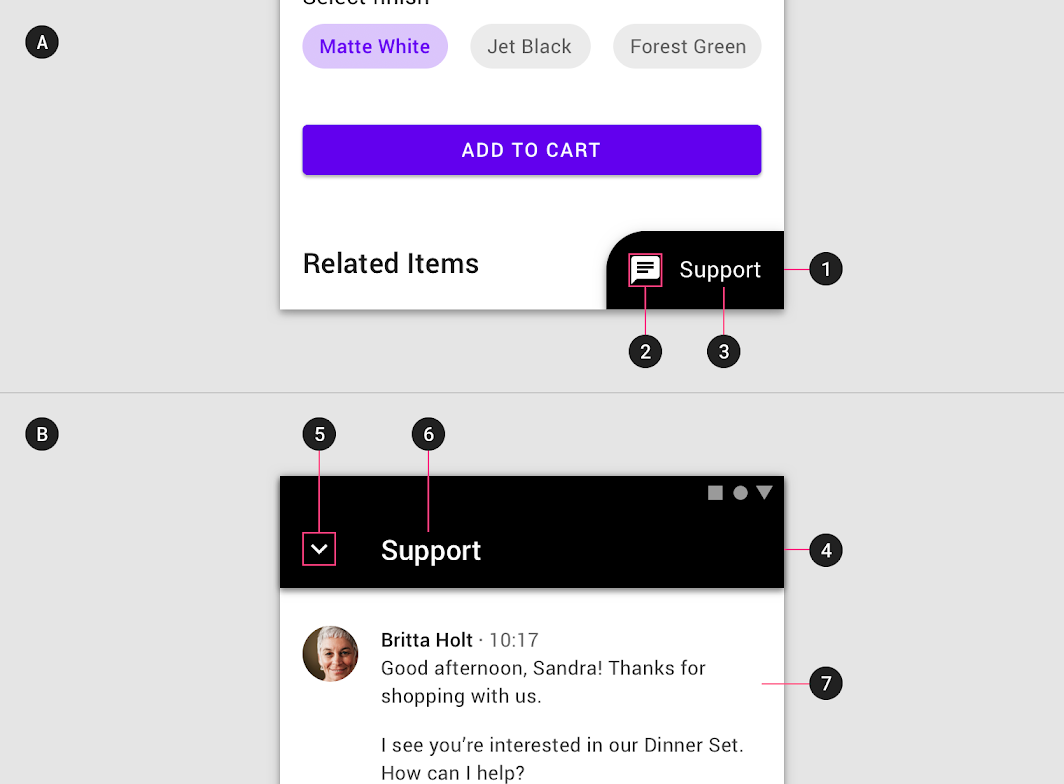
Collapsed state
1.Container
2.Icon
3.Label (Optional)
Expanded state
4.Header
5.Close action
6.Label
7.Content
Collapsed
When collapsed, an expanding bottom sheet is intended to be small and informative.
- It can use shape and color to express that it is interactive.
- An icon is required at minimum, and larger screen sizes should also include a short text label.
- To avoid blocking content, the width shouldn’t exceed half the screen.

Do
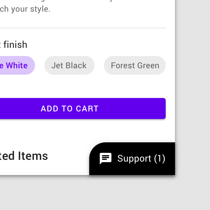
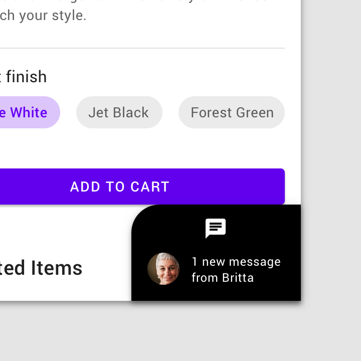
Use a short label in the collapsed state of an expanding bottom sheet to explain the feature or track updates, such as the number of unread messages.

Don’t
Don’t increase the height or width of a collapsed expanding bottom sheet by stacking elements, wrapping text, or using long labels.
Expanded
When expanded, an expanding bottom sheet is full-screen on mobile (1), but can be smaller on tablet and desktop based on its content (2).
- It contains a fixed header with a title and an affordance to collapse the sheet.
This bottom sheet covers the full screen on mobile (1). On tablet, it’s shorter to keep the main content visible (2) (Tablet example scaled to 62.5%.)
Behavior
Expanding bottom sheets can be expanded and collapsed.
Controls
Expanding bottom sheets can be expanded and collapsed.
- When collapsed, the entire container is interactive, and tapping it expands the sheet.
- Once expanded, the sheet displays an app bar with an action icon that enables collapsing the sheet. In addition, it can display a contextual action in the sheet that completes a task, such as “Checkout”, “Submit”, or “Download” buttons.

Do
A collapsed bottom sheet expands the sheet when tapped.

Don’t
Don’t add additional actions to a collapsed bottom sheet. Those actions should only appear when the sheet is expanded, in the expanded area.
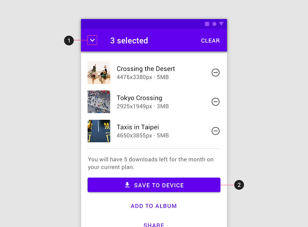
Expanded bottom sheets must contain a dedicated affordance to collapse, such as an action icon (1). They can also be dismissed by an embedded action that completes the sheet’s task, such as the “Save” button in this image selection screen (2).
Placement
Expanding bottom sheets are fixed to the bottom, trailing corner of the screen to minimize obstructing the screen’s main content.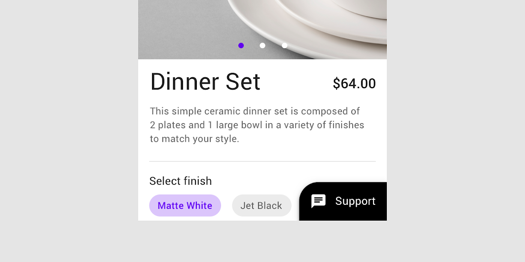

Do
Place expanding bottom sheets along the trailing edge of the screen. In this layout, the page’s headings can be read without interruption.

Don’t
Don’t place expanding bottom sheets along the leading edge of the screen. In this layout, the placement of the collapsed sheet obstructs headings and actions.
Mobile
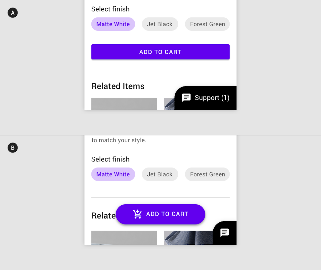
On mobile devices, an expanding bottom sheet affects other bottom-aligned components. It could obstruct important features such as bottom navigation, or create confusion when placed next to a floating action button.
The following recommendations suggest when and how to pair an expanding bottom sheet with nearby components:
| Component | Pair with an expanding bottom sheet? | Recommendation |
|---|---|---|
| Bottom navigation | Caution | Place a collapsed sheet above bottom navigation. Hide bottom navigation on scroll and when a sheet expands. |
| Bottom app bar | No | A bottom app bar would obstruct a collapsed sheet. |
| Floating action button: Regular | No | Collapsed sheets have similar size and placement as floating action buttons, which may confuse users about the usage of each. |
| Floating action button: Extended | Caution | An extended floating action button can be used if center-aligned, so it doesn’t overlap with a collapsed sheet. The button width and collapsed sheet should both be short and styled differently from one other. |
| On-screen keyboard | Yes | When the keyboard appears, it covers the sheet. When the sheet is collapsed, it doesn’t attach to the keyboard. |
| Snackbar | Yes | To avoid overlap, place a snackbar above a collapsed sheet. |

Caution
An expanding bottom sheet can be paired with other bottom-aligned components if done carefully. Example A shows a bottom sheet displaying both a label and message, as there is sufficient room to do so. Example B has a prominent extended floating action button instead, giving the sheet room to display only an icon.
Tablet and desktop
On larger screens, expanding bottom sheets don’t need to expand to the screen’s height or width. At a smaller size, expanding bottom sheets enable multi-tasking and other uses of screen space.
As their placement at the bottom of the screen may make them less noticeable, their content can be placed in a side sheet or accessed from a top app bar.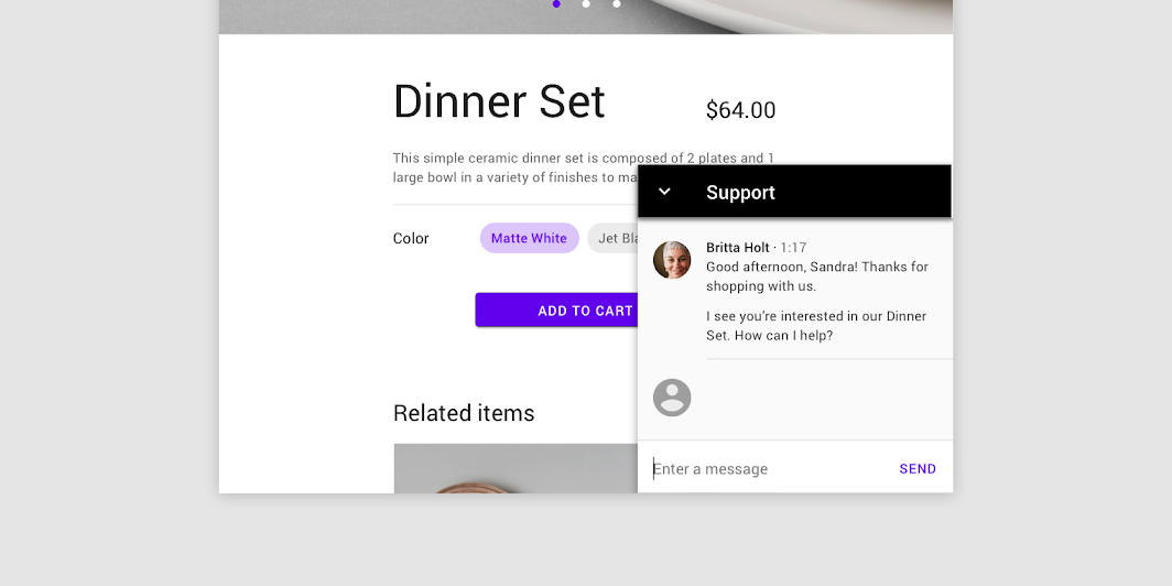
On tablet and desktop, this expanding bottom sheet doesn’t take up the full width or height of the screen, as it does on mobile.
On tablet and desktop, the bottom sheet content moves into a side sheet, where it remains visible. On mobile, this expanding bottom sheet contains a selection queue.
主题
Posivibes Material Theme
This social media app’s bottom sheets have been customized using Material Theming. Areas of customization include color and shape.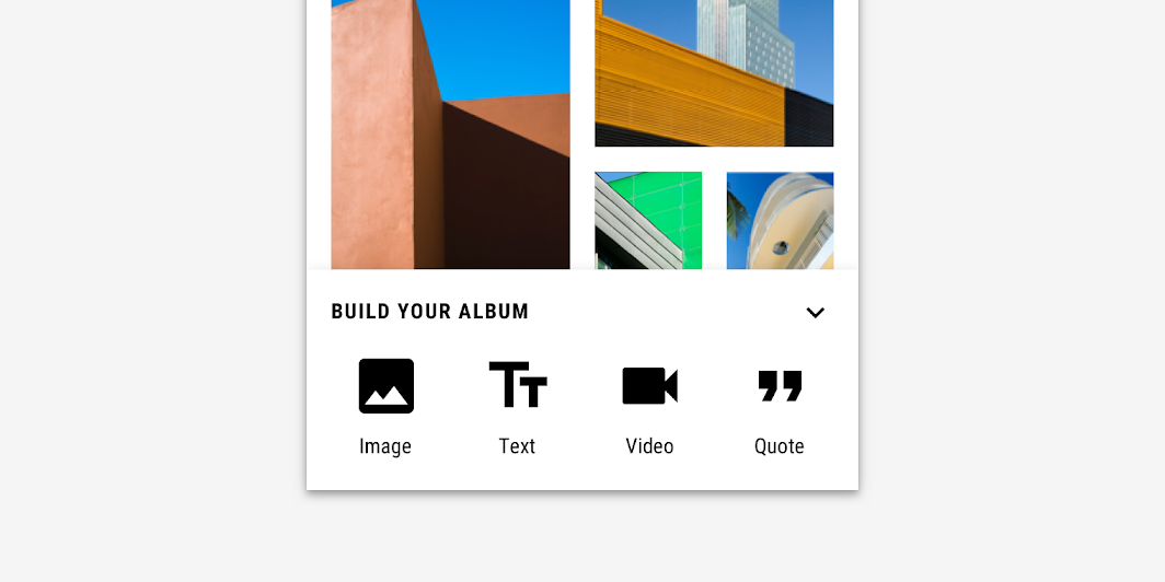
Posivibe’s customized bottom sheets
Color
Posivibe’s bottom sheets use custom color on three elements: container, text, and icons.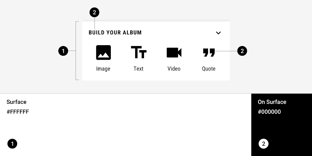
| Element | Category | Attribute | Value |
|---|---|---|---|
| Container | Surface | Color Opacity |
#FFFFFF 100% |
| Text, icons | On Surface | Color Opacity |
#000000 100% |
Shape
Posivibe’s bottom sheets use a custom container shape. Bottom sheets can only be shaped on the top left and top right corners.
| Element | Category | Attribute | Value |
|---|---|---|---|
| Container | Large component | Family Size |
Cut 0;0; n/a; n/a dp* |
Shrine Material Theme
Shrine is a retail app, and its expanding bottom sheet has been customized using Material Theming. Areas of customization include color and shape.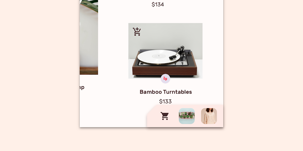
Shrine’s customized expanding bottom sheet
Color
Shrine’s expanding bottom sheet uses custom colors on its container and icon.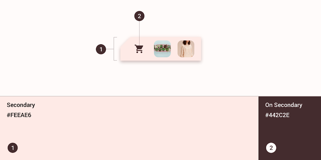
| Element | Category | Attribute | Value |
|---|---|---|---|
| Container | Secondary | Color Opacity |
#FEEAE6 100% |
| Container | On Secondary | Color Opacity |
#442C2E 100% |
Shape
The collapsed state of Shrine’s expanding bottom sheet uses a custom container shape.
The top leading corner is shaped to help indicate it is interactive.*Expanding bottom sheets can only be shaped on the top left corner.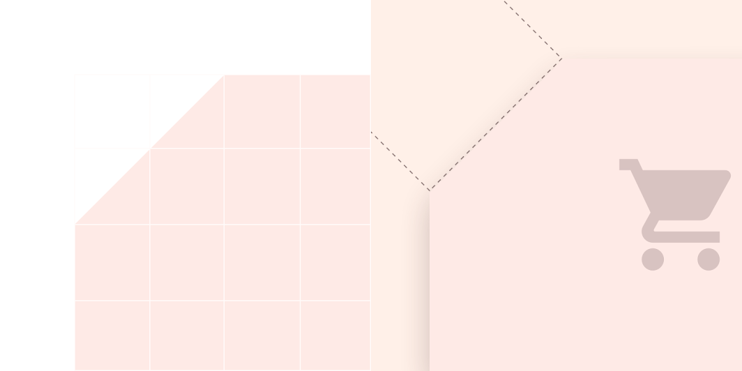
| Element | Category | Attribute | Value |
|---|---|---|---|
| Container | Large component | Family Size |
Cut 0; n/a; n/a; n/a dp* |
Specs
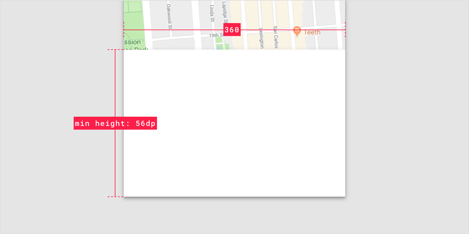
Modal bottom sheet for mobile
Standard bottom sheet for mobile

若有收获,就点个赞吧
0 人点赞
