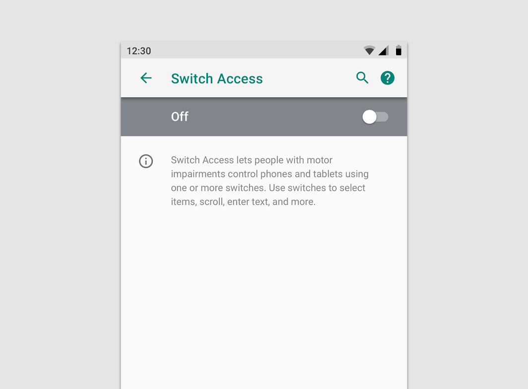
用户可以根据自己的使用习惯来对应用程序的各种行为进行设置。
App settings let users indicate preferences for how an app should behave.
位置
设置必须用“设置”这个标签作为入口,请勿使用“选项”或“首选项”之类的词汇。
All of an app’s settings should be reached via the “Settings” label. Don’t use synonyms such as “Options” or “Preferences.”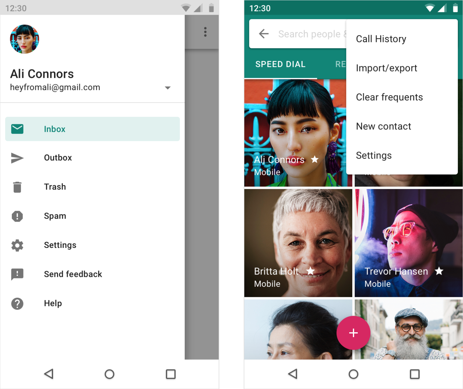
侧面导航
如果应用有侧面导航,请在所有其他项目下方添加“设置”(“帮助和反馈”选项除外)。
If side navigation such as a navigation drawer exists, include “Settings” below all other items (except Help & Feedback).
无导航
将工具栏菜单中的“设置”放置在所有其他项目的下方(“帮助和反馈”除外)。
Place Settings in the toolbar menu below all other items (except Help & Feedback).
用法
设置选项应该井井有条,用户可以通过数值或文字描述对设置变更产生的结果有一定的预期。
Settings should be well-organized, predictable, and contain a manageable number of options.
快速浏览
用户能够快速查看最重要或经常使用的设置及其值。
如果设置很多,请优先考虑最可能引起用户兴趣的设置。次要的设置可以放在下方,无需过度追求一屏显示。
A user should be able to quickly see the most important or frequently used settings and their values.
If there are many settings, prioritize the ones most likely to interest users. Less important settings can be grouped and moved to their own screen.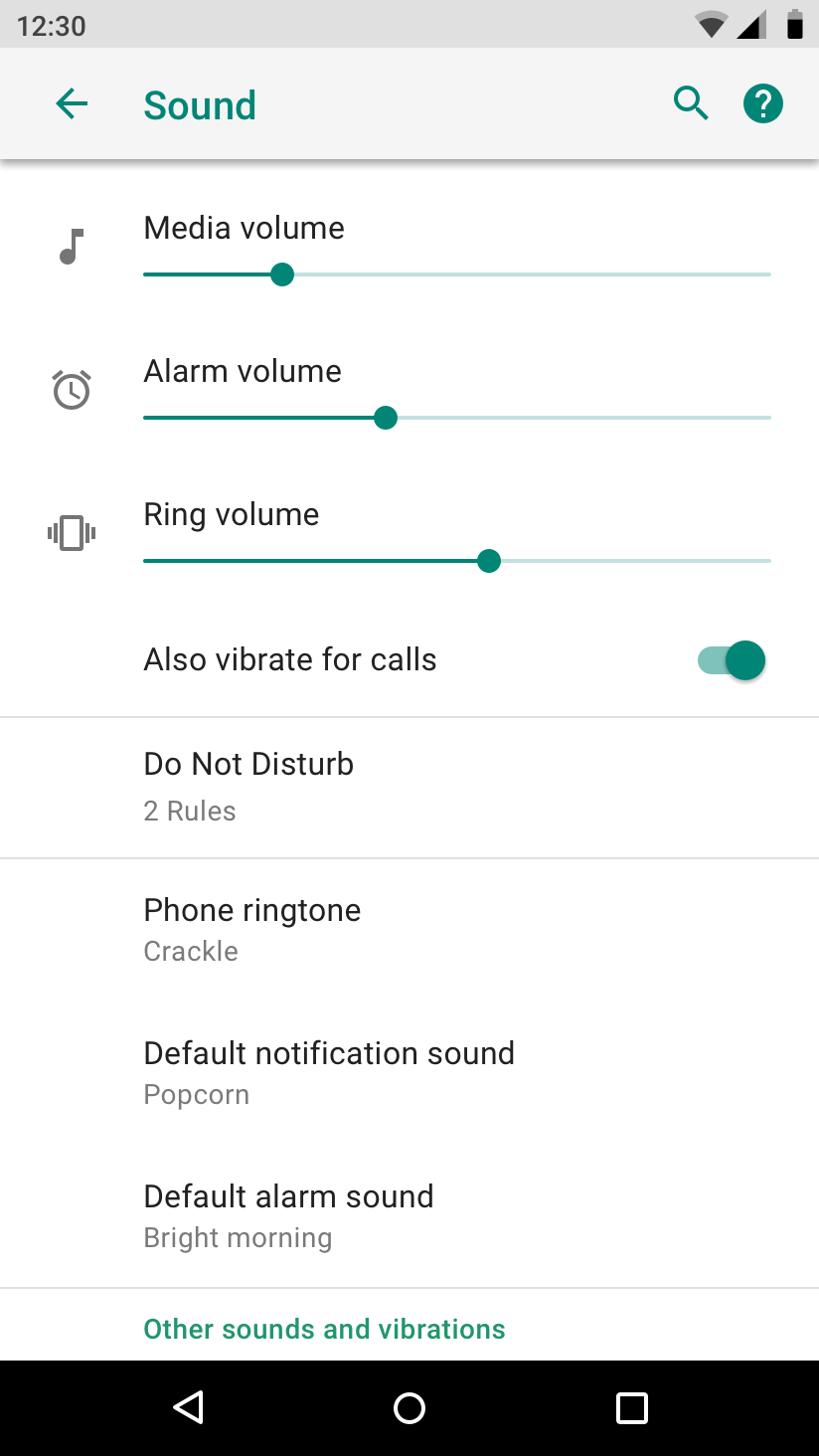
重要的设置选项显示在列表的顶部。
Important settings appear at the top of the list.
设计规范
在进行“设置”设计时
应该遵循以下几点原则:
- 保存用户的首选项
- 用户不会经常访问
- 大部分用户能够使用
- 在成本允许的前提下,尽量满足小众用户的功能需求
应该避免出现以下几点问题:
- 部分功能被频繁访问(通过数据埋点采集数据,高频设置可以移出“设置”页面)
- 包含应用程序的信息,例如版本号或者许可信息(这些信息应该放在“帮助”页面)
- 管理用户账号(用户账号的管理页面与设置页面平级,不是父子级关系)
Settings should:
- Save user preferences
- Get accessed infrequently
- Be used by most users
- Be used by a minority of users, but be essential to supporting their needs
Settings should not:
- Be frequently accessed actions (move these to a toolbar)
- Contain information about the app, such as a version number or licensing information (move these to a Help screen)
- Manage user accounts (present these in the main flow of your app, such as a side nav)
默认值
每个设置的初始值应:
- 根据测试结果,默认值可以被大多数用户接受
- 保持中立性,对用户的使用体验影响程度降到最低
- 电池低耗
- 低流量
- 仅在必要时刻打断用户操作
The initial value for each setting should:
- Represent the default most users would choose
- Be neutral and pose little risk to the user
- Use less battery or mobile data
- Only interrupt when important
分组
预先显示最重要或最常用的设置。
Show the most important or frequently used settings upfront.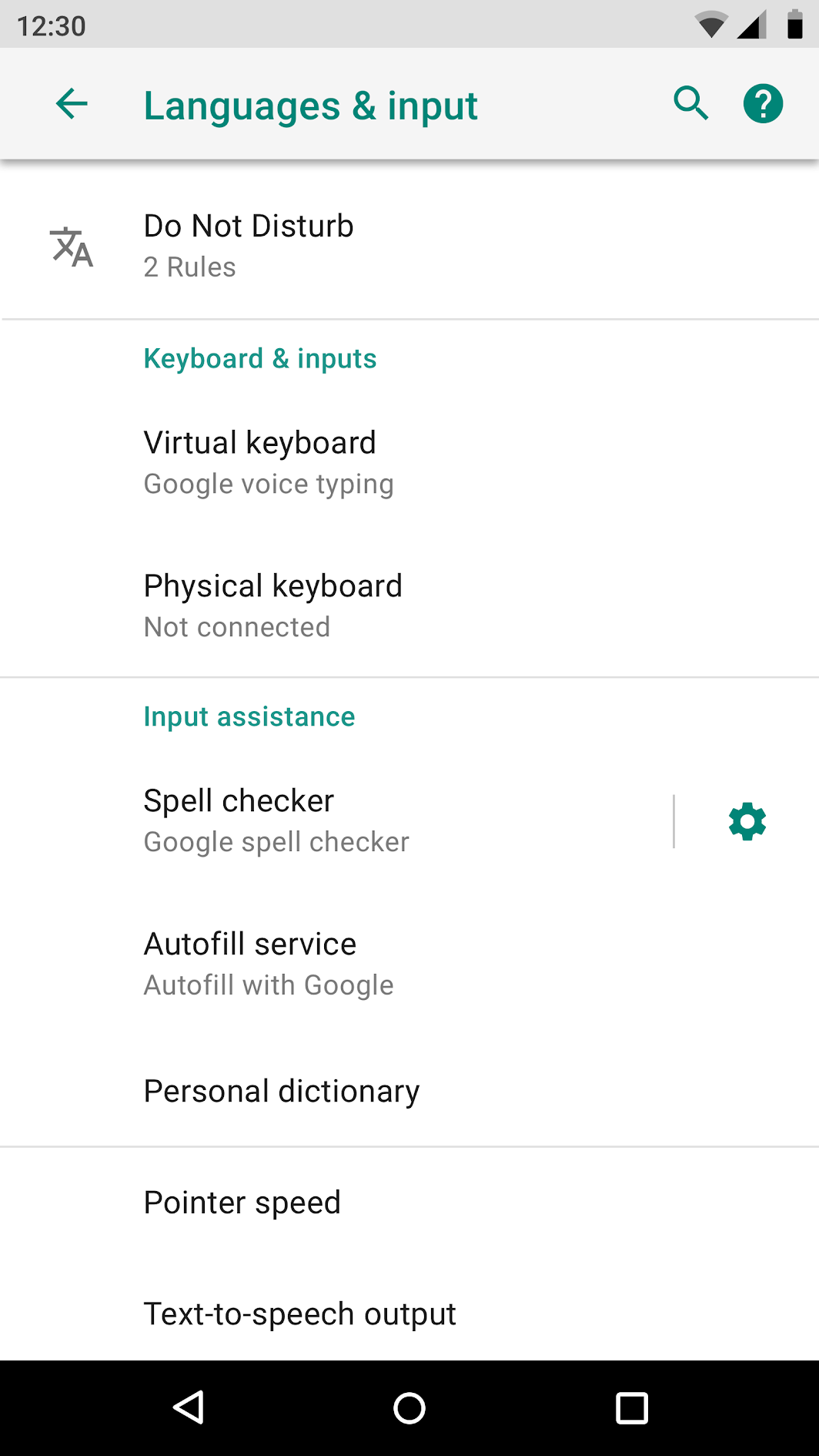
设置选项的分组设计。
分割线
通过分隔线将几个相关的设置组合在一起。
避免在每个单独的设置之间使用分割线。
Use divider lines to group together several related settings. Avoid using dividers between each individual setting.
分组标题 (可选)
每个分组可以设置标题,标题的名称应该通俗易懂,指向性明显,避免使用诸如“其它”等模棱两可的词汇。
Grouped settings can include a section title. Section titles should be specific, avoiding ambiguous names like “Other” or “Miscellaneous.”
15 项以上的设置
15 项以上的设置选项应该设置分组,帮助用户快速定位。
设计者必须使用风格一致的术语,避免产生歧义。
Related settings are best grouped under a subscreen. Use consistent terms: the label of the setting that opens a group should match the subscreen title.
标签与辅助文本
标签
标签的文本应该简洁明了,无特殊情况下,标签不可以换行显示。
标签设计应该遵循以下几点原则:
- 专有名字和标签的第一个单词大写
- 从关键词开始描述
- 避免使用诸如“不要”、“不可”之类的否定性词语
- 避免使用人称代词,例如设计者需要使用“通知”而不是“通知我”(如果需要加入人称代词来帮助用户理解,请使用“您”)
应该避免出现以下几点问题:
- 通用术语:设置、更改、编辑、修改、管理、使用以及选择
- 与标题中的词汇重复
- 专业术语(除非应用程序的受众能够理解专业术语)
Make your labels brief and meaningful. Labels will wrap to multiple lines if necessary.
Labels should:
- Capitalize only proper nouns and the first word of a label
- Start with the most important text
- Avoid negative terms like “Don’t” or “Never,” in favor of neutral terms like “Block”
- Use impersonal labels like “Notifications” instead of “Notify me” (Exception: If referring to the user is necessary for understanding the setting, use the second person (“you”) rather than the first person (“I”))
Labels should avoid:
- Generic terms, such as: Set, Change, Edit, Modify, Manage, Use, Select, or Choose
- Repeating words from the section title
- Technical jargon, unless it’s widely understood by your target audience
对齐
所有标签应与设置标题左对齐。
All labels should align with the left edge of the screen title. This provides a simpler, unified appearance.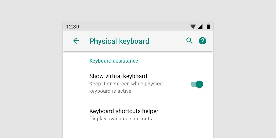
左对齐。
Labels align with the screen title
辅助文本(可选)
辅助文本可以帮助用户更好地了解设置的当前状态。
如果单靠标签本身来,用户就可以理解,那么不需要添加辅助文本。
Secondary text helps the user better understand the current state of a setting. If the label is sufficient on its own, don’t add secondary text.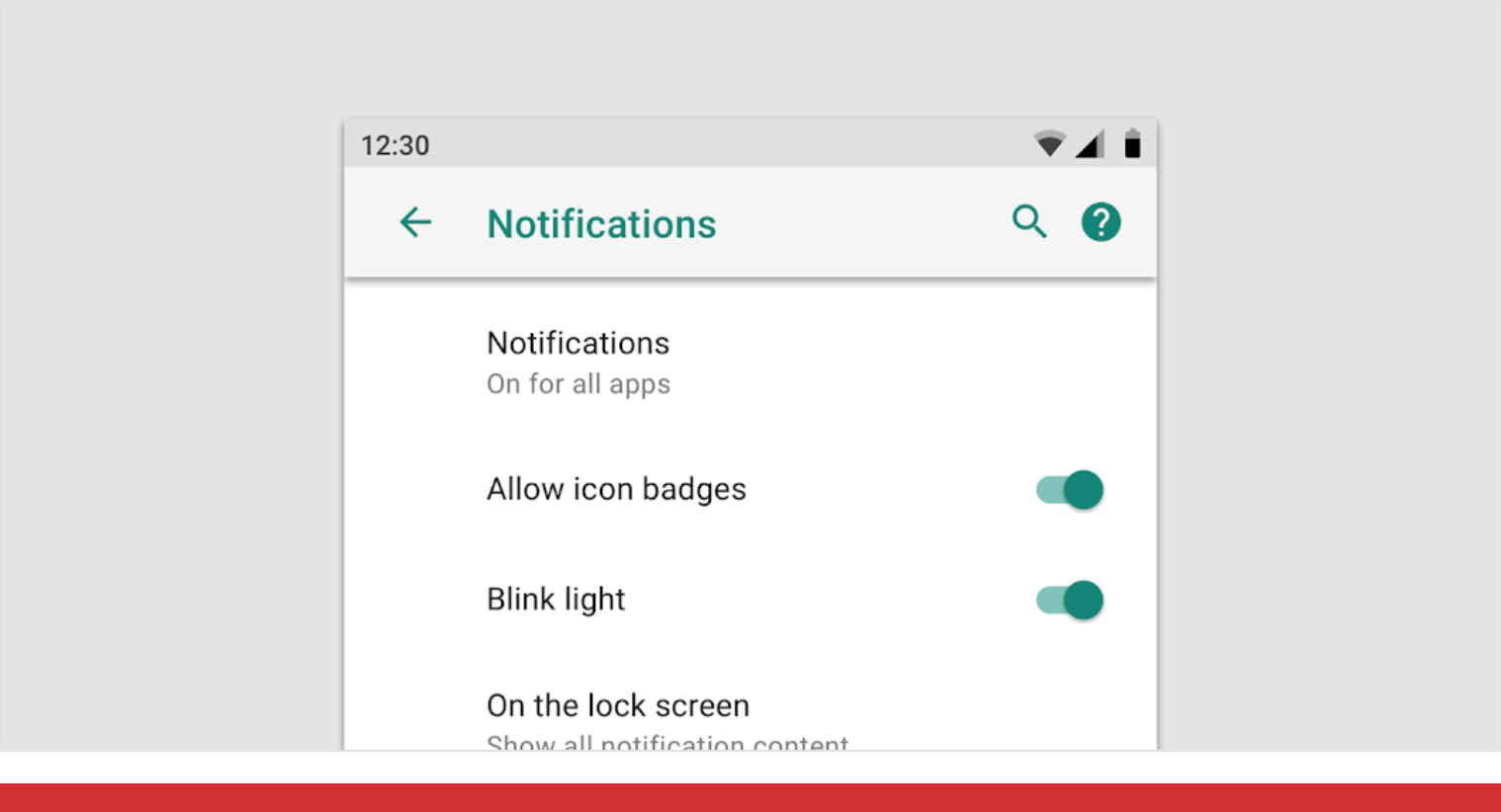
Don’t
避免标签与辅助文本中出现重复的词汇。
Avoid repeating words from the label in the secondary text.
开关或复选框
开关和复选框需要被精确描述时,设计者可以在标签下添加简短的辅助文本。
辅助文本应该:
- 传达有关设置当前的状态或与状态相关的信息
- 告知用户启用设置后会发生什么
Switch and checkbox settings that require precise descriptions may add a single-line description under the label.
Descriptions should:
- Convey information about a setting’s state or status
- Indicate what happens when a setting is enabled
Do
以动词作为开头。
Start the description with a verb.
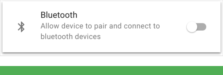
Do
解释蓝牙设置的当前状态。
Explain the current status of the setting.
在需要对设置进行长文本描述时,请在相应设置的子页面显示。
Settings that require longer explanations may add a description on a second screen.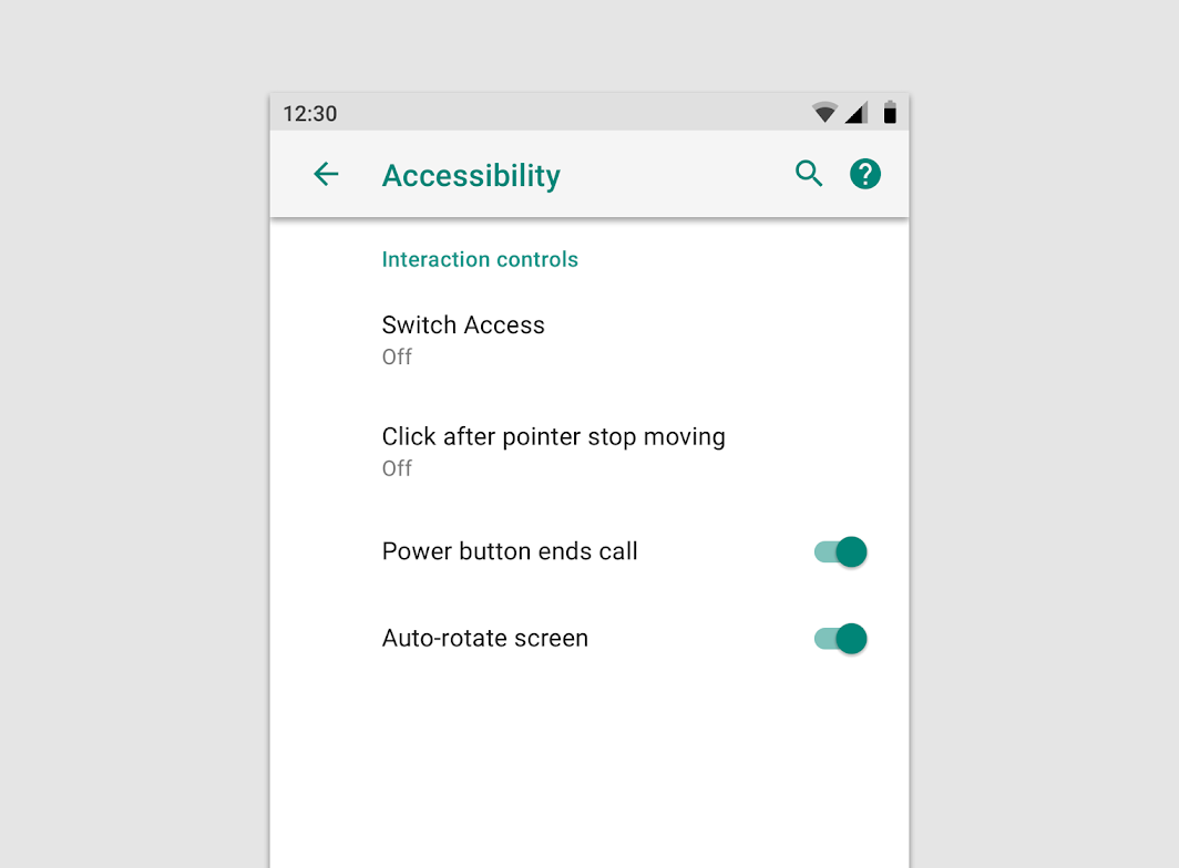
在标签下方,显示开关当前的状态。
Underneath the label, show the status text of the switch as “On” or “Off.”
在需要对设置进行长文本描述时,在相应设置的子页面显示。
Add the switch and a longer description to a second screen.
其它设置
对于非开关的设置选项,辅助文本应仅显示设置的当前状态。
Do
The secondary text conveys the current state of the setting.
Don’t
Avoid describing the setting. Show the setting’s status instead.
选择模式
单选
Use this pattern for a setting that is either selected or not selected.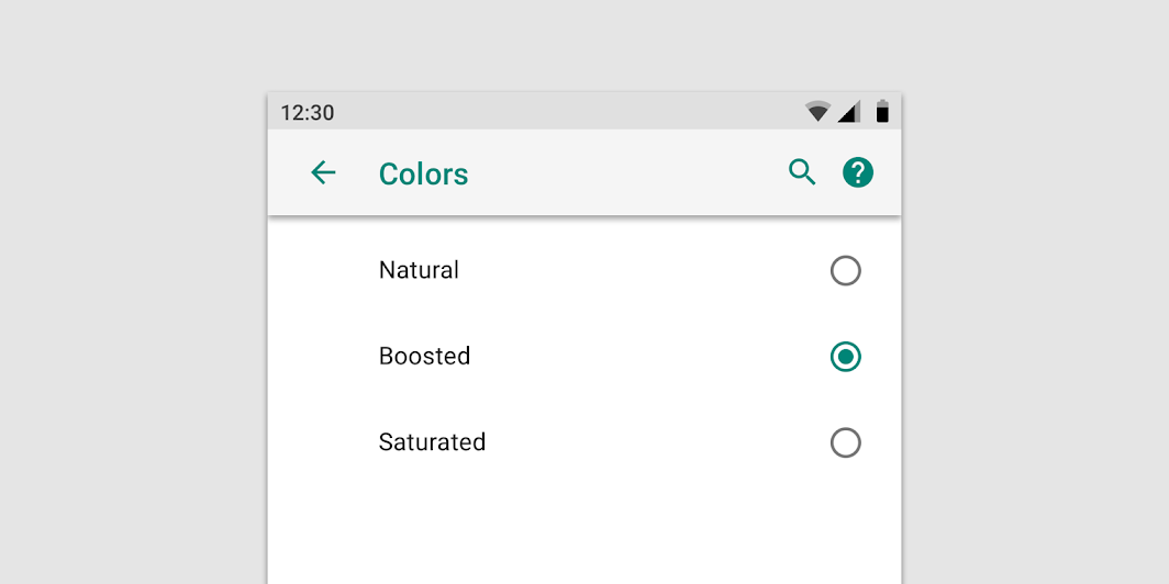
多选
Use this pattern for a setting that needs to present a discrete set of options, from which the user can choose only one.
滑动输入
Use this pattern for a setting where the range of values is not discrete and falls along a continuum.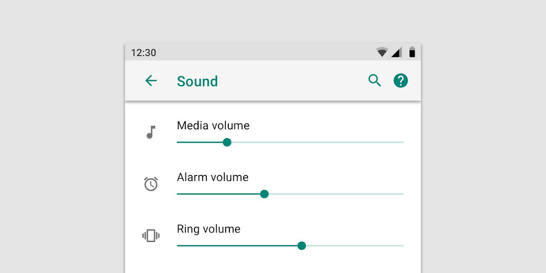
时间选择
Use this pattern for a setting that needs to collect a date or time from the user.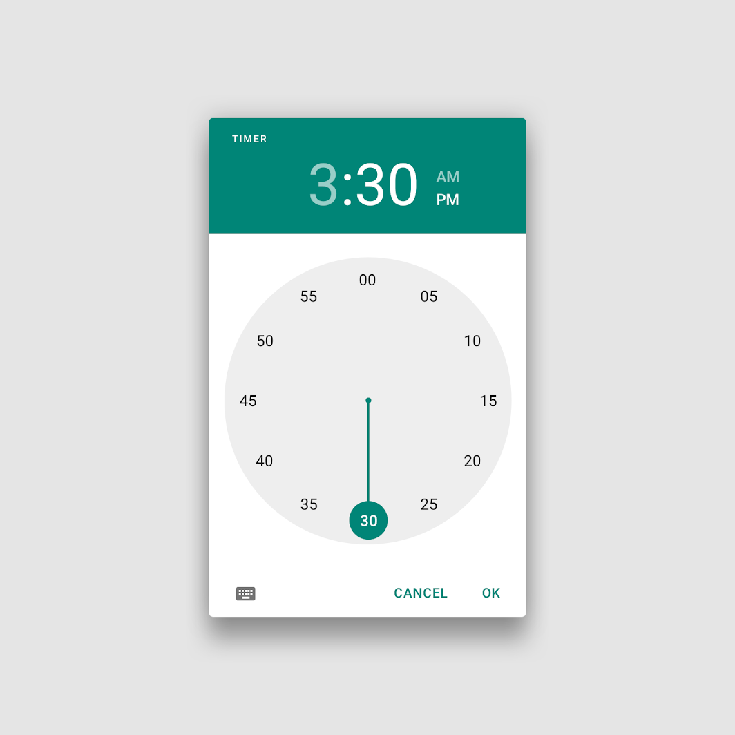
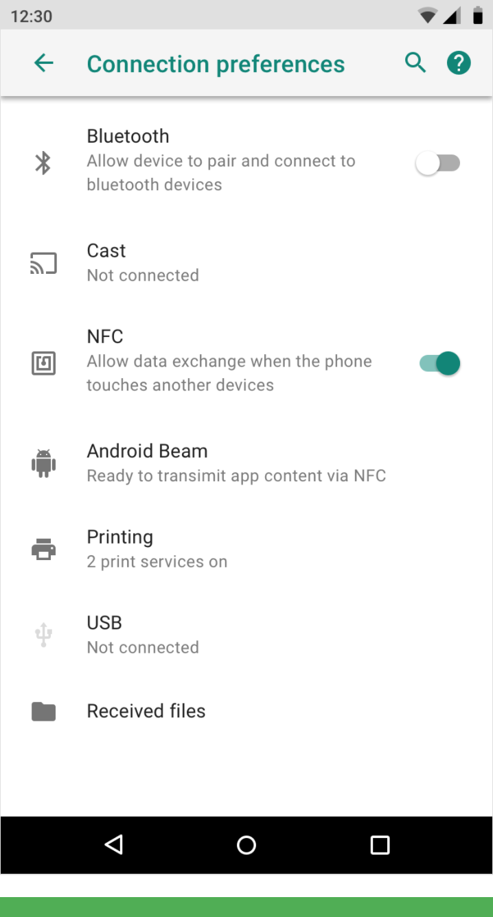
副屏列表
副屏列表包含了同一级别的列表选项。
与主屏一样拥有分组标签以及辅助文本对选项进行解释说明。
Use this pattern for a setting or category of settings that contains a list of equivalent items.
The label provides the name of the item, and secondary text may be used for status. (In this example, status is reinforced with an icon to the right of the label.) Any actions associated with the list appear in the action bar rather than the list itself.
主开关
主开关用于控制分组下的所有选项。
主开关一般位于最上方。
当主开关关闭时,分组下的所有选项消失或处于禁用状态。
Use this pattern when you need a mechanism to turn off an entire category of settings.
An on/off switch is placed as the first item in the action bar of a subscreen. When the switch is turned off, the items in the list disappear, replaced by text that describes while the list is empty. If any actions require the switch to be on, they become disabled.
You can also duplicate the master on/off switch in the menu item that leads to the subscreen. However, you should only do this in cases where users rarely need to access the subscreen once it’s initially set up.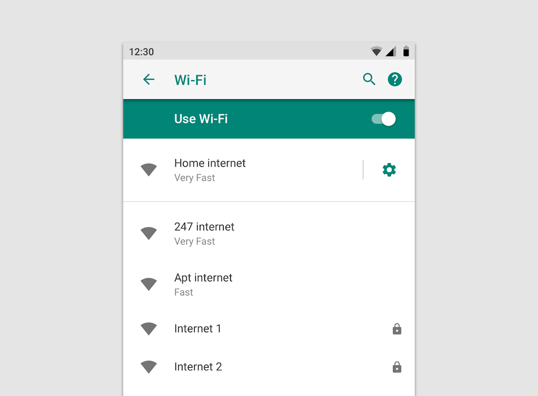
独立开关
独立开关相比于复选框来说,拥有更加详细的说明文字,一般用于开启某种模式。
独立开关仅出现在子级功能页中,用户通过查看辅助文本来切换开关状态。
Use this pattern for an individual setting that requires a more elaborate description than can be provided in checkbox form.
The on/off switch only appears in the subscreen so that users can only toggle it while viewing its descriptive text. Secondary text appears below the setting label to reflect the current selection.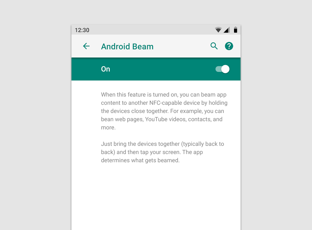
Since users might not know what this setting does, the status is more descriptive than just the word, “On”.
从属选项
当两个选项直接又从属关系时,上方按钮若处于关闭状态,其下方与自己有联系的按钮都会自动处于禁用状态(状态不会改变,只禁用)。
一般来说这种从属关系不需要再页面进行缩进设计来体现,同时设计者也需要注意从属关系中的选项个数不要超过三个。超过三个的话,需要引入子页面来展示。
Use this pattern for a setting that is only available based on the value of another setting.
A dependent setting appears below the setting it depends upon, without indentation. If it has a status line, it should say “Unavailable.” A brief explanation can be included in the status if the reason it’s unavailable isn’t obvious.
If a setting has three or more dependent settings, a subscreen with a master on/off switch reduces the clutter introduced by many disabled items.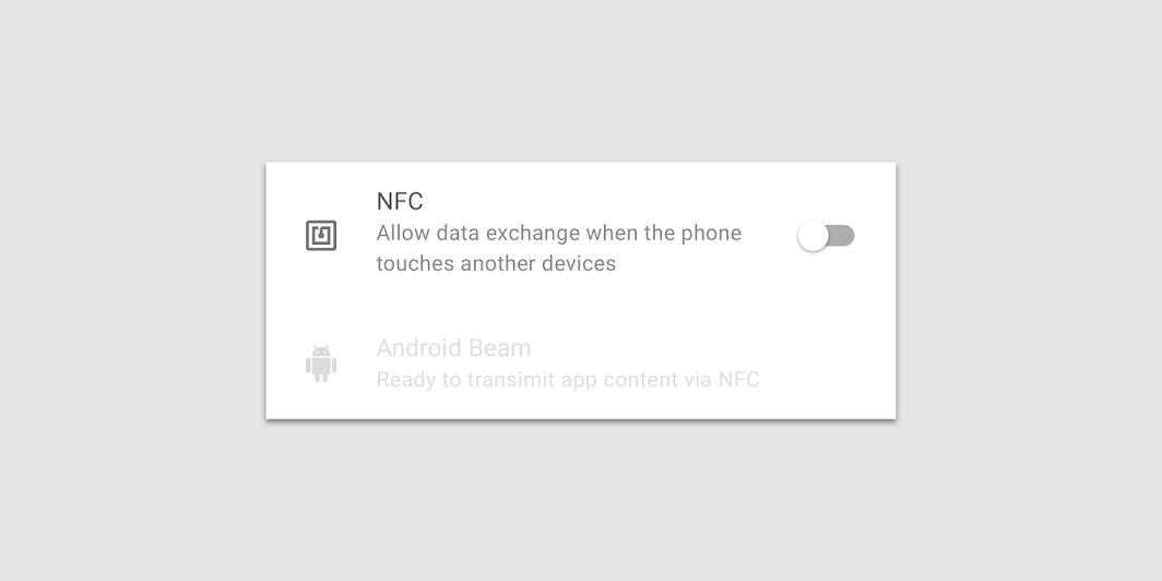
写作规范
简单直接
触摸震动
Vibrate on touch
使用触觉获得反馈
Use tactile feedback
补充说明
对于通过下拉菜单或独立按钮来进行调整的设置,请在相应的标签下方用辅助文本来解释设置的当前状态。
For a setting adjusted via a dropdown menu or on a separate screen, summarize the setting’s current state in the text below the label.
休眠设置:十分钟后进入休眠状态
After 10 minutes of inactivity
Display the currently selected setting
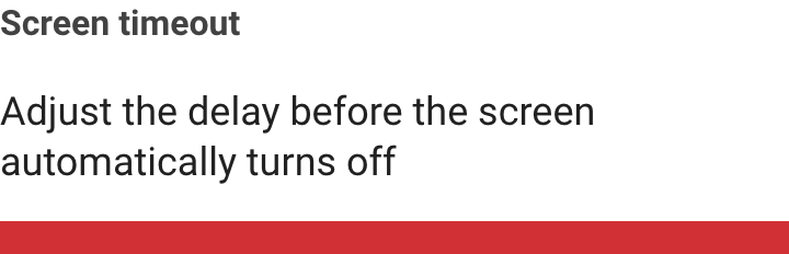
休眠设置:请调整手机进入休眠状态之前的时间
Adjust the period of inactivity before the screen turns off
Don’t display the setting’s general purpose.
锁屏界面:不显示任何通知
Adjust the period of inactivity before the screen turns off
When possible, use the same language as the option itself – in this case, an item in the related dropdown menu.
锁屏通知:请设置锁屏时显示全部通知、部分通知还是不显示所有通知
Control whether to display all notification content, only non-sensitive content, or no notifications at all.
Don’t describe the setting’s purpose or all available selection options.
术语缩写
如果没有更好的替代词汇,请使用熟悉的首字母缩写词。并向用户解释传达设置的生效方式和原因。
Use familiar acronyms when there aren’t better alternatives. Convey how and why an unfamiliar setting exists.
NFC:允许手机触碰其它设备时交换数据
Allow data exchange when the phone touches another device
UFC:使用 Near Field Communication 来读取和交换数据
Use Near Field Communication to read and exchange tags

若有收获,就点个赞吧
0 人点赞
