设计者通过视觉图像来传达信息和区分产品。
Imagery communicates and differentiates a product through visuals.

原则
图像既可以增强用户体验,又可以传达出品牌的视觉语言。
图片可帮助设计者阐明难以用文字表达的复杂信息,有时候还可以通过图片直观地指导用户如何执行操作。
Imagery can both enhance the user experience and express a brand’s visual language. Images help tell a story, clarify complex messages that are difficult to express with words, and to show users how to perform an action.
- 信息化
图像有助于设计者向用户传达清晰的信息。
Imagery assists with comprehension and helps convey a clear message.
- 愉悦感
图像以一种令用户愉悦的方式来帮助用户理解语境。
Imagery portrays context in a way that adds user delight.
- 目的性
为了清晰地描述对象,应该有目的性地使用图像。
Imagery should be used intentionally in order to create a clear story.
用法
选择图片时,应该能够表达出设计者想要表达的信息,反映出产品的风格。应用中出现的用户创作的摄影作品、专业的摄影作品或者不同风格的插图都应该能够反映出产品的风格。
同一个应用中的图像应该具有统一的功能、样式或者目标。
Images should be selected for their ability to express your message and reflect your product’s style. Whether you use user-generated photography, professional photography, or different styles of illustration, they should all lend a look and feel that reflects your product. Images should be related to one another by sharing a common function, style, and intention.
多媒体
插图和摄影可以出现在同一产品中。
Both illustration and photography can live within the same product.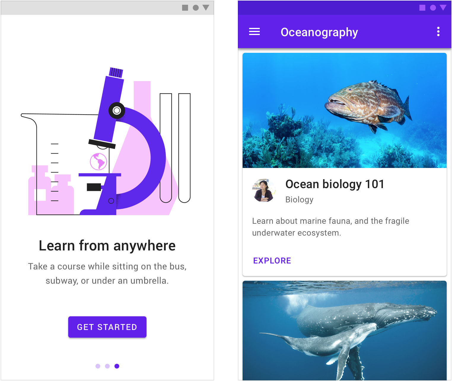
插图有助于描述抽象概念。 Illustration helps describe abstract concepts.
照片可以更好地诠释特定概念。 Photographs better represent specific concepts.
一个焦点
图像裁剪的方式取决于图像中的焦点,所以图像中应该保留一个标志性的焦点。焦点存在于单个实体到整体组合的任何事物中,焦点可以以一种令人难忘的方式来传达意象。
设计者在使用图像之前,需要找到图像中的焦点。
Have an iconic focal point in your imagery, as it impacts how it should be cropped for different sizes. A focal point can be anything embodied in anything from a single entity to an overall composition. Clearly convey concepts in a memorable way.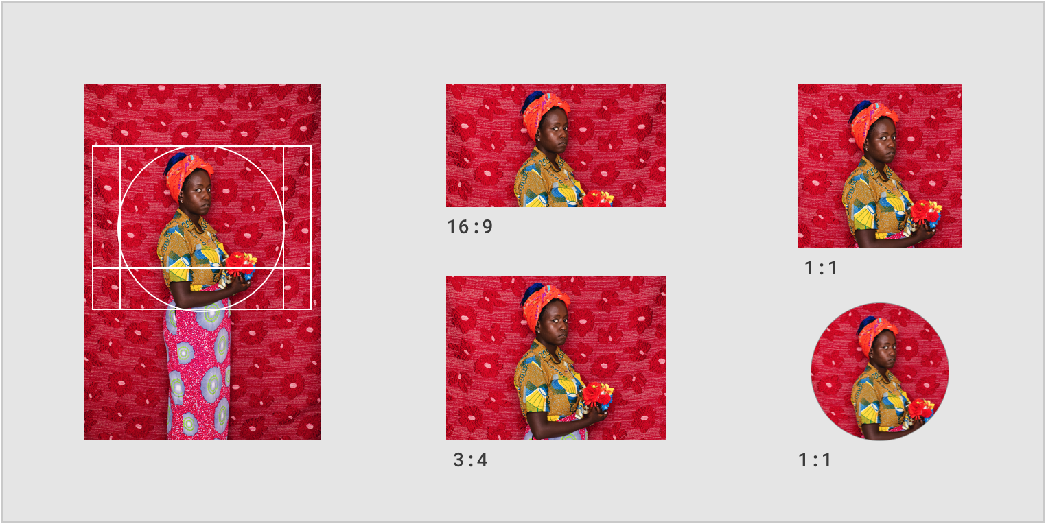
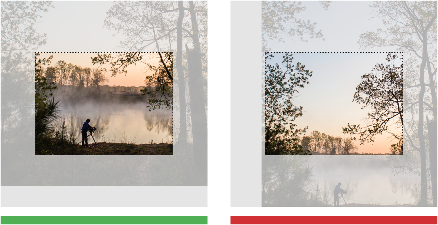
正确
裁切图像之前,请找到图像的焦点。
Establish a clear focal point when cropping an image.
错误
不要在裁剪图像时,破坏图像的焦点。
Don’t crop an image in a way that doesn’t show a clear focal point.
合适的大小
设计者为了更好地显示效果,需要根据不同的显示设备与平台调整图像大小与类型。
分辨率是图像加载速度的重要决定因素。为了保证网络带宽能够迅速加载图像,设计者需要尽可能降低图像的分辨率。
有针对性地对设备与平台使用特定比例的图像进行测试,寻找合适的分辨率大小,确保图像不会出现马赛克。
To best display images of different sizes and types, appropriately size images for different displays and platforms. Resolution is the most important factor in how quickly imagery will load.
To preserve network bandwidth, keep resolution low where possible.
Test appropriate resolution sizes for specific ratios and devices, ensuring that assets don’t appear pixelated.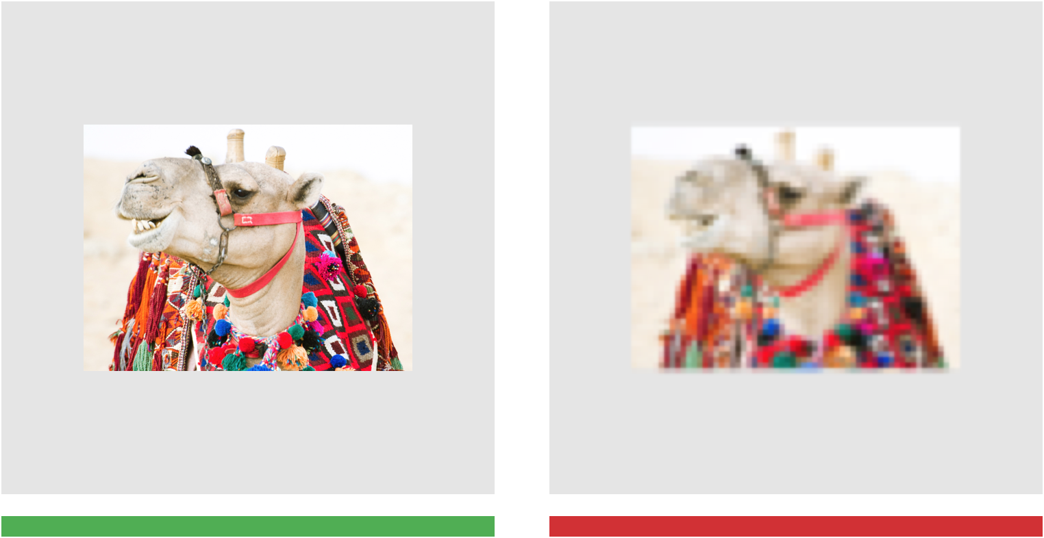
正确
在保证质量的前提下,尽可能压缩图像的大小。
Export images at the lowest file size possible without compromising quality.
错误
避免使用的图像在设备上显示时出现马赛克。
Avoid using small file sizes that may result in pixelation of the image.
无障碍设计
替代文本
为了确保视障用户能够理解图像要表达的意义,设计者应该提供替代文本(或标题)。
如果没有替代文本,屏幕阅读器只会读出“图像”,而不会解释图像的含义。
To ensure accessibility, imagery should include alternative text (or a caption) to be read by screen readers for users with visual impairments. Without alternative text, screen reader users just hear the word “image,” without any visual details.
该图片没有标题或替代文字。屏幕阅读器只会读出“图像”,而不会解释图像的含义。
Don’t
This image doesn’t have a caption or alt text. Screen readers will just read out “image” with no explanation of what the image is about.
图像的用法
通过视觉效果在应用中创造沉浸式的体验。
Create an immersive story and a sense of context in your app by using visuals.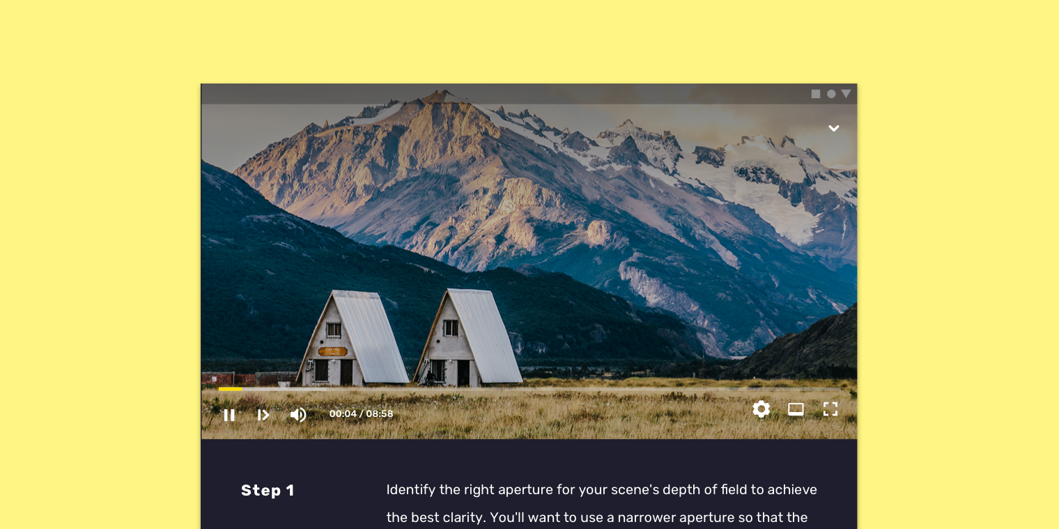
比例:62.5%
用户教育
在向用户提供说明时,分步设计结合图像,可以让用户按照自己的步调,逐步执行一系列操作。
When giving instructions to users, step-by-step imagery allows users to move through a sequence of steps at their own pace.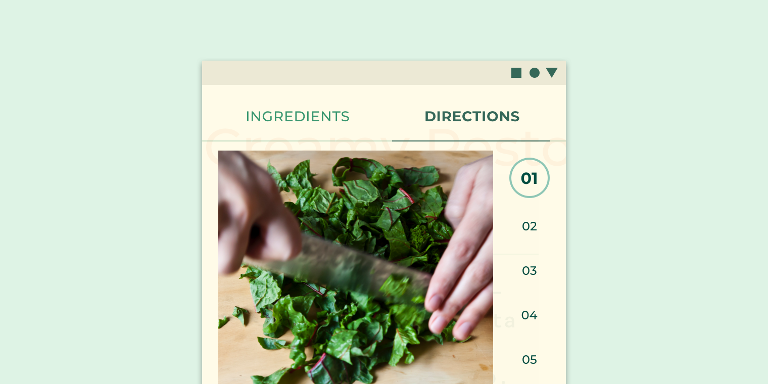
烹饪应用通过“分步设计+照片”展示烹饪方法。
当用户首次与应用互动时,图像会帮助他们确定如何进行个性化内容的定制。
When users interact with an app for the first time, imagery helps them identify what content is for.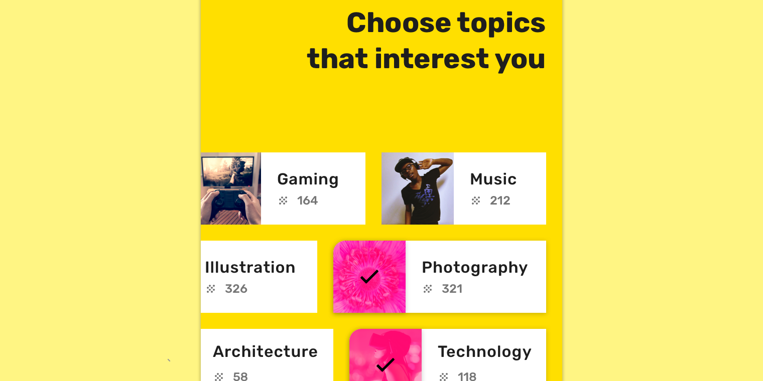
图像可帮助用户选择感兴趣的类别或主题,以便设计者能够根据每个人的个性来优化用户的体验。
Imagery helps users choose categories, or topics of interest, to better personalize the content they experience in the app.
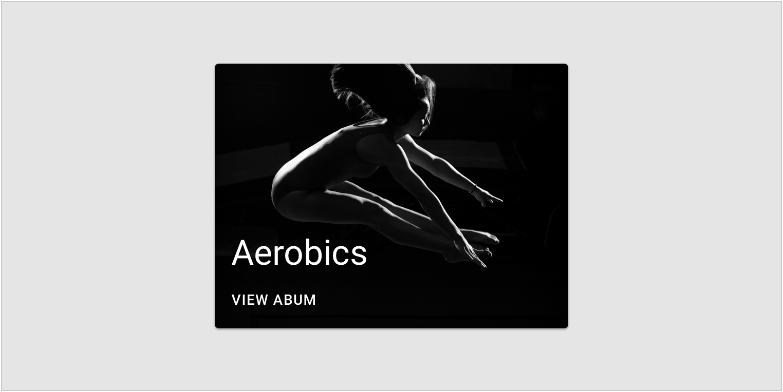
风格一致
风格一致的摄影作品能够帮助用户快速浏览产品并做出决定。
Photography with a common style can help users quickly browse and make a decision.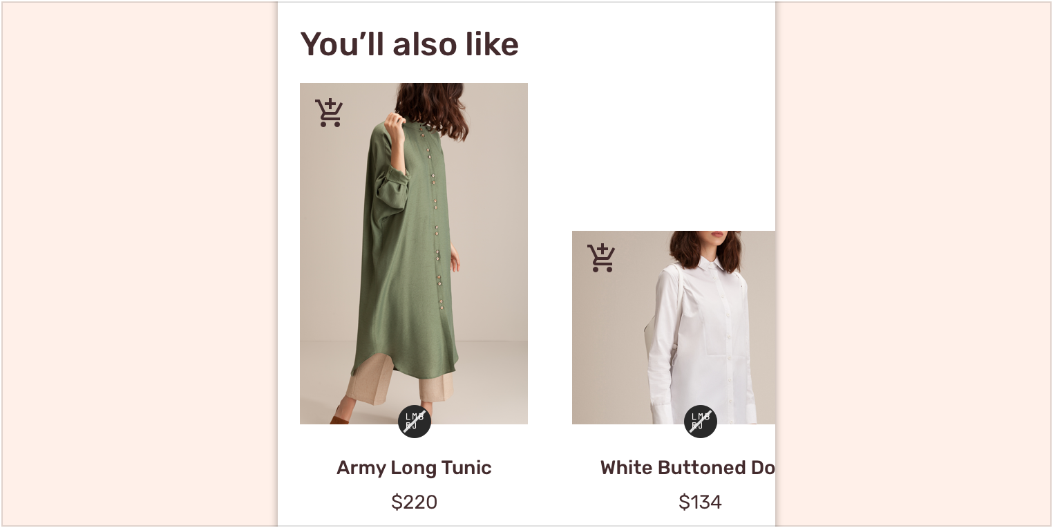
在使用过程中,静物摄影表现出统一的风格,使用户可以轻松比较产品并做出购买的决定。
When used across an app, still life photography expresses a unified style, letting users compare products easily.
愉悦感
当用户在使用过程中遇到令自己困惑或沮丧的点时,设计者可以通过图像来愉悦用户。
Imagery can be used to delight users when they reach a confusing or frustrating point in the user experience journey, such as an error screen.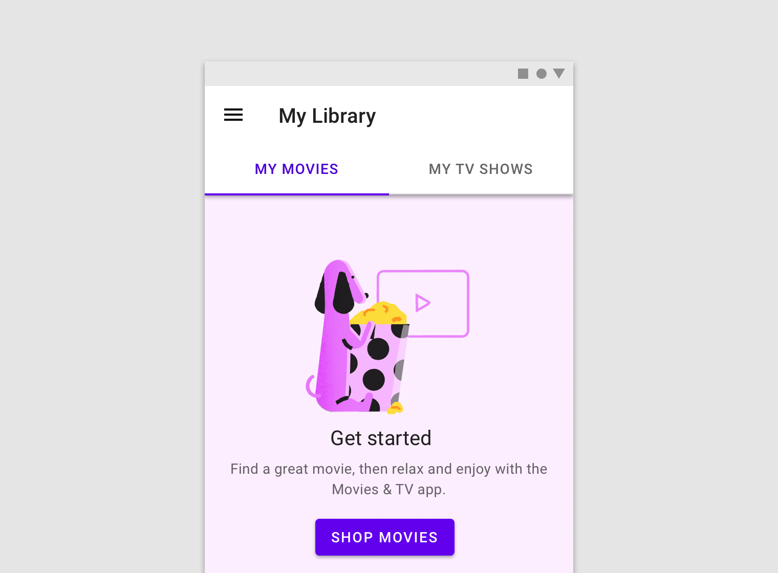
该应用程序使用插图来引导用户开始使用该应用程序。
This app uses illustration to help users get started using the app.
承上启下
图像可以帮助用户理解文本要表达的意图。
Imagery can help users understand the intent and context of associated text.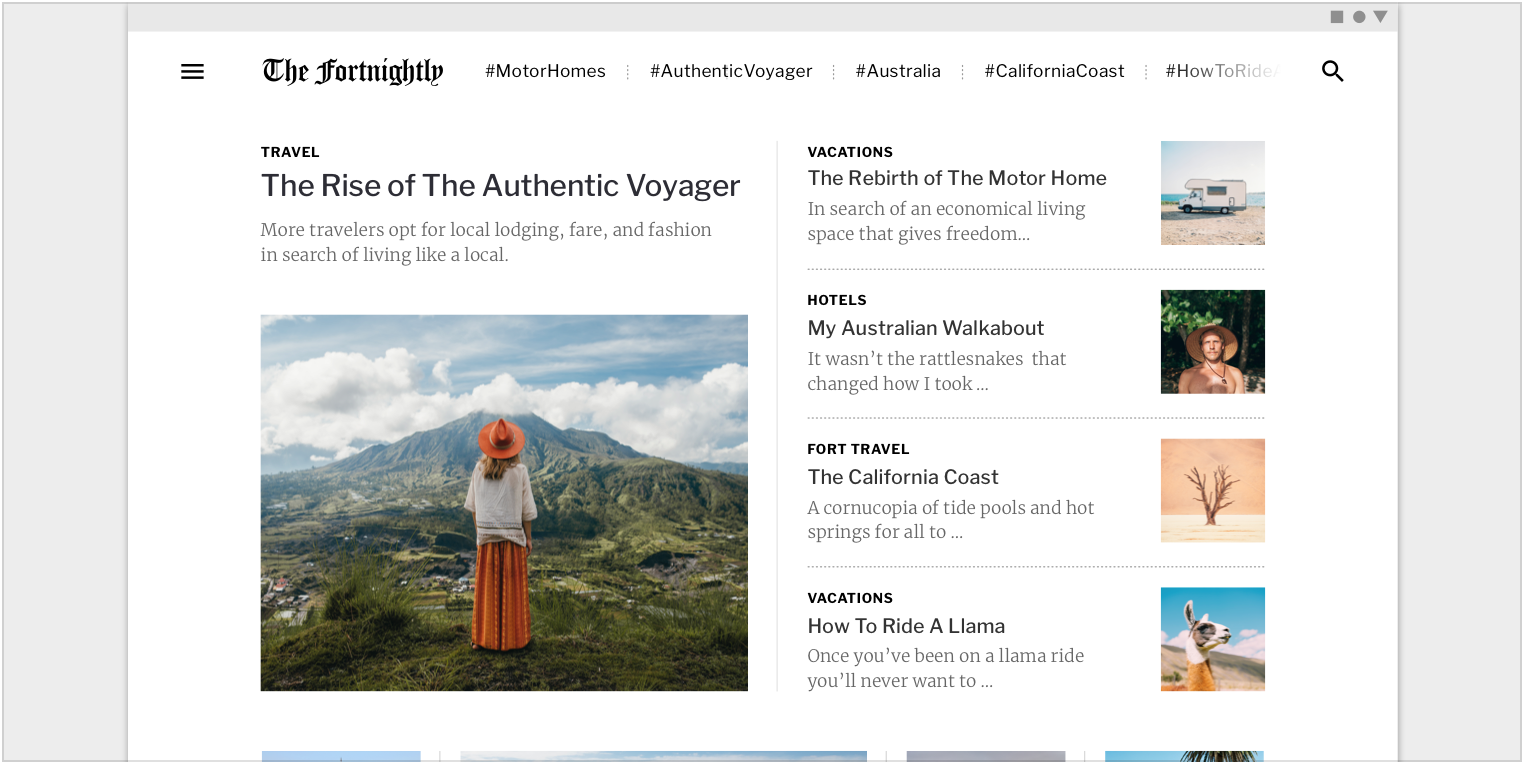
本来需要文字进行描述的内容,直接使用图像能够降低用户的理解难度。
This app uses imagery to communicate the context of an article. Scaled down to 62.5%.
头图
用法
主图在页面中可以迅速引起人们的注意,主要用于提供有关内容的背景信息或增强品牌形象。
Hero images help draw attention, provide context about content, or reinforce a brand.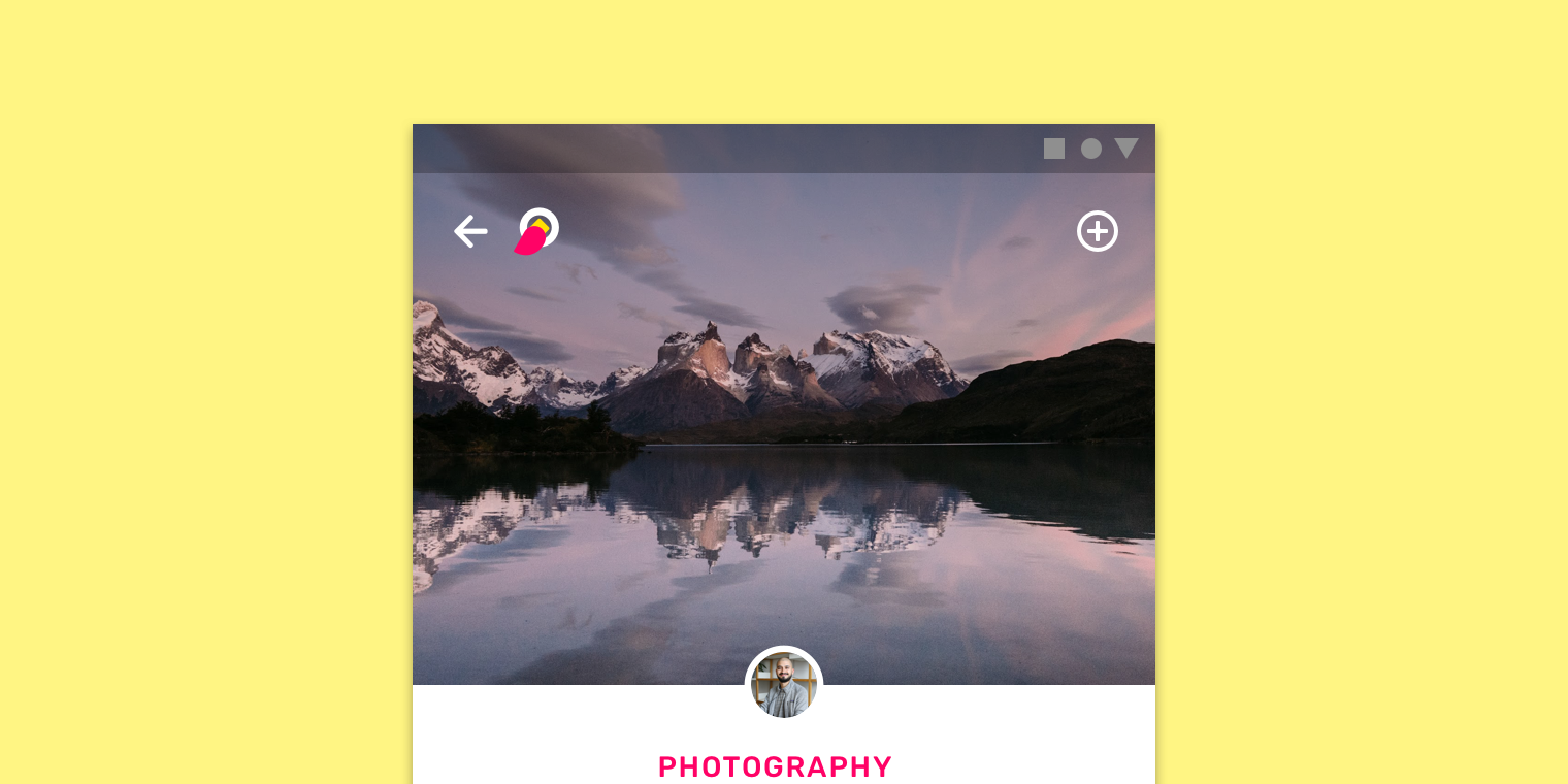
布局
主图往往布局在最显眼的位置,例如屏幕顶部。
Hero images are anchored in the most prominent position, such as the top of the screen.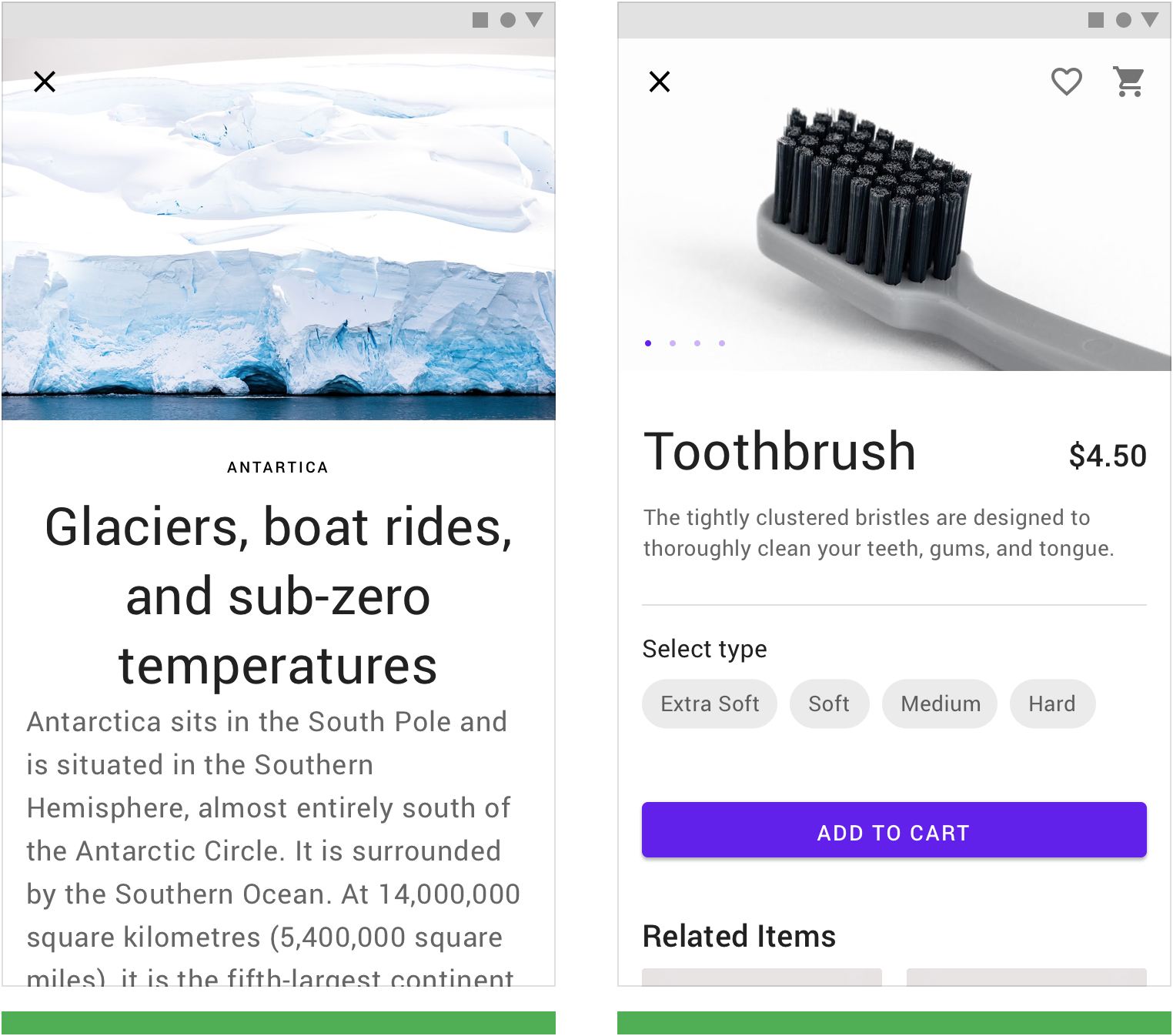
单个主图在文章顶部可以帮助作者介绍文本内容。 Use a single hero image to introduce text content.
多个主图通过轮播的方式进行展示。 Display hero images in a carousel.
缩略图
用法
缩略图通常是在空间有限时使用的尺寸较小的图片。通常出现在卡片或列表等组件中,作为完整内容的入口供用户进行预览。
用法:
- 预览,暗示用户有更多信息可以查看
- 展示其它页面的主要内容
- 辅助其它组件进行导航
Thumbnails are small images that represent information in tight spaces. They typically act as tap targets that lead to primary content, appearing within components like cards or lists.
Thumbnails are used to:
- Allude to more information
- Provide a peek at content on other screens
- Assist in navigation
缩略图可以裁剪为不同的形状。
Thumbnails can be cropped in different shapes.

这些圆形的缩略图代表应用程序中的类别。
These circular thumbnails represent categories in an app.
布局
在诸如卡片的组件中,缩略图的上方可以放置文本或操作之类的元素。
Elements like text or actions may be placed above a thumbnail in components like cards.

列表项中的一排缩略图。
A row of thumbnails inside a list item.
以多种比例显示缩略图,以表达不同的视觉优先级。
Display thumbnails at multiple scales to express varied levels of visual importance.

卡片中具有多个不同比例的缩略图。
Multiple thumbnails with different proportions in a card.
信息传达
用法
以信息传达为主要目的的图像可以帮助用户更好的理解内容,而无需干扰页面上的其它元素。
例如头像、图标以及图表等,在占用空间极小的情况下,仍然可以传达出设计者的意图。
Informational imagery assists users in understanding content, without being the focal point in a UI. It can take the form of icons, diagrams, and avatars that represent entities or content, either literally or conceptually. They occupy minimal space.
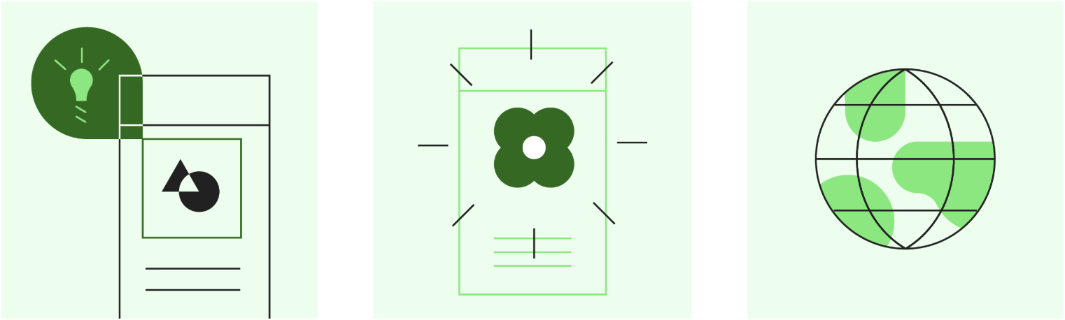
头像
头像应该使用内容简单的图片。
头像可以代表用户或品牌。
Avatars should focus on a subject, using a simple background. They can represent a user or a brand (with a logo or branded graphic).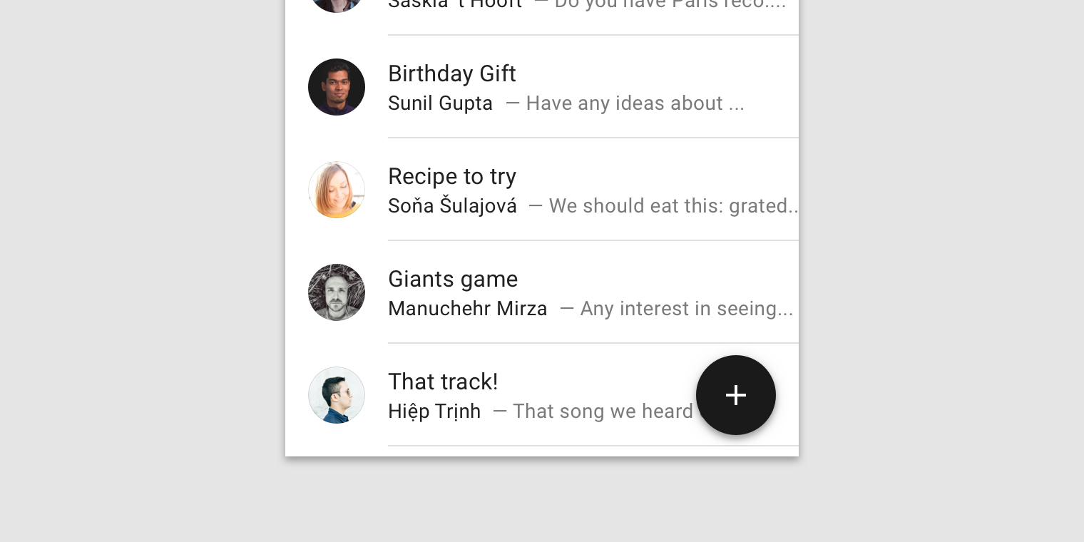

头像可以代表用户。 Avatars can represent users.
头像可以代表品牌。 Avatars can represent brands.
头像可以被裁剪成各种形状。
Avatars can be placed inside multiple components, shaped in any form.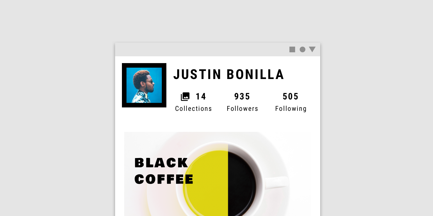
方形头像。
An avatar in a square shape.
图表
图表可以展示数据。
Diagrams can display numeric values.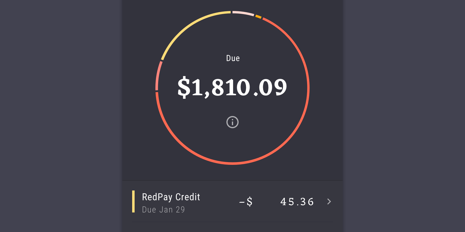
饼图说明了单个数值和总数值之间的关系。
Pie charts illustrate the relationship between a single numeric value and a total numeric value.
图标
图标可以帮助用户理解内容。
Icons can help users understand content.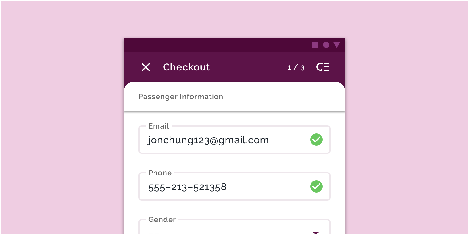
示例中的图标(绿色的选中状态的圆圈)可以让用户知道该操作已成功完成。
The green check circle icon lets users know that the action has been completed successfully.

若有收获,就点个赞吧
0 人点赞
