Material Design supports design and usability best practices across platforms to help create beautiful user experiences.
When to adapt
Material Design is built on a foundation of best practices in the fields of both traditional and web design, and is informed by user experience research and cognitive science. The design guidelines that developed from research findings are intended to be applied universally across all platforms and devices.
Design conventions differ from platform to platform. These differences in convention can affect the user’s ability to understand the UI or complete certain tasks. In such cases, it’s recommended to adapt to platform-specific conventions. In areas where design differences are minimally disruptive, adapting to the platform is optional.
The following guidelines indicate when to adapt to native platform conventions and adaptation is optional. Platform conventions constantly evolve, and Material Design is evolving with them to increase the quality of our design patterns.
Cross-platform guidelines
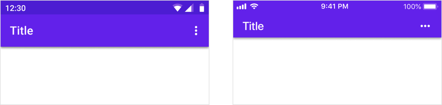
Toolbars
Toolbars are commonly used to frame the context of a screen. On iOS, toolbars are called navigation bars and their height is shorter than the Android version. On Android, toolbars are called top app bars.
It’s recommended to use a platform’s default text alignment for toolbar titles, unless multiple action buttons are present.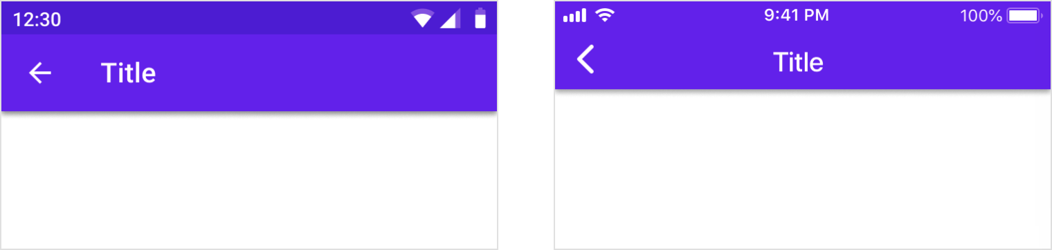
Android
Titles are left-aligned by default in top app bars.
iOS
Titles are center-aligned by default in navigation bars.
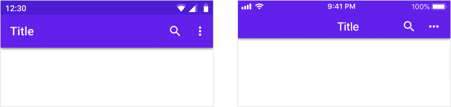
Android
When multiple actions, or even no actions, appear on the right side, top app bar titles are always left-aligned.
iOS
When multiple action buttons are on the right side, or on the home screen of an application, titles may be left-aligned.
Translucency
Material Design uses shadows to express elevation in app bars. In iOS, products can use translucency to differentiate app bars from content.
Android
Use shadow to express elevation.
iOS
Products have the option to use translucency to express elevation in iOS. Use a hairline as a bottom border of the app bar to ensure differentiation between the top app bar and scrolling content.
Iconography
System icons are used to represent many universally available actions for the platform.
Android
The up button contains a thin arrow with a stem.
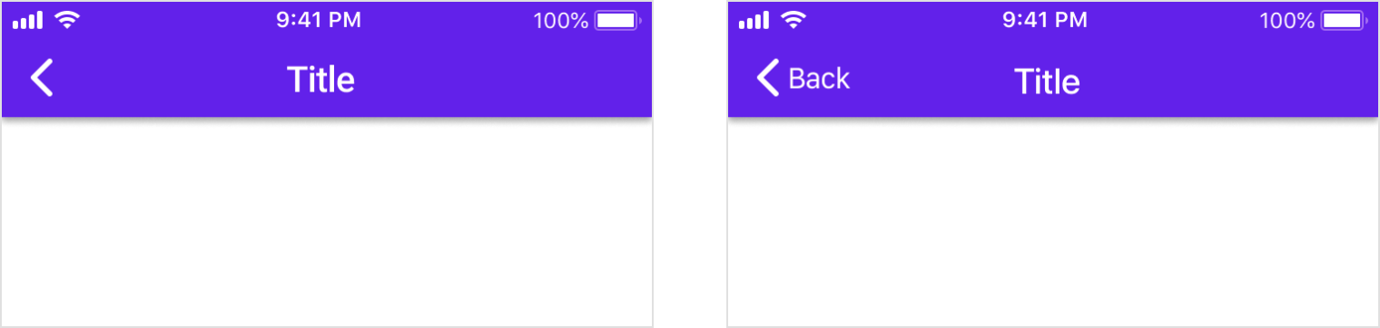
iOS
On iOS, the back arrow is thicker and doesn’t have a stem.
iOS
On iOS, the back arrow may also include a label for the associated destination.
Android
The action overflow menu icon (indicated by the “More…” symbol) contains three vertical dots.
iOS
The action overflow menu icon (indicated by the “More…” symbol) contains three horizontal dots.
Controls
Controls should clearly indicate how users should interact with them.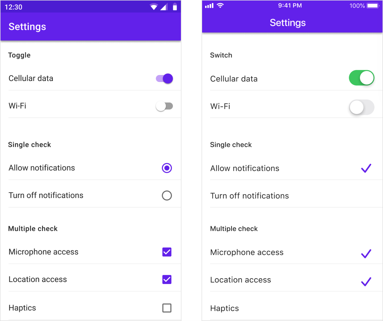
Android
Use Material switches, checkboxes, and radio buttons.
iOS
Native platform switches should be used as they have matching functionality and presentation as Material switches.
Use switches instead of checkboxes and check mark lists instead of radio buttons as these are the graphics expected on iOS.
Communication
Dialogs
Dialogs inform users about critical tasks that require a decision and they can contain multiple actions. On iOS there are components that perform similar functions to dialogs on Android, such as alerts and action sheets. Look at the number of actions and their text length to decide which component (Alert or Action Sheet) to use when adapting a dialog component to iOS.
Use Alerts when there are two actions with short text labels that fit horizontally.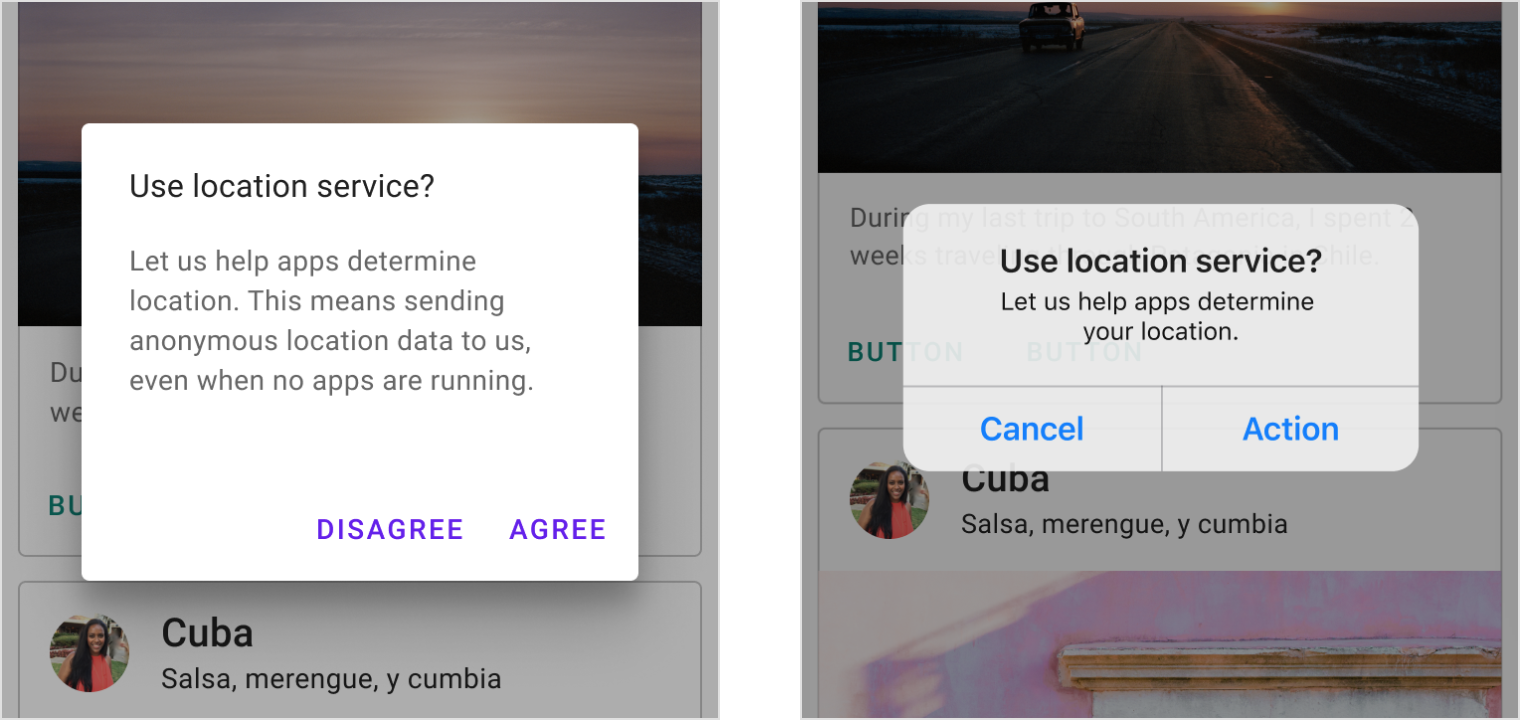
Android
Use a simple dialog when displaying two actions.
iOS
You have the option to use an alert when displaying two actions.
When there are three or more actions with long text labels in a Material dialog, products may use iOS action sheets or bottom sheets.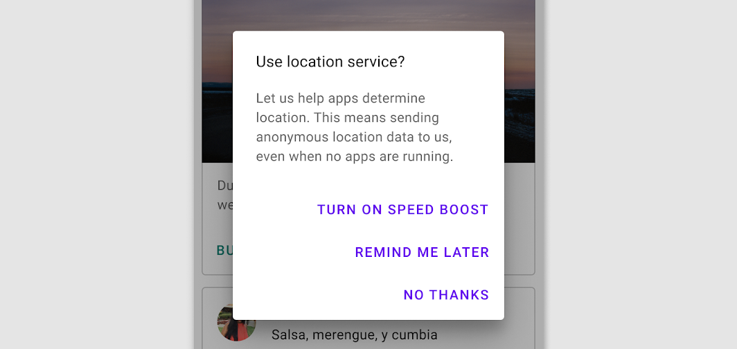
Android
Stack actions if a text label is long.
手势
Edge swipe
An edge swipe starts from the outer edge of the screen to reveal off-screen content.
Edge swipes can conflict with other swipe gestures, such as horizontal swipes through pages or table rows. To avoid conflicts, an edge swipe should perform the same behavior as any other swipe that exists over a content area.
 Android
When conflicting gestures are not present, performing an edge swipe from the left reveals off-screen content, such as a navigation drawer.
iOS
When conflicting gestures are not present, performing an edge swipe from the left navigates the user back in an app’s hierarchy.
过渡
Transitions use motion to help users navigate an app by illustrating the relationship between UI elements. It is recommended to use the platform defaults as a starting point for implementing motion for transitions.
Android
The default transition on Android uses scale to indicate moving forward and backward in a navigation flow.
iOS
The default transition on iOs uses horizontal translation to indicate moving forward and backward in a navigation flow.
排版
Typography communicates both text content and branding. In both cases, text must be accessible and resizable.
If your app already uses a brand specific typeface for branding, it’s recommended to use it in moderation throughout the app.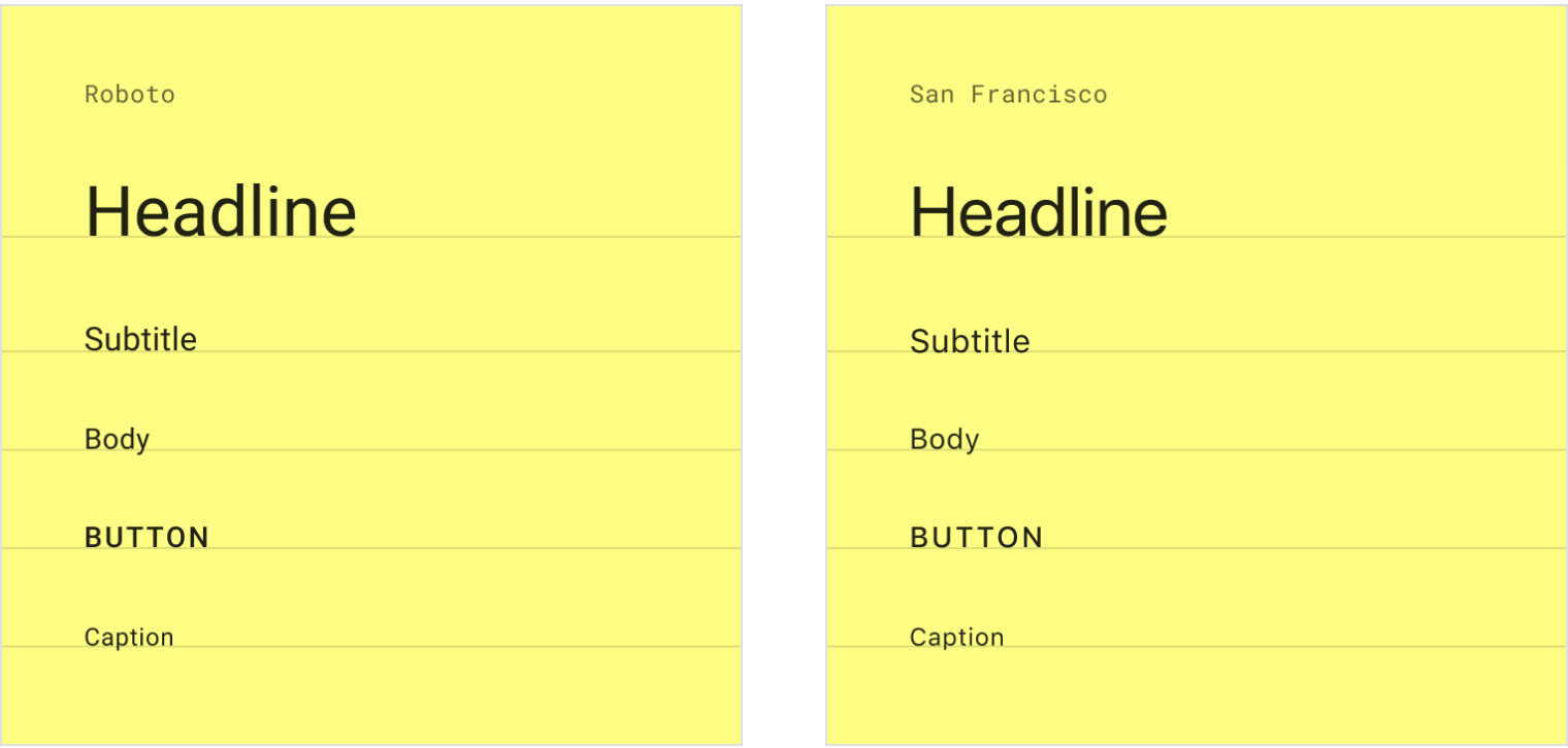
Android
The default typeface on Android is Roboto. On Android text size should be specified in scalable pixels to allow type to be resized using accessibility features.
iOS
The default typeface on iOS is San Francisco. Using this typeface is the easiest way to implement accessibility features like Dynamic Type. Using other typefaces may require adjustments to get the same accessibility features

若有收获,就点个赞吧
0 人点赞
