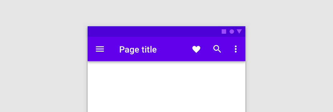
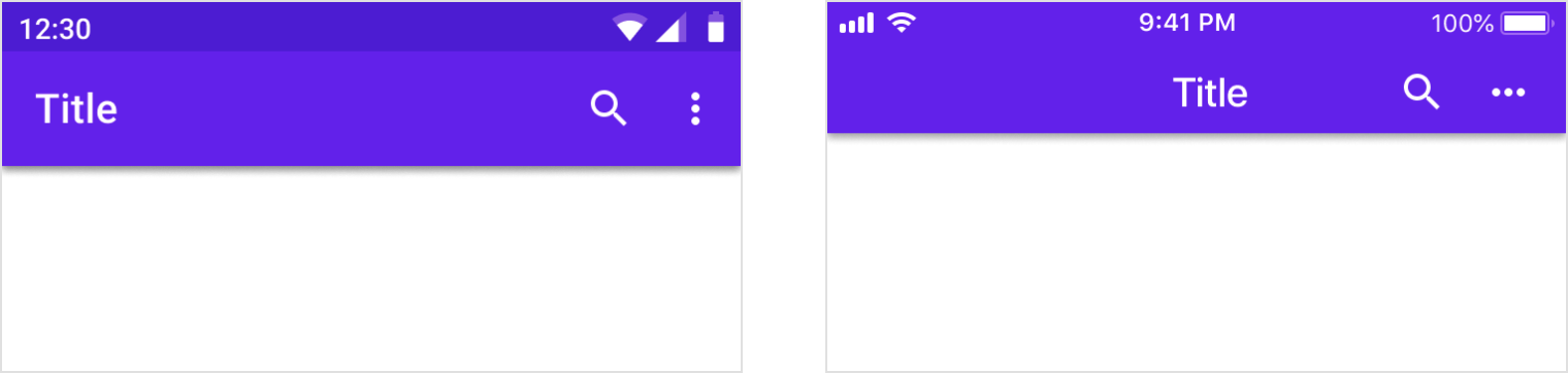
The top app bar displays information and actions relating to the current screen.

Usage
The top app bar provides content and actions related to the current screen. It’s used for branding, screen titles, navigation, and actions.
It can transform into a contextual action bar.
设计原则
Persistent
Top app bars appear at the top of each screen in an app, and can disappear upon scroll.
Guiding
Top app bars provide a reliable way to guide users through an app.
Consistent
Top app bars have a consistent position and content to increase familiarity.
分类
Regular
A regular top app bar
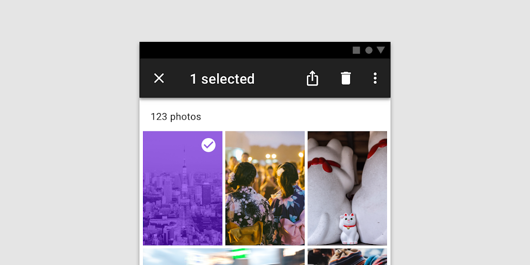
Contextual action bar
Contextual action bars provide actions for selected items. A top app bar can transform into a contextual action bar, remaining active until an action is taken or it is dismissed.
解析
The recommended placement of elements in a top app bar for left-to-right languages is:
- Place navigation on the far left
- Place any titles to the right of navigation
- Place contextual actions to the right of navigation
- Place an overflow menu (if used) to the far right
For right-to-left languages, placement positions should be flipped.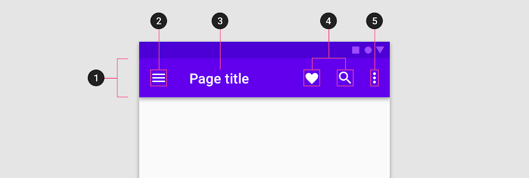
- Container
- Navigation icon (optional)
- Title (optional)
- Action items (optional)
- Overflow menu (optional)
Bar
The bar holds the content of the top app bar. A variety of bar heights are available:
- Regular
- Prominent
- Dense (desktop only)
- Prominent dense (desktop only)
Prominent
Prominent top app bars can be used for longer titles, to house imagery, or to provide a stronger presence to the top app bar.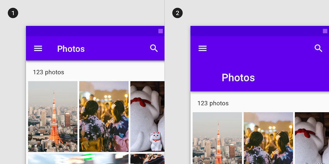
- Regular top app bar on mobile
- Prominent top app bar on mobile
Dense (desktop only)
The top app bar may be condensed on desktop to accommodate denser layouts.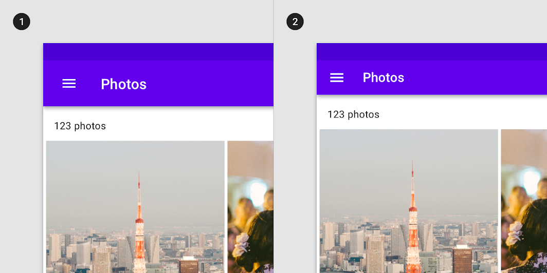
- Regular top app bar on desktop
- Dense top app bar on desktop
Prominent dense
Prominent top app bars on desktop can have a dense state to accommodate denser layouts.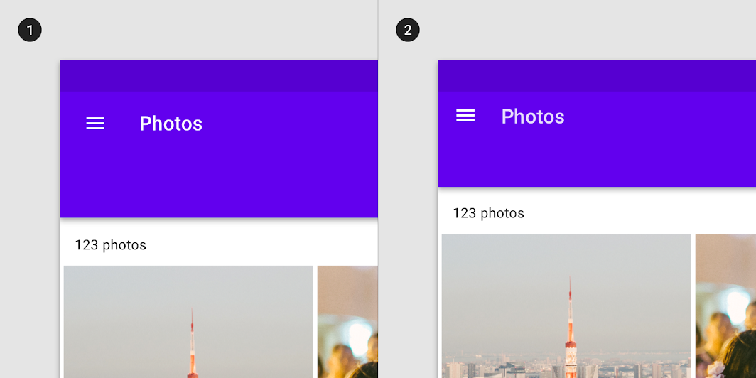
- Prominent top app bar on desktop
- Prominent dense top app bar on desktop
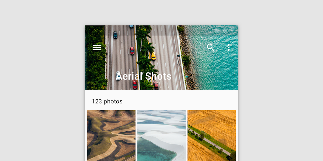
Images in bars
Bars can contain imagery. Prominent top app bars are recommended for image use because they provide more space.
Don’t use imagery that makes top app bar text and icons illegible.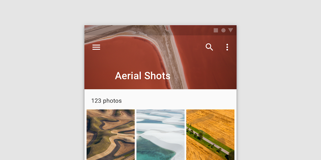
A prominent top app bar with imagery

Don’t
Don’t place imagery in a bar that makes the top app bar’s text and icons illegible.
Navigation icon (optional)
A navigation icon is optional. When it appears in an app bar, it’s aligned on the left of the bar.
It can take any of the following forms:
- A menu icon, which opens a navigation drawer
- An up arrow, which navigates upward an app’s hierarchy
- A back arrow, which returns to the previous screen
- Navigation icon
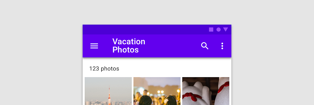
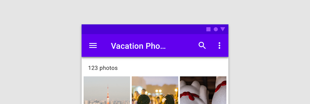
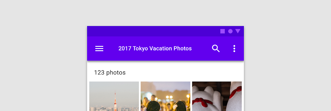
Title (optional)
The app bar title can be used to describe:
- The screen a user is currently on
- The section the user is currently in
- The app being used
By default, titles are left aligned on desktop. The default position of titles on mobile and tablet depends on the platform. More information on this is available in cross-platform adaptation.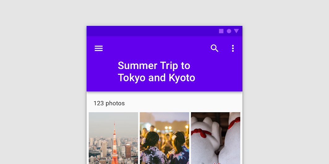

Do
If title text is long, use a prominent app bar and wrap the title to two lines

Don’t
Don’t wrap text in a regular top app bar

Don’t
Don’t truncate text, hiding the full title may cause misunderstanding

Don’t
Don’t shrink text to fit on a single line
Action items and overflow menu (optional)
App actions are placed on the right side of an app bar, either as icons or in an overflow menu. Overflow menus differ across mobile platforms. For more guidance refer to cross-platform adaptation.
Icon placement
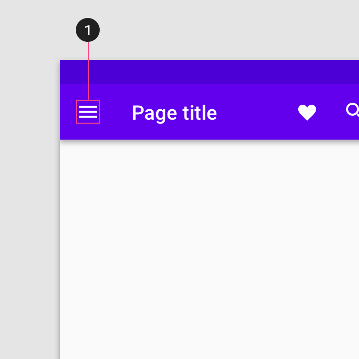
Place most-used actions on the left, progressing towards the least-used actions on the far right. Any remaining actions that don’t fit on the app bar can go into an overflow menu.
Actions move into and out of the overflow menu as the app bar width changes, such as if a device is rotated from landscape to portrait orientation. More guidance on this is available in top app bar behavior.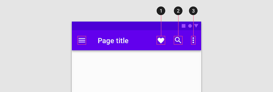

Do
Order action items by putting the most-used action (1) on the far left, second most used action (2) to its right, and so on. Any remaining or secondary actions should be placed in an overflow menu (3)
Cross-platform adaptation
On iOS, toolbars are called navigation bars and their height is shorter than the Android version. On Android, toolbars are called top app bars.
It’s recommended to use a platform’s default text alignment for toolbar titles, unless multiple action buttons are present.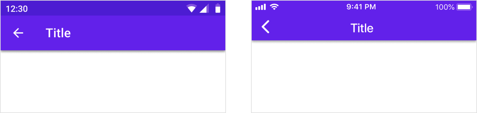
Android
Titles are left-aligned by default in top app bars.
iOS
Titles are center-aligned by default in navigation bars.
Android
When multiple actions, or even no actions, appear on the right side, top app bar titles are always left-aligned.
iOS
When multiple action buttons are on the right side, or on the home screen of an application, titles may be left-aligned.
Translucency
Material Design uses shadows to express elevation in app bars. In iOS, products can use translucency to differentiate app bars from content.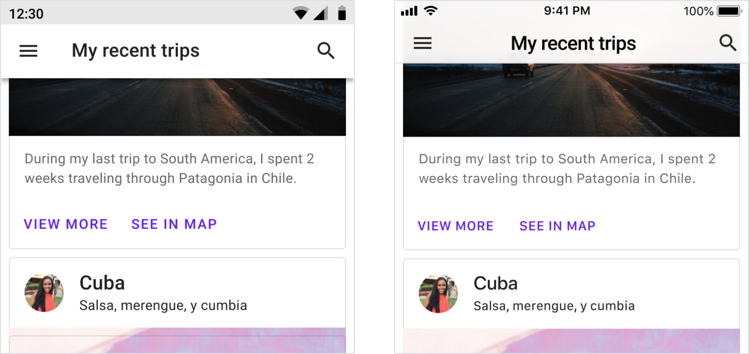
Android
Use shadow to express elevation.
iOS
Products have the option to use translucency to express elevation in iOS. Use a hairline as a bottom border of the app bar to ensure differentiation between the top app bar and scrolling content.
Behavior
Scrolling
Upon scrolling, the top app bar can remain in place, or transform in the following ways:
- Scrolling upward hides the top app bar
- Scrolling downward reveals the top app bar
When the top app bar scrolls, its elevation above other elements becomes apparent.
 The top app bar disappears upon scrolling up, and appears upon scrolling down.
Top app bars can be positioned at the same elevation as content. Upon scroll, they increase elevation and let content scroll behind them.
When scrolling up, prominent top app bars using imagery can transform into normal top app bars. They should not return to prominent mode until the user scrolls back to the top of the page.
Nesting actions
When a screen is resized, the top app bar resizes with it. Actions are consolidated into the overflow menu.
Action positioning
The actions move to the overflow menu from right to left, making the most-used action the last to be moved to the overflow menu.
As a top app bar is resized, actions move to the overflow menu from right to left.
Scaled down to 62.5%
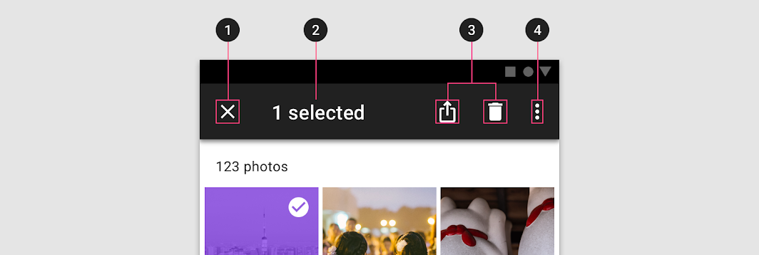
Contextual action bar
Usage
A top app bar can transform into a contextual action bar to provide contextual actions to selected items. For example, upon user selection of photos from a gallery, the top app bar transforms to a contextual app bar with actions related to the selected photos.
When a top app bar transforms into a contextual action bar, the following changes occur:
- The bar color changes
- Navigation icon is replaced with a close icon
- Top app bar title text converts to contextual action bar text
- Top app bar actions are replaced with contextual actions
Upon closing, the contextual action bar transforms back into a top app bar.
Top app bar transforming into a contextual action bar
结构
- Close button (instead of a navigation icon)
- Contextual title
- Contextual actions
- Overflow menu (optional)
Bar
When a top app bar transforms into a contextual action bar, the bar should change color to indicate a change of state.
Theming
Fortnightly Material Theme
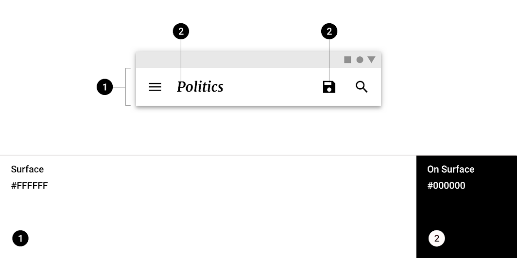
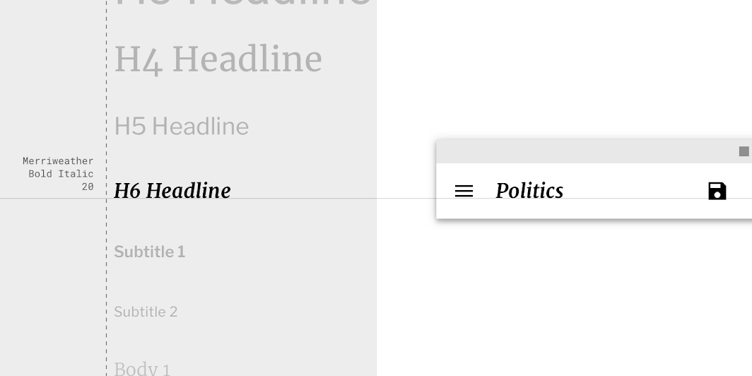
This news app’s top app bar has been customized using Material Theming. Areas of customization include color and typography.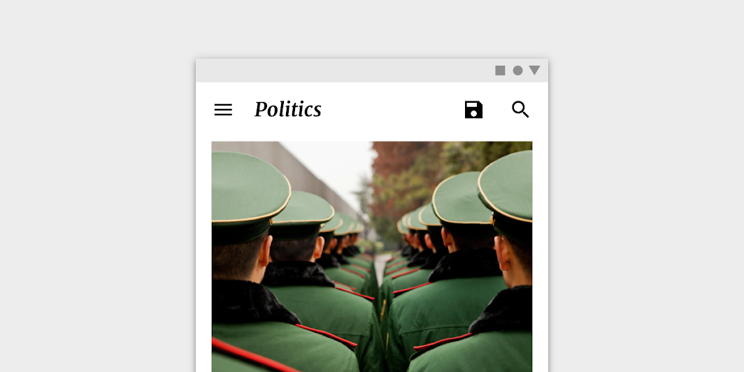
Fortnightly’s customized top app bar
颜色
| Element | Category | Attribute | Value |
|---|---|---|---|
| Container | Surface | Color Opacity |
#FFFFFF 100% |
| Text, icons | On Surface | Color Opacity |
#000000 100% |
排版
| Element | Category | Attribute | Value |
|---|---|---|---|
| Text | H6 | Typeface Font Size Case |
Merriweather Bold Italic 20 Title case |
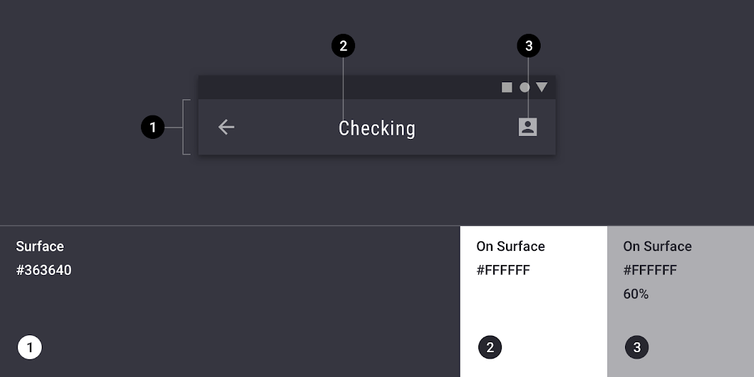
Rally Material Theme
This financial app’s top app bar has been customized using Material Theming. Areas of customization include color and typography.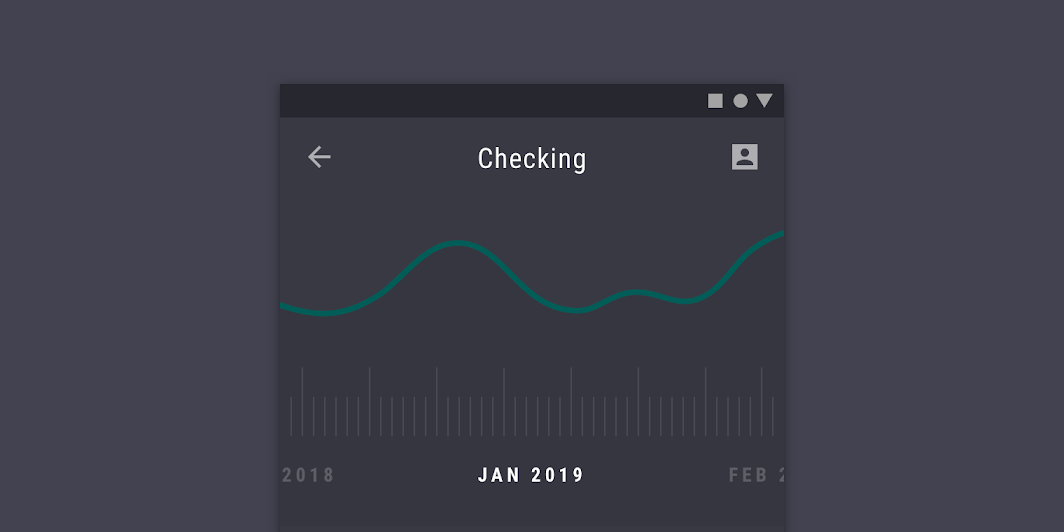
Rally’s customized top app bar
颜色
| Element | Category | Attribute | Value |
|---|---|---|---|
| Container | Surface | Color Opacity |
#363640 100% |
| Text | On Surface | Color Opacity |
#FFFFFF 100% |
| Icons | On Surface | Color Opacity |
#FFFFFF 60% |
排版
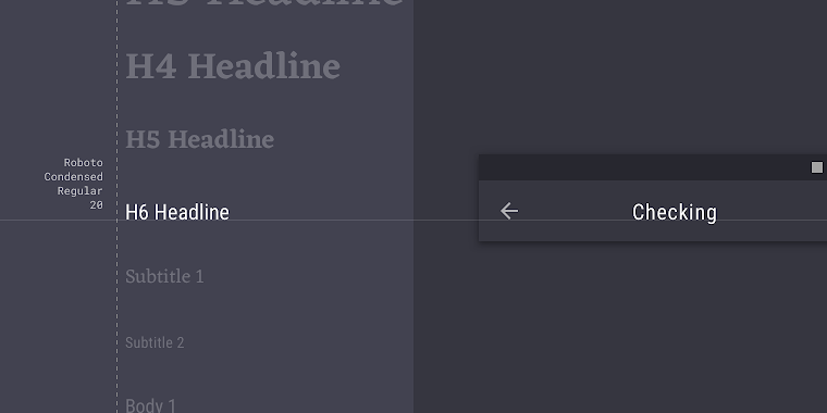
| Element | Category | Attribute | Value |
|---|---|---|---|
| Text | H6 | Typeface Font Size Case |
Roboto Condensed Regular 20 Title case |
Shrine Material Theme
This retail app’s top app bar has been customized using Material Theming. Areas of customization include color and typography.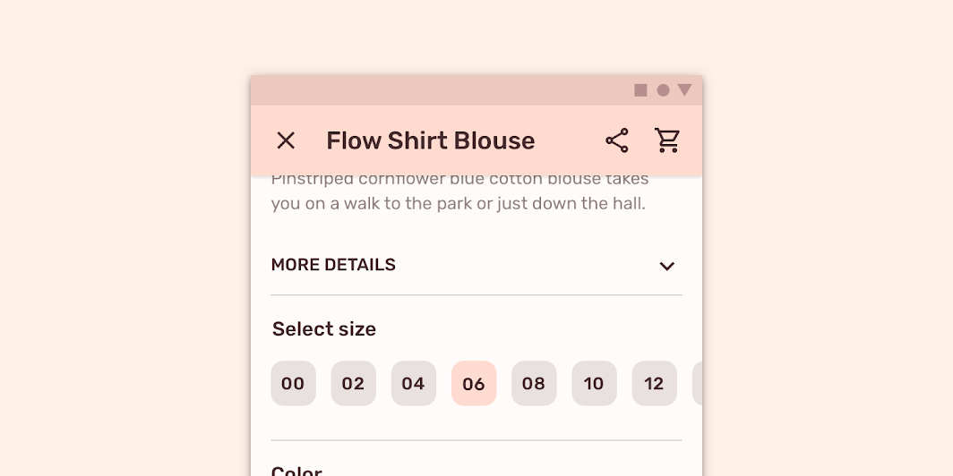
Shrine’s customized top app bar
颜色
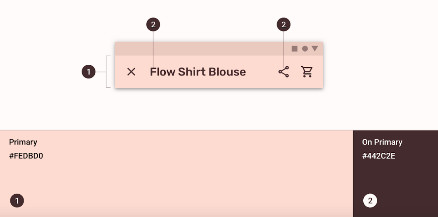
| Element | Category | Attribute | Value |
|---|---|---|---|
| Container | Primary | Color Opacity |
#FEDBD0 100% |
| Text, icons | On Primary | Color Opacity |
#442C2E 100% |
排版
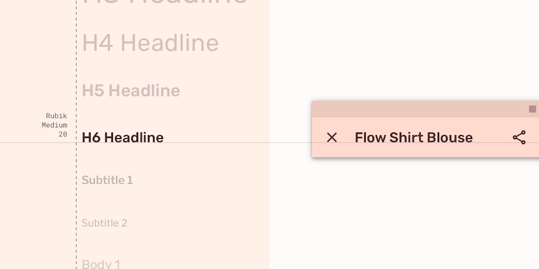
| Element | Category | Attribute | Value |
|---|---|---|---|
| Text | H6 | Typeface Font Size Case |
Rubik Medium 20 Title case |
Specs
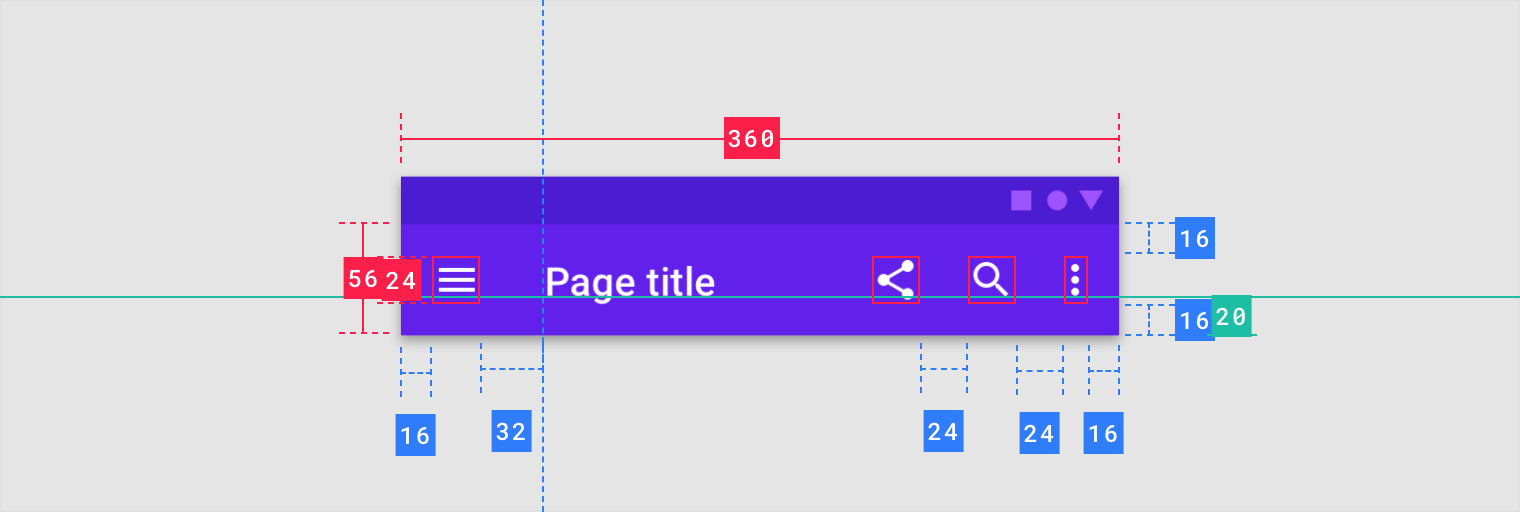
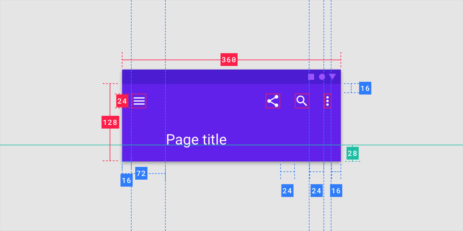
手机
Regular top app bar
Extended top app bar

若有收获,就点个赞吧
0 人点赞
