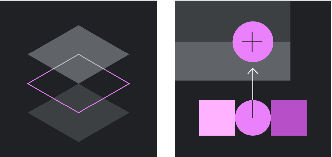
A dark theme is a low-light UI that displays mostly dark surfaces.
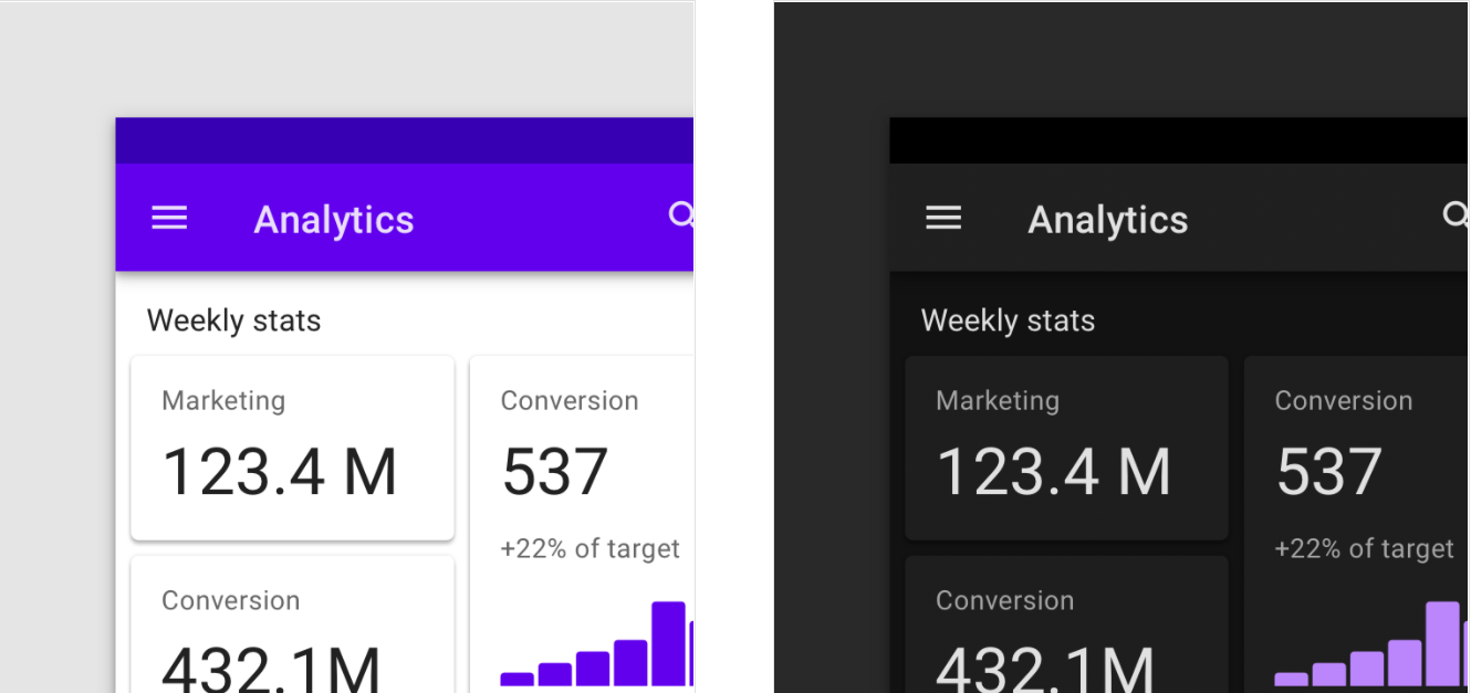
A light and dark theme UI

Usage
A dark theme displays dark surfaces across the majority of a UI. It’s designed to be a supplemental mode to a default (or light) theme.
Dark themes reduce the luminance emitted by device screens, while still meeting minimum color contrast ratios. They help improve visual ergonomics by reducing eye strain, adjusting brightness to current lighting conditions, and facilitating screen use in dark environments – all while conserving battery power. Devices with OLED screens benefit from the ability to turn off black pixels at any time of day.
原则
Darken with grey
Use dark grey - rather than black - to express elevation and space in an environment with a wider range of depth.
Color with accents
Apply limited color accents in dark theme UIs, so the majority of space is dedicated to dark surfaces.
Conserve energy
In products that require efficiency (such as devices with OLED screens), conserve battery life by reducing the use of light pixels.
Enhance accessibility
Accommodate regular dark theme users (such as those with low vision), by meeting accessibility color contrast standards.
Properties
Understanding Contrast Related Link arrow_downward Material Design dark themes are defined by the following properties:
Material Design dark themes are defined by the following properties:
- Contrast: Dark surfaces and 100% white body text have a contrast level of at least 15.8:1
- Depth: At higher levels of elevation, components express depth by displaying lighter surface colors
- Desaturation: Primary colors are desaturated so they pass the Web Content Accessibility Guidelines’ (WCAG) AA standard of at least 4.5:1 (when used with body text) at all elevation levels
- Limited color: Large surfaces use a dark surface color, with limited color accents (light, desaturated and bright, saturated colors)
Anatomy
Dark theme UIs use predominantly dark surfaces, with sparse color accents. They emit low levels of light while maintaining a high standard of usability.
1. Background (0dp elevation surface overlay)
2. Surface (with 1dp elevation surface overlay)
3. Primary
4. Secondary
5. On background
6. On Surface
7. On Primary
8. On Secondary

Behavior
A dark theme can be turned on (or off) using a control that is displayed:
- Prominently, using an icon toggle to turn the theme on or off
- With reduced prominence, with a toggle placed inside a menu or an app’s settings
A dark theme toggle in a top app bar

A dark theme toggle inside an overflow menu

A dark theme toggle inside an app’s settings

Properties
A dark theme uses dark grey, rather than black, as the primary surface color for components. Dark grey surfaces can express a wider range of color, elevation, and depth, because it’s easier to see shadows on grey (instead of black).
Dark grey surfaces also reduce eye strain, as light text on a dark grey surface has less contrast than light text on a black surface.
The recommended dark theme surface color is #121212.

Elevation
Elevation is the relative distance between two surfaces along the z-axis. Related Article arrow_downward In a dark theme, components retain the same default elevation levels…
In a dark theme, components retain the same default elevation levels and shadows as components in lighter themes. However, in a dark theme, the surfaces of different elevation levels are illuminated differently.
Higher elevation, lighter surface
The higher a surface’s elevation (raising it closer to an implied light source), the lighter that surface becomes. That lightness is expressed through the application of a semi-transparent overlay using the On Surface color.
 As a surface raises in elevation, it becomes lighter in color.
A dark theme surface is constructed by placing a semi-transparent overlay over a component surface.
A surface becomes lighter with the application of a semi-transparent white overlay.
1. Surface
2. Elevation overlay

An overlay on a surface also makes it easier to distinguish elevation between components and to see shadows. Overlays add contrast between surfaces and their shadows, making the edges of each surface more apparent.
Default themes use shadows to express elevation, while a dark theme also expresses elevation by adjusting the surface color.
These surface overlay values are designed to maximize legibility, while ensuring the different elevation levels are discernible from one another.
Elevation overlay transparencies range from 0% for the lowest level to 16% for the highest level.

| Elevation level | White overlaytransparency** |
|---|---|
| 00dp | 0% |
| 01dp | 5% |
| 02dp | 7% |
| 03dp | 8% |
| 04dp | 9% |
| 06dp | 11% |
| 08dp | 12% |
| 12dp | 14% |
| 16dp | 15% |
| 24dp | 16% |
Overlays clarify the elevation difference between components.
A. A card at 1dp elevation with 5% overlay
B. A floating action button at 6dp using a secondary color without an overlay
C. A bottom app bar at 8dp elevation with a 12% overlay

The elevation overlays are not applied to component surfaces that use primary or secondary colors.
In a dark theme, shadows remain dark to accurately represent a cast shadow.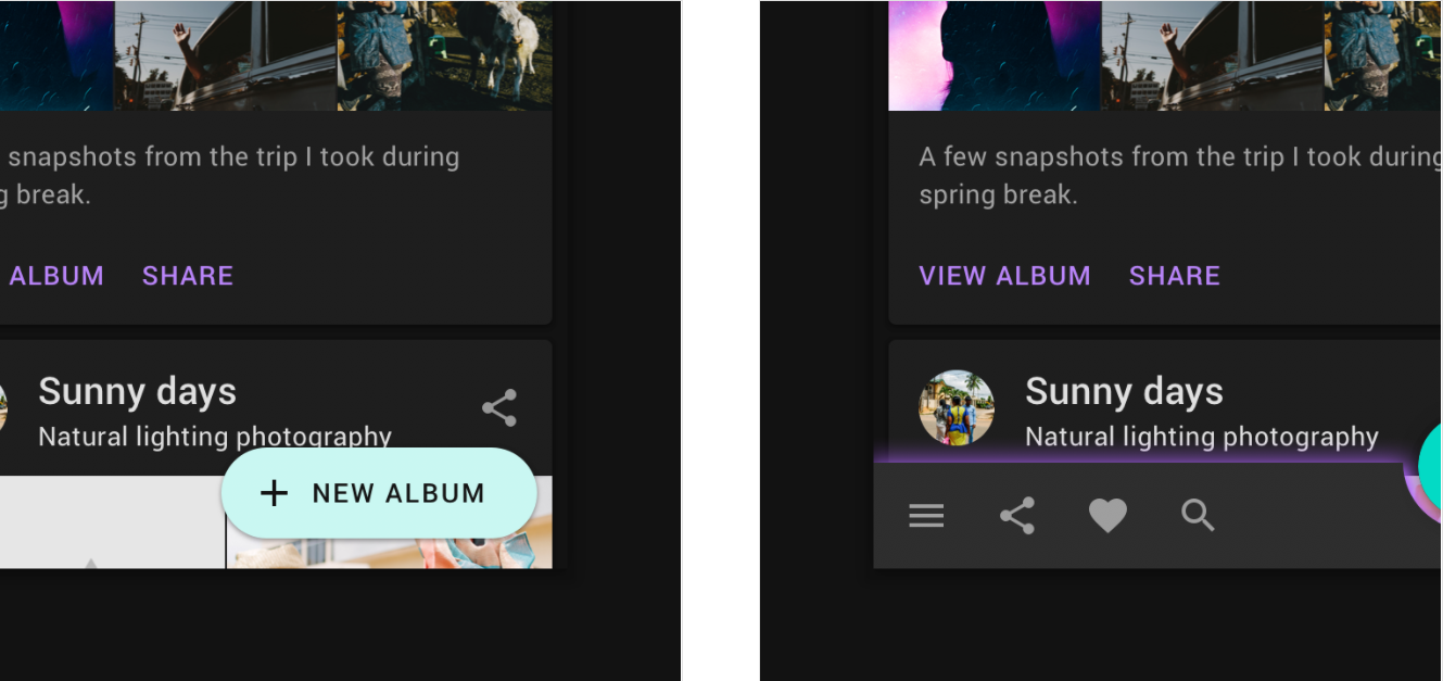
Don’t
Avoid elevation overlays on components that use a primary or secondary color for their surface container.
Don’t
Don’t use light glows in place of dark shadows to express elevation, because they don’t accurately represent elevation the way a cast shadow does.
Accessibility and contrast
Dark theme surfaces must be dark enough to display white text.
They should use a contrast level of at least 15.8:1 between text and the background.
This ensures that body text passes WCAG’s AA standard of at least 4.5:1 when applied to surfaces at the highest (and lightest) elevation.
To create branded dark surfaces, overlay the primary brand color at a low opacity over the recommended dark theme surface color (#121212). The color #1F1B24 is the result of combining the dark theme surface color #121212 and the 8% Primary color.

Caution
Ensure that the background color is dark enough so that body text meets a contrast level of at least 4.5:1 (AA) on the highest elevated surface (24dp).

UIs that require efficient battery usage can use true black. In these cases, some devices (such as wearables with OLED screens) can turn off any pixels that display black to conserve battery power.
Caution
On OLED screens, turning pixels on and off can cause a delay when the screen is scrolled, making the pixels blur.
UI application
Theme colors
All dark theme colors should display elements with sufficient contrast, passing WCAG’s AA standard of at least 4.5:1 for body text when applied to all elevation surfaces.
Desaturated colors for accessibility
A dark theme should avoid using saturated colors, as they don’t pass WCAG’s accessibility standard of at least 4.5:1 for body text against dark surfaces.
Saturated colors also produce optical vibrations against a dark background, which can induce eye strain.
Instead, desaturated colors can be used as a more legible alternative.
Less saturated colors from your color palette improve legibility and reduce visual vibration.

Don’t
Avoid using saturated colors that visually vibrate against a dark background.

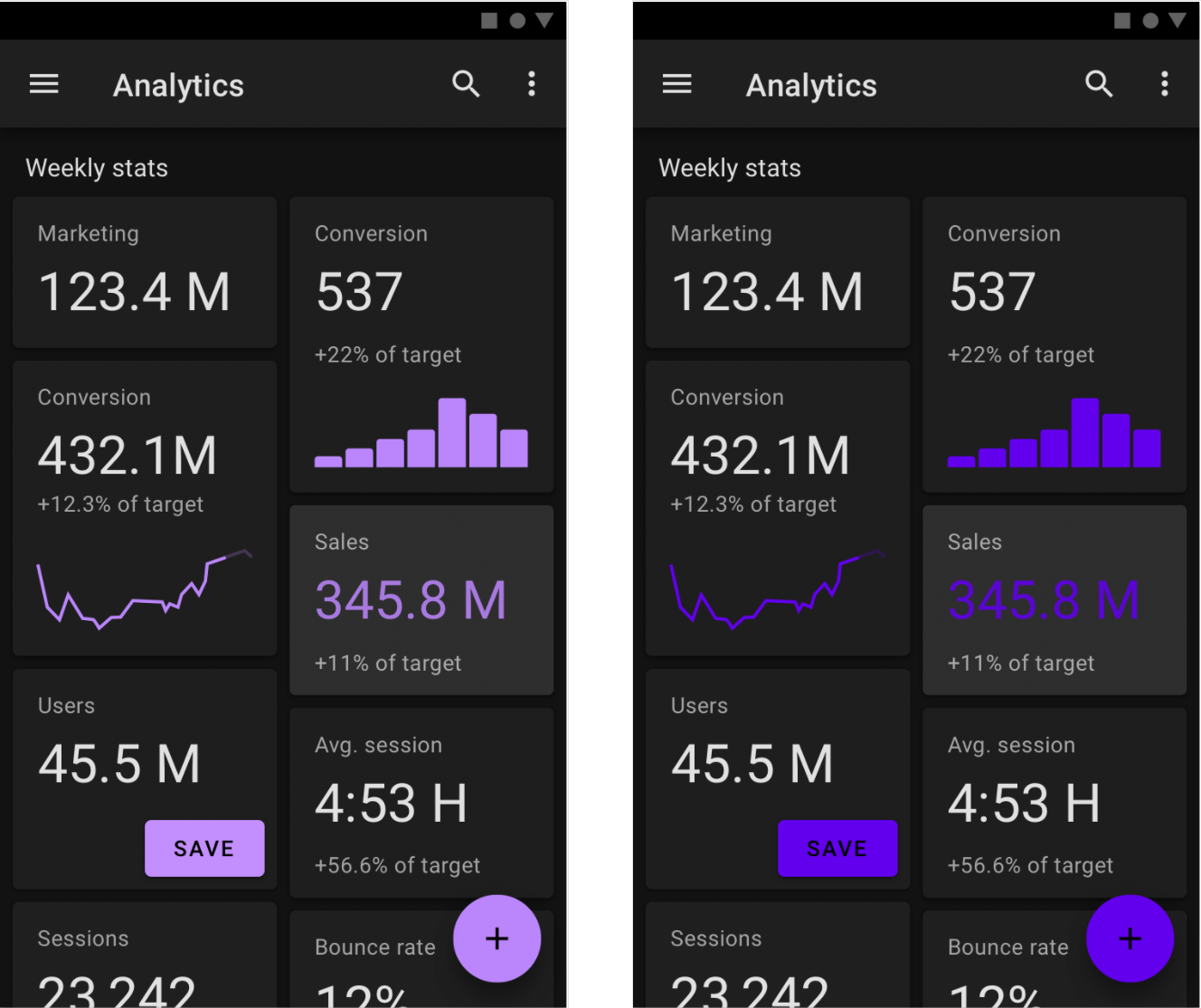
Primary color
A primary color is the color displayed most frequently across your app’s screens and components.
The baseline Material Design dark theme uses the 200 tone of the primary color (passing the WCAG’s AA standard of at least 4.5:1 for normal text, at all elevation surfaces).
A sample primary palette in a dark theme
1. Primary color indicator
2. Tonal variants

Primary color variants
Components that have light surfaces can display a variation of your dark theme’s primary color.
This dark theme UI uses a primary color (Purple 200) and a primary variant (Purple 700).

Secondary color
A secondary color can be used to accent select parts of your UI. In a dark theme, a secondary color can be desaturated to meet the 4.5:1 contrast level.
A sample secondary palette in a dark theme
1. Secondary color indicator
2. Tonal variants

This UI uses a primary color and a secondary color variant.

Accent color
In a dark theme, dark surfaces occupy the majority of the UI. Accent colors are typically light (desaturated pastels) or bright (saturated, vivid color) to help accented elements stand out. They should be used sparingly to accent key elements, such as text or buttons.
Finding accent colors
The color palette generator can be used to create (or view) a color theme. It also generates tonal palettes, which are a range of light to dark color variations, created from your primary and secondary colors. You can select variations of these for your dark theme.
To provide more flexibility and usability in a dark theme, it’s recommended to use lighter tones (200-50) in dark theme, rather than your default color theme (saturated tones ranging from 900-500).
1. Default theme primary color indicator
2. Dark theme primary color indicator

Do
Lighter tones (colors in the 200-50 range) have better readability on dark theme surfaces (at all elevations).
Don’t
Avoid using saturated colors on dark themes as they can visually vibrate against dark surfaces.
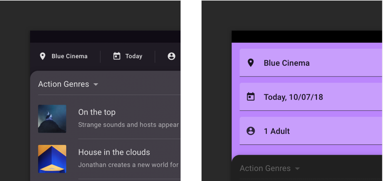
A default theme uses color for the surface of the top app bar.
In a dark theme, the surface of the top app bar uses a dark color instead of a primary or secondary color.
Brand colors
To retain brand identity, brand colors can be used at full saturation in a dark theme, although application should be limited to one or two branded elements, such as a logo or a branded button. By using branded colors sparingly, the elements remain prominent in the hierarchy.
Desaturated colors should still be used in the rest of a dark theme UI.
A fully saturated brand color is applied to the floating action button (2), while the desaturated dark theme primary color is applied to text (1).

- Dark theme primary color
2. Brand color
The dark theme baseline palette
The Material Design baseline theme includes tonal palettes for a dark theme.
Dark theme colors should be used across a dark theme UI, including:
- Color (primary, secondary, and primary color variants)
- Surfaces (backgrounds and components)
- States (such as error states)
- Content (typography and iconography)
The dark theme baseline Material color theme

1. The Material Design baseline default theme
2. The Material Design baseline dark theme

Error colors
Error colors are used to indicate an error state. The Material baseline dark theme error color is #CF6679.
This dark theme color was created by taking the light theme error color (#B00020) and lightening it with a 40% white overlay, to pass AA-Level contrast standards.

Typography and iconography colors
“On” colors
“On” colors are primarily applied to text, iconography, and strokes that are sometimes placed “on” top of key surfaces that use a primary, secondary, surface, background, or error color.
By default, dark theme “on” colors are white and black.
A UI displays the dark theme baseline colors for text and iconography.

Light text on dark backgrounds
When light text appears on dark backgrounds (shown here as white on black) it should use the following opacity levels:
- High-emphasis text has an opacity of 87%
- Medium-emphasis text and hint text have opacities of 60%
- Disabled text has an opacity of 38%
High-emphasis, medium-emphasis and disabled text

Custom application
Some use cases in Material Design can benefit from using select dark theme elements.
Large surfaces
Components that use a large portion of a screen, such as an app bar or a backdrop, can use the dark theme for their component’s surface color.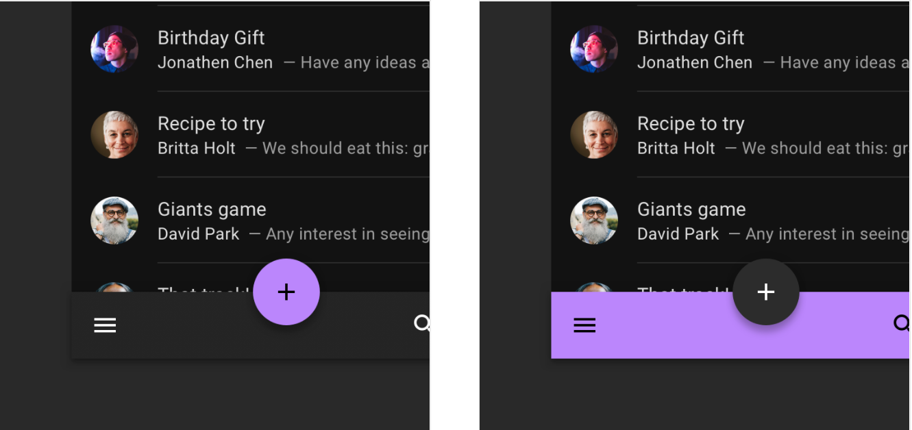
Do
Reserve bright colors for smaller surfaces.
Don’t
Don’t use bright colors for large surfaces because they can emit too much brightness.
Caution
If a dark color is preferred instead of the recommended surface color (hex value #121212), ensure that it passes the 15.8:1 contrast ratio.
Don’t
Avoid using the dark theme primary color for the backdrop because it covers a large portion of the screen with a light color.
Combining light and dark themes
When a light surface is needed in a dark theme, light coloring can be used on select component surfaces to preserve hierarchy.
For example, a dark theme snackbar can display a light surface to help it stand out. To do so, it can apply the light theme’s Surface and On Surface colors.
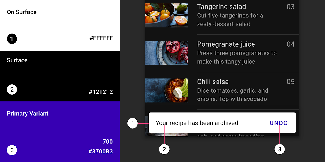
The snackbar uses a light surface in a dark theme to help it stand out.
1. On Surface: #FFFFFF
2. Surface: #121212
3. Primary Variant: #3700B3
States
States visually communicate the status of a component or interactive element through the use of overlays. In a dark theme, states should use the same overlay values as their default (or light) theme, and they can be adjusted to pass AA-level contrast standards.
There are two types of containers that inherit state overlays: containers that use the “Surface” color and the “Primary” color.
Surface containers
Surface containers that use the color called “Surface” should apply an overlay that matches the color of their icon or text label (if no icon is present).
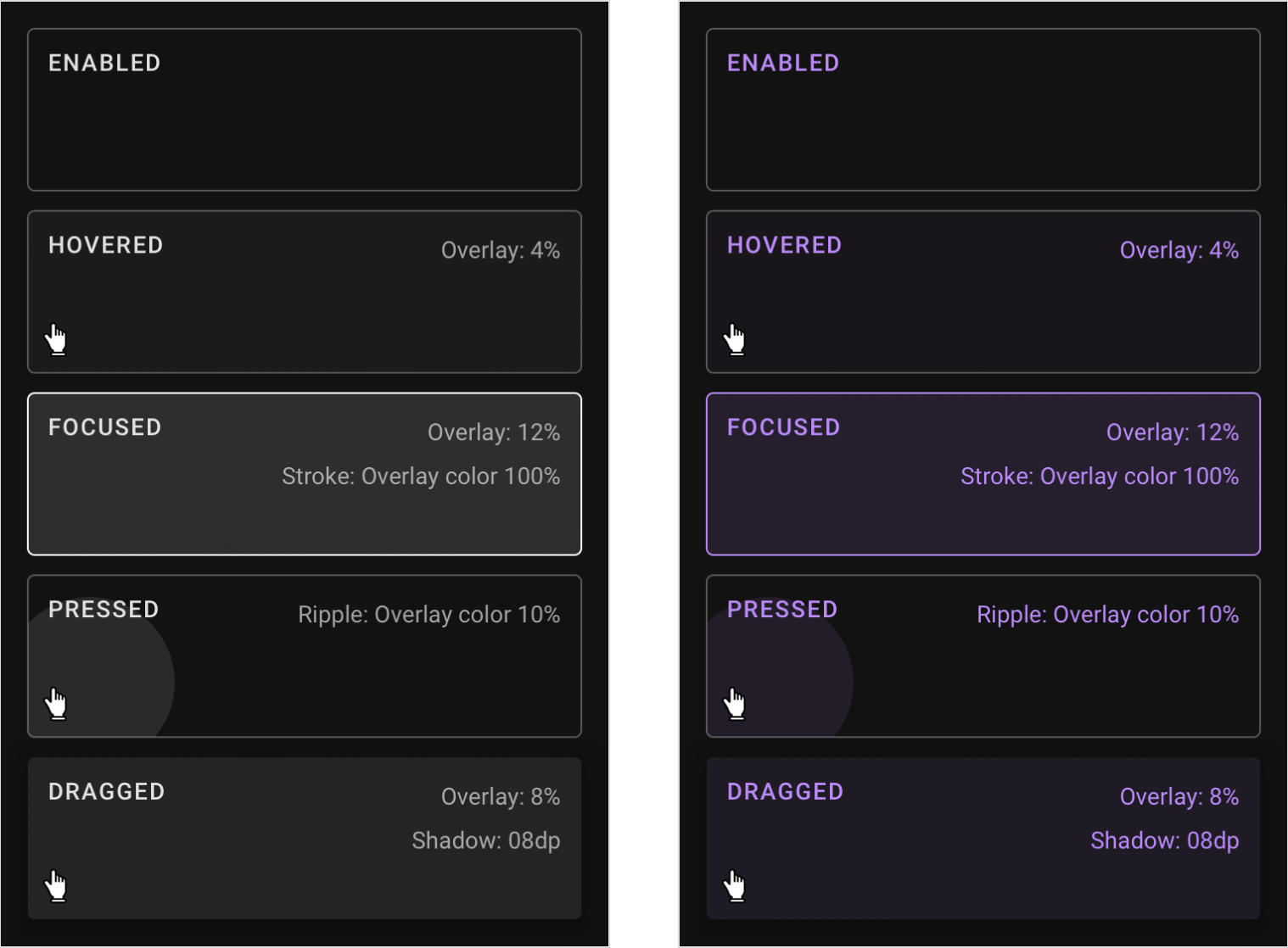
The enabled, hovered, focused, pressed, and dragged states for containers using the Surface color.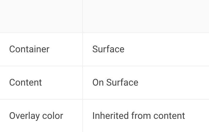
The enabled, hovered, focused, pressed, and dragged states for containers using the Surface color and the primary color for content.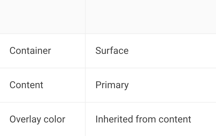
Primary containers
For surface containers that use the “Primary” color, their state overlay is white.

The enabled, hovered, focused, pressed, and dragged states for containers using the semi-transparent primary color.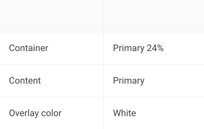
The enabled, hovered, focused, pressed, and dragged states for containers using the primary color.
Disabled states
All disabled components are displayed using 12% White for container outlines and fills and 38% White for content such as labels or icons.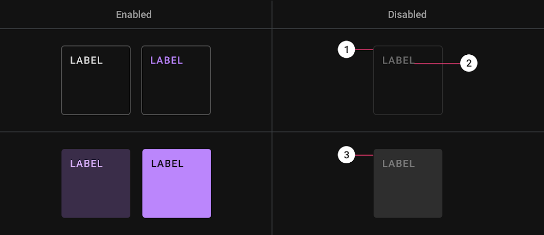
1. Outlined container: 12% White
2. Label/Icon: 38% White
3. Filled container: 12% White
Resources
Design files
These design files include elements for dark theme layouts, such as status bars, app bars, bottom toolbars, cards, dropdown menus, side navs, dialogs, floating action buttons, and other components.

Available under Apache 2.0. By downloading, you agree to the Google Terms of Service. The Google Privacy Policy describes how data is handled in this service.
Implementation
Dark theme implementation support for each platform is indicated below.
| Platform | Status |
|---|---|
| Android | Available |
| iOS | Planned |
| Web | Planned |
| Flutter | Planned |

若有收获,就点个赞吧
0 人点赞
