The Material Shape System enables you to systematically apply unique shapes across a variety of components.
Shape scheme
Shape categories
Components are grouped into shape categories based on their size. These categories provide a way to change multiple component values at once, by changing the category’s values.
Shape categories include:
The following components can use unique corner shapes:
Small Components
- Button
- Chip
- Expanding bottom sheet (collapsed) *
- Extended floating action button
- Floating action button
- Filled text field
- Outlined text field
- Snackbar
- Tooltip
Medium Components
- Card
- Dialog
- Image list item
- Menu
Large Components
- Backdrop *
- Data table
- Expanding bottom sheet (expanded / full-screen) *
- Modal bottom sheet (collapsed)
- Modal bottom sheet (expanded / full-screen) *
- Nav drawer (bottom - collapsed)
- Nav drawer (bottom - expanded / full-screen) *
- Nav drawer (side)
- Side sheet
- Standard bottom sheet (collapsed)
- Standard bottom sheet (expanded / full-screen) *
*Indicates components with certain corners that cannot be customized.
Shape attributes
Category attributes
Shape categories use attributes to define how shape is assigned to the corners of components.
The following attributes can be customized:
- Shape family
- Shape size
- Symmetry
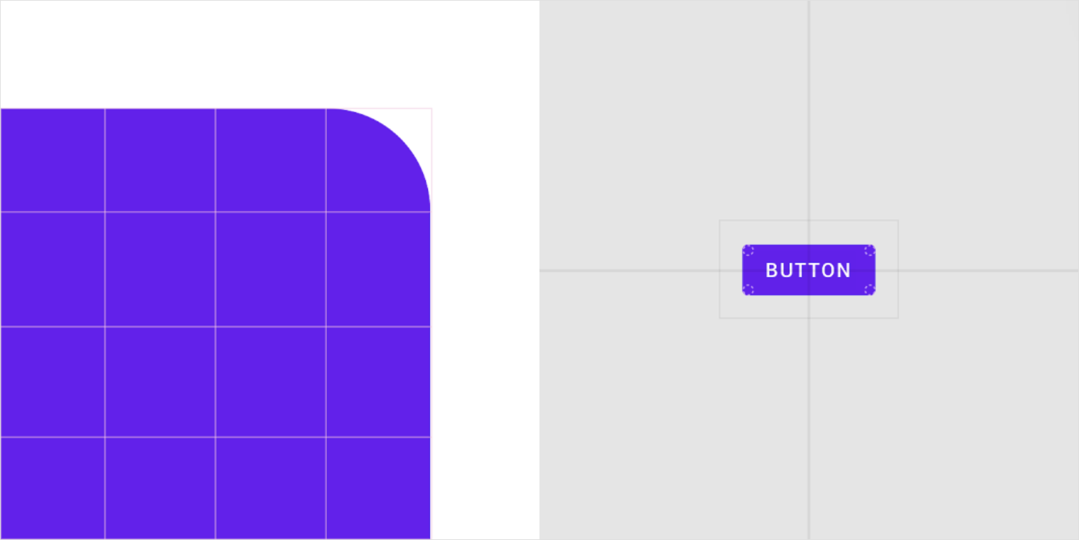
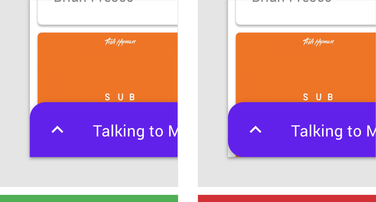
The button displayed above has the following attributes:
| Component | Element | Category | Attribute | Value |
|---|---|---|---|---|
| Button | Container | Small | Shape family Size |
Rounded 4dp;4dp;4dp;4dp |
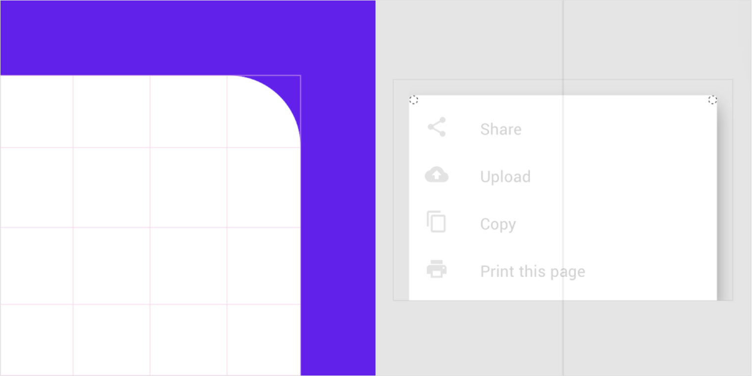
The modal bottom sheet displayed above has the following attributes:
| Component | Element | Category | Attribute | Value |
|---|---|---|---|---|
| Modal bottom sheet | Container | Medium | Shape family Size |
Rounded 4dp;4dp;n/a;n/a |
*Bottom sheets can only be shaped on the top left and top right corners.
Shape family
Components can apply one of two styles to the shapes of their corners:
- Rounded corner
- Cut corner
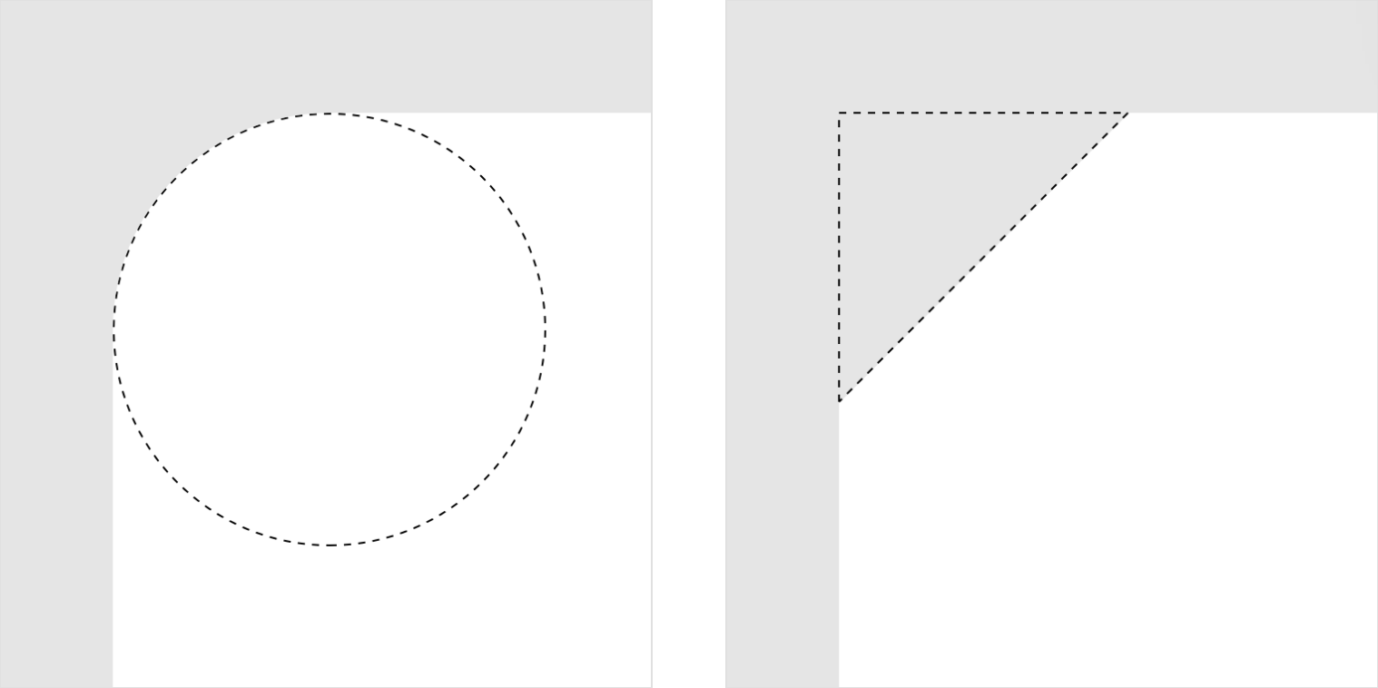
A rounded corner A cut corner
Shape size
Shape size can be determined using a value that is either absolute or a percentage.
Absolute size
Absolute size refers to having a specific value, such as 2dp. When a corner radius or cut length has an absolute size, it remains the same regardless of the component’s height. For example, if a component dynamically changes its height, its corner shape maintains the absolute corner radius or cut length size.
Percentage size
Small components can set the size of their corner shape using a percentage of the absolute height of the component. This means the corner shape will change as the component height changes.
 On a button with corner shapes of absolute size, the corners remain the same size and shape as the button grows taller.
On a button with corner shapes using percentage sizing, the corner shapes get larger as the button grows taller.
Do
Use absolute rounded corners on components like cards that change in size along with the amount of content they contain.
Don’t
Don’t use percentage rounded corner on components that dynamically change in size
Component symmetry
Components can apply corner shapes in either a symmetrical or asymmetrical way. Symmetrical components apply the same values to all corners, whereas asymmetric components can have corners with different values from each other.
- For a symmetrical component shape, specify a single shape family and single size value that will be used by all corners.
- For an asymmetric component shape, specify the shape family and size values of each corner. Shape family and size values are applied clockwise, starting from the top-left corner.
When mirroring a design for RTL layouts, components may need to mirror their shape customizations if they are positioned along an edge of the UI, or if the change affects usability. Shape customizations based on brand can optionally be mirrored.
Symmetrically shaped component
Asymmetrically shaped component
Component corners that are anchored to screen edges can’t be customized. Unique shapes on anchored corners would create gaps that display content behind a component.
Do
Corners anchored to screen edges cannot use customized shape.
Don’t
Don’t customize corner shapes that are anchored to screen edges.
Categories and overrides
Shape categories
To apply a shape family and size across all components in a category, set values for the shape category. When adjustments are made to a shape category, the changes affect all components in that shape category, except for those with an override.
Shape overrides
When a component requires a different shape than the one defined by a category, it can use an override to its shape family, size, or both. Use overrides for branding, usability, layout, hierarchy, or other factors.
When a specific component is assigned a value, it overrides the value inherited from the shape category.
The baseline theme includes several shaped components with overrides.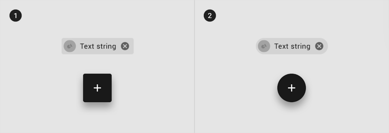
1. A chip and floating action button with baseline shape family and size values
2. A chip and floating action button with customized shape family and size values
| Component | Element | Category | Attribute | Value |
|---|---|---|---|---|
| Chip | Container | Override* | Shape family Size |
Round 50% |
| FAB | Container | Override* | Shape family Size |
Round 50% |
*The baseline theme chips and floating action buttons override the size value of the small component shape category value.
Picking shapes
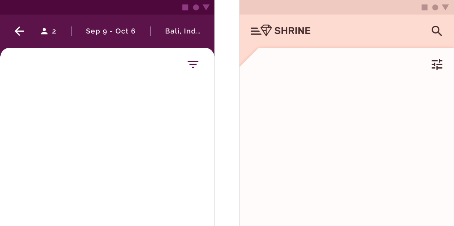
Brand and hierarchy
When applying shape to components, the shape choices you make can support your brand and your UI’s hierarchy.
Brand
When applying shape in a UI, identify the distinctive shape of your brand, such as an organic or geometric form that reflects your brand’s attributes.
Based on this shape, develop a set of similar, related shapes to apply across your product, helping to unify your brand’s expression throughout it.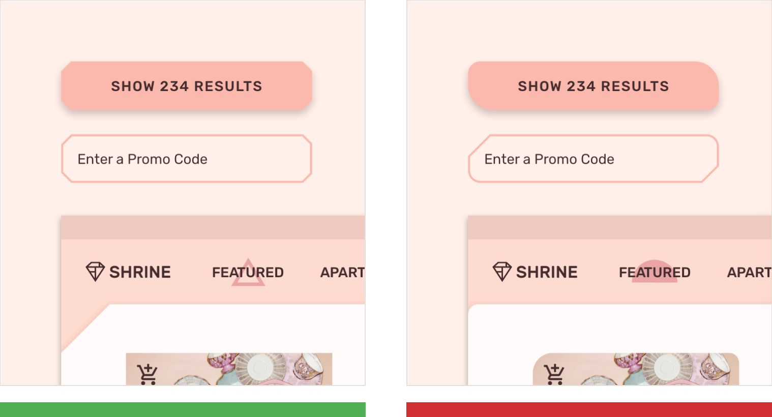
Do
An identifying shape, such as this diamond logo, is used to develop a set of similar, related shapes to unify brand expression throughout an app or set of products.
Don’t
Mixing shapes can make it hard to distinguish a brand’s style.
Hierarchy
Components with unique shapes stand out, and can be used to draw user attention to specific parts of the screen or emphasize certain areas in a layout. For example, a floating action button can use a unique shape to help it stand out from other UI elements.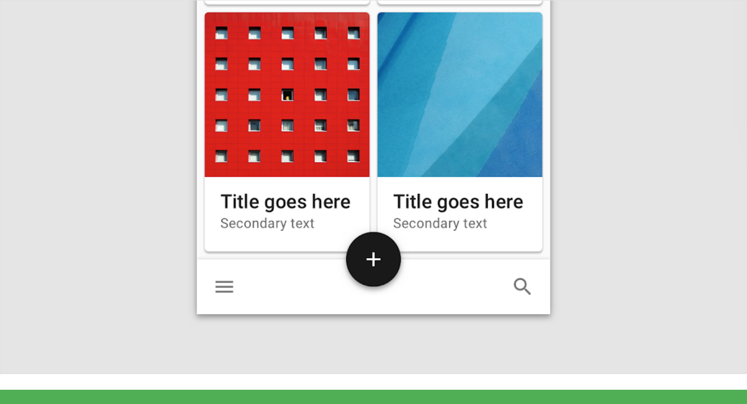
Do
The round shape of this floating action button stands out against the straight lines of the other UI elements.
Don’t
This floating action button has the same shape as other elements, making it difficult to find.
Combining brand and hierarchy
Use a set of similar, related shapes across your product’s components as a basis for developing a consistent hierarchy and brand expression.
Components that need to stand out can also use shapes that express your brand. Apply the brand shapes to components using overrides.
Overuse of shape to express brand can lead to brand dilution, where the shape loses its brand connection and becomes commonplace.
Too many unique shapes can lead to no shape being especially prominent as well as a lack of visual cohesion across components.
Transformations
Components that transform between two shapes should consider how those transformations may affect the component’s identifiability.
Shaped components that expand to fill the entire screen should not use shaping when they become full screen.
Changes in state
Components can use shape changes to indicate state changes.
For example, the selected state of a card can use a unique shape treatment that distinguishes it from unselected cards. Shapes used to indicate state should be distinct from the component’s typical shape.
Full-screen components
Don’t use shape on the corners of full-screen and expanded components.
Rectangular shapes provide more space for scrollable content.
Rectangular shapes also prevent content behind full-screen components from appearing through gaps between the shape and a screen edge.

A rounded corner is used to indicate selected cards and distinguish them from unselected cards.
The curved shape is removed from a bottom sheet’s corners as it expands to full-screen.
How content and shape affect one another
A component’s shape can be affected by its content or system customizations.
Changes to other systems
System customizations, such as changes to the type scale, can affect a component’s use of shape.
For example, increasing the type size used by a component could cause:
- Text in the component to be cropped by the shape
- The component’s height and shape to change, if its shape sizes are defined as percentages.
Changes to content
Changes to content can also affect the shape of a component.
For example, if the text length increases, the text could wrap to an additional line, increasing the height of the component and affecting shapes defined as a percentage.
Shape choice
Changing the shape style can affect content within a component.
For example, a large cut corner on a card will intrude on the content area more than a rounded corner of the same size, potentially affecting the layout of content or clipping images. To avoid unintended results, consider the choice of shape family and size in tandem with a component’s layout and content.
Caution
Cut corners take up more space in the content area than rounded corners.
Baseline shape values
Shape value ranges
Each component can apply shape in different ways. The recommended range of values for each shape family are listed in the following table.
How to read the table
Each component has two values: one for size and one for shape family. Values are applied to a component in the following order (similar to the syntax used in css), describing each corner in a clockwise pattern:
Top-left corner; top-right corner; bottom-right corner; bottom-left corner
If a single value range is listed, it applies to all corners that can be shaped.
Corner shapes can have a maximum size of 50% of a component’s absolute height. Cut corners are not recommended for some components, because the cut shape is likely to clip content.
Category: Small components
| Category or component | Corners can be shaped? | RoundedMin / Max** | CutMin / Max** | Baseline theme values |
|---|---|---|---|---|
| Small components category | Not applicable | 0-28; 0-50% |
0-28; 0-50% |
Rounded, 4dp |
| Button | Yes; Yes; Yes; Yes | 0-20; 0-50% |
0-6; 0-50% |
Rounded, 4dp |
| Chip | Yes; Yes; Yes; Yes | 0-16; 0-50% |
0-0; 0-0% |
Rounded, 50%* |
| Expanding bottom sheet (collapsed) | Yes; Yes; No; No | 0-24; 0-50% |
0-12; 0-50% |
Rounded, 24dp* |
| Extended floating action button | Yes; Yes; Yes; Yes | 0-28; 0-50% |
0-28; 0-50% |
Rounded, 50%* |
| Floating action button | Yes; Yes; Yes; Yes | 12-28; 20-50% |
12-28; 20-50% |
Rounded, 50%* |
| Filled text field | Yes; Yes; Yes; Yes | 0-20; 0-50% |
0-12; 0-50% |
Rounded, 4dp;4dp;0dp;0dp |
| Outlined text field | Yes; Yes; Yes; Yes | 0-20; 0-50% |
0-12; 0-50% |
Rounded, 4dp |
| Snackbar | Yes; Yes; Yes; Yes | 0-24; 0-50% |
0-12; 0-50% |
Rounded, 4dp |
| Tooltip | Yes; Yes; Yes; Yes | 0-16; 0-50% |
0-0; 0-0% |
Rounded, 4dp |
- indicates override of category value
Category: Medium components
| Category or component | Corners can be shaped? | Rounded Min / Max |
Cut Min / Max |
Baseline values |
|---|---|---|---|---|
| Medium components category | Not applicable | 0-36 | 0-16 | Rounded, 4dp |
| Card | Yes; Yes; Yes; Yes | 0-24 | 0-16 | Rounded, 4dp |
| Dialog | Yes; Yes; Yes; Yes | 0-36 | 0-16 | Rounded, 4dp |
| Image list item | Yes; Yes; Yes; Yes | 0-24 | 0-16 | Rounded, 0dp* |
| Menu | Yes; Yes; Yes; Yes | 0-20 | 0-12 | Rounded, 4dp |
- indicates override of category value
Category: Large components
| Category or component | Corners can be shaped? | Rounded Min / Max |
Cut Min / Max |
Baseline values |
|---|---|---|---|---|
| Large components category | Not applicable | 0-36 | 0-24 | Rounded, 0dp |
| Backdrop | Yes; Yes; No; No | 0-36 | 0-24 | Rounded, 24dp* |
| Data table | Yes; Yes; Yes; Yes | 0-20 | 0-12 | Rounded, 4dp* |
| Expanding bottom sheet (expanded / full-screen) | No; No; No; No | 0-0 | 0-0 | Rounded, 0dp |
| Modal bottom sheet (collapsed) | Yes; Yes; No; No | 0-24 | 0-12 | Rounded, 0dp |
| Modal bottom sheet (expanded / full screen) | No; No; No; No | 0-0 | 0-0 | Rounded, 0dp |
| Navigation drawer (bottom - collapsed) | Yes; Yes; No; No | 0-24 | 0-12 | Rounded, 0dp |
| Navigation drawer (bottom - expanded / full screen) | No; No; No; No | 0-0 | 0-0 | Rounded, 0dp |
| Navigation drawer (side) | Yes; Yes; Yes; Yes | 0-36 | 0-18 | Rounded, 0dp |
| Side sheet | Yes; Yes; Yes; Yes | 0-36 | 0-18 | Rounded, 0dp |
| Standard bottom sheet (collapsed) | Yes; Yes; No; No | 0-24 | 0-12 | Rounded, 0dp |
| Standard bottom sheet (expanded / full-screen) | No; No; No; No | 0-0 | 0-0 | Rounded, 0dp |
- indicates override of category value
Components that can’t have customized shape
The following components cannot customize their shape, as a shape could interfere with a components’ identifiability or legibility. A shape can also imply an unsupported action.
For example, a bottom app bar with rounded corners may appear as though it can be dragged up, but that action is not possible.
- App Bar: Bottom
- App Bar: Top
- Banner
- Checkbox
- Divider
- Expanding bottom sheet (when full screen)
- Modal bottom sheet (when full screen)
- Radio button
- Standard bottom sheet (when full screen)
- Tabs

若有收获,就点个赞吧
0 人点赞
