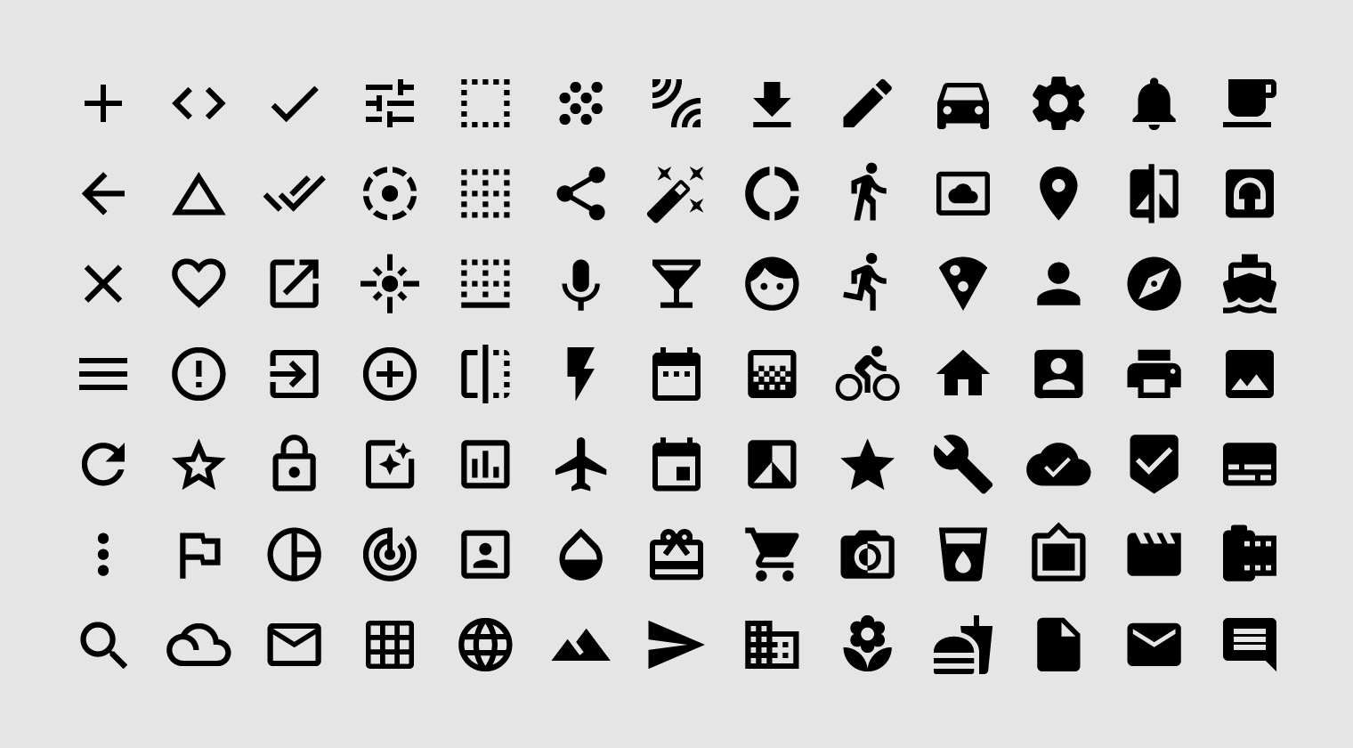
常见操作,比如文件、设备和目录的图标会使用系统图标。
System icons symbolize common actions, files, devices, and directories.
设计原则
概念
系统图标设计简单,现代,友好,有时取巧。
每个图标都缩小为最小形式,只需要表达最基本的特征。
System icons are designed to be simple, modern, friendly, and sometimes quirky. Each icon is reduced to its minimal form, expressing essential characteristics.
由于系统图标较小,为了确保可读性和清晰度,图标形状一般采用规则的几何形状,并且具有对称且一致的外观。
Icon shapes are bold and geometric. They have a symmetrical and consistent look, ensuring readability and clarity, even at small sizes.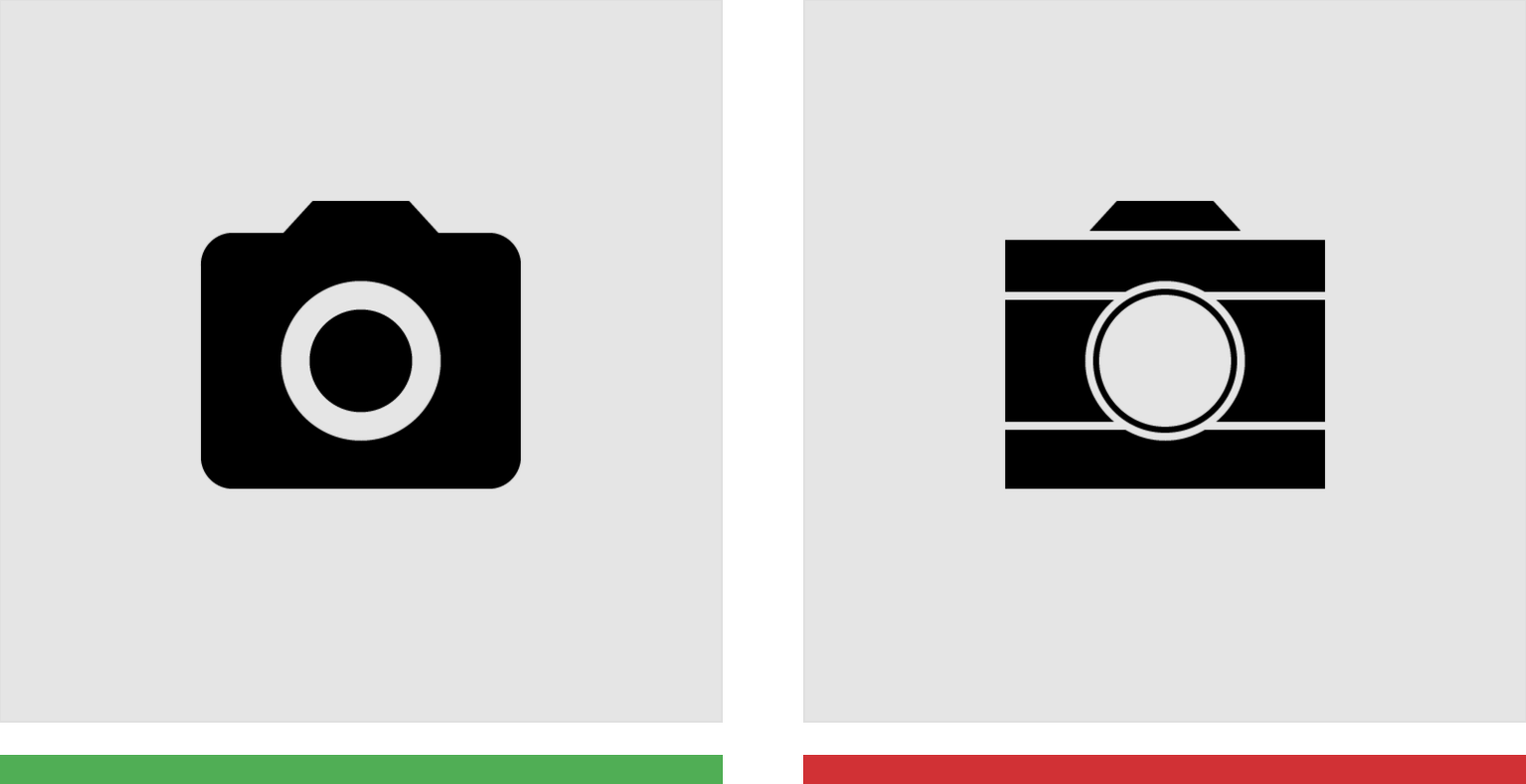
保证图标的整体性;避免使用过于细腻的笔触。
Do
Make icons graphic and bold.
Don’t
Don’t use delicate, thin stroke weights.

保证图标由规则的几何形状组成;不要使用手绘或随意的形状。
Do
Use geometric, consistent shapes.
Don’t
Don’t use gestural or loose organic shapes.
网格与图标形状
模板下载
Create your own system and product icons with these Adobe Illustrator files including the 24dp icon grid.
Available under Apache 2.0. By downloading this file, you agree to the Google Terms of Service. The Google Privacy Policy describes how data is handled in this service.
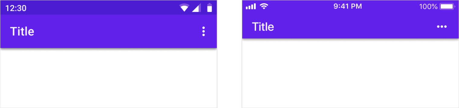
图标大小
系统图标显示为24 x 24 dp。创建用于以100%比例查看的图标,以获得完美的像素精度。
System icons are displayed as 24 x 24 dp. Create icons for viewing at 100% scale for pixel-perfect accuracy.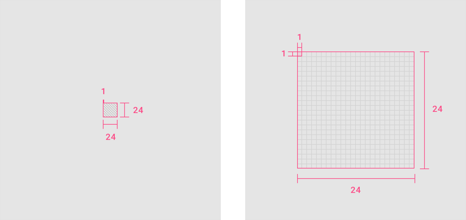
100% 比例;1000% 比例。
密集的布局
在桌面上,当鼠标和键盘是主要输入方法时,测量可以缩小到20dp。
On desktop, when the mouse and keyboard are the primary input methods, measurements may be scaled down to 20dp.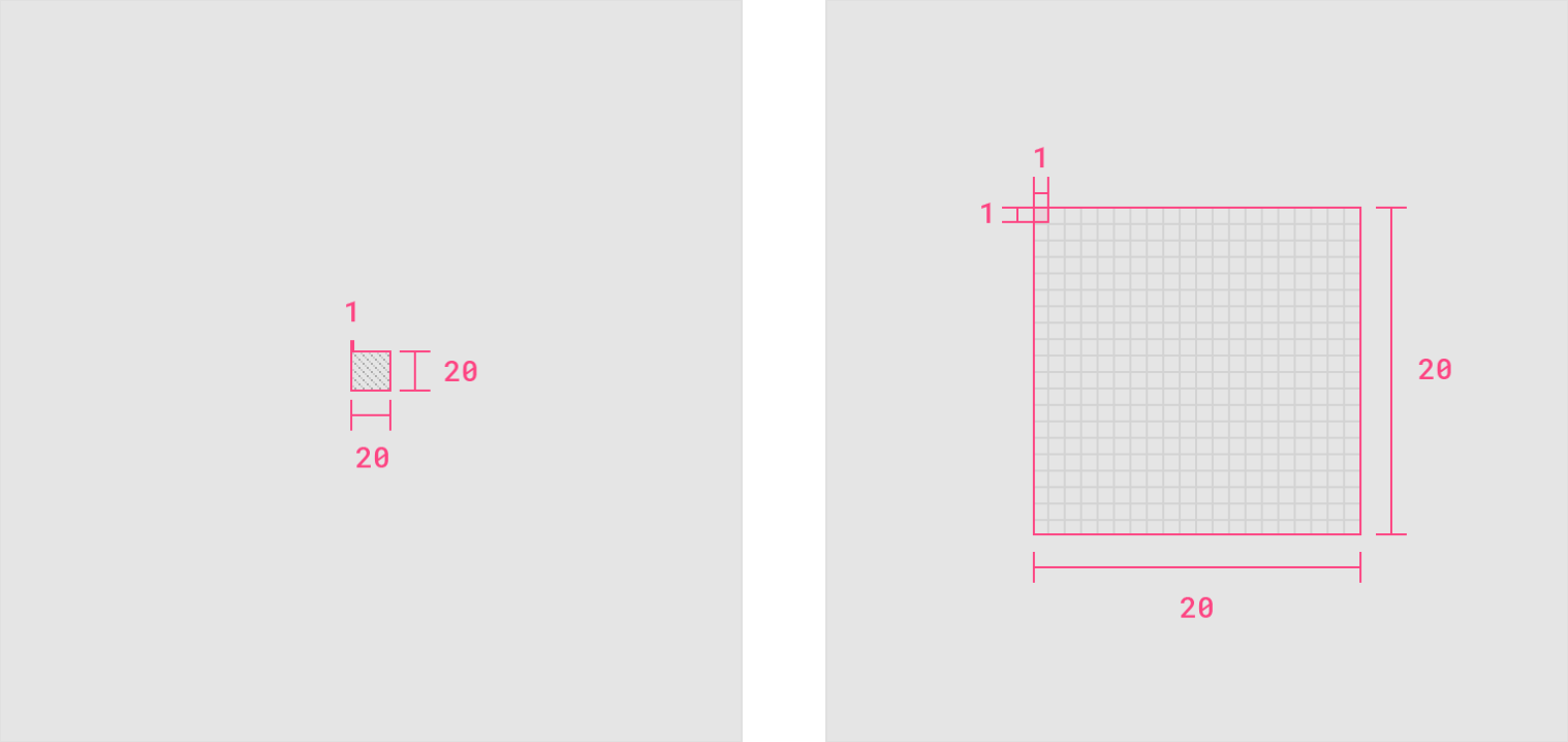
100% 比例;1000% 比例。
布局
图标内容应控制在设计区域内。
如果需要额外的空间,内容可以延伸到活动区域和修剪区域之间的外边距区域(图形的完整大小)。图标的任何部分都不应延伸到整体布局之外。
Icon content should remain inside of the live area, which is the region of an image that is unlikely to be hidden from view (such as when sidebars appear upon scrolling).
If additional visual weight is needed, content may extend into the padding between the live area and the trim area (the complete size of a graphic). No parts of the icon should extend outside of the trim area.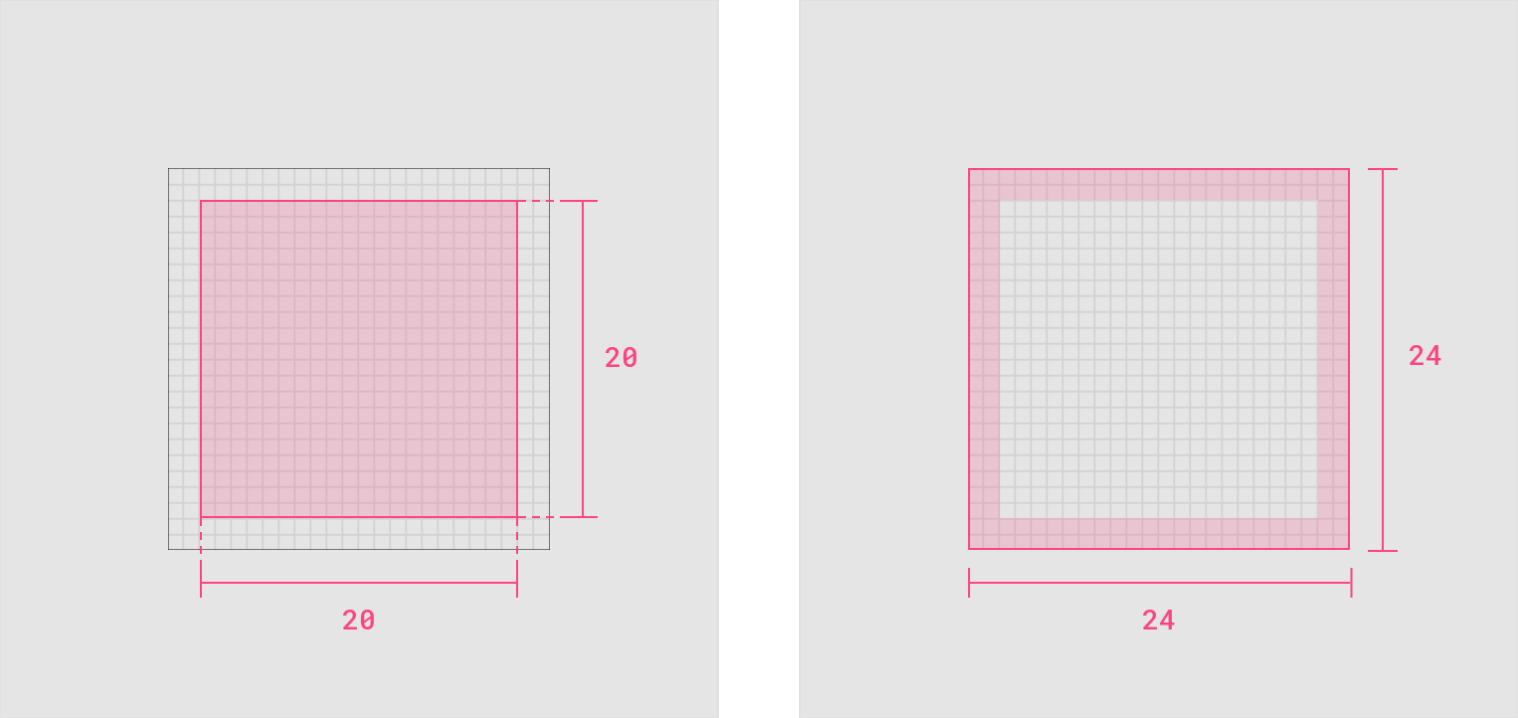
Live area
Icon content is limited to the 20dp x 20dp live area, with 2dp of padding around the perimeter.
Padding
2dp of padding surrounds the live area.
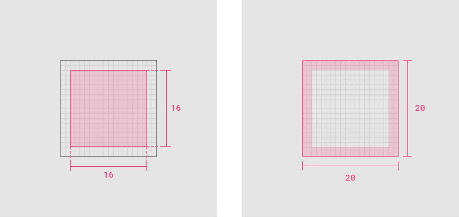
Dense live area
Icon content is limited to the 16dp x 16dp live area, with 2dp of padding around the perimeter.
Dense padding
2dp of padding surrounds the live area.
图标形状
图标网格和 Keyline
由于每个品牌的特性不同,系统图标的元素需要灵活的创意设计,而网格系统在保证图形元素统一的视觉风格的同时也提供了足够的区域来进行图标设计。
Keyline 轮廓是网格的基础。通过将这些核心形状作为规范,您可以让图标在跨系统时保持一致的视觉比例。
The icon grid establishes clear rules for the consistent, but flexible, positioning of graphic elements.
Keyline shapes are the foundation of the grid. By using these core shapes as guidelines, you can maintain consistent visual proportions across system icons.
基本形状
基本形状的 Keylines 有:圆形,正方形,矩形,正交和对角线。
这些基本形状有助于统一 Google 系统图标的视觉风格,并规范它们在图标网格上的位置。
Specific keylines are present for certain shapes: circle, square, rectangle, orthogonals, and diagonals. These basic shapes help unify Google system icons and regulate their placement on the icon grid.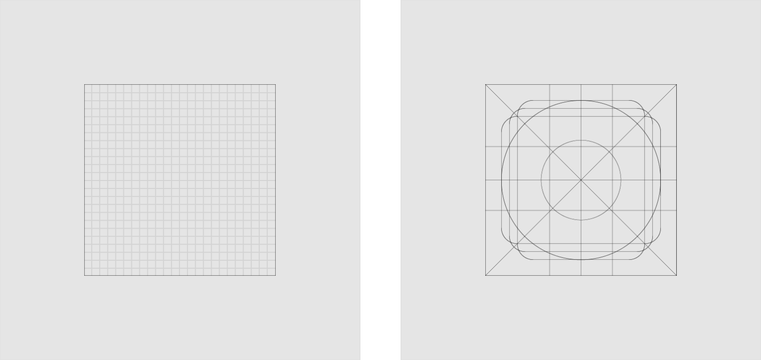
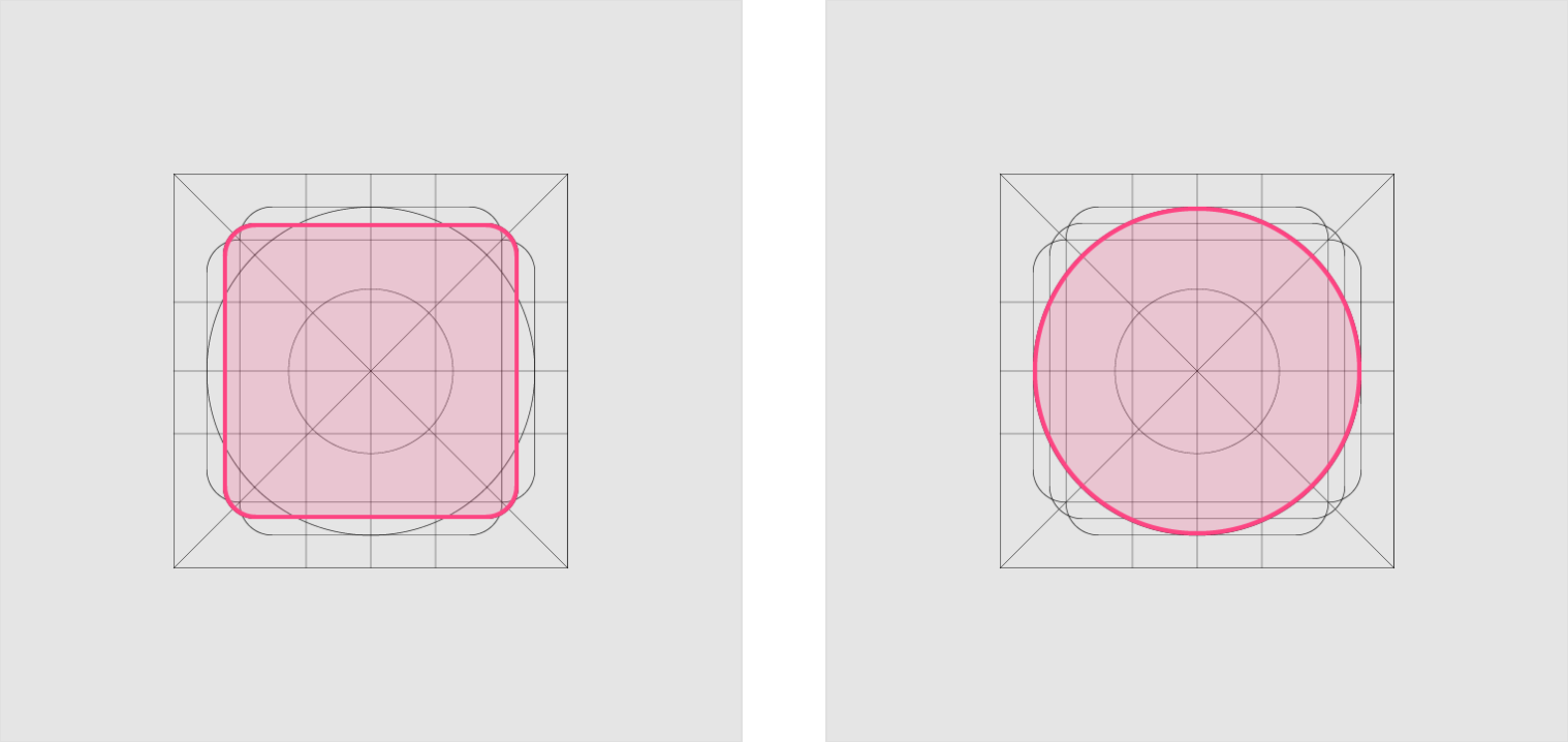
Square
Height: 18dp
Width: 18dp
Circle
Diameter: 20dp
Vertical Rectangle
Height: 20dp
Width: 16dp
Horizontal Rectangle
Height: 16dp
Width: 20dp
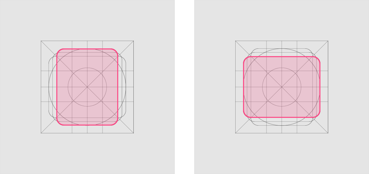
几何
已经确定了特定keylines的预设标准:圆形,正方形,矩形,正交和对角线。这些通用且简单的元素已经开发出来,用于统一Google系统图标并将它们的位置系统化到图标网格上。
Clipboard icon
Camera icon
清晰度
为避免图标出现扭曲模糊的现象,请将 X 和 Y 坐标设为整数,而不是小数,保证图标能够 “像素对齐”。
To avoid distorting an icon, position icons “on pixel” by making the X and Y coordinates into integers, without decimals.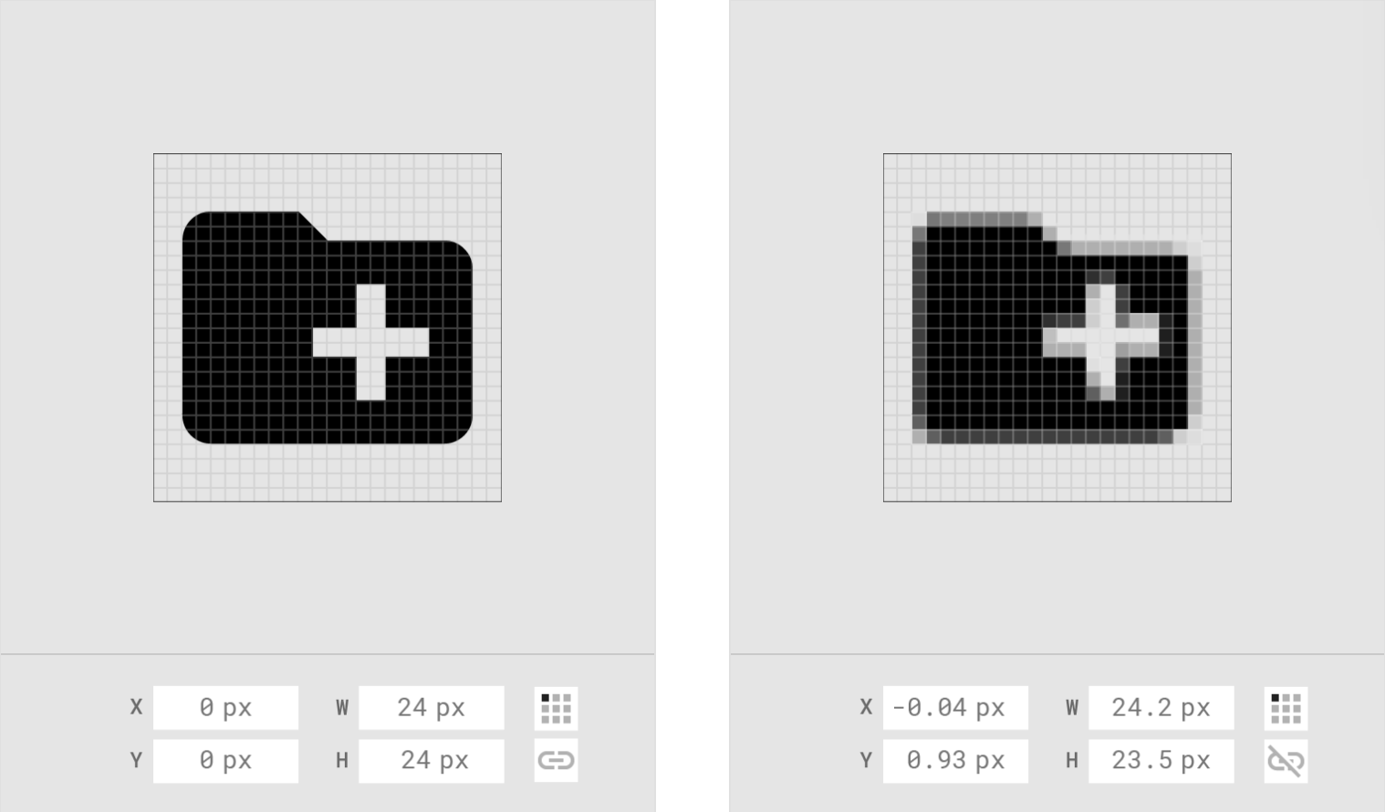
Do
Position icons “on pixel.”
Don’t
Don’t place the icon on a coordinate that isn’t “on pixel”.
跨平台设计
Anatomy

Android
The up button contains a thin arrow with a stem.
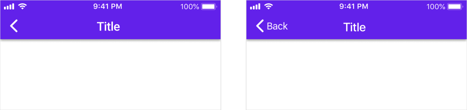
iOS
On iOS, the back arrow is thicker and doesn’t have a stem.
iOS
On iOS, the back arrow may also include a label for the associated destination.
Android
The action overflow menu icon (indicated by the “More…” symbol) contains three vertical dots.
iOS
The action overflow menu icon (indicated by the “More…” symbol) contains three horizontal dots.
设计标准
剖析
Icons are comprised of stroke terminal, iconography, counter area, stroke, and bounding area.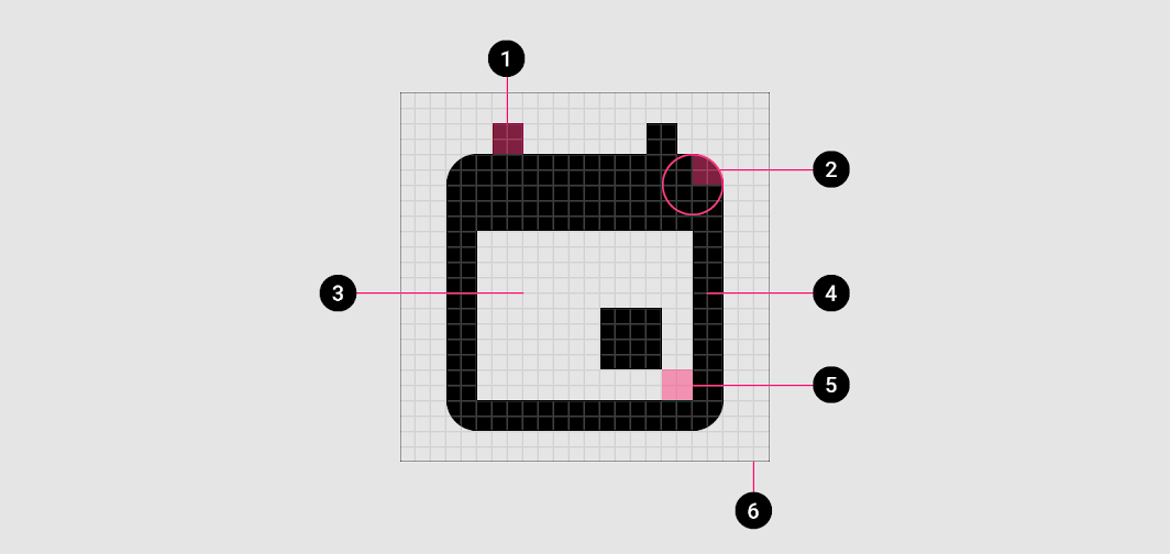
1. Stroke terminal
2. Corner
3. Counter area
4. Stroke
5. Counter stroke
6. Bounding area
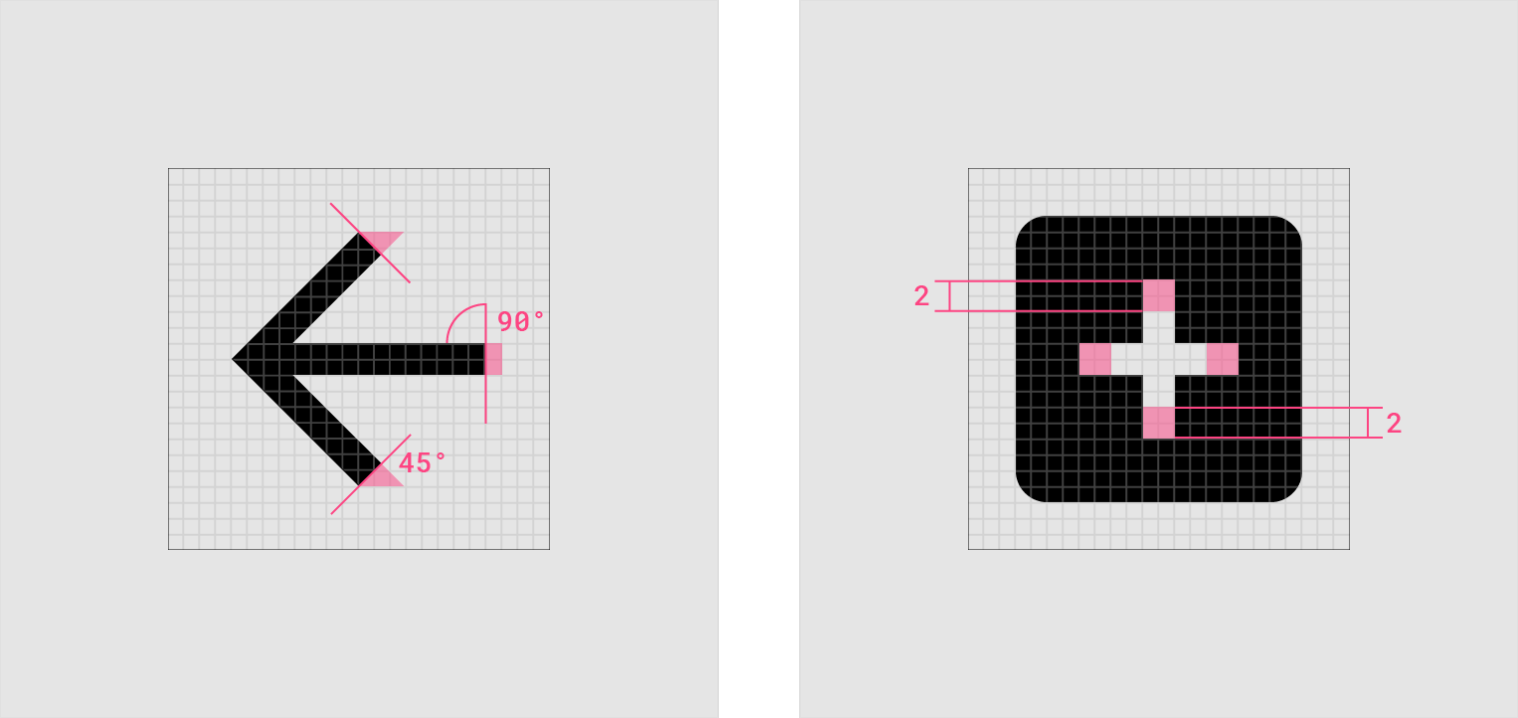
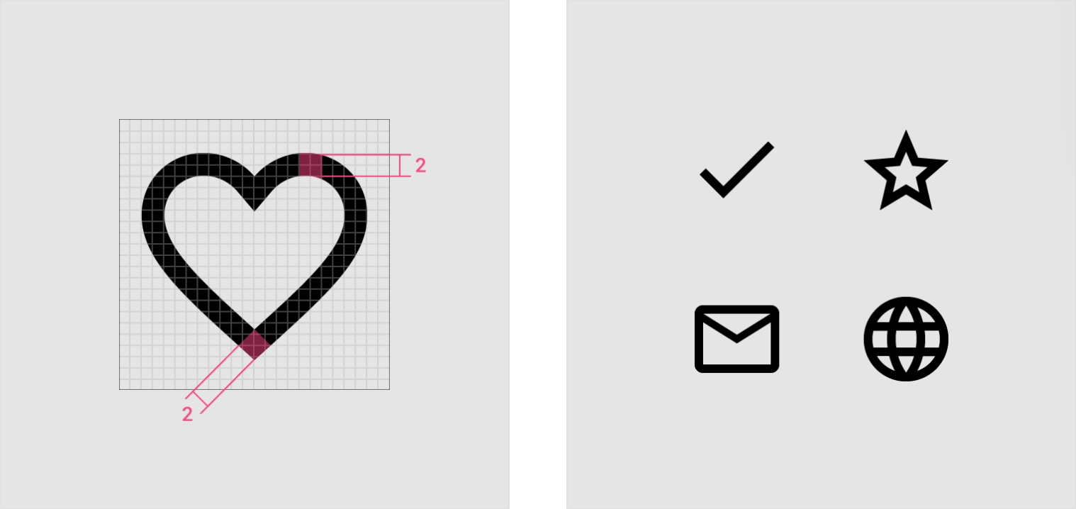
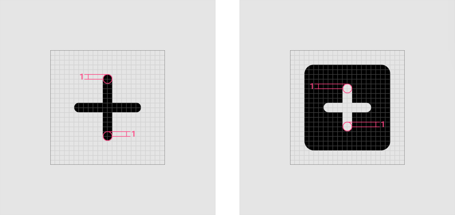
圆角
圆角半径默认为 2dp。
内角应为方形,而非圆形。对于 2dp 宽或更小的形状,笔划角不应该是圆形的。
Corner radiuses are 2dp by default. Interior corners should be square, not rounded. For shapes 2dp wide or less, stroke corners shouldn’t be rounded.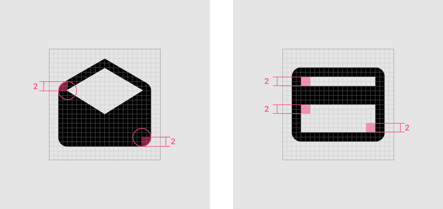
笔画
系统图标统一使用 2dp 的笔划宽度,包括曲线,角度以及内部和外部笔划。
System icons use a consistent stroke width of 2dp, including curves, angles, and both interior and exterior strokes.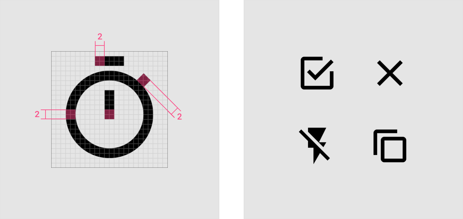
2dp stroke;Consistency
Stroke terminal;Counter stroke
Do
Use consistent stroke weights and squared stroke terminals.
Don’t
Don’t use inconsistent stroke weights or rounded stroke terminals.
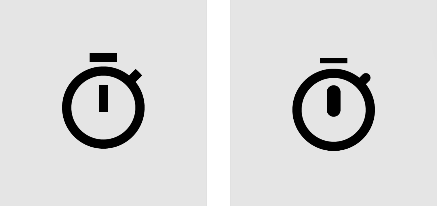
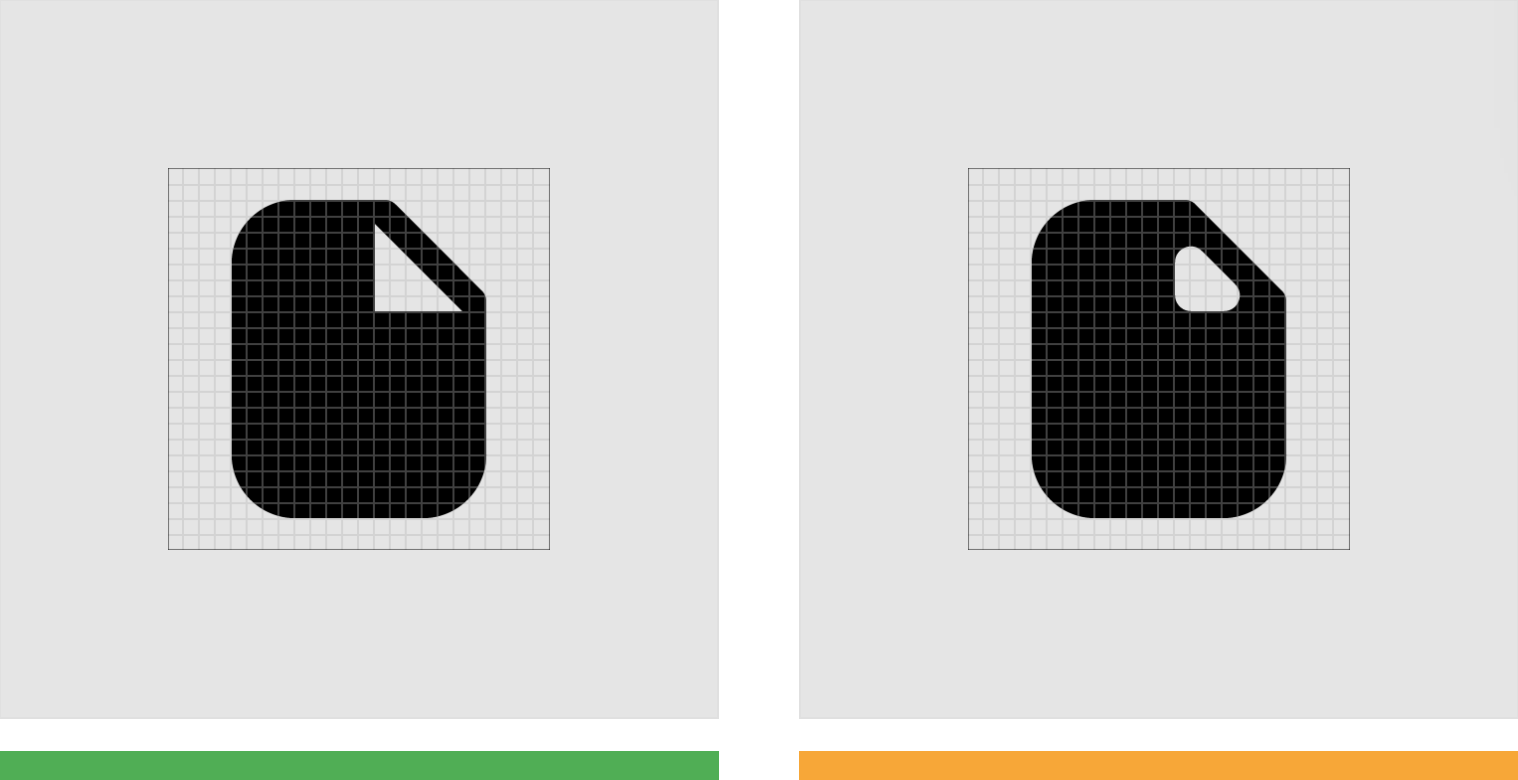
复杂图标
如果系统图标需要复杂的细节,则可以进行细微的调整以提高其易读性。
这些调整称为 光学校正。任何光学校正都应使用所有其他图标所基于的几何形式,而不会扭曲或扭曲这些形状。
If a system icon requires complex details, subtle adjustments can be made to improve its legibility. These adjustments are referred to as optical corrections. Any optical corrections should use the geometric forms on which all other icons are based, without skewing or distorting those shapes.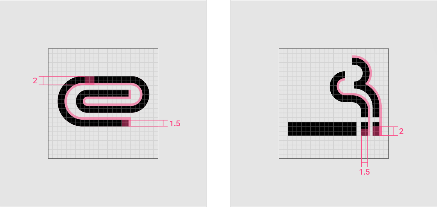
Complex adjustments
The paperclip icon uses 1.5dp of the possible 2dp stroke area to fit multiple curves within the 24 x 24dp icon space.
Small scale
This icon uses a 1.5dp stroke to show waves within the 24 x 24dp icon space.
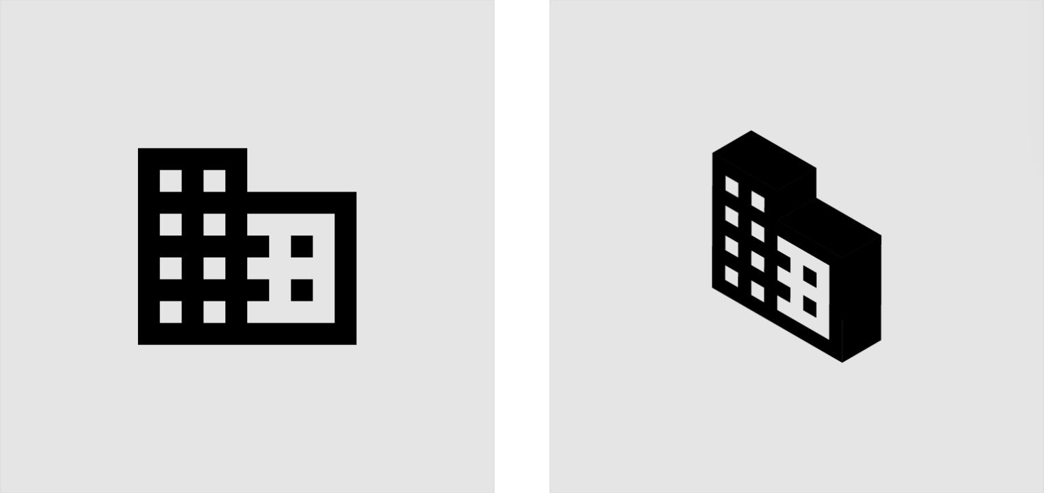
Do
Make icons face forward.
Don’t
Don’t tilt, rotate, or make icons appear dimensional.

Do
Simplify icons for greater clarity and legibility.
Don’t
Don’t be overly literal. Avoid complex icons.
空间
系统图标的周边需要留出足够的空间,以提高其触摸准确率和易读性。
24dp 的图标需要 48dp 的触摸面积。
Adequate space should surround system icons to allow legibility and touch. Icons of 24dp can use a touch target of 48dp.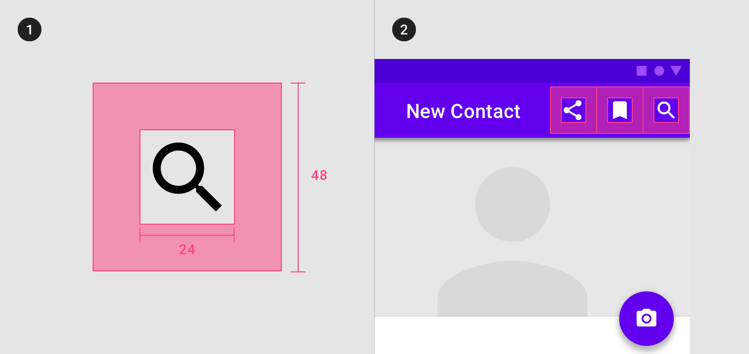
1. Clearance area
2. Placement
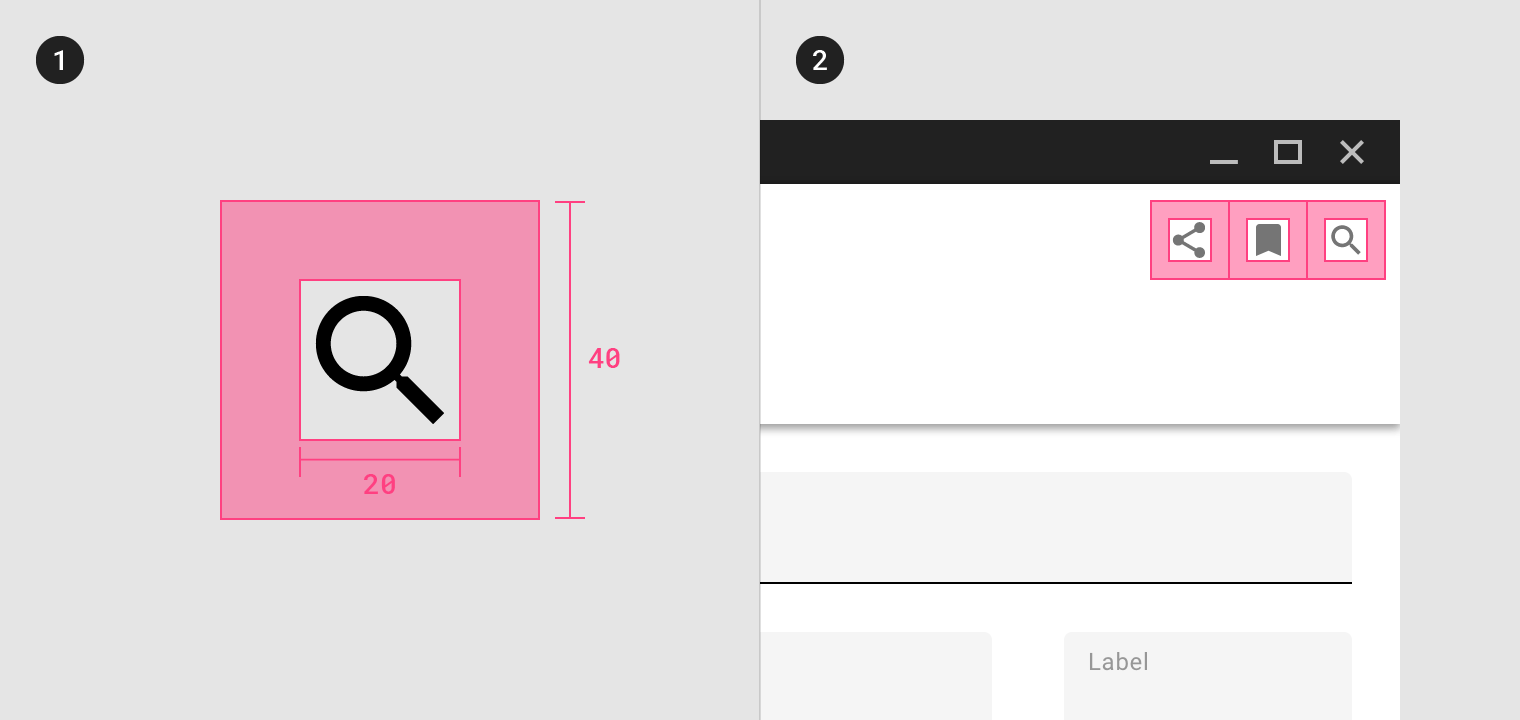
密集布局(桌面端)
当鼠标和键盘是主要输入方法时,可以压缩最大边距以适应更密集的布局。
20dp 的密集布局 - 图标需要 40dp 的触摸面积。
When a mouse and keyboard are the primary input methods, measurements may be condensed to accommodate denser layouts. Dense icons of 20dp can use a touch target of 40dp.
1. Clearance area
2. Placement
颜色
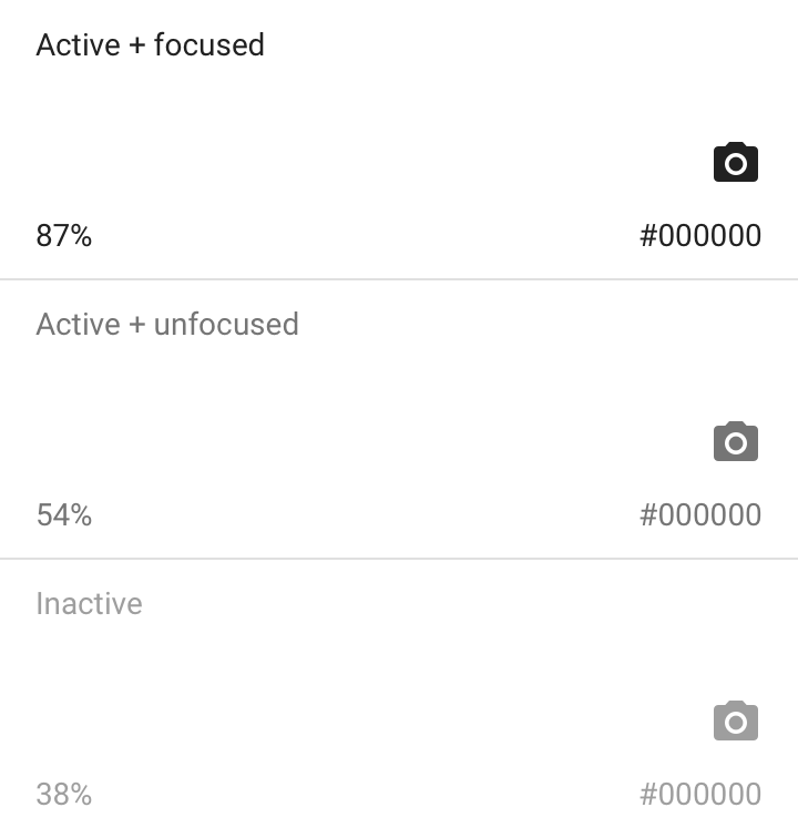
浅色背景上的图标
Active icon
The standard opacity for an active icon with focused state on a light background is 87% (#000000). An active with unfocused state is 54%.
Inactive icon
An inactive icon, which is lower in the visual hierarchy, should have an opacity of 38% (#000000).
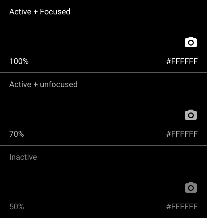
深色背景上的图标
Active icon
The standard opacity for an active icon with focused state on a dark background is 100% (#FFFFFF). An active with unfocused state is 70%.
Inactive icon
An inactive icon, which is lower in the visual hierarchy, should have an opacity of 50% (#FFFFFF).
图标主题
可以自定义系统图标的三个属性,以创建自定义系统图标:线稿或填充,圆角半径和颜色。
Three attributes of system icons can be customized in order to create custom system icons: stroke and fill, corner radius, and color.
The following four preset custom icon sets are created by adjusting these attributes.
线稿图标
图标可以根据笔画分为线稿和填充两种属性,以便在密集的 UI 中更好的工作。可以调整线稿图标的笔画粗细,以达到视觉上的一致。
Outlined icons customize stroke and fill attributes for a light, clean style that works well in dense UIs. The stroke weight of outlined icons can be adjusted to complement or contrast the weight of your typography.
线稿和填充
当系统图标未填充时,它们由它们的笔画定义。较粗的笔画能够增加图标的质感,而填充属性让图标感觉更厚重。较细的笔画能够增加图标的轻盈感,使未填充的图标更加纤细。
To maintain legibility, the recommended stroke weight is 2dp for most icons.
2dp outlined icons remain readable across sizes and applications.
笔画对齐
笔画的对齐方式会影响图标的整体外观,具体取决于笔画的边缘是放置在形状的内部、中心还是外部。在大多数情况下,笔画边缘最好与形状内部对齐。
Stroke placement affects an icon’s overall appearance, depending on whether the stroke is placed on the inside, center, or outside of a shape. In most cases, the stroke is best aligned with the inside of a shape.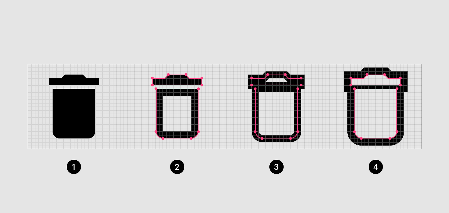
1. Standard Material icon
2. Inside stroke alignment
3. Center stroke alignment
4. Outside stroke alignment
Aligning the stroke to the shape interior produces a legible icon with a consistent stroke weight.
For optimal legibility and recognition, the standard Material icon style should be retained in some cases, such as full body human icons or proprietary icons.

Caution
In most cases, the stroke is best aligned inside of a shape. Occasionally, aligning the stroke to the center or outside of the shape works better for an icon.
Do
Adjust shapes appropriately for your design and brand when customizing an icon’s stroke and alignmen.
The lighter stroke weight of these outlined icons mimics the thin lines of the app’s brand.
1. Brand logo
2. Outlined icons in the app
3. Outlined icons
矩形图标 & 圆角图标
锋锐
矩形图标边角为直角,锋利的风格让图标即使在较小的比例下也能保持清晰。这些矩形形状适合那些不适于使用圆角图标的品牌风格。
Sharp icons display corners with straight edges, for a crisp style that remains legible even at smaller scales. These rectangular shapes can support brand styles that aren’t well-reflected by rounded shapes.
圆润
圆角图标的圆角半径大于 0dp,并且在排版上偏于厚重。
Rounded icons use a corner radius that pairs well with brands that use heavier typography, curved logos, or circular elements to express their style.
圆角半径
图标的圆角半径由弯曲的外角组成。图标的特征分为等于 0dp 或大于 0dp 两种。
An icon’s corner radius consists of curved exterior corners. Icons can be are characterized by a larger corner radius or a smaller one.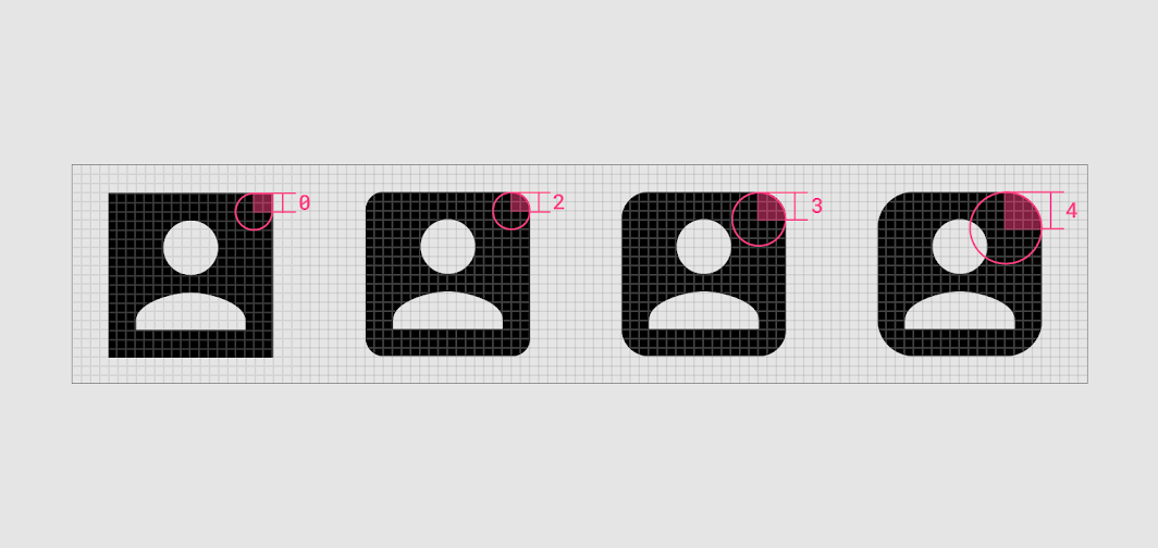
The recommended corner radius values are between 0dp and 4dp.
If the stroke is 2dp or less, the corner radius must be 1dp.
Adjust the icon’s interior corners and counter area to match the corner radius.
Do
Customize the corner radius to remain legible while reflecting your product’s style.
Caution
Don’t round interior corners if it reduces the icon’s legibility.
The 0dp corner radius of the sharp icon set echoes this app’s rectangular design details.
1. Brand logo
2. Sharp icons
3. Sharp icons in the app

This app uses rounded buttons and a line-drawn logo.
1. Brand logo
2. Rounded icons
3. Rounded icons in the app
双色图标
双色图标的填充与线稿属性同时存在,并且为填充加上了不透明度。线稿和填充的颜色色可以使用多种品牌颜色,并且可以通过对比来提高易读性。
Two-tone icons have added dimension, using the attributes of stroke, fill, and color. Contrasting stroke and fill colors enables the use of multiple brand colors and can improve legibility.
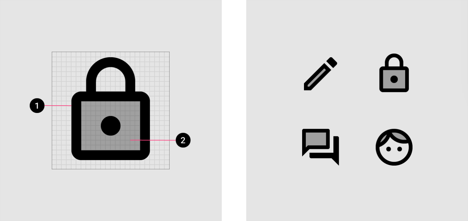
1. Stroke
2. Transparent fill
The recommended stroke weight for two-tone icons is 2dp.
Transparency should only be applied to the fill of two-tone icons.
可以调整填充的透明度,以提高易读性并与您的品牌保持一致。
图标笔划在浅色背景上必须为87%,在深色背景上为100%。填充颜色可能因背景色调而异。
Two-tone icons can use different colors for an icon’s stroke and fill. The fill’s transparency can be adjusted to improve legibility and align with your brand.
Icon strokes must be 87% on light backgrounds and 100% on dark backgrounds. Fill color can vary depending on the tone of the background.
| Light background | Dark background | |
|---|---|---|
| Stroke | 87% solid | 100% solid |
This email app uses two-tone brand elements, such as its logo.
1. Brand logo
2. Two-tone icons
3. Two-tone icons in the app

若有收获,就点个赞吧
0 人点赞
