Radio buttons allow users to select one option from a set.
Radio buttons allow for a single option to be selected from a visible list.
Usage
Use radio buttons to:
- Select a single option from a list
- Expose all available options
If available options can be collapsed, consider using a dropdown menu instead, as it uses less space.
Principles
Familiar
Radio buttons have been in user interfaces for a long time and should be used as expected.
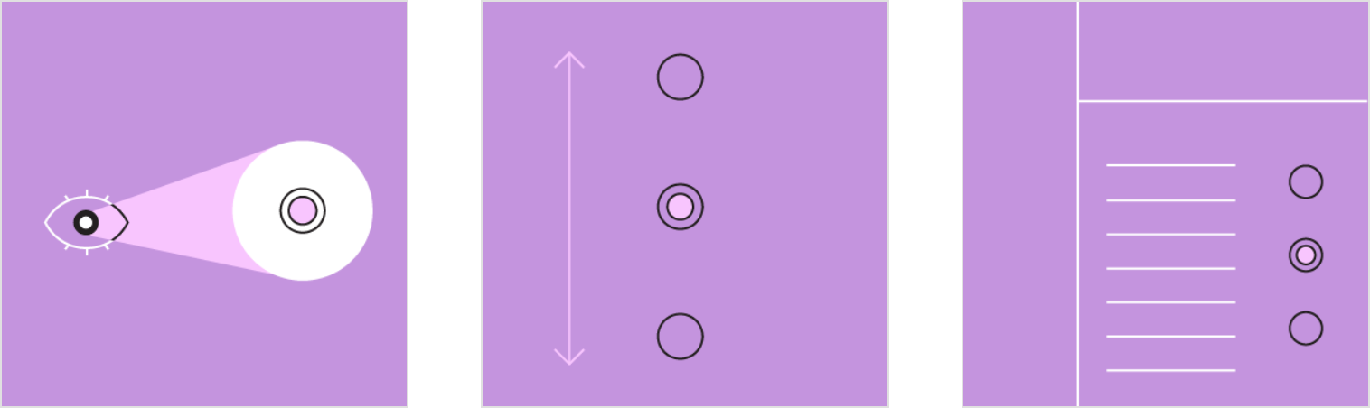
Scannable
It should be visible at a glance if a radio button has been selected, and selected items should be more visually prominent than unselected items.
Efficient
Radio buttons make it easy to compare available options.
When to use radio buttons
Radio buttons should be used instead of checkboxes if only one item can be selected from a list.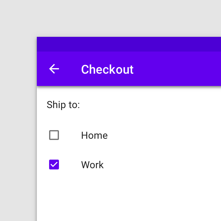

Don’t
Don’t use checkboxes when only one item can be selected from a list. Use radio buttons instead.


Do
Use radio buttons when only one item can be selected from a list.
Other selection controls
Selection controls allow users to complete tasks which involve making choices such as selecting options, switching settings on or off, or adding or removing items.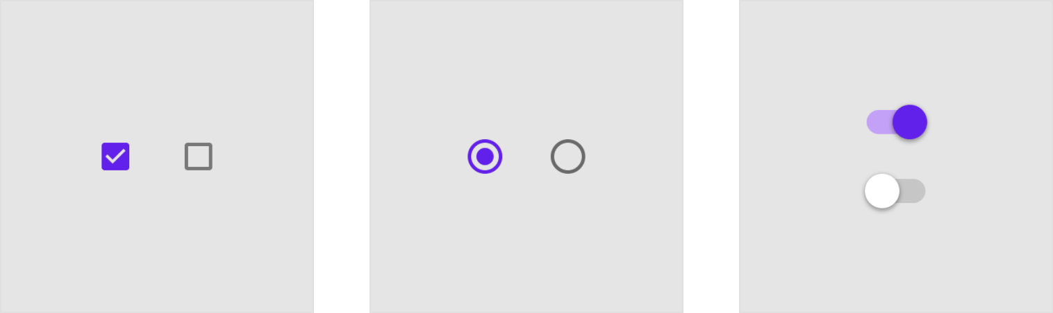
- Checkboxes
- Radio buttons
- Switches
Checkboxes and switches are alternative selection controls that can be used to enter decisions or declare preferences such as settings or dialogs.
Platform differences
Adapt selection controls, including checkboxes, to fit platform standards.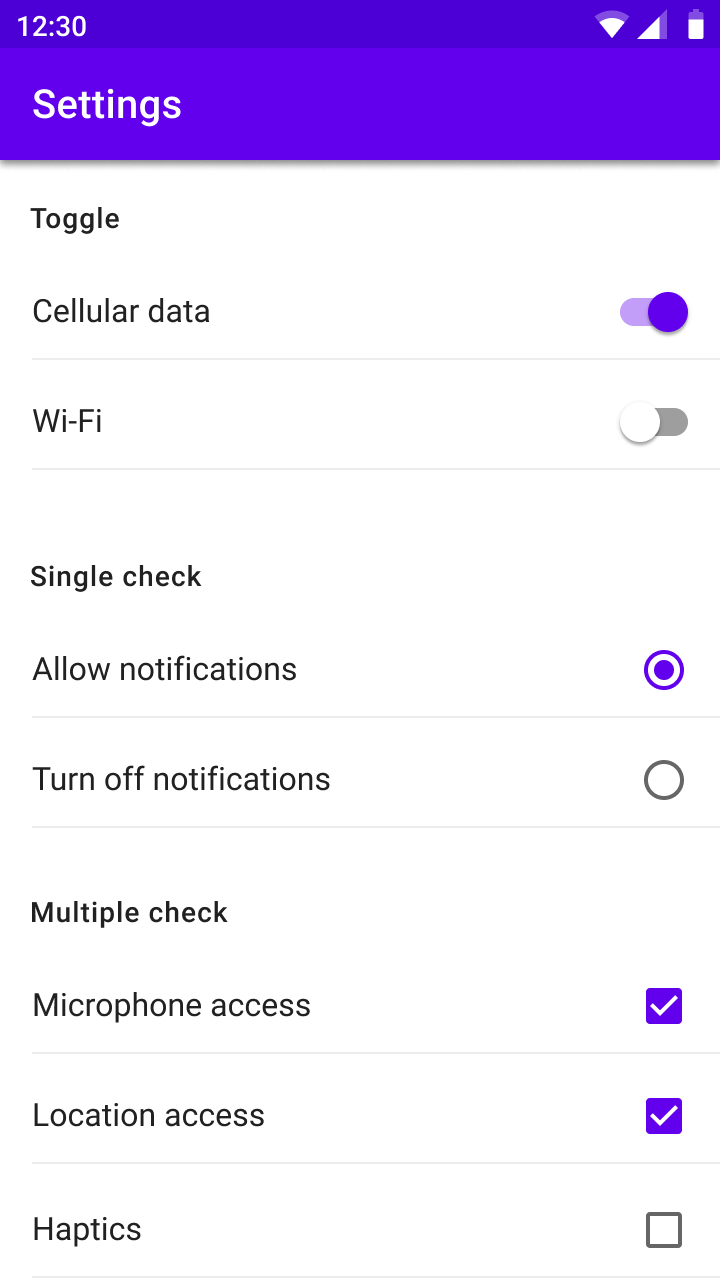
Android
Use Material radio buttons.
iOS
On iOS, use check mark lists instead of radio buttons as these are the graphics expected on iOS.
Behavior
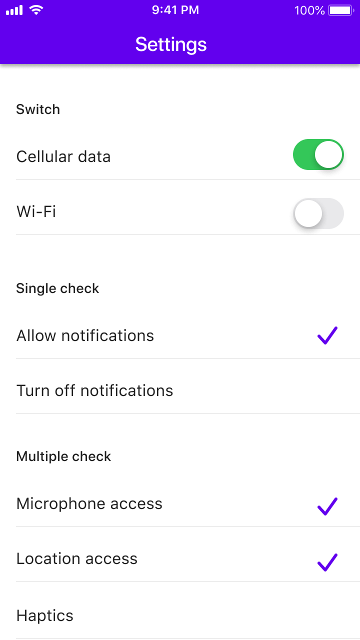
Radio buttons allow the user to select one option from a set. Use radio buttons when the user needs to see all available options. If available options can be collapsed, consider using a dropdown menu because it uses less space.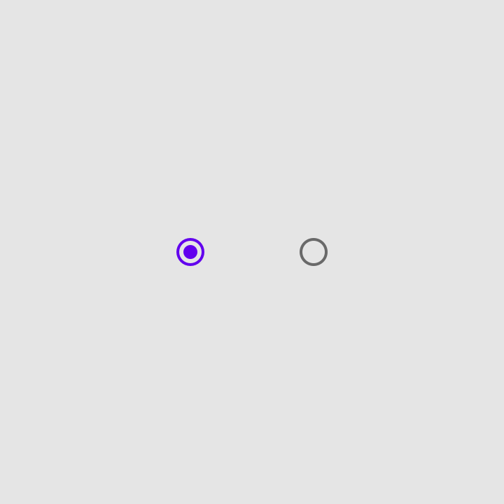
Selected and unselected radio buttons.
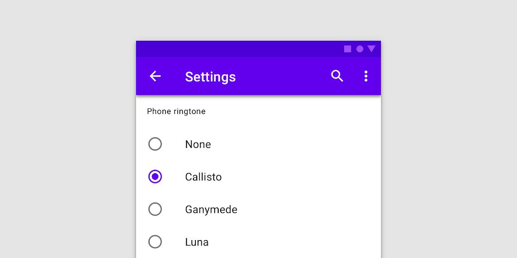
 Using radio buttons to select a single item.
States
Radio buttons can be selected or unselected. Radio buttons have enabled, disabled, hover, focused and pressed states.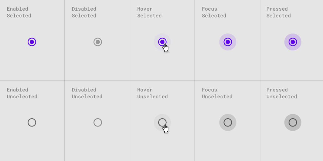
Interaction states for selected and unselected radio buttons.
Theming
Crane Material Theme
This travel app’s radio buttons have been customized using Material Theming to use custom color.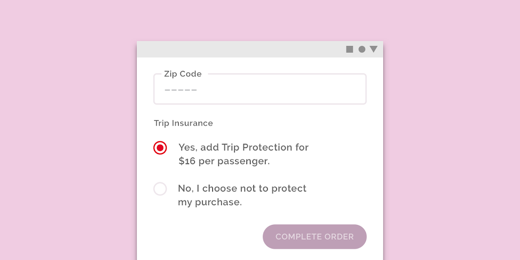
Crane’s customized radio buttons
Color
Crane’s radio buttons use a custom color.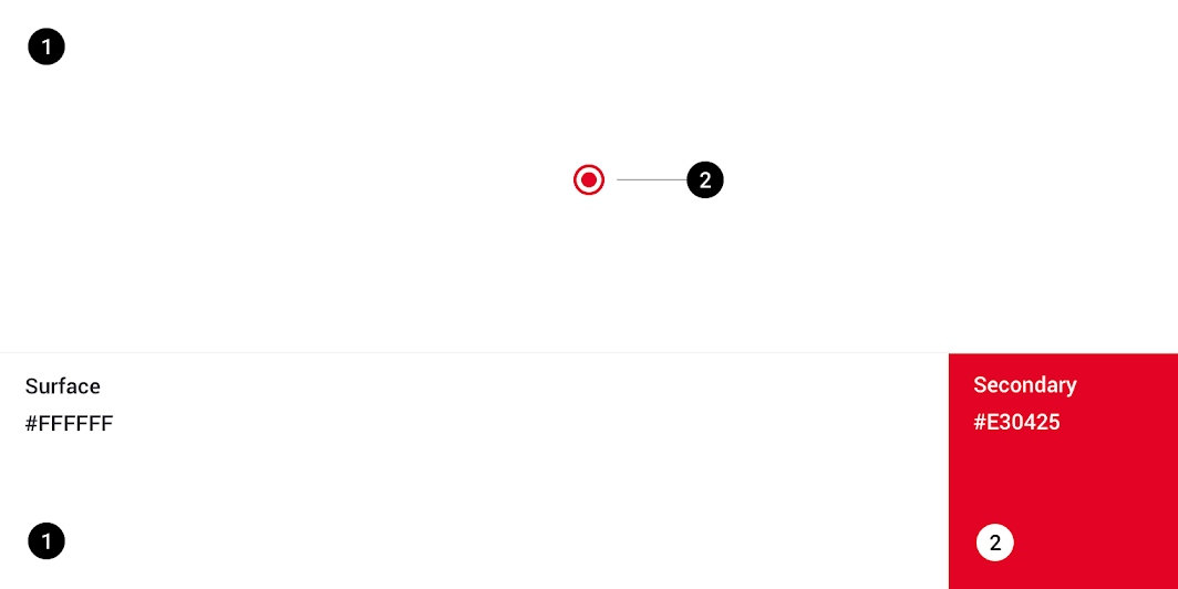
| Element | Category | Attribute | Value |
|---|---|---|---|
| Radio buttons | Secondary | Color Opacity |
#E30425 100% |
Specs


若有收获,就点个赞吧
0 人点赞
