合理地进行排版,让应用的内容能清晰有效地进行展示。
Use typography to present your design and content as clearly and efficiently as possible.
字体比例
Material Design 字体比例包括了一系列的对比样式,用以支持您的产品及其内容的需求。
The Material Design type scale includes a range of contrasting styles that support the needs of your product and its content.
排版系统共有13种字体的基础样式组合。
它包含可重复使用的文本类型,每个类别都会有专门的应用场景和意义。
The type scale is a combination of thirteen styles that are supported by the type system. It contains reusable categories of text, each with an intended application and meaning.
Type scale generator
Powered by Google Fonts, the type scale generator is a tool for creating type scales and corresponding code. Any font you choose is automatically resized and optimized based on Material typography guidance for readability.
Select a category in the type scale to view the font’s details. Adjust your font choice through the menus on the right.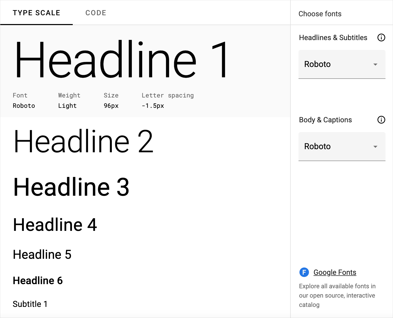
Example type scale
This example type scale uses the Roboto typeface for all headlines, subtitles, body, and captions, creating a cohesive typography experience. Hierarchy is communicated through differences in font weight (Light, Medium, Regular), size, letter spacing, and case.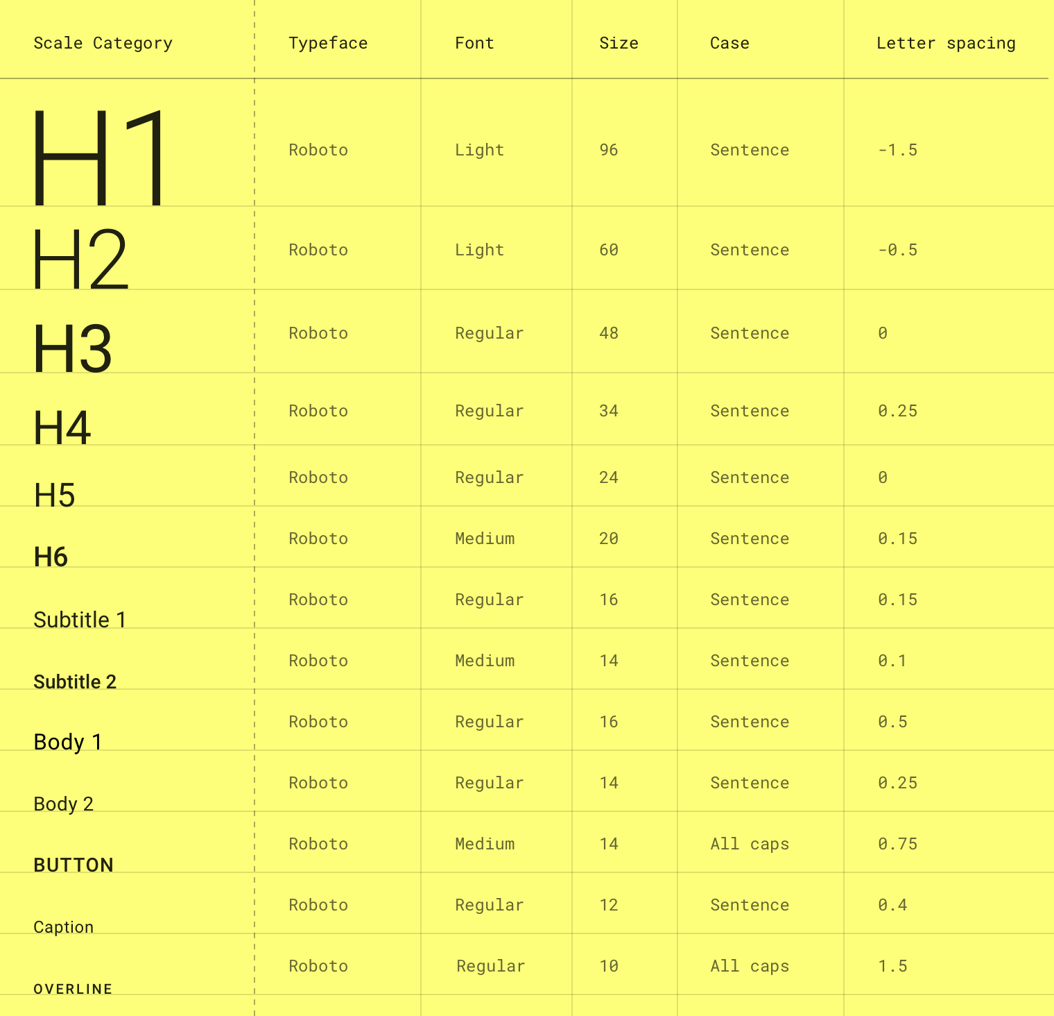
The Material Design type scale. (Letter spacing values are compatible with Sketch.)
Download this Roboto type scale using type styles in Sketch.
字体单位
以下单位用于表示Android,iOS和Web上的字体大小。
The following units are used to express font size on Android, iOS, and the web.
| Platform | Android | iOS | Web |
|---|---|---|---|
| Font size unit | sp | pt | rem |
| Conversion ratio | 1.0 | 1.0 | 0.0625 |
单位转换示例:
Example conversions
| Android | iOS | Web |
|---|---|---|
| 10sp | 10pt | 0.625rem |
| 12sp | 12pt | 0.75rem |
| 24sp | 24pt | 1.5rem |
| 60sp | 60pt | 3.75rem |
Web浏览器根据根元素大小计算REM(根em大小)。现代Web浏览器的默认值为16px,因此转换为SP_SIZE / 16 = rem。
Web browsers calculate the REM (the root em size) based on the root element size. The default for modern web browsers is 16px, so the conversion is SP_SIZE/16 = rem.
间距单位
以下单位用于UI中的间距字母。
The following units are for spacing letters in a UI.
| Platform | Android | iOS | Web |
|---|---|---|---|
| Letter spacing unit | em | pt | rem |
| Conversion ratio | (Tracking from Sketch / font size in sp) = letter spacing | 1.0 | (Tracking from Sketch / font size in px) = letter spacing |
间距转换示例:
Letter spacing examples
| Android | iOS | Web |
|---|---|---|
| (.2 tracking / 16sp font size) = 0.0125 em | -0.1 pt | (.2 tracking / 16px font size) = 0.0125 rem |
字体比例的应用
类型比例在组件和整体布局中显示为文本。类型属性可以使用字体,字体,大小写,大小和字母间距的自定义值。
The type scale appears as text in components and the overall layout. Type attributes can use custom values for the typeface, font, case, size, and letter spacing.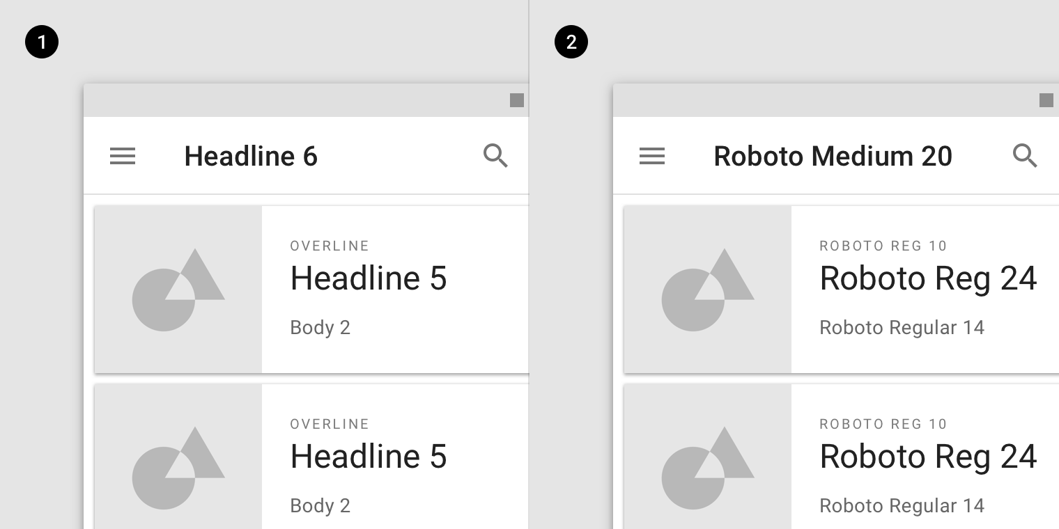
- 字体比例
- Scale categories
- 实际数值
- Actual values
标题
在类型比例中,标题范围从1到6的范围。标题是屏幕上最大的文本,保留用于短的重要文本或数字。
In the type scale, headlines span from a range of 1 through 6. Headlines are the largest text on the screen, reserved for short, important text or numerals.
对于标题,您可以选择富有表现力的字体,例如显示,手写或脚本样式。这些非传统的字体设计具有细节和复杂性,有助于吸引眼球。
For headlines, you can choose an expressive font, such as a display, handwritten, or script style. These unconventional font designs have details and intricacy that help attract the eye.
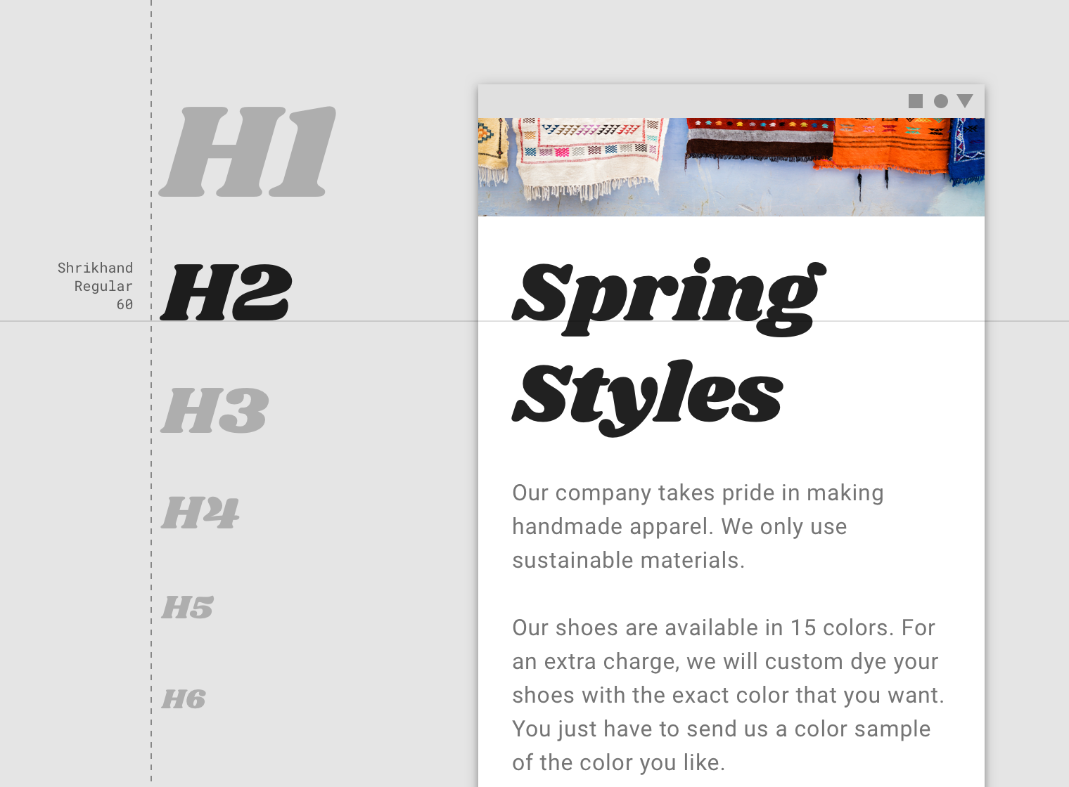
示例采用了 H2 作为标题的字体比例。
A display style is used for Headline 2.

示例采用了 H3 作为标题的字体比例。
A script style is used for Headline 3.
衬线或无衬线字体,特别是在较小尺寸时。
Serif or sans serif typefaces work well for headlines, especially at smaller sizes.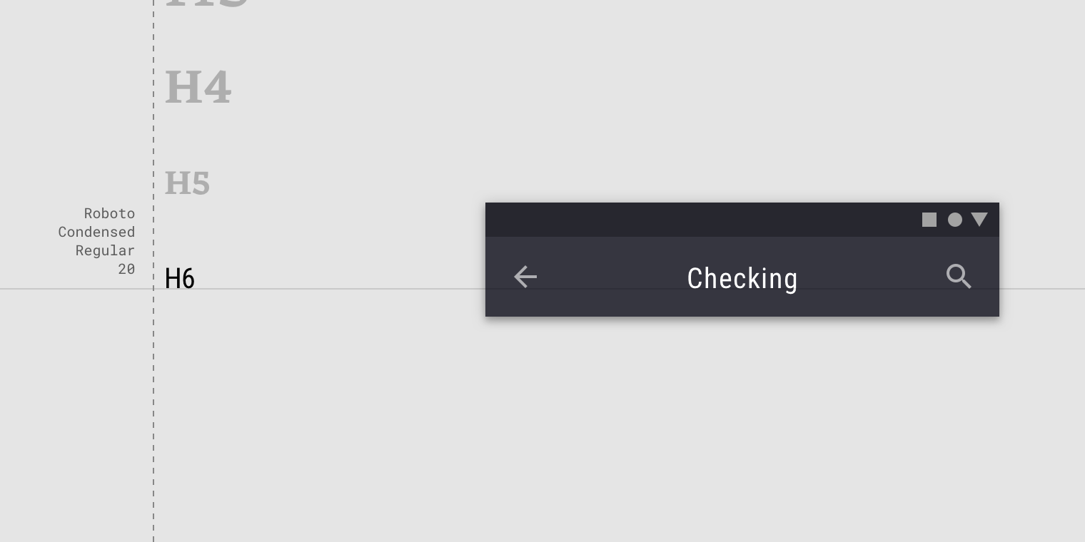
A sans serif is used for Headline 6.
副标题
副标题小于标题。它们通常保留用于长度较短的中等强度文本。Serif或sans serif字体适用于字幕。
Subtitles are smaller than headlines. They are typically reserved for medium-emphasis text that is shorter in length. Serif or sans serif typefaces work well for subtitles.
A sans serif typeface is used for Subtitle 1.
注意:谨慎在副标题上使用富有表现力的字体(手写和手稿样式)。
For subtitles, use caution when using expressive fonts, including display, handwritten, and script styles.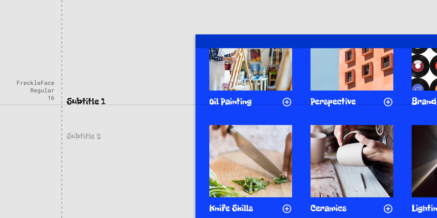
Caution
Use caution when using expressive fonts for subtitles.
正文
正文文本的范围是1-2,它通常用于长文本编写,因为它适用于小文本大小。对于较长的文本部分,建议使用serif或sans serif字体。
Body text comes in ranges 1-2, and it’s typically used for long-form writing as it works well for small text sizes. For longer sections of text, a serif or sans serif typeface is recommended.
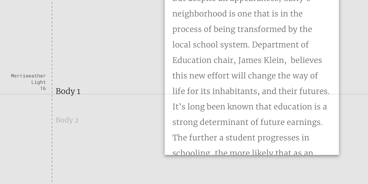
A serif typeface is used for Body 1.
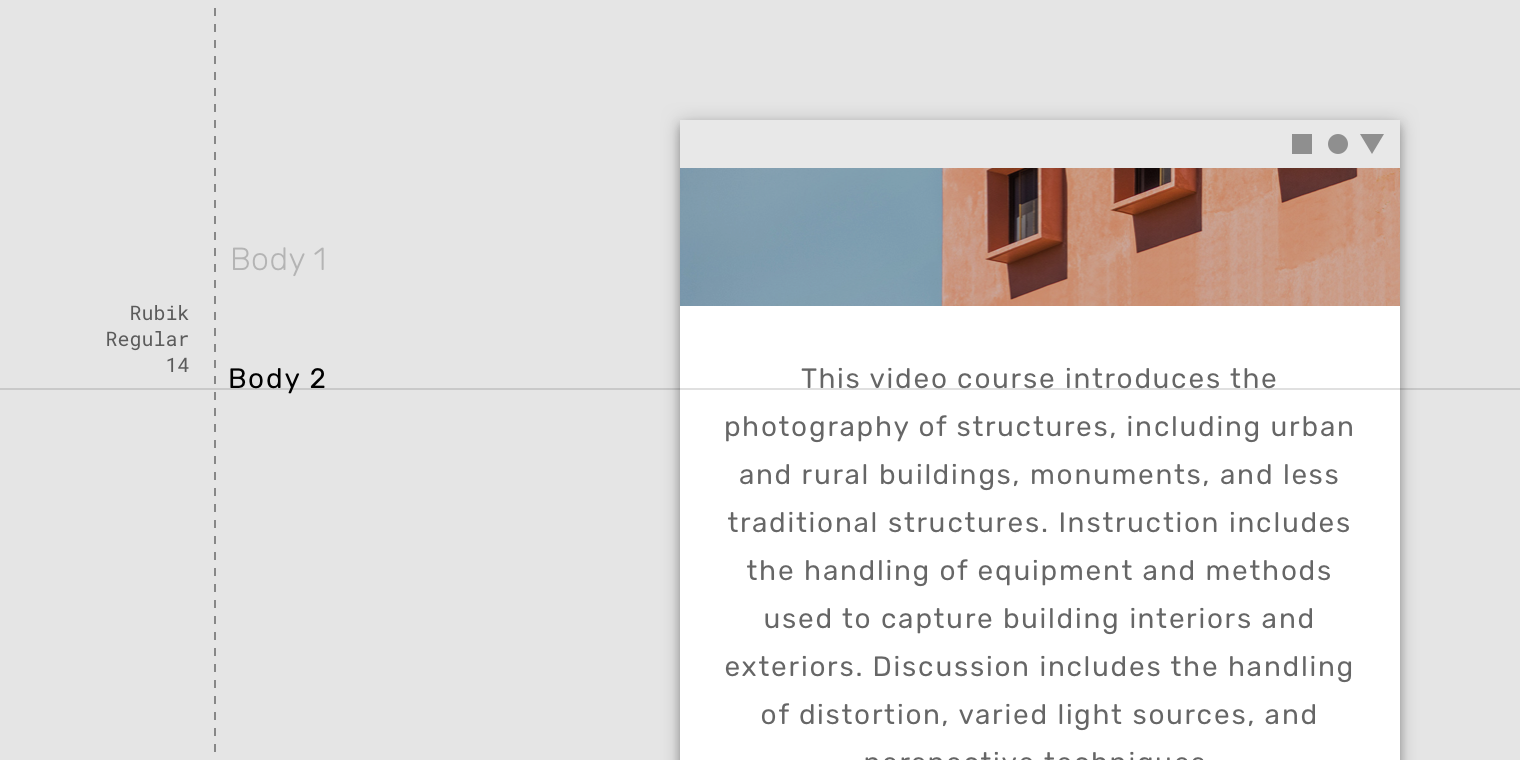
A sans serif typeface is used for Body 2.
注意:不要使用富有表现力的字体(手写和手稿样式),用于正文复制的显示。
Don’t use expressive fonts, including display, handwritten, and script styles for body copy.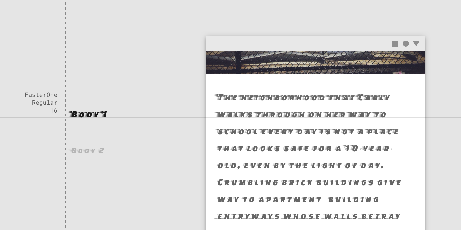
Don’t
Don’t use expressive fonts for body text.
说明文字以及上标
说明文字和上标(上面带有一行的文本)使用的是最小的字体大小。它们经常被用于为图像注释或补充说明标题。
Caption and overline text (text with a line above it) are the smallest font sizes. They are used sparingly to annotate imagery or to introduce a headline.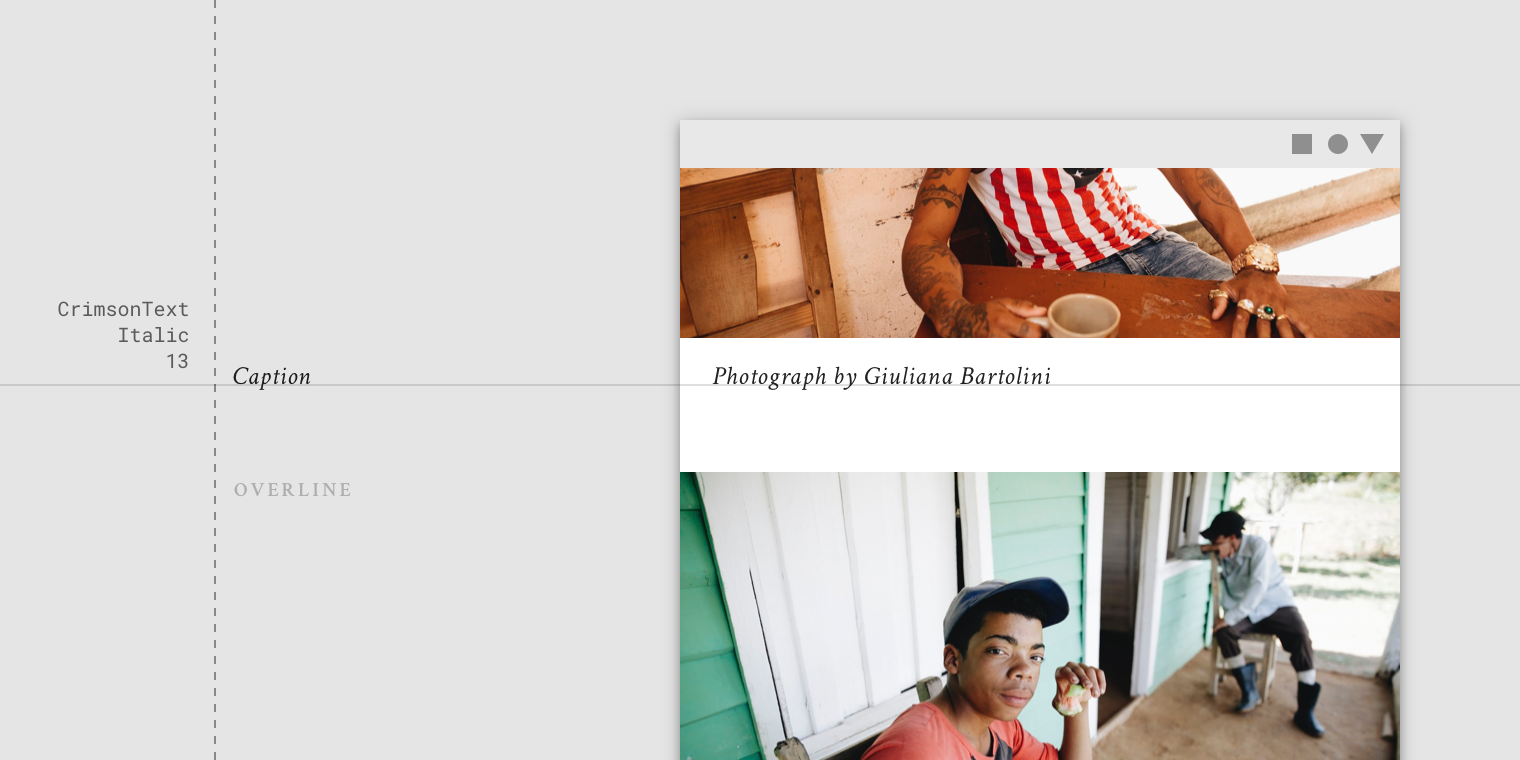
A serif typeface being used for a caption.
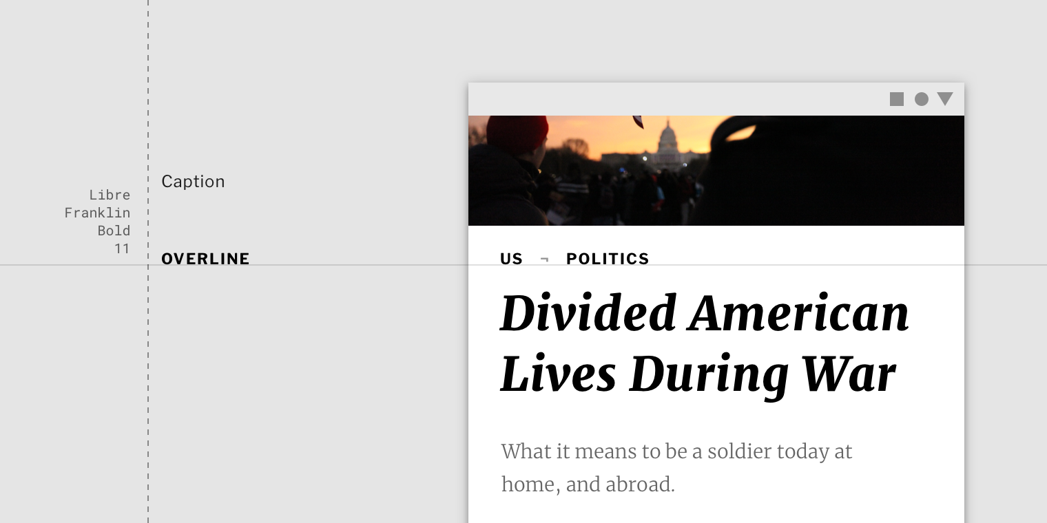
A sans serif typeface being used for an overline.
Don’t use expressive fonts, including display, handwritten, and script styles for caption or overline.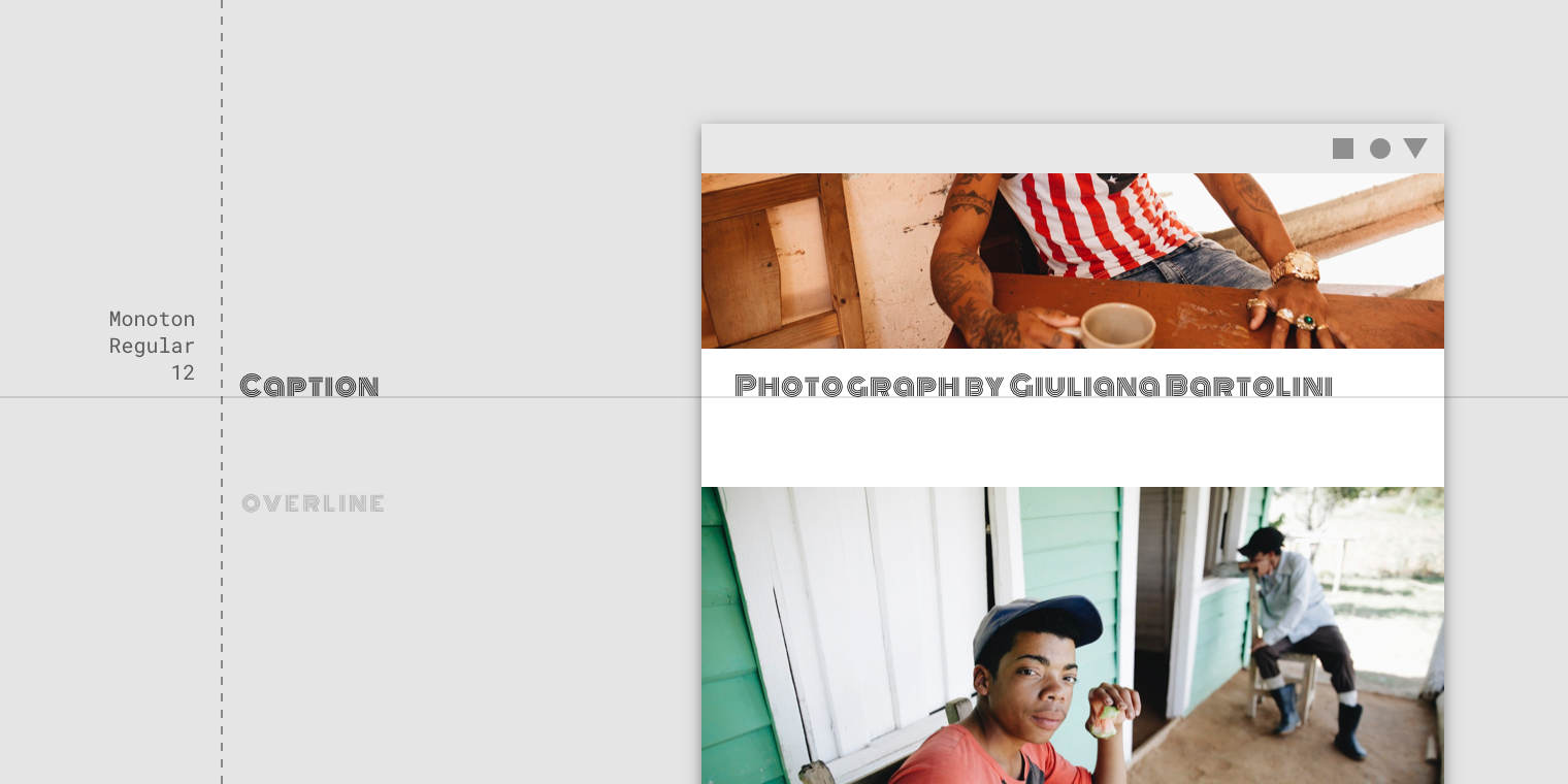
Don’t
Don’t use expressive fonts for an overline.
按钮
按钮文本是一种号召性用语,使用不同类型的按钮(例如文本,轮廓和包含的按钮)以及选项卡,对话框和卡片。
Button text is a call to action used by different types of buttons (such as text, outlined and contained buttons) and in tabs, dialogs, and cards.
按钮文本的大小写均使用无衬线字体。
Button text is typically an all caps sans serif.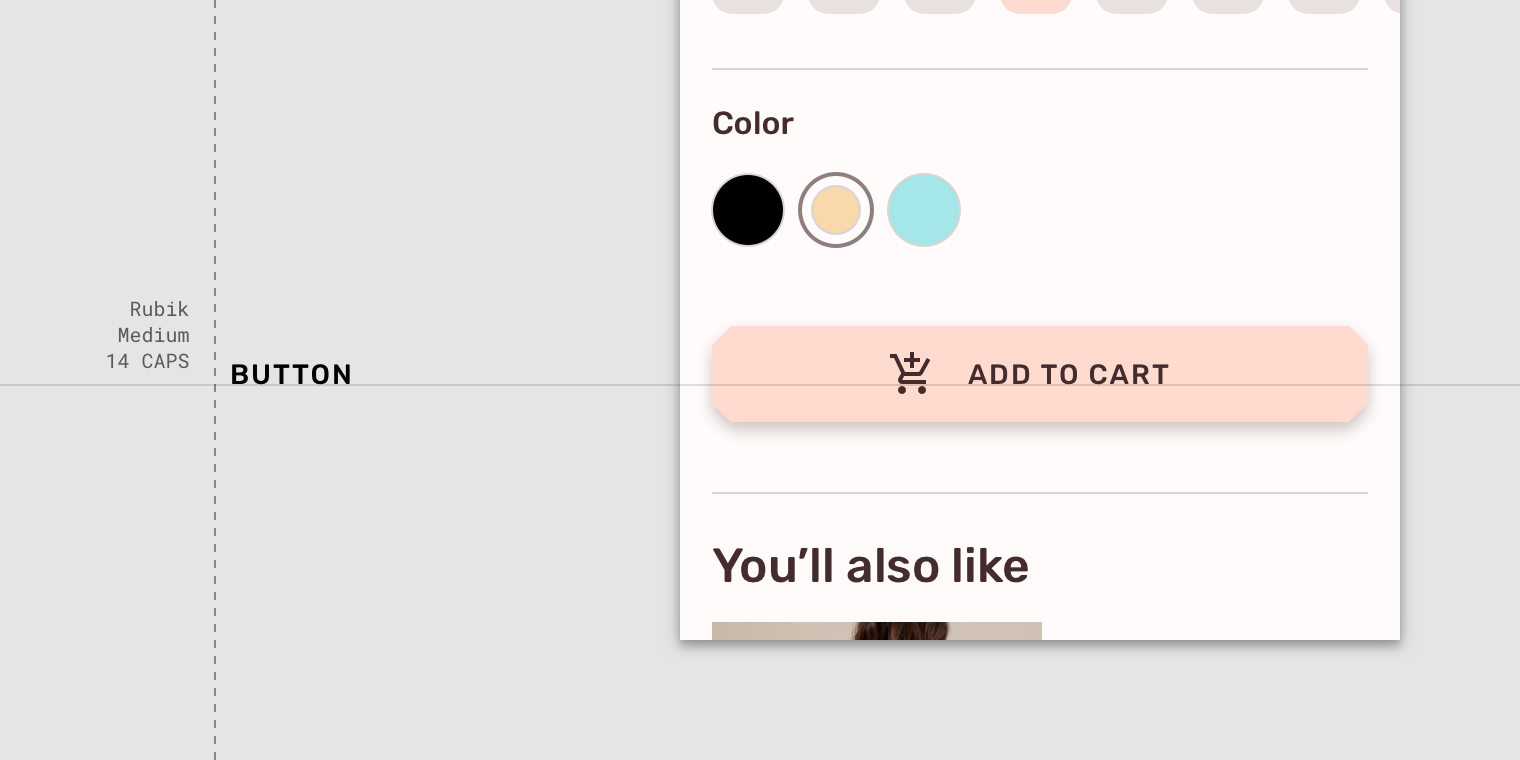
An all caps sans serif typeface being used for a button.
按钮文本可以是句子,无衬线或衬线。
Button text can be sentence case, sans serif, or serif.
Caution
Use caution when having button text appear distinct from non-interactive text, such as this upper lower, sans serif typeface on a button.
注意:不要将富有表现力的字体(手写和手稿样式),用于按钮文本。
Don’t use expressive fonts as button text, including display, handwritten, and script styles.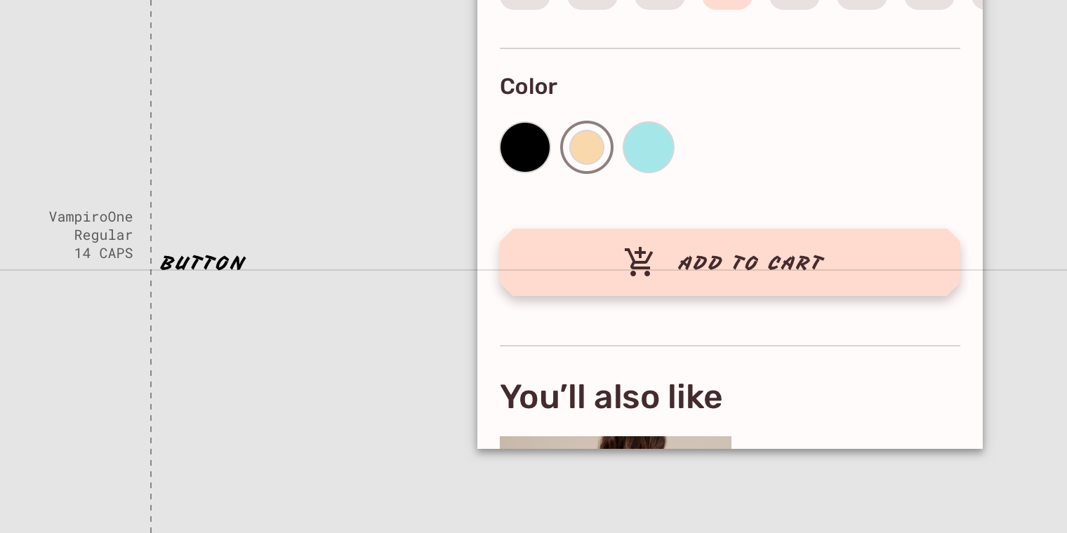
Don’t
Don’t use a display style for button text.

若有收获,就点个赞吧
0 人点赞
