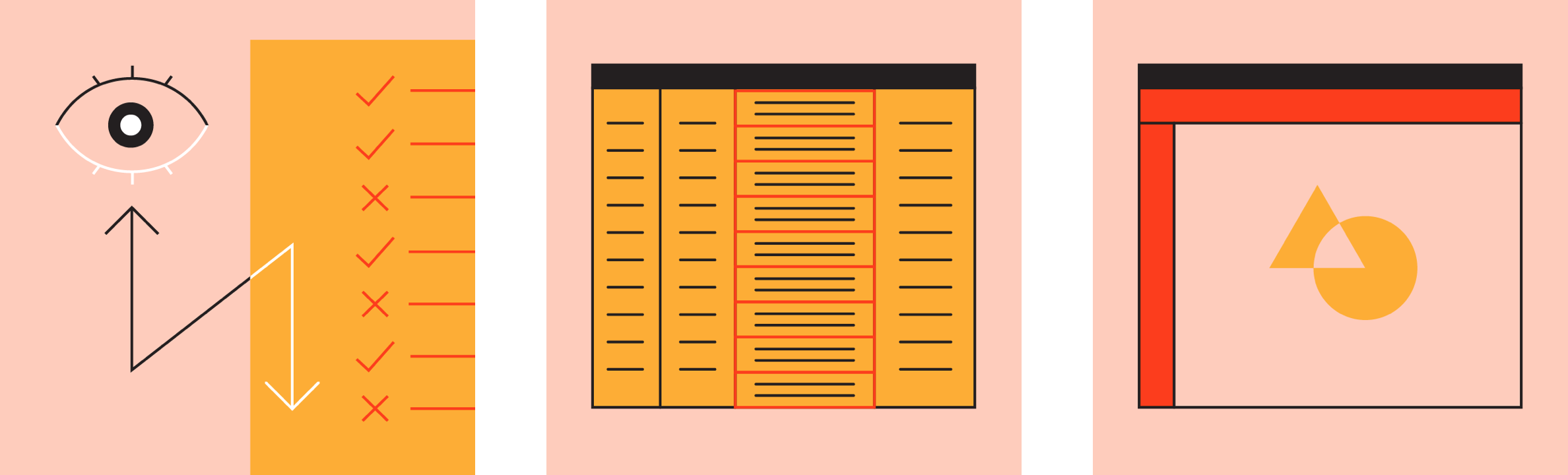
设计的呼吸感通过元素之间的间距来进行调整。本章主要讲解如何通过调整页面上的元素密度来为用户带来更好的体验。
Material Design offers guidance on high-density spacing for use cases where increased density improves the user experience.
BETA
Guidance in beta reflects the latest Material Design insights. It may significantly change to support new research and code.
Learn more or send us your feedback.
用法
These guidelines describe how and when to apply density.
原则
- 易读
紧凑的UI设计提升了小屏幕上的阅读体验。 Dense UIs improve the ease of viewing and navigating large amounts of content.
- 优先级
紧凑的UI设计能够通过减少操作距离来保持用户的专注度。 Dense UIs help users focus by reducing the space between actions.
- 易用
合理设置密度可以在单个屏幕上显示更多的内容,进行更多的操作。 Increasing density allows more content and actions to fit on a single screen.
规范
应用
材料密度指南是了解何时以及为什么应用密度可以改善用户体验的资源。
在代码的支持下,可以在刻度上整体调整材料成分的密度。在组件密度中说明了使用密度标度的指导,可以在实现中找到平台支持。
Material density guidelines are a resource for understanding when and why applying density can improve user experiences. Supported by code, Material Component density can be adjusted cohesively on a scale. Guidance on using the density scale is explained in component density and platform support can be found in implementation.
何时切换密度
是否增加用户界面的密度可以根据用户如何与组件进行交互来决定。
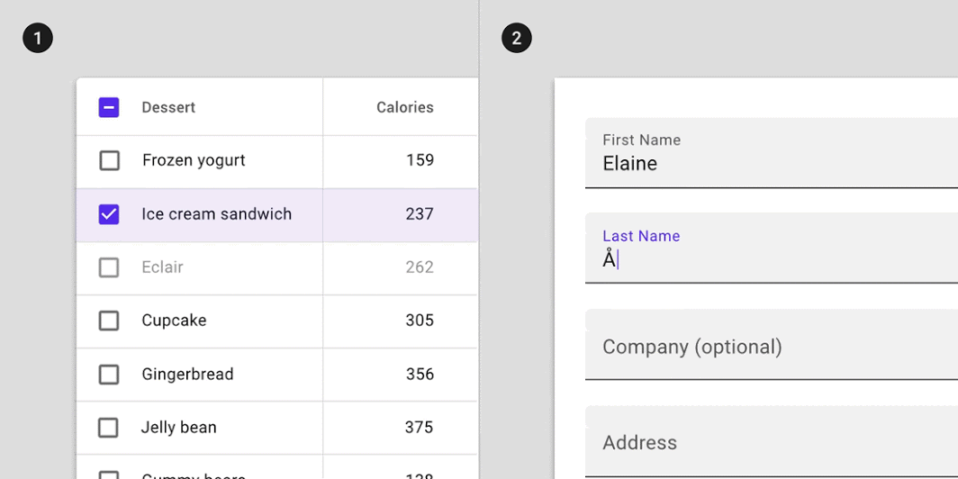
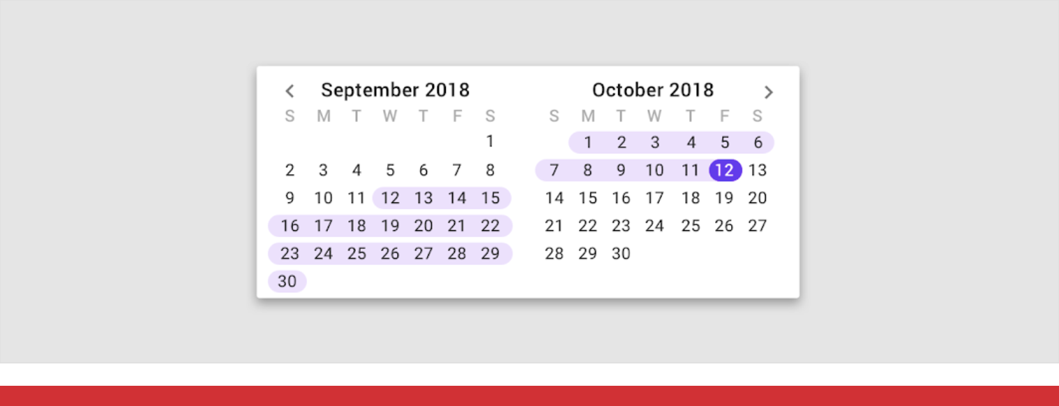
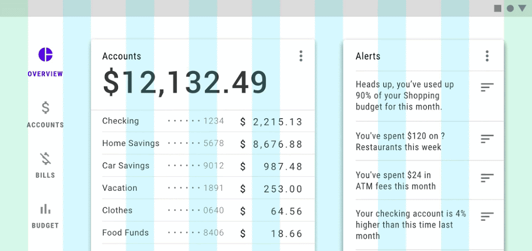
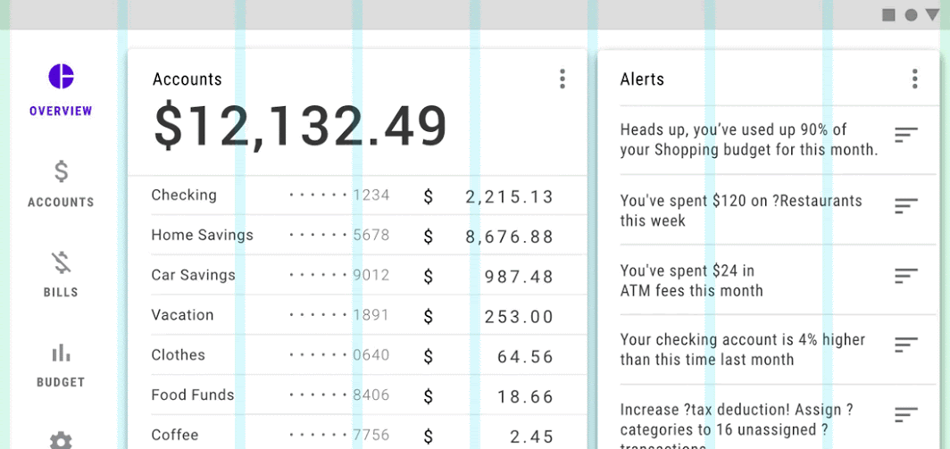
高密度组件使用户能够以更易于管理的方式处理大量信息并采取行动。列表,表格和长表单都是受益于密度增加的组件。
How users interact with a component should determine whether or not you increase the density in a UI. When users view and interact with large amounts of information, high density components can improve the experience.
By making more content available on-screen, increasing the density of lists, tables, and long forms makes information easier to scan, view, and compare.
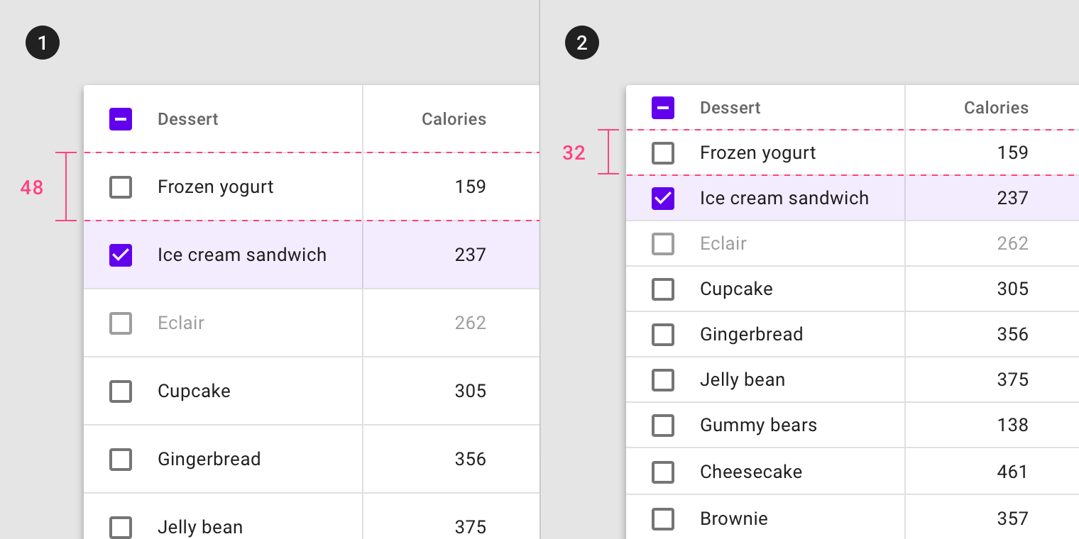
默认密度的表格高度为 32 dp;高密度的表格的高度为 24 dp。

默认密度的文本框高度为 56 dp;高密度的文本框的高度为 44 dp。
默认密度的行高度为 40 dp,按钮高度为 36 dp;高密度的行高度为 32 dp,按钮高度为 24 dp;
何时不切换密度
不应将高密度应用于 任务或与警报有关的组件。
Tasks and alert-based components should not increase density.
重点任务
不要将密度应用于涉及集中任务的组件,例如与下拉菜单或选取器进行交互。
增加这些组件的密度会降低它们的可用性。
Don’t increase the density of components that involve focused tasks, such as interacting with a dropdown menu or picker. Increasing density on components such as date pickers reduces usability by limiting tappable space.
高密度的日期选择器会降低组件的可用性。
Don’t
Don’t increase the density in components for focused tasks, such as date pickers.
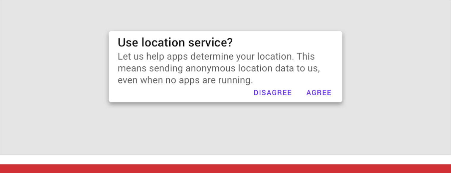
警报和消息
不要将高密度设计应用于提醒用户的组件,例如底部提示或对话框。
对警报应用高密度会降低组件的吸引力。
Don’t increase the density in components that alert the user of changes, such as snackbars or dialogs. Increasing the density of alerts makes them less effective at attracting user attention. In the example of dialogs, readability and prominence of a message are compromised when density increases.
不要将高密度应用于对话框,这会降低其可读性和显著性。
Don’t
Don’t increase the density of alert and message components, such as dialogs.
布局
网格与组件密度
如果需要显示更多的内容分组,应该使用 低密度网格与高密度组件。组件密度越高,边距与栏栅越宽。
Maintain balance between component density and the grid layout.
To create scannable groups of content, use a less-dense grid layout in combination with high-density components. The denser your components become, the larger the margins and gutter widths should be. Combining a dense layout grid with dense components can make differentiating groups of content harder for users.
组件密度越低,边距与栏栅越窄。组件密度越高,边距与栏栅越宽。
Do
Components with greater density should have lower density margins and gutters.
不用同时使用 高密度组件 与 较窄的边距、栏栅。
Don’t
Don’t use a dense layout grid with dense components.
组件
组件密度
不能单独调整某一组件的密度,而应该从整体考虑。在需要对组件密度进行调整时,应该考虑到与此组件相关的所有组件。
常见的组件密度有三种:默认、宽松以及紧凑。
Component density should not be adjusted in isolation. Instead, apply density consistently to create a cohesive component set. When you adjust one component’s density, consider how that change will affect other components in your app.
The tool below illustrates Material Components changing in coordination with three density settings: default, comfortable, and compact.
演示
Different densities across a set of Material Components.
默认: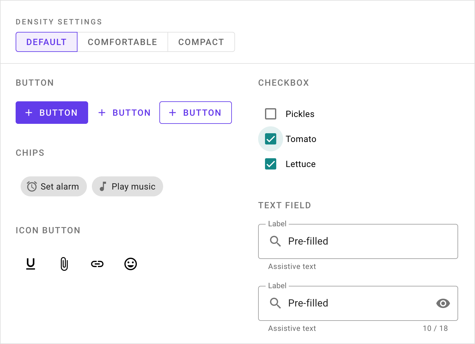
宽松: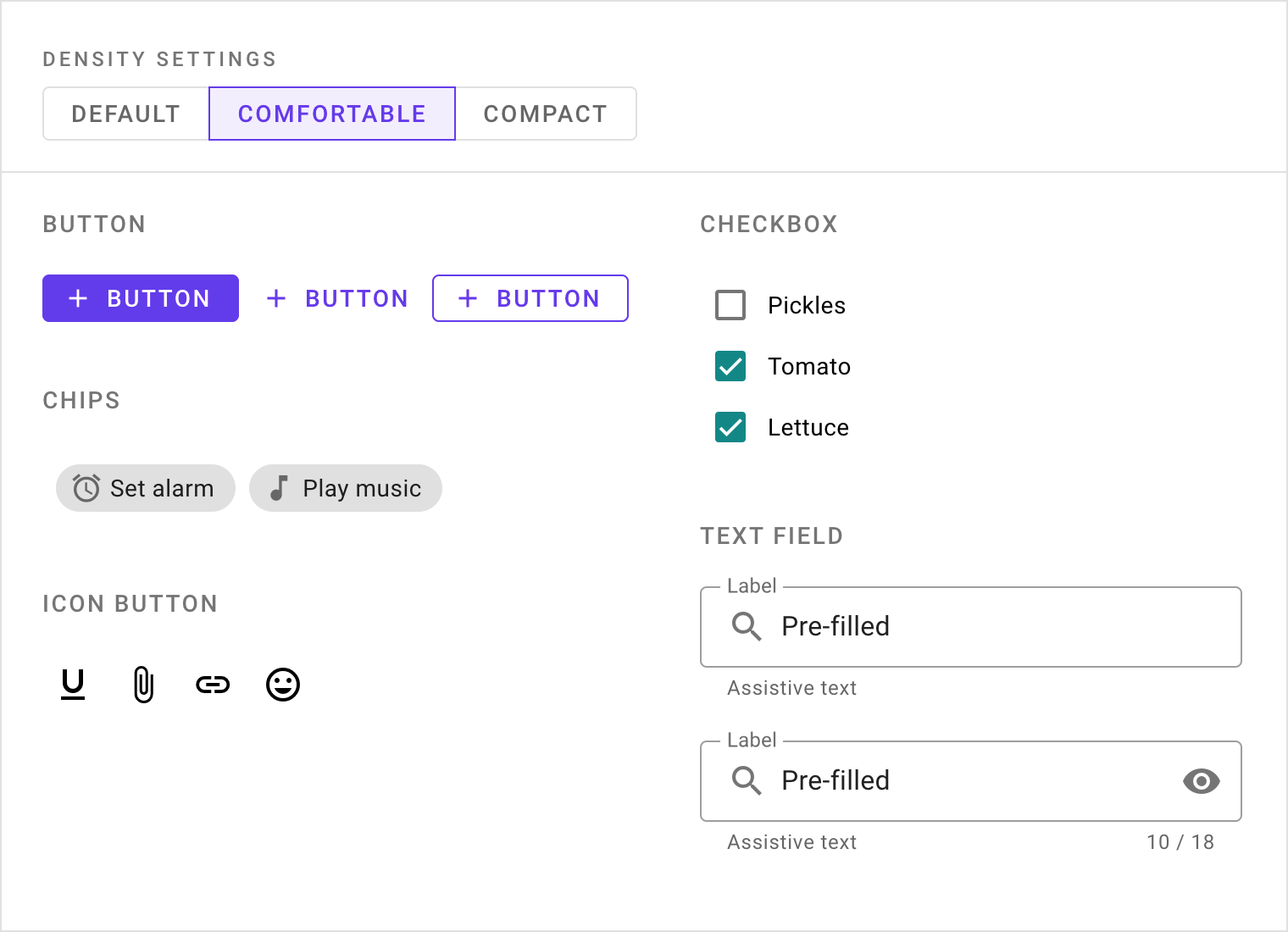
紧凑: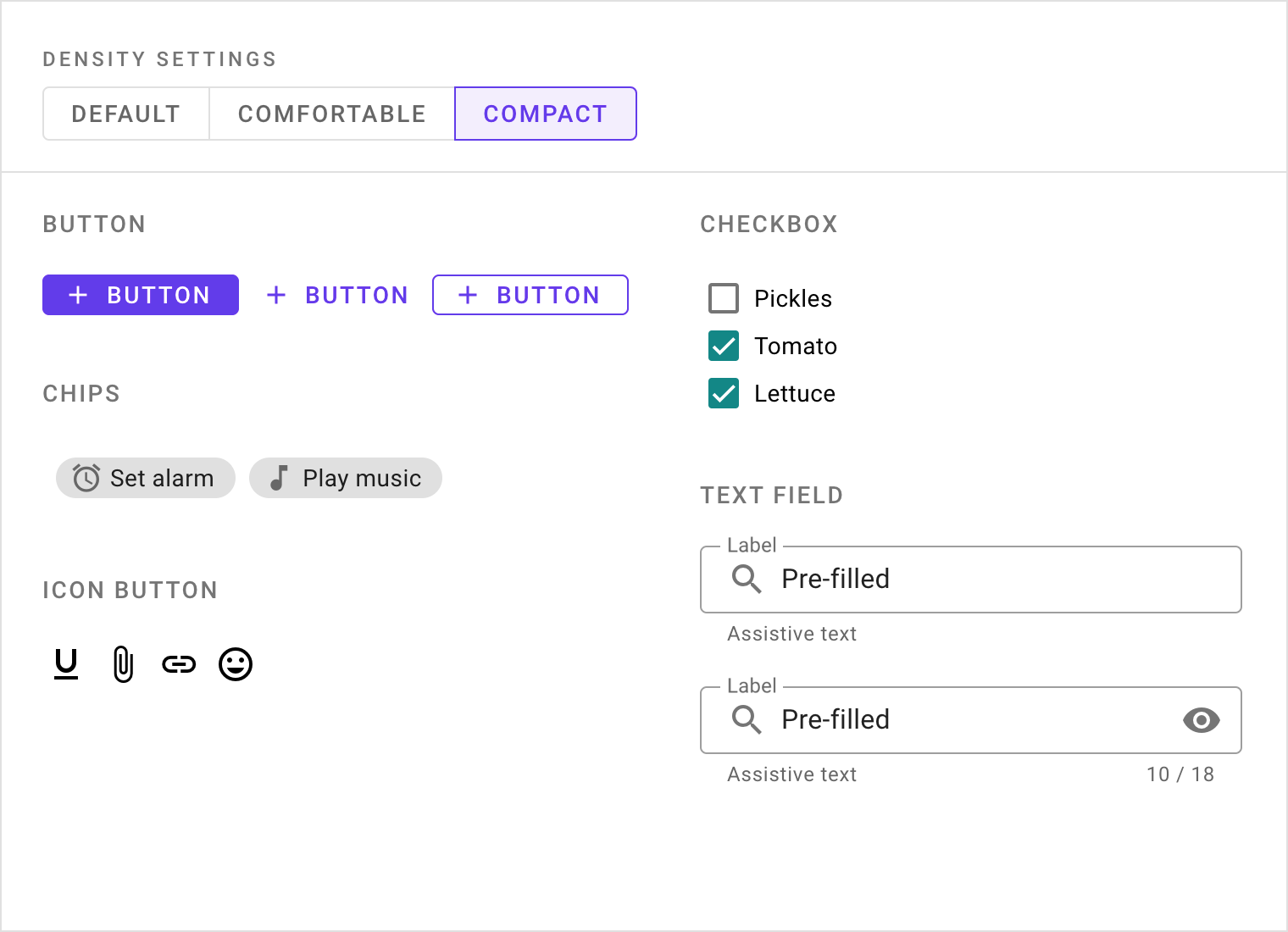
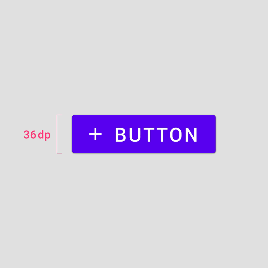
密度等级
以默认密度为 0 等级,每次递减,组件的高度减少 4 dps。
默认等级一下的常用等级有三种:-1、-2 以及 -3。
The density scale allows you to control the density of individual components when needed.
The density scale is numbered, starting at 0 for a component’s default density. The scale moves to negative numbers (-1, -2, -3) as space decreases, creating higher density. Each increment represents a decrease in the height of a component by 4dps.
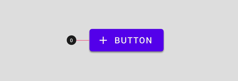
The density scale applied to a button
组件高度不得低于内容高度。
Don’t select a number from the density scale that breaks your component.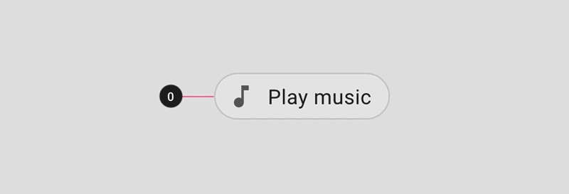
Don’t
Don’t break components by increasing density too much. The density of a chip at -4 breaks the component.
间距
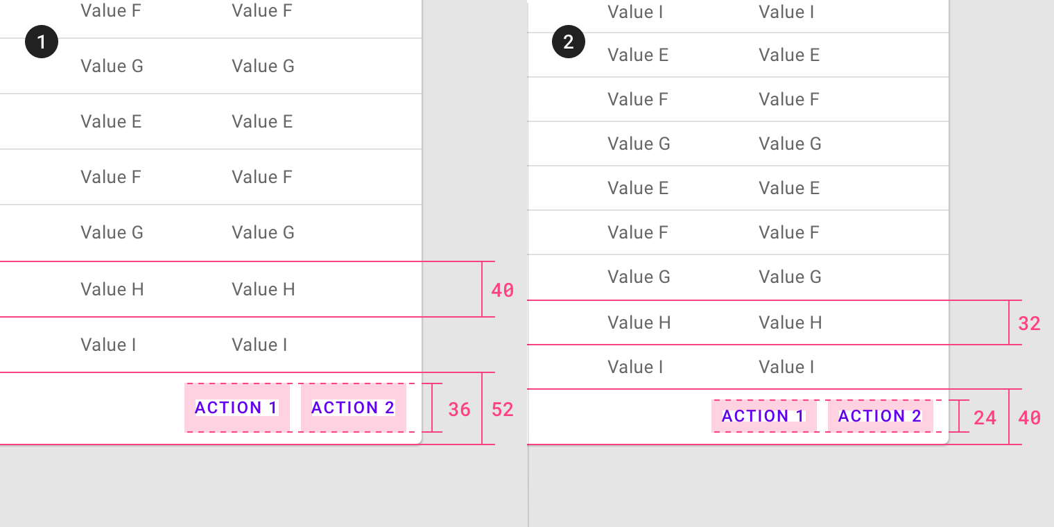
当组件的密度增加时,填充和对齐方式将保持一致,但是尺寸会发生变化。
从左到右依次为:边距、组件高度、内边距。
When a component’s density increases, the padding and alignment remains consistent, but the dimension changes.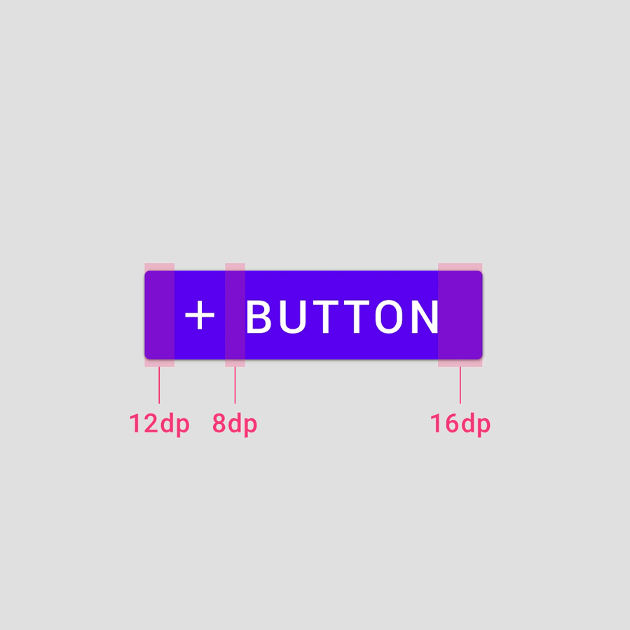
Padding
Do not change the padding of a component when increasing its density. Component padding affects height and reducing padding can affect user interactions negatively.
Dimensions
Change dimensions when increasing the density of components. Component dimensions affect the length and height of the component or element.
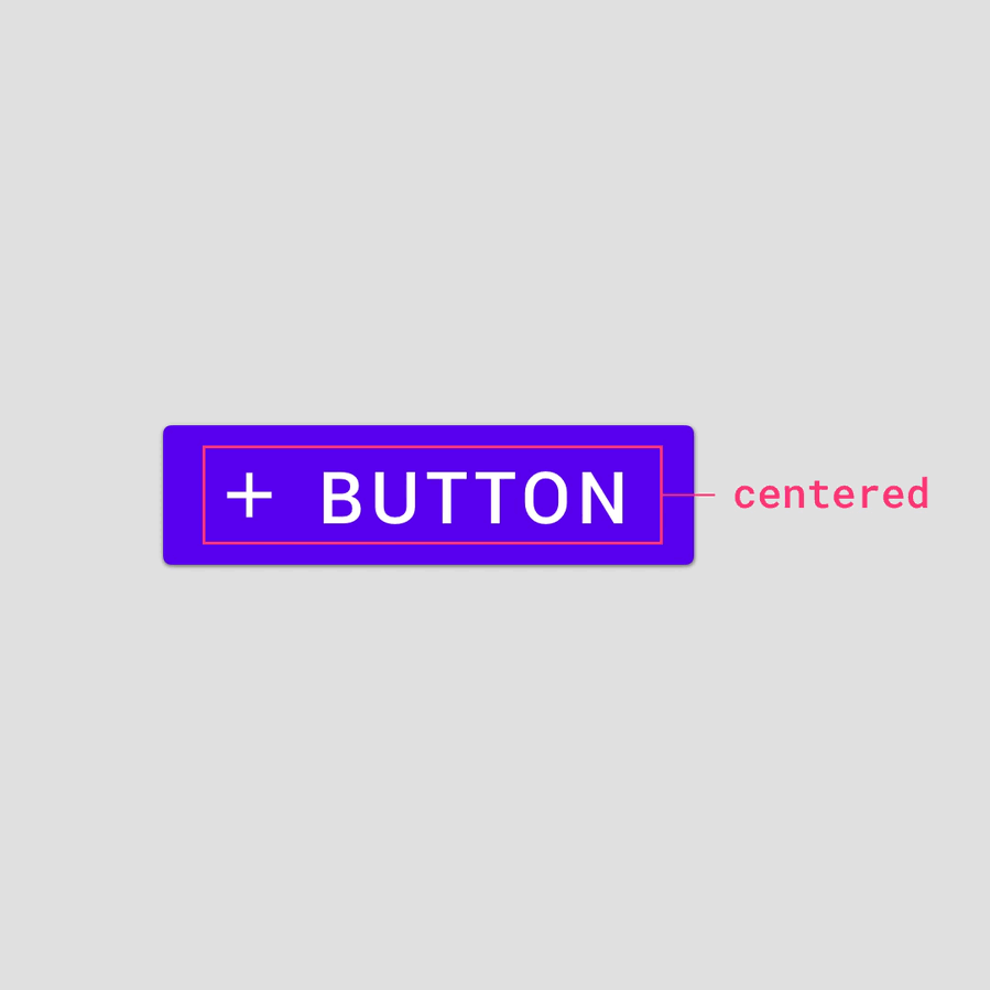
Alignment
Use a center specification to align elements within component containers. Center aligning elements allows component heights to be adjusted without additional alignment of elements.
多个元素的间隔规范
当一个组件中垂直排列多个元素时,请使用 4dp 的增量将它们分开。
让分组后的元素在组件容器中居中对齐。
When multiple elements are stacked vertically within a component, use 4dp increments to separate them. Center the grouped element within the component container.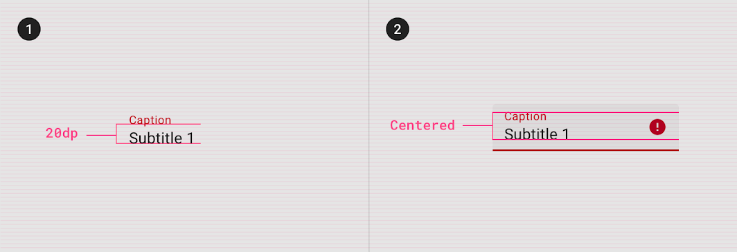
1. Elements separated by 20dp.
2. Element group centered within the component container vertically.
易用性
可触范围
触控目标 适用于接收输入(触摸和非触摸)的任何设备。
为了平衡信息密度和可用性,触摸目标应至少为48 x 48 dp,每个目标之间至少有8dp的空间。
Touch targets apply to any device that receives both touch and non-touch input. To balance information density and usability, the touch target for default density components should be at least 48 x 48 dp, with at least 8dp of space between each target. Note: on iOS, 44 x 44 dp is the recommended touch target.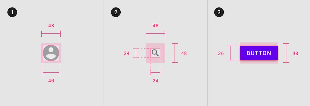
Touch target minimum of 48 x 48 dp
1. 40dp element, 48dp touch target
2. 24dp element, 48dp touch target
3. 36dp element, 48dp touch target
有时会出现以下几种极限情况,触摸目标尺寸必须小于默认的最小尺寸(48 dp)。
48 x 48 dp minimum touch targets should be the default experience in your product, with the exception of iOS products. Users must opt in to high density component experiences because higher density components do not meet accessibility requirements.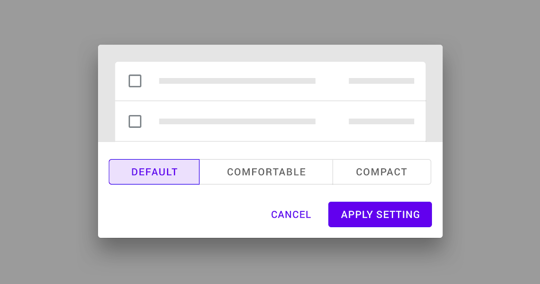
A pattern for users to opt in to a denser component experience
Typography
行高
Line height is the space between lines of text. Line height can be used as a way to create density in typographic layouts.
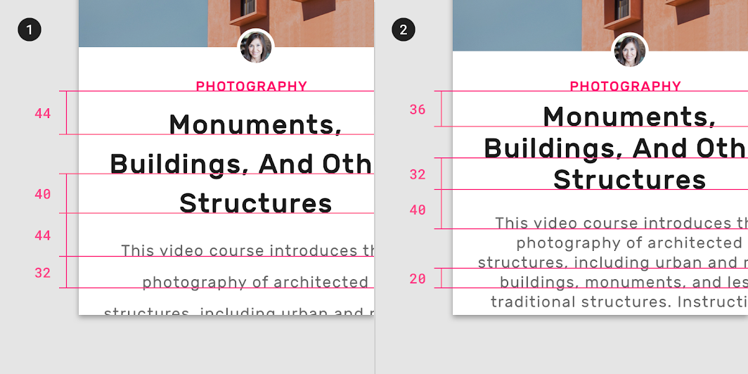
1. Larger line height: 44dp, 40dp, 44dp, 32dp
2. Smaller line height: 36dp, 32dp, 40dp, 20dp
Implementation
Density support for each platform is indicated below.
| Platform | Status |
|---|---|
| Android | Planned |
| iOS | Planned |
| Web | Available |
| Flutter | Planned |

若有收获,就点个赞吧
0 人点赞
