以图形形式来描述信息被称为数据可视化。
Data visualization depicts information in graphical form.
Guidance in beta reflects the latest Material Design insights. It may significantly change to support new research and code.
Learn more or send us your feedback.
原则
数据可视化是一种以图形形式来描述密集而复杂型信息的交互方式。最终呈现的视觉效果能让数据变得更容易理解并,这样可以帮助用户更好地做出决策。
数据可视化可以表达不同类型与大小的数据:从几个数据点到大型多变量数据集。
Data visualization is a form of communication that portrays dense and complex information in graphical form. The resulting visuals are designed to make it easy to compare data and use it to tell a story – both of which can help users in decision making.
Data visualization can express data of varying types and sizes: from a few data points to large multivariate datasets.

- 准确
在呈现信息时,不去扭曲原始数据,优先考虑数据的准确性、清晰度和完整性。
Prioritize data accuracy, clarity, and integrity, presenting information in a way that doesn’t distort it.
- 辅助
通过研究或比较的方式来帮助用户处理数据。
Help users navigate data with context and affordances that emphasize exploration and comparison.
- 扩展
针对不同设备规格采取自适应设计,同时预测用户对数据深度、复杂性以及形式的需求。
Adapt visualizations for different device sizes, while anticipating user needs on data depth, complexity, and modality.
类型
数据可视化可以以不同的形式表达。
图表是表达数据的常用方式,因为它们描述了不同的数据种类并允许用户对数据进行比较。
使用的图表类型主要取决于两件事:
- 要传达的数据
- 要传达的有关该数据的内容
下文提供了各种不同类型的图表及其用例。
Data visualization can be expressed in different forms. Charts are a common way of expressing data, as they depict different data varieties and allow data comparison.
The type of chart you use depends primarily on two things: the data you want to communicate, and what you want to convey about that data. These guidelines provide descriptions of various different types of charts and their use cases.
图表类型
时间推移型
时间推移型图表会显示一段时间内的数据,例如多个类别的趋势或比较。
常见用例包括:
- 股价表现
- 卫生统计
- 年表
Change over time charts show data over a period of time, such as trends or comparisons across multiple categories.
Common use cases include:
- Stock price performance
- Health statistics
- Chronologies
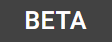
随时间变化的图表包括:
1.折线图 2.条形图 3.堆积条形图 4.烛形图 5.面积图 6.时间轴 7.地平线图 8.瀑布图
比较型
比较型图表用于比较多个不同类别之间的数据。
用例包括:
- 不同国家的收入
- 热门场地时间
- 团队分配
Category comparison charts compare data between multiple distinct categories.
Use cases include:
- Income across different countries
- Popular venue times
- Team allocations
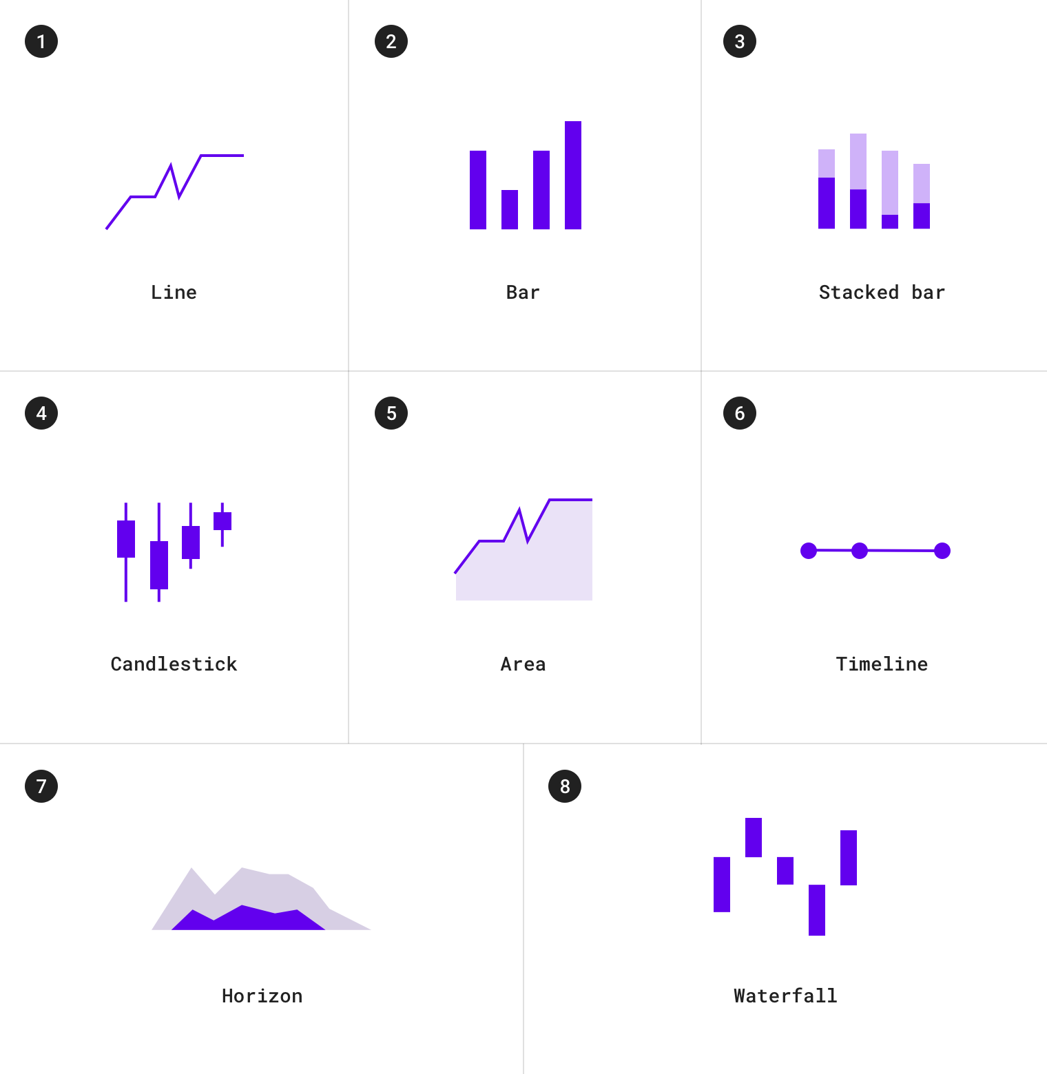
类别对比图包括:
1.条形图 2.分组条形图 3.气泡图 4.平行坐标图 5.组合折线图 6.子弹图
排行型
排名型图表用于显示项目在有序列表中的位置。
用例包括:
- 选举结果
- 绩效统计
Ranking charts show an item’s position in an ordered list.
Use cases include:
- Election results
- Performance statistics
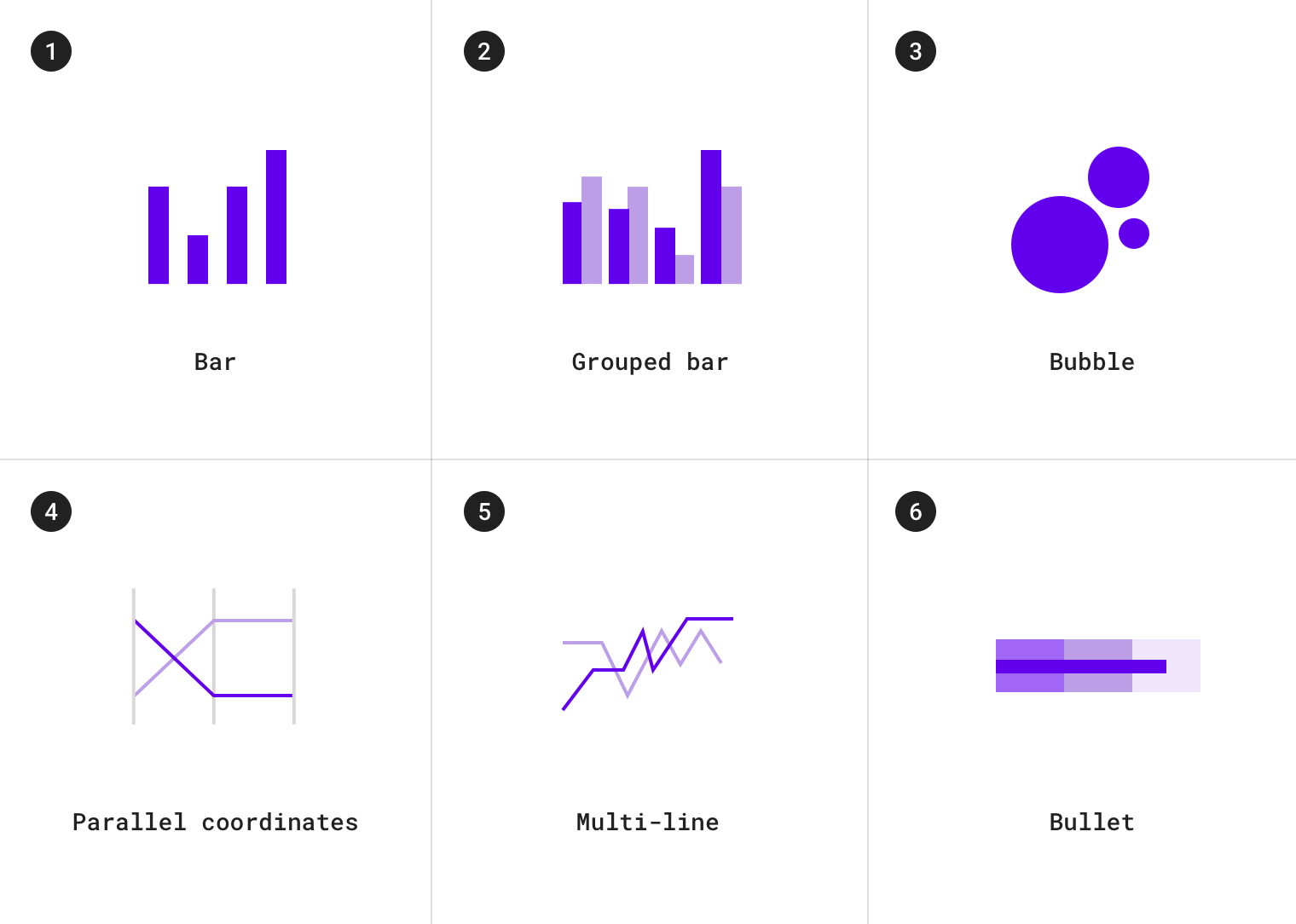
排名图表包括:
1.有序条形图 2.有序柱形图 3.平行坐标图
堆叠型
堆叠型图表用于显示元素增长或分步发展的过程。
用例包括:
- 产品类别的综合收入
- 预算
Part-to-whole charts show how partial elements add up to a total.
Use cases include:
- Consolidated revenue of product categories
- Budgets

堆叠型图表包括:
1.堆积条形图 2.饼图 3.甜甜圈图表 4.堆积面积图 5.树形图 6.太阳图
关联型
关联型图表用于显示两个或多个变量之间的相关性。
用例包括:
- 收入和预期寿命
Correlation charts show correlation between two or more variables.
Use cases include:
- Income and life expectancy
关联型图表包括:
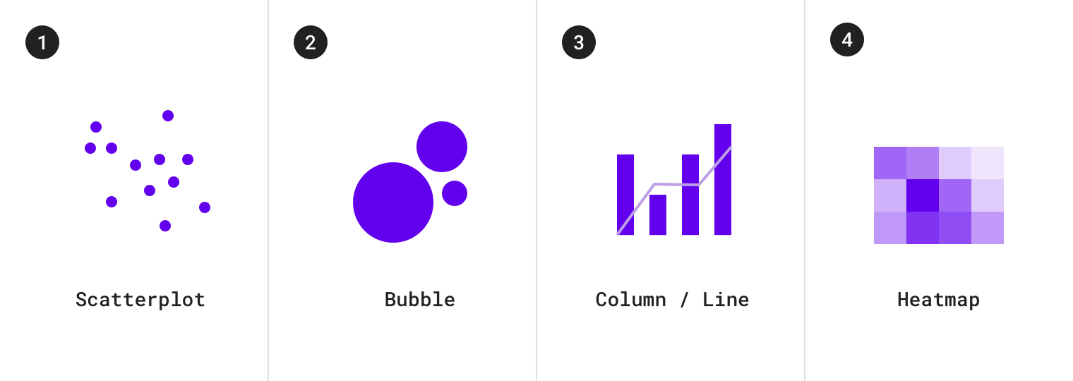
1.散点图 2.气泡图 3.柱形图和折线图 4.热力图
分布型
分布型图表用于显示每个值在数据集中出现的频率。
用例包括:
- 人口分布
- 收入分配
Distribution charts show how often each values occur in a dataset.
Use cases include:
- Population distribution
- Income distribution
分布型图表包括:
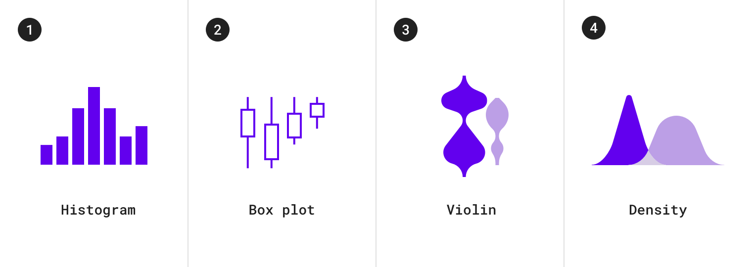
1.直方图 2.箱形图 3.小提琴图表 4.密度图表
流程型
流程图用于显示多个状态之间的数据移动。
用例包括:
- 资金转移
- 投票计数和选举结果
Flow charts show movement of data between multiple states.
Use cases include:
- Fund transfers
- Vote counts and election results
流程图包括:
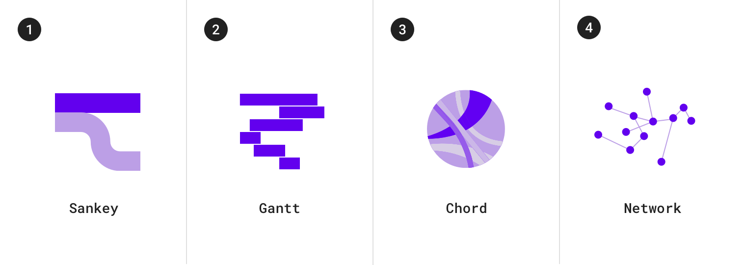
1.桑基图 2.甘特图 3.和弦图 4.网络拓扑图
关系型
关系图用于显示多个项目如何相互关联。
用例包括:
- 社交网络
- 单词图表
Relationship charts show how multiple items relate to one other.
Use cases include
- Social networks
- Word charts
关系图包括:
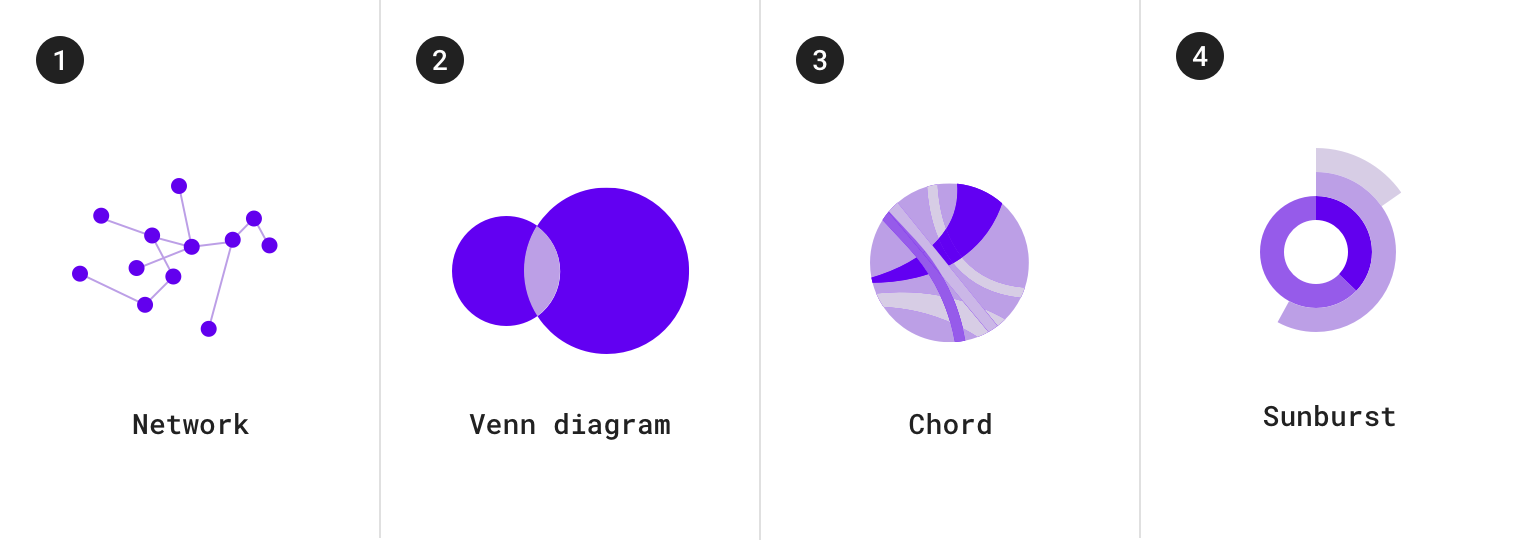
1.网络拓扑图 2.维恩图 3.和弦图 4.太阳图
选择图表
我们可以通过各种各样的图表来展示数据。
我们提供了以下指南来帮助设计者选择图表。
Multiple types of charts can be suitable for depicting data. The guidelines below provide insight into how to choose one chart over another.
时间推移型
我们使用数据点按照时间顺序分布的时序图来表示时间推移中数据的变化情况。
能够表示时间推移的图表包括:折线图,条形图和面积图。
Change over time can be expressed using a time series chart, which is a chart that represents data points in chronological order. Charts that express change over time include: line charts, bar charts, and area charts.
| Type of chart | Usage | Baseline value * | Quantity of time series | Data type |
|---|---|---|---|---|
| 折线图 | 展示数据的微小变化 | Any value | Any time series (works well for charts with 8 or more time series) | 连续型 |
| 饼状图 | 展示数据之间较大的差异:各组数据在整体中的占比、数据间的比较以及排名 | Zero | ≤ 4 | 离散型或分类 |
| 面积图 | 展示数据集之间的关系以及各组数据在整体中的占比 | Zero (when there’s more than one series) | ≤ 8 | 连续型 |
*基线值是y轴上的起始值。
条形图和饼图
条形图和饼图都可用于显示各组数据在总值中所占的比例。
Both bar charts and pie charts can be used to show proportion, which expresses a partial value in comparison to a total value.
- 条形图
- 使用共同基线值
- 通过条形长度表示数值
饼图
- 使用圆内的圆弧或角度表示整体的一部分
Bar charts express quantities through a bar’s length, using a common baseline
- Pie charts express portions of a whole, using arcs or angles within a circle
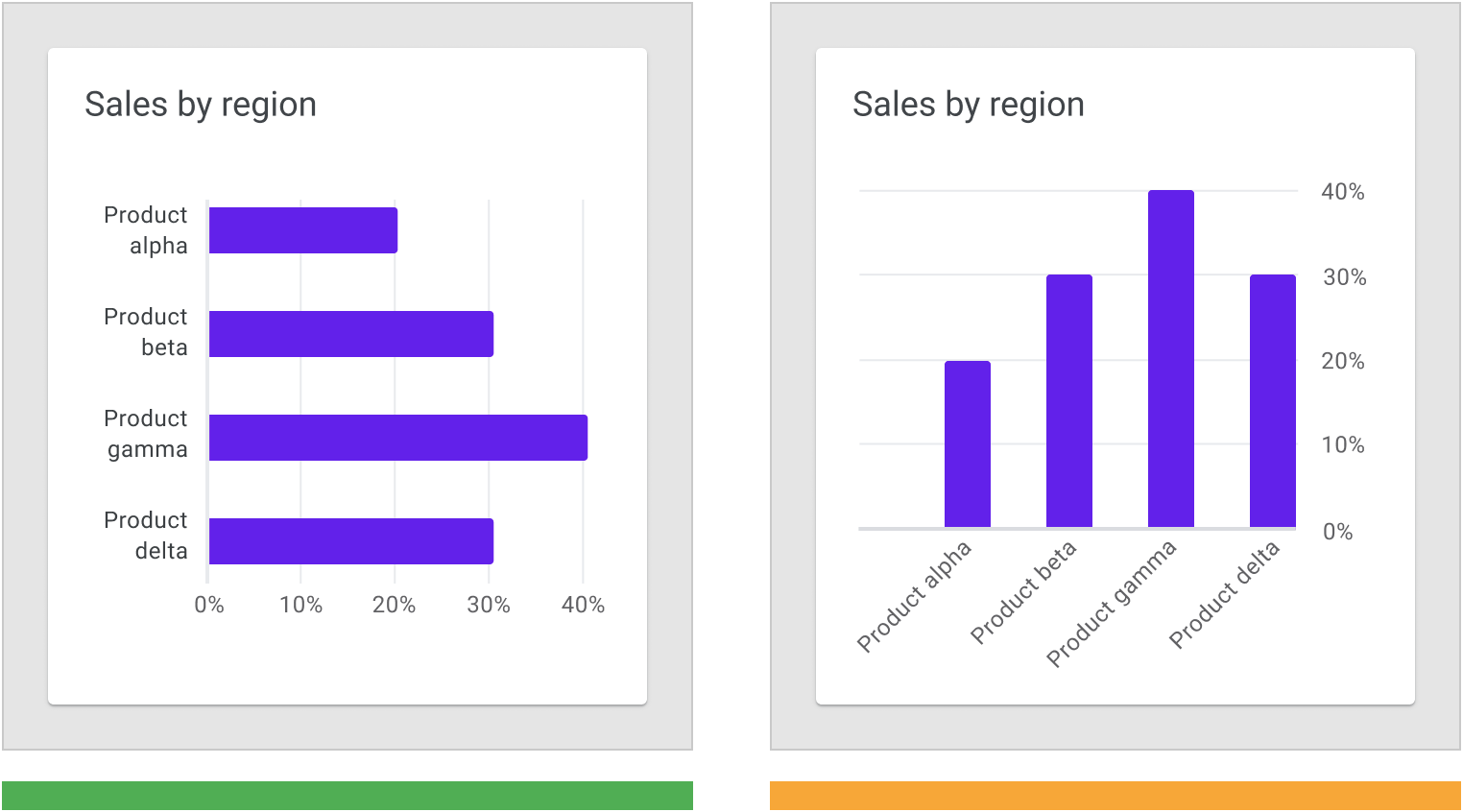
条形图、折线图以及堆积面积图,这三类图表比饼图更有效地显示数据随时间变化的情况。由于条形图更加直观反馈数值,这三类图表虽然拥有相同的基线值,我们会优先使用条形图来展示数据。
Bar charts, line charts, and stacked area charts are more effective at showing change over time than pie charts. Because all three of these charts share the same baseline of possible values, it’s easier to compare value differences based on bar length.
正确:使用条形图显示随时间的变化或类别之间的差异; Do Use bar charts to show changes over time or differences between categories.
错误:很难在饼状图中比较每个切片的大小差异。 Don’t Don’t use multiple pie charts to show changes over time. It’s difficult to compare the difference in size across each slice of the pie.
面积图
面积图有多种,常见的有两种:
- 堆叠面积图
- 重叠面积图
Area charts come in several varieties, including stacked area charts and overlapped area charts:
- Stacked area charts show multiple time series (over the same time period) stacked on top of one another
- Overlapped area charts show multiple time series (over the same time period) overlapping one another
Overlapping area charts are not recommended with more than two time series, as doing so can obscure the data. Instead, use a stacked area chart to compare multiple values over a time interval (with time represented on the horizontal axis).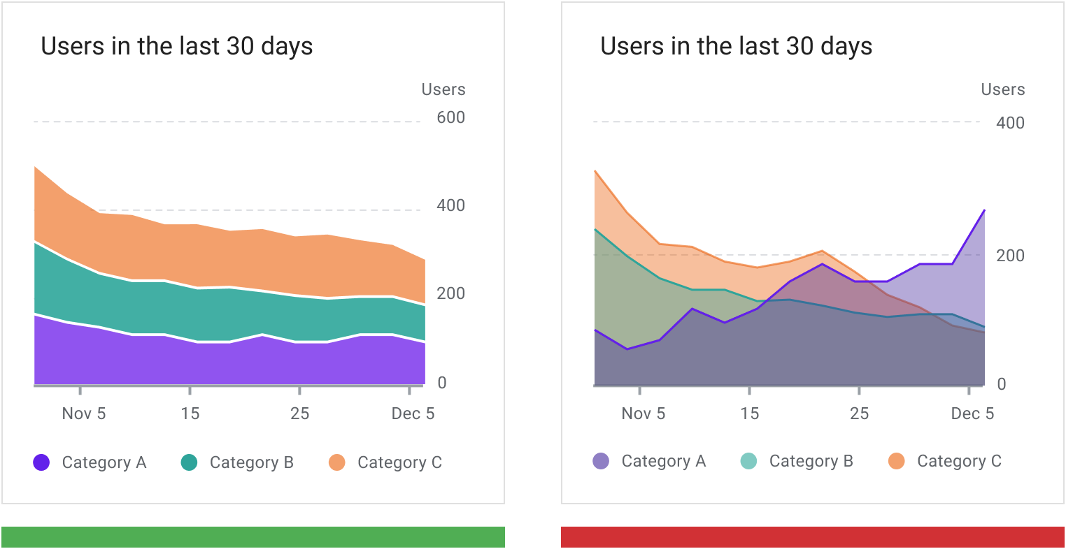
正确:数据组在两组以上时,推荐使用堆叠面积图。 Use a stacked area chart to represent multiple time series and maintain a good level of legibility.
错误:在使用重叠面积图时,建议不要使用两组以上的数据组,因为这样做会使数据模糊不清。 Don’t use overlapped area charts as it obscures data values and reduces readability.
样式
数据可视化使用自定义的样式和形状来帮助用户理解数据。
我们可以通过以下内容,来强化图表的定制化功能:
Data visualizations use custom styles and shapes to make data easier to understand at a glance, in ways that suit the user’s needs and context.
Charts can benefit from customizing the following:
- 图形符号
- 字体排版
- 插图
- 坐标轴和标签
图例与注释
Graphical elements
- Typography
- Iconography
- Axes and labels
- Legends and annotations
Styling different types of data
Visual encoding is the process of translating data into visual form. Unique graphical attributes can be applied to both quantitative data (such as temperature, price, or speed) and qualitative data (such as categories, flavors, or expressions).
These attributes include:
- Shape
- Color
- Size
- Area
- Volume
- Length
- Angle
- Position
- Direction
- Density
Expressing multiple attributes
Multiple visual treatments can be applied to more than one aspect of a data point. For example, a bar color can represent a category, while a bar’s length can express a value (like population size).
Shape can be used to represent qualitative data. In this chart, each category is represented by a specific shape (circles, squares, and triangles), which makes it easy to compare data both within a specific range or against other categories.

形状
图表可以使用各种各样的形状来显示数据。
Charts can use shapes to display data in a range of ways. A shape can be styled as playful and curvilinear, or precise and high-fidelity, among other ways in between.
形状细节水平
形状的样式取决于图表读取数据所需的精度。
需要用户进行探索的图表中的形状应该在提供完整数据的前提下,便于用户与之交互(触摸目标的大小以及其他元素)。
旨在表达一般概念或趋势的图表,形状在设计时可以降低读取数据所需的精度。
Charts can represent data at varying levels of precision. Data intended for close exploration should be represented by shapes that are suitable for interaction (in terms of touch target size and related affordances). Whereas data that’s intended to express a general idea or trend can use shapes with less detail.
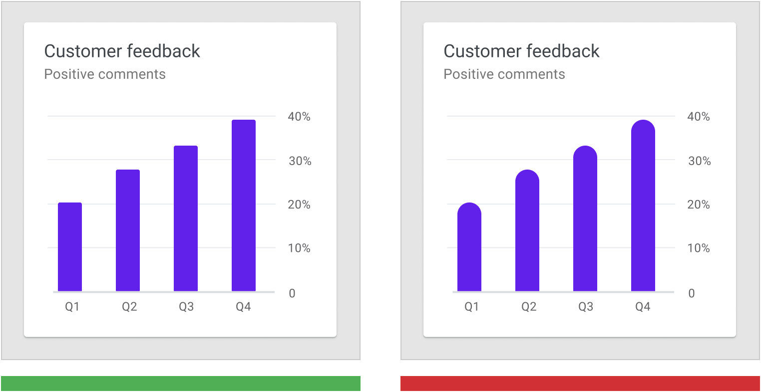
正确:此图表中的条形有微妙的圆角,但是不影响图表的易读性。 The bars in this chart have subtle rounded corners, ensuring that the top of the bar precisely measures the bar’s length.
错误:条形图中条形的顶端圆角过大,用户难以读取图表的形状要传达的数值大小。 Don’t use shapes that make it hard to read a chart, such as bars with imprecise top edges.
颜色
区分图表数据时,颜色有以下四种作用:
- 区分数据类别
- 代表数值大小
- 突出显示特定数据
- 表达意义
Color can be used to differentiate chart data in four primary ways:
- Distinguishing categories from one another
- Representing quantity
- Highlighting specific data
- Expressing meaning
区分数据类别
Color is used to define categories in a donut chart.
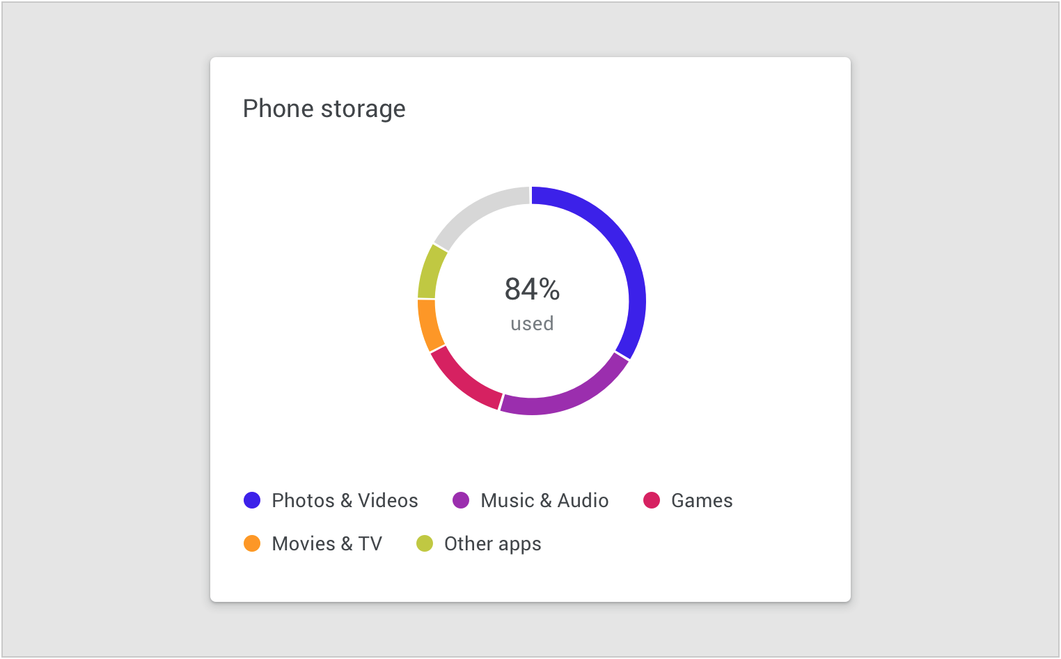
表示数值大小
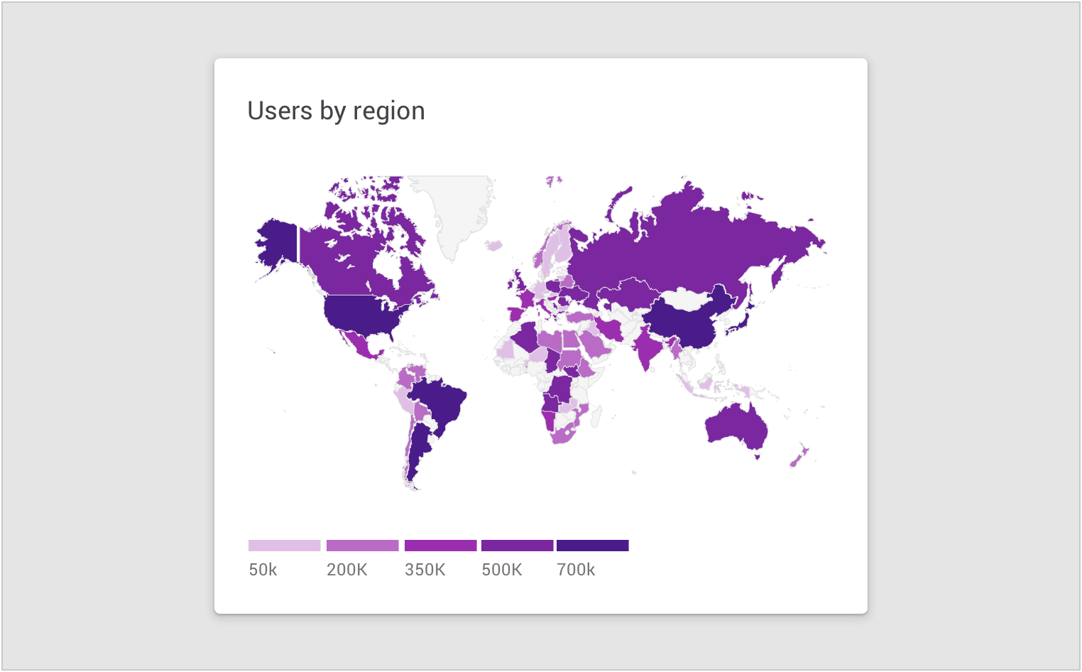
Color is used to represent data values in a map.
突出显示数据
Color is used to highlight specific data in a scatterplot.

Areas of focus
Color can highlight an area of focus, when it is used sparingly. It’s not recommended to use a substantial amount of color highlights, as they can distract and hinder user focus.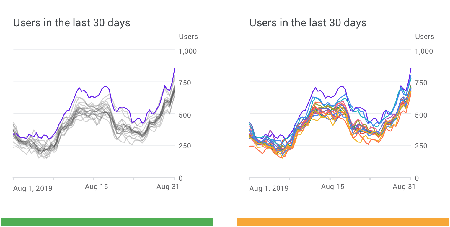
正确:使用颜色高光和中性色的组合来提高数据之间的对比度,并强调特定数据。 Use a combination of color highlights and neutral colors to provide contrast and emphasis.
注意:单个图表中使用的颜色过多,可能会妨碍用户筛选重要的信息。 Many colors in a single chart can hinder focus.
表达意义
正确:使用其他视觉提示(如图标)强化图表颜色的含义。 Reinforce the meaning of chart colors with other visual cues, like icons.
错误:不要仅使用颜色来表示特殊的含义。 Don’t use color alone to indicate meaning.
无障碍设计
为了照顾对颜色差异不敏感的用户,设计者可以使用其他方法来强调特定的数据,例如使用高对比度的配色,变换形状或添加纹理。
将文本标签应用于图表,还有助于阐明其含义,同时降低用户对图例的需求。
相关链接:color contrast
To accommodate users who don’t see color differences, you can use other methods to accentuate data, such as high-contrast shading, shape, or texture.
Applying text labels to data also helps clarify its meaning, while eliminating the need for a legend. See more in color contrast.
线
图表中的线可以帮助用户数据的质量、层次结构以及数据之间的差异性。
设计者可以根据需求设置线的格式。
Chart lines can express qualities about data, such as hierarchy, highlights, and comparisons. Line styles can be styled in different ways, such as using dashes or varied opacities.
可以使用线的特定元素包括:
- 图例注释
- 预测数据
- 比较工具
- 置信区间
- 置信区间是指由样本统计量所构造的总体参数的估计区间。
- 异常状态
Lines can be applied to specific elements, including:
- Annotations
- Forecasting elements
- Comparative tools
- Confidence intervals
- Anomalies
正确:改变线条的纹理来表示不同的数据类型。 Vary a line’s texture to represent different data types.
错误:当数据类别相同时,不要使用不同的颜色来显示其周期性变化。 Don’t use different colors to show periodical variation for the same data category.
文本
文本可用于标记不同的图表元素,包括:
- 图表标题
- 数据标签
- 轴标签
- 注释
在组件中,优先级最高的是图表标题,轴标签与图例则是优先级最低的。
Text can be used to label different chart elements, including:
- Chart titles
- Data labels
- Axis labels
- Legend
The text with the highest level of hierarchy is usually the chart title, with axis labels and the legend having the lowest level of hierarchy.

| Scale category | Typeface | Font | Size |
|---|---|---|---|
| 1. Chart title | Roboto | Regular | 18pt |
| Chart subtitle | Roboto | Regular | 14pt |
| 2. Data label | Roboto | Regular | 22pt |
| Sub-label | Roboto | Regular | 14pt |
| 3. Axis labels | Roboto | Regular | 12pt |
| 4. Legend labels | Roboto | Regular | 12pt |
字重
标题等级与字重可以向用户传达出组件中各个元素的层级。但是由于图表类的组件位置有限,排版要求较高,对于标题等级与字重的控制更为严格。
Headings and varying font weights can communicate which content is more (or less) important than other content in the hierarchy. However, these treatments should be used sparingly, with a limited number of typographic styles.
正确:粗体(Blod)仅用于一个或两个关键元素,不会影响整体的视觉效果。 Bold used just for one or two key elements creates a balanced design.
错误:粗体(Blod)用于太多元素,用户难以识别组件中的关键元素。 Bold used on too many elements can make it harder to identify important elements.
图标
图标可以表示图表中不同类型的数据,并且可以提高图表的易读性。
图标可用于:
- 数据分类
- 用于对数据进行分组
- 交互控件
- 例如筛选过滤、缩放、保存以及下载
- 状态显示
- 例如错误,没有数据,完成状态和危险
在图表中放置图标,尤其是在表示操作或状态时,建议使用被广泛接收的图标样式,例如:保存、下载、完成、错误以及报警。
Iconography can represent different types of data in a chart and improve a chart’s overall usability.
Iconography can be used for:
- Categorical data to differentiate groups or categories
- UI controls and actions, such as filter, zoom, save, and download
- States, such as errors, no data, completed states, and danger
When placing icons in a chart, it’s recommended to use universally recognizable symbols, particularly when representing actions or states, such as: save, download, completed, error, and danger.
正确:使用标签和图标的组合,可以清楚地表示关键信息。 Use labels along with icons to clearly represent key information.
错误:避免仅使用图标或符号来表示关键信息。 Avoid using solely icons and symbols to represent important information.
在使用颜色来传达信息时,可以使用图标来进行补充说明。
Icons supplement color in conveying meaning.
坐标系
坐标系用于表示所显示的数据的比例和范围。
A labelled axis, or multiple axes, indicates the scale and scope of the data displayed. For example, line charts display a range of values along both horizontal and vertical labelled axes.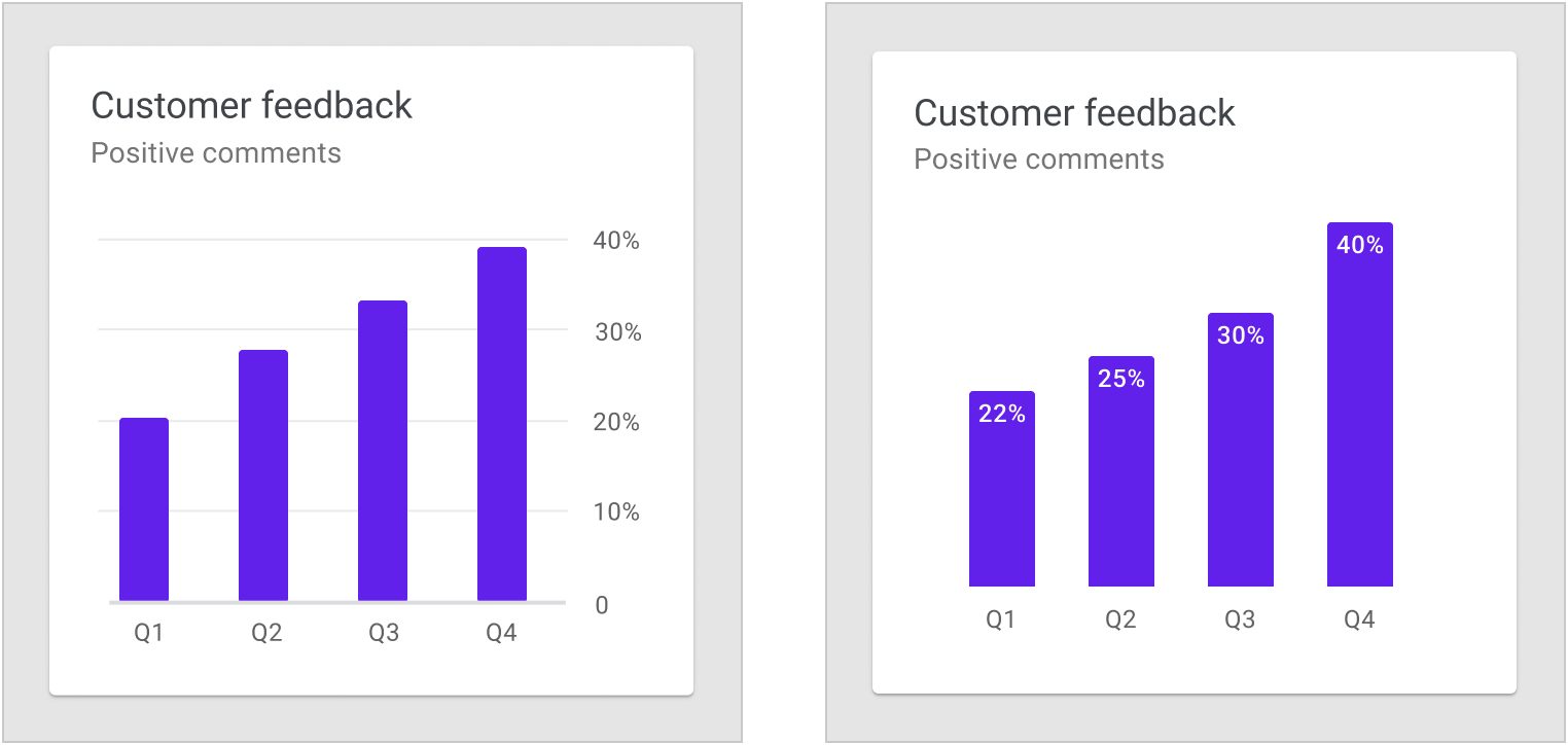
条形图应始终从基线值为 0 的x轴上开始; Bar charts should always start at the x-axis baseline value of zero.
可以根据需要隐藏图表的坐标系,仅保留能够关键元素。 Consider removing axes altogether to keep the data as the focal point. You can place values directly on their corresponding chart elements.
条形图基线
条形图应从基线(y轴上的起始值)开始为零。若基线值不为 0,用户可能会读取错误的数据,并且对真实的数据变化产生误解。
Bar charts should start at a baseline (the starting value on the y-axis) of zero. Starting at a baseline that isn’t zero can cause the data to be perceived incorrectly.
正确:基线值为 0 的条形图。 A bar chart starting at the zero baseline
错误:基线值不为 0 的条形图。此基线开始于 20%,这样会放大条形图的数据周期性变化。 Don’t start the baseline at values other than zero. This baseline starts at 20%, making the bar differences look more dramatic.
轴标签
坐标轴的标签是用户根据图表做出判断的重要元素。设计者需要在同一套设计系统规定统一的标签使用方法以及样式。
Label usage should reflect the most important data insights in a chart. Axis labels should be used as needed, and in consistent ways across a UI. Their presence should not inhibit reading the chart.
轴标签的目的是提高图表的可读性。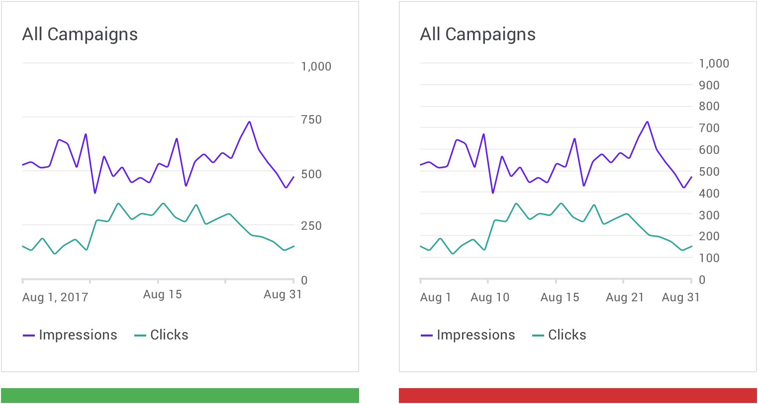
正确:根据情况,使用数量合理的标签能够提高图表易读性。 Support legibility by using a balanced number of axis labels.
错误:不合理的标签设计会降低图表的易读性。 Don’t overload the chart with numerous axis labels.
文字方向
在排版允许的情况下,文本标签优先水平放置在图表上,以便用户进行阅读。
尽量不使用旋转、垂直堆叠的排版方式。
Text labels should be placed horizontally on the chart so that they are easy to read.
Text labels should not:
- Be rotated
- Stacked vertically
正确:文本标签优先水平放置在图表上。 Orient text horizontally on bar charts, rotating the bars if needed to make space.
注意:当空间不允许时,可以旋转标签来节约空间(保证被展示的信息的完整性)。 Don’t rotate bar labels, as it makes them difficult to read.
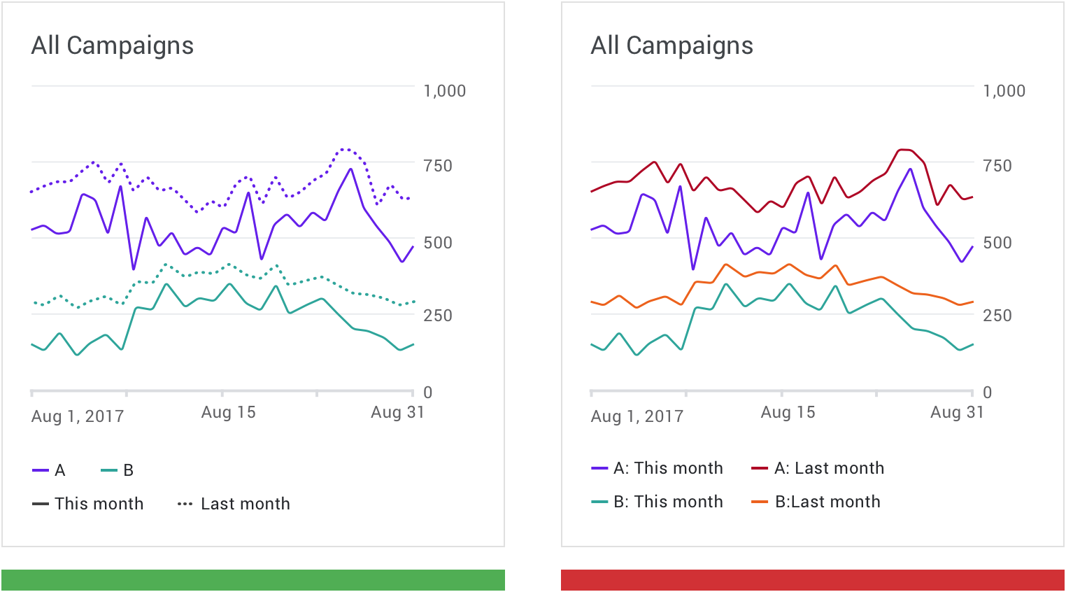
图例和注释
图例和注释辅助用户理解图表的信息。
注释 应突出显示数据点、数据异常值以及任何值得用户注意的内容。
Legends and annotations describe a chart’s information. Annotations should highlight data points, data outliers, and any noteworthy content.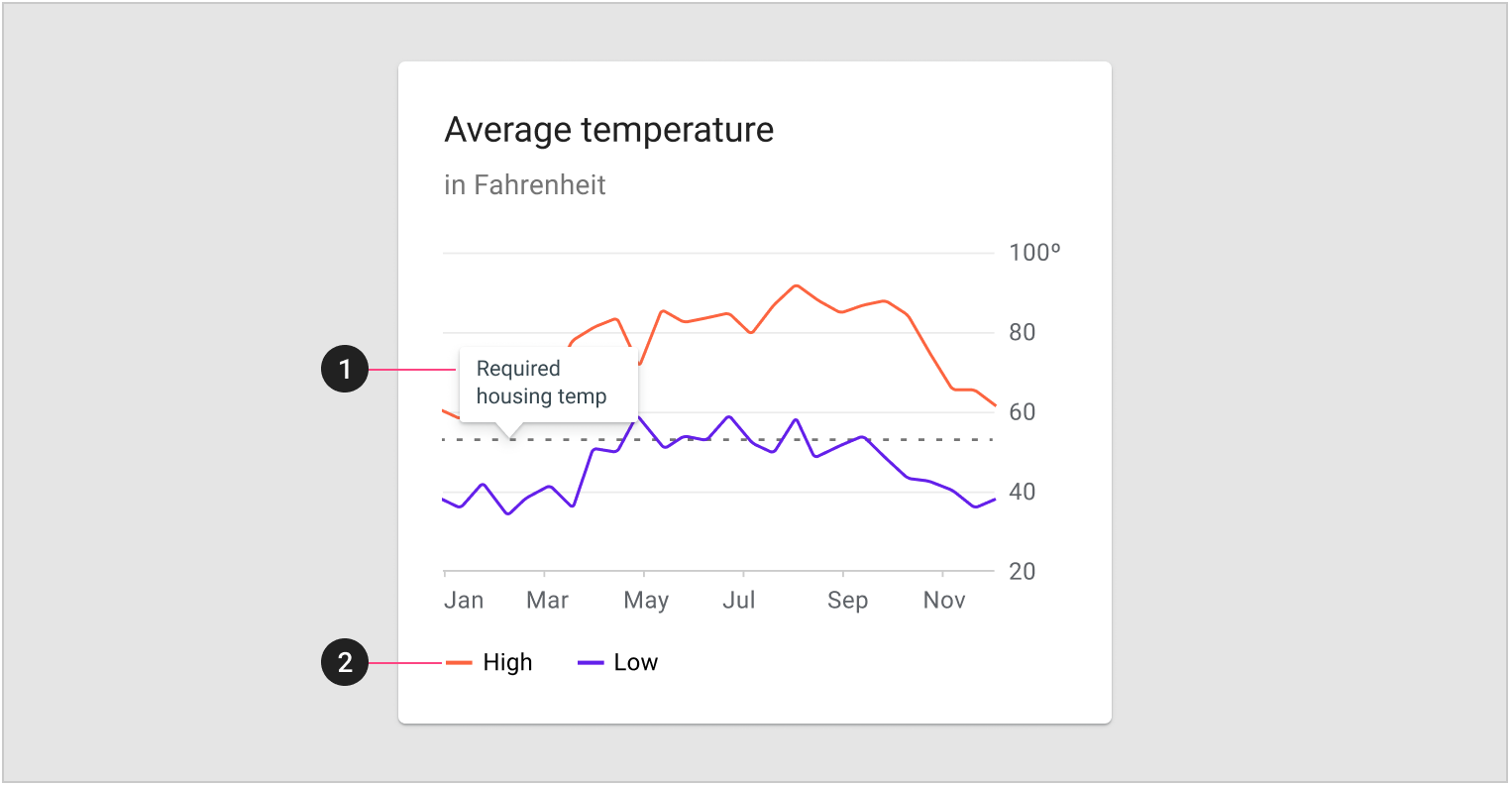
- 注释
- 图例
- 在桌面上,建议将图例放置于在图表下方;
- 在移动设备上,建议将图例放在图表上方,以便在交互时,保持图例的可见状态。
On desktop, it’s recommended to place a legend below a chart. On mobile, place the legend above the chart to keep it visible during interactions.
标签与图例
在简单的图表中可以直接在图表中用标签来代替图例。但是在信息密集的图表中,则需要专门留出区域来设计图例。
Chart elements can be labeled directly in simple charts. However, charts that are dense (or part of a larger group of charts) can display labels in a legend.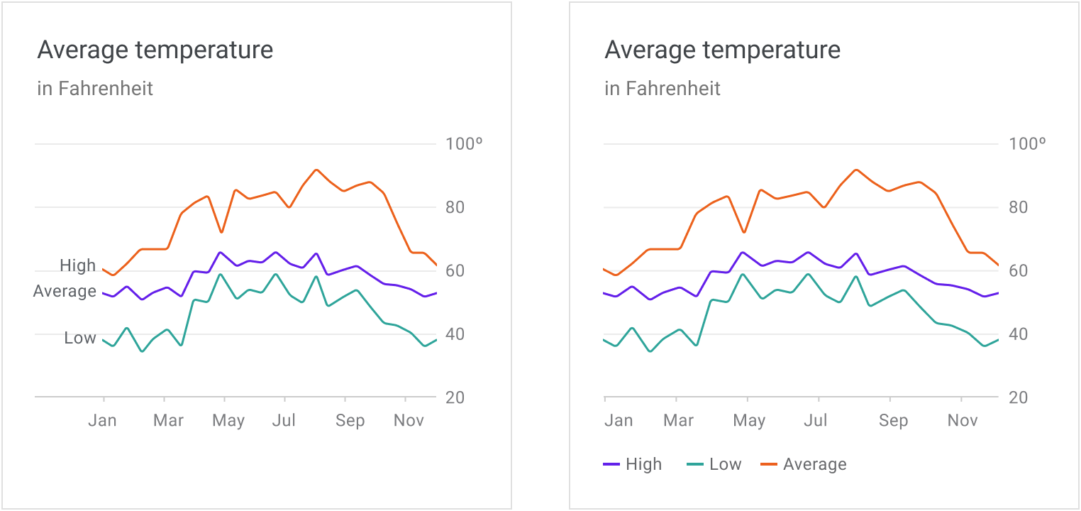
使用标签代替图例的折线图; 使用图例的折线图。
小屏显示
可穿戴设备(或其他小屏幕)上显示的图表是移动设备或桌面端图表的简化版本。
Charts displayed on wearables (or other small screens) should be a simplified version of the mobile or desktop chart.
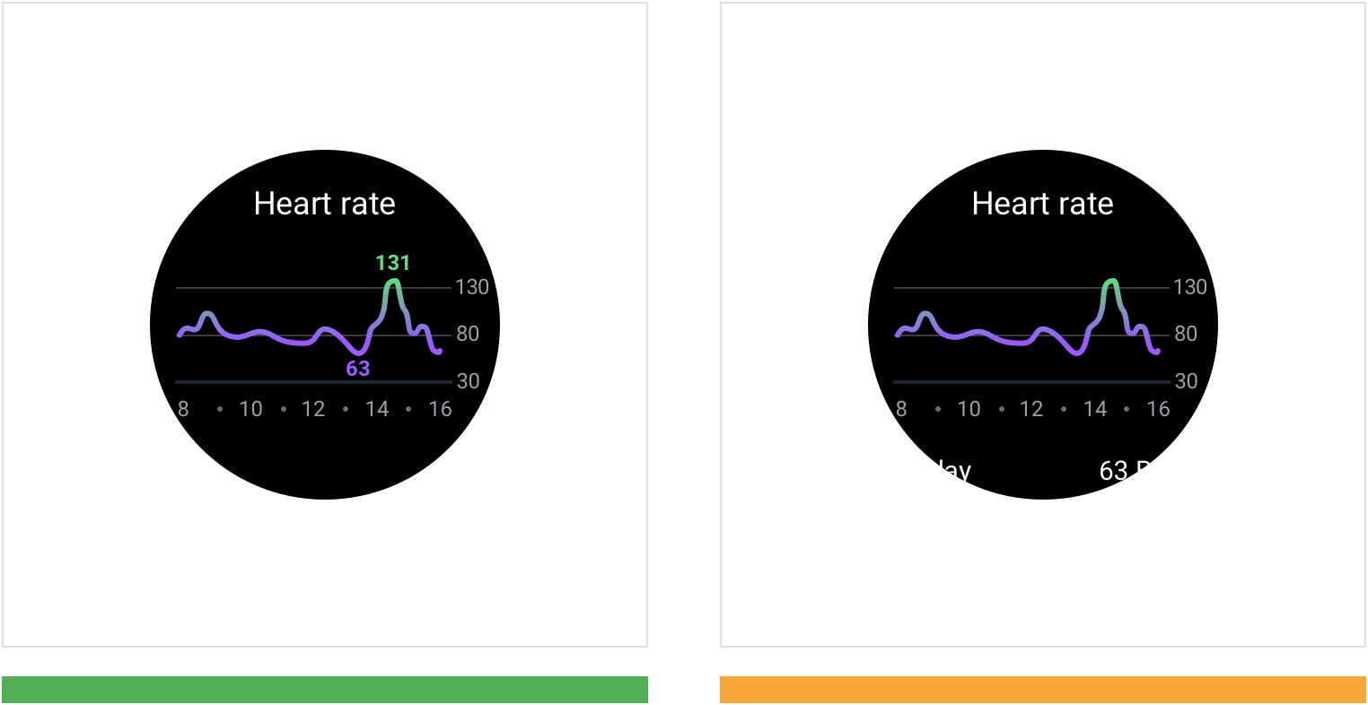
正确:在图表上优先对关键点进行展示。此示例中,当前屏幕只显示最高和最低的数据值。 Annotate key points on the graph to describe the data. In this example, the highest and lowest data values are displayed.
注意:不要将关键数据点放在屏幕外,减少用户的操作。 Don’t place key data points off-screen, as it requires the user to scroll to see them.
阈值能够辅助用户对当前图表进行分析。

行为
图表包含的交互操作可以让用户能够对显示的数据进行控制。这些交互操作可以让用户能够专注于自己所需要的内容。
推荐设计者使用以下几种交互模式:
- 渐进展开
- 渐进的方式在于提前预设了一条明确的路径,用户可以按需查看图表的详细信息
- 直接操作
- 允许用户直接对UI元素进行操作,最大限度地减少屏幕上所需的操作数量,包括:缩放、平移、分页以及数据控件
- 视角切换
- 设计者可以通过一种设计来适配不同的用户需求或数据类型,例如数据控件和动效。
Charts provide interaction patterns that give users control over the data displayed. These patterns let users focus on a chart’s specific values or ranges.
The following recommended interaction patterns, styles, and effects (like haptic feedback) can improve user understanding of chart data:
- Progressive disclosure provides a clear path to unveiling details, accessible on demand.
- Direct manipulation allows users to directly act on UI elements, minimizing the number of actions needed on a screen, including: zooming and panning, pagination, and data controls.
- Changing perspective enables one design to work for different users and data types, such as data controls and motion.
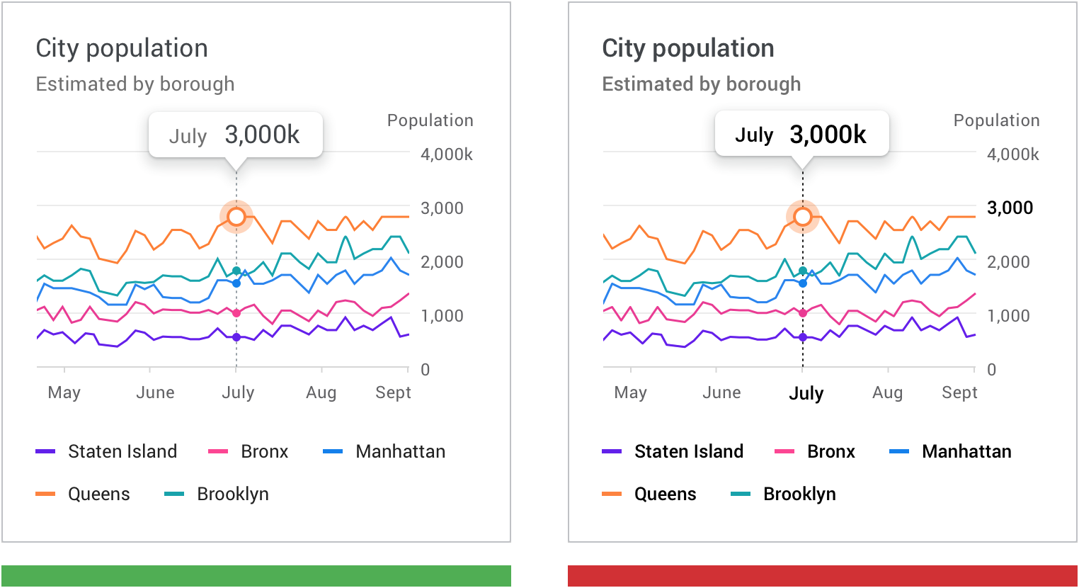
渐进展开
使用渐进展开的方式来披露显示图表详细信息,允许用户根据需要查看特定数据点。
Reveal chart details using progressive disclosure, which allows users to view specific data points as needed.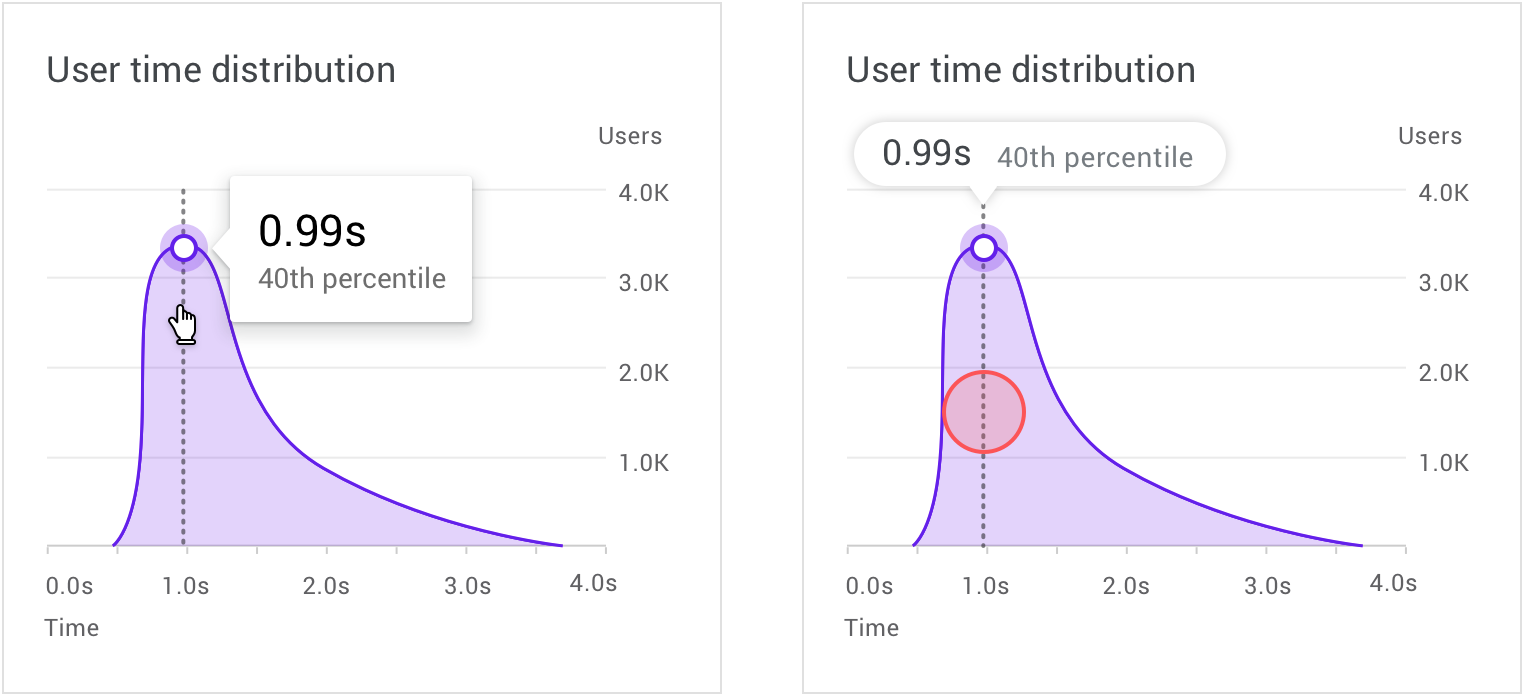
在桌面端上,鼠标悬停状态可以显示更详细的数据信息; On desktop, a hover state can reveal more detailed data.
在移动设备上,手指触摸并按住相应的位置,会在图表上方显示更详细的数据信息。 On mobile, a touch and hold gesture displays a tooltip placed above the chart.
缩放和平移
缩放和平移是应用比较广泛的交互手势,是用户学习数据和探索图表的基础交互手势。
Zooming and panning are popular chart interactions that affect how closely users can study data and explore the chart UI.
缩放
缩放图表能够让用户决定当前视图中图表呈现内容的多少。
如何选择缩放的执行方式,取决于设备类型。
- 在桌面端上,手势主要通过鼠标完成
- 在移动设备上,用户可以通过捏合操作,对图表进行缩放
注意:当缩放手势不是主要操作时,可以通过单击、拖动(在桌面上)或双击(在移动设备上)来实现。
Zooming changes whether the UI is shown from either nearer or farther away. The device type determines how zooming is performed.
- On desktop, zoom occurs through clicking and dragging, or scrolling
- On mobile, zooms occurs using pinch to zoom
When zooming isn’t the primary action, it can be implemented via clicking and dragging (on desktop) or double tapping (on mobile).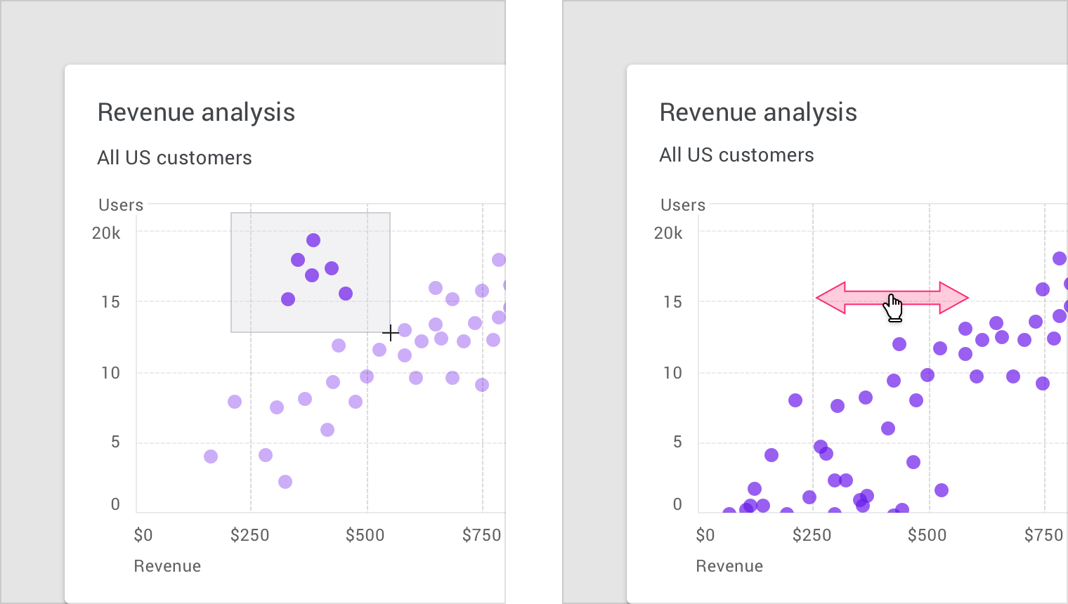
设备上的缩放手势。
分页
在移动设备上,分页是一种常见交互设计,用户可以通过左右滑动来查看上一个或下一个图表。
On mobile, pagination is a common pattern that allows users to view the previous or next chart by swiping right or left.
 在移动设备上,用户可以向右滑动以查看前一天。
On mobile, a user can swipe to the right to view the previous day.
数据控制
可以使用控件对当前图表中展示的数据进行切换,常见的实现方式有:Tab页、下拉菜单、筛选以及更改数据。
这些控件除了让用户对展示的数据进行控制之外,还可以对图表的信息进行补充说明。
Data can be filtered or changed using toggle controls, tabs, and drop-downs.
These controls can also display metrics, while users adjust the controls.Data can be filtered or changed using toggle controls, tabs, and drop-downs.
These controls can also display metrics, while users adjust the controls.
切换按钮。
动效
动效可以增强用户与图表进行交互时的联系。
动效设计还应该满足以下几点要求:
- 目的性(非装饰性),用来表达不同状态或空间之间的联系
- 合理性,动效呈现出来的视觉效果应该是平稳的
- 即时性,不会妨碍用户使用的流畅性
Motion can enhance and reinforce the relationship between data and how users interact with it.
Motion should be used purposefully (not decoratively), expressing the connection between different states and spaces.
Motion should feel logical, smooth, and responsive, without obstructing the user’s journey.
> 在左边的示例中,用户正在从时间区间为单日的图表转向区间为周的图表。在转换期间不会显示所选日期范围之外的数据,从而降低了交互的复杂性,减少了用户的负担;
In this example, data animates between being displayed by day and then by week. Data outside of the selected date range isn’t displayed during the transition, reducing complexity.
> 在右边的示例中,动效展示了两个不同图表之间的关系。
Animation shows how two different diagrams are related.
空状态
当图表中没有数据时,提供空状态设计可以告知用户当前图表的状态以及数据可用时的预期视觉效果。
在适当的情况下,可以展示具有设计感的动画来降低用户因为没有数据产生的沮丧感。
Empty graphs and charts can display content that suggests what to expect when data is available.
Where applicable, character animations can be shown to provide delight and encouragement.
Characterful animations enhance an otherwise empty graph.
仪表盘
数据可视化并不单独应用于单个图表,而是将信息有组织有规律的呈现给用户,让用户能够通过这些处理过的信息获取最大的利益。
单个图表有时候并不能满足所有用户的需求,通过各种可视化图表的组合能够更好的传递信息。
Data visualization can be displayed across a series of multiple charts, in UIs called dashboards. Multiple, separate charts can sometimes better communicate a story, rather than one complex chart.
仪表盘中的设计
仪表板的意义在于其布局、样式以及交互模式。无论是制作演示文档还是对数据进行深度挖掘,仪表盘的设计取决于其适用方式。
仪表板应该:
- 优先处理重要的信息(排版布局)
- 放置一个焦点,围绕这个焦点,根据层次结构(使用颜色,位置,大小和视觉权重)对信息的优先级进行排序
A dashboard’s purpose should be reflected in its layout, style, and interaction patterns. Its design should suit how it will be used, whether it’s a tool for making a presentation or deeply exploring data.
A dashboard should:
- Prioritize the most important information (using layout)
- Display a focal point that prioritizes information according to hierarchy (using color, position, size, and visual weight)
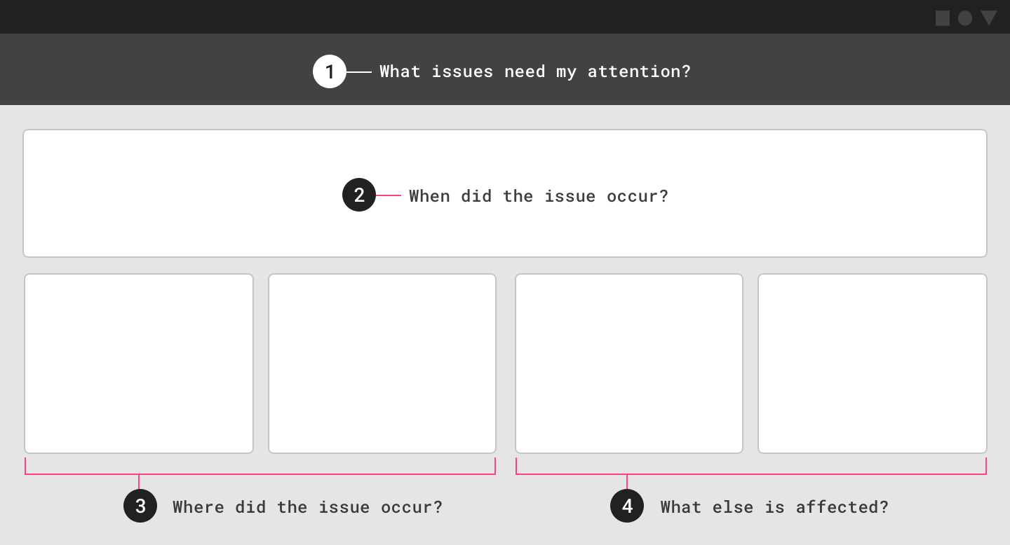
应根据数据中的问题确定信息的优先级并进行排版。
在此示例操作仪表板中,考虑以下用户问题:
- 需要注意的问题
- 问题发生的时间
- 发生问题的位置
- 受该问题影响的其他变量
Information should be prioritized and arranged based on the questions asked of the data. In this example operations dashboard, the following user questions are considered:
- Issues that need attention
2. Time that issue occurred
3. Location that issues occurred
4. Other variables affected by the issue
分析型仪表盘
分析型仪表板使用户能够对多组数据进行探索分析,并发现其中的趋势。
通常情况下,这些仪表板都包含着很多复杂的图表,这些图表被用来挖掘数据背后的价值。
用例:
- 强调随时间变化的趋势
- 回答“为什么”和“假设”问题
- 预测
- 创建深度报告
示例:
- 跟踪广告活动的效果
- 跟踪产品在其生命周期中产生的销售额和收入
- 显示随时间变化的城市人口趋势
- 实时跟踪气候数据
Analytics dashboards enable users to explore multiple sets of data and discover trends. Usually these dashboards include complex charts that enable the discovery of data insights.
Use cases include:
- Highlighting trends over time
- Answering “why” and “what if” questions
- Forecasting
- Creating in-depth reports
Analytics dashboard examples:
- Tracking ad campaign performance over time
- Tracking the sales and revenue generated by a product through its lifecycle
- Showing city population trends over time
- Tracking climate data over time

分析型仪表盘可以用于显示气候数据。 Analytics dashboard displaying climate data
监控型仪表盘
监控型仪表盘在设计之初就已经预先设计了问题的答案。它们通常用于完成与监控相关的任务。
通常情况下,这种类型的仪表板中,展示信息会尽量使用简单直观的图表。
用例:
- 跟踪目标当前的完成进度
- 实时跟踪系统性能
示例:
- 跟踪客服中心的各种活动数据,例如通话音量、等待时间、通话时间长度以及通话类型等
- 监控在云服务器上应用程序的运行状态
- 股市应用
- 显示赛车被监控的遥测数据
Operations dashboards are designed to answer a predefined set of questions. They are typically used to complete monitoring-related tasks.
In most cases, these types of dashboards feature current information arranged in a set of simple charts.
Use cases include:
- Tracking current progress against a goal
- Tracking system performance in real time
Operations dashboard examples:
- Tracking call center activities such as call volume, wait times, call length, or call types
- Monitoring the health of an app running on Cloud.
- Displaying stock market performance
- Monitoring telemetry data on a race car
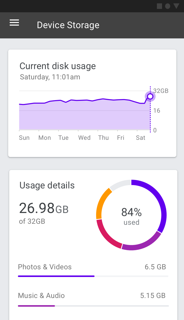
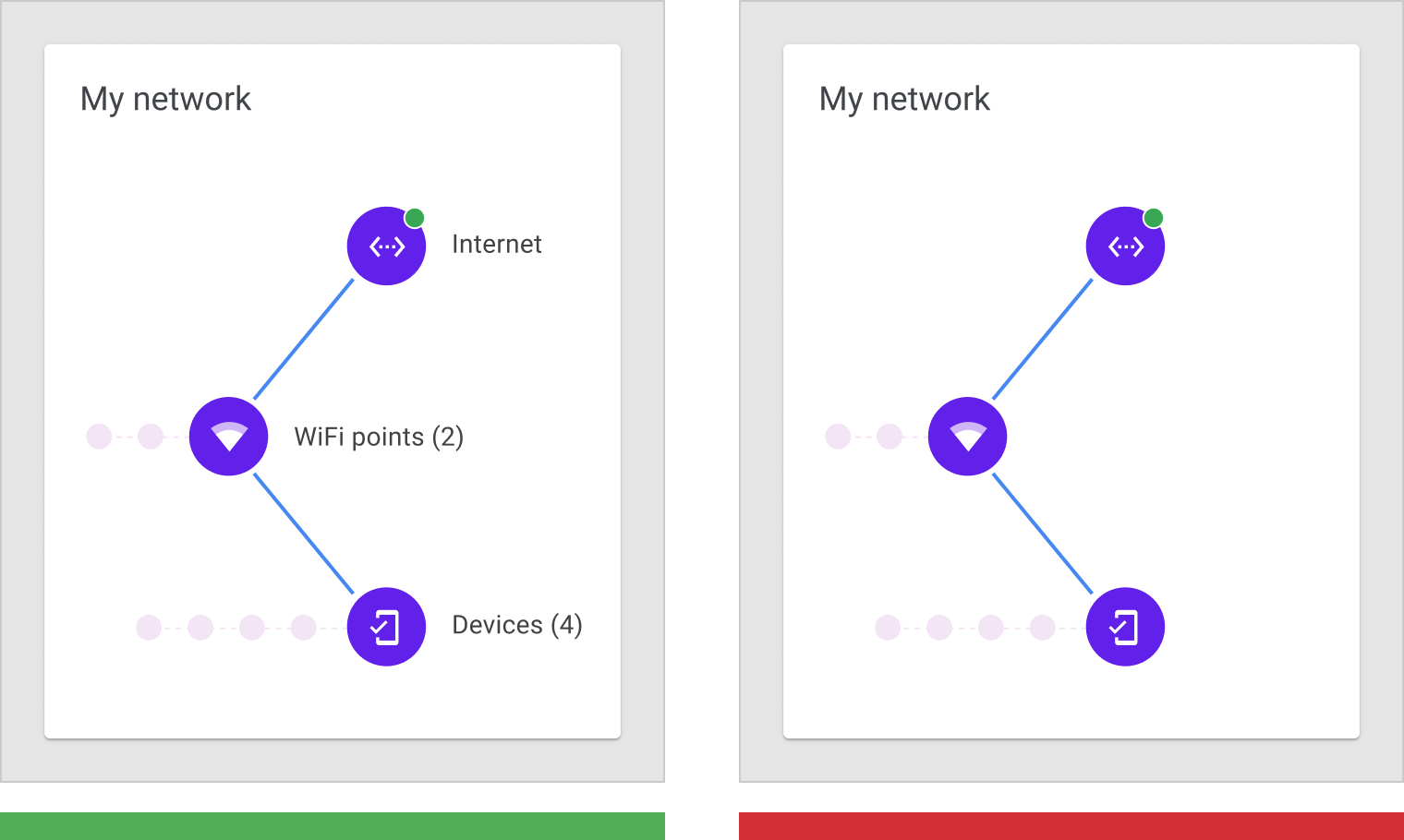
监控型仪表盘用于显示设备的内存状况。
Operations dashboard displaying device storage metrics
演示型仪表盘
演示型仪表盘会根据主题来展示相应的图表。
通常情况下,演示型仪表盘会包含各种卡片,通过卡片中的动态标题来告知用户每个图表的内容。
用例:
- 展示关键数据点
- 根据经营综合报告,展示重点的分析成果
示例:
- 提供投资账户绩效的概述
- 提供产品销售和市场份额数据的摘要
Presentation dashboards provide a curated snapshot on a topic of interest.
These dashboards typically include a few small charts or a scorecard, with dynamic headlines that explain the trends and insights provided in each supporting chart.
Use cases include:
- Providing an overview of key performance indicators
- Creating a high-level executive summary
Presentation dashboard examples:
- Providing an overview of investment account performance
- Providing a summary of product sales and market share data
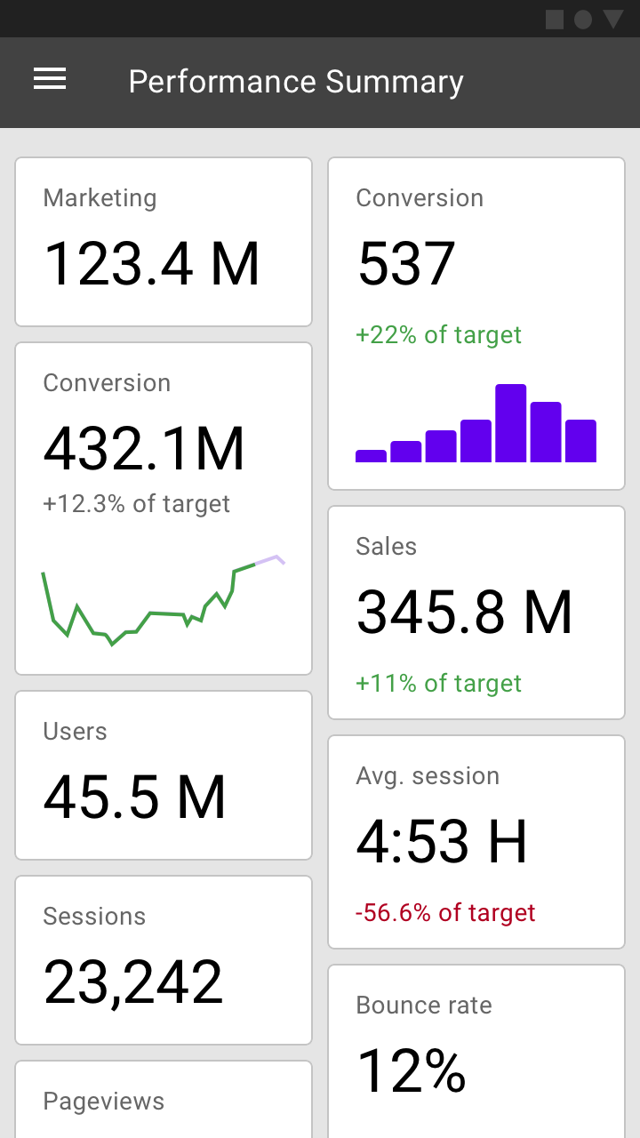
演示型仪表盘显示网站数据。
Analytics dashboard displaying website usage data

若有收获,就点个赞吧
0 人点赞
