Material Design 的响应式布局网格能够自适应屏幕大小和方向,确保整个布局的一致性。
Material Design’s responsive layout grid adapts to screen size and orientation, ensuring consistency across layouts.
列、栏栅、边距
Material Design 的布局网络由三个元素组成:
The responsive layout grid is made up of three elements: columns, gutters, and margins.
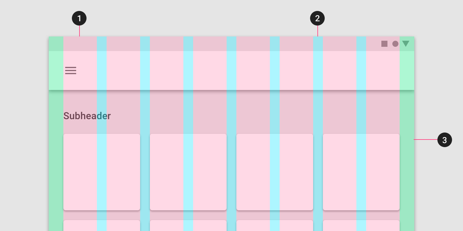
- 列;
- 栏栅(每列的间距);
- 边距。
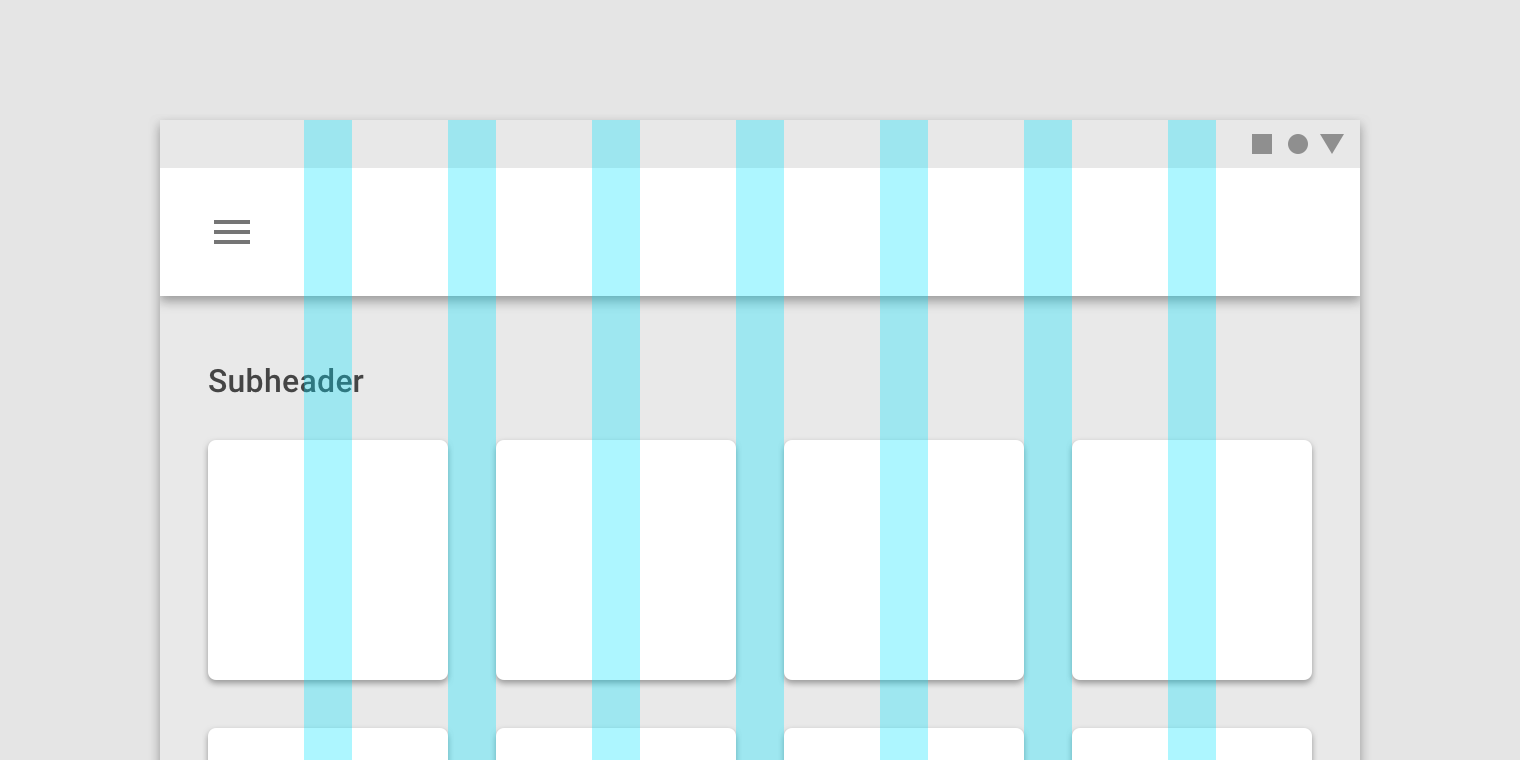
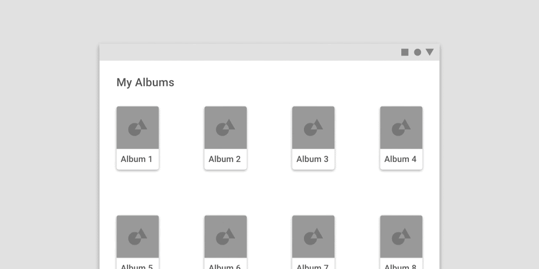
列
内容放置在包含列的屏幕区域。
列宽是用百分比而非固定值来定义的,这是为了让内容能够灵活地适应任何屏幕大小。
网格中显示的列数取决于查看屏幕的断点范围(预定屏幕大小的范围),无论是移动设备,平板电脑还是其他大小的断点。(断点释义:根据不同的屏幕的宽度来选定断点范围。例如,手机的断点范围就是屏幕的宽度,单位为 dp。)
移动设备(手机)的断点范围为360dp,此时布局网络采用 4 列。
Content is placed in the areas of the screen that contain columns.
In responsive layouts, column width is defined with percentages, rather than fixed values. This allows content to adapt to any screen size. The number of columns displayed in the grid is determined by the breakpoint range, a range of predetermined screen sizes. A breakpoint can correspond with mobile, tablet, or other screen type.
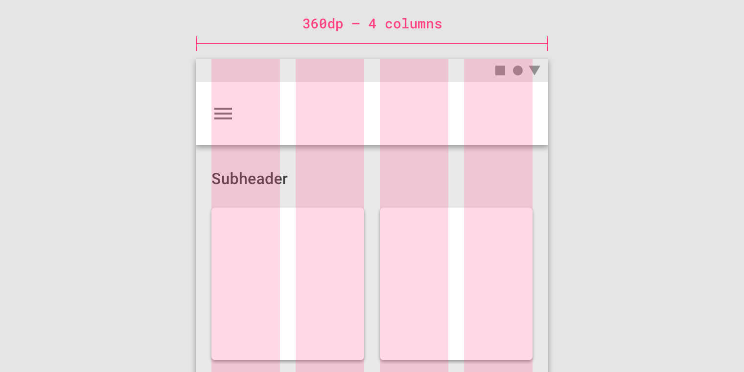
On mobile, at a breakpoint of 360 dp, this layout grid uses 4 columns.
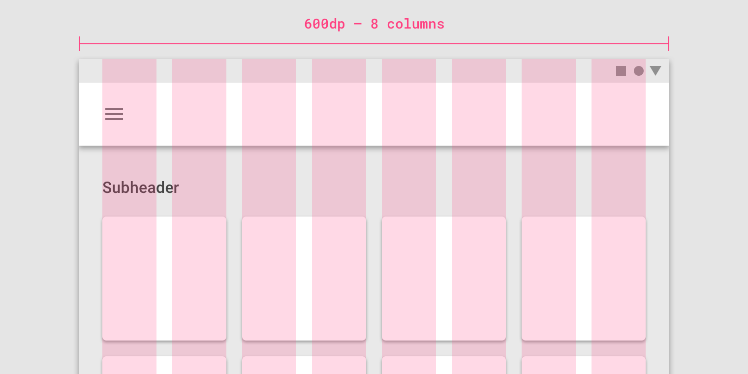
On tablet, at a breakpoint of 600 dp, this layout grid uses 8 columns.
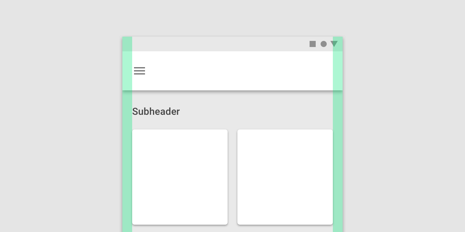
栏栅
栏栅是列之间的空间,用于分离内容。
在每个断点范围内,栏栅的宽度都是固定值。
为了更好地适应屏幕,栏栅的宽度可以在不同的断点处改变。较宽的水槽更适合较大的屏幕,因为它们在各列之间能够留出更多空白。
在移动设备(手机)上,在360 dp 的断点处,此布局网格使用16dp的栏栅。
A gutter is the space between columns that helps separate content.
Gutter widths are fixed values at each breakpoint range. To better adapt to a given screen size, gutter widths can change at different breakpoints.
Wider gutters are more appropriate for larger screens, as they create more open space between columns.
On mobile, at a breakpoint of 360 dp, this layout grid uses 16dp gutters.
On a tablet, at a breakpoint of 600 dp, this layout grid uses 24dp gutters.
边距
边距是内容与屏幕左右边缘之间的距离。
边距宽度在每个断点范围内定义为固定值。
为了更好地适应屏幕,边距值可以在不同的断点处改变。较大的边距更适合较大的屏幕,因为它们会在内容周边创建更多空白区域,避免内容过多显得拥挤。
Margins are the space between content and the left and right edges of the screen.
Margin widths are defined using fixed or scaling values at each breakpoint range. To better adapt to the screen, the margin width can change at different breakpoints. Wider margins are more appropriate for larger screens, as they create more whitespace around the perimeter of content.
On mobile, at a breakpoint of 360 dp, this layout grid uses 16dp margins.
自定义网格
布局网络可以根据你的产品以及不同设备尺寸的需要作出相应的调整。
The layout grid can be adjusted to meet the needs of both your product and multiple device sizes.
自定义栏栅
可以调整栏栅的宽度以在布局网络的列之间创建更多或更少的空间。
Gutters can be adjusted to create more or less space between the columns of a layout.
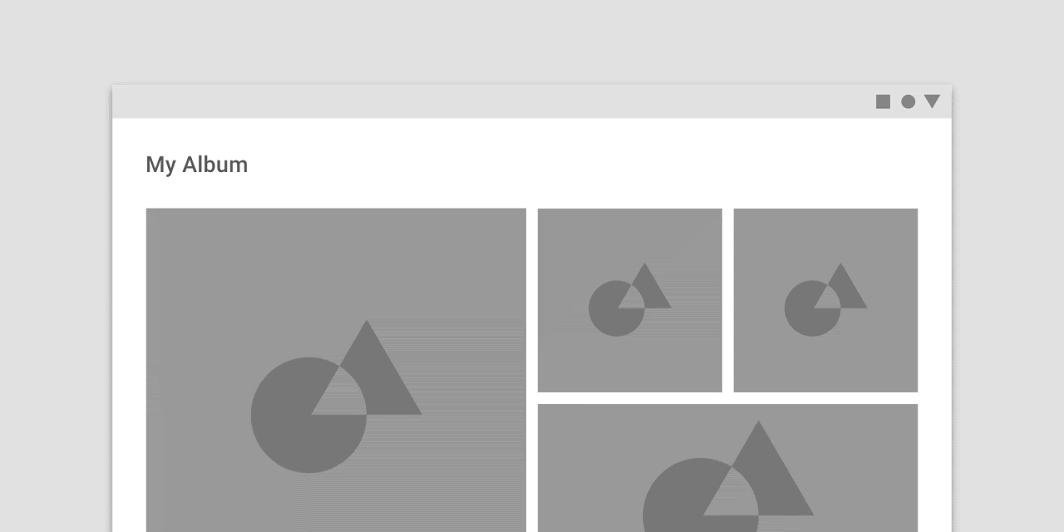
此布局网格使用8dp 栏栅。更紧密的间距可能表明图像彼此关系密切,被当成一个整体存在。
This layout grid uses 8dp gutters. The tighter spacing may suggest the images are closely related to one another, so that they are perceived as part of a collection.
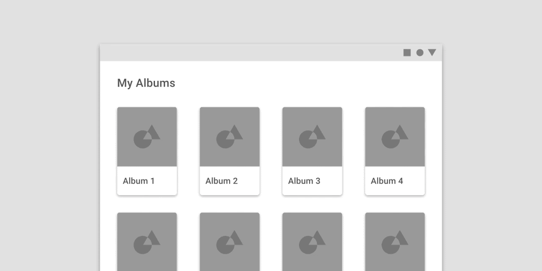
这个布局网格使用更大的32dp的栏栅来增加列之间的间距。额外的空间有助于将每张卡片视为一个集合中独立的实体。
This layout grid uses larger, 32dp gutters to create more separation between columns. The extra space helps each album to be perceived as an individual entity within a collection.
例如,与列的宽度相同,会导致页面上的空间不足以容纳足够的内容,同时也会导致画面出现割裂感。
Don’t
Don’t make gutters too large or the same width as the columns. Oversized gutters won’t leave enough room for content and may prevent a layout from appearing unified.
栏栅 & 边距
在相同的断点内,栏栅和边距的宽度可以彼此不同。
Within the same breakpoint, gutter and margin widths can be different from each other.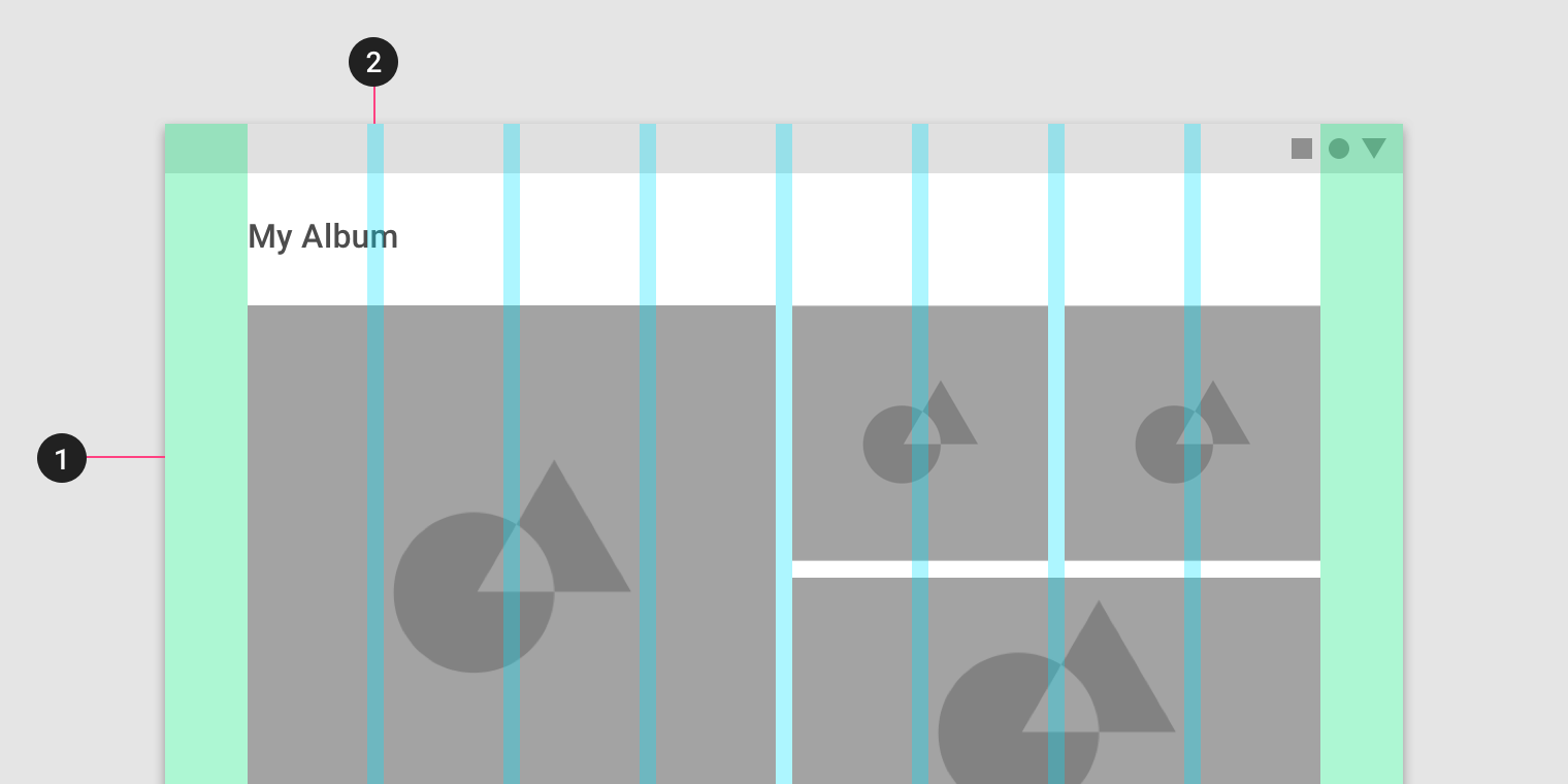
- 栏栅 = 32 dp;
- 边距 = 8 dp。
- 32dp margins
2. 8dp gutters
Horizontal grids
Material Design 的布局网格可以为触碰屏提供横向(水平)布局的模式。
列,栏栅和边距从上到下依次排列。屏幕的高度决定了水平网格中的列数。
横向滚动用户界面在非触摸屏幕和网页端上并不常见。
The Material Design layout grid can be customized for touch UIs that scroll horizontally.
Columns, gutters, and margins are laid out from left to right, rather than top to bottom. The height of the screen determines the number of columns in a horizontal grid.
Horizontally scrolling UIs are uncommon on non-touch and web platforms.
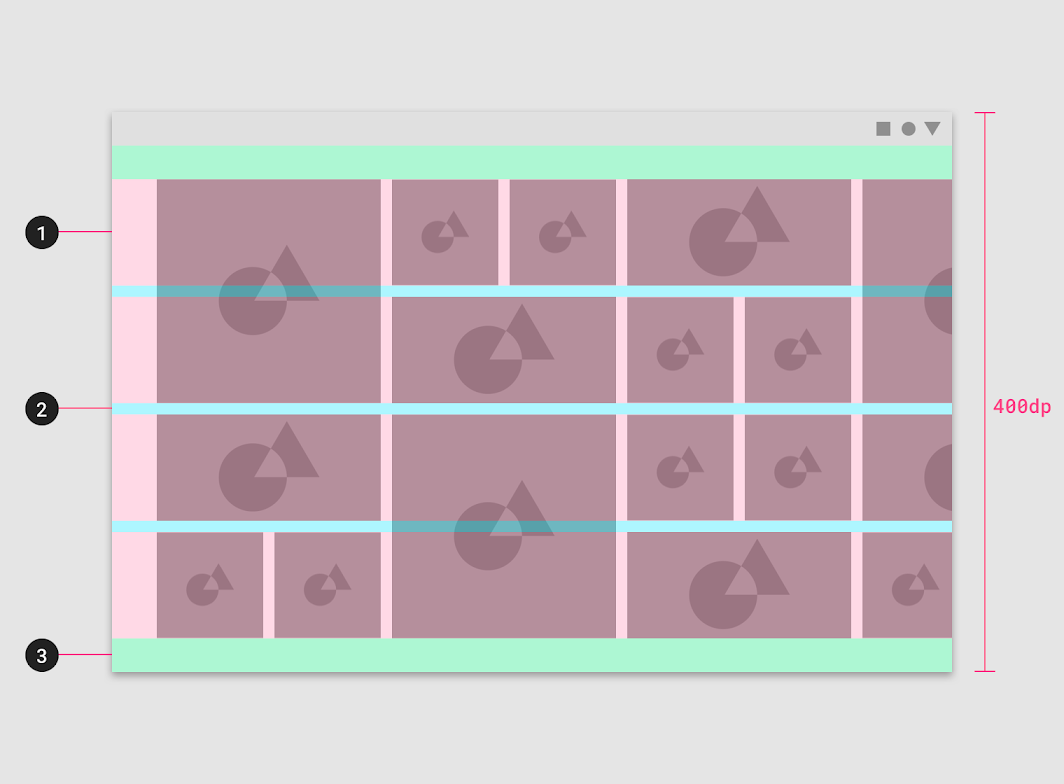
This horizontal layout grid uses four horizontal columns, for a total layout height of 400dp.
- Columns
2. Gutters
3. Margins
横向网格可以定位以适应不同的高度,为应用栏或顶部的其他UI区域提供空间。
Horizontal grids can be positioned to accommodate different heights, allowing space for app bars or other UI regions at the top.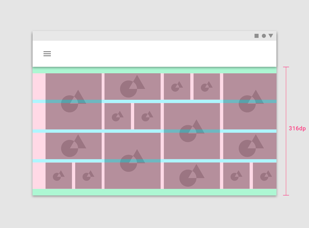
This horizontal layout grid starts below the Top App Bar component and uses four horizontal columns at a height of 316dp
断点
断点是具有特定布局要求的预定屏幕尺寸的范围。
在给定的断点范围内,布局会根据屏幕大小和方向进行调整。
A breakpoint is the screen size threshold determined by specific layout requirements. At a given breakpoint range, the layout adjusts to suit the screen size and orientation.
Material Design provides responsive layouts based on 4-column, 8-column, and 12-column grids, available for use across different screens, devices, and orientations.
Each breakpoint range determines the number of columns, and recommended margins and gutters for each display size.

断点系统
Material Design 根据以下列结构提供了响应式布局。
使用4列,8列和12列网格的布局可用于不同的屏幕,设备和方向。每个断点范围决定了列的数量,并为每个显示大小确定了建议的页边距和排水沟。
The responsive layout grid is primarily used to organize content and components in a layout’s body region. Layout regions are described in detail in the Understanding layout guidance.
When scaling a layout for different screen sizes or orientations, the responsive grid adjusts margin and body widths as well as the number of columns in the layout.
| 断点范围 | 竖屏 | 横屏 | 屏幕 | 列 | 边距 / 栏栅* |
|---|---|---|---|---|---|
| 0 – 359 | small handset | xsmall | 4 | 16 | |
| 360 – 399 | medium handset | xsmall | 4 | 16 | |
| 400 – 479 | large handset | xsmall | 4 | 16 | |
| 480 – 599 | large handset | small handset | xsmall | 4 | 16 |
| 600 – 719 | small tablet | medium handset | small | 8 | 16 |
| 720 – 839 | large tablet | large handset | small | 8 | 24 |
| 840 – 959 | large tablet | large handset | small | 12 | 24 |
| 960 – 1023 | small tablet | small | 12 | 24 | |
| 1024 – 1279 | large tablet | medium | 12 | 24 | |
| 1280 – 1439 | large tablet | medium | 12 | 24 | |
| 1440 – 1599 | large | 12 | 24 | ||
| 1600 – 1919 | large | 12 | 24 | ||
| 1920 + | xlarge | 12 | 24 |
边距和栏栅可以灵活调整,不需要大小相同。
iOS 设备的断点
下面表格中的边距和栏栅宽度适用于iOS上屏幕,设备,方向和宽度的断点。
| Device | Orientation | Vertical Size Category | Horizontal Size Category | Columns | Margins/ Gutters* |
|---|---|---|---|---|---|
| iPhone | Portrait | Regular | Compact | 4 | 16 |
| iPhone | Landscape | Compact | Compact | 4 | 16 |
| iPhone Plus | Portrait | Regular | Compact | 4 | 16 |
| iPhone Plus | Landscape | Compact | Regular | 4 | 16 |
| iPad | Portrait | Regular | Regular | 8 | 16 |
| iPad | Landscape | Regular | Regular | 8 | 24 |
| iPad - Even Split Multitasking | Portrait | Regular | Compact | 12 | 24 |
| iPad - Even Split Multitasking | Landscape | Regular | Compact | 12 | 24 |
| iPad - 2/3 Split Multitasking | Portrait | Regular | Compact | 12 | 24 |
| iPad - 2/3 Split Multitasking - First App | Landscape | Regular | Regular | 12 | 24 |
| iPad - 2/3 Split Multitasking - Second App | Landscape | Regular | Compact | 12 | 24 |
| iPad Pro - Even Split Multitasking | Portrait | Regular | Compact | 12 | 24 |
| iPad Pro 13in - Even Split Multitasking | Landscape | Regular | Regular | 12 | 24 |
边距和栏栅可以灵活调整,不需要大小相同。
At extra small breakpoints, margins have a baseline value of 16dp. The body remains responsive to increases in size. Upon reaching the next larger breakpoint, small at 600dp wide), the margin increases to 32dp.
When the width of the body reaches 840dp, the margins become flexible and increase up to a maximum margin width of 200dp. After the maximum width is reached, the body region once again becomes responsive, continuing to scale horizontally. At large breakpoints, the body region can maintain a maximum width while margins again scale horizontally.
新表:
| Screen size | Margin | Body | Layout columns |
|---|---|---|---|
| Extra-small (phone) | |||
| 0-599dp | 16dp | Scaling | 4 |
| Small (tablet) | |||
| 600-904 | 32dp | Scaling | 8 |
| 905-1239 | Scaling | 840dp | 12 |
| Medium (laptop) | |||
| 1240-1439 | 200dp | Scaling | 12 |
| Large (desktop) | |||
| 1440+ | Scaling | 1040 | 12 |
Layout anatomy
Layout regions are the foundation for a composition.
They’re building blocks for a layout and are composed of elements and components that share similar functions. Layout regions can also be composed of other smaller containers as well.
A large screen layout structure is based on three main elements:
- Body
- Navigation
- App bars
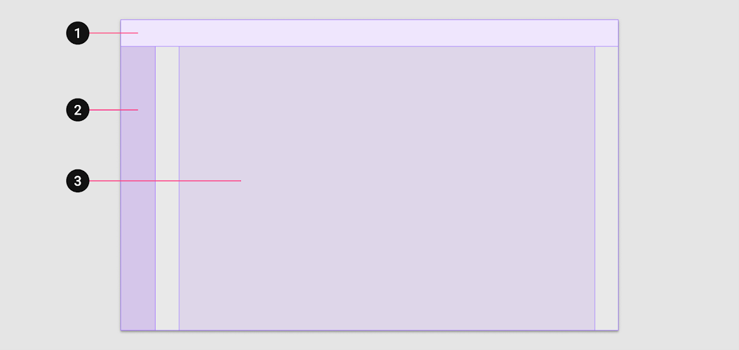
1. App bars 2. Navigation 3. Body
Material Design’s responsive layout grid primarily informs the layout’s body region. Each of the three layout regions are described in detail in the Understanding layout guidance.

若有收获,就点个赞吧
0 人点赞
