Material 的平面可以以不同的形状显示。形状能够引导用户、提高组件的识别度、对状态进行具象化的展示、对品牌特性进行诠释。
Material surfaces can be displayed in different shapes. Shapes direct attention, identify components, communicate state, and express brand.
塑形
默认情况下,Material 的平面形状为具有4dp圆角的矩形。有如下几种属性进行调节:
- 顶角和曲线
- 边角和曲线
- 角的数量
对于形状变化来说,微妙的调整或许更能吸引用户的注意力,例如圆角或异形角。
Material surfaces have a rectangular shape by default, with 4dp rounded corners. Their shape can be customized by adjusting their:
- Corner angles and curves
- Edge angles and curves
The size of shape changes can be subtle or more significant.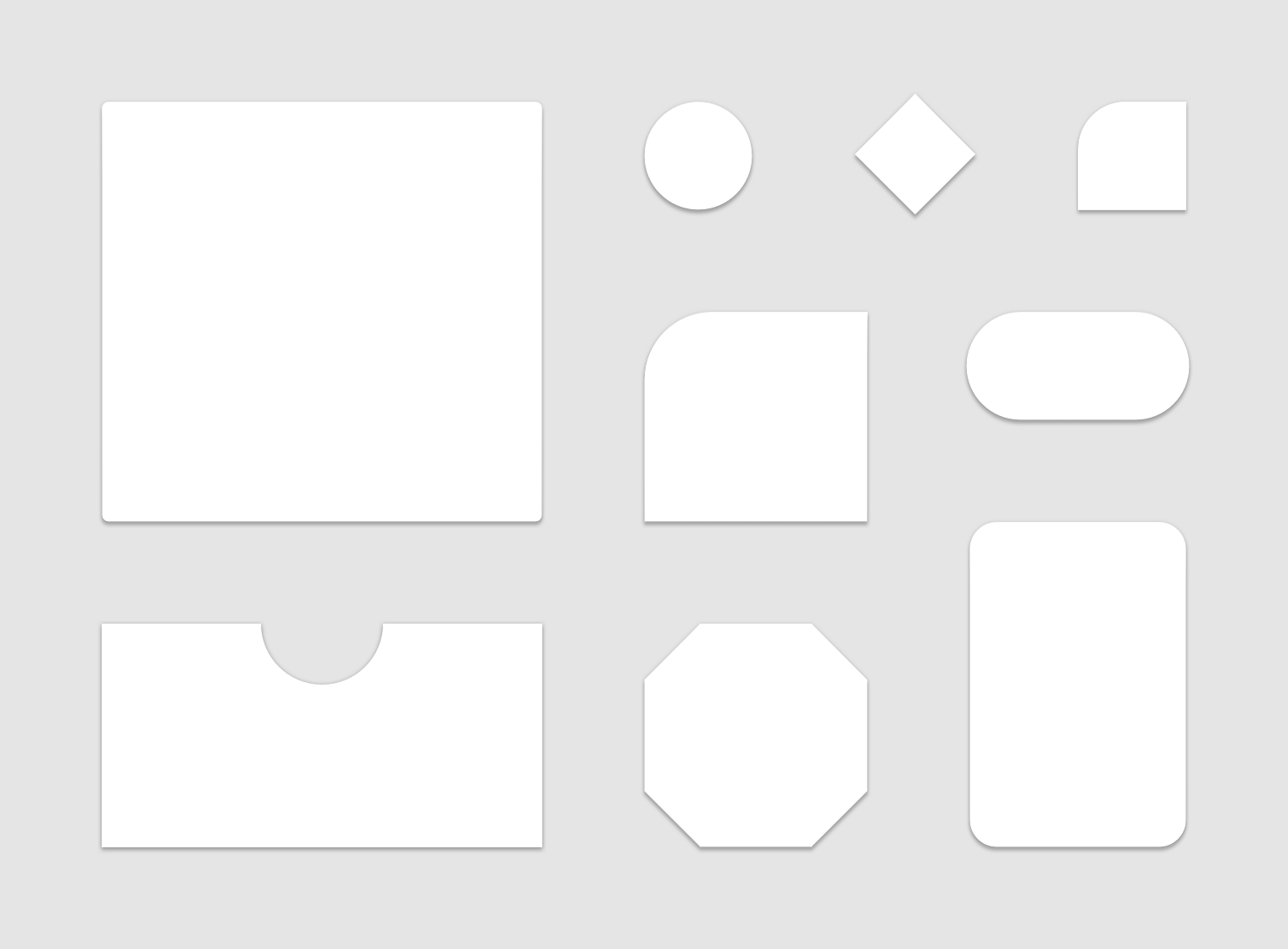
The default Material shape can be customized.
用法
重点
由于独特的形状能够在页面上更容易被注意到,它们可以将注意力集中在屏幕的不同部分。
Because unique shapes stand out, they can direct attention to different parts of a screen.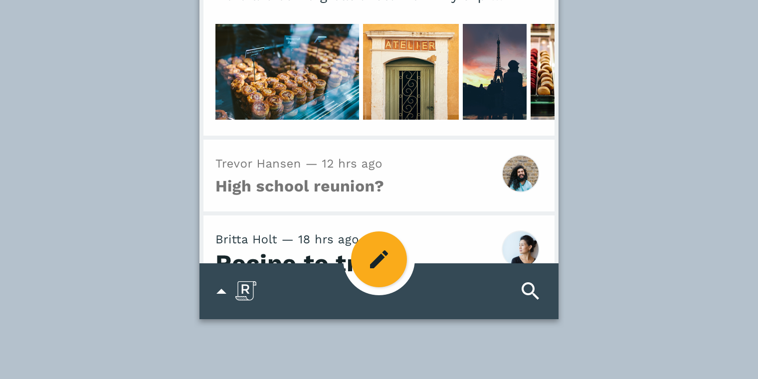
This combination of a round floating action button and curved bottom app bar stands out from the rectangular shapes elsewhere on screen.
识别度
各式各样的形状为用户提供了一种识别组件和不同 Material 平面的方法。
Shape provides a way for users to recognize components and identify different Material surfaces.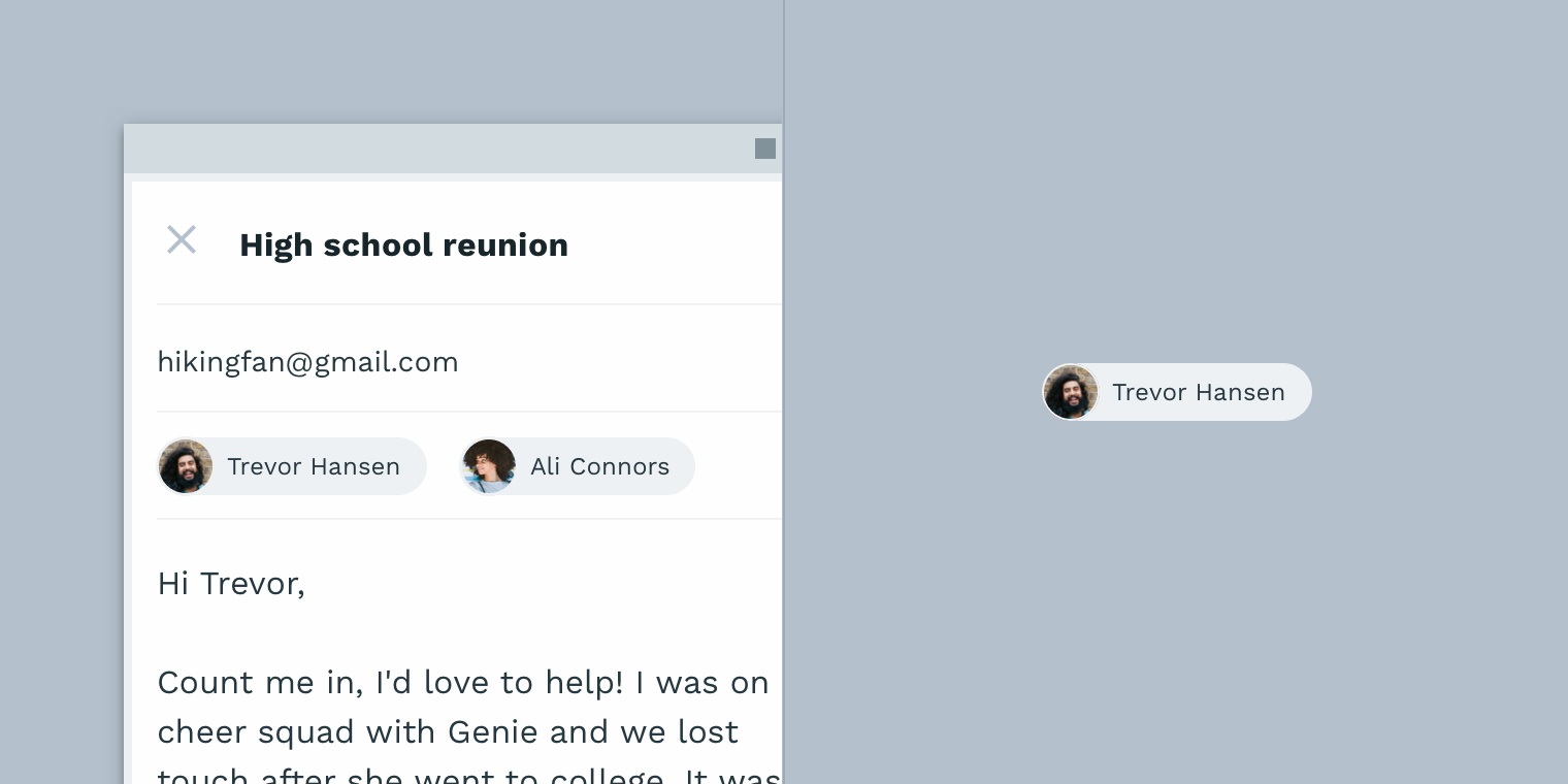
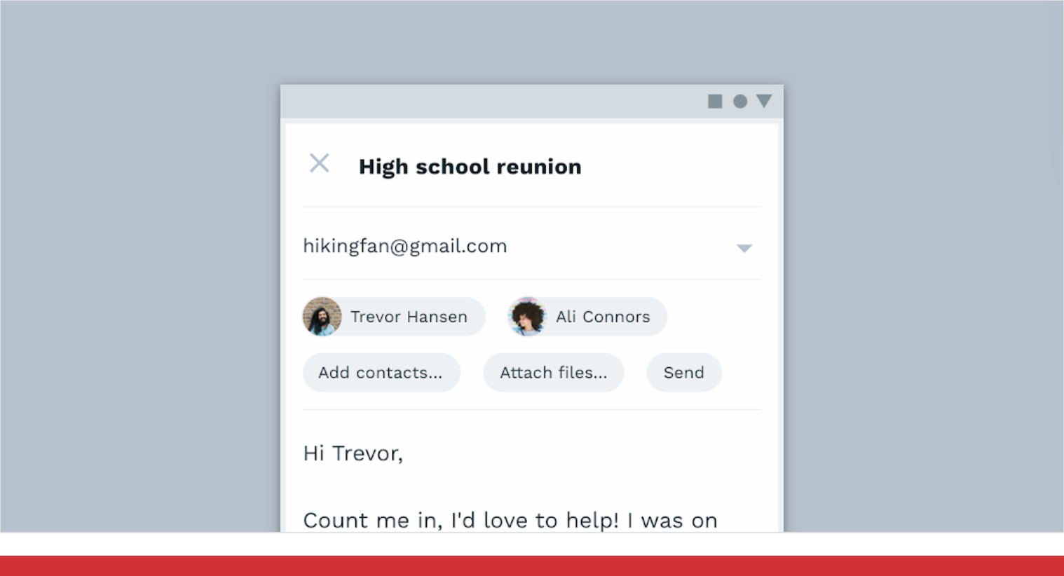
这些“联系人卡片”可以通过其一致的形状来辅助用户对组件进行识别。
状态
您可以通过使用与该组中其余元素不同的形状来表示元素的状态发生了更替。当使用形状来指示状态更改时,请保证在每个实例中都使用该状态,保证视觉风格的一致性。
You can communicate an element’s change of state by using a different shape from the rest of the elements or surfaces in that group. When using shape to indicate a state change, use it consistently with that state, in every instance it occurs.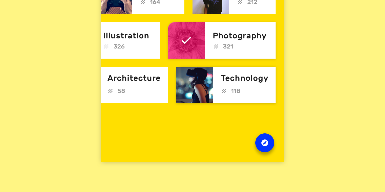
此卡在选择时会改变形状以表示它从“默认”状态跳转到了“被选中”的状态。
品牌
要在整个应用程序中表达品牌的视觉语言,请在保证一致的前提下将形状与其他自定义选项(如颜色)结合使用。巧妙地应用经过调整的小形状有助于加深品牌的整体印象。
To express a brand’s visual language throughout an app, use shape in tandem with other customizations (like color) in consistent ways. Small adjustments to shape, applied strategically through an app, contribute to the overall impression a brand makes.
下图实例中,展示了形状在品牌特性表达中的应用。
表现形式
只有在形状的边缘与背景有着高对比度的时候,形状才具有可见性。
默认情况下,Material Design 通过使用阴影来让形状的边缘变得明显。另外也有一些其他方法,例如设置颜色填充和不透明度。
Shape is made visible when surface edges have sufficient contrast against their background. By default, Material Design makes shapes noticeable by using shadows to display surfaces edges. Other methods to show surface edges and shapes can be used in combination with shadows, or on their own, such as color fills and opacity.
Do
A colored fill on this floating action button contrasts with the content on the surface behind it, making its surface edges and shape noticeable.
Don’t
A semi-transparent surface and white color makes it hard to see the edges and shape of this floating action button.
意义
联系
形状可用于反映特定目的或含义。当单独的表面形状可能不明确时,文本或图标可以帮助强化这种意义。
Shapes can be used to reflect a specific purpose or meaning. Text or icons can help reinforce that meaning when the shape of a surface alone could be ambiguous.
Do
The menu has an arrow-like corner that points toward the navigation drawer, reinforcing that these components are connected.
Don’t
Don’t use shapes in ways that create ambiguous meaning. This Cancel button’s label text implies that it will return the user to a previous point in the flow, but the arrow-shaped button points forward, as though it continues the flow’s progress.
组件
形状
合理设计组件的形状既可以帮助用户识别组件又可以提升组件的可用性。
组件改变形状的程度取决于以下两种情况:
- 组件需要依赖其形状对本身的功能进行识别
- 组件需要符合人体工程学要求,例如最小触摸目标尺寸
Shape both helps users identify components and affects how usable they are.
The degree to which components can change their shape depends on:
- If a component relies on its shape for identification
- If it has ergonomic requirements, such as a minimum touch target size
Don’t
Don’t use shapes that make components unrecognizable.

Don’t
Don’t use shapes that interfere with a component’s ability to receive user input. This button has a touch target that is too small.
Don’t
Don’t use shapes that make a component unrecognizable. These buttons look very similar to the chips above them, which makes it difficult to distinguish the two components.
Shape customization tool
The Material shape customization tool can be used to generate different shapes for various individual components. A table of shape value ranges indicates recommended value ranges for each component.
Components are organized into three categories, based on their relative size. Components linked to their category will inherit the shape values assigned to the category. Alternatively, individual component corners can be shaped independent of their category’s values.
Implementation
Shapes implementation across supported platforms is indicated below.
| Platform | Status |
|---|---|
| Android | Available |
| iOS | Available |
| Web | Available |
| Flutter | Available |

若有收获,就点个赞吧
0 人点赞
