桌面小部件可显示应用程序包含的最重要的数据和功能的信息。
Widgets display glanceable information of an app’s most important data and functionality.
分类
桌面小部件能够直接在主屏幕上展示应用的关键数据与功能。
通过桌面小部件可以快速导航到相应的应用。
在技术支持的前提下,用户可以在其主屏幕面板上移动小部件并调整其大小。
Widgets display your app’s new and interesting content in a consolidated form on a mobile home screen. They link to richer detail within the app.
Users can move and, if supported, resize widgets across their home screen panels.
信息类
信息类小部件可以展示应用的关键数据,并且实时更新,例如时钟或运动信息。
轻按窗口小部件时,应用程序启动,并跳转到详细信息所在的页面。
Information widgets display a few elements of importance to a user and track how that information changes over time, such as weather or sports scores. Tapping the widget launches the associated app into a detail screen.
An information widget
聚合类
聚合类小部件显示多个相同类型的元素,例如新闻应用程序中的文章集合。
交互:浏览、收藏、打元素的详情页面。
Collection widgets display multiple elements of the same type, such as a collection of articles from a news app.
They focus on two interactions:
- Browsing a collection
- Opening an element’s detail screen
Collection widgets can scroll vertically.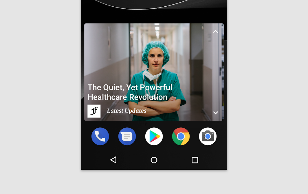
A collection widget
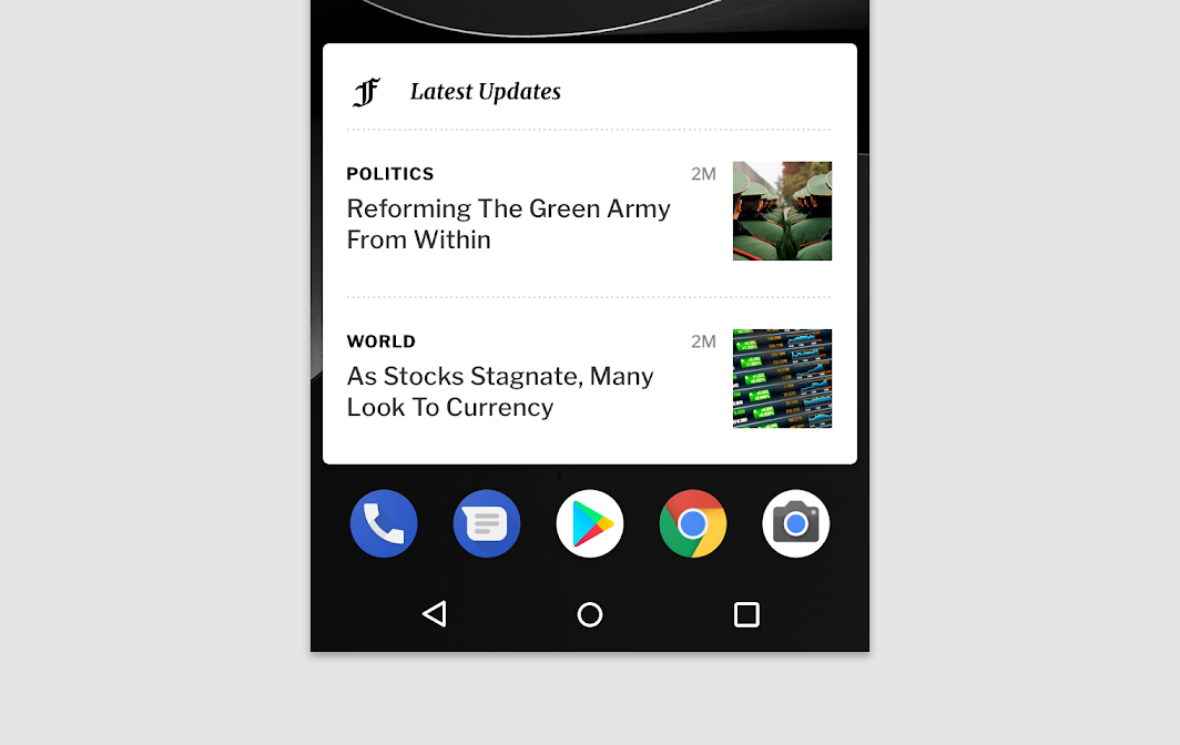
A collection widget
控制类
控制类小部件可以在不打开应用程序的情况下从主屏幕触发一些常用功能。
例如,音乐应用程序的小部件允许用户从音乐应用程序外部播放,暂停或跳过音乐曲目。
控制小部件可以根据触点位置来判断是否进入详情页面。
Control widgets display frequently used functions. These functions may be triggered from the home screen without opening the app.
For example, music app widgets allow the user to play, pause, or skip music tracks from outside the music app.
Control widgets may or may not progress to a detail screen.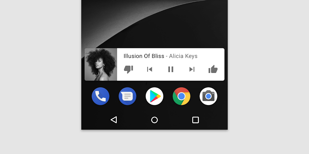
A control widget
混合类
部分小部件会对上述几种类型的组件进行组合。
设计者需要确定小部件的核心功能,以某一种类型为中心,并根据自己的需要添加其它的元素。
Many widgets are hybrids that combine elements of the different types above. Center your widget around one of these types and add elements of others as needed.
A hybrid music player widget combines a control widget with elements of an information widget. The result keeps the user informed about which track is currently playing.
行为
滚动
可滚动的小部件
用户可以在聚合类的小部件中进行滚动操作,以查看更多的内容。
对于小尺寸的桌面部件,内容需要严格控制。
List or grid-based collection widgets usually expand or contract the vertical scrolling area. Regardless of the widget’s size, the user can still scroll all elements into view.
Determine how much of your app’s information should surface. For smaller widget sizes, concentrate on the essential and then add more contextual information as the widget grows.
不可滚动的小部件
信息类小部件不可滚动。
Information widgets are not scrollable. All content and layout must dynamically fit into the size selected by the user.
调整大小
在技术允许的前提下,用户可以根据自己的需要在一定范围内调整小部件的宽度与高度。
Resizing allows users to adjust the height or width of a widget. This allows users to influence the layout of widgets on home panels.
Your app may be completely resizable or constrained to horizontal or vertical size changes.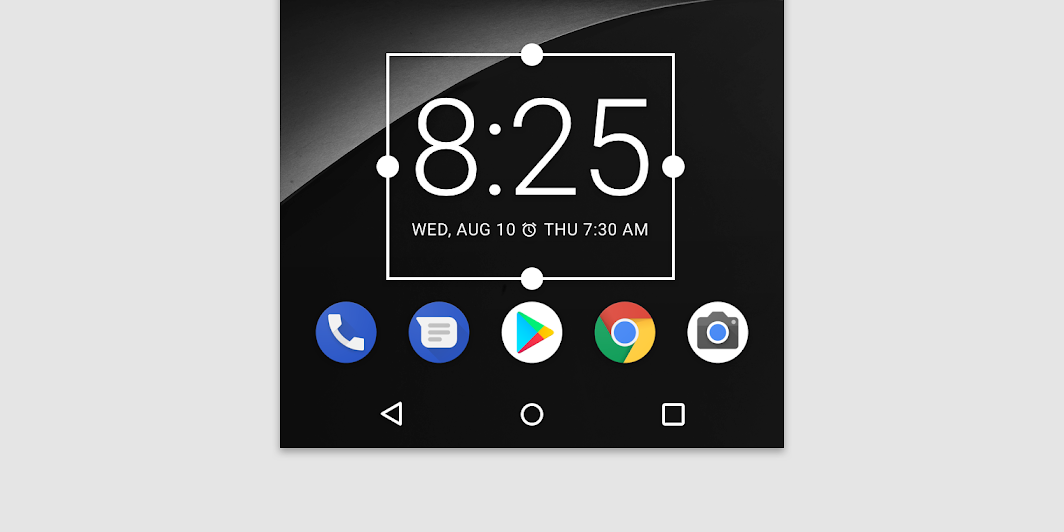
A long press and subsequent release sets resizable widgets into resize mode. Users can use the drag handles or the widget corners to set the desired size.
自适应
自适应大小调整小部件应适应不同设备之间的规格要求。
Widgets should accommodate different spacing requirements across devices, including cell number, size, and spacing variations.
导航
用户可以通过小部件跳转到应用程序相应的页面。
- 允许用户创建新内容的功能(例如,创建文档或短信)
- 访问详情页
Your widgets should provide navigation links to frequently used areas of your app, including:
- Functions that allow the user to create new content, such as a new document or message
- Access to the top level of your app
配置过程
小部件被拖拽到桌面上后,小部件会显示配置信息,让用户对小部件的各种参数进行配置。
无特殊要求的情况下,设计者需要注意以下两点:
- 显示不超过 2-3 个配置元素
- 使用对话框而不是全屏显示选择,避免用户打开新的页面
设置完成后,小部件上通常不会显示“设置”或“配置”按钮。
Once placed on a home screen panel, Android widgets display their configuration choices.
Configuration should:
- Present no more than 2-3 configuration elements
- Present choices using dialogs, rather than full-screen, to retain the user’s context
Once set up, widgets do not typically show a “Setup” or “Configuration” button.

若有收获,就点个赞吧
0 人点赞
