Buttons allow users to take actions, and make choices, with a single tap.
Usage
Buttons communicate actions that users can take. They are typically placed throughout your UI, in places like:
- Dialogs
- Modal windows
- Forms
- Cards
- Toolbars
Principles
Identifiable
Buttons should indicate that they can trigger an action.
Findable
Buttons should be easy to find among other elements, including other buttons.
Clear
A button’s action and state should be clear.
类型
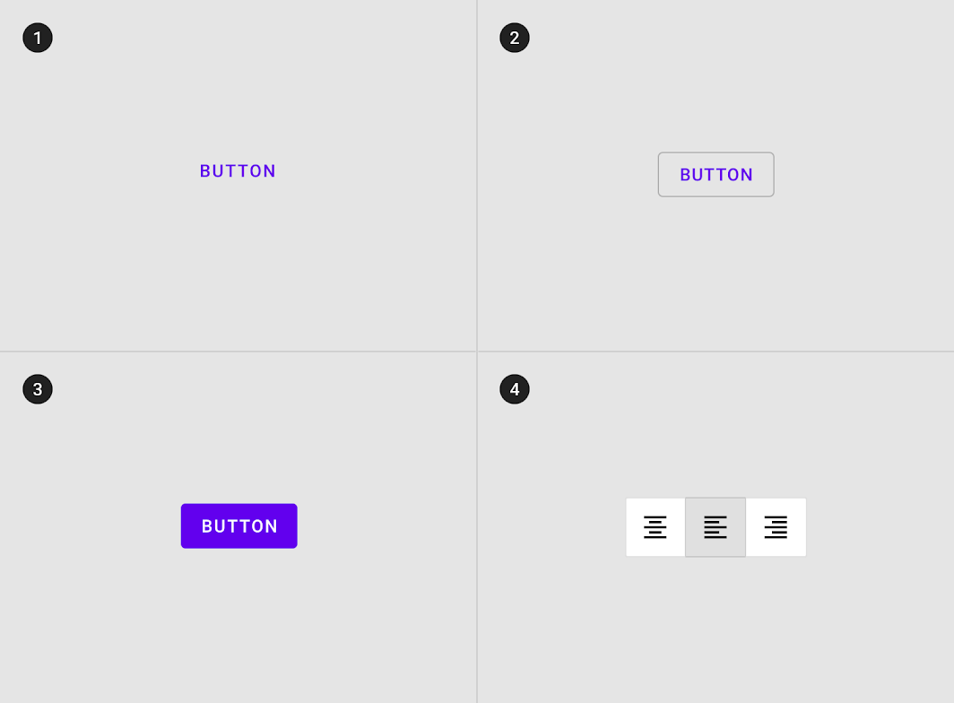
1. Text button (low emphasis)
Text buttons are typically used for less important actions.
2. Outlined Button (medium emphasis)
Outlined buttons are used for more emphasis than text buttons due to the stroke.
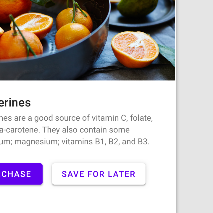
3. Contained button (high emphasis)
Contained buttons have more emphasis, as they use a color fill and shadow.
4. Toggle button
Toggle buttons group a set of actions using layout and spacing. They’re used less often than other button types.
解析
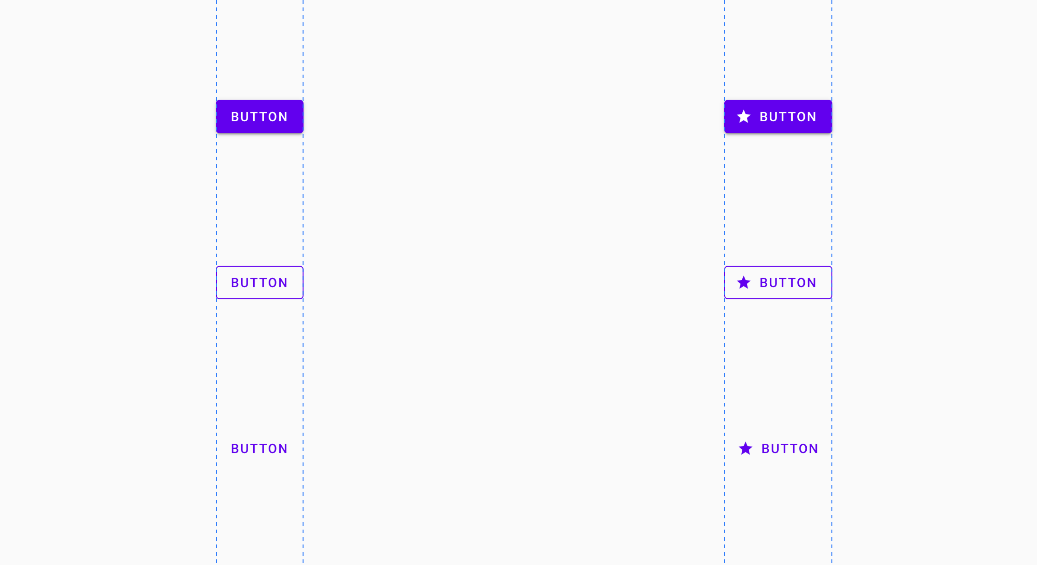
Buttons contain one required element and four optional elements.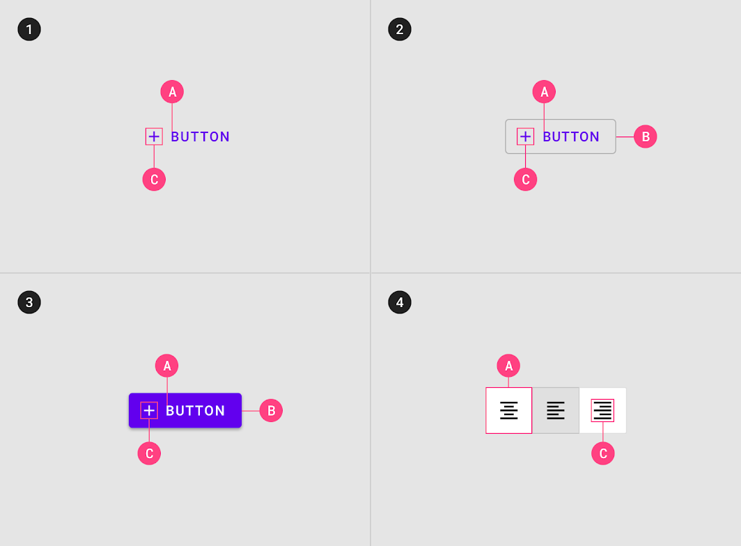
1. Text button
A. Text label
C. Icon (optional)
2. Outlined button
A. Text label
B. Container
C. Icon (optional)
3. Contained button
A. Text label
B. Container
C. Icon (optional)
4. Toggle button
A. Text label
C. Icon (optional)
Text label
Text buttons and contained buttons use text labels, which describe the action that will occur if a user taps a button. If a text label is not used, an icon should be present to signify what the button does.
By default Material uses capitalized button text labels (for languages that have capitalization). This is to distinguish the text label from surrounding text. If a text button does not use capitalization for button text, find another characteristic to distinguish it such as color, size, or placement.

Do
Use capitalization for languages that allow capitalization.

Don’t
Don’t wrap text. For maximum legibility, a text label should remain on a single line.
Hierarchy and placement
Hierarchy
A layout should contain a single prominent button that makes it clear that other buttons have less importance in the hierarchy. This high-emphasis button commands…
A single, prominent button
A layout should contain a single prominent button that makes it clear that other buttons have less importance in the hierarchy. This high-emphasis button commands the most attention.
Other buttons
An app can show more than one button in a layout at a time, so a high-emphasis button can be accompanied by medium- and low-emphasis buttons that perform less important actions. When using multiple buttons, ensure the available state of one button doesn’t look like the disabled state of another.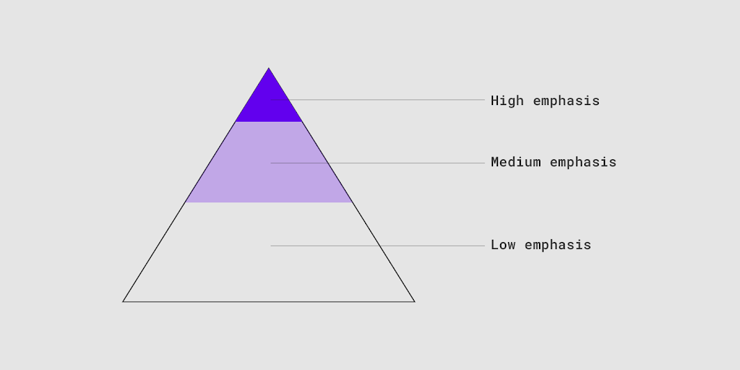
A button’s level of emphasis helps determine its appearance, typography, and placement.
Placement
Multiple button types can be used to express different emphasis levels.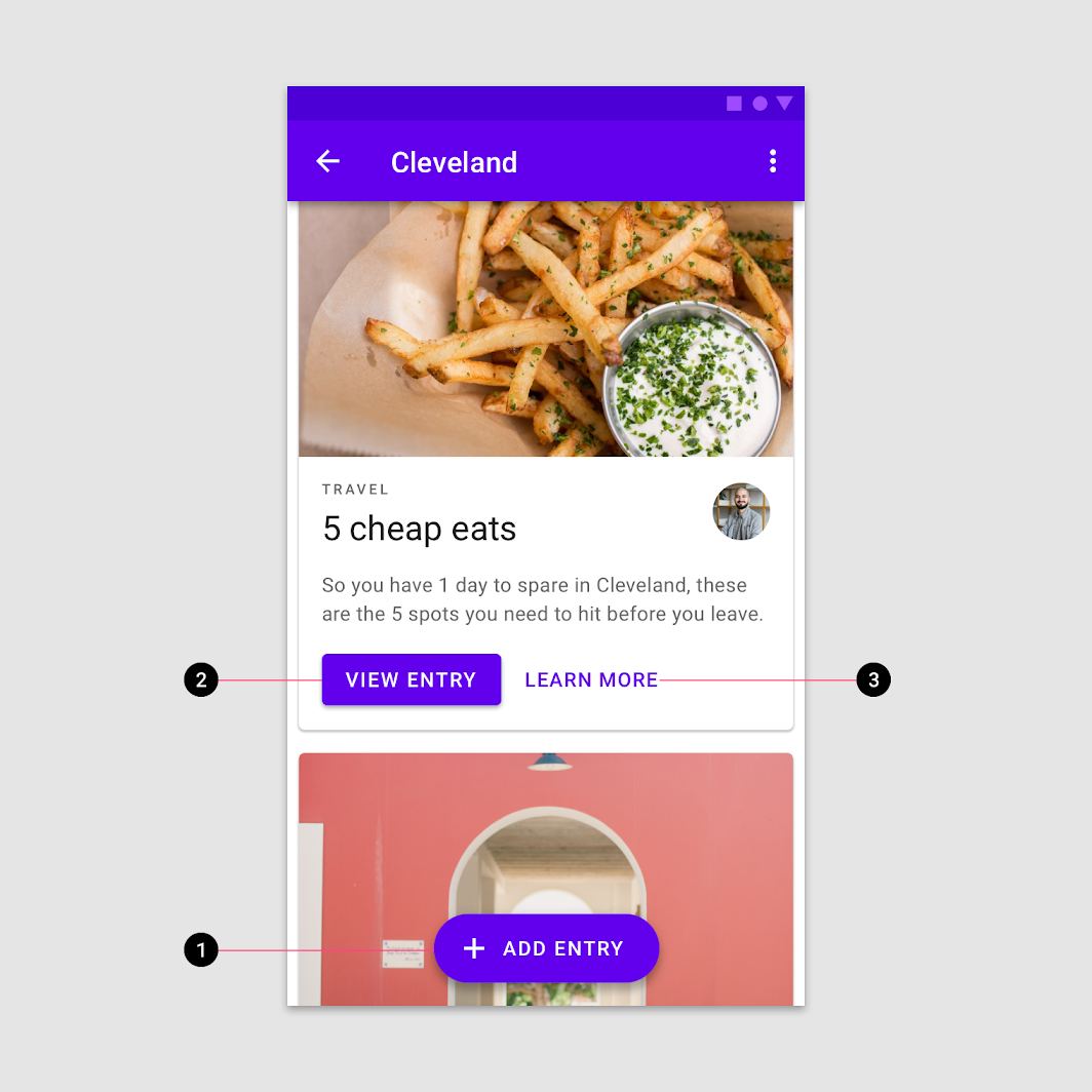
This screen layout uses:
- An extended floating action button for the highest emphasis
- A contained button for high emphasis
- A text button for low emphasis


Do
In a bottom bar, when using multiple buttons, indicate the more important action by placing it in a contained button (next to a text button).

Don’t
Avoid using two contained buttons next to one another if they don’t have the same fill color.

Do
In a bottom bar, when using multiple buttons, you can place a outlined button (medium emphasis) next to a contained button (high emphasis).

Do
When using multiple buttons in a bottom bar, you can place a text button (low emphasis) next to an outlined button (medium emphasis).

Do
Use a contained button in a bottom sheet next to other important details.

Don’t
Don’t place a button below another button if there is space to place them side by side.
Behavior
Scaling and adaptation
When scaling layouts for large screen devices, buttons can adapt their visual presentation, alignment, and arrangement to fit different contexts and user needs.
Container properties
Buttons are typically placed in containers such as cards or dialogs. As a parent container scales to adapt to different screen sizes, a button’s size, position, and alignment within the container can also change.
Buttons can be aligned left, right, or center as the parent container scales.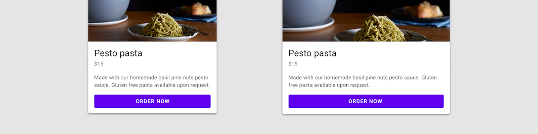
A button’s position and size should scale in relationship to its container.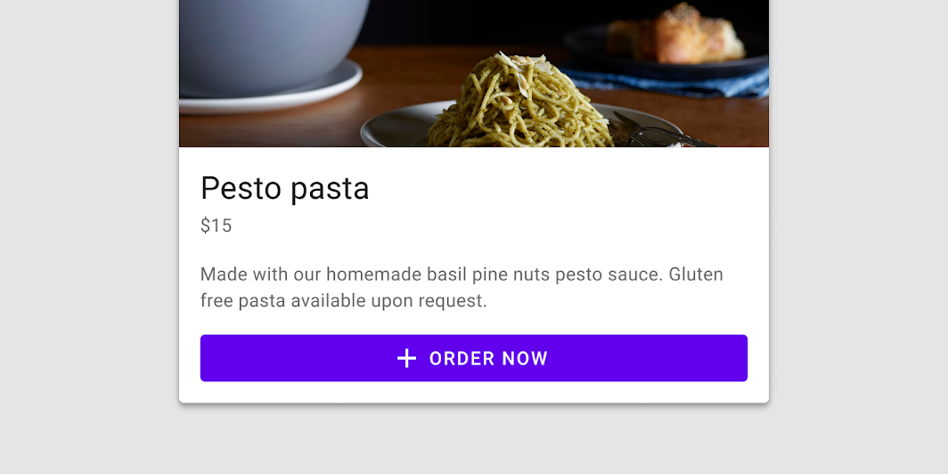
Arrangement
Define the position and alignment of button elements such as text and icons in relationship to their container. For example, the icon and text label within a button remain centered and anchored to each other as the button width scales.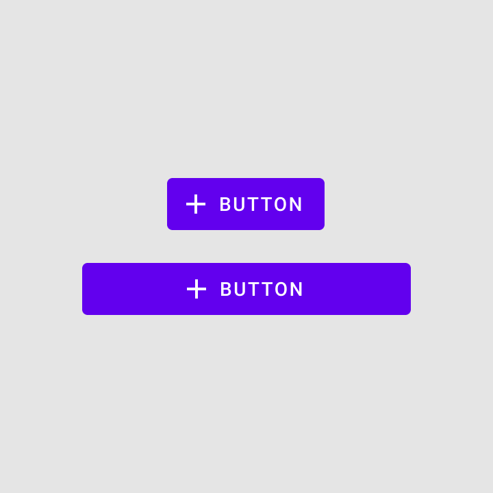

Do
Group internal elements so that they scale appropriately. Icons and text labels remain centered when button width increases.

Don’t
Don’t ungroup elements inside of a button container. This can lead to unwanted movement, such as the icon and label anchoring to opposite sides of the button.
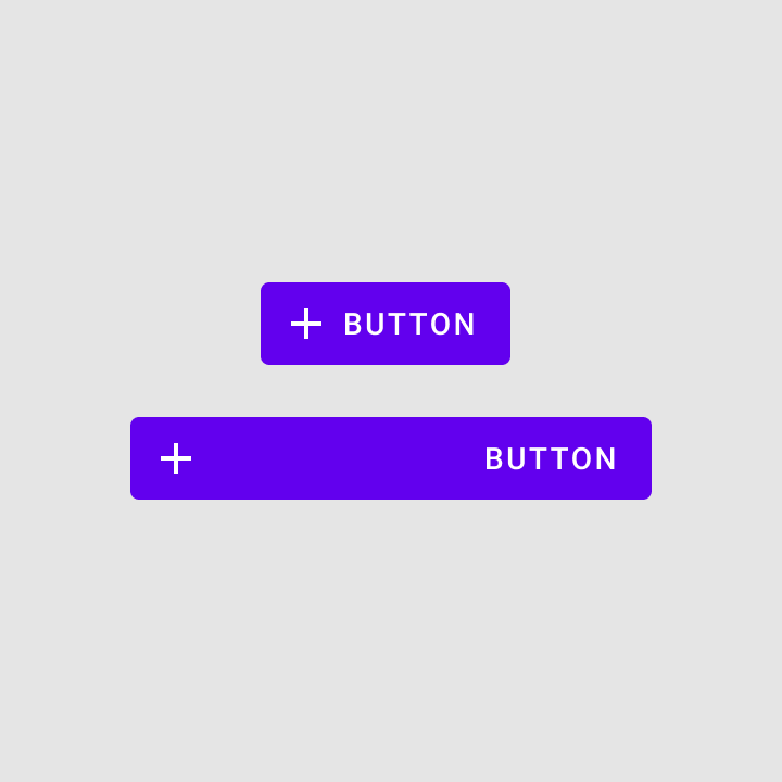
The size and placement of buttons can change as parent containers, such as cards, adapt for larger screens.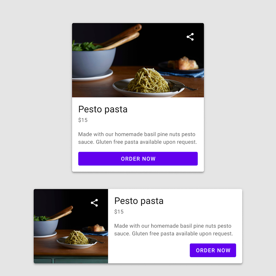
Two buttons scaling to accommodate different component sizes.
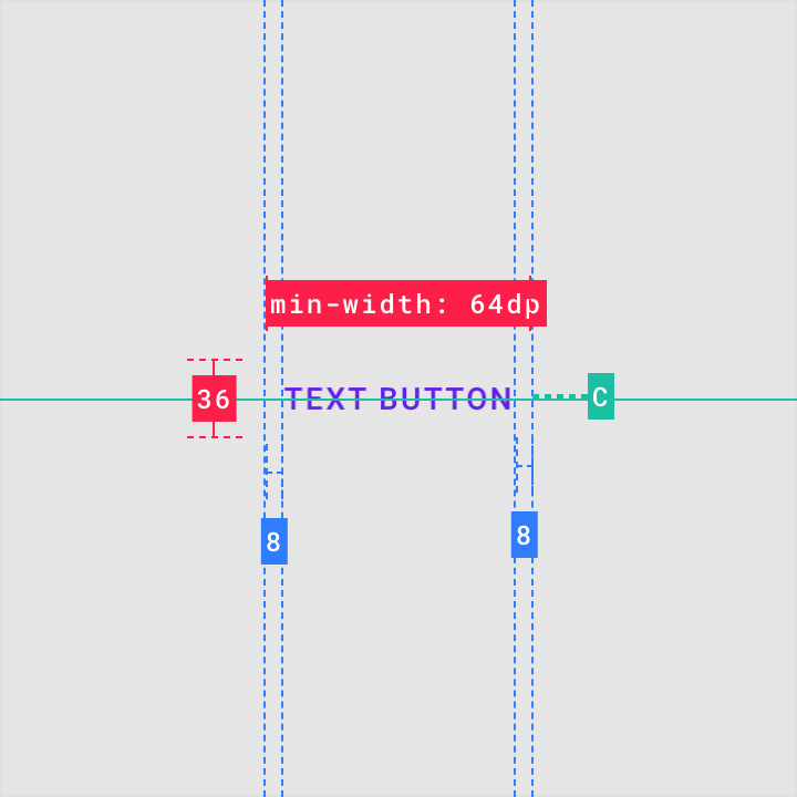
Text button
Usage
Text buttons are typically used for less-pronounced actions, including those located:
- In dialogs
- In cards
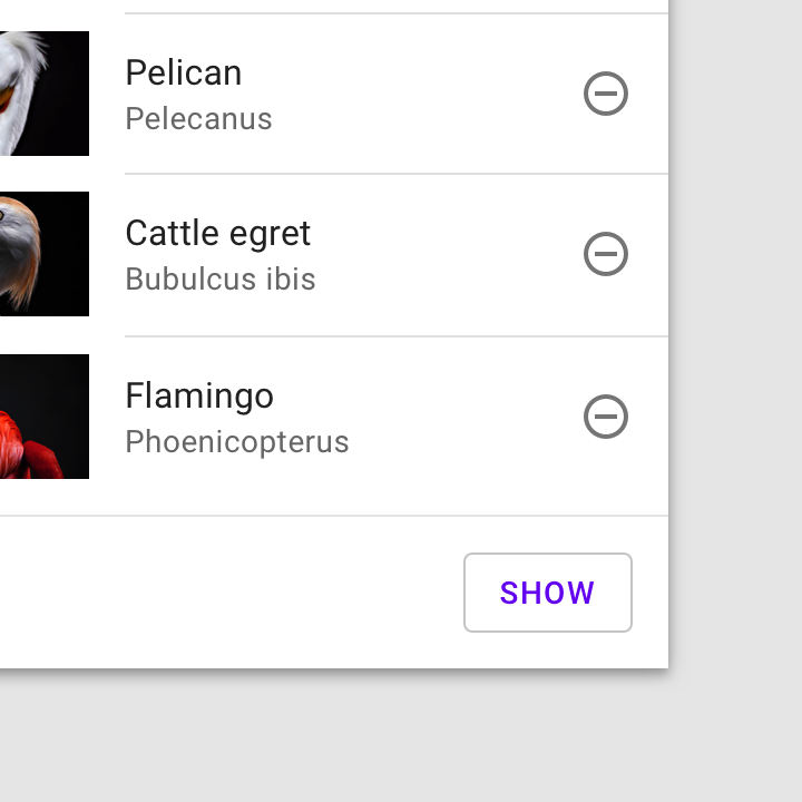
In cards, text buttons help maintain an emphasis on card content.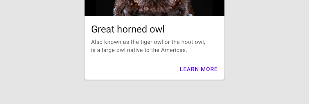
Text button
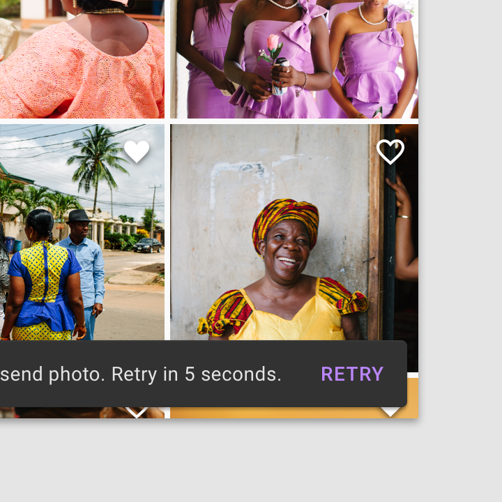
Use a text button in snackbars.
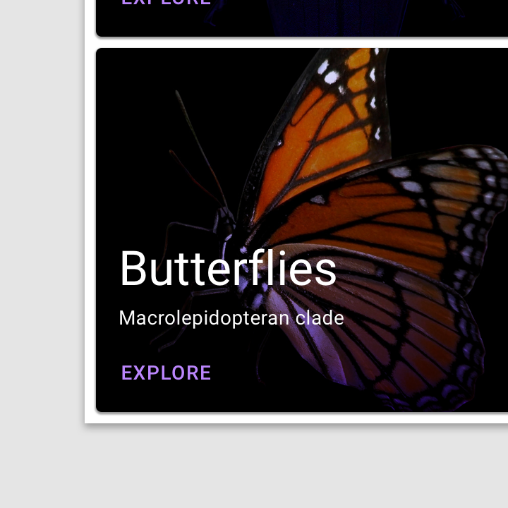
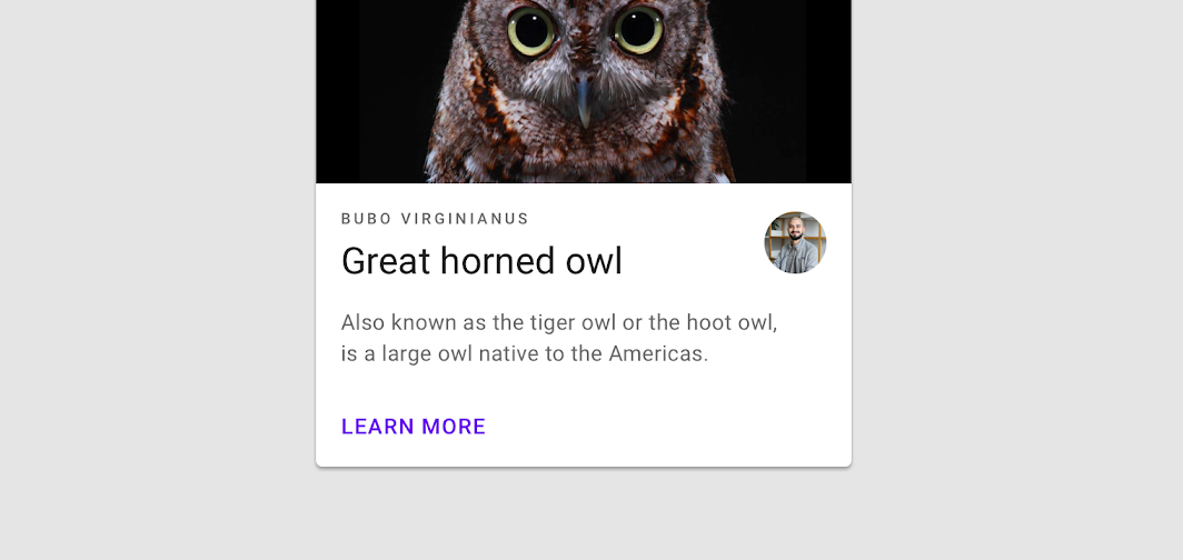
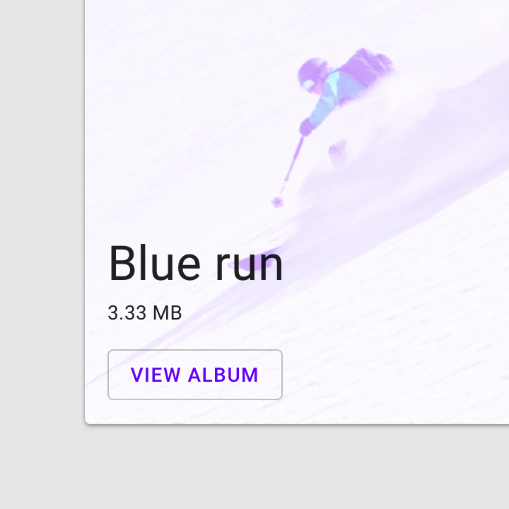
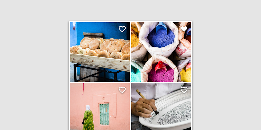
A text button against an image background.
Text label
A button’s text label is the most important element on a button, as it communicates the action that will be performed when the user touches it.
Text label using a distinct action.

Caution
Text labels need to be distinct from other elements. If the text label isn’t fully capitalized, it should use a different color, style, or layout from other text.

Don’t
Avoid text labels that are too long. They should be concise.
Placement
Text buttons are often embedded in contained components like cards and dialogs, in order to relate themselves to the component in which they appear. Because text buttons don’t have a container, they don’t distract from nearby content.
Dialogs use text buttons because the absence of a container helps unify the action with the dialog text. Align text buttons to the right edge for left-to-right scripts.
Text buttons minimize distraction from card content.
状态
Text buttons can be placed in front of a variety of backgrounds. Until the button is interacted with, its container isn’t visible.
To maintain accessibility, Material Design provides baseline opacity values for the color overlays used by states. A brand can adjust opacity values to suit its color scheme.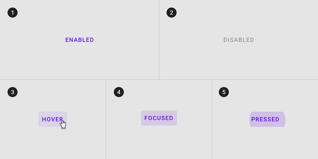
Text button states
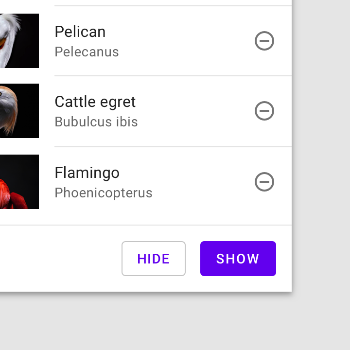
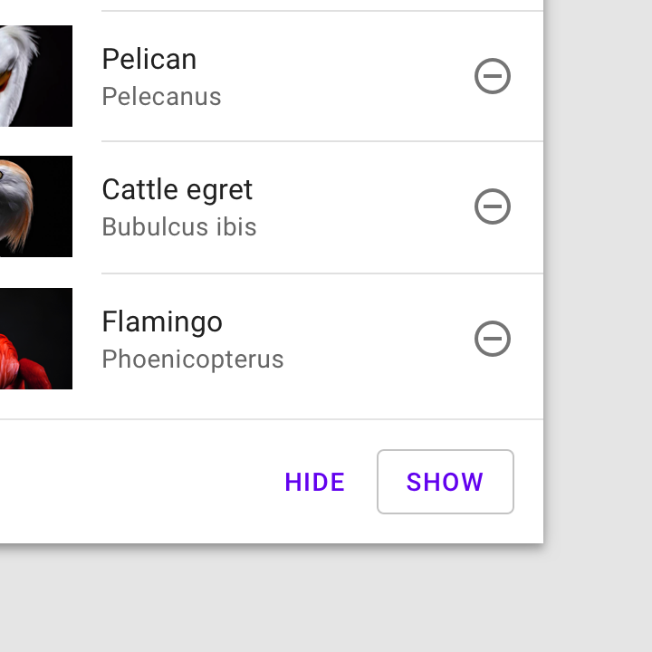
Outlined button
Usage
Outlined buttons are medium-emphasis buttons. They contain actions that are important, but aren’t the primary action in an app.
Alternatives
Outlined buttons are also a lower emphasis alternative to contained buttons, or a higher emphasis alternative to text buttons.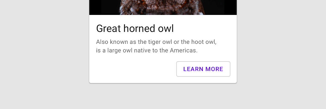
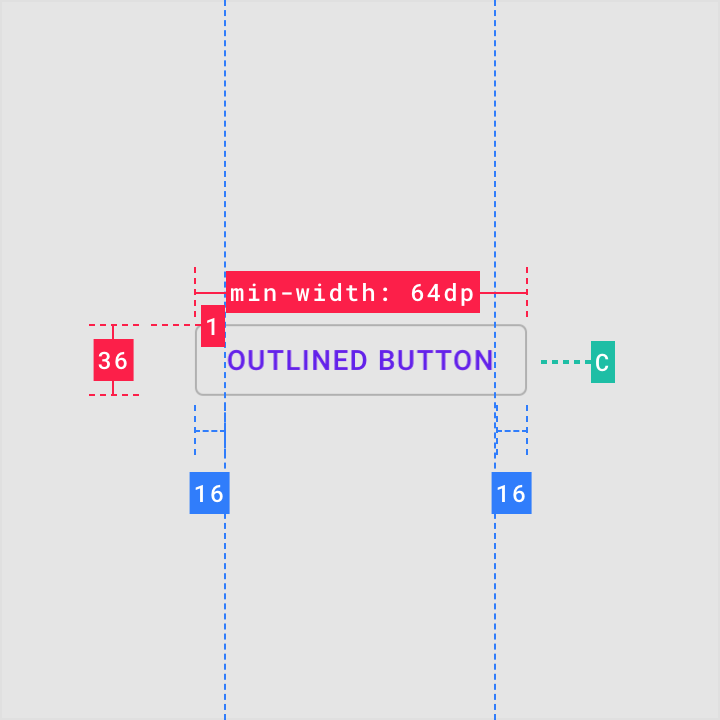
Container
Outlined buttons display a stroke around a text label. Stroke can be represented in different ways:
- Set a button’s width to be the size of the text label, with 16dp padding on the left and right
- Set the button’s relative position to the responsive layout grid
In a resting state, outlined buttons should display containment with a stroke and no fill.
Outlined button

Do
An outlined button’s width is dynamically set to fit the text label.

Don’t
An outlined button’s width shouldn’t be narrower than the button’s text length.

Caution
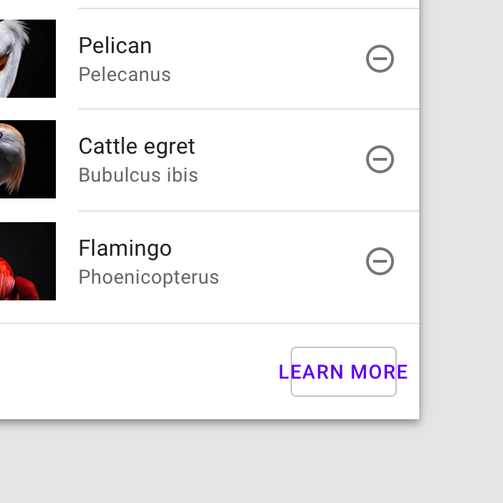
Distinguish text when using outlined buttons in front of images. This image uses a light purple scrim to make text easy to read in the outlined button.
状态
Outlined buttons can be placed on top of a variety of backgrounds. Its container is transparent and until the button is interacted with, a color isn’t visible.
To maintain accessibility, Material Design provides baseline opacity values for the color overlays used by states. A brand can adjust opacity values to suit its color scheme.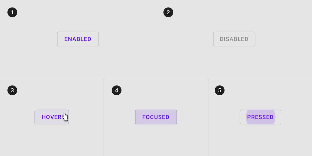
Outlined button states
Contained button
Usage
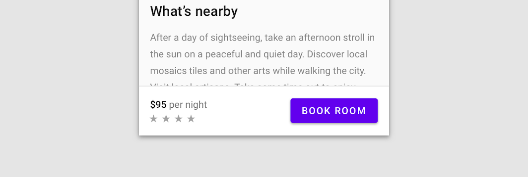
Contained buttons are high-emphasis, distinguished by their use of elevation and fill. They contain actions that are primary to your app.
A contained button

Do
Text labels can be written in sentence case, as long as the button is clearly distinguishable from elements around it
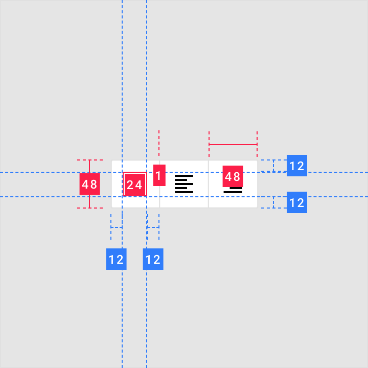
Container
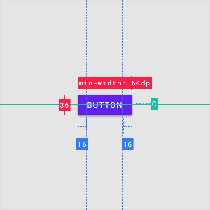
Contained buttons display a container around a text label. Containers can be represented in different ways:
- Set container width to the size of the text label with 16dp padding on the left and right
- Set the container’s relative position to the responsive layout grid
Contained buttons should display containers with a solid color.
A contained button with solid color


Do
A button container’s width is dynamically set to fit its text label.


Don’t
A button container’s width shouldn’t be narrower than its text.
Button container width can be set according to the responsive layout grid.
Contained button in a responsive layout grid
图标
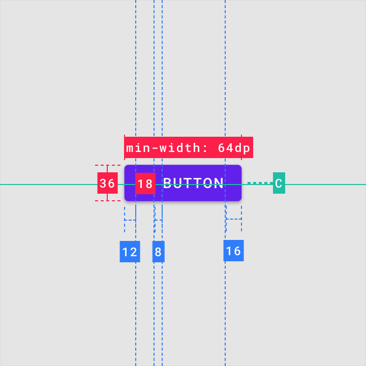
Contained buttons can place icons next to text labels to both clarify an action and call attention to a button.

Do
Use icons that clearly communicate their meaning.

Don’t
Don’t vertically align an icon and text in the center of a contained button.

Don’t
Don’t use two icons in the same button.
Shadow & elevation
Buttons at higher elevations typically appear more prominent in a design. On press, elevated buttons lift up and the container displays touch feedback.
Higher elevation increases the prominence of a contained button.
状态
Recommended opacity values for button container fill colors can be found in the states guidelines. An app can alter the overlay values of the button to suit a brand’s color palette.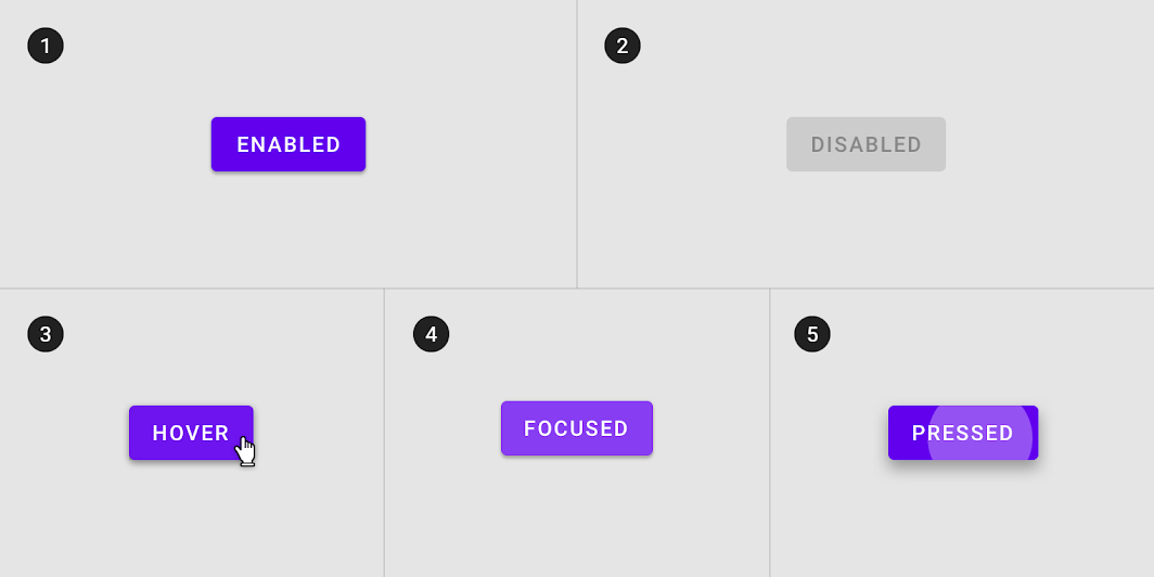
Contained button states
Toggle button
Usage
Toggle buttons can be used to group related options. To emphasize groups of related toggle buttons, a group should share a common container.
Selected action
Only one option in a group of toggle buttons can be selected and active at a time. Selecting one option deselects any other.
These toggle buttons present options for aligning text to the left, right, and center.
Icons can be used as toggle buttons when they allow selection, or deselection, of a single choice, such as marking an item as a favorite.
状态
Active and available toggle buttons
A toggle button’s state makes it clear which button is active. Hover and focus states express the available selection options for buttons in a toggle group.
Disabled toggle buttons
Toggle buttons that cannot be selected can either be given a disabled state, or be hidden.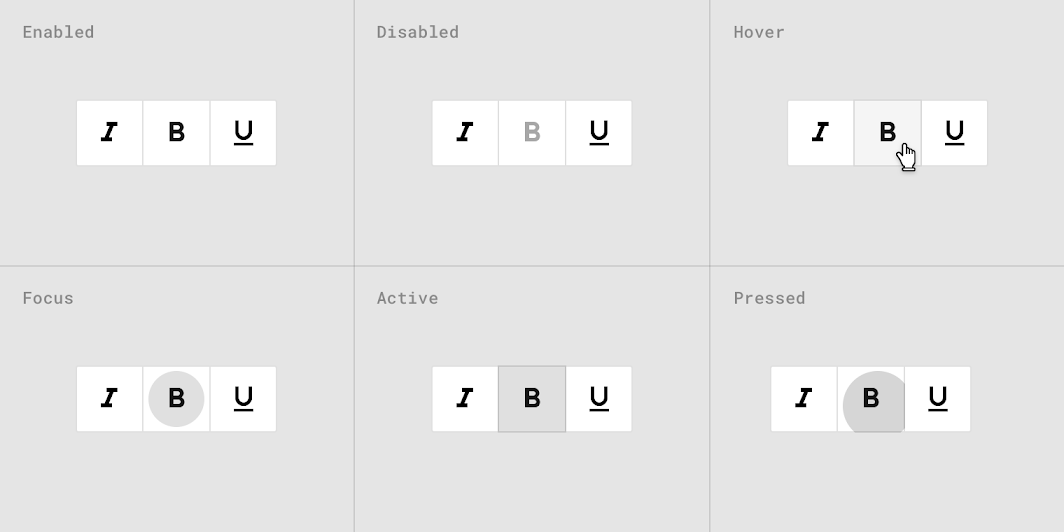
Toggle button states
Theming
Crane Material theme
This travel app’s buttons have been customized using Material Theming. Areas of customization include color, typography, and shape.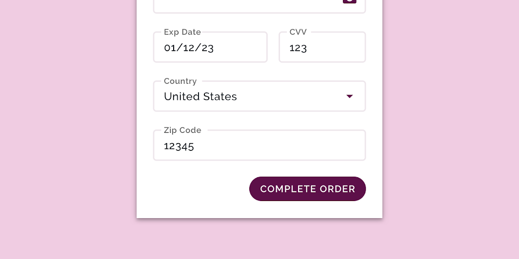
Crane’s customized buttons
Color
Crane’s buttons use custom color on two elements: the container and text.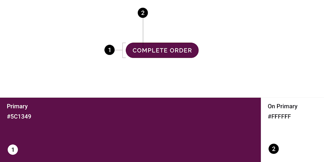
| Element | Category | Attribute | Value |
|---|---|---|---|
| Container | Primary | Color Opacity |
#5C1349 100% |
| Text | On Primary | Color Opacity |
#FFFFFF 100% |
Typography
Crane’s buttons use custom typography for the button text.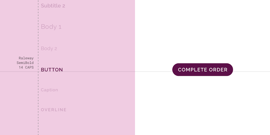
| Element | Category | Attribute | Value |
|---|---|---|---|
| Text | Button | Typeface Font Size Case |
Raleway SemiBold 14 All caps |
Shape
Crane’s button containers have custom corner shapes, with a 50% corner radius. *Crane buttons are in the small component shape category, and they use a custom size.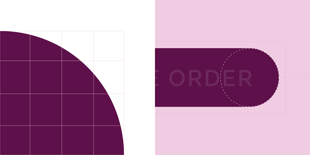
| Element | Category | Attribute | Value |
|---|---|---|---|
| Container | Override* | Family Size |
Rounded 50% |
Fortnightly Material theme
This news app’s buttons have been customized using Material Theming. Areas of customization include color and typography.
Fortnightly’s customized buttons
Color
Fortnightly’s buttons use custom color on two elements: background and text.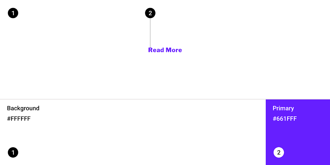
| Element | Category | Attribute | Value |
|---|---|---|---|
| Background | Background | Color Opacity |
#FFFFFF 100% |
| Text | Primary | Color Opacity |
#661FFF 100% |
Typography
Fortnightly’s buttons use custom typography for the button text.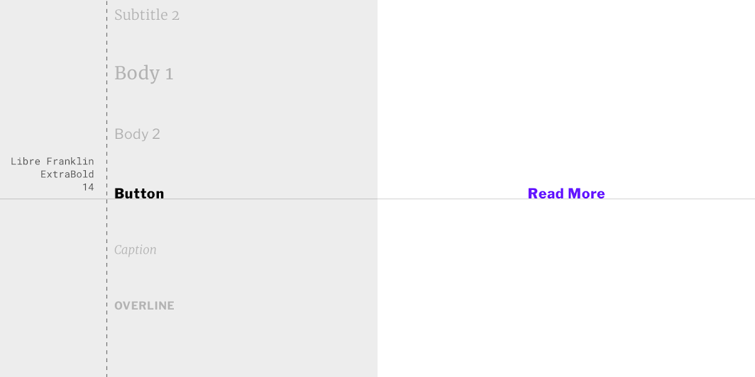
| Element | Category | Attribute | Value |
|---|---|---|---|
| Text | Button | Typeface Font Size Case |
Libre Franklin ExtraBold 14 Sentence case |
Rally Material theme
This personal finance app’s buttons have been customized using Material Theming. Areas of customization include color and typography.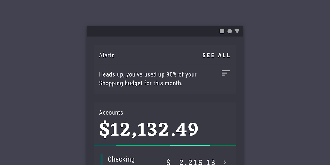
Rally’s customized buttons
Color
Rally’s buttons use custom color on two elements: background and text.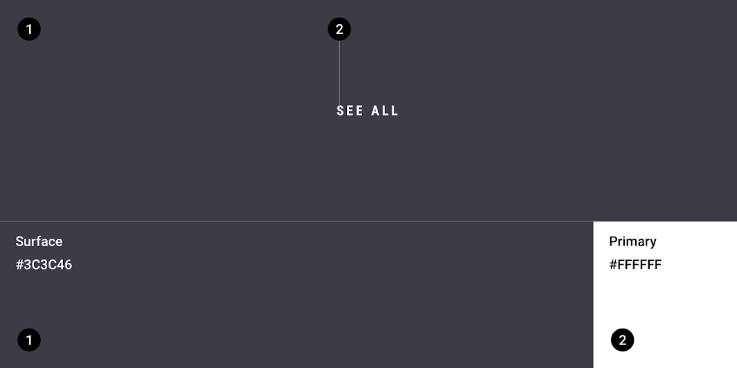
| Element | Category | Attribute | Value |
|---|---|---|---|
| Background | Surface | Color Opacity |
#3C3C46 100% |
| Text | Primary | Color Opacity |
#FFFFFF 100% |
Typography
Rally’s buttons use custom typography for the button text.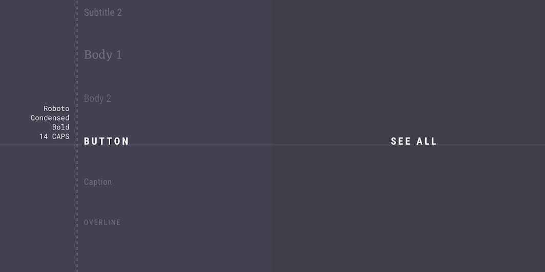
| Element | Category | Attribute | Value |
|---|---|---|---|
| Text | Button | Typeface Font Size Case |
Roboto Condensed Bold 14 All caps |
Posivibes Material theme
This social media app’s buttons have been customized using Material Theming. Areas of customization include color, typography, and shape.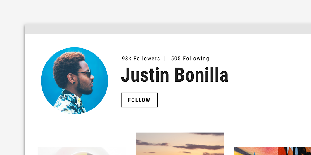
Posivibe’s customized buttons
Color
Posivibe’s buttons use custom color on two elements: the container stroke and text.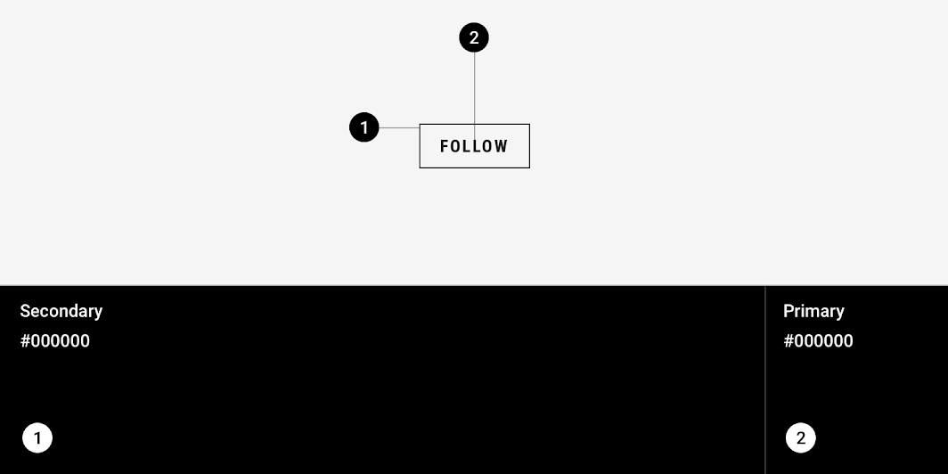
| Element | Category | Attribute | Value |
|---|---|---|---|
| Container stroke | Secondary | Color Opacity |
#000000 100% |
| Text | Primary | Color Opacity |
#000000 100% |
Typography
Posivibe’s buttons use custom typography for the button text.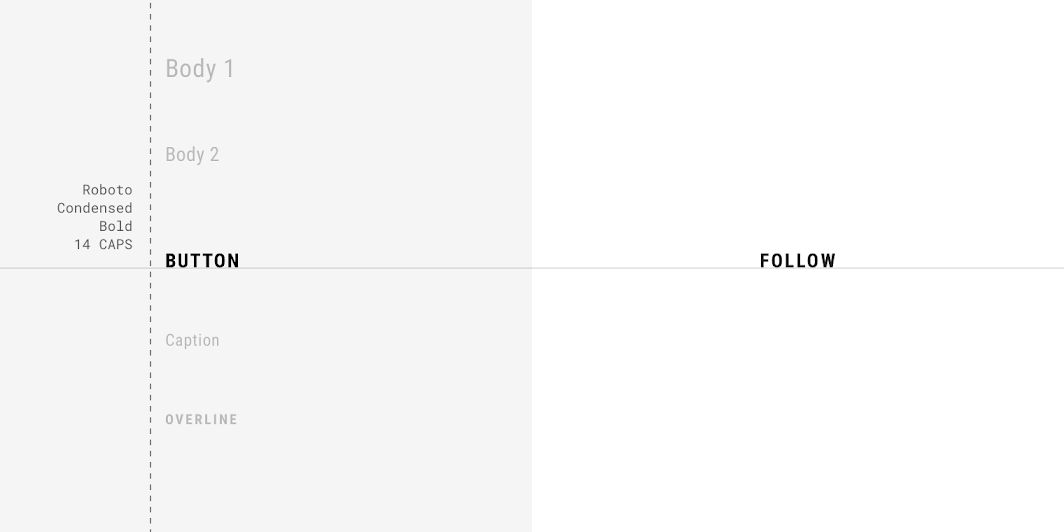
| Element | Category | Attribute | Value |
|---|---|---|---|
| Text | Button | Typeface Font Size Case |
Roboto Condensed Bold 14 All caps |
Shape
Posivibe’s button containers have custom corner shapes, with 0dp long cut corners.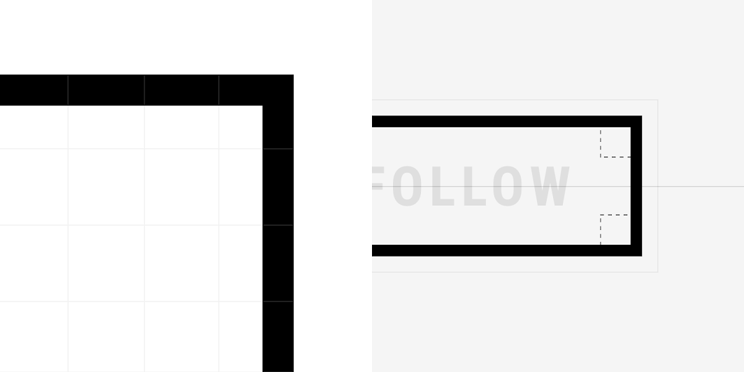
| Element | Category | Attribute | Value |
|---|---|---|---|
| Container | Small component | Family Size |
Cut 0;0;0;0dp |
Reply Material theme
This email app’s buttons have been customized using Material Theming. Areas of customization include color and typography.
Reply’s customized buttons.
Color
Reply’s buttons use custom color on four elements: background, icon, icon fill, and text.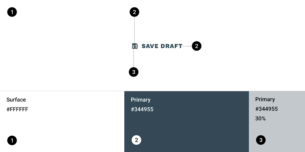
| Element | Category | Attribute | Value |
|---|---|---|---|
| Background | Surface | Color Opacity |
#FFFFFF 100% |
| Icon | Primary | Color Opacity |
#344955 100% |
| Icon fill | On Primary | Color Opacity |
#344955 30% |
| Text | Primary | Color Opacity |
#344955 100% |
Typography
Reply’s buttons use custom typography for the button text.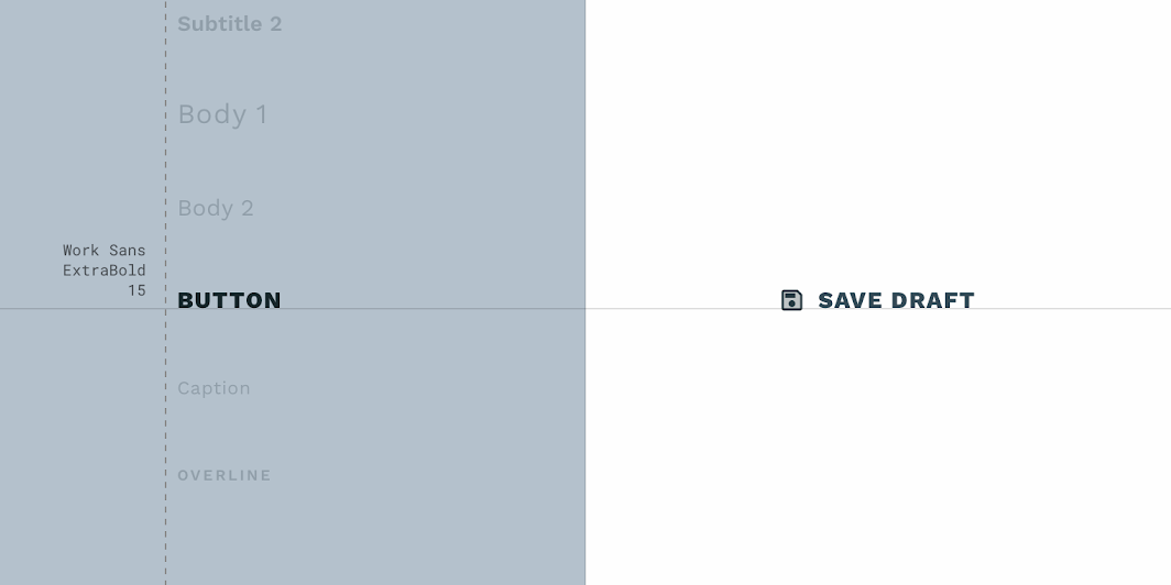
| lement | Category | Attribute | Value |
|---|---|---|---|
| Text | Button | Typeface Font Size Case |
Work Sans ExtraBold 15 All caps |
Shrine Material theme
This retail app’s buttons have been customized using Material Theming. Areas of customization include color, typography, and shape.
Shrine’s customized buttons
Color
Shrine’s buttons use custom color on three elements: the container, icon, and text.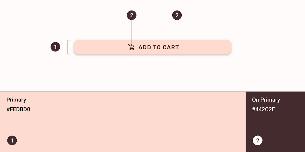
| Element | Category | Attribute | Value |
|---|---|---|---|
| Container | Primary | Color Opacity |
#FEDBD0 100% |
| Icon | On Primary | Color Opacity |
#442C2E 100% |
| Text | On Primary | Color Opacity |
#442C2E 100% |
Typography
Shrine’s buttons use custom typography for the button text.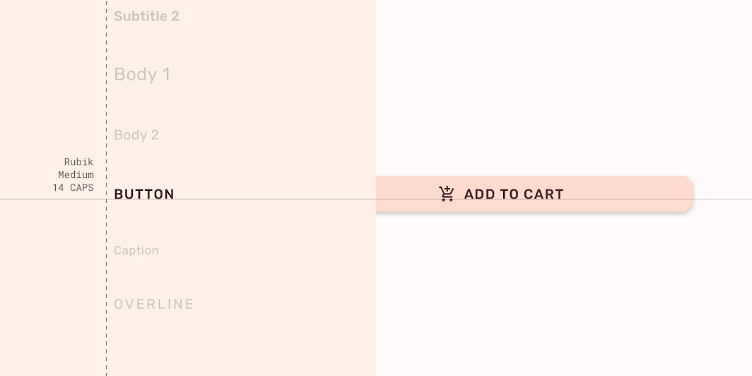
| Element | Category | Attribute | Value |
|---|---|---|---|
| Text | Button | Typeface Font Size Case |
Rubik Medium 14 All caps |
Shape
Shrine’s button containers have custom corner shapes, with cut corner shapes.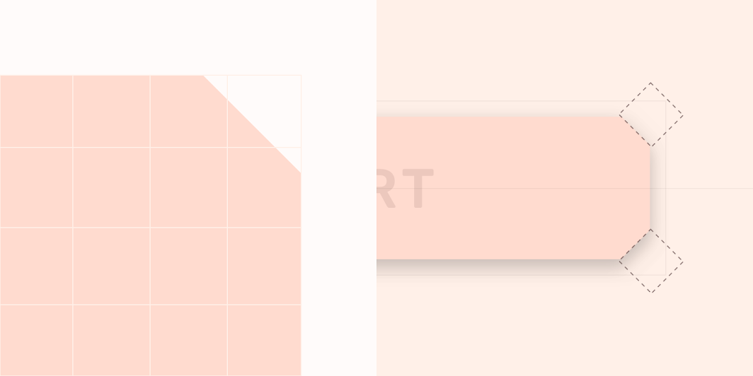
| Element | Category | Attribute | Value |
|---|---|---|---|
| Container | Small component | Family Size |
Cut 4dp; 4dp; 4dp; 4dp |
Specs
Contained button
Contained button with icon
Outlined button
Text button
Toggle buttons

若有收获,就点个赞吧
0 人点赞
