设计中的辅助功能可以帮助残障获得更好的应用体验。
Accessibility in design allows users of diverse abilities to navigate, understand, and use your UI.
Understanding accessibility
优化产品的辅助功能可以覆盖更多的用户,包括低视力、失明、听力障碍、认知障碍、运动障碍或者情景障碍(如手臂骨折)的用户。
Improving your product’s accessibility can enhance the usability for all users, including those with low vision, blindness, hearing impairments, cognitive impairments, motor impairments or situational disabilities (such as a broken arm).
原则
- 精确导航
- 通过设计清晰的布局和以及简明扼要的辅助文字来为用户导航。
- Help users navigate by designing clear layouts with distinct calls to action.
- 覆盖面广
- 应用程序能够适应各种用户。
- Design your app to accommodate a variety of users.
- 特定设备
- 根据平台特性,支持相应的辅助技术。就像某些设备在数据输入时,支持触摸、键盘和鼠标的输入法一样。
- Support assistive technologies specific to your platform, just as you support the input methods of touch, keyboard, and mouse.
Mobile guidance
This section primarily applies to mobile UI design. For more information on designing and developing more accessible products, visit the Google accessibility site.
Disclaimer
These materials are for your information only, and do not constitute legal advice. Consider consulting your attorney for advice on any particular issue.
技术支持
辅助功能可以获得多种技术(例如,放大工具、助听器等设备)的支持,来帮助或改善残疾人获得更好的用户体验。
Assistive technology helps increase, maintain, or improve the functional capabilities of individuals with disabilities, through devices like screen readers, magnification tools, and hearing aids.
屏幕阅读器
屏幕阅读器是一种应用软件,可以让文字转化成盲文或者直接通过语音朗读文本。
视力受损、暂时无法阅读或阅读困难的人可以使用屏幕阅读器。应用程序会通过读取屏幕上可见的内容,如文字(包括按钮上的文本),将隐藏的内容,如图标,转化成文字内容朗读出来。
当用户需要使用屏幕阅读器时,应用可以提供一些纯文字的界面。
A screen reader is a software program that uses a braille display or reads text aloud, such as Google’s screen reader TalkBack. People with vision impairments, difficulties reading, or temporarily can’t read might use a screen reader. Screen readers will verbalize the visible content and read it aloud. Paragraph and button text, as well as hidden content like alternative text for icons and headings, are identified by the program. Content can be labelled to optimize the experience for those who use screen readers or experience a text-only version of your UI.
使用屏幕阅读器导航
屏幕阅读器为用户提供了多种浏览屏幕的方式,包括:
触摸浏览:用户触摸界面时,屏幕阅读器可以朗读用户手指下方的屏幕内容。使用户可以快速了解整个页面的布局。用户在“模式”下完成的操作被称为“触摸探索”。
线性导航:用户可以通过在屏幕上前后滑动来移动焦点,用户可以由上往下来“阅读”页面的内容。
用户可以根据自己的需要,在以上两种浏览方式之间进行切换。
Screen readers give users multiple ways to navigate a screen, including:
- Explore by touch: Touch interface screen readers allow users to run their finger over the screen to hear what is directly underneath. This provides the user with a quick sense of an entire interface. Alternatively, the user can quickly move to a UI element from muscle memory. In TalkBack, this feature is called “explore by touch”. To select an item, the user double taps.
- Linear navigation: Users may also move focus by swiping backwards or forwards on a screen to read pages in a linear fashion, from top to bottom. This allows users to hone in on certain elements. In TalkBack, this is called linear navigation.
Users can switch between both “explore by touch” and “linear navigation” modes.
按地标导航
当某些导航元素被标记时,通过语音技术来帮助用户在各个元素之间进行切换。
Some assistive technologies allow users to navigate between page landmarks, such as headings, when these landmarks use the appropriate semantic markup.
控制器
控制器允许用户以线性的方式来切换页面上的内容。
控制器大致可以分为两类:
- 硬件:触控板、鼠标上的轨迹球或者键盘等
- 软件:虚拟触控板等
Hardware or software directional controllers (such as a D-pad, trackball, or keyboard) allow users to jump from selection to selection in a linear fashion.
层级结构
合理的导航设计可以帮助用户了解他们在应用所处的位置以及当前屏幕上有哪些重要的信息。
一般为了对重要信息进行强调,设计者会使用多种视觉元素或文字提示,例如颜色、形状、文本以及动效。
When navigation is easy, users understand where they are in your app and what’s important. To emphasize which information is important, multiple visual and textual cues like color, shape, text, and motion add clarity.
反馈类型
视觉反馈(例如标签、颜色或图标)和 触摸反馈,可以向用户显示当前页面中可以交互的元素。
导航
Navigation can have clear task flows with minimal steps, with navigation controls easy to locate and clearly written. Focus control, or the ability to control keyboard and reading focus, can be implemented for frequently used tasks.
层级
UI 设计中,每一个按钮、图像或者文本都会增加其复杂性。
设计者可以通过以下标准来简化产品的 UI:
- 清晰可见的元素
- 足够的对比度和尺寸
- 合理的层级结构
- 一目了然的关键信息
如何通过层级来调整元素的重要性:
- 将重要操作放在屏幕顶部或底部(可通过快捷方式访问)
- 将相似层次结构的相关元素放置在彼此相邻的位置
Every added button, image, and line of text increases the complexity of a UI. You can simplify how your UI is understood by using:
- Clearly visible elements
- Sufficient contrast and size
- A clear hierarchy of importance
- Key information that is discernable at a glance
To convey an item’s relative level of importance:
- Place important actions at the top or bottom of the screen (reachable with shortcuts)
- Place related items of a similar hierarchy next to each other
正确:通过将操作放在屏幕顶部显示其重要性。
Do
By placing important actions at the top of the screen they’re given more importance in the hierarchy.

注意:当重要的操作与普通内容混合布局时,用户可能不清楚页面上最重要的元素是什么。

Caution
When important actions are embedded within other content, it may be unclear what the most important elements are on the page.
视觉层次结构
为了确保屏幕阅读器能够按照预期的顺序朗读页面上的内容,设计师需要与开发人员密切协作,保证在编写 HTML 时,按照预期设计来进行实现。
虽然 CSS 用于实现页面的布局和外观,但屏幕阅读器依赖于任何平台(移动或 web)上 HTML 的自顶向下的结构来创建屏幕阅读器所遵循的顺序。
To enable the screen reader to read out content in the intended order, it’s important for designers to collaborate with developers – both for writing out the HTML in the correct order, and understanding how screen readers will interpret designs.
While CSS determines the layout and appearance of a page, screen readers rely on the top-down structure of HTML on any platform (mobile or web). This structure creates a map for the screen reader to follow when reading the content.
Do
The HTML reflects the visual hierarchy by reading the content from the top left (Step 1) to the top right (Step 2), bottom left (Step 3) to bottom right (Step 4).

<section class="container"><div class="col-left"><img class="step-1" /><img class="step-3" /></div><div class="col-right"><img class="step-2" /><img class="step-4" /></div></section>
Example code for displaying the images in a screenreader-friendly hierarchy

Caution
While some users may look at images in the visual order of the screen from top left (Step 1) to the top right (Step 2), bottom left (Step 3) to bottom right (Step 4), screen readers will, by default, verbalize the content in the top-down order of the HTML (Step 1, Step 3, Step 2, and Step 4).
<section class="container"><div class="col-left"><img class="step-1" /><img class="step-3" /></div><div class="col-right"><img class="step-2" /><img class="step-4" /></div></section>
Example code for displaying images in which the screenreader reads the items in the left column before reading the items in the right column.
焦点顺序
常规的视觉布局顺序即使屏幕的顶端到底端,从最重要的项到最不重要的项进行遍历。
在设计焦点与顺序时,请注意以下几点:
- 元素在获得焦点时的顺序
- 元素分组的方式
- 当焦点元素消失时,焦点移动的位置
焦点可以通过视觉指示器和辅助功能的文本来组合表示。
Input focus that follows the order of the visual layout usually flows from the top to the bottom of the screen. It can traverse from the most important to the least important item.
To help determine your focus points and movements, consider:
- The order in which elements receive focus
- The way in which elements are grouped
- Where focus moves when the element in focus disappears
Focus points can be expressed through a combination of visual indicators and accessibility text.

黑色圆圈中的数字,表示屏幕元素获取焦点的顺序。 The black circles indicate the order in which onscreen elements could receive focus.
分组
可以通过分组的方式将重要性相近的内容聚合起来,并且在空间上进行展示。
Items can be grouped under headings that communicate what the groupings are. These groups organize content spatially.
过渡
屏幕或任务中的焦点设计可以改善用户在工作流中的用户体验。如果任务被中断后,通过焦点,能够在中断的地方迅速开始。
Focus traversal between screens and tasks improves the user experience when it’s continuous. If a task is interrupted and then resumed, it can help to return focus to the element that was previously focused.
颜色 & 对比度
颜色与对比度可以帮助用户阅读并理解应用程序中的内容,以及能够采取正确的操作与元素进行交互。
Color and contrast can be used to help users see and interpret your app’s content, interact with the right elements, and understand actions.
无障碍颜色设计
颜色设计可以帮助设计者传达情绪、语气以及关键信息。
为了满足无障碍设计,需要合理地选择主色、辅色以及强调色。元素的颜色之间如果能够有足够的对比度,可以提高低视力用户的体验。
Color can help communicate mood, tone, and critical information. Primary, secondary, and accent colors can be selected to support usability. Sufficient color contrast between elements can help users with low vision see and use your app.
对比度
颜色对比度对于用户区分各种文本和非文本元素来说非常重要。在强光或弱光条件下,较高的对比度使图像更容易看到。
对比度用于表示两种颜色的差异。
基于颜色的亮度,通常在 1:1 ~ 21:1 之间进行取值(根据 W3C )。比率越大,表示对比度越大,颜色之间的差异就越大。
W3C 建议对正文文本和图像文本使用以下对比度:
Color contrast is important for users to distinguish various text and non-text elements. Higher contrast makes the imagery easier to see. A low-contrast image may be hard for some users to differentiate in bright or low light conditions, such as on a very sunny day or at night.
Contrast ratios represent how different one color is from another color, commonly written as 1:1 or 21:1. The greater the difference is between the two numbers in the ratio, the greater the difference in relative luminance between the colors. The contrast ratio between a color and its background ranges from 1-21 based on its luminance (the intensity of light emitted) according to the World Wide Web Consortium (W3C).
The W3C recommends the following contrast ratios for body text and image text:
| Text type | Color contrast ratio |
|---|---|
| Large text (at 14 pt bold/18 pt regular and up) and graphics | 3:1 against the background |
| Small text | 4.5:1 against the background |
Do
These lines of text follow the color contrast ratio recommendations and are legible against their background colors.

Caution
These lines of text don’t meet the color contrast ratio recommendations and can be difficult to read against their background colors.

Icons or other critical elements should also consider using the above recommended contrast ratios.
Do
These icons follow the color contrast ratio recommendations and are legible against their backgrounds.

Caution
These icons don’t follow the color contrast ratio recommendations and may be difficult to discern against their backgrounds.

Logo 以及装饰组件
醒目的 Logo 不一定必须符合对比度的设计标准。
Decorative elements (such as logos or illustrations) might not meet contrast ratios, but if they serve an important function (like linking to a website) it helps to make them distinguishable.
醒目的 Logo 不一定必须符合对比度的设计标准。

Do
Decorative logos that are distinguishable might not meet contrast ratios.
请勿为了满足对比度的标准篡改原有的 Logo 设计。

Don’t
Don’t distort your logo to meet contrast ratios.
其他的视觉提示
对于色盲或者看不出颜色差异的用户,其他的视觉元素也可以帮助设计者传达相同的信息。由于色盲也有不同的分类,除了颜色与对比度之外,设置其他的视觉提示同样也能够传达信息。
比如,笔画、文本指示器、图案或文本等元素都可以描述操作或内容。
For users who are colorblind, or do not see differences in color, other design elements can help express the same amount of information.
Because colorblindness takes different forms (including red-green, blue-yellow, and monochromatic), multiple visual cues help communicate important states. Elements such as strokes, indicators, patterns, texture, or text can describe actions and content.
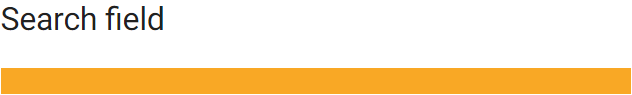
文本字段错误状态仅通过红色的下划线展示,视觉上有障碍的用户可能注意不到这种提示。
Do
The text field error state is communicated through multiple cues: title color, text field stroke, and an error message below the field.

Caution
The text field error state is only communicated with a colored stroke, which could be missed by a user who cannot perceive color.

布局 & 版式
Material Design 可以针对无法查看屏幕或者无法使用小区域的触摸目标的用户提供相应的解决方案。
Material Design’s touch target guidelines can help users who aren’t able to see the screen, or who have difficulty with small touch targets, to tap elements in your app.
可触区域 & 指针
接触目标
元素的可触区域应该大于可视区域,可触区域用于响应用户的输入。
例如,一个图标的可视区域大小为 24 x 24 dp,但是为了提供更大的可触区域,通过设置透明的遮罩将可触区域的大小提高到 48 x 48 dp。
可触区域的大小最小为 48 x 48 dp。无论屏幕大小如何,48 x 48 dp 的可触区域的物理尺寸约为 9mm。
触摸屏上的元件的建议目标尺寸为 7-10mm。
设计者需要设置合理的可触区域来覆盖应用的服务对象。
Touch targets are the parts of the screen that respond to user input. They extend beyond the visual bounds of an element. For example, an icon may appear to be 24 x 24 dp, but the padding surrounding it comprises the full 48 x 48 dp touch target.
For most platforms, consider making touch targets at least 48 x 48 dp. A touch target of this size results in a physical size of about 9mm, regardless of screen size. The recommended target size for touchscreen elements is 7-10mm. It may be appropriate to use larger touch targets to accommodate a larger spectrum of users.
Note that on iOS, 44 x 44 pt is the recommended touch target. For platform-specific implementation guidance, visit the developer resource page.
指针
指针区域与可触区域类似,但是指针区域一般用于描述指针设备(例如鼠标或手写笔)的运动跟踪。
指针区域至少应为44 x 44 dp。
Pointer targets are similar to touch targets, but apply to the use of motion-tracking pointer devices such as a mouse or a stylus. Consider making pointer targets at least 44 x 44 dp.

头像
- 可视区域:40 x 40 dp
- 可触区域:48 x 48 dp
头像
- 可视区域:24 x 24 dp
- 可触区域:48 x 48 dp
触控目标间距
通常来讲,触摸区域应该比可视区域多出 8 dp 以上的空间距离,以保证信息密度的合理性以及可用性。
In most cases, touch targets separated by 8dp of space or more promote balanced information density and usability.

按钮
- 可触区域:48 x 48 dp
- 可视区域:36 x 36 dp
布局
响应式布局
响应式布局能够根据屏幕尺寸调整内容布局,防止因为设备类型的缘故,产生截断导致内容显示不全。
Flexible, responsive layouts help content scale in relation to the screen size. This helps avoid truncating content that may not display entirely on specific device types or at varied resolutions.
分组
相关性高的元件可以进行组合,提供可读性。
Related items can be grouped in proximity to one another to improve readability.
Do
The slider value is in close proximity with the slider control.

Caution
Consider moving the slider value if it might be too far away from the control. Someone using screen magnification may not be able to view both the slider and the value without panning back and forth.

排版
字体
为了提高文字的可读性,用户可能会调整字体大小。移动设备和浏览器中有一项很重要的功能就是,用户可以在系统允许的范围内调整字体大小。
To improve readability, users might increase font size. Mobile devices and browsers include features to allow users to adjust their font size system-wide. To enable system font size in an Android app, mark text and their associated containers to be measured in scalable pixels (sp).
Ensure that there is sufficient space for large and foreign language fonts. See Line Height for information on the recommended sizes of foreign language fonts.
语法
辅助文本
辅助功能文本是指屏幕阅读器中的辅助功能软件所使用的文本,如 Android 中的 TalkBack,iOS 中的 VoiceOver 以及桌面端的 JAWS。屏幕阅读器会通过语音朗读屏幕上的文本以及元素,包括可见(例如按钮上的文本)或者不可见的替代文本(如图片内容的文字介绍)。
Accessibility text refers to text that is used by screen reader accessibility software, such as Google’s TalkBack on Android, Apple’s VoiceOver on iOS, and Freedom Scientific’s JAWS on desktop. Screen readers read aloud the on-screen text and elements (such as buttons), including both visible and nonvisible alternative text.
可见文本 & 不可见文本
辅助文本包括可见文本(例如,UI 元素的标签,按钮、链接和表单上的文本)或者不可见文本(图片内容的文字介绍)。
有时,屏幕上的标签可能会被可访问性文本替代,以向用户提供更多信息。
当可见文本和不可见文本都具有描述性和意义时,它可以帮助用户使用屏幕上的标题或链接进行导航。屏幕阅读器可以帮助设计者测试可访问性文本并确定可以添加文本的位置。
Accessibility text includes both visible text (including labels for UI elements, text on buttons, links, and forms) and nonvisible descriptions that don’t appear on screen (such as alternative text for images). Sometimes an on-screen label may be overridden with accessibility text to provide more information to the user.
When both visible and nonvisible text is descriptive and meaningful, it helps users navigate using headings or links on a screen. A screen reader can help you test accessibility text and identify places where you can add it.
备选文本 - Alt text
为了帮助无法查看屏幕内容的用户,设计者通过 Alt text 将图像的内容转化成可供阅读器阅读的文本内容。
Alt text 是代码中的短标签(最多 125 个字符),用于帮助无法看到图像的用户描述图像。由于Alt text 仅用于图像,因此无需在 Alt text 中添加额外的描述(例如,“image of” 或 “picture of”)。
屏幕阅读器将通过语音读出 Alt text 来代替图像。如果图像加载失败,也可以显示 Alt text,来帮助用户了解图像中包含的信息。Alt text 中的关键词也可以改善搜索引擎(SEO)的结果。
Alt text helps translate a visual UI into a text-based UI. Alt text is a short label (up to 125 characters) in the code that describes an image for users who are unable to see them. Since alt text is only for images, there is no need to add “image of” or “picture of” to the alt text. A screen reader will read the alt text aloud in place of the image. Alt text is valuable for sighted users as well as alt text appears if an image fails to load. Include targeted keywords to help inform the user about the image. Keywords can also improve search engine optimization (SEO).
Do
Use alt text to convey what the image is showing in an informative, short phrase.

Alt text example: The Tokyo Tower and skyline at night
Caution
Using only one or two words to describe an image may not be informative.

Alt text example: Skyline
Do
Write short, concise alt text that can be read quickly by a screen reader and give the user context.

Alt text example: A rooftop view of the Tokyo Tower and skyline at night
Caution
Lengthy descriptions in alt text may get truncated. Most screen readers do not read more than 125 characters of text.

Alt text example: The Tokyo skyline. Taken at night from a local hotel rooftop. This image was taken with a digital SLR on March 7, 2014 during a full moon
Do
Include targeted keywords.

Alt text example: An evening skyline view in Shibakoen, Minato City, Tokyo, Japan
Don’t
Placing keywords into the alt text simply for the purpose of improving SEO may confuse screen reader users.

Alt text example: Tokyo, tok yo, Japan, japan, ja pan, sushi, tower, evening, night, buildings, build, sky, skyline, view
Do
Write alt text that describes the image without using the words, “picture of” or “image of.”

Alt text example: A cityscape featuring the Tokyo Tower at night
Caution
Including “image of” or “picture of” in alt text is unnecessary.

Alt text example: An image of the Tokyo Tower
注释、正文和嵌入文本
与图像相关的文本必须是屏幕阅读器可以识别的。
The text in and around images should consider accessibility because it presents key information about the images.

- 图像
- 注释(说明文本)
- 正文
说明文字注释
注释一般位于图像下方,用于解释图片的内容。例如,图像的归属人、内容、事件发生的时间与地点等等信息,都需要阅读器根据说明文本来向用户传递信息。
Captions are the text that appear below an asset. They explain an asset’s contextual information–the who, what, when, and where. Both sighted and screen reader users rely on captions for descriptions of assets.
Do
For long descriptions, use captions instead of alt text since they are available to all users and alt text is limited to 125 characters

Caption example: Originally a staple in the Presidential library, this 1920s antique rocking chair now resides in the home of Dr. Black.
Alt text example: Mahogany wood and green, velvet tufted antique rocking chair in a home library
Caution
If alt text and captions repeat the same content, screen reader users may be slowed down.

Caption and alt text examples: An antique mahogany and tufted green velvet rocking chair from the 1920s in the home library of Dr. Black
正文
正文一般会出现在图像的周围,用于详细解释图像的内容或者引出上下文。如果正文中对图像进行了解释,那么设计者可以设置Alt text 为空(alt=“”)。
如果 alt=“” ,请确保删除图像的文件名。
Adjacent text or body text is the text next to the image that can explain the image within a narrative. If the adjacent text explains the asset, then alt text may not be needed and the alt tag can be left empty (alt=””). If leaving the alt tag empty, remove the imagery file name if it appears.
The caption and the surrounding body text explain the image. The alt tag is empty (alt=””).

Caption example: Originally a staple in the Presidential library, this 1920s antique rocking chair now resides in the home of Dr. Black.
Adjacent text: Found at a garage sale in Orlando, Florida, this antique collectors’ item now lives in the home library of Dr. Simone Black. The chair now sits surrounded by hundreds of books and the natural light of Dr. Black’s home.
在图像中嵌入文本
屏幕阅读器无法读取嵌入图像中的文本。
如果图像中有作为文本嵌入的基本信息,请在Alt text 中放置嵌入文本。
Screen readers are unable to read text that is embedded in imagery. If there is essential information embedded as text in the image, include the essential information in the alt text.
Caution
Take caution when embedding essential information as text in an image and repeating it as alt text.

Embedded and alt text examples: A former staple in the Presidential library, this 1920s mahogany and green velvet antique rocking chair now resides in the home of Dr. Black
Alt text 和注释的组合
Alt text 和标题可以包含不同的信息。
当正文与注释中没有完全涵盖对图像特征的描述时,需要使用 Alt text 来对注释与正文进行补充。
Alt text and captions contain different information. Alt text is only useful when the adjacent text and caption do not explain characteristics of the image that are important to understand for those who cannot see the image, such as descriptions of the colors, sizes, and location of an object.
Do
Use captions for long descriptions.

Caption text example: Originally a staple in the Presidential library, this 1920s antique rocking chair now resides in the home of Dr. Black. It will be available at auction this coming fall in Boston.
Alt text example: Mahogany wood and green velvet tufted antique rocking chair in a home library
Caution
Repeating the same information for the captions and alt text may slow down screen reader users.

Caption & alt text examples: The antique mahogany wood and tufted green velvet rocking chair from the 1920s in the home library of Dr. Black.
阅读速度
屏幕阅读器在朗读时,文本越简短,用户“阅读”的速度越快。
Screen reader users hear every UI element read aloud. The shorter the text, the faster a screen reader user can navigate it.
Do
请使用清晰易读的文本。
Write clear and short accessibility text.
Caution
不要使用冗长生啤的文本。
Consider rewriting long and less concise accessibility text.
控件类型和状态
屏幕阅读器可以自动朗读出控件的类型或状态,可以说出控件名称。
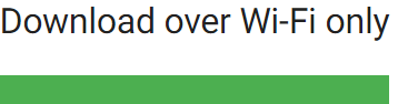
Do
Use short descriptions.
Caution
Usually the control type should not be stated because the ARIA label will announce the control type for screen reader users, making the extra label redundant.
Do
Use short descriptions.
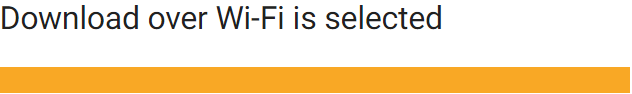
Caution
Consider not including the current state, in this case, that Wi-Fi is “selected.”
开发者说明
如果屏幕阅读器没有将控件的类型或状态正确地传达给用户,那么该控件的辅助功能设置可能是有问题的。
Accessibility role association: 每一个元素都可以与辅助功能相关联,并且通过编码加入辅助功能系统中进行联动。这意味着每一个元素都需要准确地被命名。
Native elements: If you extend or inherit from a native UI element, you will probably find the correct role. Otherwise, to override accessibility information for each platform, see ARIA for the web and AccessibilityNodeInfo for Android.
If the control type or state isn’t being read correctly, the control’s accessibility role may be a custom control or improperly set.
- Accessibility role association: Each element can be associated with an accessibility role on a website or can be coded to be communicated correctly. This means setting a button as a button, and a checkbox as a checkbox.
- Native elements: If you extend or inherit from a native UI element, you will probably find the correct role. Otherwise, to override accessibility information for each platform, see ARIA for the web and AccessibilityNodeInfo for Android.
操作的动词描述
我们在描述一个元素所具备的交互操作时,应该从功能上进行描述,而不是元素的外观。
Action verbs indicate what an element or link does if tapped, rather than what an element looks like. This describes what an element does without relying on visual acuity.
Do
当我们描述“编辑”按钮时,只描述它的外观是无法传递出正确的信息的。
The description read aloud indicates the action represented by the icon.

Caution
Describing what the icon looks like may not explain what the action does.

Do
Accessibility text for a navigation menu could be “Show navigation menu” and “Hide navigation menu” (preferred) or “Show main menu” and “Hide main menu” (acceptable).

Caution
Consider revising accessibility text that doesn’t indicate what action will occur, such as “Side drawer.”

导航菜单的辅助功能文本有两种表示方法:
- 首选:“显示导航菜单”和“隐藏导航菜单”
- 可选:“显示主菜单”和“隐藏主菜单”
请不要用跟操作无关的“侧导航”来进行描述。
元素的状态切换
在值或状态之间切换的元素组件,需要向用户说明切换时会发生的后果。例如,当星形图标的明暗表示愿望在愿望清单中是否存在时,则需要向用户传达:“添加到愿望清单”或“从愿望清单中删除”。
- 属性类,如复选框是否勾选代表当前状态的开关。
- 动作类,例如“添加到愿望清单”。
For icons that toggle between values or states, announce the icon according to how it is presented to the user. For example, if a star icon represents the action of adding something to a wishlist, the app could verbalize “Add to wishlist” or “Remove from wishlist.”
- If the icon is a property of an item, screen readers will verbalize the current state (such as “on” or “off”) if coded as a checkbox.
- If the icon is an action and is selected, the text label can specify the action that occurs, such as “Add to wishlist.”
控制互动
当用户使用除手指或鼠标以外的硬件设备(例如,键盘或智能音箱)进行导航时,请正确地将如何与这些硬件设备进行交互传递用户。
Users might navigate with a keyboard or other device, not with their fingers or a mouse, which should be considered when describing for users how to interact with a control. Accessibility software will describe the correct interaction for the user.
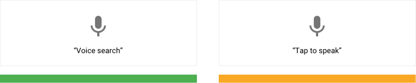
Do
The command “voice search” describes the user task (search) paired with the input method (voice).
Caution
Consider revising commands that don’t fully express how to activate a control. This voice command says “tap,” even though it could be selected via a keyboard press, switch device, or braille display. Because this is a task to perform a search, the action could be mentioned instead of “speak.”
“语音搜索”的描述正确描述了用户能够获取的功能。
“点击后开始通话”的描述没有告诉用户能够获取的功能。
提示语
提示语用于对用户可能不清楚的动作做补充性的描述。例如,Android 的“双击”在提示用户双击两次的同时,Android TalkBack 还将对动作会产生的后果做补充性的描述。
Hint speech provides extra information for actions that aren’t clear. For example, Android’s “double-tap to select” feature prompts the user to tap twice. Android TalkBack will also announce any custom actions associated with an element.
图像
图像的类型
如何将辅助功能设计应用与图像,首选需要了解各种类型图像之间的差异。
To know when and how to apply accessibility guidelines to imagery, it’s important to understand the differences between image types.
装饰类 & 信息类图像
装饰类图像的作用跟上下文关系不大,主要起到装饰性作用。
装饰类图像在页面中:
- 不包含注释
- 不必满足颜色对比度准则
- 不包含 Alter text
- 图像标签中应该有一个(alt=“”),以便屏幕阅读器跳过它们
信息类图像以一种简短、易懂的方式传达一个概念。
信息类图像在页面中:
- 需要正文
- 需要注释
- 如果正文与注释无法解释图像,需要 Alt text
- 必须满足颜色对比度准则
To find out if an image needs to meet color contrast guidelines and would benefit from a caption, determine if your image is decorative or informative.
According to the W3C, decorative images don’t add information to the content of a page. Decorative images:
- Don’t need captions
- Don’t have to meet color contrast guidelines
- Don’t need alt text
- Should have a null (empty) tag (alt=””) in the image label so screen readers skip them
According to the W3C, informative images convey a concept in a short, digestible manner. Informative images:
- Relay accurate information that is relevant to the adjacent text
- Need captions
- Need alt text if the caption or adjacent text does not explain the image
- Have to meet color contrast guidelines for essential items
Do
This informative image is a photo that shows what the location looks like.

示例中的图像,展示了当前地点的预览图。 Alt text example: Aerial view of people walking and biking on the High Line in New York City
Caution
Using decorative images, such as a bicycle or an ice cream cone, to show a location may not be useful to screen reader users because it doesn’t provide additional information.

装饰类图像不能用于替代信息类图像,它们无法提供额外的信息。
Alt text example: Close-up on a person’s foot pedaling a bike.
要素与非要素
信息类图像中的元素可能会分为:基本元素和辅助元素。
对于任何基本元素来说,大文本相对于背景必须有 3:1 的颜色对比度,小文本相对于背景必须有 4.5:1 的颜色对比度。
Informative images have essential and non-essential elements. Essential information should have a 3:1 color contrast ratio for large text and 4.5:1 for small text.
插图作为信息类图片包含基本元素与辅助元素:

- 基本元素:文本必须要遵循颜色对比度准则和字号的要求。
- 基本元素:基础元素中的图形传递了重要的信息,必须遵循颜色对比度准则。
- 辅助元素:辅助元素起到装饰性作用,不传递信息,不需要满足颜色对比度的要求。
The illustration contains both essential and non-essential information:
- Essential: The text meets all contrast ratios and size requirements.
2. Essential: An illustrative visual representation of the instructions that follows color contrast guidelines.
3. Non-essential: The decorative elements create background and personality for the illustration. They do not relay information and do not have to meet contrast requirements.
功能性图像
功能性图像指的是 Logo、图标、按钮内的图像以及其它可以进行交互的图像。
功能图像的 Alt text 跟其他类型图像不同,因为功能图像的 Alt text 需要描述图像的交互功能,而不是只描述其内容或外观。
当按钮中的图标或图像具有特定功能时,向其添加alt标记,用动作动词(而不是图标名称)解释其功能有关编写可访问文本的信息,请参见编写。
According to the W3C, functional images are logos, icons, images within a button, and images that are actionable, such as a link. The alt text for functional images differs from alt text for other types of imagery because functional imagery alt text depicts the image’s function – not its content or what it looks like.
When the icon or image within a button has a specific function, add an alt tag to it explaining its function with an action verb, not the icon name. See Writing for information on writing more accessible text.
logo
Logo 需要一个alt 标记来描述其功能,但它们是一种独特的功能图像,因为:
- 不需要满足颜色对比度
- 文本没有字号的要求
如果 Logo 只是在页面中起到装饰性的作用,则需要给 alt 设置空值。
Logos may benefit from an alt tag describing their function, but they are a unique kind of functional image because they:
- Might not meet color contrast ratios
- Might not meet text size requirements
See Color and Contrast for more information about logos and color contrast.
However, when a logo is part of a text link and is only decorative without any functionality, add a null value alt tag (alt=””).
The alt text indicates that clicking on the logo will direct the user to the Google Search home website.

Alt text example: Link to Google Search home
语音 & 动效
语音
在 UI 元素中添加描述性的标签,可以通过语音帮助用户使用应用程序。在辅助模式中,用户在触摸屏幕上的 UI 元素时,屏幕阅读器可以将标签朗读出来。
在以下情况下,屏幕阅读器可能无法正常使用:
- 当屏幕上有自动播放的背景音乐时,设计者可以为用户提供暂停这些声音的控件
- 当元件本身具有语音功能时
Users can navigate your app using sound when you add descriptive labels to UI elements. When using a screen reader (such as TalkBack) and navigating by touch exploration, labels are spoken out loud when users touch UI elements on the screen.
Screen readers can be difficult to use when:
- Sound plays over a screen reader, such as background music that autoplays (you can provide controls for users to pause or stop these sounds)
- Extra sounds are added to native elements (screen readers will be able to interpret native elements correctly)
语音的替代品
当屏幕阅读器无法正常使用时,可以用视觉元素(如隐藏字幕)替代语音。
Visual alternatives can be given to sound or other critical audio elements and alerts, such as closed captions or a transcript.
动效
Material Design 会使用动效来引导用户关注的焦点。在删除非必要的元素时,以页面转换为焦点来为用户导航。
为了帮助对运动物体或者低视力的用户更加方便地使用产品,Material Design 对动效的设计进行了规范,该规范支持 W3C 中的一下内容:
- 如果动效时长超过五秒,则使其自动暂停、停止或隐藏
- 我了满足闪烁和红色闪烁的阈值,一秒内的内容闪烁的次数限制在三次以内
- 避免在屏幕的中心区域出现闪烁
Material Design uses motion to guide focus between screens. Surfaces transform into focal points for the user to follow and unimportant elements are removed.
To allow users with motion and vision sensitivities to use interfaces comfortably, Material Design provides motion guidance, which supports the following from the W3C:
- Enable content that moves, scrolls, or blinks automatically to be paused, stopped, or hidden if it lasts more than five seconds
- Limit flashing content to three times in a one-second period to meet flash and red flash thresholds
- Avoid flashing large central regions of the screen
定时控制
设计者可以设置应用程序中的控件在一定时间后自动消失。例如,播放视频时,播放控件会在五秒后从屏幕上淡出。
Controls in an app can be set to disappear after a certain amount of time. For example, five seconds after starting a video, playback controls can fade from the screen.
高优先级控制
控件消失后,用户可能会因为没有注意到而错过自己需要使用的功能。
例如,辅助模式中,屏幕阅读器可以将控件朗读出来,并且允许用户再次打开,或者以其它的方式唤醒。
Controls that perform high-priority functions can be missed by users if timers cause them to disappear too quickly. For example, TalkBack reads controls out loud if they are focused on. Placing them on timers can prevent the controls from completing their task.
Controls that enable important functions can allow users to turn them on again, or perform the same function in other ways. Learn more in Composition.
技术实现
通过使用标准化的平台控件以及语法(web 端),应用程序会自动包含与平台辅助功能所需的标记与代码。
根据平台的差异性,来开发符合其标准的辅助及时能够为用户带来更好的体验。
By using standard platform controls and semantic HTML (on the web), apps automatically contain the markup and code needed to work well with a platform’s assistive technology. Meeting each platform’s accessibility standards and supporting its assistive technology (including shortcuts and structure) gives users an efficient experience.
Do
使用符合平台规范的弹窗控件。
Use native elements, such as the standard platform dialog.
Caution
请勿使用不符合平台标准的对话框控件来执行任务。
Be wary of using non-standard elements, such as a non-standard platform dialog to perform a standard dialog task. It requires extra testing to work well with assistive technology.


开发完成后,打开平台的辅助设置测试产品。
注意事项:
- 可缩放的文本以及宽松的布局可以根据用户的辅助设置(大号文本、颜色校正、放大功能等等)进行适配
- 桌面端(鼠标 + 键盘)的输入信息可以完全由键盘执行操作
- 移动端(手指触控)可以通过屏幕阅读器以及其它辅助技术来完成操作
You can test your design with the platform accessibility settings turned on (both during and after implementation.)
Other design considerations:
- Scalable text and a spacious layout accommodate users who may have large text, color correction, magnification, or other assistive settings turned on.
- Keyboard and mouse interfaces can have every task and all hover information available through keyboard-only input.
- Touch interfaces can allow screen readers and other assistive technology devices to read all parts of your interface.
Do
缩放 UI 以满足用户的需求。
Scale your UI to work well with magnification and large text.

Caution
不能因为放大 UI 而出现内容上的截断。
This UI hasn’t scaled well with magnification and large text. Portions of content are overlapping or cut off.

UI 组件的标签
要让屏幕阅读器用户知道哪些UI元素是可点击的,请允许屏幕阅读器大声读出组件的名称ContentDescription属性可以添加到包含没有可见文本的图标的组件(如按钮、图标和选项卡)。对于web应用,添加一个add aria标签。
为了让用户知道哪些 UI 组件是可以交互的,请使用屏幕阅读器清晰地读出 UI 组件的名称。设计者可以添加contentDescription 属性到没有包含可见文本的组件中。对于 WEB 应用,请添加 aria-label 标签。
To let screen reader users know which UI elements are tappable, enable screen readers to read the names of components out loud. The contentDescription attribute can be added to components (such as buttons, icons, and tabs) that contain icons without visible text. For web apps, add an add aria-label.

1. Label the search icon
2. Label the microphone icon
1. Label the edit icon
2. Label the chat icon

帮助文档
特殊的辅助功能介绍可以放在帮助文档中。了解更多(Google Drive)
Features with special accessibility considerations can be included in help documentation. As an example, review this guide on how to use a screen reader with Google Drive.
测试与研究
遵循以上这些辅助功能设计准则虽然可以提高应用程序的覆盖面,但是仍然不可以保证所有人都可以体验应用的全部功能。
因此,我们还建议:
- 在完成辅助功能设计后,请测试是否能够在辅助模式下完整地体验应用的主要功能。例如,语音提示的声音不够或者语速过快时,可以做出对应的调整
- 让残障用户测试应用
- 思考如何保证每个元素具有可访问性的基础上,将它们组合成一个连贯的用户流程
- 让主要的任务流程能够被更多的人使用
与用户(尤其是需要使用辅助模式的用户)沟通,了解他们的需求,了解他们希望从您的应用程序中能够得到什么,他们使用了哪些工具以及如何使用它们。
熟悉这些工具,以便为他们提供最佳体验。
Following these accessibility guidelines helps improve the accessibility of your app, but does not guarantee a fully accessible experience. It is recommended that you also:
- Test your app for full task completion, beginning to end, with various assistive technologies turned on. For example, turn on Explore by Touch in TalkBack and change the speed at which text is spoken out loud.
- Have users with impairments test your app.
- Consider how individual elements can be made more accessible while also fitting together in a coherent user flow.
- Make the primary tasks in an app as usable as possible for a wide range of users.
Talk to your users, particularly those who use assistive technology, to learn about their needs, what they want out of your app, which tools they use, and how they use them. Become familiar with these tools so that you can give them the best experience.

若有收获,就点个赞吧
0 人点赞
