Material Design 中组件的排列方式有一定的规则,一般来说影响组件位置的因素有以下几个:
- 基准网格
- 辅助线
- 间距
- 容器与宽高比
- 交互方式
Spacing methods use baseline grids, keylines, padding, and incremental spacing to adjust ratios, containers, and touch targets.
基准网格
8 dp 网格
所有组件均与移动设备,平板电脑和桌面端的8dp方形基线网格对齐。
应用栏和浮动操作按钮(FAB)对齐到8dp网格。
All components align to an 8dp square baseline grid for mobile, tablet, and desktop.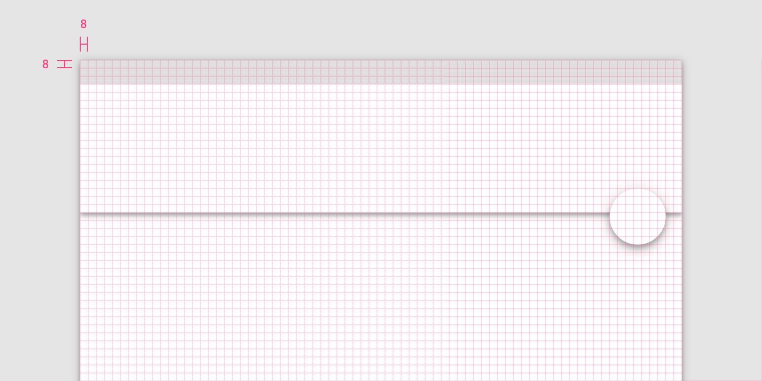
The app bar and floating action button align to the 8dp grid.
4 dp 网格
图标,文本和组件内的一些元素可以对齐到4dp网格。
底部导航栏的元素与4dp网格对齐。
Icons, type, and some elements within components can align to a 4dp grid.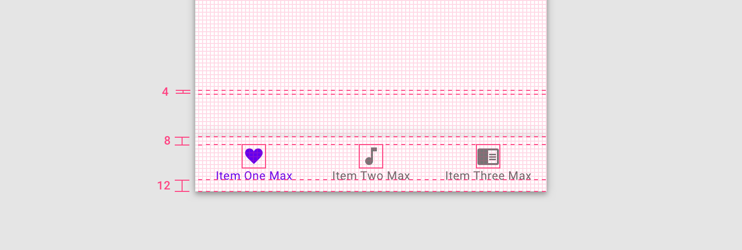
Elements of the bottom navigation bar align to the 4dp grid.
4 dp 基准网格
文本与 4 dp 基线对齐。
Type aligns to the 4dp baseline grid.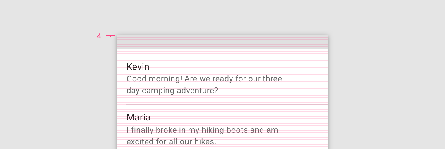
4dp baseline grid
文本可以放置在4dp网格之外,当它位于组件的中心位置时,如按钮或列表项。
即使类型不在4dp网格上,该文本也会在列表项的中心垂直对齐。
Type can be placed outside of the 4dp grid when it’s centered within a component, such as a button or list item. When placed outside of the grid but centered within a component, text can still appear vertically center-aligned.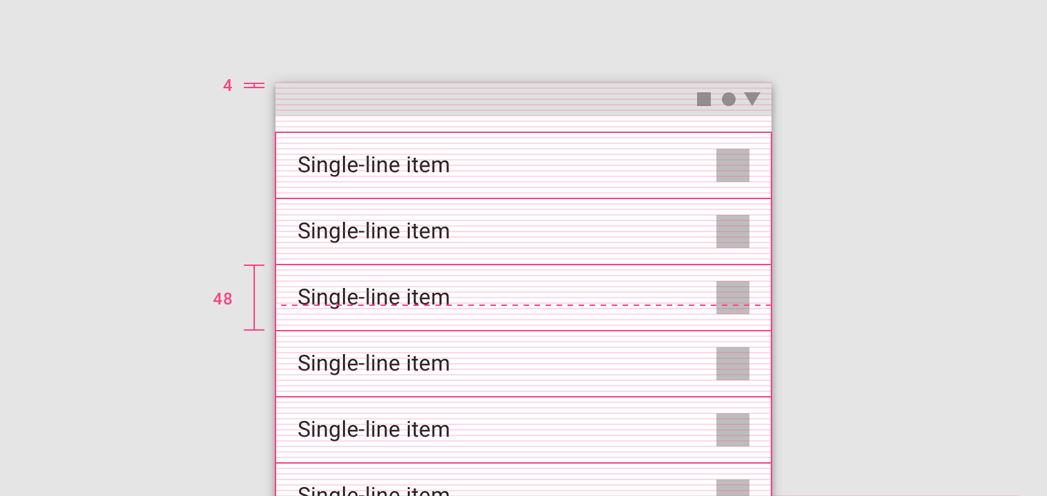
The text appears vertically aligned in the center of the list item, though the type is placed outside of the 4dp grid.
留白
方法
留白主要用于对组件之间以及组件内部的元素间距进行规范。
Spacing methods are more granular than the responsive layout grid. Spacing methods are a set of rules around how to place elements within layouts and components.
- 间距规范
- 尺寸规范
- 对齐规范
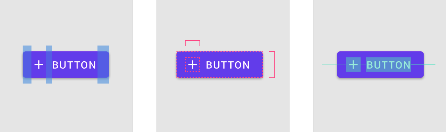
- Button with plus icon and padding
- Padding is the space between elements within a component.
- Dimensions describe the width and height of component elements.
- Alignment is the placement of elements within a component.
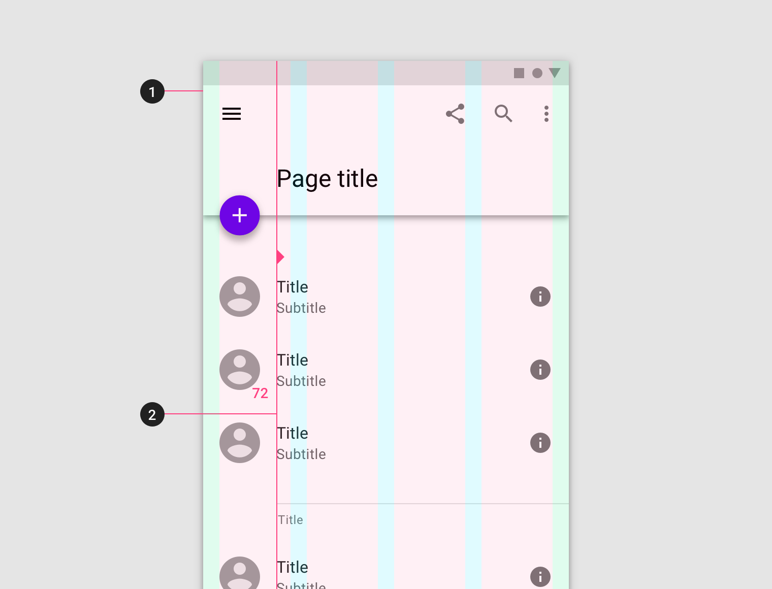
间距规范
填充是指UI元素之间的空间。填充是关键线的另一种间距方法,以8dp或4dp的增量进行度量。填充可以在垂直和水平方向上进行测量,不需要跨越布局的整个高度。
Padding refers to the space between UI elements. Padding is an alternative spacing method to keylines and is measured in increments of 8dp or 4dp.
Padding can be measured both vertically and horizontally and does not need to span the whole height of a layout.
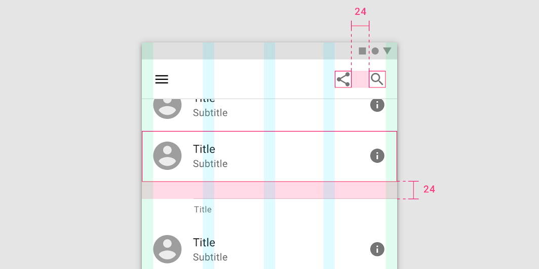
A layout with 24dp padding between components.
尺寸规范
尺寸包括元素的宽度与高度。
某些组件(例如应用程序栏或列表)仅需要概述元素的高度。这些元素的高度应与8dp网格对齐。这些组件的宽度与屏幕宽度有关,视屏幕而定。
Dimensions refer to the width and height of component elements.
Some components, such as an app bar or list, only outline the height of an element. The heights of these elements should align to the 8dp grid. Their widths are not specified because it’s responsive to a viewport width.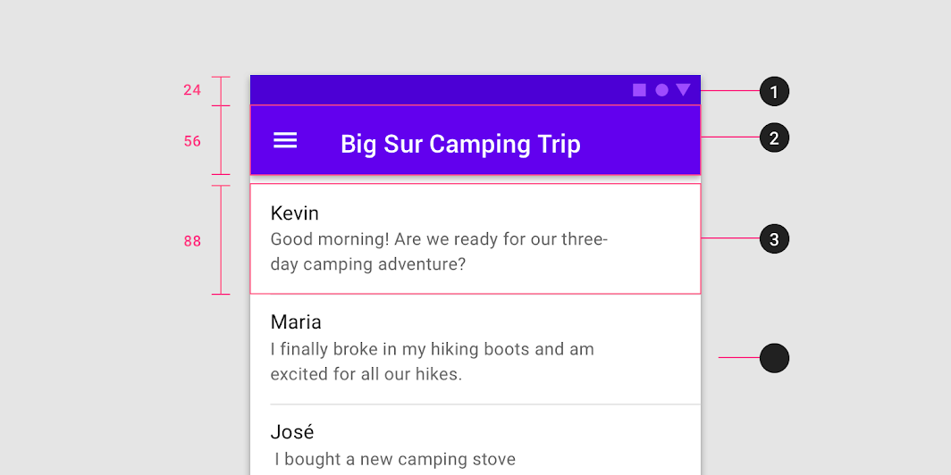
- Status bar height: 24dp
- App bar height: 56dp
- List item height: 88dp
对齐规范
对齐规范限制了是组件中元素的位置。
Alignment is the placement of elements within a component.
- 外边距
- 中间对齐
参考线
参考线 能够保证布局网络之外的元素位置能够保持一致。
它们是垂直的线条,用于辅助设计师放置不需要与网格对齐的元素。参考线的位置由元素与屏幕边缘的距离确定,并且以 8 dp 为增量进行测量。
参考线 应该与响应式布局网络结合使用,以便在整个设计中保证元素的位置统一。
Keylines are an alignment tool that enables consistent placement of elements outside of the layout grid. They are vertical lines that show where elements are placed when they don’t align to the grid. Keylines are determined by each element’s distance from the edge of the screen and are measured in increments of 8dp.
- 外边距
- 参考线
参考线 可以根据实际的产品需求调整,但是调整倍率必须是 8 的倍数。它们可以在每个断点范围内调整。
Keylines can create more or less space between elements in a layout. They are adjustable per breakpoint range.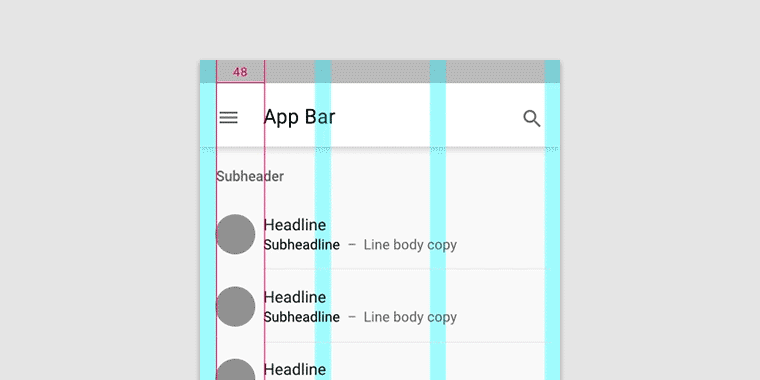
Keylines can expand or reduce the space between elements.
容器与比例
容器
容器是用来表示封闭区域的形状。
容器可以容纳各种UI元素,如图像,图标或表面。
A container is a shape used to represent an enclosed area. Containers can hold UI elements such as images, icons, or surfaces.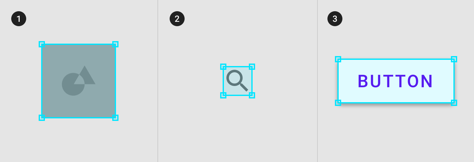
- 图片容器
- 图标容器
- 按钮容器
200%
- Image container
2. Icon container
3. Surface container
容器大小可以是固定,并限制其内部元素的大小或者对其进行裁剪。
或者,他们可以自适应内容的大小。
Containers can be rigid and restrict the size or cropping of elements within them. Alternatively, they can be flexible and grow to support the size of the content they hold.
1. Rigid image container that crops the original image size.
2. Flexible image container that scales to hold the original image size.
宽高比
宽高比是元素宽度与高度的比例。
要保持布局的一致性,请在图片、平面和屏幕大小等元素上使用一致的宽高比。
宽高比写为 宽度:高度。
建议在您的用户界面中使用以下宽高比:16:9、3:2、4:3、1:1、3:4和2:3。
An aspect ratio is the proportion of an element’s width to its height. Aspect ratios are written as width:height.
To maintain consistency in your layout, use a consistent aspect ratio on elements like images, surfaces, and screen size.
The following aspect ratios are recommended for use across your UI: 16:9; 3:2; 4:3; 1:1; 3:4; 2:3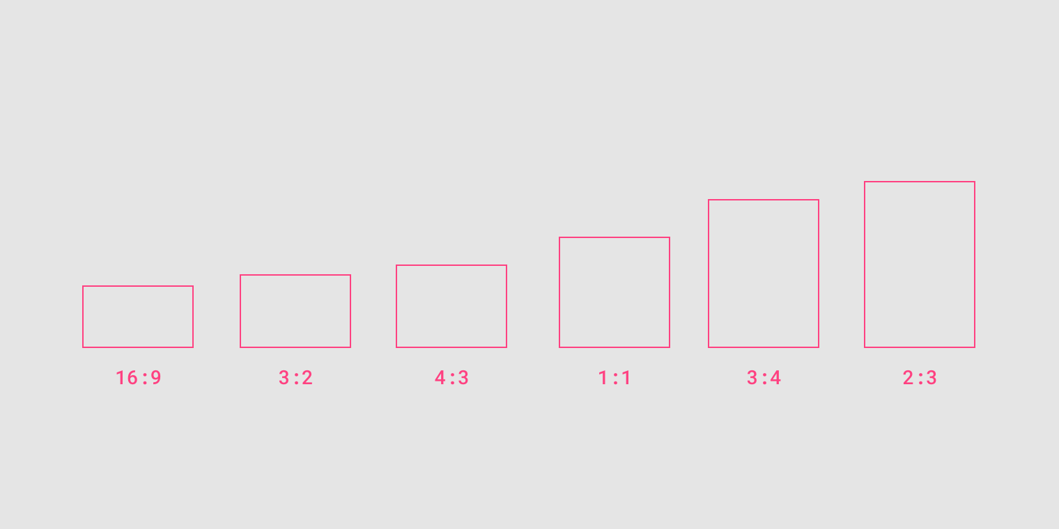
弹性比例
灵活的比例尺寸由布局网格确定:
- 容器宽度由屏幕布局决定,并调整大小以求空间利用的最大化;
- 容器高度由该容器中图像的高度决定的。
根据内容使用弹性比例来决定容器的高度。
Flexible ratio sizing is determined by the layout grid:
- Container width is determined by the screen layout and grows to fill the maximum space available
- Container height is determined by the height of the image in the container
Use a flexible ratio to allow content form determine the height of the container.
Container widths are determined by the column widths in the layout grid.
响应式裁剪
要响应式地显示图像,需要定义图像在不同断点范围内的裁剪方式。
在不同的断点范围内,可以进行以下几种方式的裁剪:
- 保持一个固定比例
- 适应不同的比例
- 固定图像高度
To display images responsively, define how an image will be cropped at different breakpoint ranges. At different breakpoint ranges cropping can:
- Maintain one fixed ratio
- Adapt to different ratios
- Fix image heights
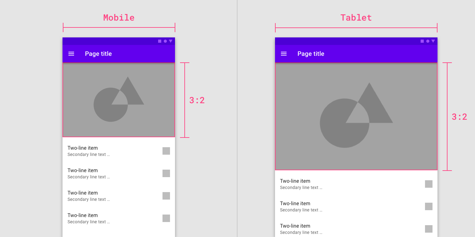
保持固定比例
图像大小可以在断点范围内保持一个固定比例。
下图中的界面改变断点范围之后,图像的比例仍为:3:2。
Image sizing can hold one fixed ratio across breakpoint ranges.
50%
The image in the UI maintains a 3:2 ratio between breakpoints.
自适应比例
图像根据不同的断点范围调整自己的比率。
下图中的界面改变断点范围之后,图像的比例从 1:1 变为 16:9。
Image ratios can change by adapting to different breakpoint ranges.

50%
The image ratio changes from 1:1 to 16:9 between breakpoints.
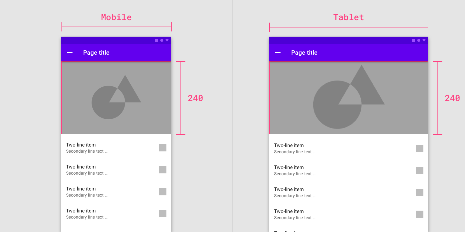
固定图片高度
图像大小可以在断点范围变化时,保持固定的高度,只改变宽度。
Image sizing can maintain a fixed height and fluid width across and within breakpoint ranges.
50%
The image maintains a fixed height while the width between breakpoints is fluid.
触摸 & 点击
触控点适用于能够触摸或非触摸输入的任何设备。
为了平衡信息密度和可用性,触摸目标应至少为48 x 48 dp,它们之间至少有8dp的空间。
Touch targets apply to any device that receives both touch and non-touch input. To balance information density and usability, touch targets should be at least 48 x 48 dp with at least 8dp of space between targets.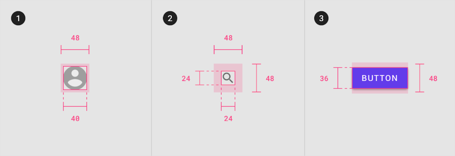
Touch target minimum of 48 x 48 dp

若有收获,就点个赞吧
0 人点赞
