质感设计的布局使用统一的元素与间距来保证跨平台、环境和屏幕尺寸的一致性。
Material Design layouts use uniform elements and spacing to encourage consistency across platforms, environments, and screen sizes.
原则
- 可预测性
用户界面符合大部分用户的使用习惯,使用直观且可预测的布局,具有一致的用户界面区域和空间组织。降低用户学习成本。
- 一贯
布局应该使用一致的网格,参考线和边距。
- 响应
Material 的布局是自适应的,并会对来自用户,设备和屏幕元素的输入做出反应。
Predictable
Use intuitive and predictable layouts with consistent UI regions and spatial organization.
Consistent
Layouts should use grids, keylines, and padding consistently.
Responsive
Layouts are adaptive. hey react to input from users, devices, and screen elements.
布局
Layout regions are the foundation for interactive experiences. They’re a layout’s building blocks and are composed of elements and components that share a similar function. Layout regions can also group smaller containers such as cards.
A large screen layout has three main regions:
- App bars
- Navigation
- Body
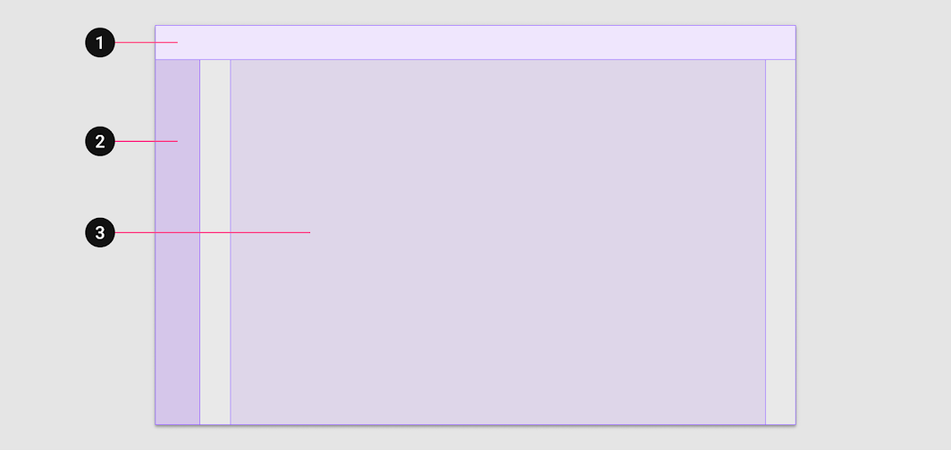
1. App bars 2. Navigation 3. Body
When creating a responsive layout system, it’s helpful to establish minimum and maximum dimensions for the body and margins, as well as scaling behavior that allows each region to adapt to different form factors. The following guidance describes Material’s baseline dimensions and behavior.
Body region
The body region is used for displaying most of the content in an app. It typically contains components such as lists, cards, buttons, and images.
The body region uses scaling values for three parameters:
- Vertical and horizontal dimensions
- Number of columns
- Margins
At extra small breakpoints margins have a value of 16dp. As the layout increases in size, the body section expands relative to the width of the screen. Upon reaching the first breakpoint (small; 600dp wide) the margin increases to 32dp.
When the width of the body reaches 840dp, margins increase to a maximum width of 200dp. After this maximum width is met, the body region once again becomes responsive, continuing to scale horizontally.
Responsive column grid
The responsive column grid is made up of columns, gutters, and margins, providing a convenient structure for the layout of elements within the body region. Components, imagery, and text align with the column grid to ensure a logical and consistent layout across screen sizes and orientations.
As the size of the body region grows or shrinks, the number of grid columns changes in response.
Recommended grid behavior for device breakpoints
| Screen size | Margin | Body | Layout columns |
|---|---|---|---|
| Extra-small (phone) | |||
| 0-599dp | 16dp | Fluid | 4 |
| Small (tablet) | |||
| 600-904 | 32dp | Fluid | 8 |
| 905-1239 | Fluid | 840dp | 12 |
| Medium (laptop) | |||
| 1240-1439 | 200dp | Fluid | 12 |
| Large (desktop) | |||
| 1440+ | Fluid | 1040 | 12 |
Learn more about the responsive layout grid.
Navigation region
The navigation region holds navigational components and elements such as the navigation drawer or navigation rail. It helps users navigate between destinations in an app or to access important actions. The navigation region maintains a consistent width of 256dp when expanded; it is 72dp when collapsed.
If the layout’s margin is less than 48dp (screen widths between 600dp and 839dp, for example) the width of the body region can decrease size to accommodate the navigation region.
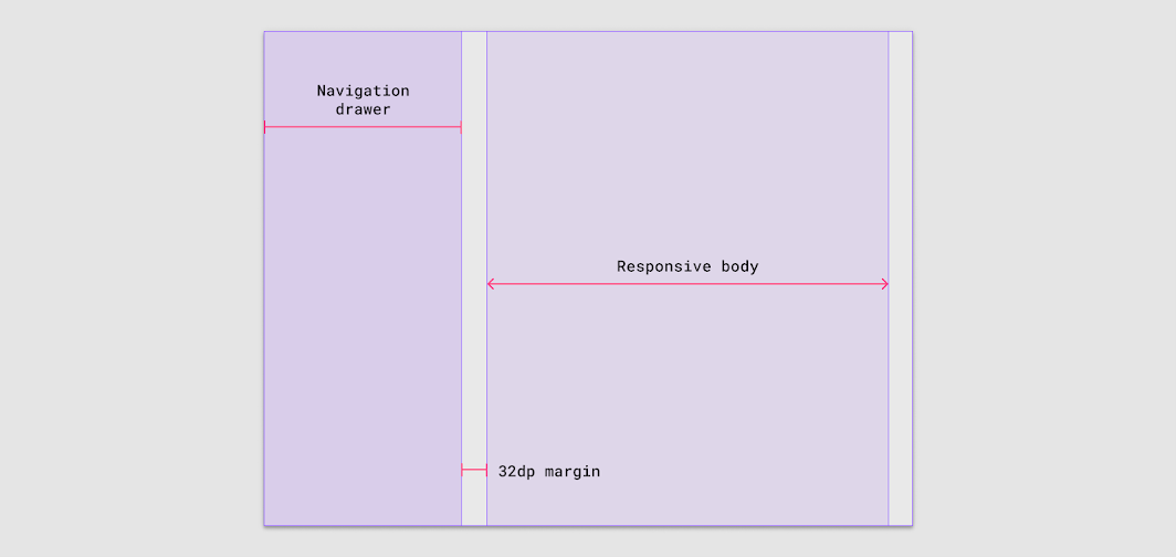
When using a navigation drawer, the body region can be compressed to accommodate the navigation region
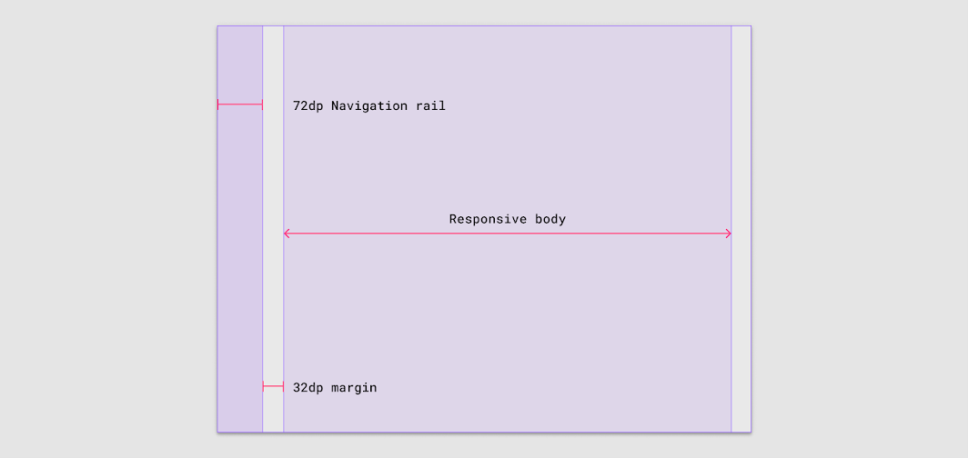
The navigation region in its collapsed (72dp) state can use a navigation rail.
If the screen width is below 600dp, a modal navigation drawer can fill the navigation region. The drawer appears elevated above the body region.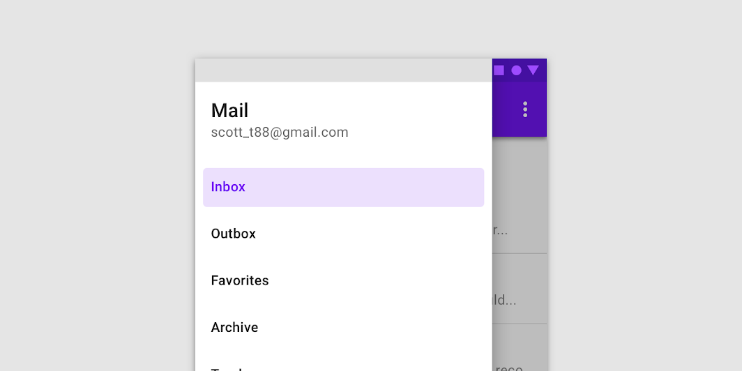
App bar
The app bar is used to display and group components and actions that help users perform primary actions, or take action on elements in the body region.
Composition
Visual grouping
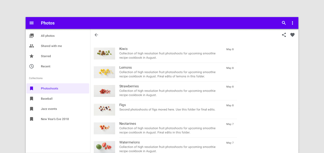
The first step to creating order in a layout is visual grouping. Elements in a layout that have similar content or functionality can be grouped together and separated from other elements using open space, typography, and dividers.

Typography and white space separate the items in a simple image list.
Containment
Following the visual grouping, the next group to consider is any element that is related through shared context, such as an image and its caption or supporting information. These contextually related elements can be grouped using the concept of containment.
Containment works through creating boundaries between groups.
Method 1: Implicit containment means reducing the open space around related elements by drawing them closer together. At the same time, the space outside of this grouping is increased to create a distinct conceptual boundary.
Method 2: Alternatively, explicit containment can be created by adding an outline or elevation level to a group of related elements. For example, creating a card from an image and its caption or supporting text makes the two elements more defined as a group through the card’s elevated boundary.
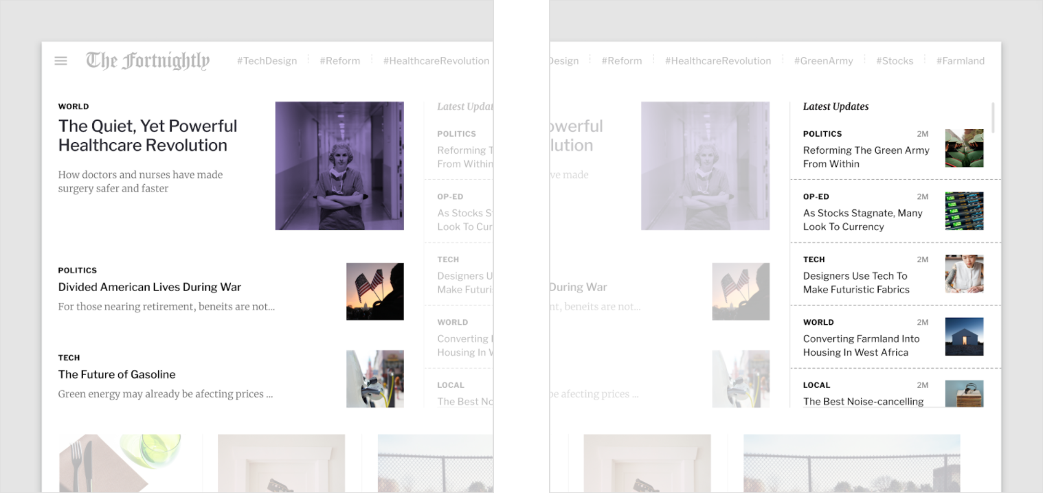
In Fortnightly, implicit containment is achieved through spacing.
In Fortnightly, explicit containment is achieved through use of boundaries such as dividing lines.
When composing elements or components that contain text, ensure that each container uses responsive dimensions so that text can easily scale and remain readable.
Scaling with text
The ideal line length for text is 40-60 characters. This maintains readability when scaling elements, such as cards, that contain text. When elements contain text, margins and typographic properties should be responsive to ensure that lines of text don’t extend too long in a horizontal layout.
When longer line lengths are necessary, consider adjusting the line height to improve readability.
After reaching the maximum line length, typography can help improve readability.
Anchors and constraints
When scaling components or layout containers, consider how their position and alignment should scale. Internal elements can be anchored to the left, right, or center as a parent container scales. Internal elements can also maintain fixed positions, for example in the case of a floating action button or navigation drawer.
A component’s internal composition should accommodate the ergonomic needs of the device on which it appears. For example, a horizontally-oriented card on mobile can adapt to a more square-shaped card on larger screens. This change lends more prominence to imagery and allows for larger type styles to enhance readability. In the case of an icon button, the icon and text label within the button can remain anchored to each other, remaining centered within the button as it scales horizontally.
Material measurements
质感设计的布局在视觉上是平衡的。
大多数组件的尺寸能够以 8dp 为单位的网格进行对齐,基本上能够让间距保持一致。小的组件,如文本、图标则需要以 4dp 为单位的网格进行对齐。
To ensure that Material Design layouts are visually balanced, most measurements align to 8dp, which corresponds to both spacing and the overall layout. Components are sized in 8dp increments, ensuring a consistent visual rhythm across each screen.
Smaller elements, such as icons, can align to a 4dp grid, while typography can fall on a 4dp baseline grid, meaning that each line’s typographic baseline is spaced in increments of 4dp from its neighbor.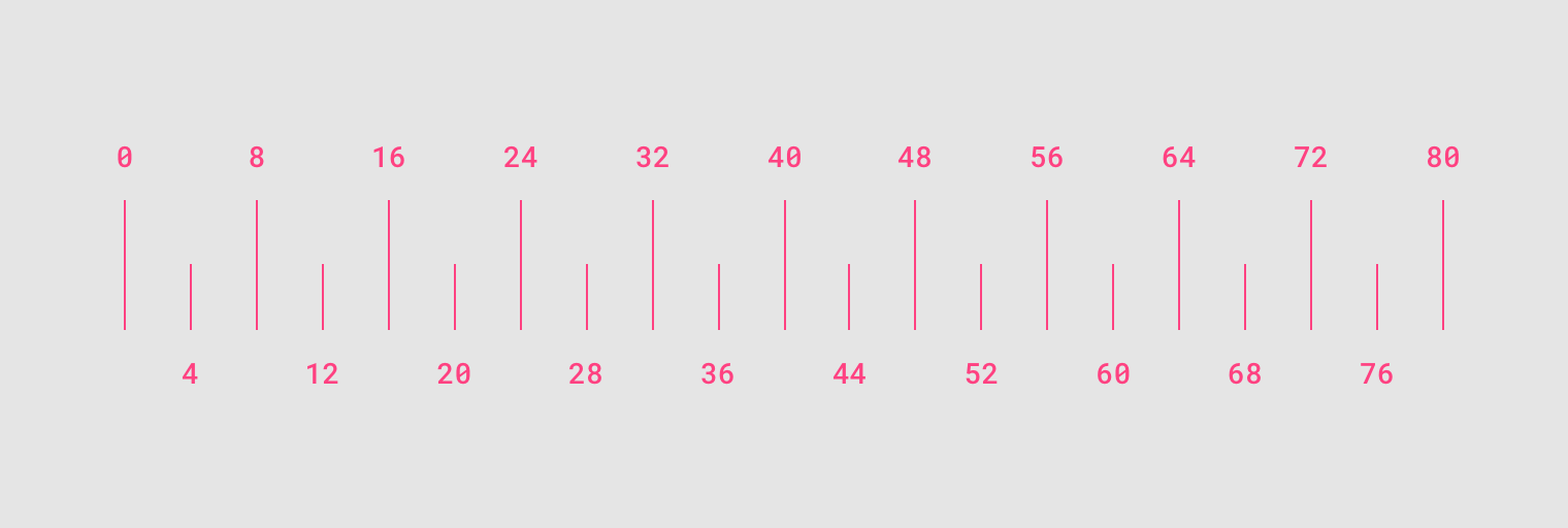
8dp and 4dp units
资源
The Material Design Kit on Figma includes templates for working with the breakpoint, column grid, and margin guidance described above.
To get started, download it from Material Design community page.

若有收获,就点个赞吧
0 人点赞
