Sliders allow users to make selections from a range of values.
Usage
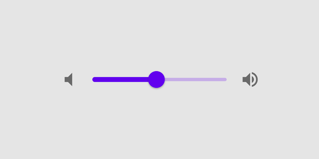
Sliders allow users to view and select a value (or range) from the range along a bar. They’re ideal for adjusting settings such as volume and brightness, or for applying image filters.
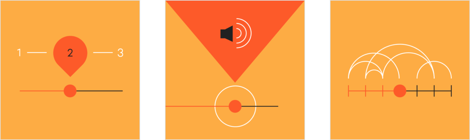
Sliders can use icons on both ends of the bar to represent a numeric or relative scale. The range of values or the nature of the values, such as volume change, can be communicated with icons.
Immediate effects
Changes made with sliders are immediate, allowing the user to make slider adjustments while determining a selection. Sliders shouldn’t be used to adjust settings with any delay in providing user feedback.
Current state
Sliders reflect the current state of the settings they control.
Top: A continuous slider; Bottom: A discrete slider

Principles
Adjustable
Sliders should be used for making selections from a range of values.
Immediate
When interacting with a slider, changes should be reflected back to a user immediately.
Accessible
Sliders should present the full range of choices that are available to a user.
Values
Editable numeric values
Editable numeric values allow users to set the exact value of a slider.
Upon pressing the slider thumb or the value indicator text field, the input becomes editable for text entry. Upon entry, the thumb position is updated immediately to match any change in value. Note that editable values are not part of the component’s default behavior, but is a feature you can develop. Our usability research supports that this feature can make sliders easier to use in some cases.
Order of values
For languages that are displayed from left-to-right, such as English, the smallest value for the range appears on the left and the largest value appears on the right.
For right-to-left languages, like Arabic, the value position should be reversed, placing the largest value on the left, and the smallest on the right.
A slider with editable numeric values

Types
Continuous sliders
Continuous sliders allow users to set and select a value along a subjective range.
Continuous slider

Discrete sliders
Discrete sliders can be adjusted to a specific value by referencing its value indicator.
Allowed selections may be organized and indicated with tick marks that a slider thumb will snap to.
Discrete slider

Anatomy

A slider can contain the following elements:
1. Track
The track shows the range that is available for a user to select from. For left-to-right (LTR) languages, the smallest value appears on the far left end of the track and the largest value is on the far right. For right-to-left (RTL) languages this orientation is reversed.
2. Thumb
The thumb is a position indicator that can be moved along the track, displaying the selected value of its position.
3. Value label (optional)
A value label displays the specific numeric value that corresponds with the thumb’s placement.
4. Tick mark (optional)
Tick marks along a track represent predetermined values that the user can move the slider to.
Continuous sliders
Continuous sliders allow users to make selections that don’t require a specific value.
Behavior
 Click and drag
This continuous slider is controlled by clicking the thumb and dragging it.
Click jump
This continuous slider is controlled by clicking the track.
Click and arrow
This continuous slider is controlled by clicking the thumb, then using arrow keys to move it.
Tab and arrow
This continuous slider is controlled by using the tab key to select the thumb of the desired slider, then using arrow keys to move it.
States
Continuous sliders reflect state changes through the thumb ripple. When disabled, both the thumb and track change to reflect the state.
Slider states

Discrete sliders
Discrete sliders display a numeric value label upon pressing the thumb, allowing users to input an exact value.
Behavior
Click and drag
This discrete slider is controlled by clicking the thumb and dragging it.
Click jump
This discrete slider is controlled by clicking the track.
Click and arrow
This discrete slider is controlled by clicking the thumb, then using arrow keys to move it.
Tab and arrow
This discrete slider is controlled by using the tab key to select the thumb of the desired slider, then arrow keys to move it.
Tick marks (Optional)
Discrete sliders can use evenly spaced tick marks along the slider track, and the thumb will snap to them. Each tick mark should change the setting in increments that are discernible to the user.
Value entry field (Optional)
Value entry fields become editable after selecting the thumb or entry field. After a text entry is made, the slider position automatically updates to reflect the new value.
States
Discrete sliders reflect state changes through the thumb ripple. When disabled, both the thumb and track change to reflect the state.
Discrete slider states

Theming
Crane Material Theme
This travel app’s sliders have been customized using Material Theming. One area of customization includes color.
Crane’s customized sliders

Color
Crane’s sliders use custom color on three elements: the active track, inactive track, and thumb.

| Element | Category | Attribute | Value |
|---|---|---|---|
| Active track, thumb | Secondary | Color Opacity |
#E30425 100% |
| Inactive track | Secondary | Color Opacity |
#E30425 38% |
Specs
Continuous sliders
Active track: 6dp height
Inactive track: 4dp height
Thumb radius: 20 dp

Discrete sliders
Active track: 6dp height
Inactive track: 4dp height
Thumb radius: 20dp
Discrete regions of the track: 2dp radius circles


若有收获,就点个赞吧
0 人点赞
