“帮助 & 反馈”中的内容通过用户研究预设了用户可能会遇到的问题以及相应的答案。
Help content provides answers to user questions and concerns.
用法 & 位置
用法
“帮助 & 反馈”中的内容通过用户研究预设了用户可能会遇到的问题以及相应的答案。用户可以提交评论,报告错误以及提出帮助内容尚未收录的问题。
Help content provides answers to common questions about your app. Users can submit comments, report bugs, and ask questions that are not already answered by the help content.
常见位置
“帮助 & 反馈”应易于查找,设计者可以将“帮助 & 反馈”放在导航组件中。
它通常显示在导航抽屉或溢出菜单中的“帮助”或“反馈”标签下。
Help content should be easy for users to find. It can be placed in various points in your navigation. It usually appears in a navigation drawer or overflow menu under the label “Help” or “Send feedback.”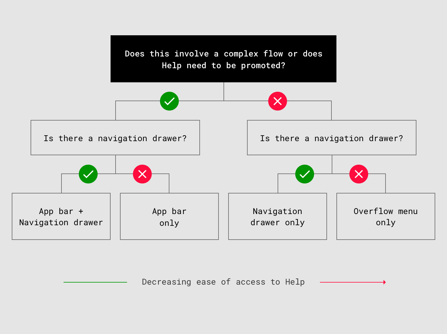
“帮助 & 反馈”的位置与应用复杂性之间的关系:
- 复杂应用,可以在导航抽屉和应用栏中都放置一个指向“帮助 & 反馈”的链接(增加入口,降低用户的时间成本)。
- 简单应用,则仅需要将“帮助”放在导航抽屉或溢出菜单中。
It is easier to find Help content in both the navigation drawer and app bar or only in the app bar. It is less easy to find Help content when it is only in the navigation drawer or overflow menu.
- If your app is complex and has a navigation drawer, place a link to “Help” both in the navigation drawer and the app bar.
- If your app is complex and does not have a navigation drawer, place a link to “Help” in the app bar.
- If your app is not complex, place “Help” in a navigation drawer or overflow menu only.
抽屉导航(侧边栏)
“帮助” 应该是抽屉导航中的最后一项,其上方是“反馈”。
“Help” should be the last item in the navigation drawer, with “Send feedback” directly above it.
Anytime “Sign out” appears in a navigation drawer, it should be the last item in the list.
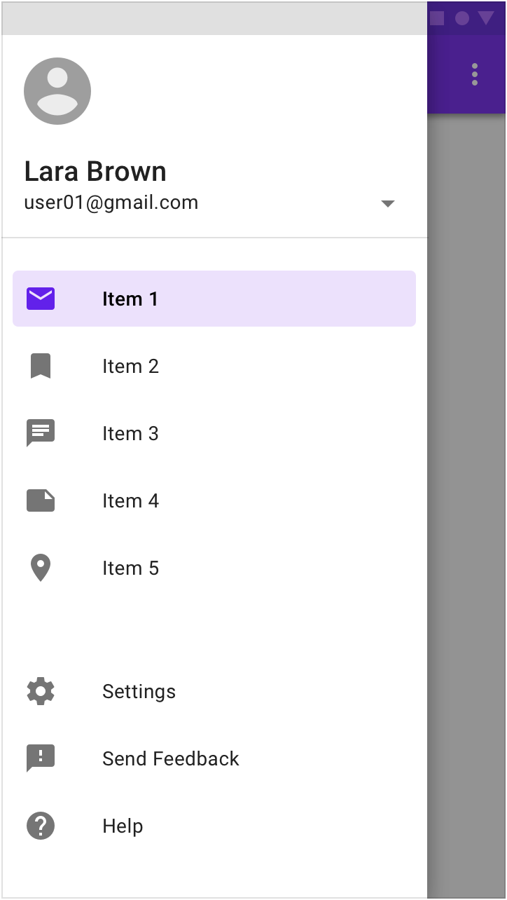
导航抽屉显示“帮助”和“发送反馈”。
溢出菜单
没有导航抽屉时,可以在溢出菜单中放置“帮助 & 反馈(或“发送反馈”)”。
“Help” and “Feedback” (or “Send feedback”) should be placed in the overflow menu when there is no navigation drawer.
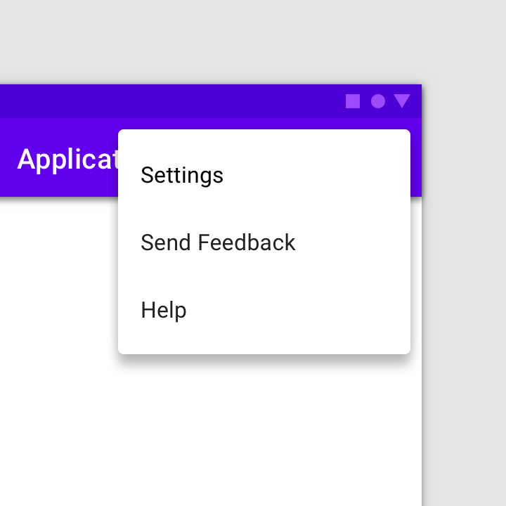
在溢出菜单中添加“帮助 & 反馈”。
应用栏
若针对当前页面的内容需要提供帮助,例如“付款或退款”,请在应用栏添加一个“帮助”图标(若空间不够,可以隐藏在“更多”中)。
To provide help for urgent issues, such as payments and refunds, place a Help icon in the app bar. Desktop apps may also place a Help icon in the app bar, as there is more space in the desktop UI.

应用栏中单独放置的“帮助”图标。
“帮助”页面
“帮助”页面中可以提供“发送反馈”按钮,供用户报告问题或发送评论。
较少查看的内容(例如“关于”,“隐私”和“服务条款”)可以放在溢出菜单中。
The help screen can include a “Send feedback” button for users to report issues or send comments.
Content viewed less often (such as “About,” “Privacy,” and “Terms of service”) may be placed in an action overflow menu.

“帮助”页面包括常见问题和解答以及发送反馈的操作按钮。
图标
帮助
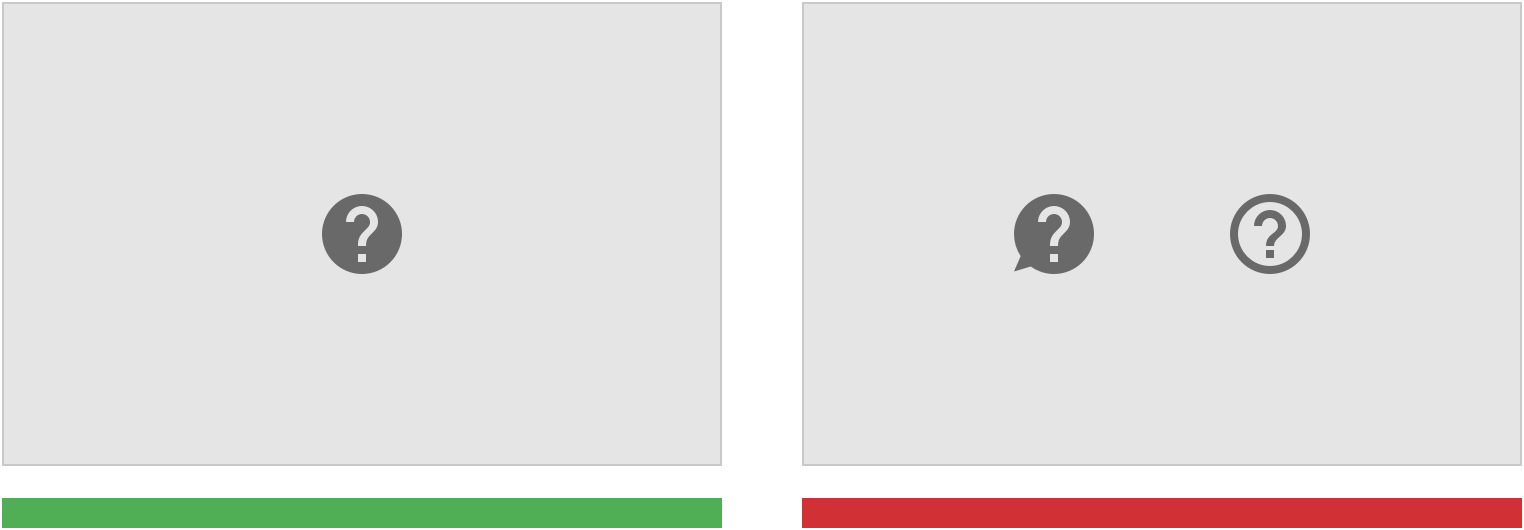
To indicate Help content, use the icon for Help.
错误:请勿使用图标变体,例如带有气泡或轮廓的图标。
Don’t
Don’t use icon variations, such as those with speech bubbles or outlines.
发送反馈
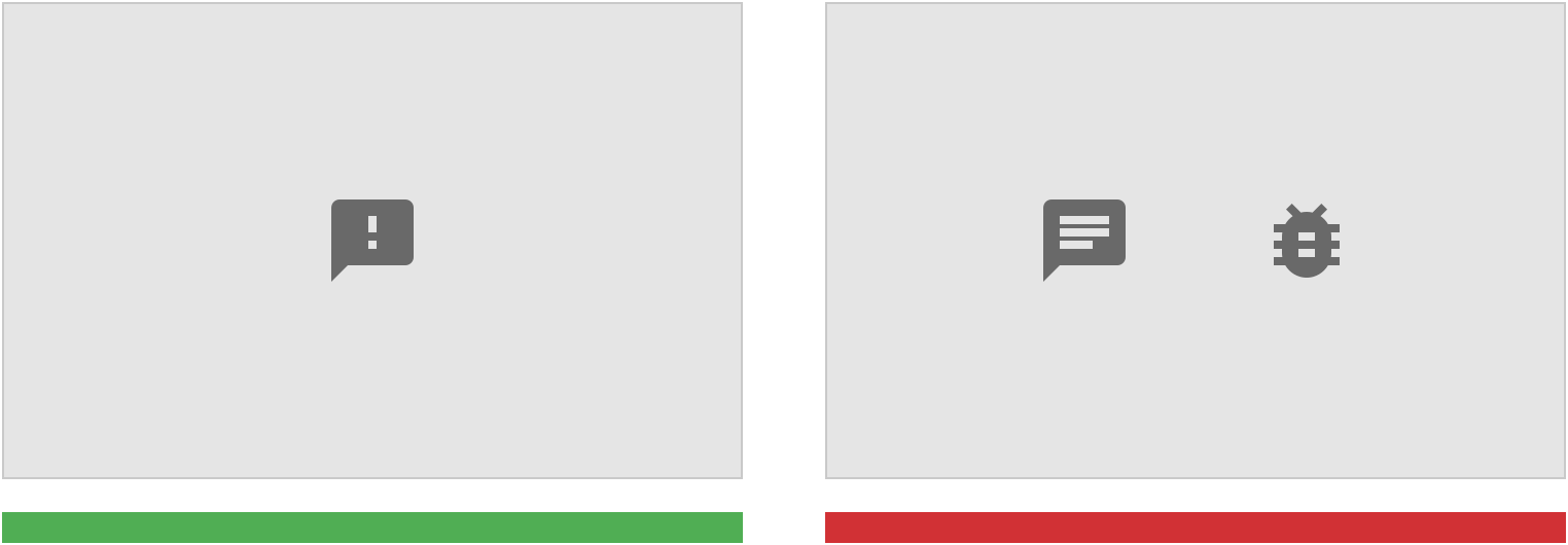
正确:要指示用户可以在何处发送反馈。
To indicate where users can send feedback, use the Material Design icon for feedback.
错误:请勿使用图标变体,例如带有气泡或轮廓的图标。
Don’t
Don’t use icon variations, such as chat or bug icons.
帮助工具提示
当简短描述可以帮助用户理解当前语境时,设计者可以提供“帮助工具提示”按钮。
用户通过悬停或单击的操作来查看辅助文本。
When a brief description can help provide context, you can display a help tooltip. Help icons provide helper text on hover, tap, or click.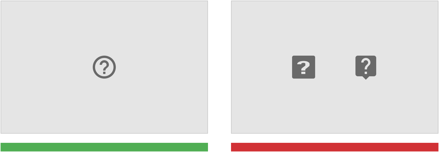
正确:表示有帮助工具提示。
To indicate a help tooltip is available, use the Material Design Help outline icon.
错误:请勿使用图标变体,例如带有气泡或轮廓的图标。
Don’t
Don’t use icon variations or icons with speech bubbles or outlines.
文法
易于阅读
通过使用不同层级的标题、列表、表格以及段落之间的空格来规范文本,使内容层级清晰,易于阅读。
引用用户需要交互的元素(例如:按钮或链接)时,可以在引用时加粗高亮显示。
Make content clear and easy to scan by formatting text with bold headings, lists, tables, and space between paragraphs.
When referring to elements that users need to select, such as buttons or links, you can bold their names when referring to them.
标题有助于组织文章的内容,根据它们用户能够快速找到自己所需要的内容。
Headings help organize an article’s content. They help readers scan the page to quickly find the information they need.
提供关键信息
提供的问题描述或解答要简明扼要。
Keep explanations as short as possible, without giving details that aren’t relevant to typical usage.
使用简单的语言
尽可能避免在帮助内容中使用专业术语。
Avoid using technical terms in help content where possible.
显示图片
提供分步说明时,请显示相关图像或图标以说明用户需要做什么。
When providing step-by-step instructions, show relevant images or icons to explain what the user needs to do.

若有收获,就点个赞吧
0 人点赞
