Date pickers let users select a date, or a range of dates.
Usage
Date pickers let users select a date or range of dates. They should be suitable for the context in which they appear.
Date pickers can be embedded into:
- Dialogs on mobile
- Text field dropdowns on desktop
Principles
Relevant
Date pickers can display past, present, or future dates – as relevant to the task.
Clear
Clearly indicate important dates, such as current and selected days.
Intuitive
To ensure picking a day or time is intuitive, use common picker patterns, such as a calendar.
解析
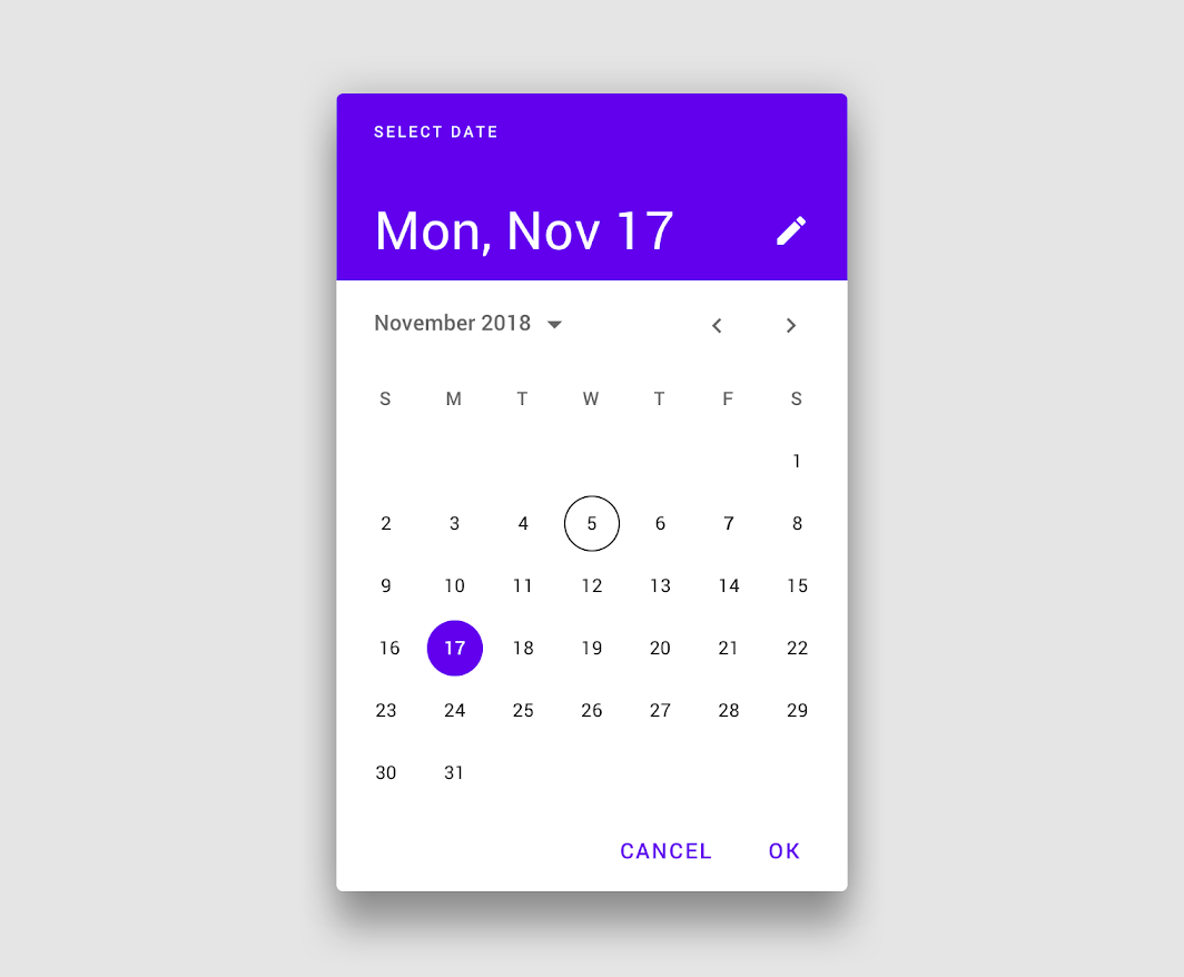
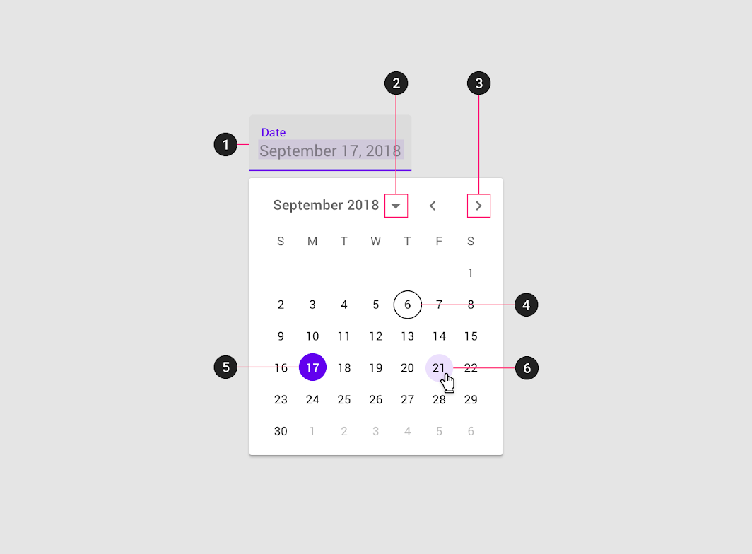
Mobile calendar date picker
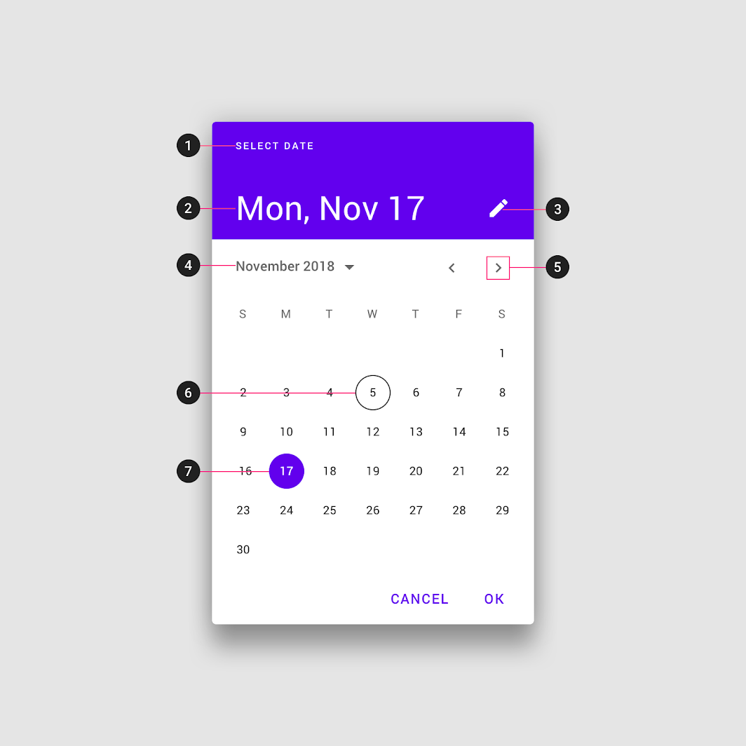
- Title
- Selected date
- Switch-to-keyboard input icon
- Year selection menu
- Month pagination
- Current date
- Selected date
Mobile date range picker
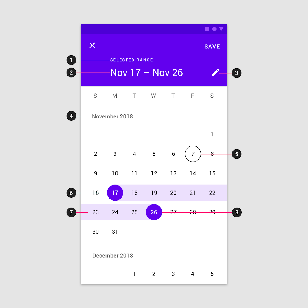
- Title
- Selected date range
- Switch to keyboard input icon
- Month and year label
- Current date
- Start date
- Selected range
- End date
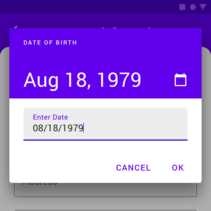
Mobile input picker
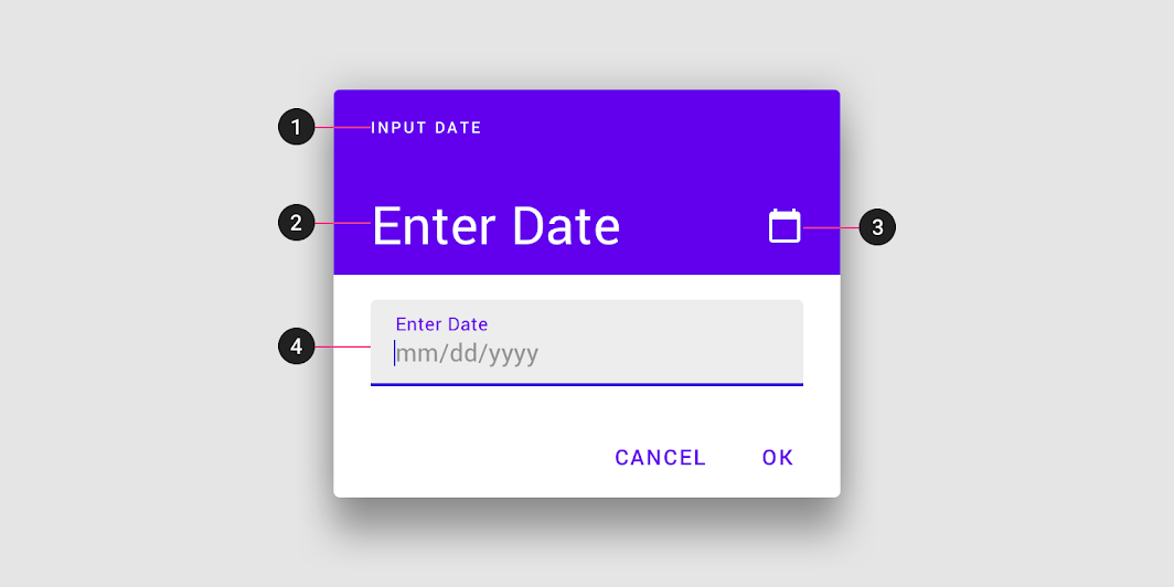
- Title
- Selected date
- Switch-to-calendar view icon
- Text field
Desktop date picker
- Text field
- Year and month selection
- Month pagination
- Today’s date
- Selected day
- Hover state
Mobile pickers
Mobile calendar pickers
Usage
Mobile calendar pickers can be used to select dates in the near future or past, when it’s useful to see them in a calendar month format. They are displayed in a dialog.
Common use cases include:
- Making a restaurant reservation
- Scheduling a meeting
They aren’t ideal for selecting dates in the distant past or future that require more navigation, such as entering a birth date or expiration date.
Mobile calendar pickers allow selection of a single date and year.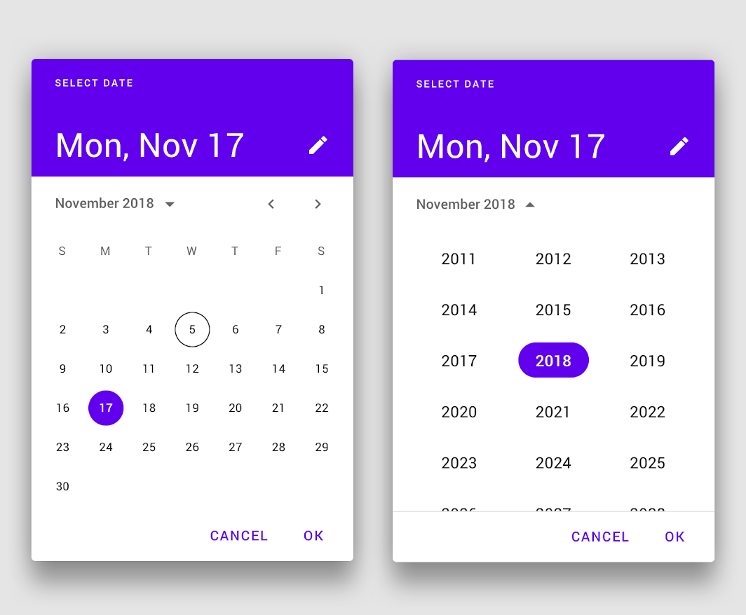
Mobile calendar picker

Do
Maintain 16dp left and right padding from the edge of the screen. The top and bottom of the picker should be vertically centered in the screen.

Don’t
Don’t use more than 16dp from the left and right screen edges, as it creates smaller touch targets.
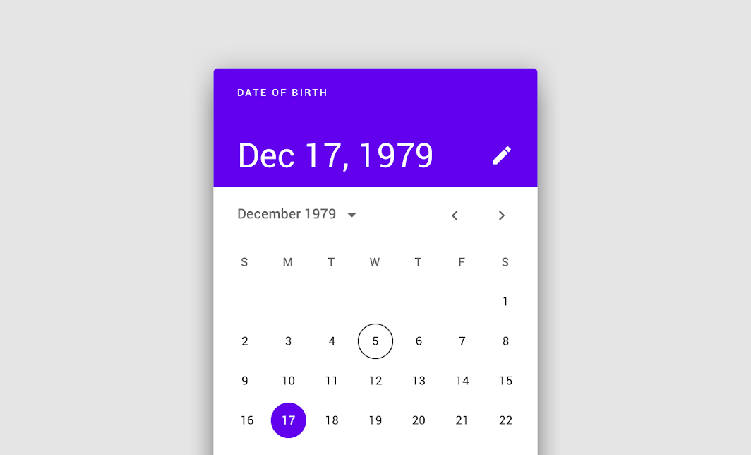

Don’t
Don’t use a calendar picker to prompt for dates in the distant past or future, such as a date of birth. In these cases, use a mobile input picker or a text field instead.
Behavior
Mobile calendar pickers navigate across dates in several ways:
- To navigate across months, swipe horizontally
- To navigate across years, scroll vertically
- To access the year picker, tap the year
 Horizontal swiping lets the user navigate across months.
Tapping the year menu accesses the year picker. Scrolling vertically navigates across years.
Mobile calendar pickers adapt to a device’s orientation.
Mobile date range pickers
Usage
Mobile date range pickers allow selection of a range of dates. They cover the entire screen.
Common use cases include:
- Booking a flight
- Reserving a hotel
Mobile date range picker
Behavior
Mobile date range pickers navigate across dates in several ways:
- To select a range of dates, tap the start and end dates on the calendar
- To navigate across months, scroll vertically
Select a range of dates with the date range picker.
Scroll vertically to access different months.
Mobile date input pickers
Usage
Mobile date input pickers allow the manual entry of dates using the numbers on a keyboard. Users can input a date or a range of dates in a dialog.
Mobile date input picker
Mobile date input pickers allow for keyboard input to select a date or range of dates.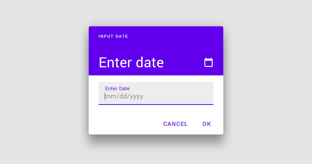
Mobile date input picker

Do
For dates that don’t require a calendar view, make the mobile date input picker as the default prompt.

Do
Alternatively, a text field with appropriate hint text can prompt for dates, such as in a form.
Behavior
The mobile date input picker can be accessed from any other mobile date picker, via the edit icon.
Switching from a mobile calendar picker to a mobile date input picker
Switching from a mobile date range picker to a mobile date input picker
Desktop pickers
Desktop date pickers
Usage
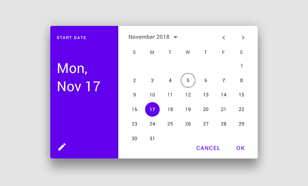
Desktop date pickers allow the selection of a specific date and year. The desktop date picker displays a date input field by default, and a dropdown calendar appears when the user taps on the input field. The user can interact with either form of date entry.
Desktop date pickers are ideal for navigating dates in both the near future (or past) and the distant future (or past), as they provide multiple ways to select dates.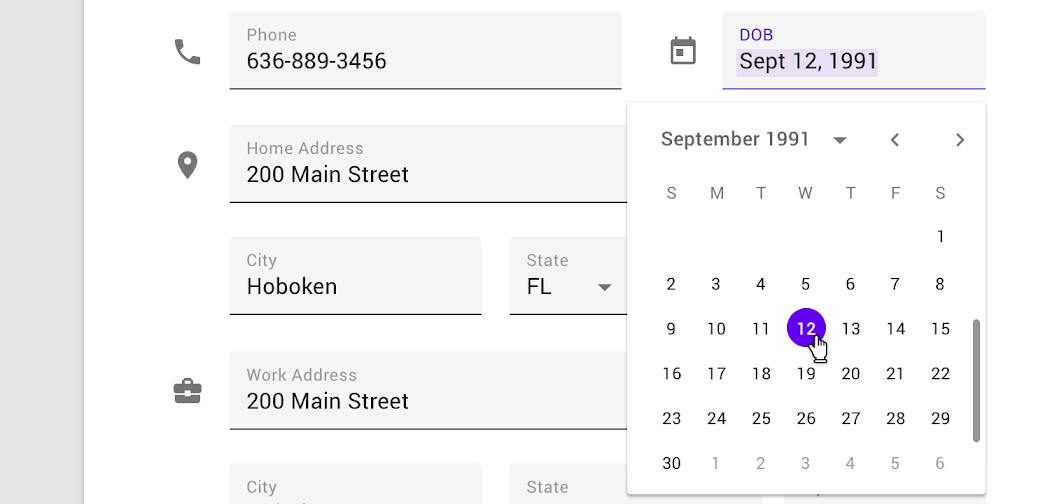
Desktop date picker
Behavior
Users can input dates either using a keyboard or by navigating the calendar UI; both options are immediately available when the desktop date picker is accessed.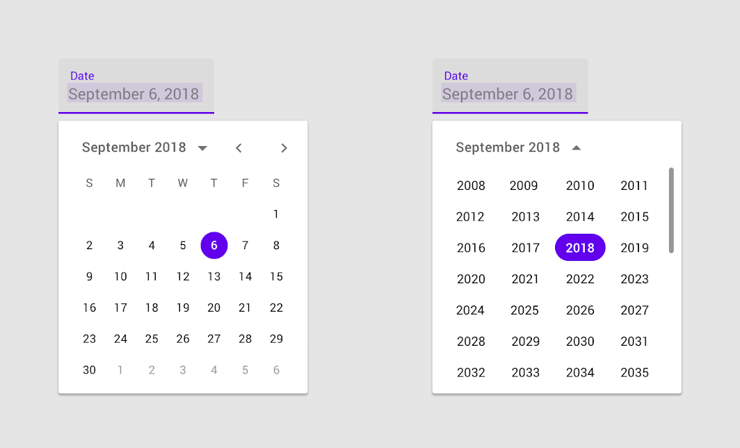
Desktop date picker
Navigate through months by tapping the back and next arrows.
Navigate through years by tapping the dropdown.
Desktop date range pickers
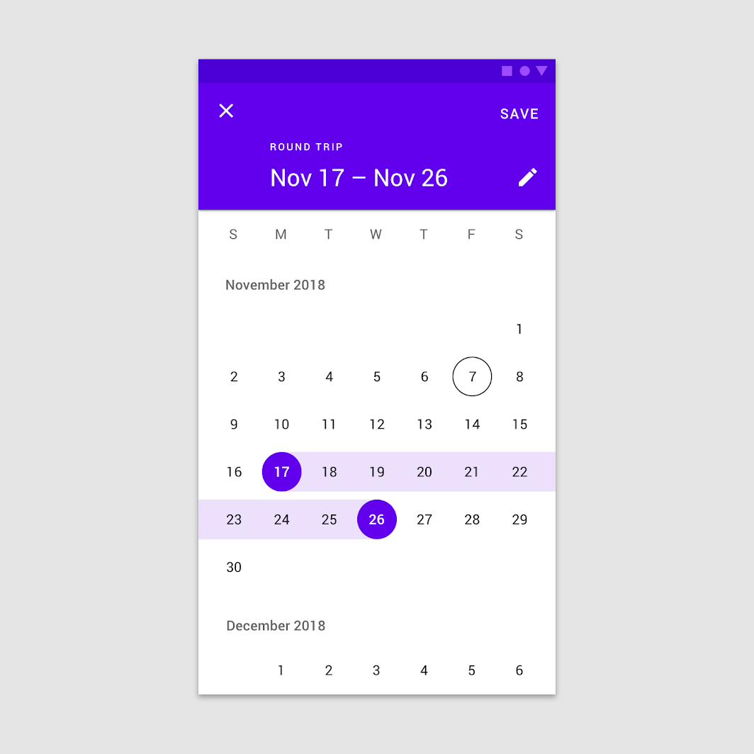
Desktop date range pickers allow a range of days to be selected. They display both calendar and date input fields.
Desktop date range pickers select ranges of dates. The text field reflects the calendar dates selected.
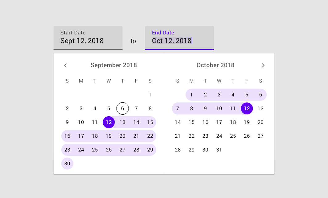
Desktop date range picker

Do
Use hover states to preview a user’s selection.

Don’t
Don’t use the same style for hover and selected states.
Tooltips can help explain how to use date picker controls.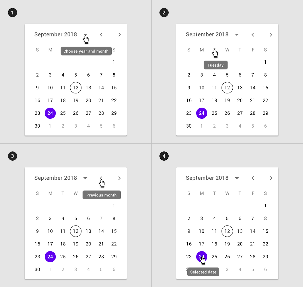
- Tooltip used on month and year selector
- Tooltip on day selector
- Tooltip used on month pagination control
- Tooltip used on selected date
主题
Crane
Pickers can be customized to express your brand identity by altering their layout, typography, shape, color, and motion.
- Layout
- Typography
- Shape
- Color
- Motion
Color
Color can be used to create bold visual moments in a picker.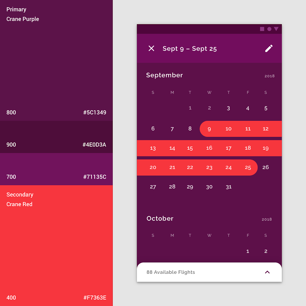
This date range picker users Crane’s brand colors.
Shape
The shape indicating selection can be customized to match the degree of boldness desired, or align to a specific style.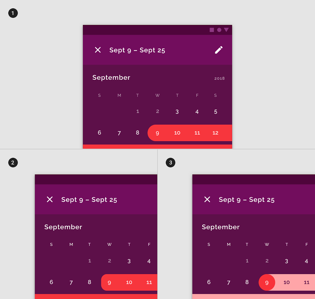
- A custom color and shape for selected dates
- The rectilinear custom shape
- A rounded style for start and end dates and a different color for the dates in between the start and end dates help distinguish the selected period.
Layout
Date pickers span the full width of the screen.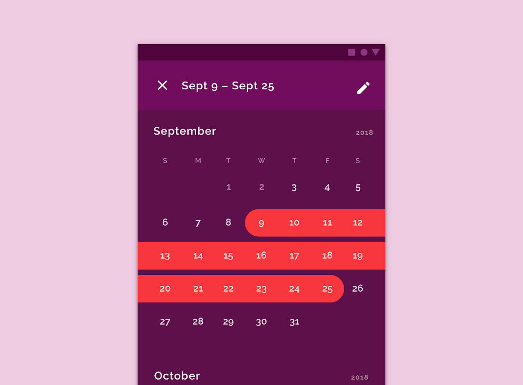
A date picker with customized layout, shape, color, and typography
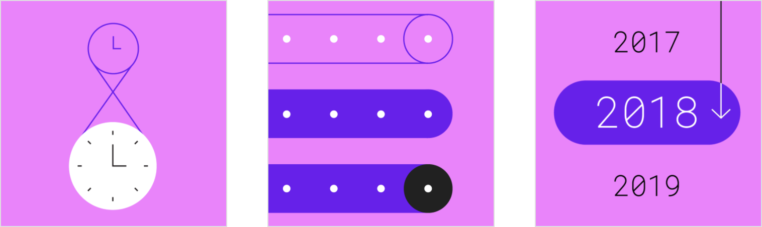
动效
Stretch is used on the selection indicator.
Specs
Accessibility
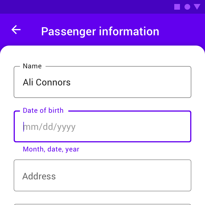
On mobile, a date picker should allow users to enter dates manually by inputting text, without using the picker. This interaction allows multiple input methods and makes it accessible to those using assistive technology.
- On desktop, the text field can be used for input.
- On mobile, the input picker should be available from the calendar pickers via the edit icon.
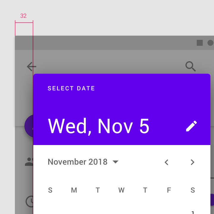
Touch targets
Touch targets for mobile date pickers should be as large as possible, filling the available space. The minimum touch target size for a date picker is 32 x 32dp.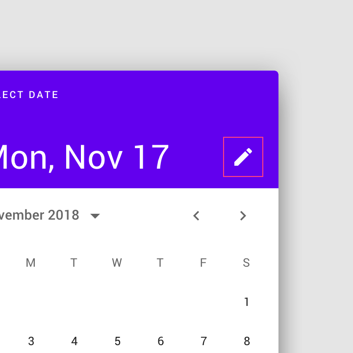
The edit icon indicates the ability to switch to the mobile input picker.
On the mobile date range picker, touch targets are maximized at 48 x 48dp.
Mobile calendar picker
Calendar header
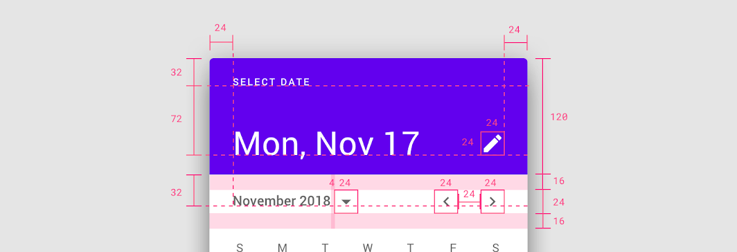
The mobile calendar picker is a standard dialog.
Padding
• Left and right: 24dp
• Menu bar top and bottom: 16dp
• Between month name and button: 4dp
• Between month pagination: 24dp
Baseline heights
• First baseline: 32dp from top
• Second baseline: 72dp from first baseline
• Third baseline: 32 dp from bottom of header
Element size
• Edit icon: 24 x 24dp
• Month dropdown button: 24 x 24dp
• Month pagination: 24 x 24dp
Calendar view
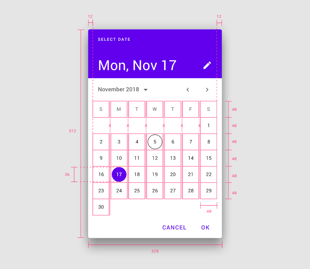
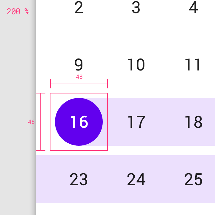
• Dimensions: 328 x 512dp
• Left and right padding: 12dp
• Date bounding box: 40 x 40dp
• Selected date: 36 x 36dp
• Padding between dates: 4dp
Year selection view
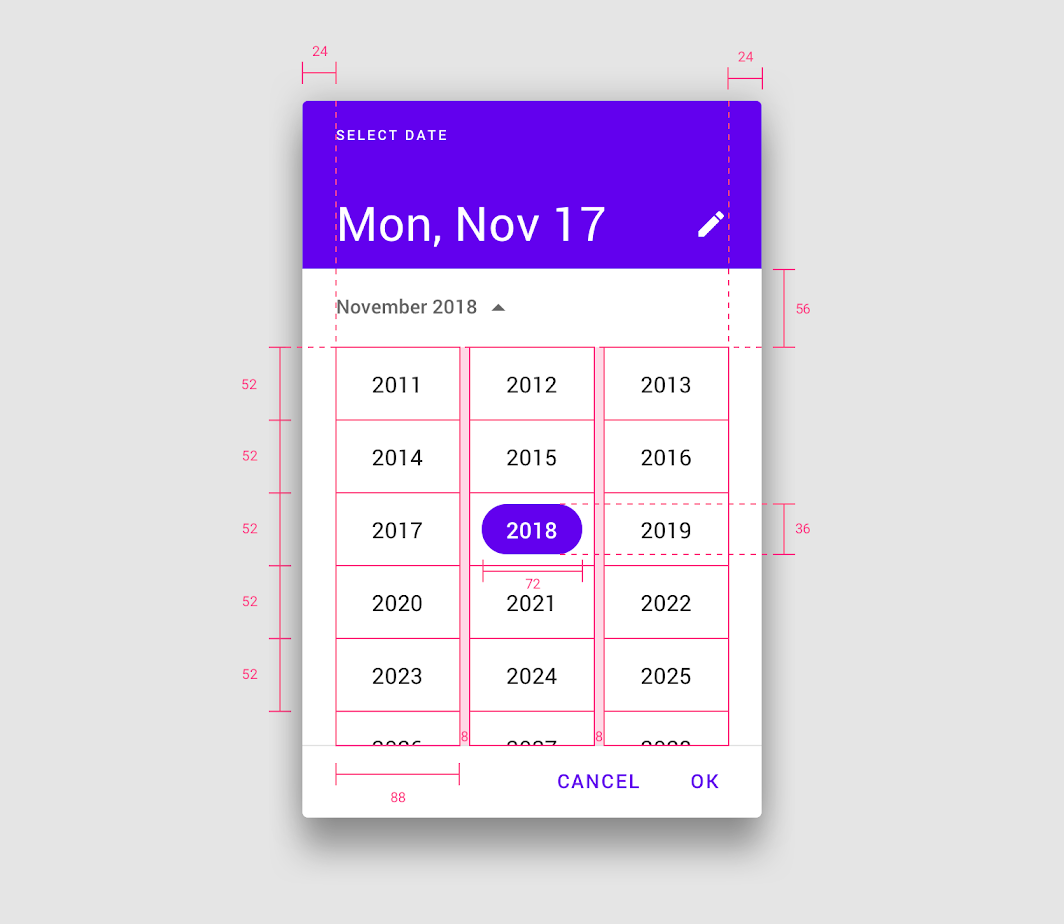
The mobile calendar picker contains an exposed dropdown menu that enables year selection.
• Left and right margins: 24dp
• Year bounding box: 88 x 52 dp
• Selected year: 72 x 36dp
Mobile range picker
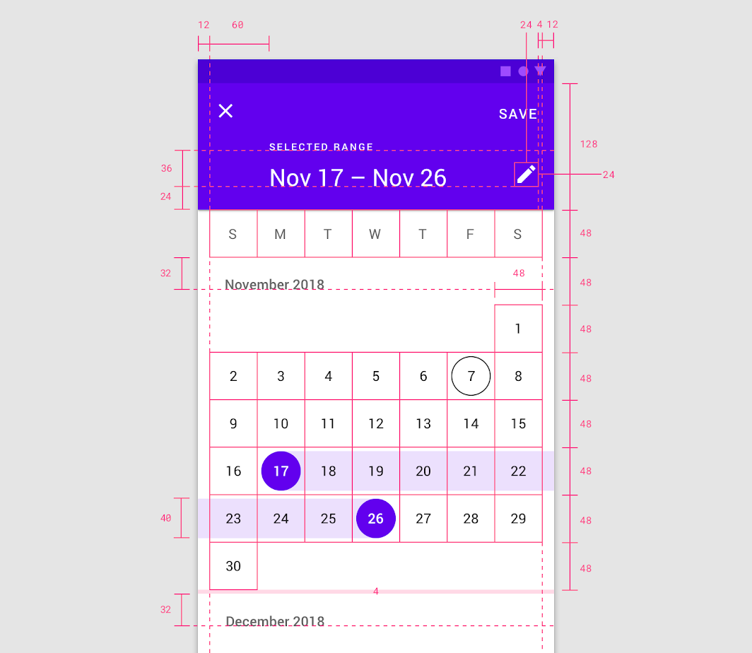
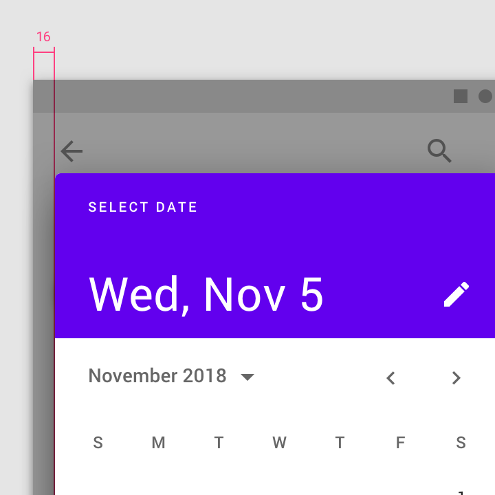
The mobile calendar picker is a full-screen dialog.
Padding
• Left and right padding: 12dp
• Padding between months: 4dp
• Edit icon padding: 16dp from right
Header
• Header height: 128dp
• Header text inset: 60dp from left margin
Baseline heights
• First baseline: 36dp from second baseline
• Second baseline: 24dp from bottom of header
• Third baseline (month name): 32dp from days of week
Element size
• Edit icon: 24 x 24dp
• Date bounding box: 48 x 48dp
• Selected date: 40 x 40dp
Mobile input picker
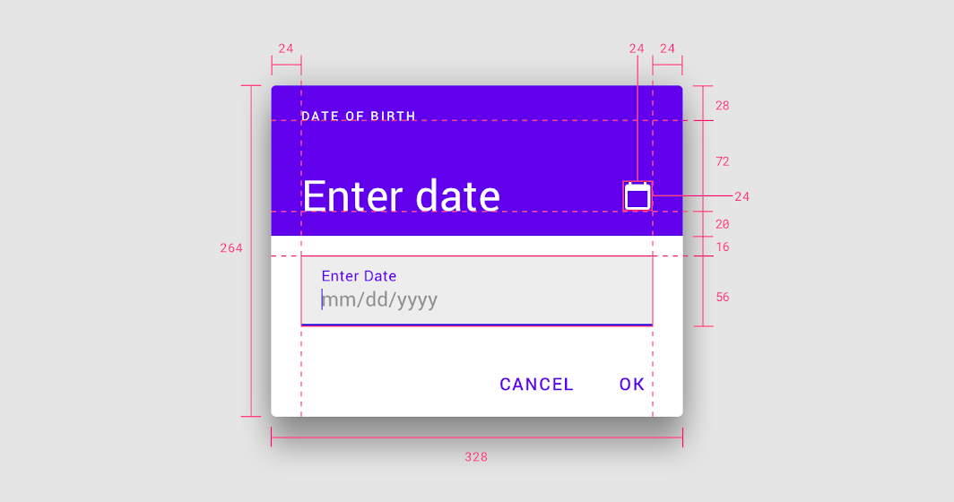
The mobile calendar picker is a standard dialog.
• Dimensions: 264 x 328dp
• Left and right padding: 24dp
Baseline heights
• First baseline: 28dp from top
• Second baseline: 72dp from first baseline
Element size
• Edit icon: 24 x 24 dp
• Text field: 16dp from bottom of header
• Text field height: 56dp
Desktop date picker
Calendar view
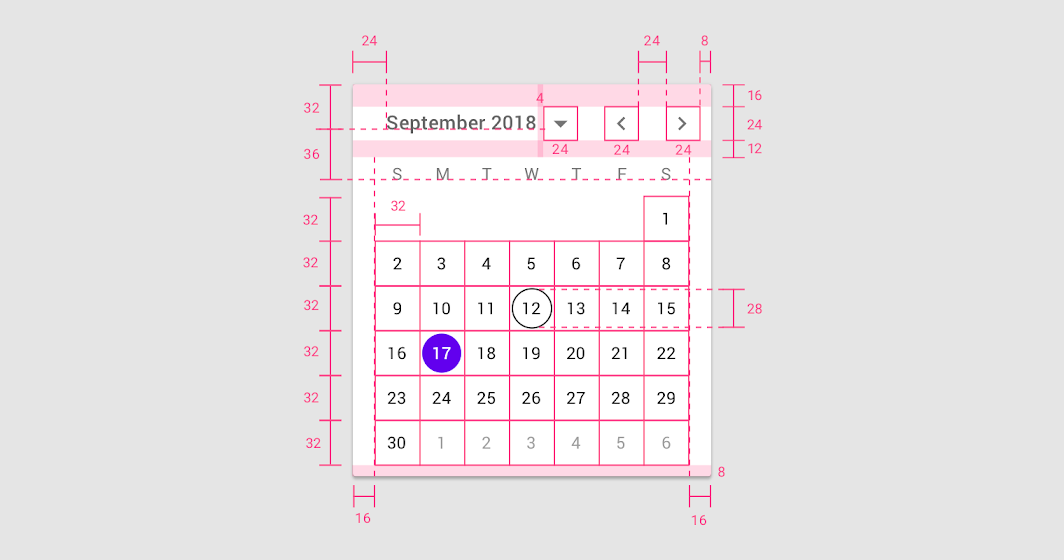
Padding
• Menu left padding: 24dp
• Menu right padding: 8dp
• Menu top padding: 16dp
• Menu bottom padding: 12dp
• Padding between month name and button: 4dp
• Padding between month pagination: 24dp
• Left and right padding of calendar area: 16dp
• Bottom padding: 8dp
Baseline heights
• First baseline: 32dp from top
• Second baseline: 36dp from first baseline
Element size
• Month dropdown button: 24 x 24dp
• Month pagination: 24 x 24dp
• Date bounding box: 32 x 32 dp
• Selected date: 28 x 28dp
Year selection view
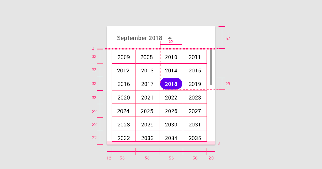
Padding
• Left padding: 12dp
• Right padding: 20dp
• Bottom padding: 8dp
• Padding between menu and years: 4dp
Baseline height
• Menu height: 52dp
Element size
• Year bounding box: 56 x 32dp
• Selected year: 52 x 28dp
Desktop date range picker
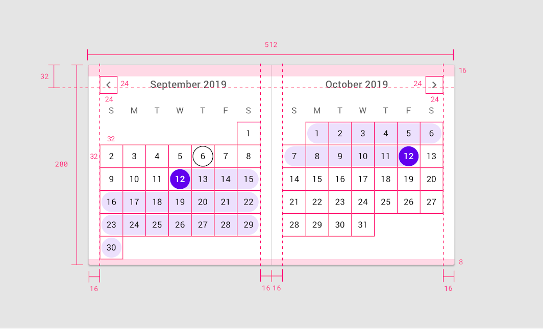
The desktop date range picker consists of two single pickers displaying consecutive months.
• Left, right, and inside padding: 16dp
• Bottom padding: 8dp
• Month title baselines from top: 32dp
• Pagination arrows: 24 x 24dp

若有收获,就点个赞吧
0 人点赞
