这一章节的指南描述了各种组件在布局网络和不同的断点范围下的行为方式。
This page describes how components behave in a layout, both in relationship to the grid as well as breakpoints.
位置术语
UI 元素在不同断点范围内以不同的方式运行。
UI elements behave in different ways at each breakpoint range. The position of UI elements, components, and surfaces in the grid are described with the terms below.
| Position term | Definition |
|---|---|
| Above; below | The y position of an element |
| In front of; behind | The z position of an element |
| Left; right; center |
The x position of an element |
| Top; bottom | The y position of an element relative to a container or screen edge |
| Vertically centered |
The x and y position of an element centered relative to a container or the screen edges |
| Sticky | An element that scrolls with the UI and locks at a certain point in the scroll range |
| Floating | A fixed element positioned in front of scrolling content |
| Leading edge | The edge of a screen or layout that written content begins from. For example, in LTR languages such as English, this is usually the left edge of a screen |
| Trailing edge | The edge of a screen or layout where written content ends |
组件适配
Component adaptation describes changes in visual presentation (padding, size, layout, or alignment), or switching out one component for another that is better suited to the device size and use case.
Visual presentation
Visual presentation is the most common method of adaptation.
This type of adaptation affects the scale and placement of content and objects on screen, as well as their relationships to each other.
For example, a text list on a mobile device can adjust margins, vertical spacing, or density to better fit larger screens like tablets.
Size constraints
Material Components have minimum and maximum values for container dimensions, margins, and padding. For size constraints of each component, visit the Components section.
For example, snackbars have a maximum width of 600dp for large screens. These minimum and maximum values allow for continuous change to the component’s visual presentation as a layout expands from mobile to large screens.
When scaling a layout, components can have fixed or responsive widths within the range of size constraints.
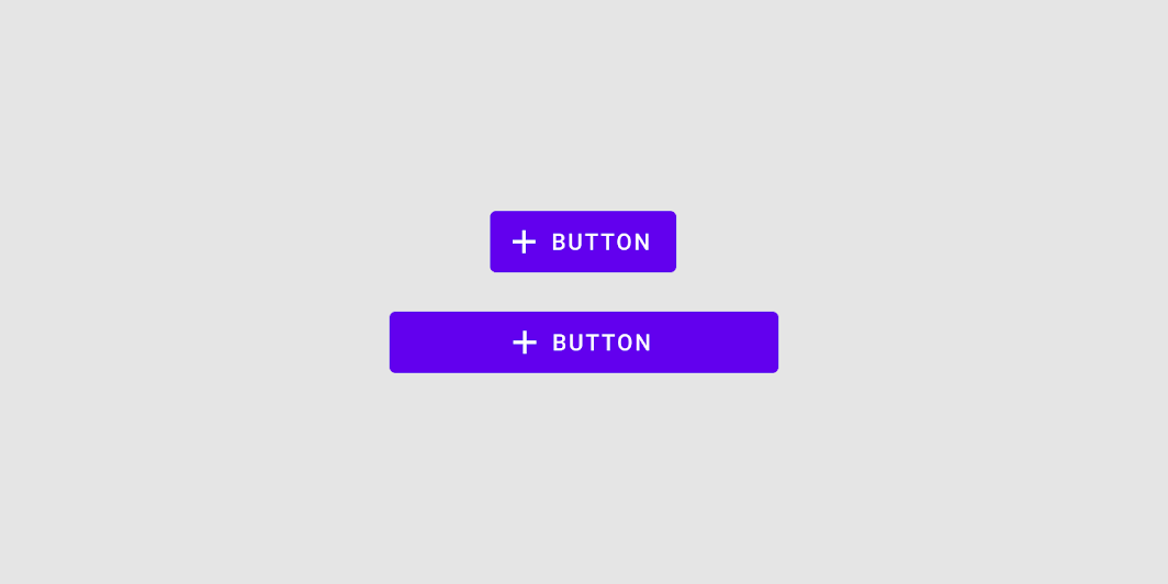
Elements with fixed widths remain the same width regardless of a screen’s size.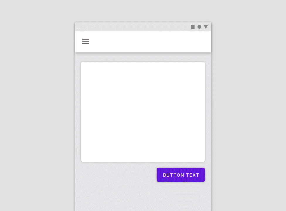
The button component remains fixed in position and size along the right margin.
Elements with responsive widths expand and contract as a screen size changes.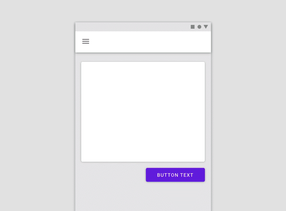
The button scales in response to the two columns on the right side.
Don’t
Don’t use a container on responsive components if the screen is too narrow to display elements and padding at smaller widths.
Caution
Use caution when enlarging a responsive component across several columns in a wide screen. Certain components such as buttons can become overly emphasized at larger screen widths
Internal Composition
When scaling a component, define the position and alignment of its internal elements in relationship to the container.
For example, the icon and text label within an icon button remain anchored to each other and remain centered while the button expands horizontally.
A button’s internal elements maintain a consistent relationship as the component scales
For more complex components, like app bars, internal elements can be grouped and anchored to multiple points within the container.
For example, a menu icon and logo can be grouped and anchored to the leading edge, while a search bar is anchored to the center, and action icons are anchored to the trailing edge.
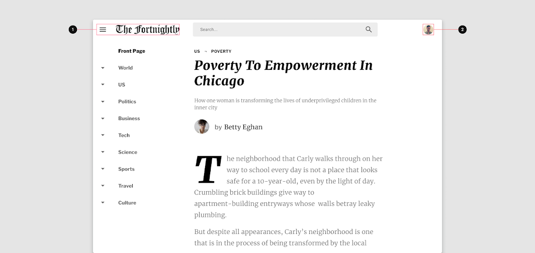
1. Logo and menu icon anchored to the leading edge of Fortnightly’s app bar 2. Account picker anchored to the trailing edge of Fortnightly’s app bar
A component’s internal composition should accommodate the ergonomic needs of the device on which it’s displayed.
For example, a horizontally-oriented card on a mobile device can shift to a more square-shaped card on larger screens.
This adaptation gives more prominence to imagery and allows for larger type styles to enhance readability.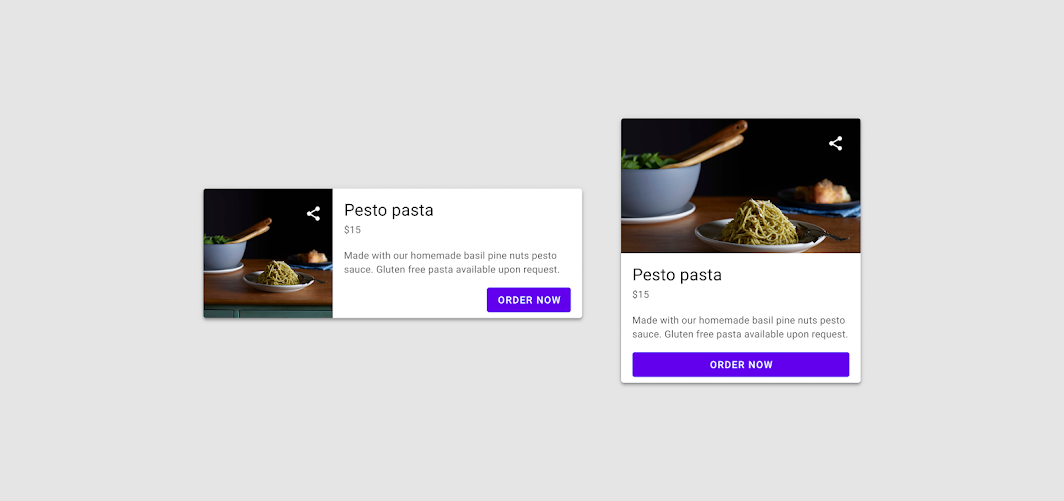
Cards can change orientation on larger screens.
组件置换
As a layout changes across screen sizes, components with similar functions can also be exchanged.
This makes it possible to adjust a layout for large-scale changes to the ergonomic and functional qualities of an interface.
For example, a bottom navigation bar can swap with a navigation rail on tablets, and a navigation drawer on larger screens.

Components can switch types as well. For example, a full-screen dialog on mobile can be exchanged with a simple dialog on larger screens.
This component change maintains the function of the dialog, while also making use of screen space in a way that preserves a user’s context by revealing underlying content.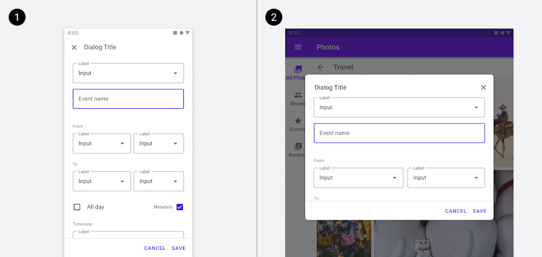
A full screen dialog can adapt to a simple dialog on larger screens.
Some functionally-equivalent component groups are defined below.
| Component type | Mobile option | Tablet option | Laptop option |
|---|---|---|---|
| Navigation | Bottom navigation | Navigation rail | Navigation drawer |
| Navigation | Modal navigation drawer | Modal navigation drawer | Permanent navigation drawer |
| Communication | Full-screen dialog | Simple dialog | Simple dialog |
| Action | Bottom sheet | Menu | Menu |
Use caution when swapping components by ensuring that the interchangeable components are functionally equivalent.
Do not, for example, swap a button for a chip.
Use caution when changing between list items and cards. The component swap should always serve a functional and ergonomic purpose for the user.
自适应模式
组件可以根据 屏幕尺寸和设备类型 调整大小。
这些尺寸调整可以包括:
- 使用其它更合适的组件
- 改变组件的可见性以适应更小的空间(折叠)
- 更换输入方式
可见性
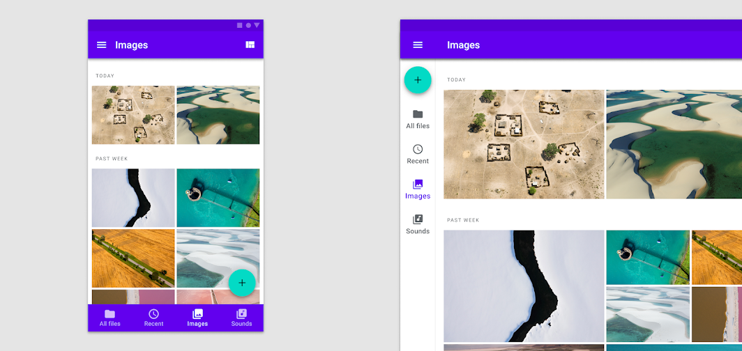
当在指定的断点范围变大时,如果空间允许,可以显示由于断点范围较小被隐藏起来的部分 UI。
屏幕尺寸增加时,元素(如侧面导航)可以变为可见。
Parts of the UI that are hidden by smaller screens can be revealed when additional space becomes available at larger breakpoints.
Elements, such as side navigation, can become visible when the screen size increases.
A UI can reveal more robust or complex options, such as additional editing features in a doc.

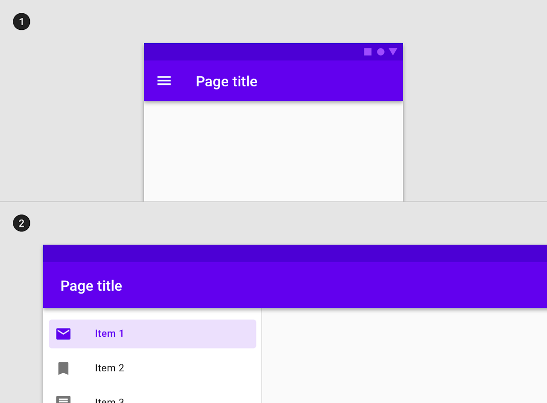
Content that only appears after tapping on a small screen (1) can be revealed by default when more space is available (2).
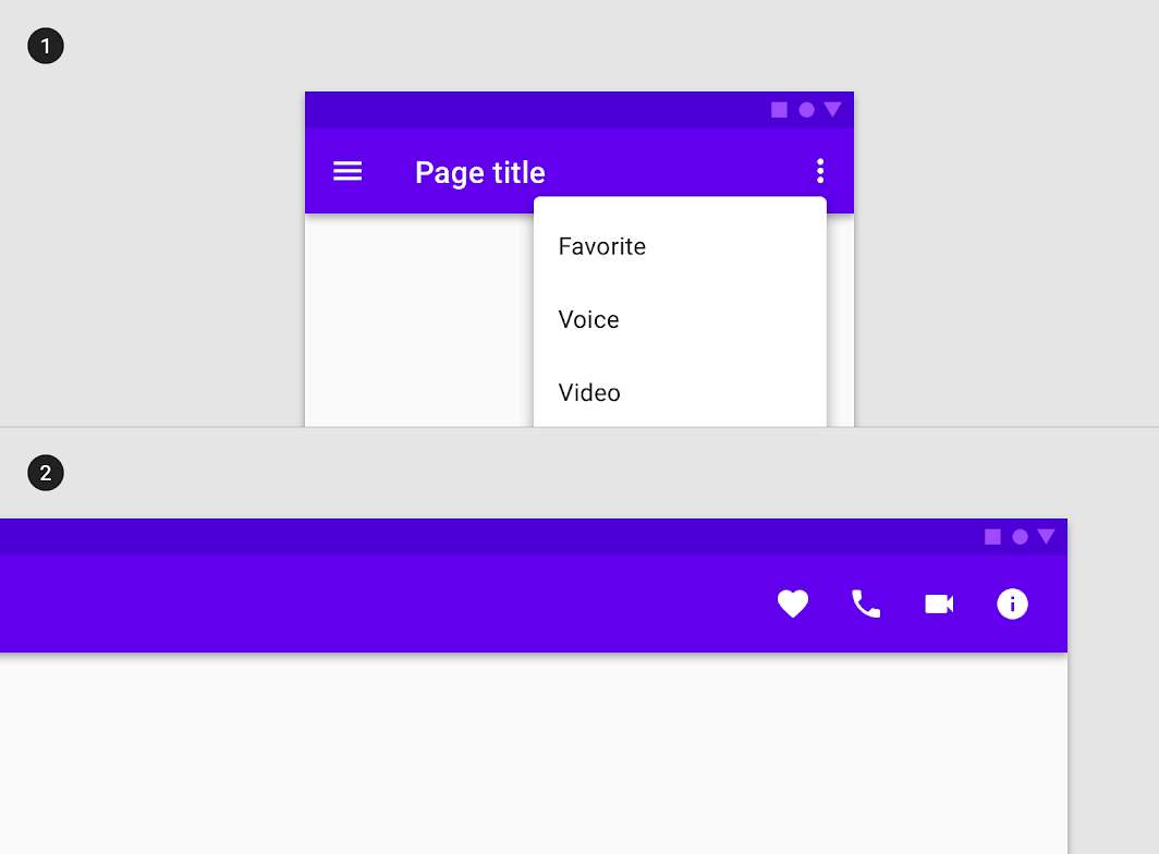
Menu items (1) can transform into icons in a toolbar on a larger screen (2).
Reposition
An interface, and the components that comprise it, can reflow or reposition to take advantage of additional screen space. Repositioning is also a way to address changing ergonomics and input methods on different screen sizes.
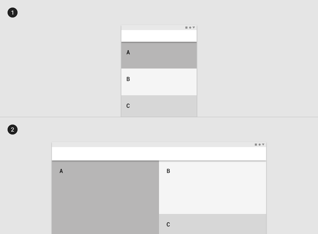
Elements in a single-column format can reflow to fill the content area on a larger screen.
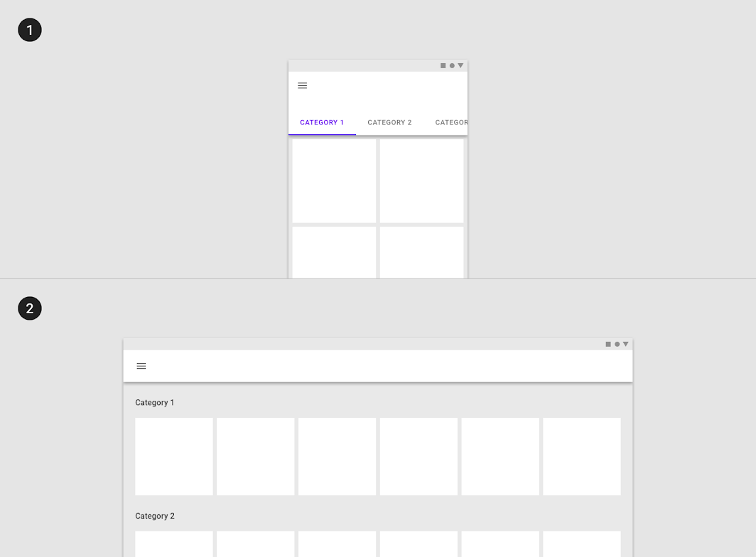
Horizontal tabs can reflow into a vertical list on a larger screen.
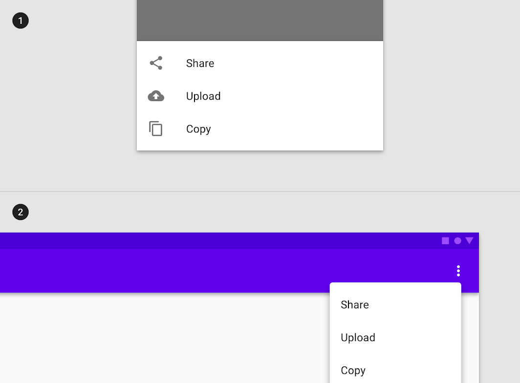
A bottom sheet with menu items on a small screen be swapped for a menu on a larger screen.
The Floating Action Button can be repositioned to account for the ergonomics of a larger screen.

若有收获,就点个赞吧
0 人点赞
