Checkboxes allow users to select one or more items from a set. Checkboxes can turn an option on or off.
Usage
Use checkboxes to:
- Select one or more options from a list
- Present a list containing sub-selections
- Turn an item on or off in a desktop environment
设计原则
Familiar
Checkboxes have been in user interfaces for a long time and should be used as expected.
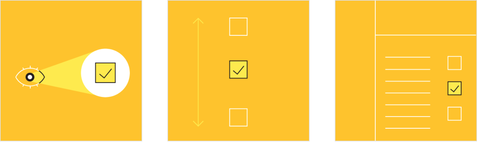
Scannable
It should be visible at a glance if a checkbox has been selected, and selected items should be more visually prominent than unselected items.
Efficient
Checkboxes make it easy to compare available options.
When to use checkboxes
Checkboxes should be used instead of switches if multiple options can be selected from a list.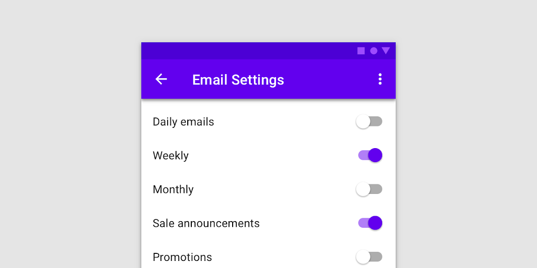

Don’t
If a list consists of multiple options, don’t use switches. Instead, use checkboxes. Checkboxes imply the items are related, and take up less visual space.

Do
Checkboxes let users select one or more options from a list. A parent checkbox allows for easy selection or deselection of all items.
Other selection controls
Selection controls allow users to complete tasks which involve making choices such as selecting options, switching settings on or off, or adding or removing items.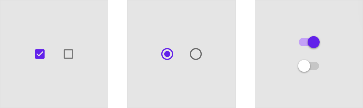
Checkboxes Radio buttons Switches
Radio buttons and switches are alternative selection controls that can be used to enter decisions or declare preferences such as settings or dialogs.
Platform differences
Adapt selection controls, including checkboxes, to fit platform standards.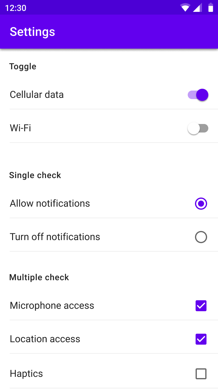
Android
Use Material checkboxes.
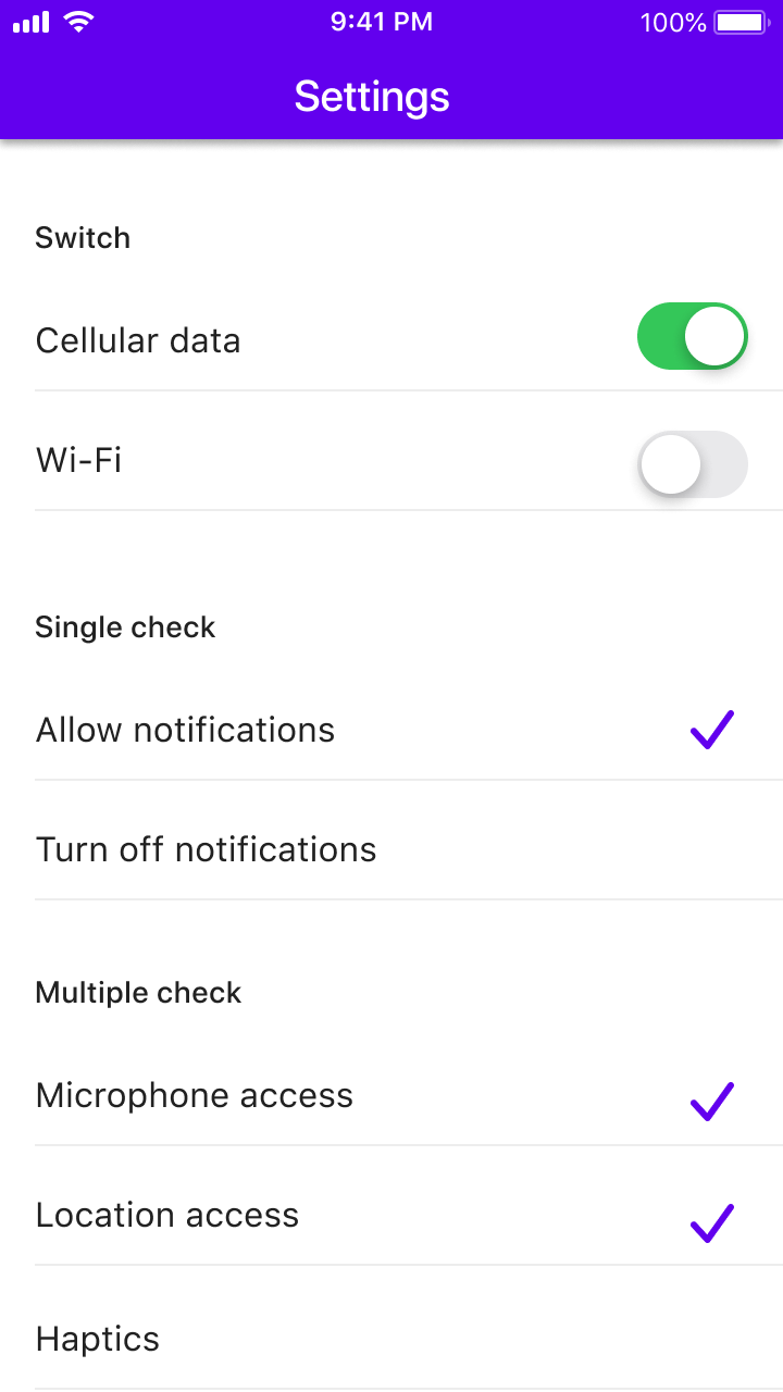
iOS
Use switches instead of checkboxes and check mark lists instead of radio buttons as these are the graphics expected on iOS.
Behavior
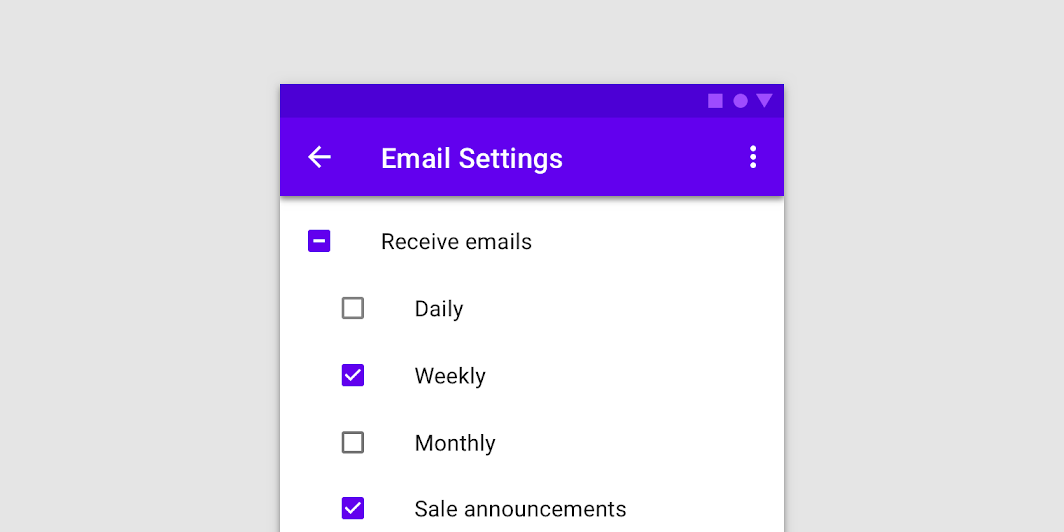
 Selecting multiple items in a list using checkboxes
Turning an item on or off using a checkbox
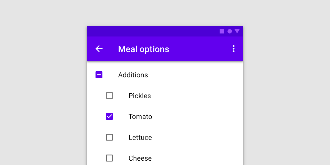
Parent and child checkboxes
Checkboxes can have a parent-child relationship with other checkboxes.
- When the parent checkbox is checked, all child checkboxes are checked
- If a parent checkbox is unchecked, all child checkboxes are unchecked
- If some, but not all, child checkboxes are checked, the parent checkbox becomes an indeterminate checkbox
Checked, unchecked, and indeterminate states of a parent checkbox
状态
Checkboxes can be selected, unselected, or indeterminate. Checkboxes have enabled, disabled, hover, focused and pressed states.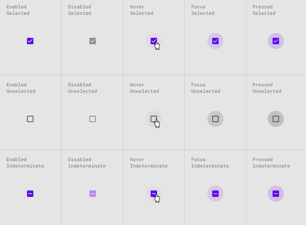
Interaction states for selected, unselected, and indeterminate checkboxes
主题
Crane Material Theme
This travel app’s checkboxes have been customized using Material Theming to use custom color.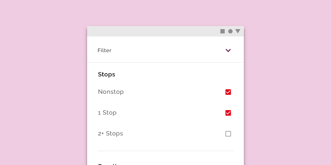
Crane’s customized checkboxes
Color
Crane’s checkboxes use a custom color.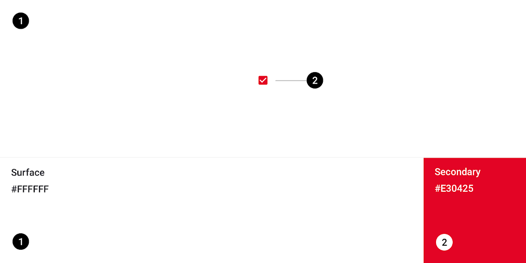
| Element | Category | Attribute | Value |
|---|---|---|---|
| Checkboxes | Secondary | Color Opacity |
#E30425 100% |
Specs


若有收获,就点个赞吧
0 人点赞
