Switches toggle the state of a single item on or off.
Usage
Switches are the preferred way to adjust settings on mobile.
Use switches to:
- Toggle a single item on or off, on mobile and tablet
- Immediately activate or deactivate something
设计原则
Familiar
Switches have been in user interfaces for a long time and should be used as expected.
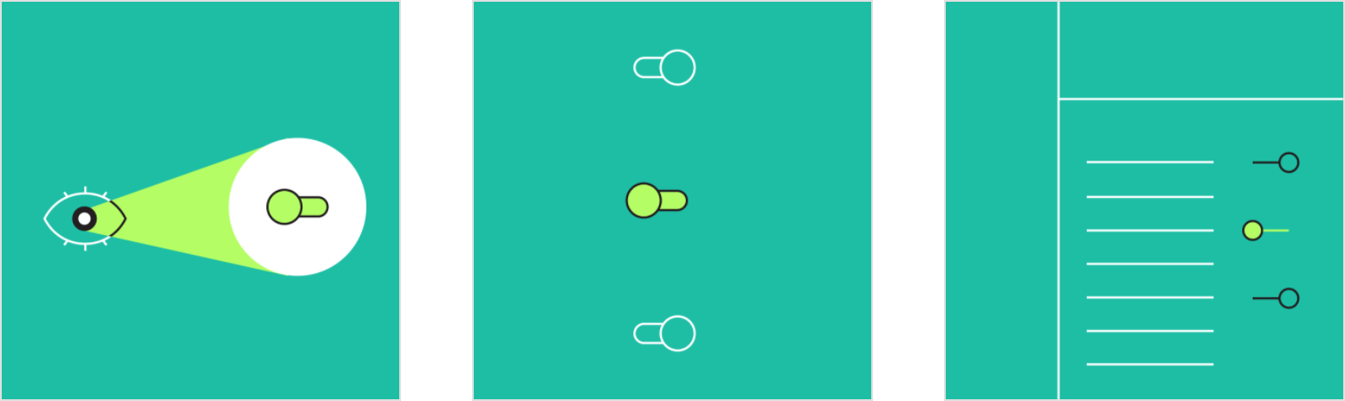
Scannable
It should be visible at a glance if a switch has been selected, and selected items should be more visually prominent than unselected items.
Efficient
Switches make it easy to compare available options.
When to use switches
Switches should be used instead of radio buttons if each item in a set can be independently controlled.
Don’t
Don’t use radio buttons to toggle items on or off. Radio buttons convey that a set of items are options, and that only one can be selected at a time. Instead, use switches.

Use switches to turn an item on or off, especially on mobile instead of a checkbox.

Other selection controls
Selection controls allow users to complete tasks which involve making choices such as selecting options, switching settings on or off, or adding or removing items.
Checkboxes

Radio buttons

Switches

Checkboxes and radio buttons are alternative selection controls that can be used to enter decisions or declare preferences such as settings or dialogs.
Platform differences
Adapt selection controls, including switches, to fit platform standards.
Android
Use Material switches.

iOS
Use platform-specific switches on iOS instead of Material switches, as they have matching functionality and presentation.

Behavior
A switch is successfully toggled when the switch thumb slides to the other side of the track upon user interaction.
Text label
The option that the switch controls, as well as the state it’s in, should be made clear from the corresponding inline label.
Avoid creating a switch that includes the text “on” and “off” within the graphic itself. The switch alone should be sufficient.
1. Thumb
2. Track

 Using a switch to turn an option on and off
When a user toggles a switch, its corresponding action takes effect immediately.
Display processing status
Because a switch shows the actual status of something, sometimes there is a delay in its change of state. In such cases, a processing status animation can be used.
An indicator can be used on the full screen to demonstrate status, as described in the progress indicator guidance. Processing status should not be indicated through an animation on the thumb of the switch because it will be harder to read and understand.
Don’t demonstrate status by animating the thumb of a switch.
States
Switches can be on or off. Switches have enabled, disabled, hover, focused, and pressed states.
Display the outer ripple only on form factors that use touch, where interaction may otherwise obstruct the switch completely.
For desktop, the ripple reaction isn’t needed.
Interaction states for on and off switches

Theming
Crane Material Theme
This travel app’s switches have been customized using Material Theming to use custom color.
Crane’s customized switches
[

](https://material.io/design/material-studies/crane.html)
Color
Crane’s switches use a custom color.

| Element | Category | Attribute | Value |
|---|---|---|---|
| Switches | Primary | Color Opacity |
#5D1049 100% |
[
](https://material.io/design/color/the-color-system.html)
Specs


若有收获,就点个赞吧
0 人点赞
