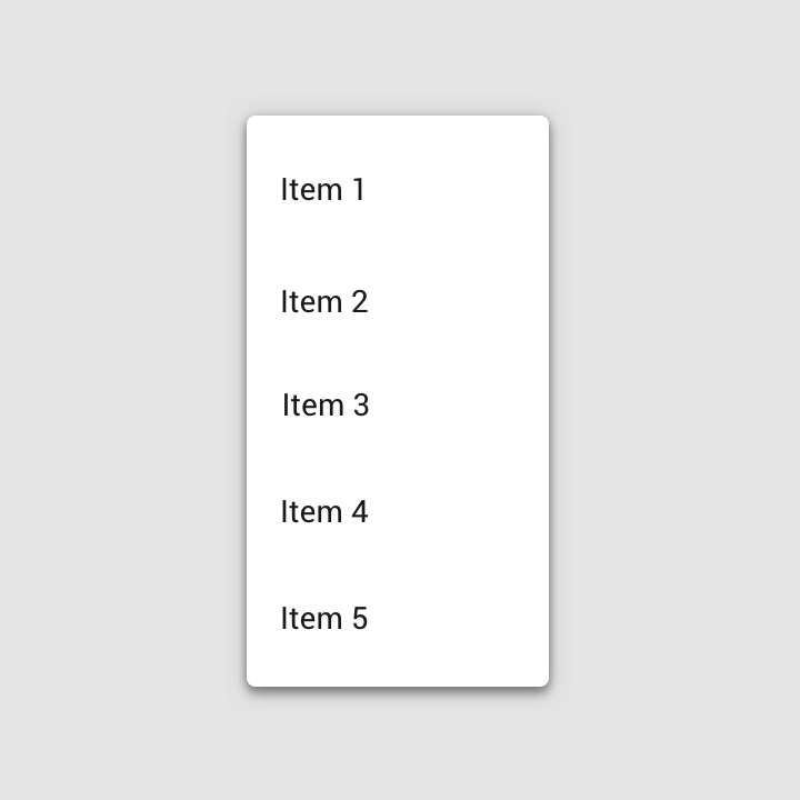
Menus display a list of choices on temporary surfaces.
Usage
A menu displays a list of choices on a temporary surface. They appear when users interact with a button, action, or other control.
设计原则
Nimble
Menus should be easy to open, close, and interact with.
Contextual
Menu content should be suited to user needs.
Scannable
Menu items should be easy to scan.
分类
Menus allow users to make a selection from multiple options. They are less prominent and take up less space than selection controls, such as a set of radio buttons.
Dropdown menus
Dropdown menus display a list of options, triggered by an icon, button, or action. Their placement varies based on the element that opens them.
Exposed dropdown menus
Exposed dropdown menus display the currently selected menu item above the list of options. Some variations can accept user-entered input.
Placement
Elevation
Menus appear in front of all other permanent UI elements.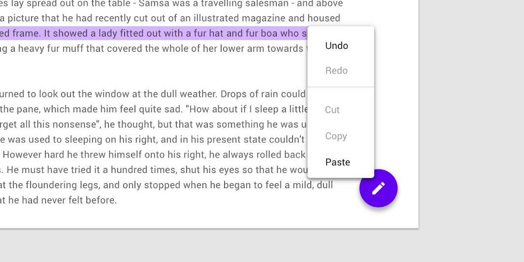
Menus appear at a higher elevation than all other permanent UI elements.
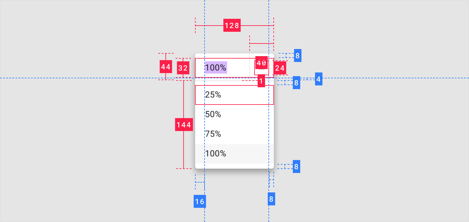
Height
The maximum height of a menu should be at least one row less than the height of the app’s UI.
The rows in this menu are 32dp tall. That’s also the space used between the menu and the bottom of the screen.
Position
Menus should be positioned relative to the edge of the screen or browser. They typically appear next to (or in front of) the element that generates them. If they are in a position to be cut off by the browser or screen’s edge, the menu can instead appear to the left, right, or above the element that generates it.
Menus can change their position to avoid being truncated by the screen or browser’s edge.
解析
Menus display lists of related options (which can be grouped together) as well as unrelated options. Menus appear when a user taps an interactive UI element such as an icon, button, action, or content, such as selected items or text.
分类
Text list
- Container
- Text
- Divider
Text and icon list

- Container
- Leading icon
- Text
- Divider
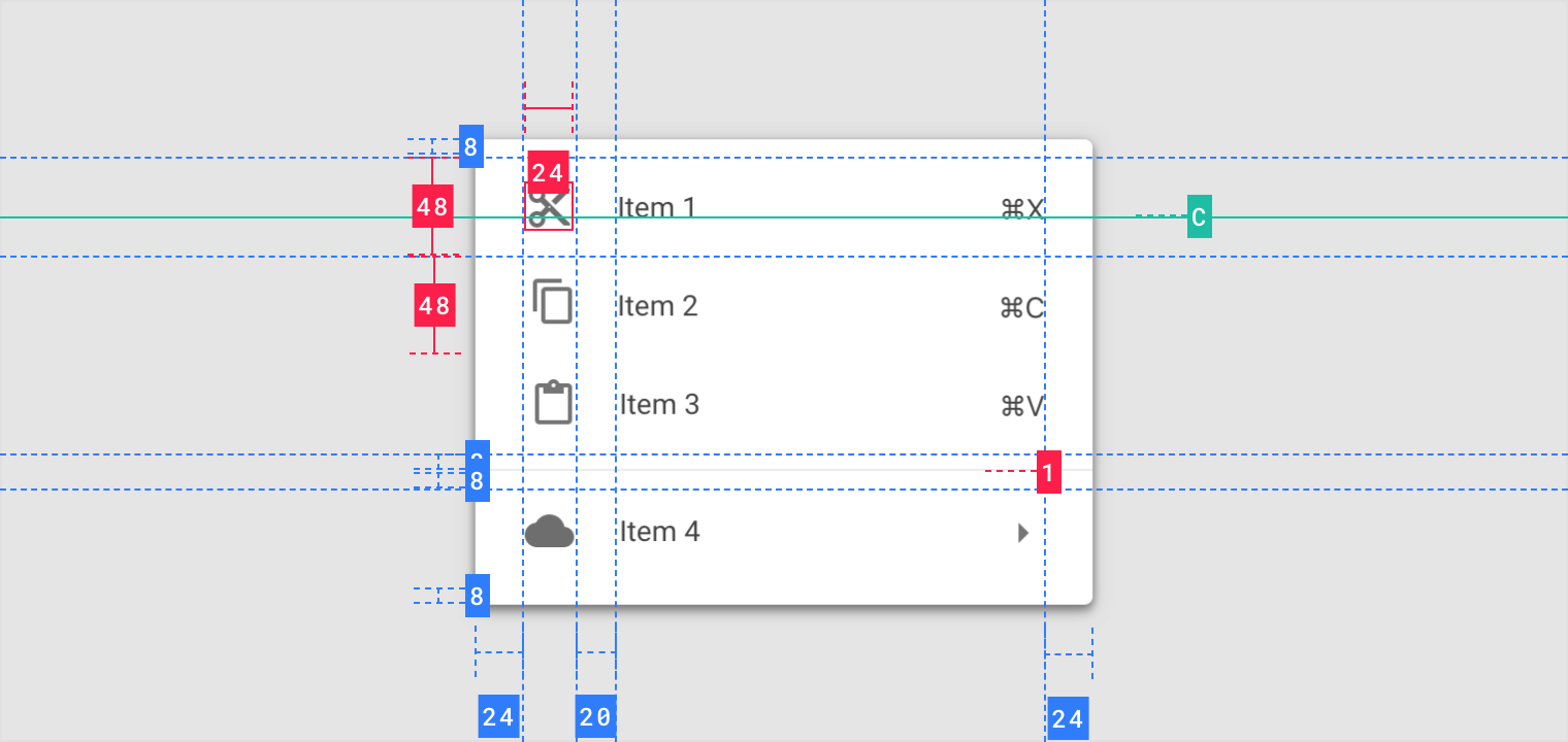
Text, icon, and keyboard command list
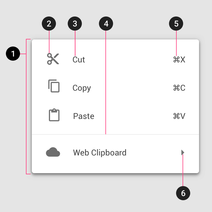
- Container
- Leading icon
- Text
- Divider
- Command
- Cascading menu indicator
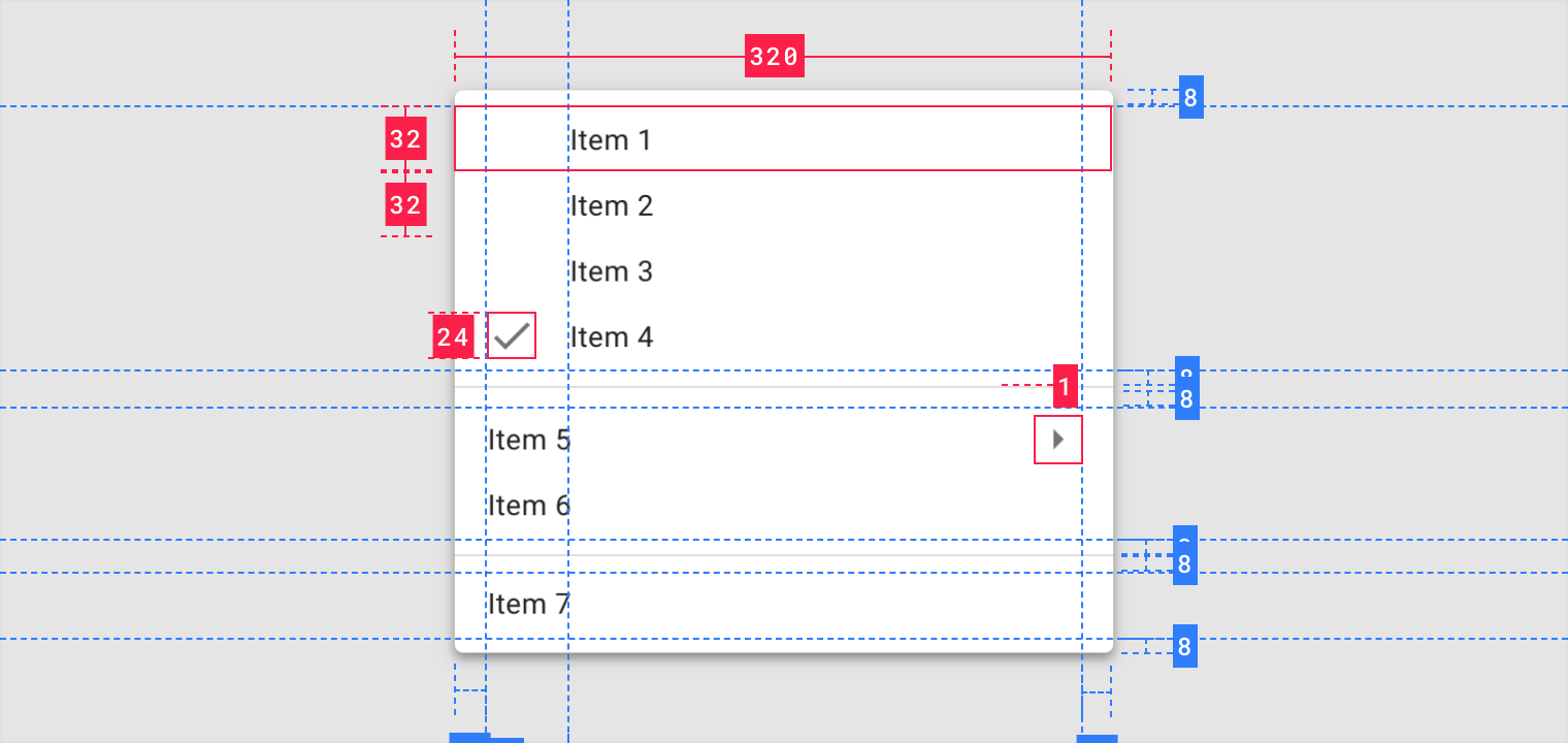
Text with selection state list

- Selection state
Actions
Disabled actions
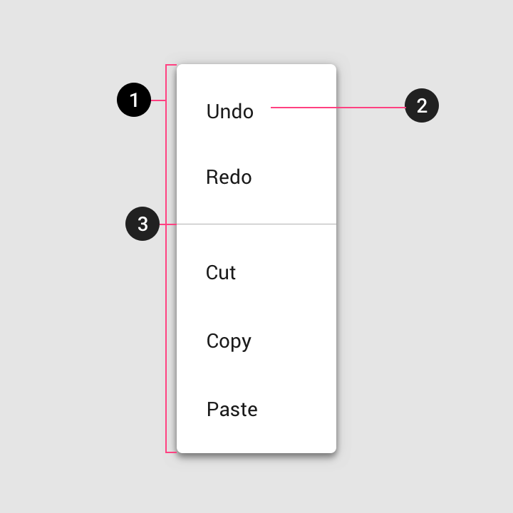
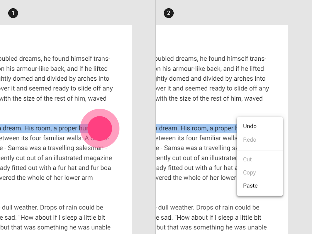
Display actions as disabled when they can only be used sometimes, under certain conditions. They should be displayed as disabled rather than removing them.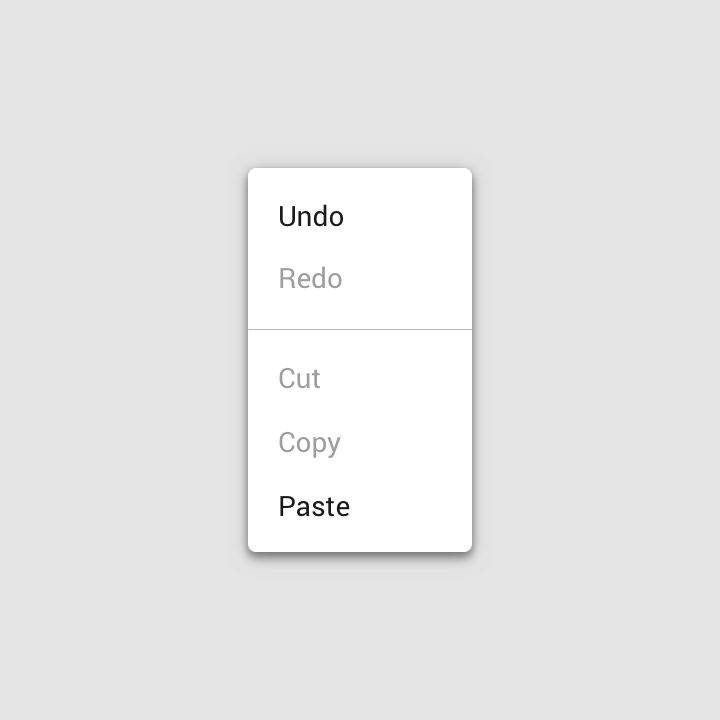
The Redo action is disabled when that action isn’t available, and the Cut and Copy actions are disabled until content is selected.
Behavior
Scrolling
If not all menu items are displayed at once, menus can be scrollable. In this state, menus show a persistent scrollbar.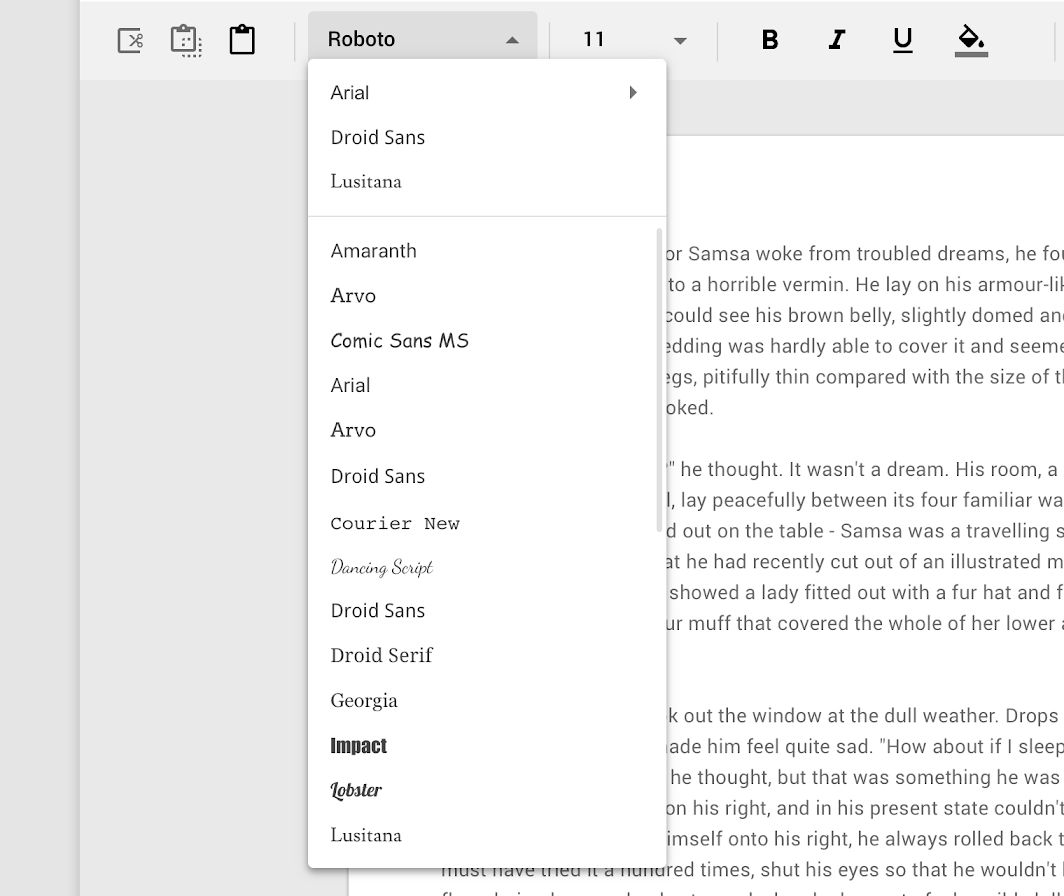
When content is scrollable, menus display scrollbars.
Transitions
Menus use a fade transition pattern to enter and exit the screen. The animation creates a relationship between the menu and the action that generates the menu.
Position
A menu’s position on screen affects where and how it will appear. If opened at the top of the screen, it will expand downwards (to avoid being cropped).
 Menus at different positions on screen open in different ways, adapting to the space available.
By default, menus open with an entrance animation. However, on desktop, menus can skip the animation and open instantly instead.
1. Mobile menus have entrance animations
2. Desktop menus have the option to open instantly
Scaling and adaptation
Bottom sheets are an alternative to inline menus or simple dialogs on mobile devices. They create space to display additional items, longer descriptions, and iconography.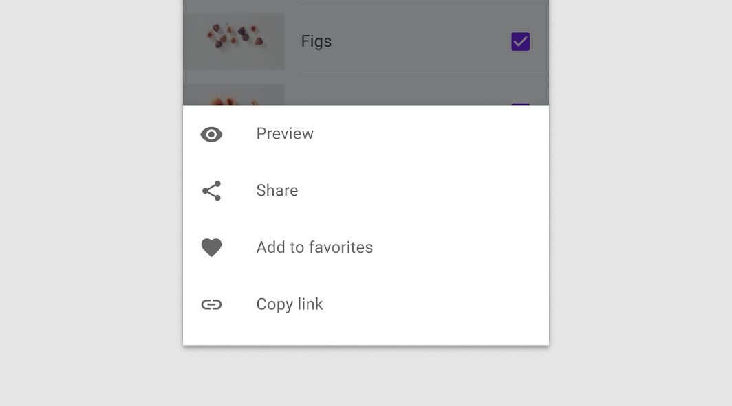
The bottom sheet can replace an inline menu on smaller screens.
Bottom sheets containing a set of actions on mobile can become a context menu on larger screens in order to preserve the intent and context of the primary content.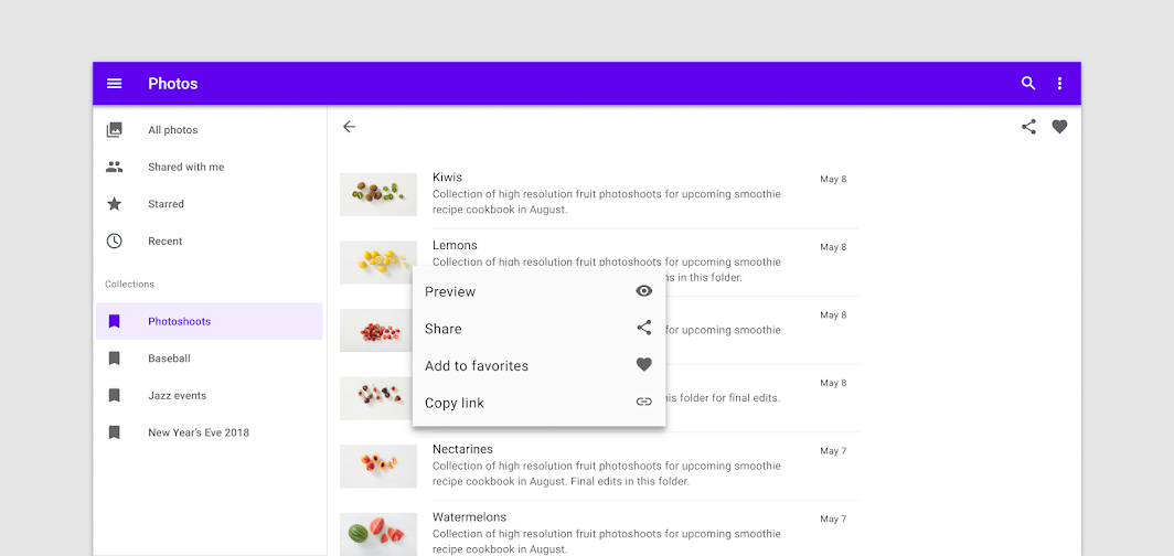
On larger screens, a context menu can be more appropriate
Dropdown menu
Usage
A dropdown menu is a compact way of displaying multiple choices. It appears upon interaction with an element (such as an icon or button) or when users perform a specific action.
Placement
Dropdown menus are positioned relative to both the element that generates them and the edges of the screen or browser. They can appear in front of, beside, above, or below the element that generates them.
Default placement
A dropdown menu is typically positioned below the element that generates it.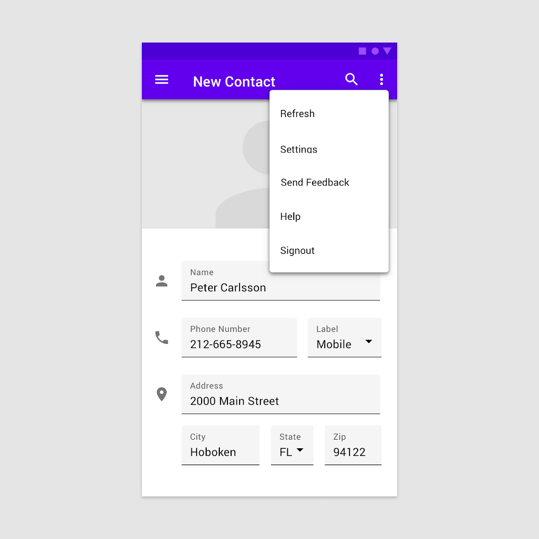
A dropdown menu triggered by an icon on mobile.
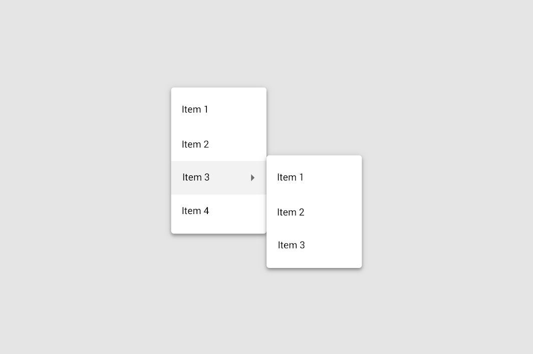
Cascading menu (Desktop only)
Cascading menus allow users to choose from a large variety of choices, by displaying menus with multiple levels of hierarchy.
They are organized into menus of parent list items that contain child list items. Child list items appear to the right or left of parent list items, depending on where there is room to expand child list items.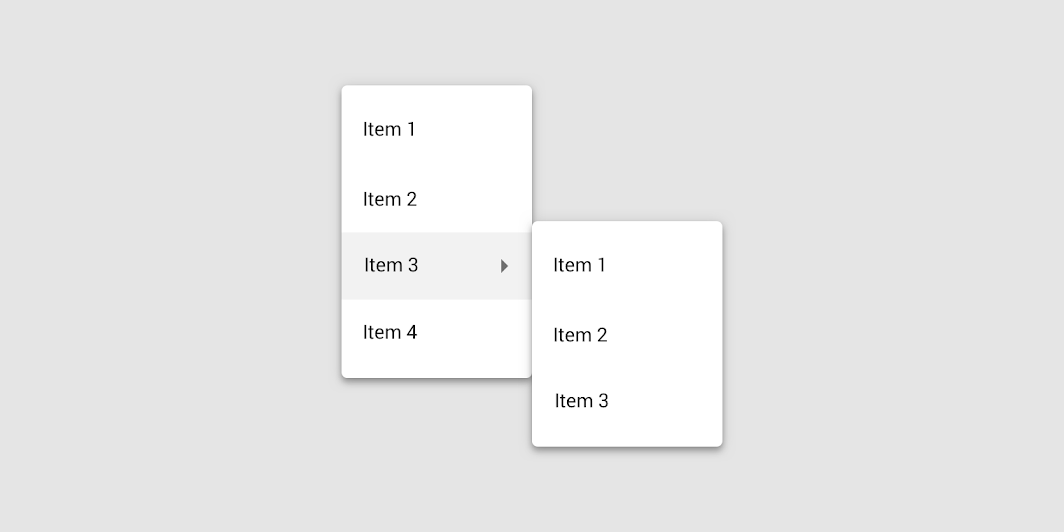
A parent list item can trigger a cascading menu containing child actions.
Contextual menu
Contextual menus aren’t triggered by a consistent UI element. They appear next to where a user taps, and their actions can vary based on the tap target.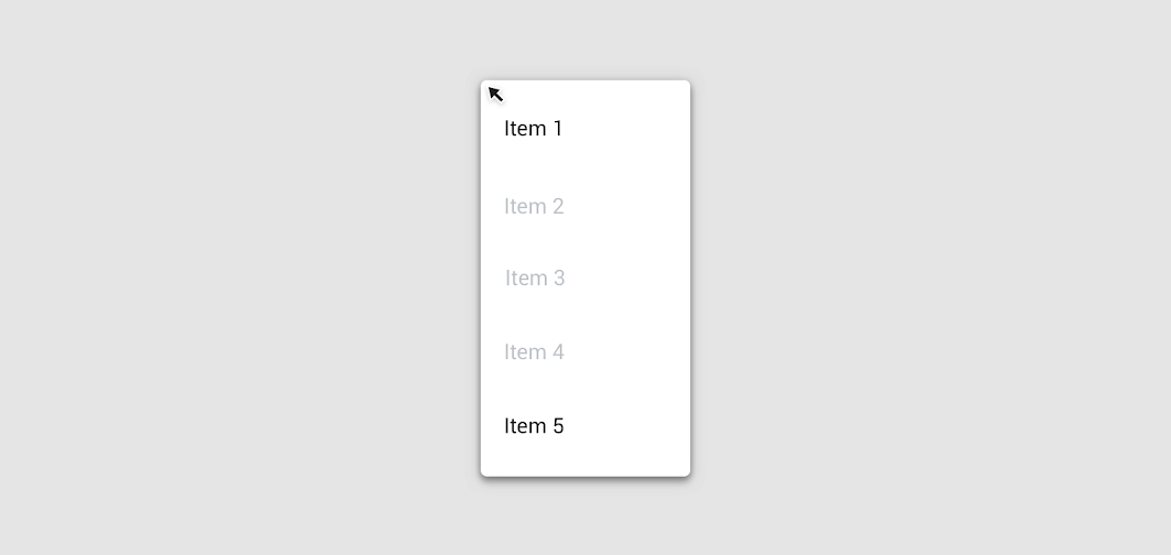
To reveal a contextual menu, tap and hold, or right click (desktop), selected text.
A contextual menu appears next to selected text.
Behavior
When an option is chosen from a dropdown menu, the element that generates it remains the same.
1. Tapping the icon triggers a dropdown menu.
2. Choosing a menu option doesn’t change the icon of the element generating the menu.
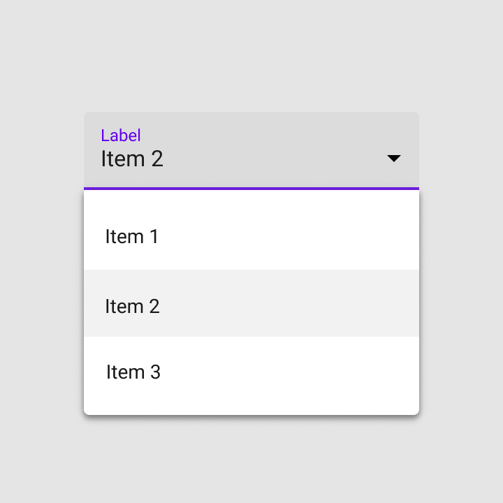
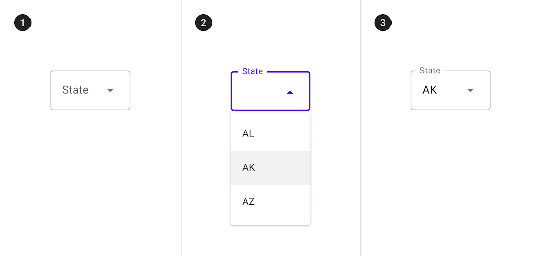
Exposed dropdown menu
Usage
Exposed dropdown menus display the currently selected menu item above the menu.
They can be used only when a single menu item can be chosen at a time.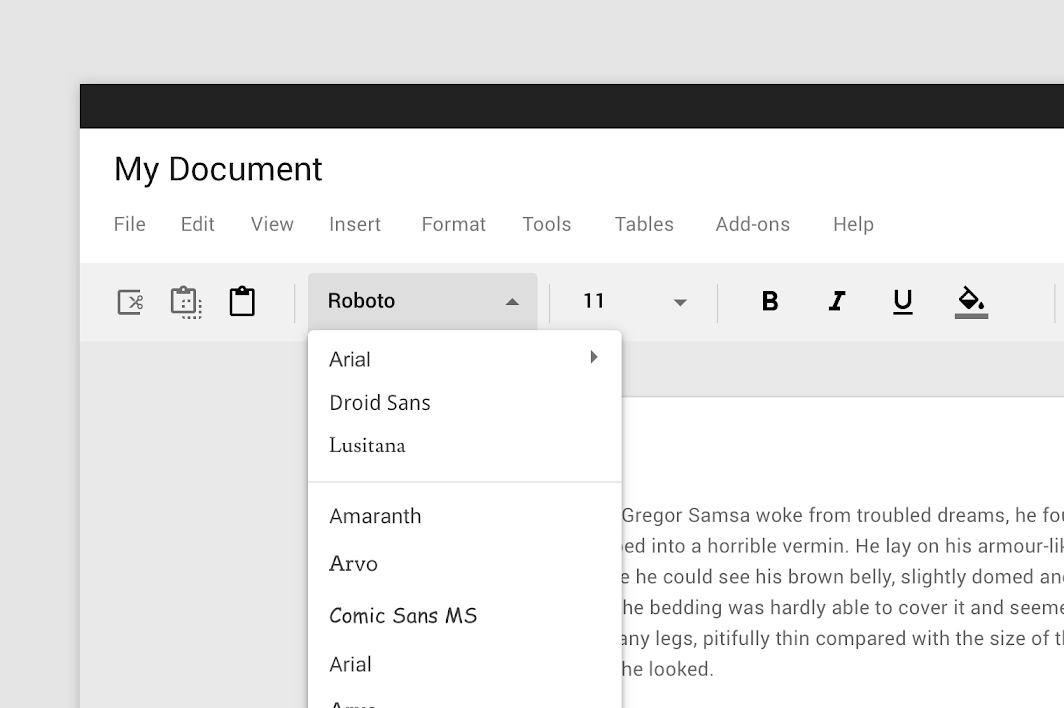
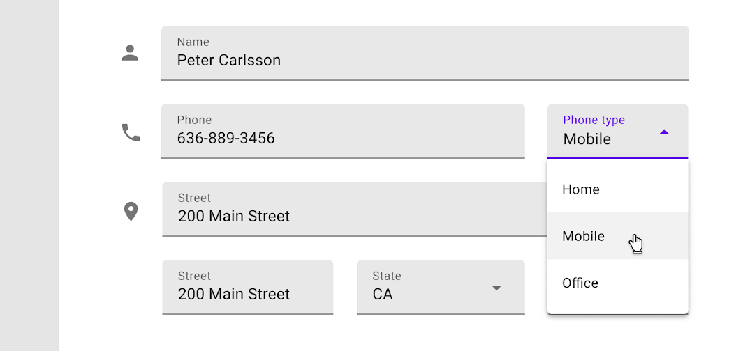
Exposed dropdown menu in a form
Behavior
Upon selecting an item, an exposed dropdown menu updates to display that item. In some cases, it can accept and display user input (whether or not it’s listed as a menu choice).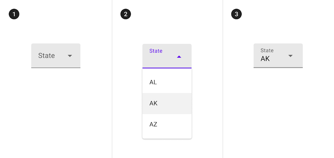
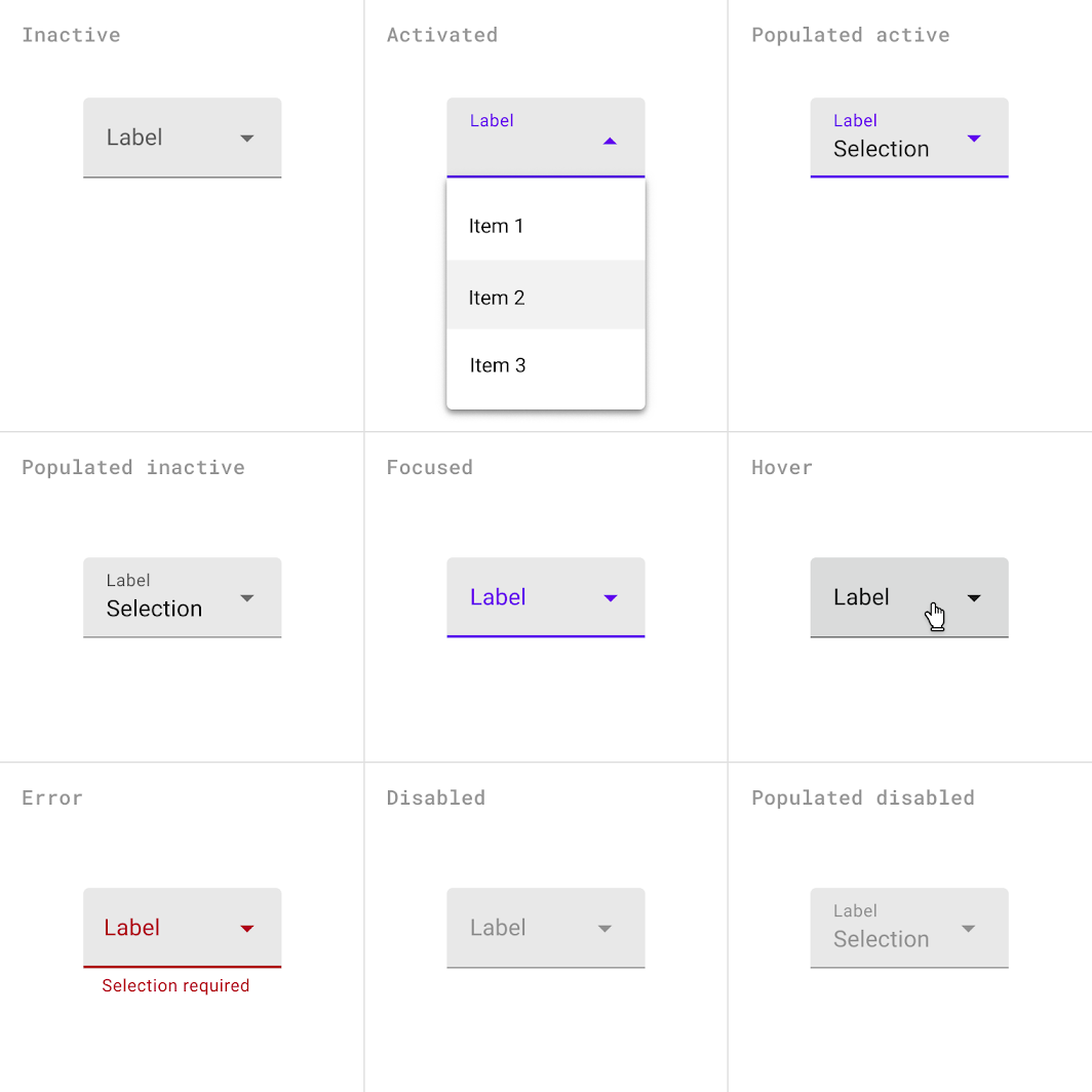
Filled exposed dropdown menu states
- Inactive
2. Activated
3. Inactive and populated
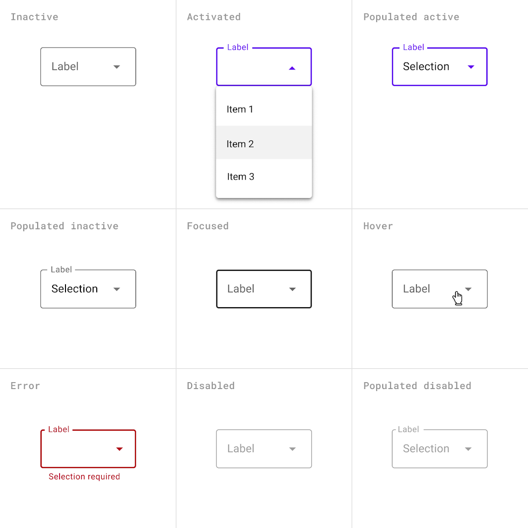
Outlined exposed dropdown menu states
- Inactive
2. Activated
3. Inactive and populated
Placement
An exposed dropdown menu is positioned below the element that generates the dropdown. Alternatively the filled and outlined variations can open a native picker.
The menu appears below the text field on desktop and mobile. On mobile, a native picker can instead be used.
Variations
An exposed dropdown menu can be customized to have a different appearance or behavior.
Editable dropdown menu
An editable dropdown menu displays the currently selected menu item above the menu. A user can enter a value that’s not listed in the menu. You can restrict the types of values that users can enter to certain types. For example, you can set the menu to only accept positive numbers.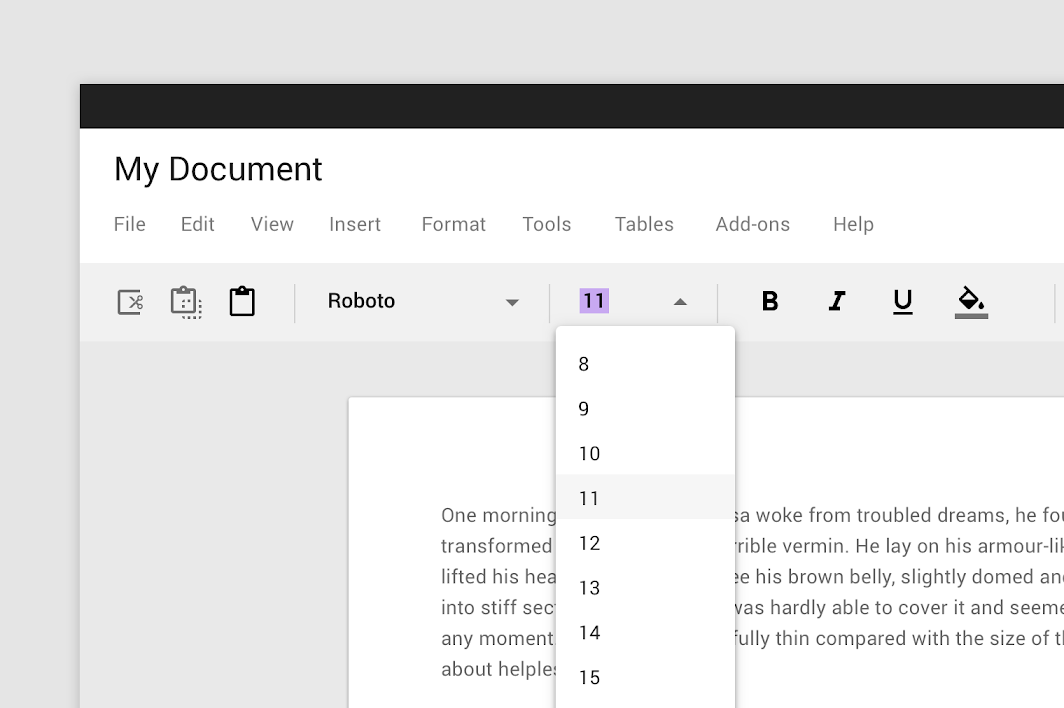
A user can also enter a value not listed in the menu, such as seven.
Filled dropdown menu
A filled dropdown menu looks like a filled text field. It displays the currently selected menu item above the menu.
Filled dropdown menu
The menu container corners furthest from the menu control have a 4dp radius.
Filled dropdown menu
Top corners: 0dp radius
Bottom corners (shaped): 4dp radius
When using a leading icon with a filled dropdown menu, the floating label and the menu items must be aligned with one another.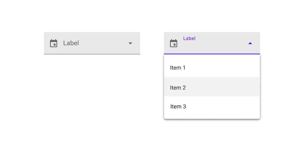
Filled dropdown menu with a leading icon
Outlined dropdown menu
An outlined dropdown menu looks like an outlined text field. It displays the currently selected menu item above the menu.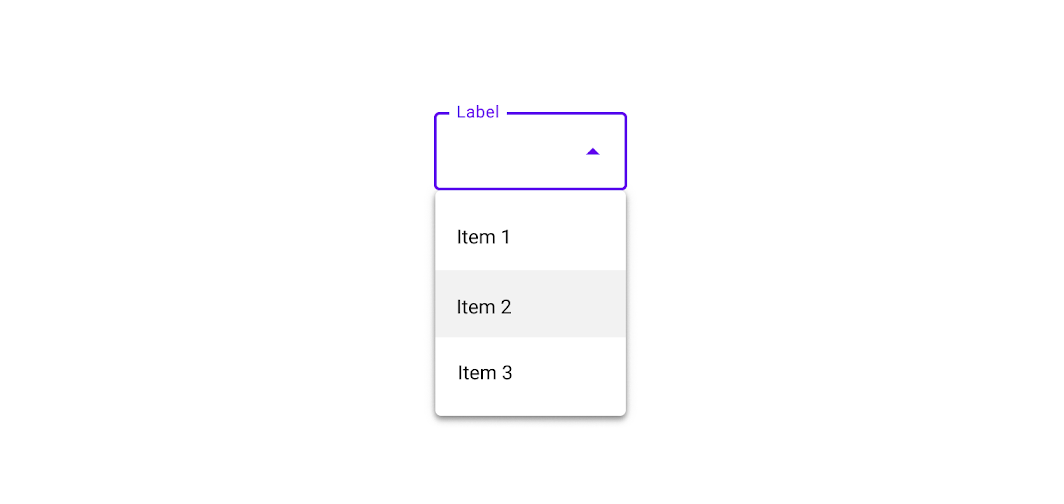
Outlined dropdown menu
For outlined dropdown menus, all corners of the menu container have a 4dp radius.
Outlined dropdown menu
All corners: 4dp radius
Forms with outlined dropdown menus should align the menu label with the icon.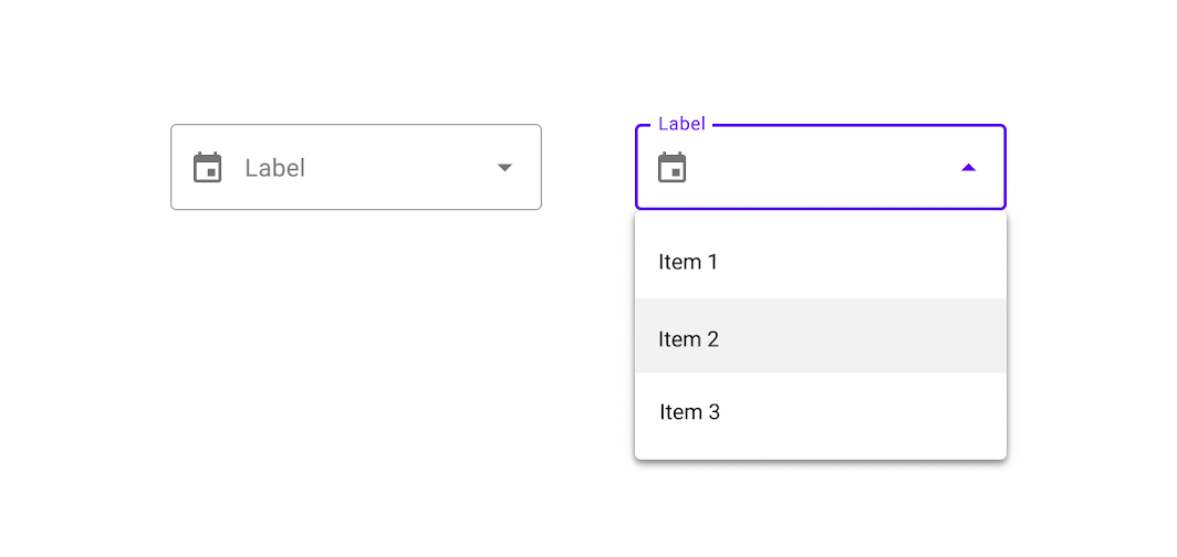
Outlined dropdown menu with a leading icon
状态
Filled exposed dropdown menu states
Outlined exposed dropdown menu states
主题
Basil Material theme
This recipe app’s menus have been customized using Material Theming. Areas of customization include color and typography.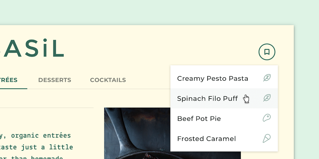
Basil’s customized menu
Color
Basil’s menus use custom color on four elements: the menu container, text, icon, and hover overlay.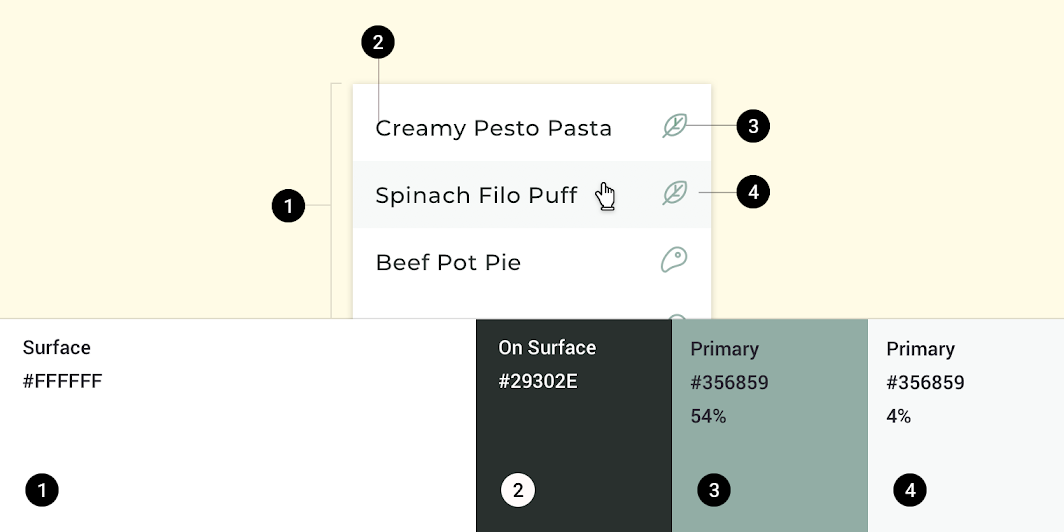
| Element | Category | Attribute | Value |
|---|---|---|---|
| Container | Surface | Color Opacity |
#FFFFFF 100% |
| Text | On Surface | Color Opacity |
#29302E 100% |
| Icon | Primary | Color Opacity |
#356859 54% |
| Hover overlay | Primary | Color Opacity |
#356859 4% |
Typography
Basil’s menu text uses custom typography.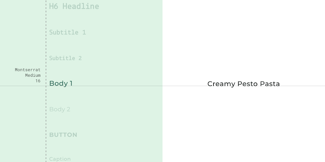
| Element | Category | Attribute | Value |
|---|---|---|---|
| Text | Body 1 | Typeface Font Size Case |
Montserrat Medium 16 Title case |
Shape
Basil’s menu containers have custom corners, with 0dp corner radiuses.
| Element | Category | Attribute | Value |
|---|---|---|---|
| Container | Medium component | Family Size |
Rounded 0dp; 0dp; 0dp; 0dp |
Shrine Material theme
This retail app’s menus have been customized using Material Theming. Areas of customization include color and typography.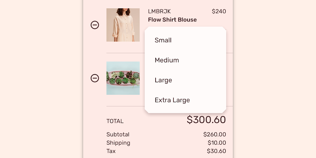
Shrine’s customized menu
Color
Shrine’s menus use custom color on two elements: the menu container and text.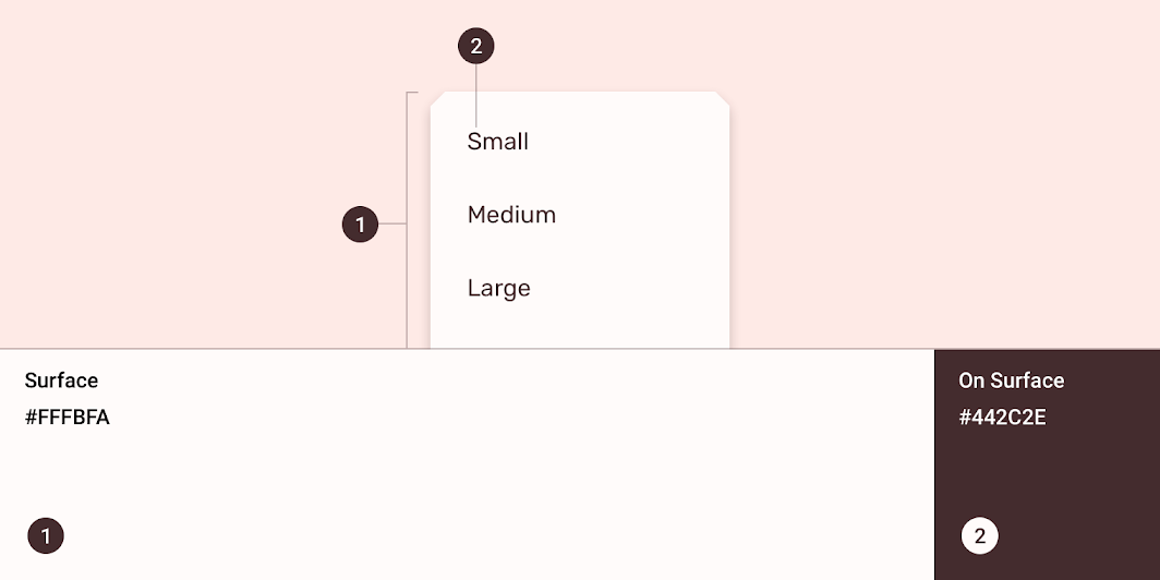
| Element | Category | Attribute | Value |
|---|---|---|---|
| Container | Surface | Color Opacity |
#FFFBFA 100% |
| Text | On Surface | Color Opacity |
#442C2E 100% |
Typography
Shrine’s menu text uses custom typography.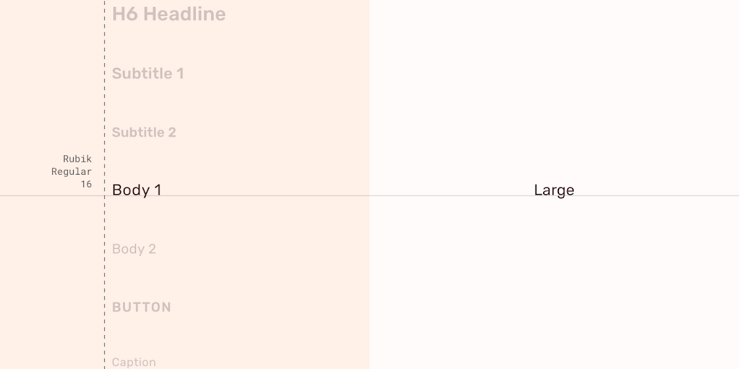
| Element | Category | Attribute | Value |
|---|---|---|---|
| Text | Body 1 | Typeface Font Size Case |
Rubik Regular 16 Title case |
Shape
Shrine’s menu containers have custom corner shapes, with 8dp long cut corners.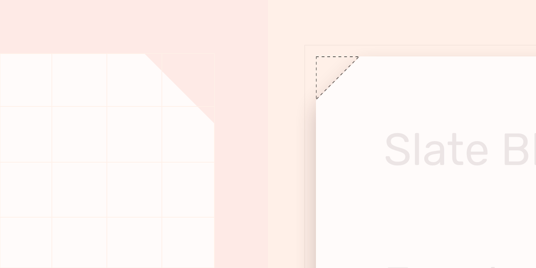
| Element | Category | Attribute | Value |
|---|---|---|---|
| Container | Medium component | Family Size |
Cut 8dp; 8dp; 8dp; 8dp |
Specs
Minimum and maximum width
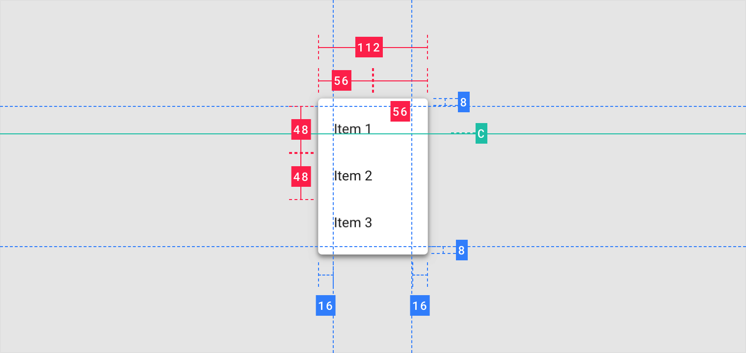
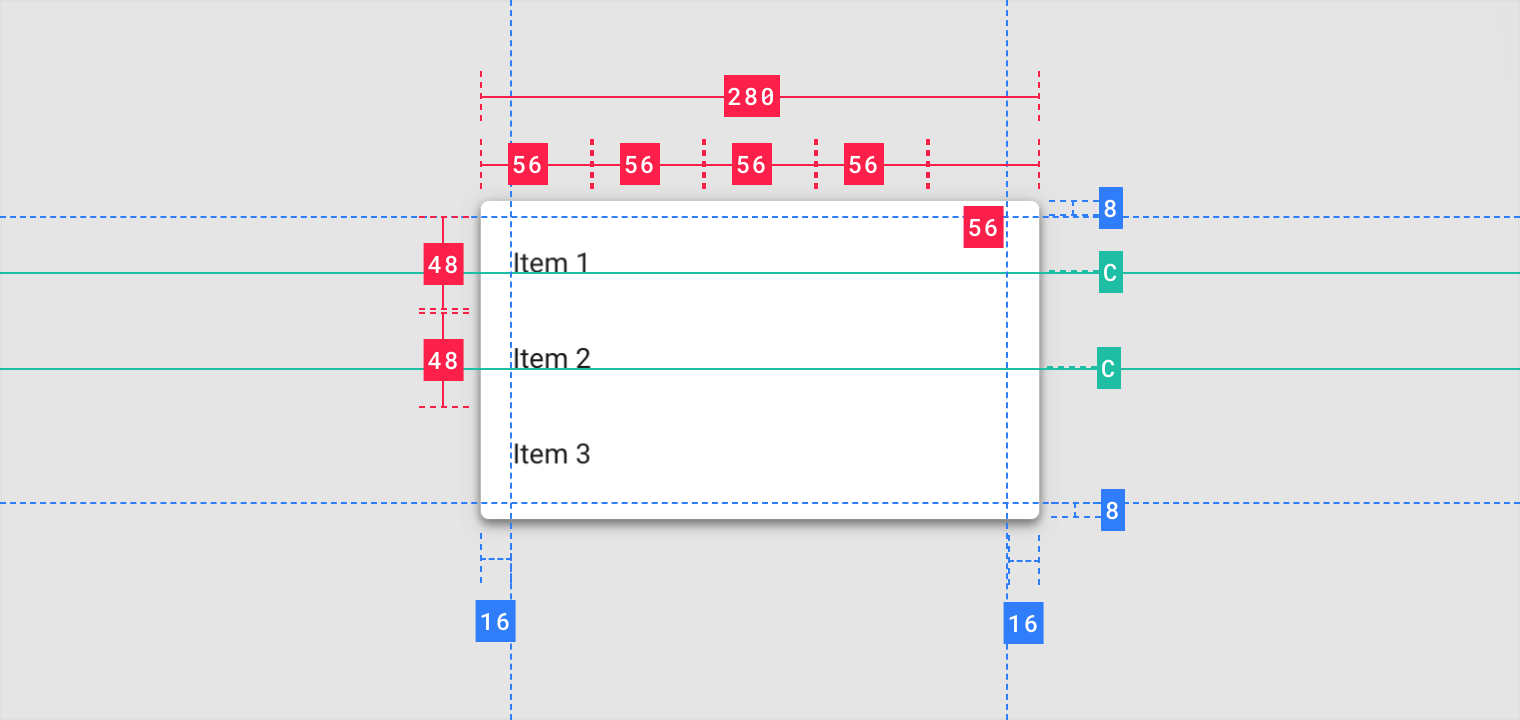
Dropdown
Mobile
Desktop
Dropdown (Desktop)
Dense

若有收获,就点个赞吧
0 人点赞
