Snackbars provide brief messages about app processes at the bottom of the screen.
Usage
Snackbars inform users of a process that an app has performed or will perform. They appear temporarily, towards the bottom of the screen. They shouldn’t interrupt the user experience, and they don’t require user input to disappear.
Frequency
Only one snackbar may be displayed at a time.
Actions
A snackbar can contain a single action. “Dismiss” or “cancel” actions are optional.
Principles

Informational
Snackbars provide updates on an app’s processes.
Temporary
Snackbars appear temporarily, and disappear on their own without requiring user input to be dismissed.
Contextual
Snackbars are placed in the most suitable area of the UI.
When to use
Snackbars communicate messages that are minimally interruptive and don’t require user action.
| Component | Priority | User action |
|---|---|---|
| Snackbar | Low priority | Optional: Snackbars disappear automatically |
| Banner | Prominent, medium priority | Optional: Banners remain until dismissed by the user, or if the state that caused the banner is resolved |
| Dialog | Highest priority | Required: Dialogs block app usage until the user takes a dialog action or exits the dialog (if available) |
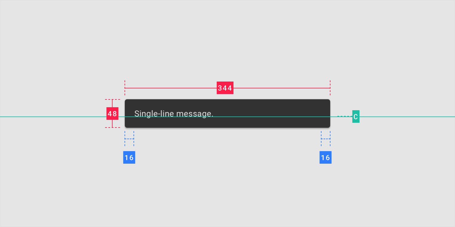
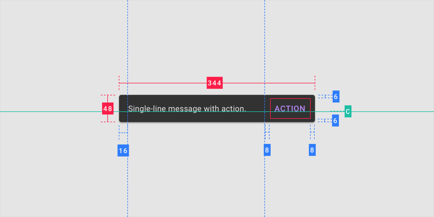
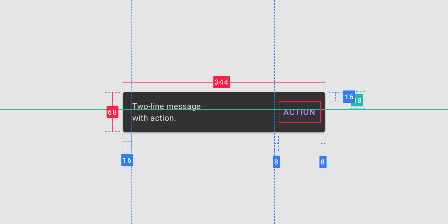
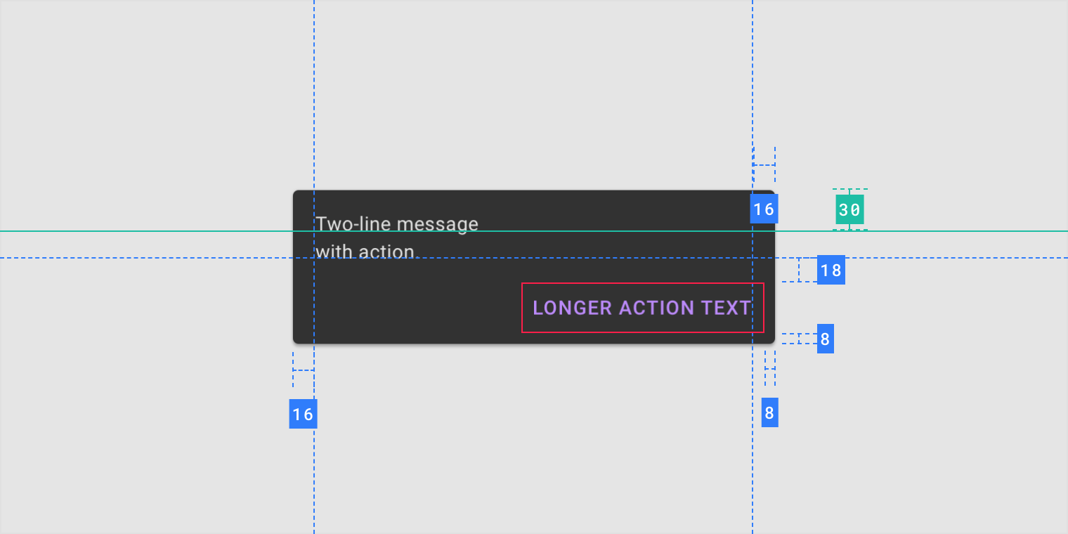
Anatomy
1. Text label
2. Container
3. Action (optional)

Text label
Snackbars contain a text label that directly relates to the process being performed. On mobile, the text label can contain up to two lines of text.
Text labels are short, clear updates on processes that have been performed.


Do
On mobile, use up to two lines of text to communicate the snackbar message.


Do
In wide UIs like desktop and tablet, snackbars should have only a single line of text.


Don’t
Don’t use icons in snackbars. If your message needs an icon, consider using a different component.

Container
Snackbars are displayed in rectangular containers with a grey background. Containers should be completely opaque, so that text labels remain legible.
Do
Snackbar containers use a solid background color with a shadow to stand out against content.


Do
In wide layouts, extend the container width to accommodate longer text labels.


Caution
An app can apply slight transparency to the container background, as long as text remains clearly legible.


Don’t
Avoid significantly altering the shape of a snackbar container.


Don’t
Avoid displaying a snackbar container without elevation.

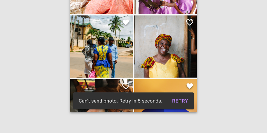
Action
Snackbars can display a single text button that lets users take action on a process performed by the app. Snackbars shouldn’t be the only way to access a core use case, to make an app usable.
To distinguish the action from the text label, text buttons should display colored text.


Don’t
The text label shouldn’t share the same color as the text button.


Don’t
Don’t use a filled or elevated button in a snackbar, as it draws too much attention.


Do
If an action is long, it can be displayed on a third line.


Do
To allow users to amend choices, display an “Undo” action.


Caution
A dismiss action is unnecessary, as snackbar disappears on their own by default.

Behavior
Appearing and disappearing
Snackbars appear without warning, and don’t require user interaction. They automatically disappear from the screen after a minimum of four seconds, and a maximum of ten seconds.
Consecutive snackbars
When multiple snackbar updates are necessary, they should appear one at a time.
 Consecutive snackbars should appear above persistent bottom navigation.

Don’t
Avoid stacking snackbars on top of one another.

Don’t
Don’t animate other components along with snackbar animations, such as the floating action button.
Scaling and adaptation
Size constraints
On small screens, snackbars should expand vertically from 48dp to 64dp to accommodate one or two lines of text, while maintaining a fixed distance from the leading, trailing, and bottom edges of the screen.
On medium and large screens, snackbars should scale horizontally to accommodate longer text strings, keeping in mind that the ideal line length for text is typically between 40-60 characters.
Snackbars use a flexible distance from the trailing edge of the screen. Whenever possible, snackbars on medium and large displays should aim for a single line of text with an optional button.
A single-line snackbar expanded to accommodate its content on a tablet.

Placement
At the bottom of the UI
Snackbars should be placed at the bottom of a UI, in front of app content. Avoid placing a snackbar in front of frequently used touch targets or navigation.
Place a snackbar in front of the content.


Don’t
Avoid placing snackbars in front of navigation components.

Snackbars can span the entire width of the screen only when a UI does not use persistent navigation components like app bars or bottom navigation bars.
Snackbars that span the entire width of a UI can push only FABs up when they appear.
Caution
Snackbars can span the entire width of a UI. However, they should not appear in front of navigation or other important UI elements like floating action buttons.

Snackbars and floating action buttons (FABs)
Snackbars should appear above FABs.
Snackbar above a FAB


Don’t
Don’t place a snackbar in front of a FAB.


Don’t
Don’t place a snackbar behind a FAB.

Snackbars and persistent footer elements
Snackbars should appear directly above persistent footer elements.
Snackbar above persistent footer elements


Do
Place snackbars in front of medium extended sheets.


Don’t
Avoid pushing bottom persistent elements up when snackbars appear.

Snackbars in wide layouts
In wide layouts, snackbars can be left-aligned or center-aligned if they are consistently placed on the same spot at the bottom of the screen.
Left-aligned snackbar

Center-aligned snackbar


Don’t
Avoid placing snackbars flushed to one edge of the layout.


Don’t
Avoid placing consecutive snackbars side by side or next to one another.

Specs

若有收获,就点个赞吧
0 人点赞
