用户引导通过虚拟拆箱的体验来引导新用户发现产品的价值。
Onboarding is a virtual unboxing experience that helps users get started with an app.
用法
用户引导应该设置合适的目标来帮助用户熟悉应用。
Your onboarding should have specific goals suited to the user’s level of familiarity with the app.
| 使用阶段 | 目标 |
|---|---|
- 用户已经安装了该应用,因此无需查看更多营销信息 - 用户可能希望在不阅读说明手册的情况下尝试使用该应用 - 用户尚未熟悉该应用程序的用户界面或准备对其进行了解 |
- 欢迎用户并激发他们对未来体验的兴趣 - 直接或间接地帮助用户了解如何在生活中使用该应用程序 - 督促用户使用应用的第一个星期采取行动,以增加参与度,提高产品的用户留存率 |
| User context | Onboarding goals |
|---|---|
- The user has already installed the app and doesn’t need to see more marketing for it - The user may be eager to try the app without reading an instruction manual - The user is not yet familiar with the app’s UI or ready to learn about it |
- Welcome users and excite them about the experience ahead - Help users implicitly or explicitly understand how the app can be used in their lives - Drive users to take actions that increase engagement and retention in the first seven days |
从应用商店开始,到用户执行一个关键操作为止,用户引导是这个流程中的重要节点。
在设计用户引导时,需要根据用户引导上下游的各个页面。
新用户才需要用户引导。
Onboarding is one point in a longer journey that begins in the app store and ends with the user taking the first key retention-correlated action in your app.
When designing your onboarding, consider the screens that came before it and those that will come after it.
Show onboarding to first-time users. Don’t show it to returning users.
类型
共有三种入门模式:
- 自定义模式
- 快速入门模式
- 展示型引导页
There are three onboarding models: self-select, quickstart, and top user benefits.
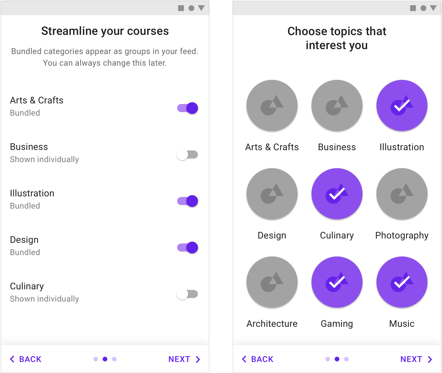
自我选择 允许用户自定义体验的内容。 Self-select: Allow users to customize their experiences
快速开始 作为应用程序的一部分来引导用户。 Quickstart: Start the user directly in the app

展示型引导页 显示轮播图或简短的动画,告知用户应用程序可以为其带来的好处。 Top user benefits: Display a carousel or a brief animation highlighting benefits of using the app
我们为设计者如何设计用户引导提供了一些参考准则:
The onboarding best suited to your app depends on if your app uses a common, recognizable UI style and and how easy it is to set up.
| 自定义模式 | 快速开始模式 | 展示型引导页 | |
|---|---|---|---|
| When to use | - 应用的 UI 可以定制 - 应用有需要用户设置或同意某些条件的要求 |
应用需要在前期增加用户的参与度,提高产品的用户留存率 | - 应用解决了某些棘手的问题或可以为用户带来一定的好处 - 需要告知用户应用有了新的功能或者对 UI 进行了改版 |
| When not to use | - 应用解决了某些棘手的问题或可以为用户带来一定的好处 - 需要告知用户应用有了新的功能或者对 UI 进行了改版 |
应用解决了某些棘手的问题或可以为用户带来一定的好处 | - 应用的用户界面和用户体验是大多数用户熟悉的模式 - 应用没有重大变化 |
| Combinations | 不要将“自定义”与“展示型引导页” | 适用于第一次启动应用 | - 不要将“自定义”与“展示型引导页” - 可以出现在注册后或注册后 |
| Usage | Self-Select | Quickstart | Top User Benefits |
|---|---|---|---|
| When to use | - The UI can be customized - Your app has setup and consent requirements |
You’ve already identified the behaviors that correspond to increased engagement (in the first session) or increased retention (in the first seven days) | - Your app is tackling a new challenge or providing a new kind of benefit - To announce new uses or major UI changes |
| When not to use | - Your app is tackling a new challenge or providing a new kind of benefit - To announce new uses or major UI changes |
Your app is tackling a new challenge or providing a new kind of benefit | - Your app’s UI and benefits use patterns familiar to most users - Your app has no major changes |
| Combinations | Don’t combine Self-Select with Top User Benefits | Ok to include setup before first-run experience | - Don’t combine Top User Benefits with Self-Select - It’s okay for your app to show setup after or as part of onboarding |
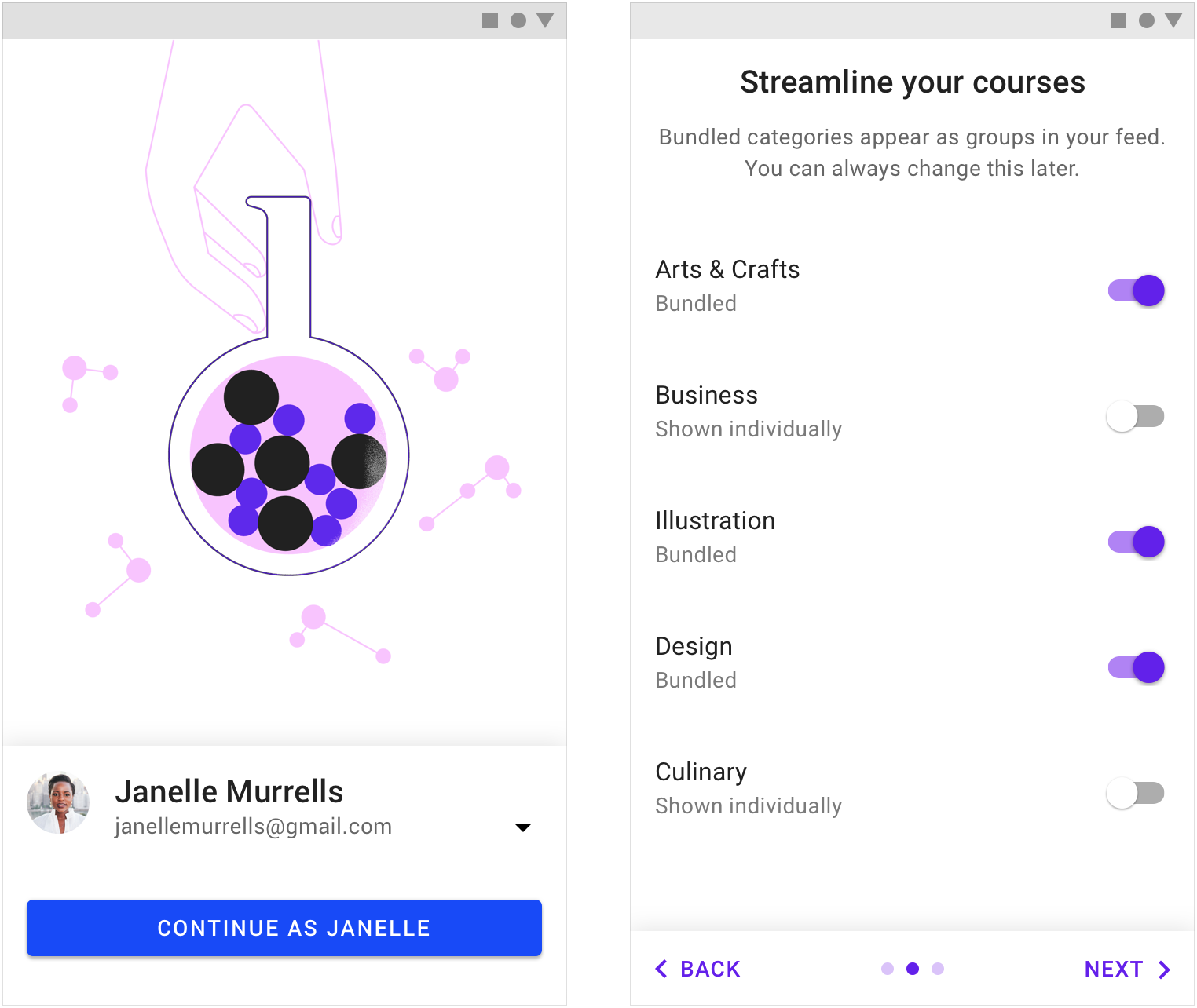
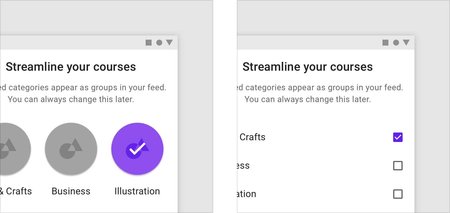
自定义模式
“自定义模式”允许用户通过做出一系列简短选择来定制其首次运行体验。
这种体验方式提供了隐式的教育,使用户对即将到来的页面有控制感和新鲜感。
The Self-Select model allows users to customize their first-run experience by making a short series of choices.
This experience provides implicit education, giving the user a sense of control and vested interest in the screens to come.
登录页面。 自定义页面。
正确的“选择”
用户在“自定义模式”中的选择会影响到用户引导的成功率。
要求:
- 有意义且引人注目
- 提供用户不知道的信息
- 简短
The choices you give users affect the success of your onboarding.
Choices should:
- Be meaningful and noticeable
- Provide new information
- Be short
“选择”要有意义而引人注目
提供对用户体验具有有意义和显着影响的“选择”。用户在做出选择的同时,可以间接地了解并学习应用的交互方式。
Offer choices that have a meaningful and noticeable impact on the user experience. These implicitly teach users how to interact with your UI.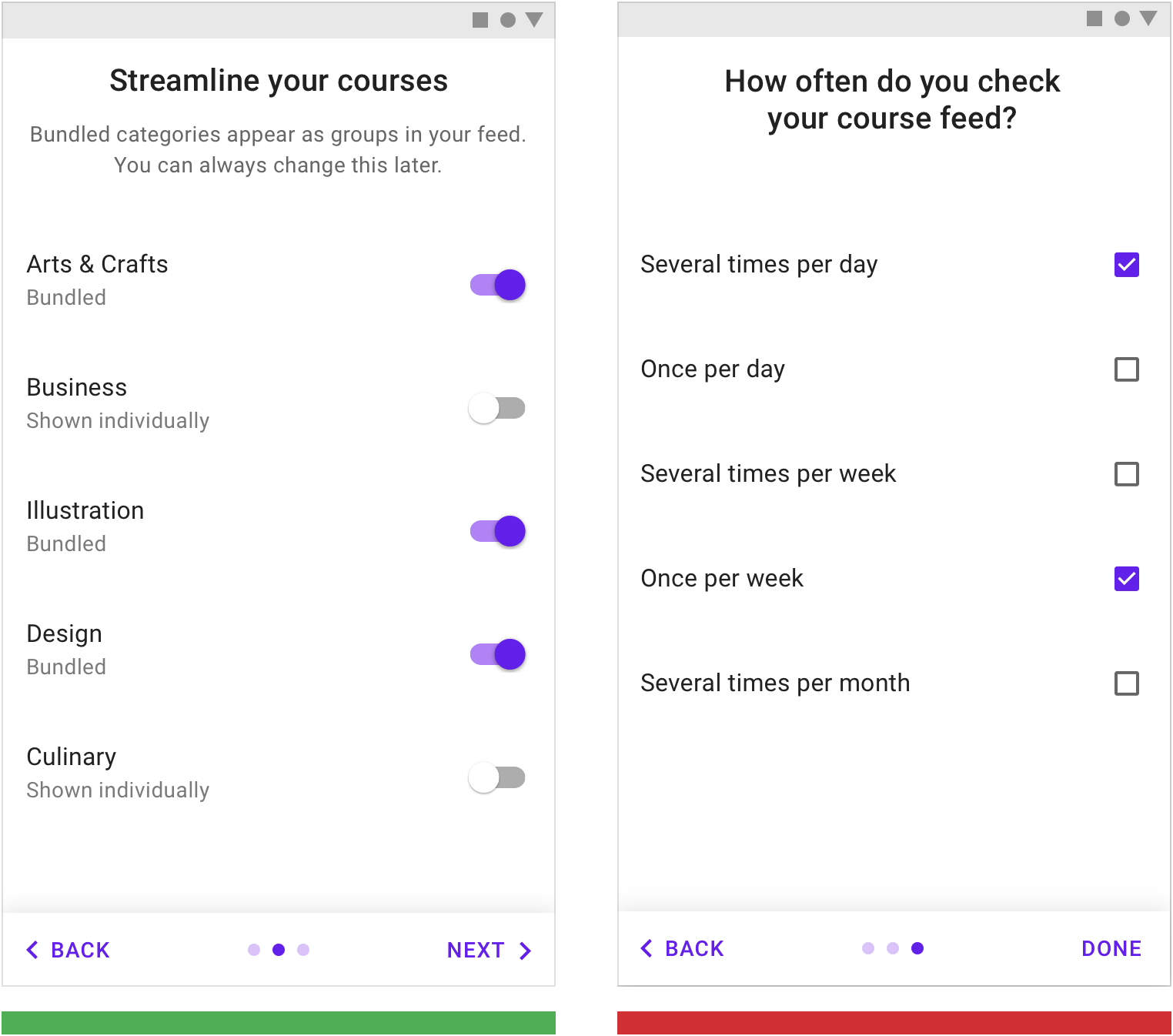
正确
让用户自己在引导阶段对之后会有什么样的用户体验做出有意义的选择。
Asking how a user wishes to be notified by the app during onboarding will have a meaningful impact on the user experience.
错误
不要提供对用户体验没有影响的选择。用户感兴趣的内容并不一定会对应用整体的体验产生影响。
Don’t include selections that have no impact on their experience. While it may interest app makers how often a user checks their feed, it doesn’t impact the user’s experience.
“选择”设计者不知道的
在引导阶段,用户的选择是让设计者了解用户偏好的途径。但是在引导时,要让用户觉得自己并不是在做出抉择,而是在于设计者进行交流。
Don’t ask for preferences that can be garnered from normal usage.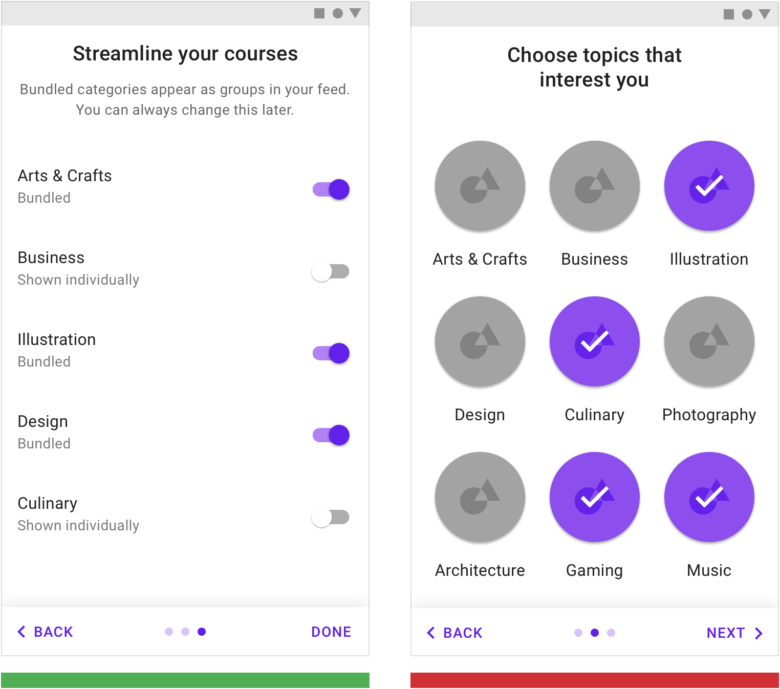
正确
不要让用户承担选择可能会造成的后果,提前告知用户,他们的选择是可逆的。
Normal usage won’t easily clarify what a user wants to bundle. It is valuable to ask the user their preferences.
错误
要让用户觉得自己并不是在做出抉择,而是在于设计者进行交流。示例中的“选择”并不会明显影响应用的体验,反而会给用户压力。
Don’t ask users to make selections that will become evident with normal use of the app and that won’t meaningfully change the first-run experience.
“选择”要简短
将自定义的选择限制一屏以内,若内容超出一屏,则另起一页放置。
每个页面上的“选择”不应该超过十个。
Limit choices to one screen, or make multiple screens feel connected to each other.
Each screen should have fewer than ten choices.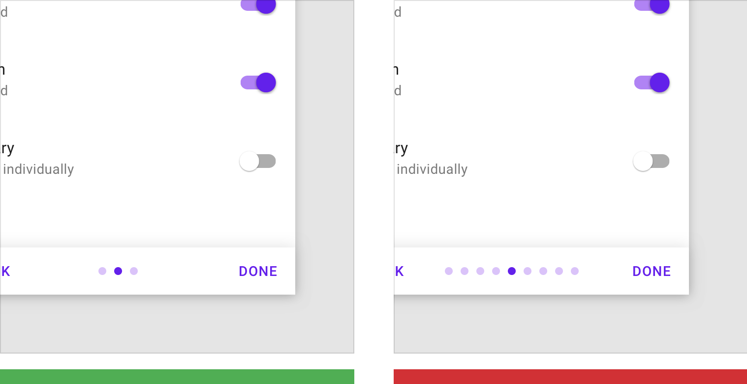
正确
将自定义的选择限制一屏以内。
A single Self-Select screen
错误
自定义的选择所占屏数过多。
Many Self-Select screens
在设计用户引导之前,请考虑如何将用户引导的内容与用户的首次用户体验结合在一起。用户在完成引导任务之后,用户所处的位置应该能够根据刚刚学到的内容进行相关操作。
When designing onboarding, think about how the onboarding process connects to a user’s first-run experience. After onboarding, the users should land on a screen that makes it easy to act on what they just learned.
设计
设计“自定义模式”的用户引导时,应该保证用户引导的内容与应用相关。内容为主的应用可能需要向用户询问用户感兴趣的主题。
一些常见的“自定义模式”设计:
Design your Self-Select screens to relate to what your app does. Apps focused on content consumption may ask for topics of interest, whereas apps with feeds may ask which topics to bundle.
Some common Self-Select design patterns include:

捆绑式列表
网格视图(左) 列表视图(右)
快速入门
在“快速入门”的模式中,用户直接进入 UI,而没有其它模式的用户引导(登录和设置除外)。
快速入门:
- 使用户能够快速了解该应用程序的核心功能
- 通常优先处理第一个关键操作
- 提供一种可选的方式来了解更多信息或向用户进行提问
In the Quickstart model, users land directly in the UI without any onboarding model shown (other than sign in and setup).
The Quickstart model:
- Enables users to quickly get started with the core functionality of the app
- Often prioritizes the first key action
- Can also provide an optional way to learn more or ask for help
最佳实践
给用户一些事情做
不要让用户停留在空白的页面上,孤立用户与应用进行互动。
Rather than leaving users on a blank screen, your UI should encourage interaction.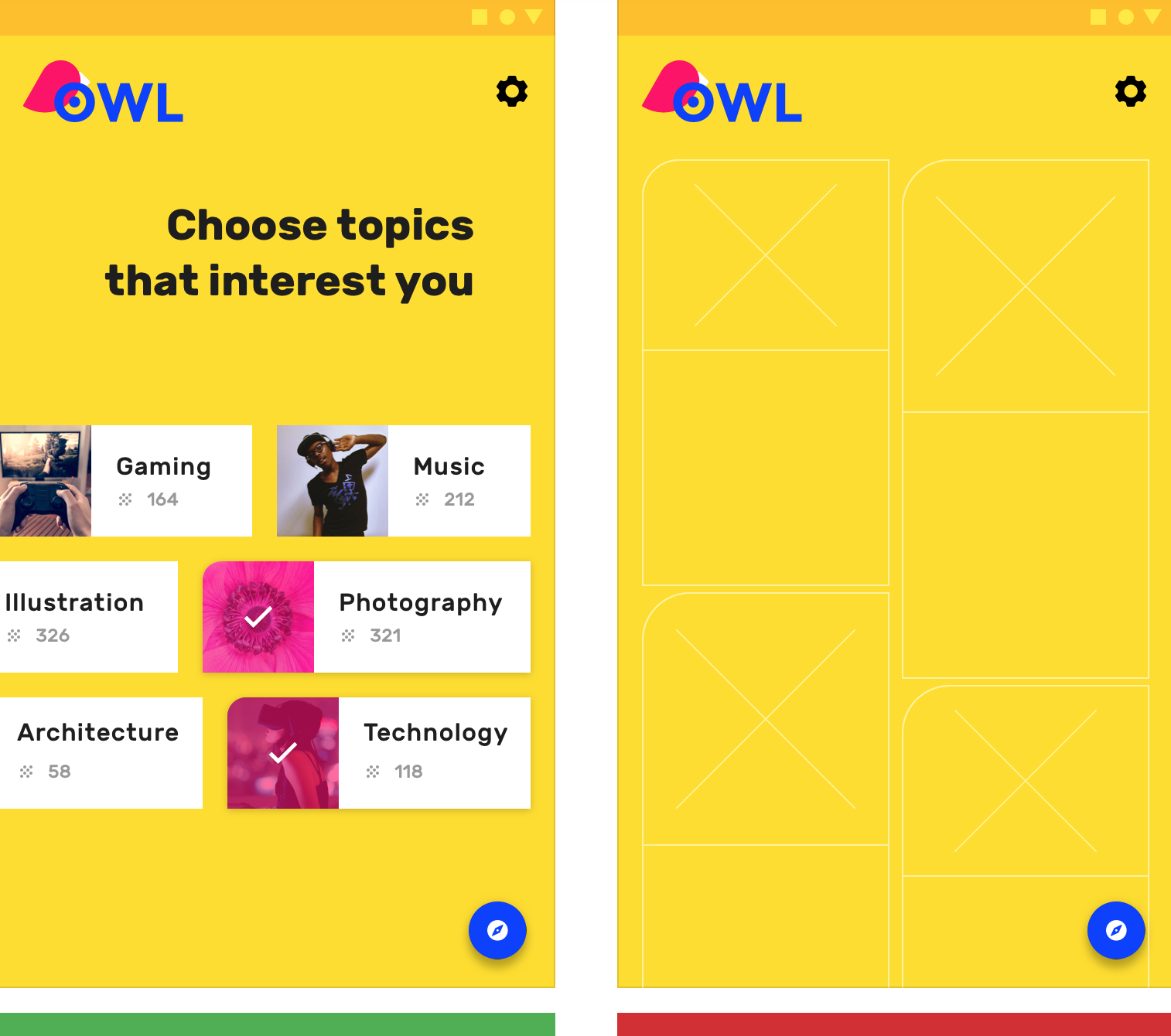
正确
提供选项以使用户进行操作。
Provide options to get the user started.
错误
不要让用户无所事事。
Don’t leave users with nothing to do.
提供更多了解应用的机会
当用户即将完成第一次的用户引导后,仍然不知道该如何使用该应用时,设计者应该提供其它的机会来帮助用户更好地了解应用。
If it appears as though the user is unclear how to use the app towards the end of the average first-run experience (90% of the way through the first session), display a UI prompt offering the opportunity to learn how to use the app.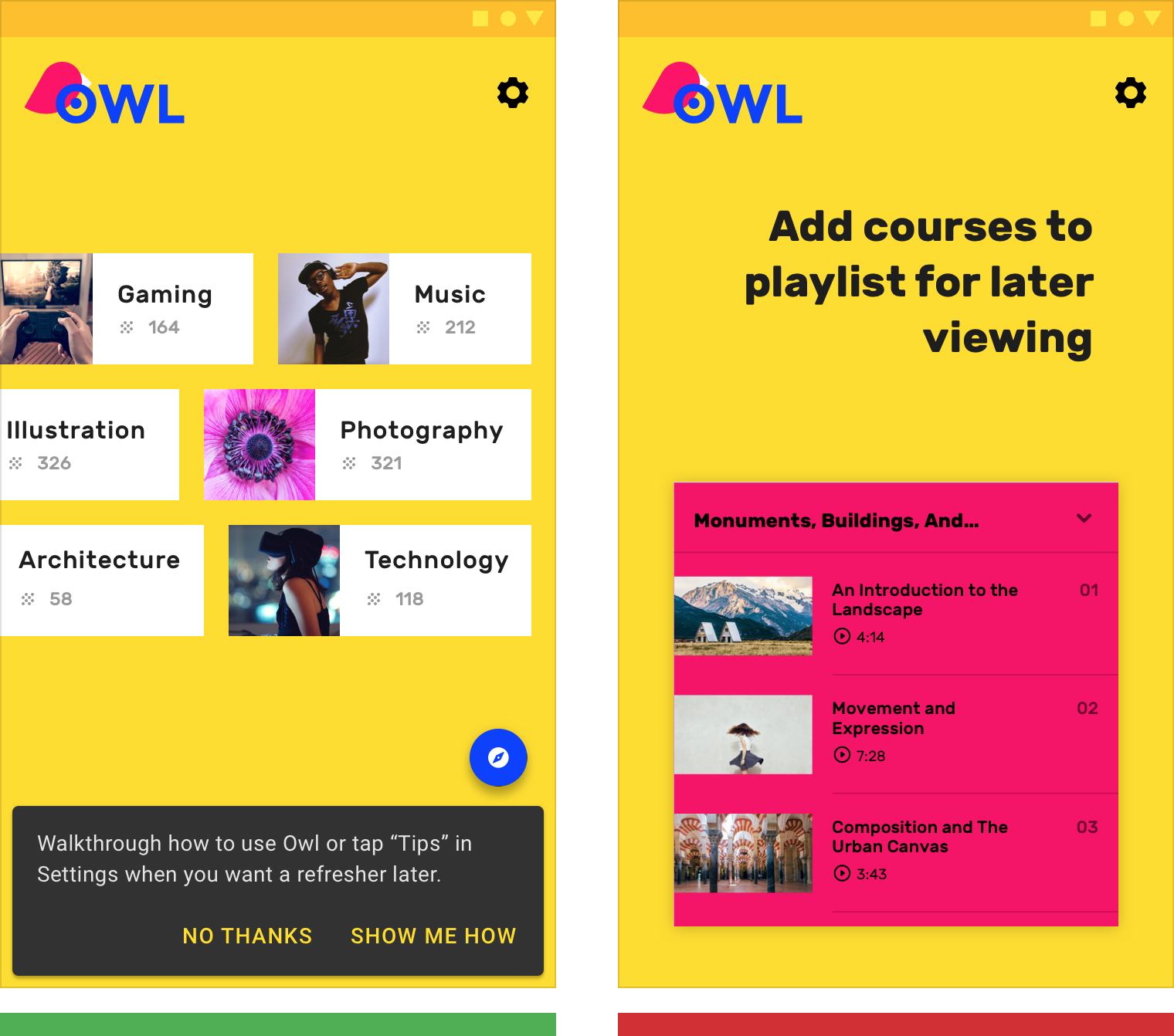
正确
为用户提供更多了解该应用程序的机会。
Offer the user the opportunity to learn more about the app.
错误
不要强制对用户进行引导。
Don’t force education upfront.
优先处理第一个关键动作
根据数据监控,设计者可以为用户提供,统计结果中前一个星期大部分用户都会进行的一个操作。另外,也可以引导用户尝试应用的核心功能。
Choose the action most closely linked to engagement in the first seven days. Alternatively, introduce core functionality as tips for actions that a user hasn’t tried.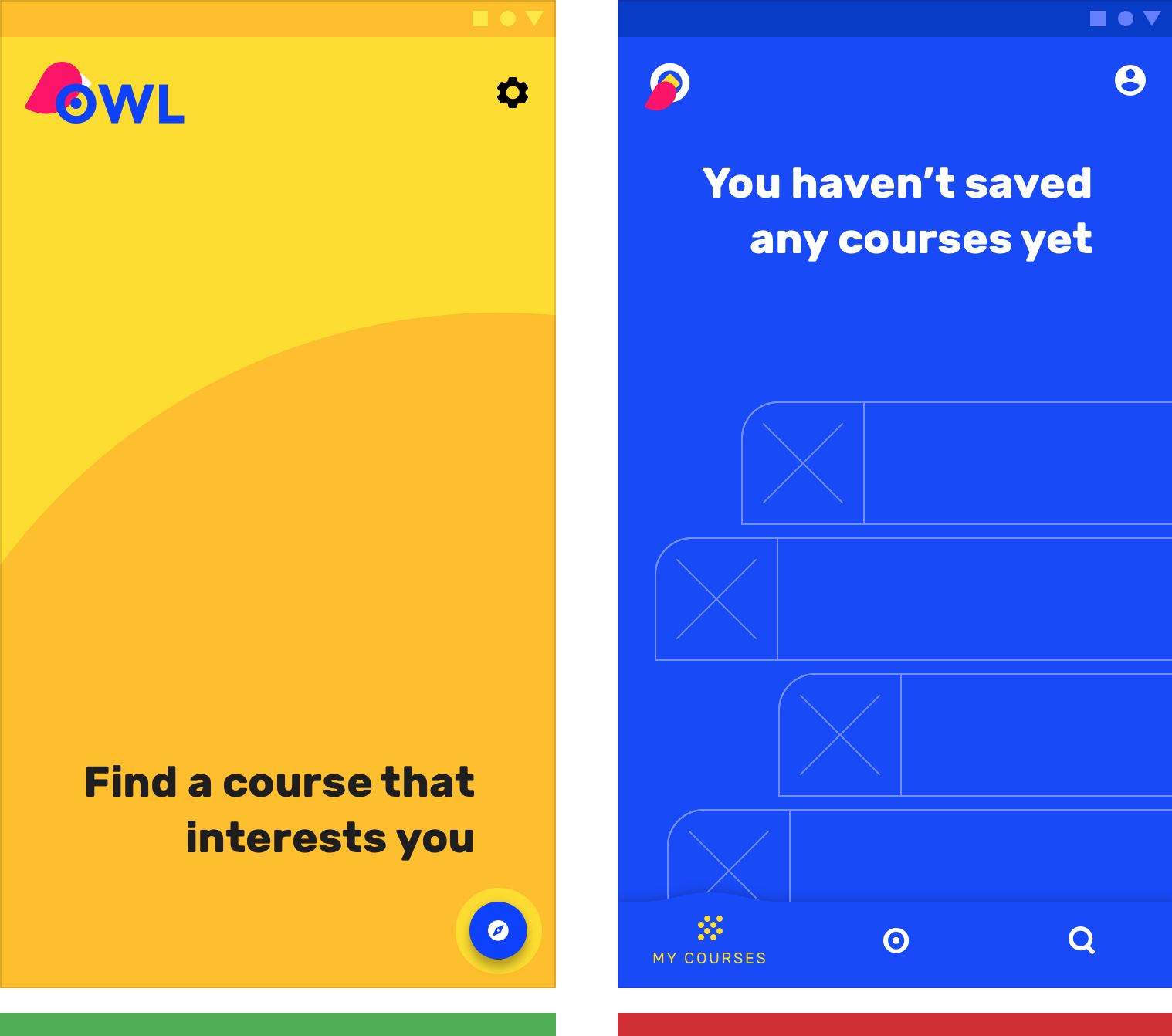
正确
推动用户采取第一个关键操作。
Nudge users to take the first key action.
错误
不要让用户无所事事。
Don’t leave users with nothing to do.
展示型引导页
展示型引导页通过展示与产品内容有关的轮播图或简短的动画,告知用户应用程序可以为其带来的价值。
The Top User Benefits onboarding model contains a brief autoplay carousel, or animated storyboard, that highlights the primary benefits from using an app.
正确的价值
展示型引导页展示的价值最多三项。这些价值更多的体现在定位上,而不是具体功能的描述说明。
设计之前应该注意:
- 产品解决了哪些问题
- 产品带来的主要好处
- 为什么产品具有用户粘性
The Top User Benefits model should demonstrate up to three primary benefits from using the app. These benefits should position the app as relevant and personal during a moment that matters, rather than give instructions or describe features.
When identifying which benefits to present, consider:
- Problems that the app solves
- The primary benefits the app creates
- The app’s “toothbrush features” (meaning, a feature you would use once or twice a day)
类型
自动轮播图
自动轮播的图片停留时间在两到三秒钟,需要在用户丧失耐心之前,进入下一个屏幕。
当用户试图通过触摸与轮播图交互时,应该禁用自动轮播的功能。否则,自动轮播会一直持续到用户点击“开始使用”的按钮为止。
用户可以通过左右滑动来控制轮播图。
A maximum of three illustrations should auto-rotate every two to three seconds and display pagination navigation. Auto-advance the first screen more quickly so that it’s clear this isn’t a single screen. The auto-advance feature should be disabled if the user touches the carousel.
Display a “Get Started” button throughout the animation, and loop through the animation continuously until the “Get Started” action is tapped.
The screen should be swipe-enabled, either in a forward or backward direction.
 > 按钮和分页导航是固定的。插画是动态轮播的,而且插图的风格必须保持一致,示例中,插图的内容基本处于页面的同一位置。
The button and pagination navigation are fixed. The typography is dynamic and on a separate field than the illustration, but at the same elevation.
视频动画
除了自动轮播图,设计者可以通过短暂的动画来制作引导页。
视频动画没有分页符,只有“开始使用”的按钮。
Another option for Top User Benefits is a video.
This should include a “Get Started” button, without pagination circles.
> 视频动画。
Video implementation
优秀案例
保持视觉风格一致
字符、情景、样式、排版以及按钮颜色在视觉效果上,都需要保持风格一致。
Maintain visual continuity throughout characters, environments, style, typography, and button colors.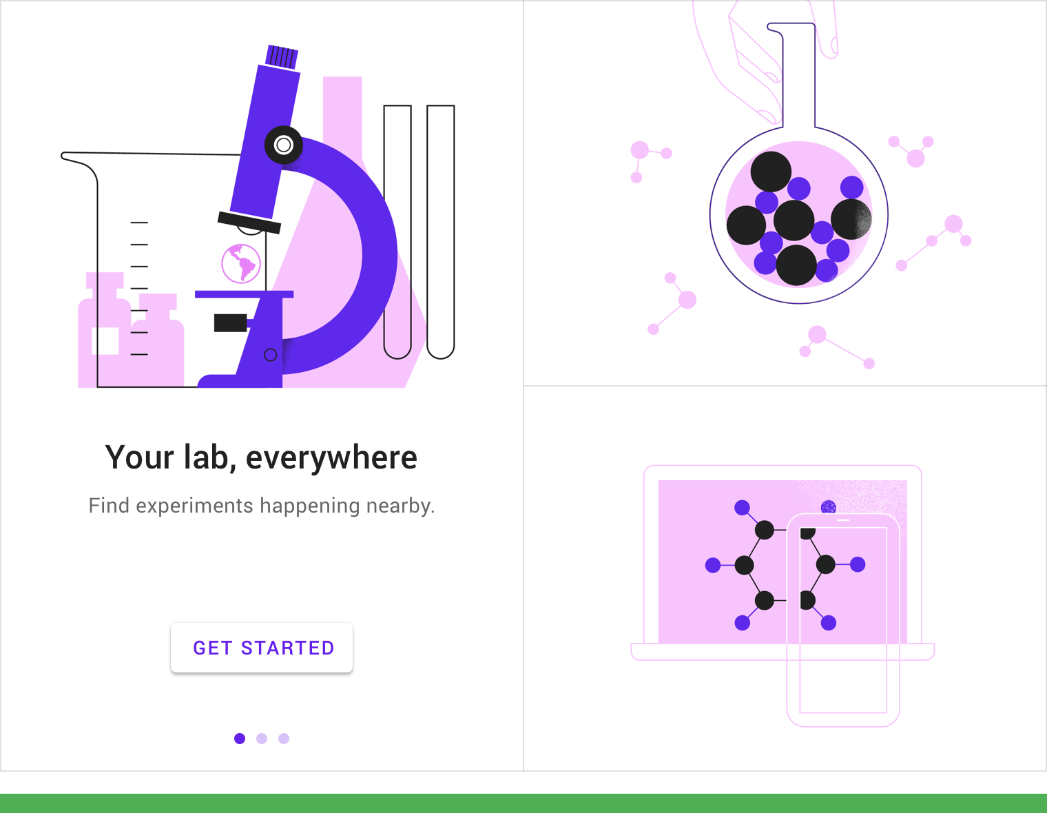
图例中的引导页保证了视觉风格的一致性。
Using consistent visuals and colors throughout the experience unify the story by creating a uniform canvas for the button and circles.
简化
在保证概念能够清晰传递给用户的前提下,尽可能简化视觉元素。
Simplify the visuals to the essentials needed to convey a concept.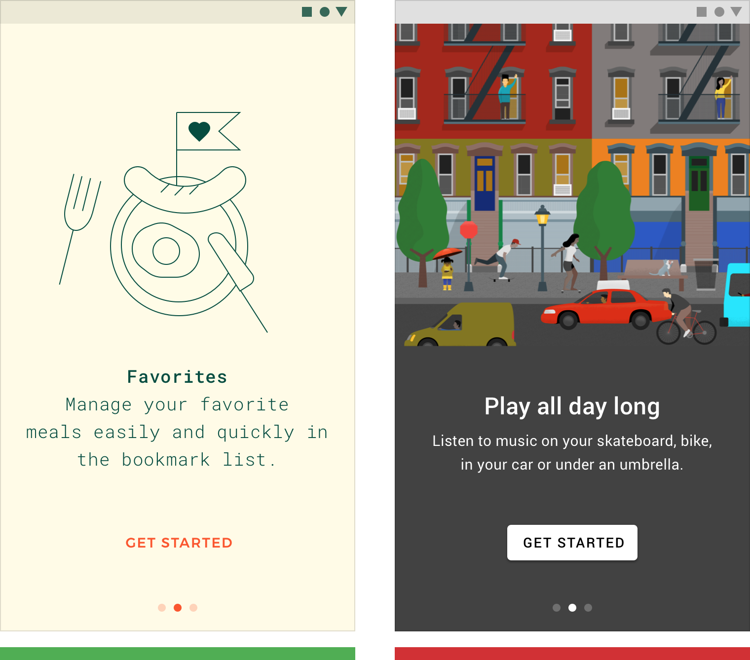
正确:简化文字和图像,专注于基本概念的传递。
Simplify text and imagery to focus on the essential concept.
错误:此图像中没有焦点。
There is no point of focus in this image.
不要直接使用应用截图
如果用户没有体验过你的应用,请不要使用应用截图。
Don’t show app UI if users haven’t experienced it yet. Show the user benefit first.
You may display education about the specific UI in a later context.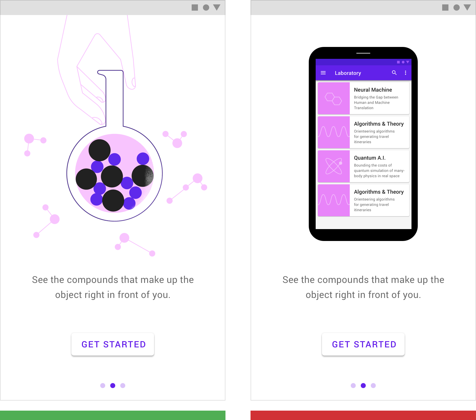
正确:利用简洁的插图能够迅速向用户传达使用该应用程序的好处。
This illustration helps convey the benefits of the app.
错误:直接给用户展示应用截图会误导用户,让用户分不清是应用的介绍还是可交互的组件。
Showing the actual app’s UI makes it unclear if the images are an illustration or an interactive element.
用户在完成引导任务之后,用户所处的位置应该能够根据刚刚学到的内容进行相关操作。
Design onboarding that connects to a first-run experience. The UI seen after onboarding should make it easy for users to act on what they just learned.
设计
文本与展示型引导页相辅相成。
如果文字可以更好地表达想法,请不要使用图像。
为了适应各种各样的平台,插图的核心区域的宽高比应该控制在 1:1 左右。确保背景和文本颜色符合用户能够识别的最低对比度。
The design of Top User Benefits should compliment the writing. If there’s an idea that can be better expressed through words, use text rather than imagery.
These layouts are designed to allow an illustration with a 1:1 aspect ratio to consistently fit on screens across all platforms. Ensure that the background and text color meet minimum contrast ratios for accessibility.
手机和平板电脑(纵向)
将居中对齐的文本和交互按钮放置在插图下方。
Place center-aligned copy and interactions beneath the illustration.

手机(纵向)

平板(纵向)
手机和平板电脑(横向)
将左对齐的文本和交互按钮放置在插图的右边缘,垂直居中。
Place left-aligned copy and interactions against the right edge of the illustration, vertically centered.

手机横版

平板横版
桌面端
将插图,文本和交互放置在居中的卡片中。
在此卡旁边显示“下一个”和“上一个”的按钮,并在其下方显示分页指示。
Place illustration, copy, and interactions in a centered card. Display “Next” and “Previous” buttons beside this card and pagination indicators beneath it.

桌面端
可穿戴设备和电视的用户引导使用交互方法各不相同,应区别对待。
Onboarding experiences for wearables and TV use different methods of interaction, and should be treated differently.
设计规范
手机和平板电脑(纵向)
Copy and UI are center-aligned on the screen and built from the bottom of the screen upward with 24dp padding.

- Headline: Type 24sp, Leading 32sp
- Subhead 1: Type 15sp, Leading 24sp
- 32sp line height
- 56dp padding between the top of button and the center of copy (allowing room for 1-3 lines of text)
- 24dp vertical padding
手机和平板电脑(横向)
Align copy and UI to the left edge of the illustration, vertically centered.

- Headline: Type 24sp, Leading 32sp
- Subhead 1: Type 15sp, Leading 24sp
- 32sp line height
- 56dp padding between the top of the button and the center of copy (allowing room for 1-3 lines of text)
- 24dp vertical padding
桌面端

- Headline: Type 24sp, Leading 32sp
- Subhead: Type 16sp, Leading 24sp
- Line Height: 32sp
- Padding between top of button and center of copy: 56dp (allowing for 1-3 lines of text)
- Vertical padding from image to pagination dots: 24dp
- Horizontal spacing from image to arrow: 48dp

若有收获,就点个赞吧
0 人点赞
