Tooltips display informative text when users hover over, focus on, or tap an element.
Usage
When activated, tooltips display a text label identifying an element, such as a description of its function.
Principles
Transient
Tooltips appear on hover, focus, or touch, and disappear after a short duration.
Paired
Tooltips are always paired nearby the element with which they are associated.
Succinct
Tooltips only include short, descriptive text.
Placement

Do
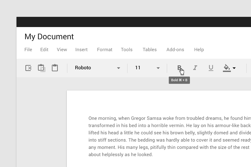
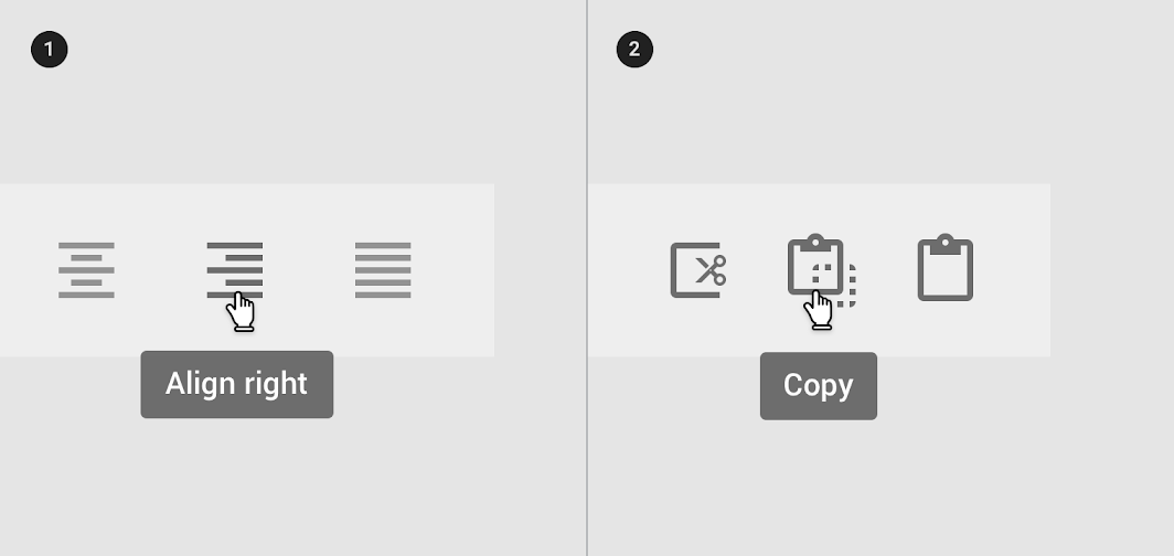
Use tooltips for interactive imagery.
200% zoom
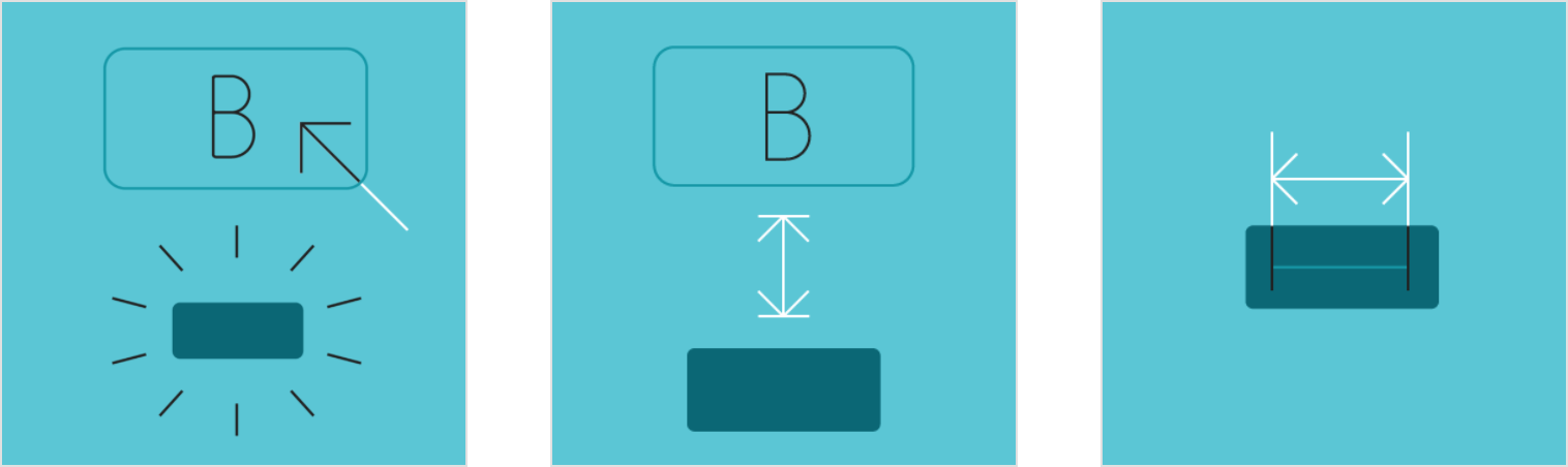
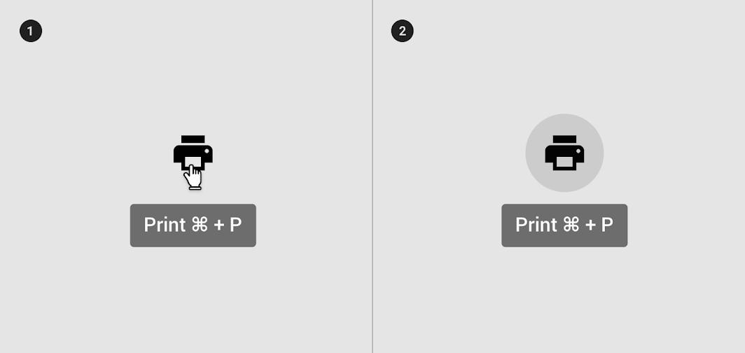
1. On hover
2. On focus

Don’t
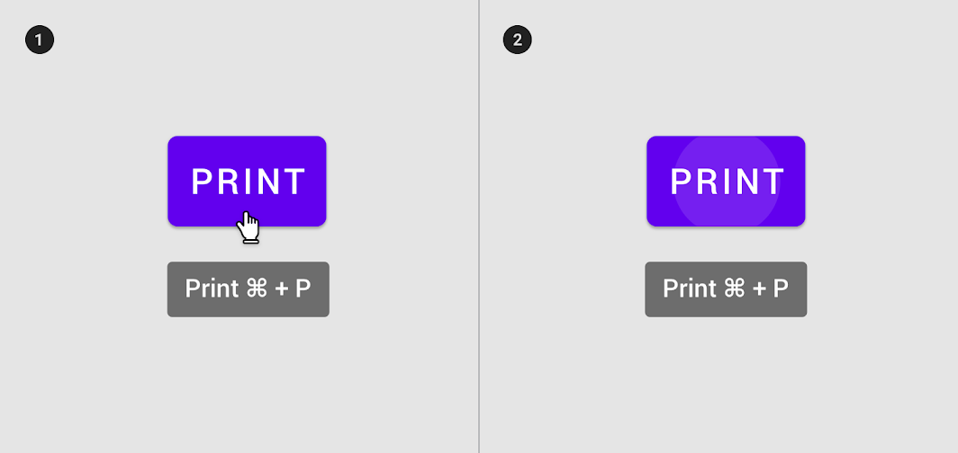
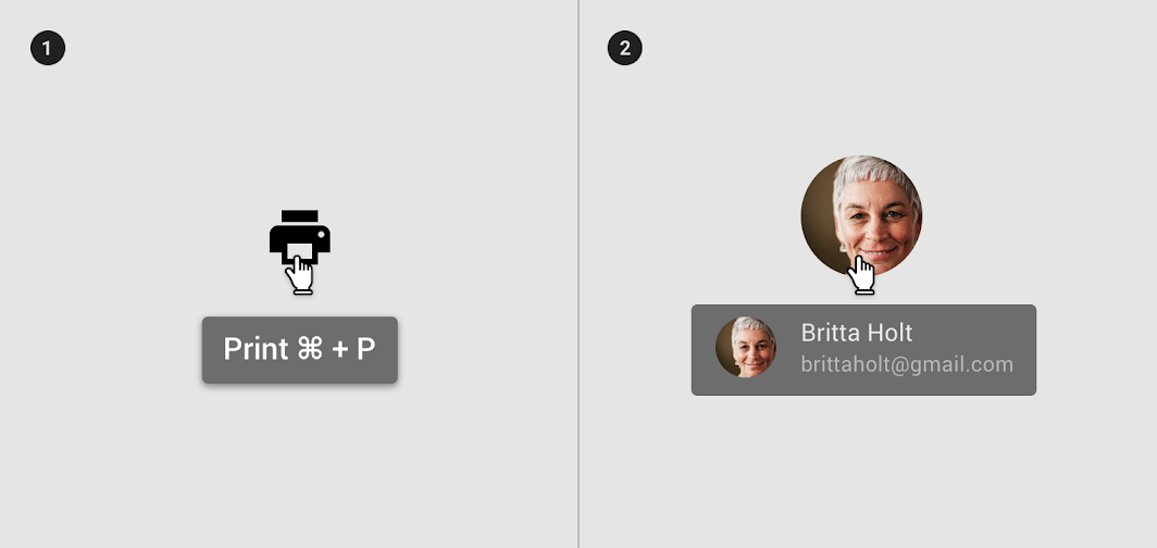
Don’t use tooltips to restate visible UI text.
200% zoom
1. On hover
2. On focus

Do
200% zoom
- Tooltips describe differences between similar elements
2. Tooltips distinguish actions with related iconography

Don’t
200% zoom
- Don’t display shadows on tooltips
2. Don’t display rich information and imagery on tooltips


Do
Keep the position of the tooltip visible.

Don’t
Don’t crop tooltips.
Desktop
Desktop tooltip on hover
Mobile
 Tooltip displayed through long press
Tooltip summoned through focus (Android only)
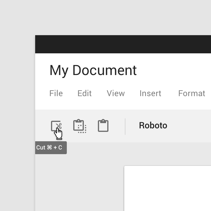
Behavior
A tooltip is displayed upon tapping and holding a screen element or component (on mobile) or hovering over it (desktop). Continuously display the tooltip as long as the user long-presses or hovers over the element.
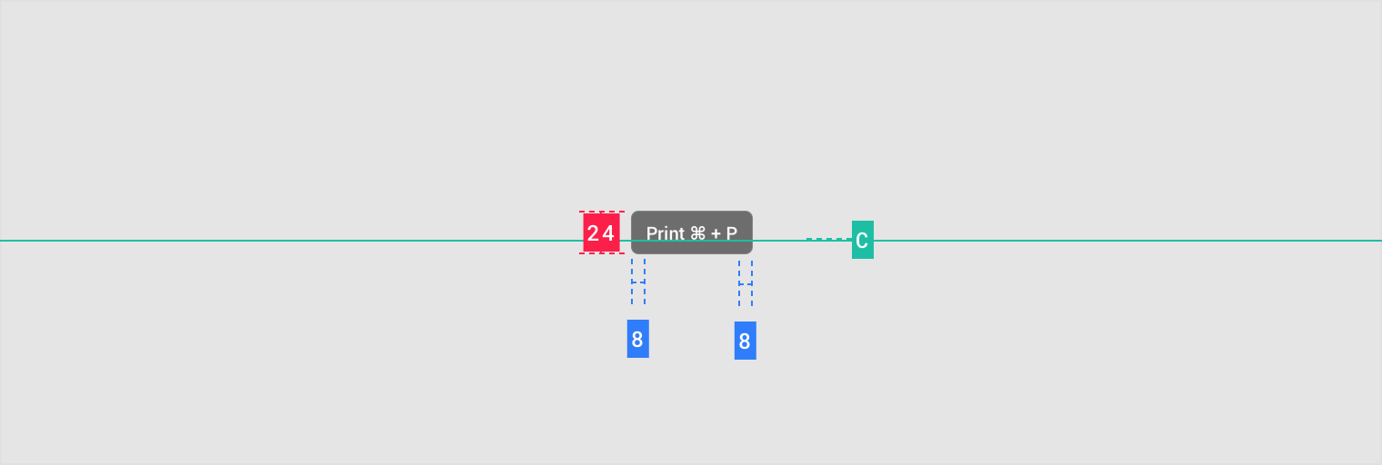
Timing
Display the tooltip for 1.5 seconds. If the user takes another action before that time ends, the tooltip will disappear.
Transitions
Tooltips use a fade transition pattern to enter and exit the screen.
1. 200%
2. 100%
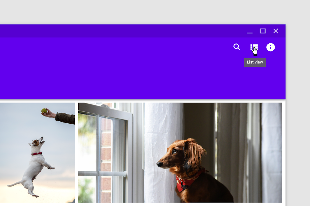
On desktop, tooltips appear in the center of click targets and stay in place while cursor moves within the target.
1. Tooltip disappears when cursor moves out of the touch target
2. Tooltip remains while cursor moves within the touch target
主题
Reply Material Theme
This email app’s tooltips have been customized using Material Theming. Areas of customization include color, typography, and shape.
Reply’s customized tooltip.
Color
Reply’s tooltips use custom color on two elements: the container, and text string.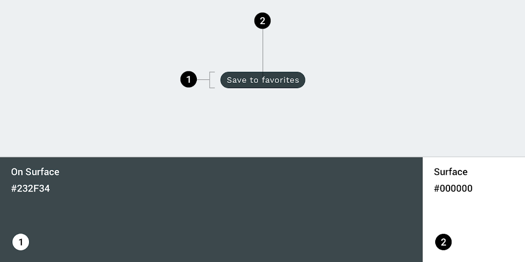
| Element | Category | Attribute | Value |
|---|---|---|---|
| Container | On Surface | Color Opacity |
#232F34 100% |
| Text string | Surface | Color Opacity |
#FFFFFF 100% |
Typography
Reply’s tooltips use custom typography for the text string.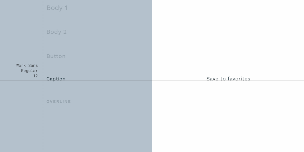
| Element | Category | Attribute | Value |
|---|---|---|---|
| Text string | Caption | Typeface Font Size Case |
Work Sans Regular 12 Sentence case |
Shape
Reply’s tooltips use a custom container shape, with a 50% corner radius.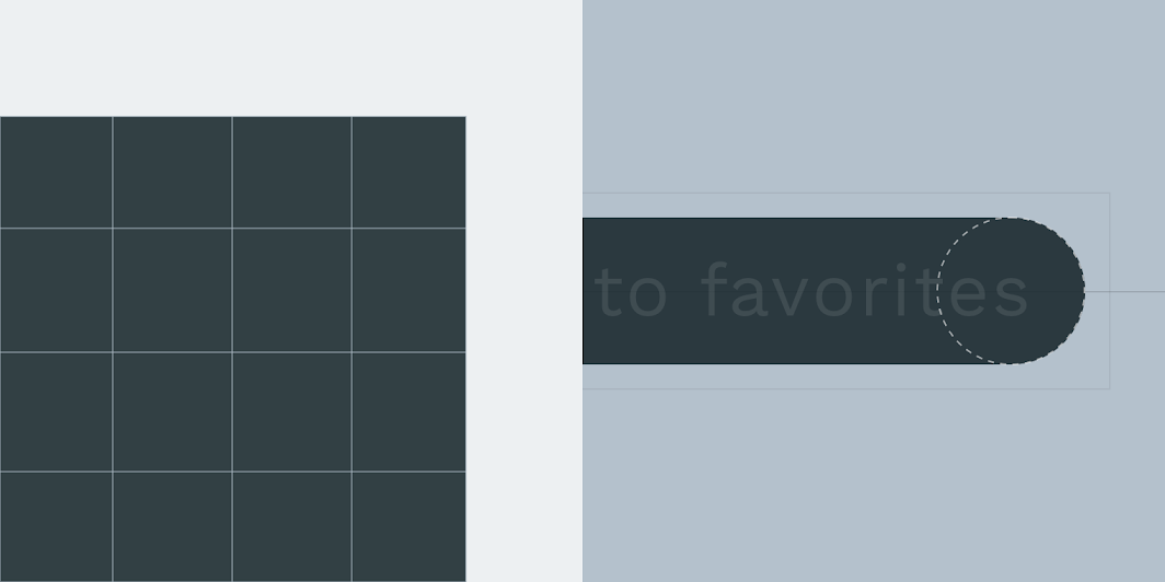
| Element | Category | Attribute | Value |
|---|---|---|---|
| Container | Small component | Family Size |
Rounded 50% |
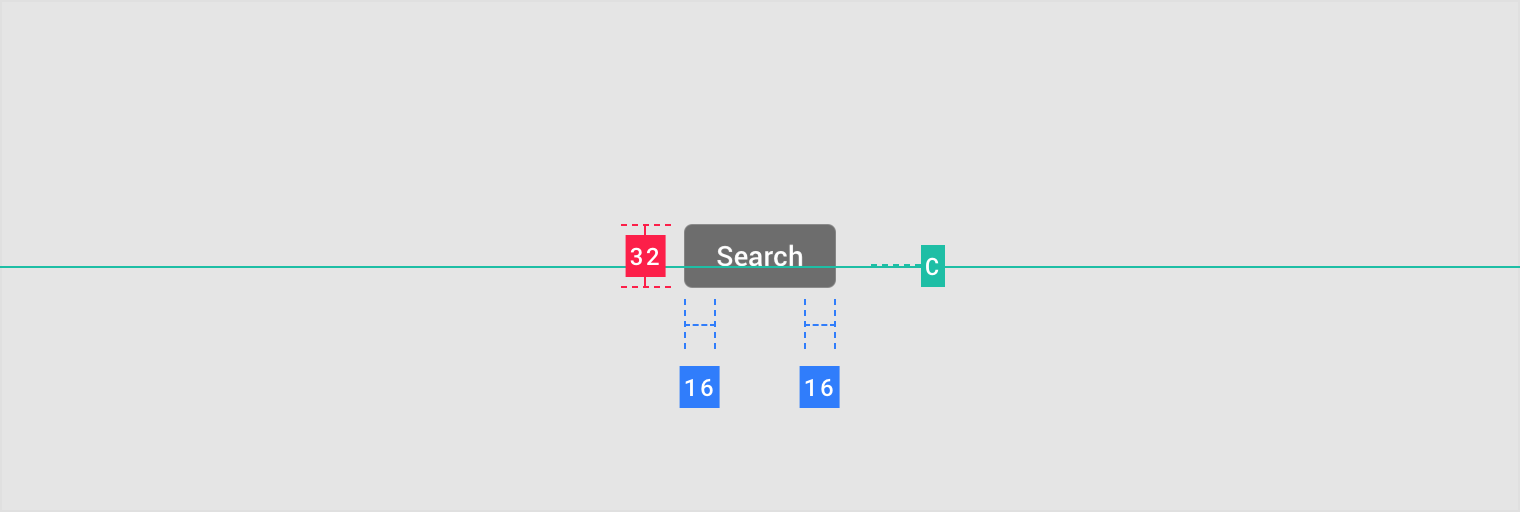
Specs
Desktop
Mobile

若有收获,就点个赞吧
0 人点赞
