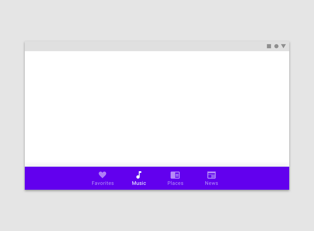
Bottom navigation bars allow movement between primary destinations in an app.
Usage
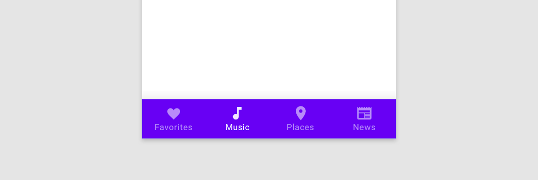
Bottom navigation bars display three to five destinations at the bottom of a screen. Each destination is represented by an icon and an optional text label. When a bottom navigation icon is tapped, the user is taken to the top-level navigation destination associated with that icon.

Ergonomic
The bottom navigation bar is easy to reach on a handheld mobile device.
Consistent
When used, the bottom navigation bar appears at the bottom of every screen.
Related
Bottom navigation bar destinations should be of equal importance.
When to use
Bottom navigation should be used for
- Top-level destinations that need to be accessible from anywhere in the app
- Three to five destinations
- Mobile or tablet only
Bottom navigation shouldn’t be used for
- Single tasks, such as viewing a single email
- User preferences or settings

Don’t
Don’t use a bottom navigation bar for fewer than three destinations (use tabs instead).

Don’tDon’t use more than five destinations. For those cases, try tabs or a navigation drawer.

Caution
Combining bottom navigation and tabs may cause confusion, as their relationship to the content may be unclear. Tabs share a common subject, whereas bottom navigation destinations are top-level and disconnected from each other.
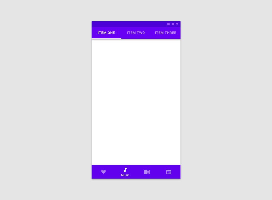
Image is 50% scale.
解析
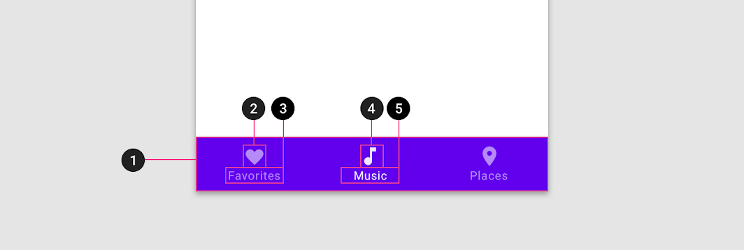
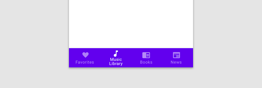
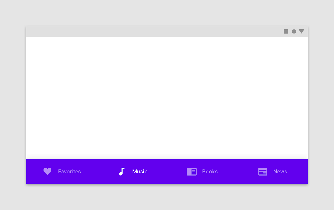
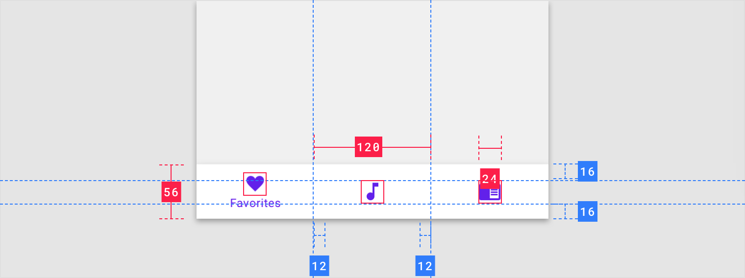
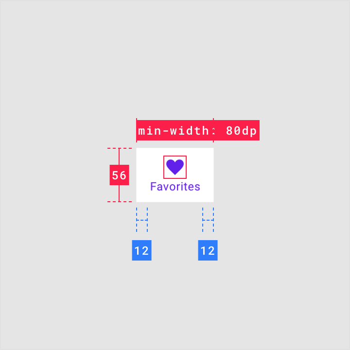
There are three destinations in this bottom navigation, each with an icon and text label.
- Container2. Inactive icon
- Inactive text label
- Active icon
- Active text label
Text labels
Text labels provide short, meaningful descriptions of bottom navigation destinations.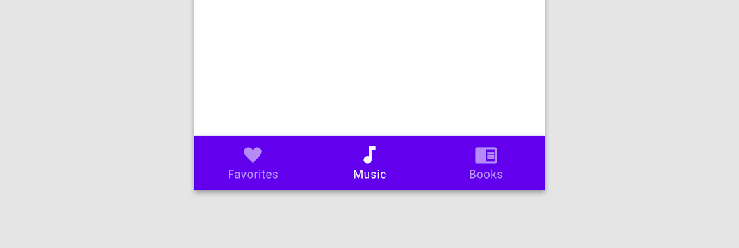

Do
Use short text labels.

Don’t
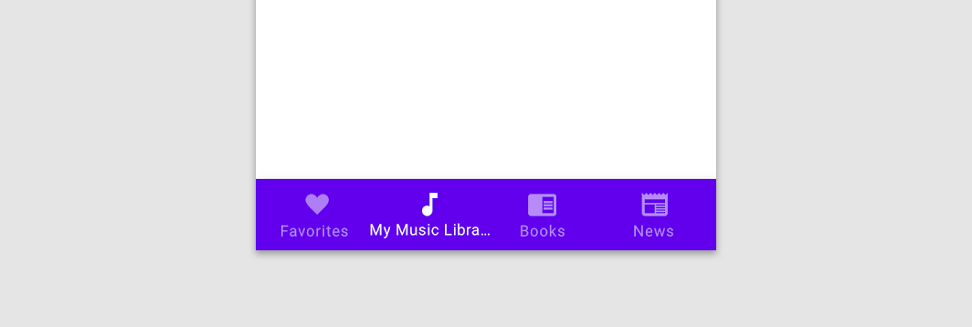
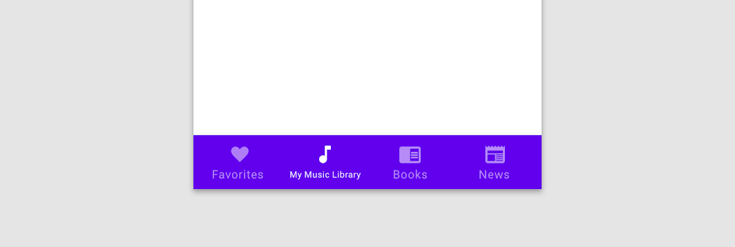
Don’t truncate text. The truncation may obscure important destination information.

Don’t
Don’t shrink text to fit on a single line.

Caution
Avoid wrapping text.
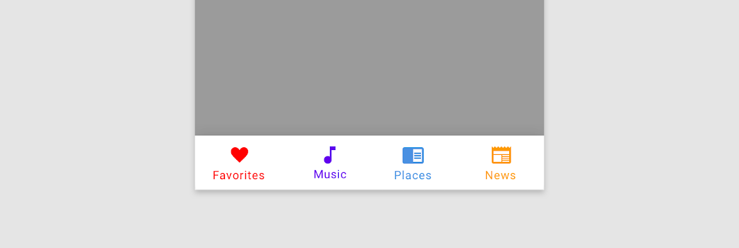
Icon & label colors
The active destination’s icon and label should use your app’s Primary or a High-Emphasis “On” color depending on the component’s color scheme. Inactive icons and labels can use the Medium-Emphasis “On” color.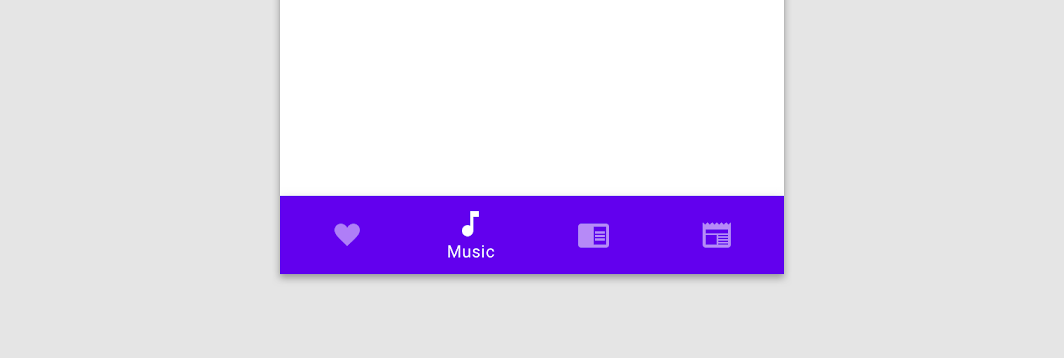

Do
Use the Primary or High-Emphasis “On” color for the active destination in a bottom navigation bar.

Don’t
Don’t use multiple or low-contrast colors in a bottom navigation bar, as they make it harder for users to distinguish the active item and navigate to other destinations.
Behavior
Navigation
Bottom navigation behaves differently on Android and iOS. When you select a bottom navigation item (one that’s not currently selected), each platform displays different outcomes:
- On Android: the app navigates to a destination’s top-level screen. Any prior user interactions and temporary screen states are reset, such as scroll position, tab selection, and in-line search.
- On iOS: the destination reflects the user’s prior interaction. If the user previously visited that section of the app, they return to the last screen viewed (with its prior state preserved, if possible). Otherwise, the app navigates to the top-level screen.
Default platform navigation can be overridden when needed to improve the user experience. For example, an Android app that requires frequent switching between sections can preserve each section’s state. Or, an iOS app can return users to the top-level screen (or reset their scroll position) if it better suits the use case.
 On Android, revisiting a section resets the app, returning the user to its top-level screen.
On iOS, when a user revisits a section they return to where they left off in that section, such as a detail screen.
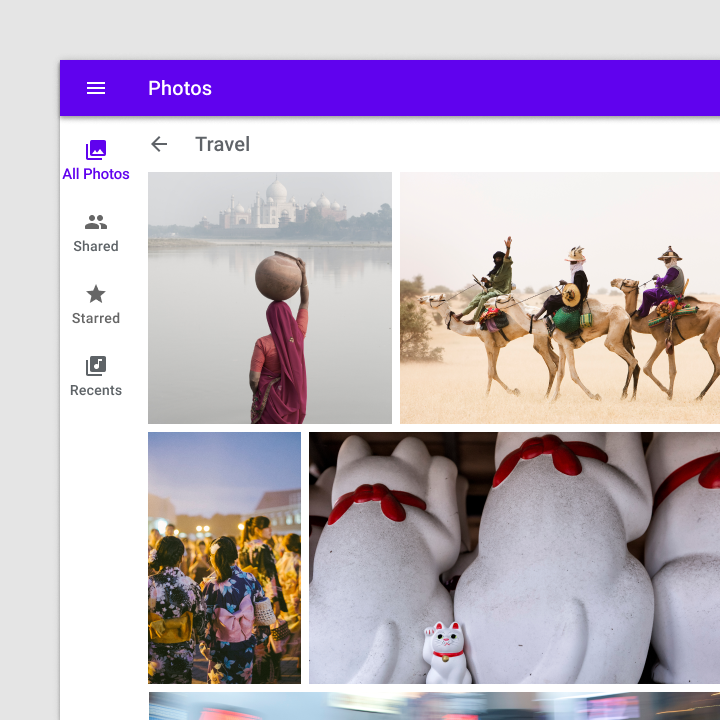
When moving downward in the app’s hierarchy (from a parent screen to a child screen), a bottom navigation bar can be displayed persistently for quick navigation between an app’s sections.
The bottom navigation bar in this music app remains in view when navigating to an album.
Badges
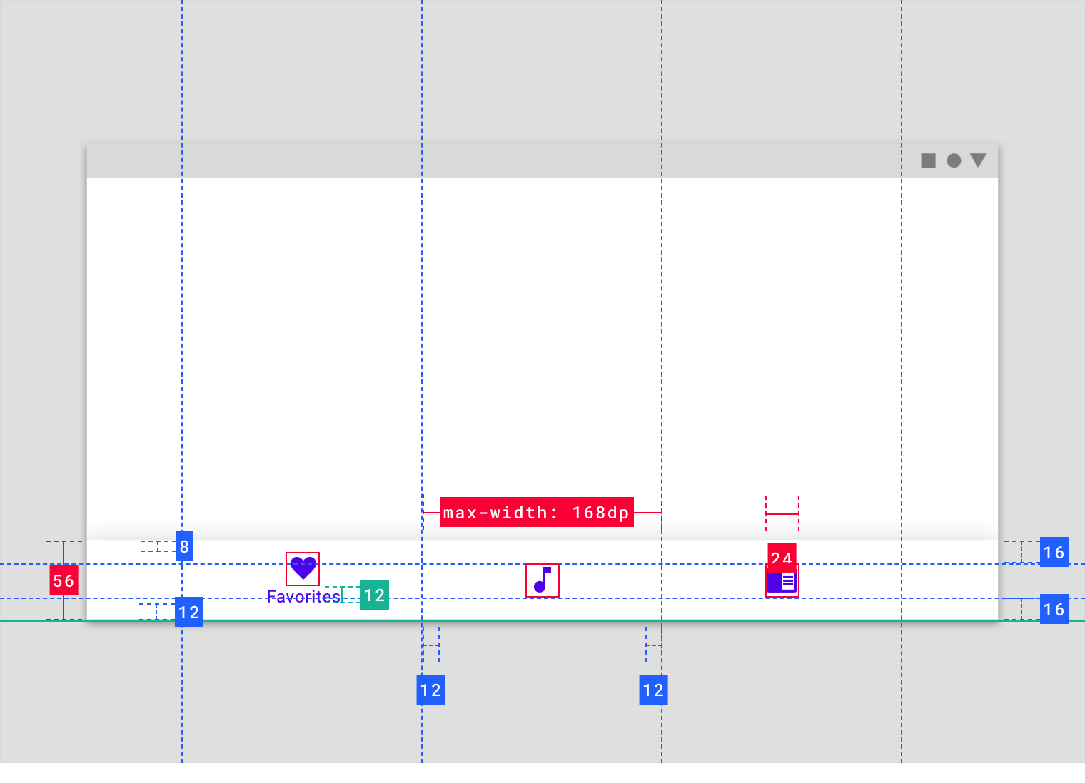
Bottom navigation icons can include badges in their upper right corner. These badges can contain dynamic information, such as a number of pending requests.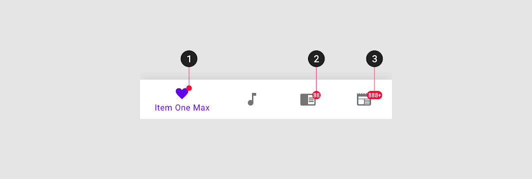
- Badge
- Badge with a number
- Badge with a maximum character count
滚动
Upon scroll, the bottom navigation bar can appear or disappear:
- Scrolling downward hides the bar
- Scrolling upward reveals it
The bottom navigation bar can disappear to allow more space for content.
Transitions
A fade-through transition pattern is recommended for transitions between bottom navigation destinations. Lateral (side-to-side) transitions may imply a peer relationship between the items that does not exist, or mislead users into thinking they can use gestures to navigate between sections.

Do
Transition between active and inactive bottom navigation destinations using a cross-fade animation.

Don’t
Avoid using lateral motion to transition between views. Lateral motion is reserved for navigating between peers.
Scaling and adaptation
Only use bottom navigation on mobile and small tablet interfaces. On large screens, swap out bottom navigation bars for a component that’s better suited to large screen contexts.
Component swapping means that components with similar functions are swapped to make changes to an interface that enhance the ergonomics and functionality. Component swapping is triggered by pre-set device breakpoints. When a screen scales beyond a breakpoint, swappable components should change into a more appropriate component for a given screen size.
Component swapping can create a cohesive navigation system that adapts across screen sizes.
At medium breakpoints, replace the bottom navigation bar with a navigation rail.
At large breakpoints, replace the navigation rail with a navigation drawer.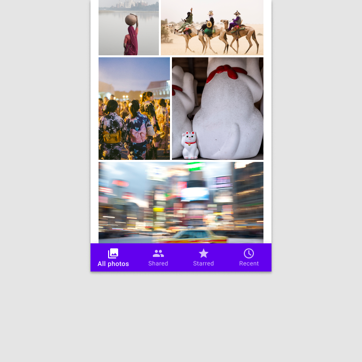
Small breakpoints: 360-599dp
For small devices like phones, horizontal space is at a premium; the content area of an app usually spans the entire width of a screen. In this case, smaller navigation components should anchor to the top or bottom of a layout, saving space while making primary destinations accessible.
Medium breakpoints: 600-1239dp
On medium-sized devices like tablets, move primary navigation elements into a navigation rail that is fixed to the leading edge of the layout.

Large breakpoints: 1240dp+
On devices with 1240dp+ widths, present destinations in a permanently visible or dismissible navigation drawer. Assign hierarchy based on how frequently or quickly a user needs to move between destinations.
Placement
Elevation
Bottom navigation can be temporarily covered by dialogs, bottom sheets, navigation drawers, the on-screen keyboard, or other elements needed to complete a flow. They should not be permanently obstructed on any screen.
The search feature of the “Radio” screen triggers the on-screen keyboard, temporarily covering the bottom navigation bar until the search flow is completed.
Fixed navigation bar
Bottom navigation bar destinations have fixed positions. They don’t scroll or move horizontally.

Don’t
Bottom navigation bar destinations don’t scroll.
Landscape view

Do
On mobile (in landscape mode) or tablet, bottom navigation destinations can retain the same spacing used in portrait mode, rather than being equally distributed across the bottom app bar.

Do
On mobile (in landscape mode) or tablet, bottom navigation destinations can be positioned horizontally instead of stacked. In this case, it’s recommended that destinations are evenly distributed across the entire bar.
States
Bottom navigation destinations may be active, inactive, focused or pressed.
Bottom navigation uses opacity and text to show when a destination is active. States are used to show pressed, focused, and unselected states.
Inactive destination states are represented with reduced opacities; active states have full opacity.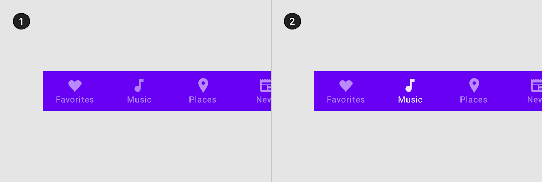
- Inactive destinations
- An active destination
When text labels are not used persistently (at all times), only active destinations are given text labels.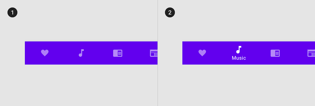
- Inactive destinations without text labels
- An active destination with a text label
Research
Material Design conducted research to understand the usability and design preferences for embedding a floating action button (FAB) in the bottom navigation bar. Preferences and rankings for the different designs were gathered from around 650 participants from the United States, twenty from India and ten from Brazil.
Research findings included:
- Across all locations, participants liked the bottom navigation bar with an embedded, centered FAB because of the aesthetic and ergonomic benefits.
- Across all locations, participants appreciated when navigation or common actions were incorporated in an easy-to-access area like the bottom navigation bar.
- Design preferences for the shape of the bar varied by location. While many participants in the United States and Brazil favored the mini FAB, participants in India preferred an inset or overlapping FAB.
Theming
Owl Material Theme
This educational app’s bottom navigation bar has been customized using Material Theming. Areas of customization include color and typography.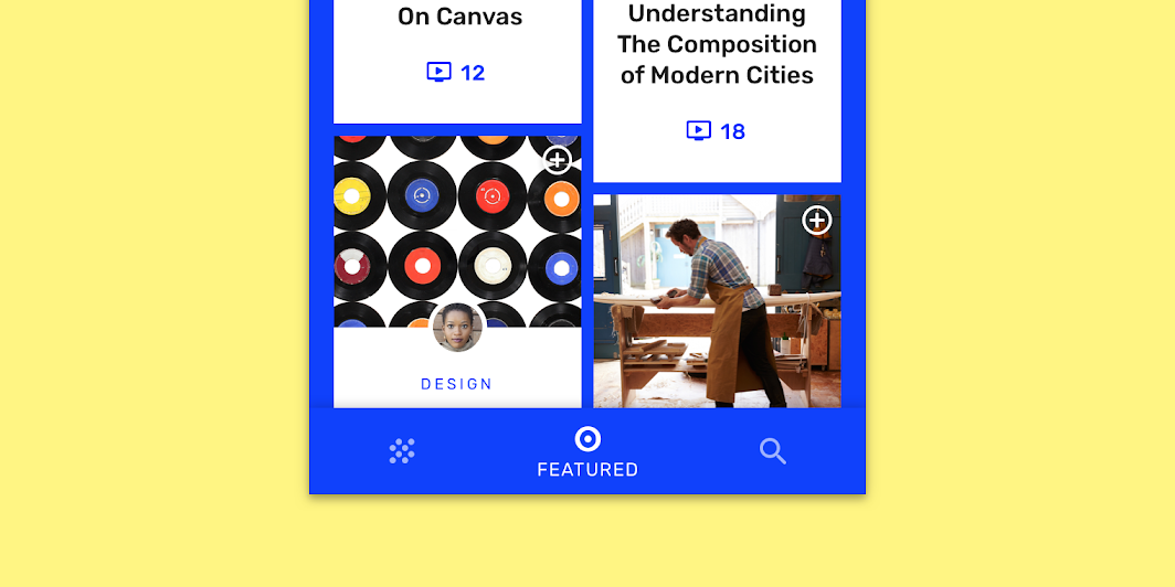
Owl’s customized bottom navigation bar
Color
Owl’s bottom navigation bar uses custom color on three elements: the container, activated items, and inactive items.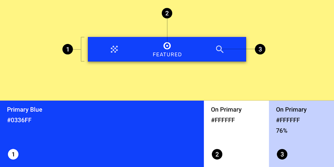
| Element | Category | Attribute | Value |
|---|---|---|---|
| Container | Primary Blue | Color Opacity |
#0336FF 100% |
| Active icon, active text | On Primary | Color Opacity |
#FFFFFF 100% |
| Inactive icons | On Primary | Color Opacity |
#FFFFFF 76% |
Typography
Owl’s bottom navigation bar uses custom typography for text labels.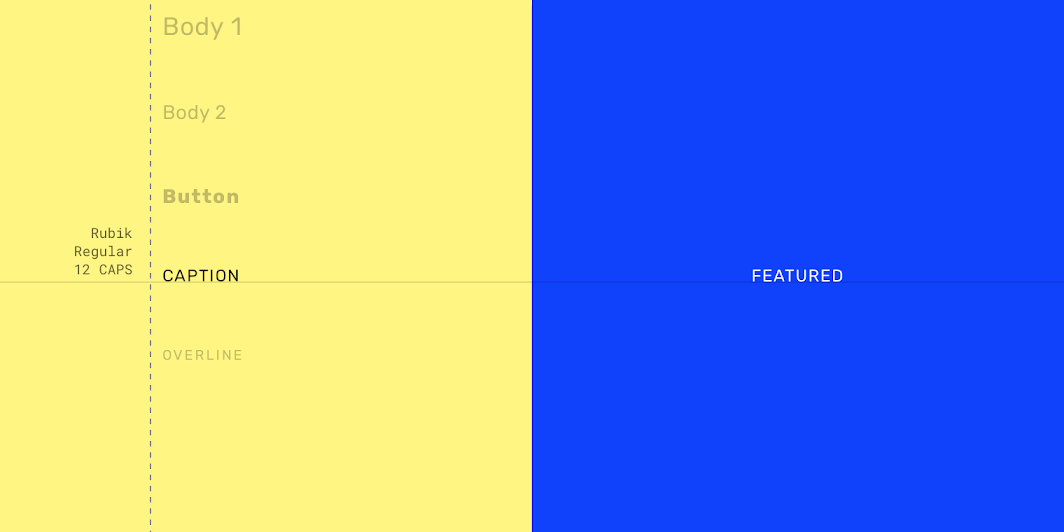
| Element | Category | Attribute | Value |
|---|---|---|---|
| Text label | Caption | Typeface Font Size Case |
| Rubik
Regular
12
All caps |
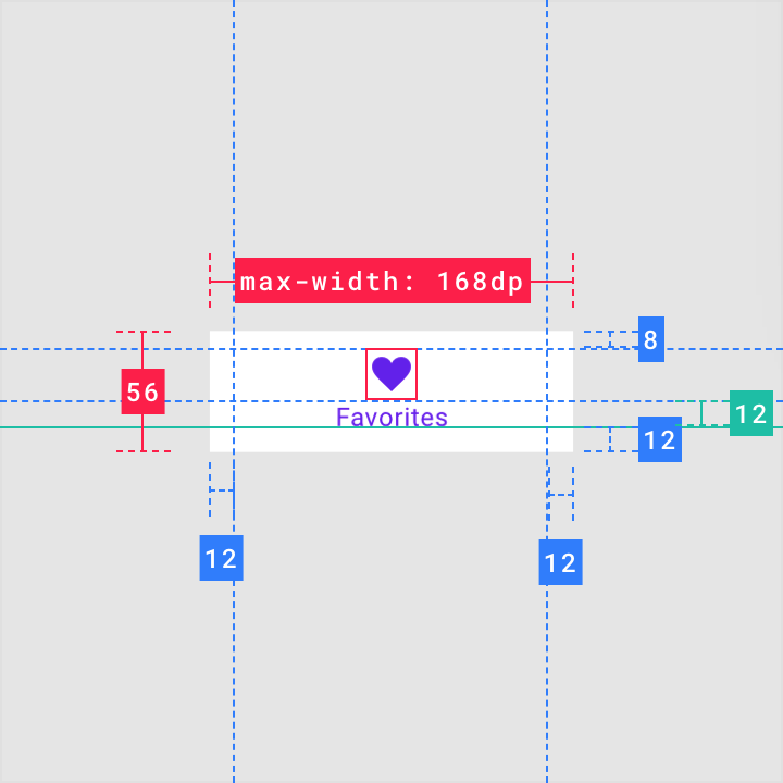
Specs
Mobile
Portrait
Minimum width
Maximum width
Landscape

若有收获,就点个赞吧
0 人点赞
