颜色有助于表达层次结构,建立品牌形象,赋予更多的意义,并指示元素状态。
Color helps express hierarchy, establish brand presence, give meaning, and indicate element states.
层级结构
在 Material Design 中,页面上特定元素的颜色会对注意力起到引导作用。当元素的颜色与周围环境形成对比时,说明该元素很重要,值得用户去关注。
因为颜色主题各不相同:从鲜艳明亮到纯粹静谧,设计者用不同的方式来指示页面中哪些元素更重要。
In Material Design, color draws attention to specific elements on-screen. When an element’s color contrasts with its surroundings, that element stands out, so users can tell it’s important. Because color themes vary – from bold and bright, to monochromatic or muted – there are different ways to indicate which elements have greater importance.
例如:黑色图标在白色背景下放置时会更加突出;彩色卡片放置在单色组件旁边时会引起注意。
For example, black icons stand out when they are placed against a white background. Multicolored cards draw attention to themselves when placed next to monochromatic colors.
Surface contrast
对比度在元素之间使用更强烈的颜色对比,能够突出特定元素。
To bring attention to important events, use stronger color contrasts between elements.
Color and shape
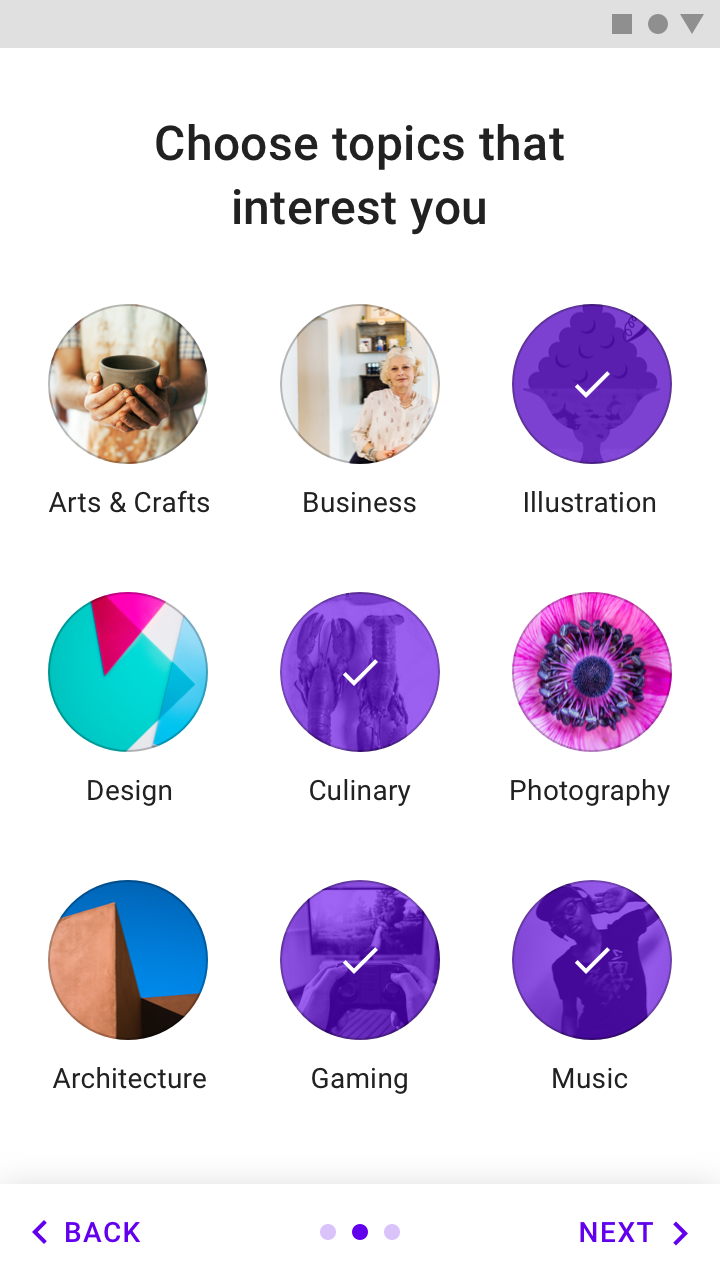
颜色和形状视觉强调可以同时改变颜色和形状的元素,这种强调用来表明某些元素已被选中或需要用户马上进行处理。
Visual emphasis is given to an element that changes both color and shape at the same time. Use this kind of emphasis to indicate something has been selected or requires immediate attention.
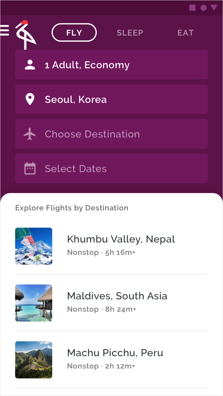
- 紫色背景与白色的表单 形成鲜明对比,用来强调 项目选择 的功能是这个旅行应用的重点
- The purple background has a high contrast with the white surface, bringing emphasis to the list item choices – the main point of this travel app.
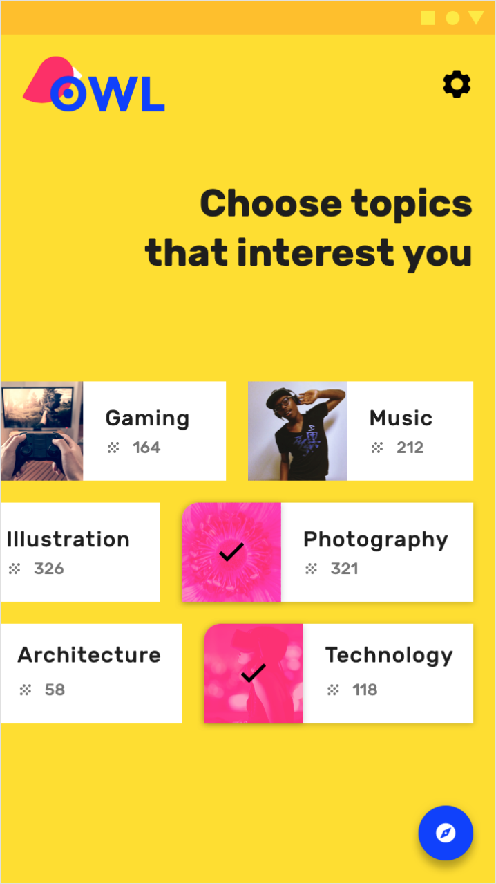
- 具有圆角的粉红色纸片表示它们已被用户选择
- The chips with curved, pink left corners indicate they have been selected by the user.
颜色限制
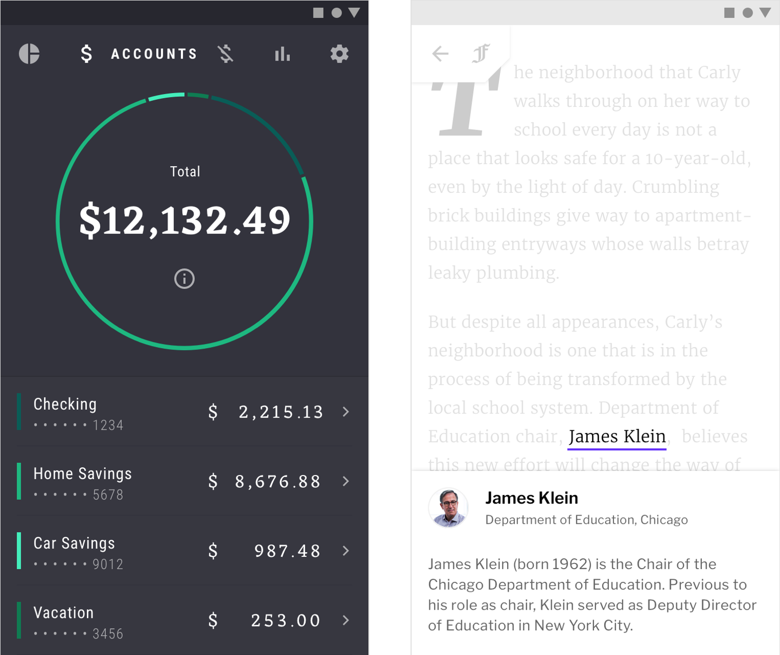
通过限制应用中颜色的使用,获得颜色的区域会受到更多关注,例如文本,图像和按钮等单个元素。
By limiting the use of color in your app, the areas that do receive color gain more attention, such as text, images, and individual elements like buttons.
Because the content of this product is multicolored, a black floating action button contrasts greatly with the bright colors, making it more visible.
A grayscale color palette is best for allowing photography and text to stand out.
品牌
您的品牌可以使用个性化的配色来加强品牌的存在感。
品牌色可以在关键时刻使用,将这些颜色与特定的动作和信息相关联。品牌色的应用方式多种多样:大胆、热情、微妙、复杂 等等。
品牌的个性化可以通过色彩映射到您的应用中。
Your brand can use color to emphasize its presence. Brand colors can be used in key moments, in ways that associate those colors with specific actions and information.
Brand color application can be bold and brash, subtle and sophisticated, or anywhere in between. Your brand’s personal approach to color should be reflected in your app.
大胆用色
希望传达能量和兴奋感的品牌通常以大胆的方式使用颜色。他们的应用程序在大胆用色的同时,也需要保持内容的易读性和整体可用性。
Brands that wish to convey a sense of energy and excitement often use color in bold ways. Their apps should reflect that same approach, while preserving content legibility and overall usability.
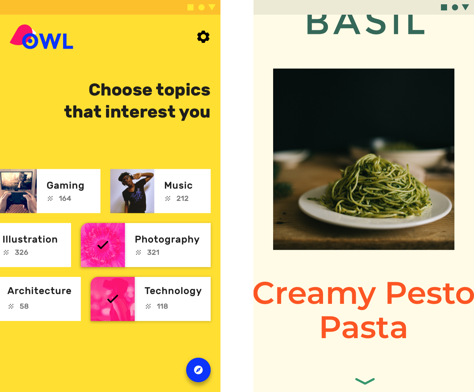
- 这款教育应用以充满活力的方式使用大胆、饱和的品牌颜色(黄色,蓝色,洋红色),与品牌精神相匹配
- This educational app uses bold, saturated brand colors (yellow, blue, magenta) in a vibrant way that matches the spirit of the brand.
- 这个烹饪应用程序以大胆色彩和排版方法注入了能量和热情,同时保持了内容的易读性和整体可用性
- This cooking app’s bold approach to color and typography infuses energy and excitement while remaining legible and usable.
即使是内敛的品牌也可以以大胆用色。
Even brands with more subtle color approaches can use color in bold, celebratory ways.
从左到右依次为:启动屏幕、新手引导页、功能引导页。
- Launch screens
- Launch screens can be celebratory moments that use color in bold ways.
- Onboarding
- Color used during onboarding can connect content to branding.
- Feature discovery
- New features can be highlighted to ensure the user sees them by using color to guide user focus.
色彩运用
Brands can use color in subtle ways, whether that means conveying sophistication, emphasizing content, or suiting content in some other way. When using color with subtlety, ensure that interactive areas and state changes remain identifiable and easily seen.
This financial app uses small amounts of color to display information, such as data in graphs. Using color in this way connects information to brand colors.
This news app uses its secondary color (purple) sparingly. By doing so, it stands out in the places it is used. Using color in this way makes content the most important element on the page.
Brand presence can be maintained subtly by incorporating brand colors into moments like loading a placeholder UI, showing progress indicators, or expressing state changes.
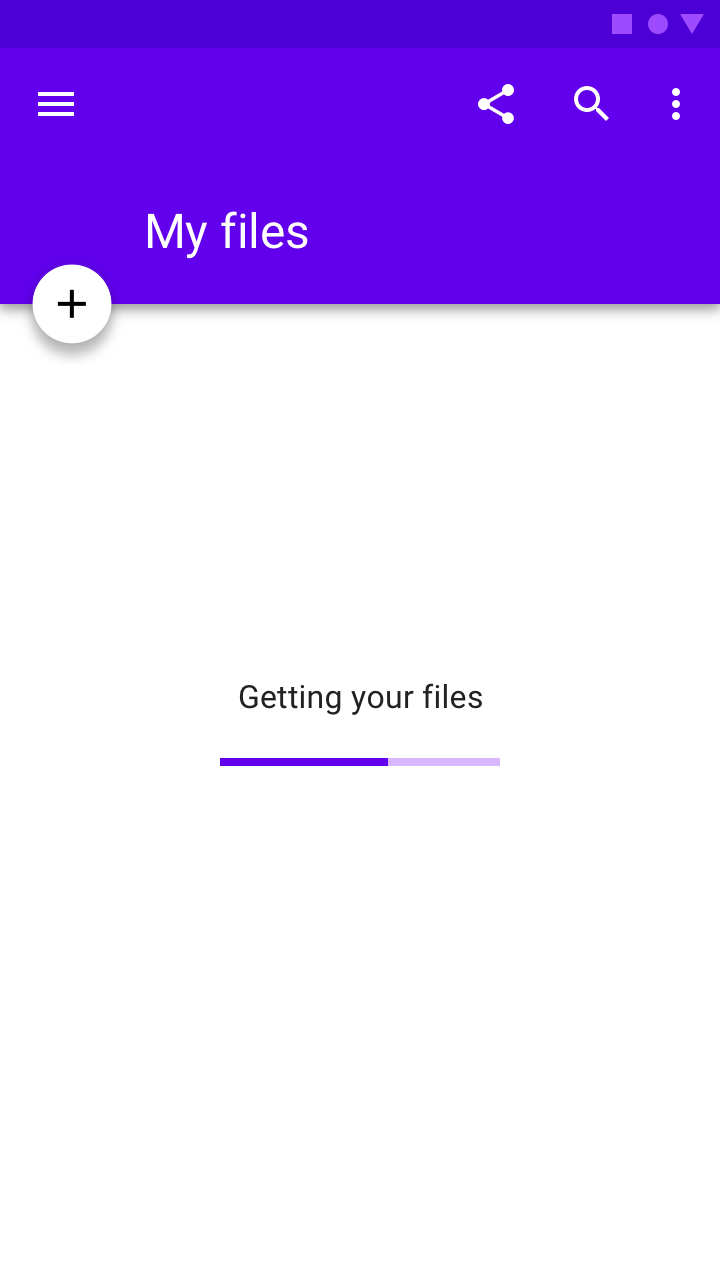
Placeholder UI
A placeholder UI is displayed while screen content loads. Including a brand color here assures users that they are still in the app as it loads.

Progress indicators
Progress indicators are a subtle but powerful place to incorporate brand color, as they tie the function of the app to the brand.
State changes
State changes can subtly reinforce brand presence.
意义
颜色可以传达不同 UI 元素的含义。
例如,天气应用程序可以根据当前天气状况使用不同的配色,导航应用程序可以根据显示交通状况使用不同的配色(交通畅通为绿色,拥堵为红色)。
Color can communicate the meaning of different UI elements. For example, a weather app may display colors indicating current weather conditions, and a navigation app may display color showing traffic conditions, with roads colored red or green
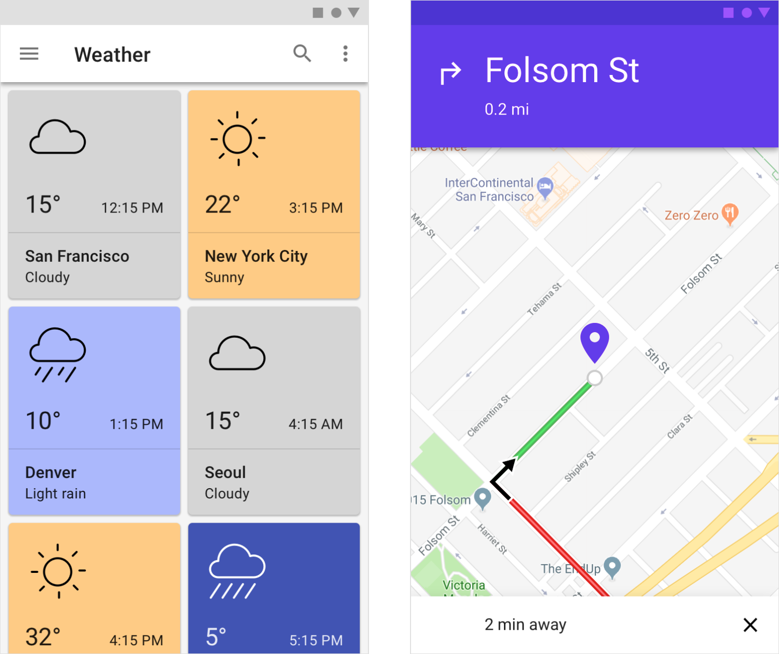
This weather app pairs color with weather conditions.
A navigation app uses color to signal traffic conditions.
一致性与语境
颜色的意义应该在产品中保持统一,即使语境发生变化,某些颜色所代表的含义应该是一致的。
设计者还应注意具有当地或文化意义的颜色。例如,警报通常在某些文化中可能会显示为红色,但在其他文化中则不是。
日期选中状态在紫色背景下显示为红色,将品牌的主色(red)与选择旅行日期相关联,有助于彰显品牌特色。
Color should be used consistently in a product, so that certain colors always mean the same thing, even if the context changes. Attention should also be given to colors with local or cultural significance. For example, alerts may typically be colored red in some cultures, but not in others.
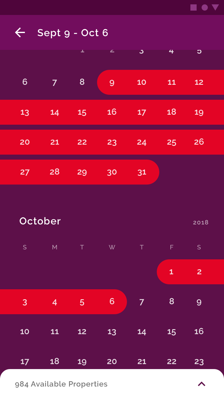
由于红色是品牌色,因此不要使用它来传达错误状态;使用品牌色以外的颜色作为警报颜色。
Date selection is shown in red against a purple background, associating the brand’s primary color (red) with choosing travel dates.

Don’t
Since red is a brand color, don’t also use it to convey an error state.
Do
Choose alternative alert colors that don’t use brand coloring.
状态
颜色可以提供有关应用程序状态的信息(组件和元素)。
这包括:
- 元素或组件的当前状态(例如开关启用还是禁用按钮)
- 应用、组件或元素的状态切换
通过颜色来指示状态转变应该是鲜明的,用户可能不会注意到微小的变化。最好以多种方式的组合来指示状态的变化,例如通过切换图标的可见性或移动元素的位置。
Color can provide information about the state of an app, its components, and elements.
This includes:
- Current state of an element or component, such as whether a button is enabled or disabled
- Changes in state to an app, component, or element
Color should be noticeable when indicating state changes, as subtle differences in color may be missed. It’s best to indicate a change of state in more than one way, such as by displaying an icon or moving the location of an element.
Indicating interaction
为了强调特定的交互,对用户与之交互的内容使用与周围环境有强烈对比的提示色。
To emphasize a specific interaction, use strong color contrasts on content that a user has interacted with, relative to content a user hasn’t.
This image has a color treatment that indicates the user is interacting with it.
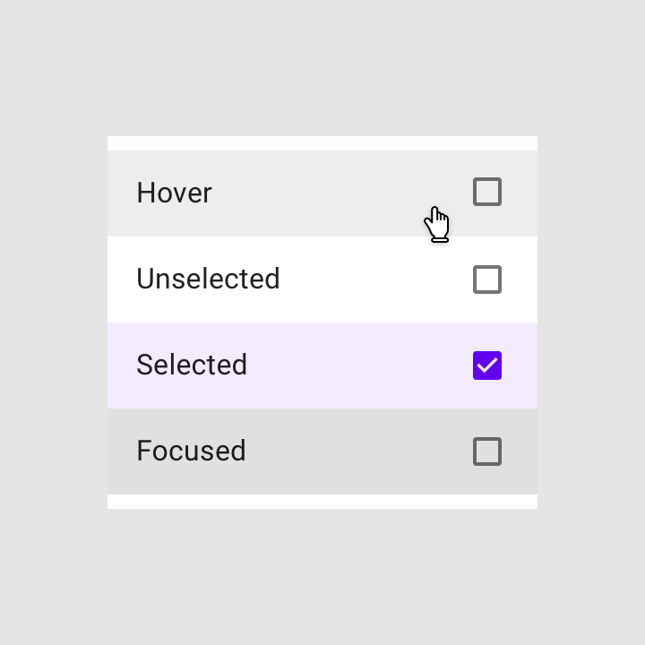
Indicating selection
选中说明要强调元素已被选中,必须在这些元素上使用强烈对比的提示色。
To emphasize selected elements, use strong color contrasts on those elements.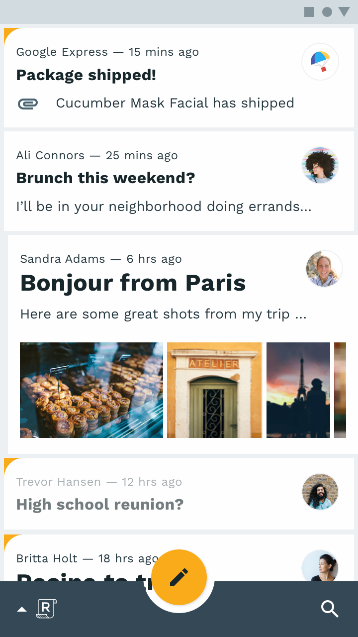
The emails in this list use brand colors to indicate those which are selected, using a colored corner shape.

若有收获,就点个赞吧
0 人点赞
