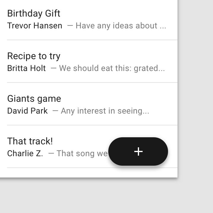
A floating action button (FAB) represents the primary action of a screen.
usage
A floating action button (FAB) performs the primary, or most common, action on a screen. It appears in front of all screen content, typically as a circular shape with an icon in its center. FABs come in three types: regular, mini, and extended.
Only use a FAB if it is the most suitable way to present a screen’s primary action.

Do
Represent the most common primary action with a floating action button, such as drafting a new email.


Do
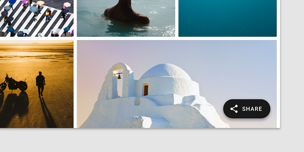
FABs are not needed on every screen, such as when images represent primary actions.

Don’t
Don’t display multiple FABs on a single screen.

Caution
Occasionally two FABs can be used, if they perform distinct, yet equally important, actions
设计原则
Primary
A FAB represents the primary action on a screen.
Constructive
A FAB should perform a constructive action (such as create, share, or explore).
Contextual
A FAB should be relevant to the screen on which it appears.
解析

- Container
- Icon
Container
The FAB is typically displayed in a circular container. An app’s color scheme determines its color fill, which should contrast with the area behind the FAB.
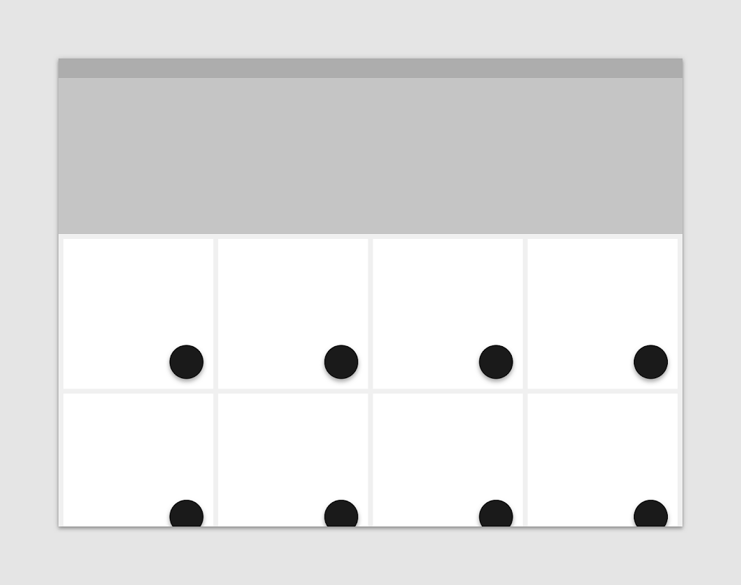
FAB containers come in two sizes:
- Default (56 x 56dp)
- Mini (40 x 40dp)
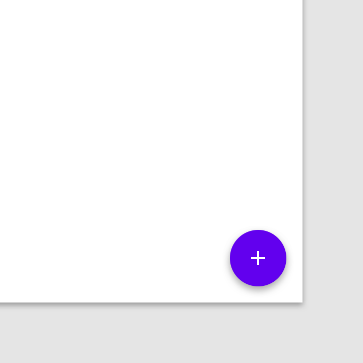
A mini FAB should be used on smaller screens. When a screen width is 460dp or less, the container of a default FAB (56dp) should transform into the mini size (40dp).
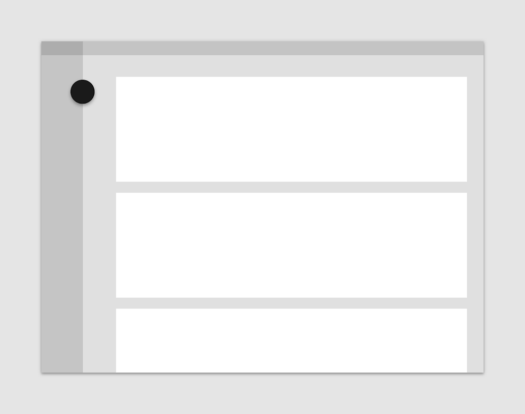
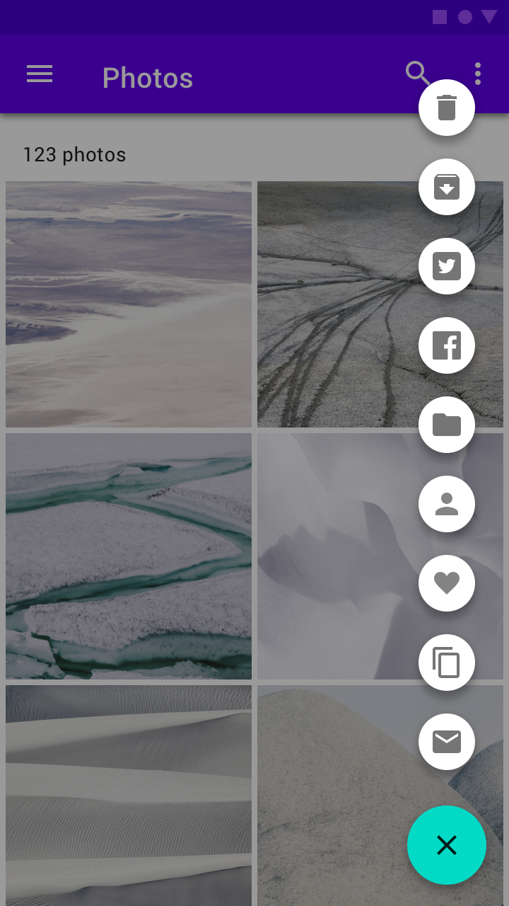
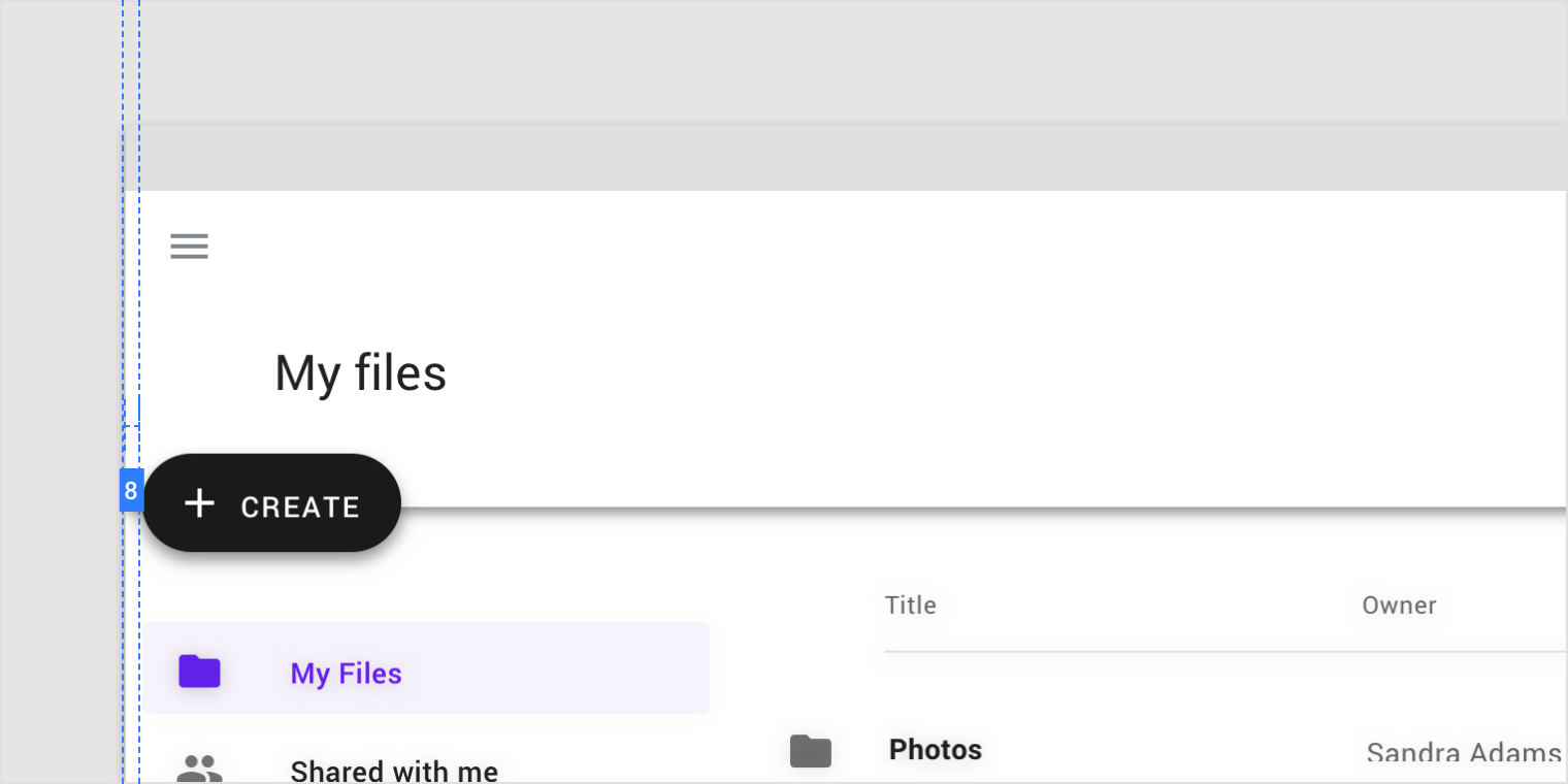
Mini FABs can also be used to create visual continuity with other screen elements.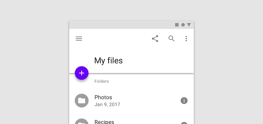
This mini FAB creates visual continuity by having a related size, shape, and placement to the folder icons below it.

Do
FAB containers adopt a color from an app’s palette.

Don’t
Don’t layer badges or other elements in front of a FAB.
Icon
A FAB’s icon should clearly illustrate its action. A FAB shouldn’t contain notifications or actions found elsewhere on a screen.

Don’t
Don’t use ambiguous iconography.


Don’t
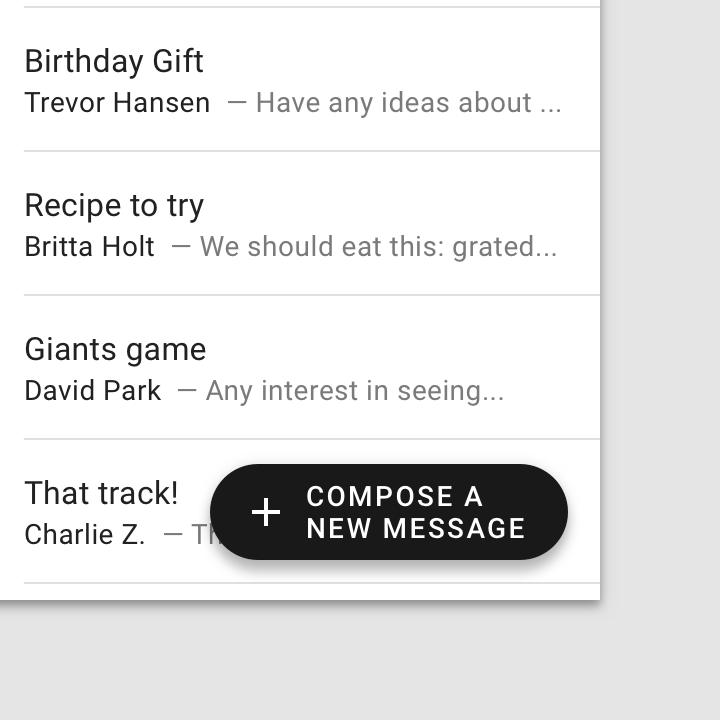
Don’t place text in a regular FAB.
Placement
FABs can attach to top app bars and the edge of some components.

Do
A floating action button (FAB) can attach to a top app bar.

Do
A FAB can be attached to the edge of a component.

Don’t
Individual components, such as cards, cannot each have their own FAB.
Behavior
Actions
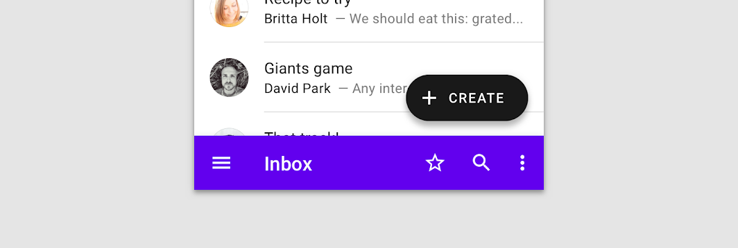
A floating action button (FAB) can trigger an action either on the current screen, or it can perform an action that creates a new screen.
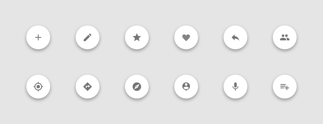
A FAB promotes an important, constructive action such as:
- Create
- Favorite
- Share
- Start a process
Avoid using a FAB for minor or destructive actions, such as:
- Archive or trash
- Alerts or errors
- Limited tasks like cutting text
- Controls better suited to a toolbar (like controls to adjust volume or font color)

Do
Use FABs for primary, positive actions.


Don’t
Do not use FABs for minor, overflow, unclear, or destructive actions
动效
 Throughout this user flow the FAB location remains consistent.
Appearing on screen
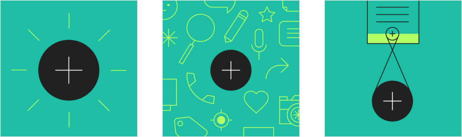
When a FAB animates on screen, it expands outward from a central point. The icon within it may be animated as well.
While FABs should be relevant to screen content, they aren’t attached to the surface on which content appears. FABs move separately from other UI elements because of their relative importance.
Screen transitions
FABs can morph to launch related actions. When a screen changes its layout, the FAB should disappear and reappear during the transition.
Reappearance
The FAB should only reappear if it’s relevant to the new screen. It should reappear in the same position, if possible.
Tabbed screens
When tabs are present, the FAB should briefly disappear, then reappear when the new content moves into place. This expresses that the FAB is not connected to any particular tab.

Do
When switching between tabs, FABs disappear and then reappear.

Don’t
When switching between tabs, FABs don’t move in unison with screen content.
Types of transitions
Speed dial
When pressed, a FAB can display three to six related actions in the form of a speed dial. This transition can occur in one of the following ways:
- Upon press, the FAB can emit related actions
- Upon press, the FAB can transform into a menu containing related actions (Android only)
If more than six actions are needed, something other than a FAB should be used to present them.
Emit related actions
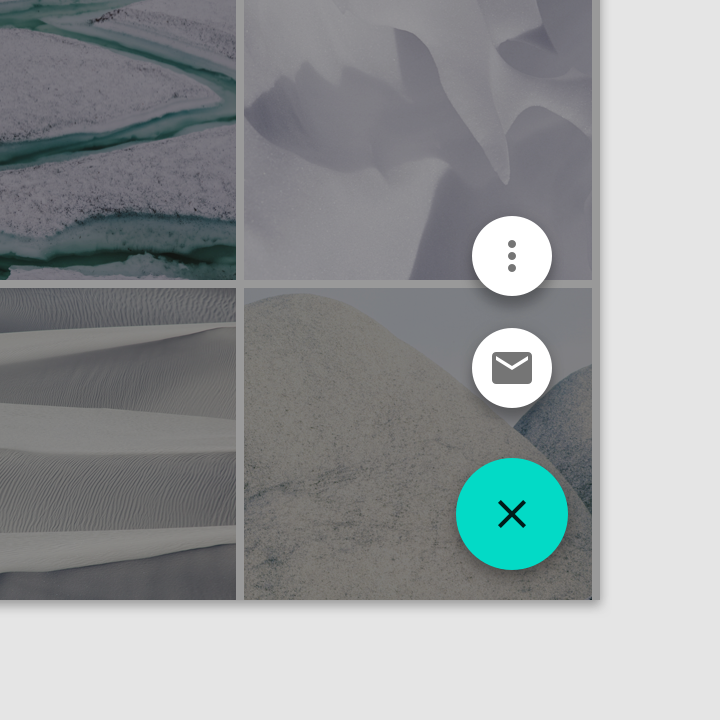
Upon press, the FAB remains visible and emits a stack of related actions. If the FAB is tapped in this state, it should either initiate its default action or close the speed dial actions.
A FAB displays a stack of related actions.

Don’t
A speed dial should include at least three options.

Don’t
A speed dial should include no more than six options.

Do
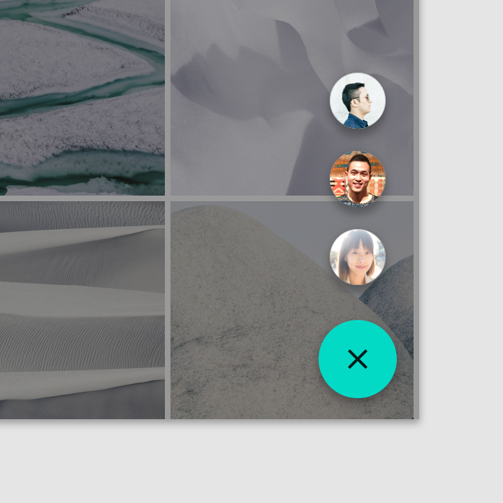
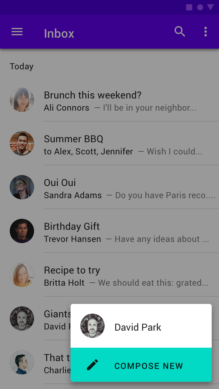
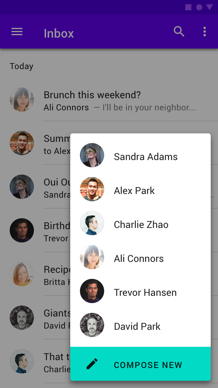
A FAB can contain a list of contacts.

Do
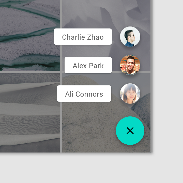
Related actions can have text labels.


Don’t
A FAB shouldn’t transform into unrelated actions.

Don’t
Speed dial options shouldn’t include an overflow menu.
Transform into a menu with the related actions
Upon press on Android, the FAB can transform into a menu containing related actions. A scrim indicates that functionality outside of the action menu is temporarily disabled. The menu remains on-screen until an action, or the scrim, is tapped.
A FAB transforming into an action menu

Don’t
Don’t use an action menu with fewer than three options.

Don’t
An action menu shouldn’t include more than six options, as action menus don’t support scrolling.
Transformations
The FAB uses a container transform transition pattern to transform into various surfaces.
Within the screen
The FAB can transform into another surface in an app. Morphing should be reversible and transform the new surface back into the FAB.
A FAB can morph into a surface that is part of the app structure.
Full screen
The FAB can transform into a new surface that spans the entire screen. This type of transformation is typically for creating new content.
A FAB can transform into a new surface that spans the entire screen.
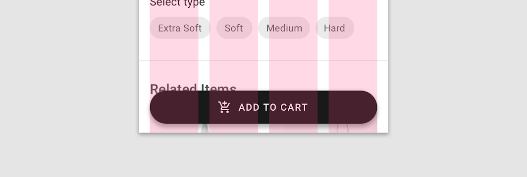
Extended FAB
The extended FAB is wider, and it includes a text label.
Extended FAB
Anatomy

- Container
- Icon (optional)
- Text label
Container
The width of an extended FAB’s container can be fixed or fluid.
- A fixed width container is defined by the cumulative width of the icon, text label, and padding.
- A fluid width container is defined by its relationship to something else on screen, such as screen width or the layout grid.
This fixed extended FAB’s width is defined by the cumulative width of the icon, text label, and container padding.
This extended FAB’s container width is defined by the layout grid columns.
图标
The icon of an extended FAB should intuitively represent its action.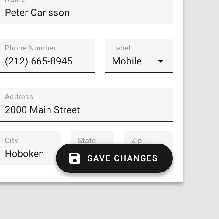
Icons should be placed to the left of text labels for left-to-right languages.
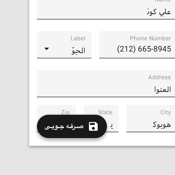
Icons should be placed to the right for right-to-left languages.


Do
Unlike standard FABs, extended FABs don’t require an icon.

Don’t
An extended FAB can’t have an icon without a text label.
Text label
The text label of an extended FAB should describe its action.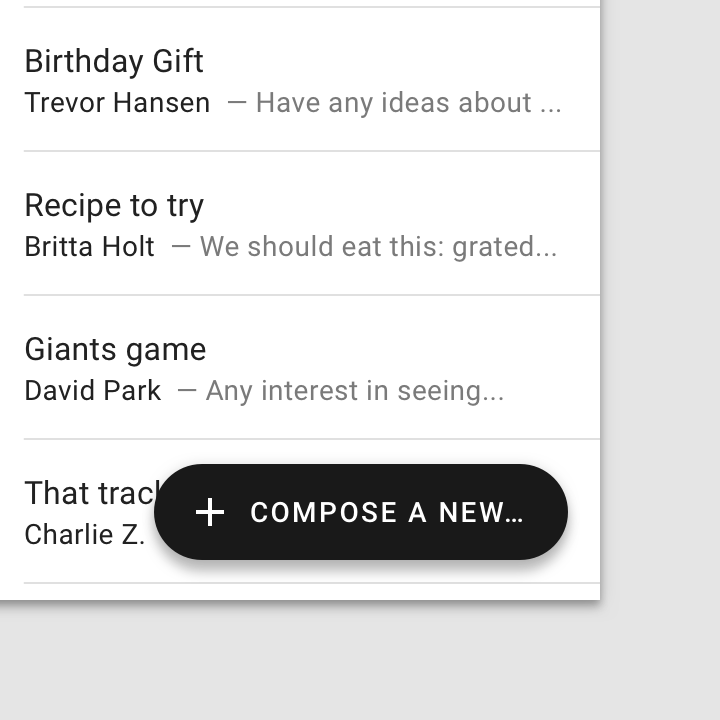

Caution
Only truncate text if shorter text isn’t an option.

Don’t
Avoid wrapping text.
Placement
The extended FAB can be positioned in the center, left, or right side of a screen.
Desktop and tablet
For UIs larger than 840dp, such as desktop, the extended FAB should be placed at the top left of the screen, or at the bottom right of the screen.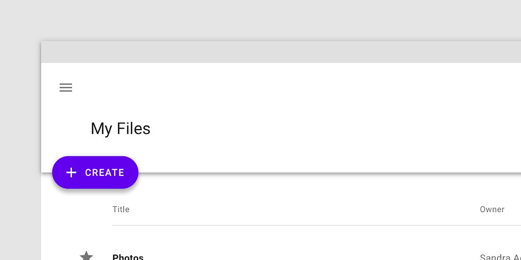
On desktop, the extended FAB placed at the top left
On desktop, the extended FAB placed at the bottom right
Mobile
On mobile, the extended FAB should be placed at the bottom right or bottom center.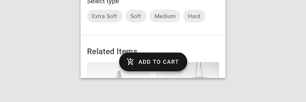
On mobile, the extended FAB placed at the bottom center
On mobile, the extended FAB placed at the bottom right

Caution
Avoid using an extended FAB above a bottom app bar, as the combination takes up a lot of screen space. If they are paired, the extended FAB should collapse on scroll.
Behavior
Speed dial
The extended FAB can also display a speed dial of 3-6 related actions when tapped. On hover, these related actions expand to display labels.
During the speed dial transition, the extended FAB becomes a standard FAB.
Extended FAB speed dial
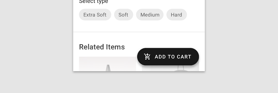
Transformation to a standard FAB
If space becomes limited, the extended FAB can transform into a standard FAB. For example, if an app viewport is resized below 840dp, or a navigation drawer opens up.
Extended FAB transforming into a standard FAB
An extended FAB can transform into a standard FAB when a screen is scrolled.
The FAB should not return to an extended FAB until the user scrolls back to the top of the page.
Extended FAB transforming into a standard FAB after the user scrolls to the top of the page
主题
Reply Material Theme
This email app’s floating action button has been customized using Material Theming. Areas of customization include color and shape.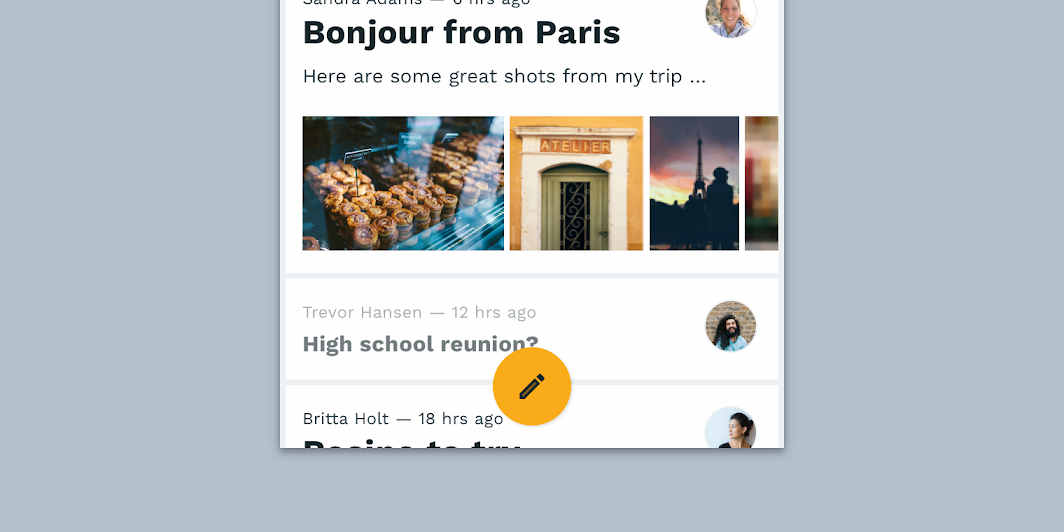
Reply’s customized FAB
Color
Reply’s extended FAB uses custom color on two elements: the container, icon, and text.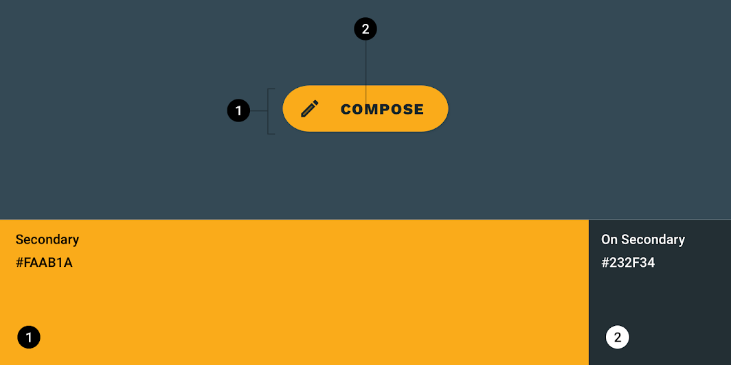
| Element | Category | Attribute | Value |
|---|---|---|---|
| Container | Secondary | Color Opacity |
#FAAB1A 100% |
| Icon | On Secondary | Color Opacity |
#232F34 100% |
| Text | On Secondary | Color Opacity |
#232F34 100% |
Typography
Reply’s extended FAB uses custom typography on its button text.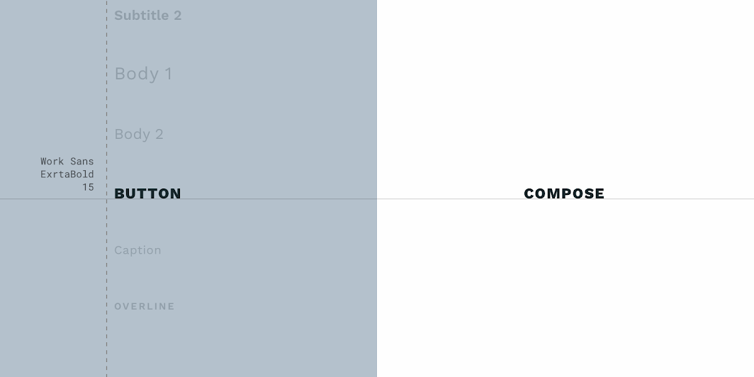
| Element | Category | Attribute | Value |
|---|---|---|---|
| Text | Button | Typeface Font Size Case |
Work Sans ExtraBold 15 All caps |
Shape
Reply’s floating action button uses a custom shape on the container.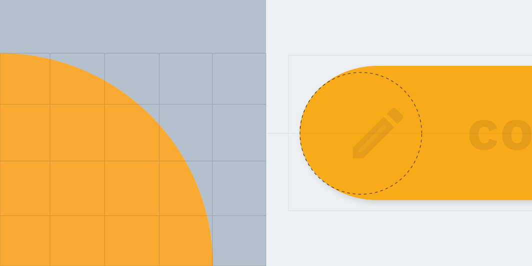
| Element | Category | Attribute | Value |
|---|---|---|---|
| Container | Small component | Family Size |
Rounded 50% |
Posivibes Material Theme
This social media app’s floating action button has been customized using Material Theming. Areas of customization include color and shape.
Posivibes’ customized FAB
Color
Posivibe’s FAB uses custom color on two elements: the container and icon.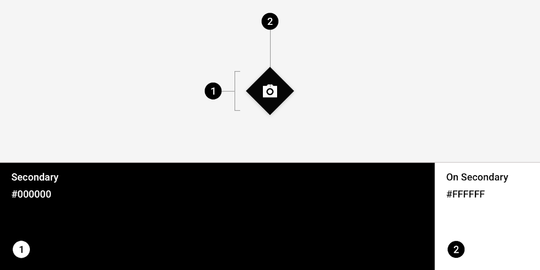
| Element | Category | Attribute | Value |
|---|---|---|---|
| Container | Secondary | Color Opacity |
#000000 100% |
| Icon | On Secondary | Color Opacity |
#FFFFFF 100% |
Shape
Posivibes’ FAB uses a custom shape on its container. *Posivibes’ FABs use an override of the small component shape category size value.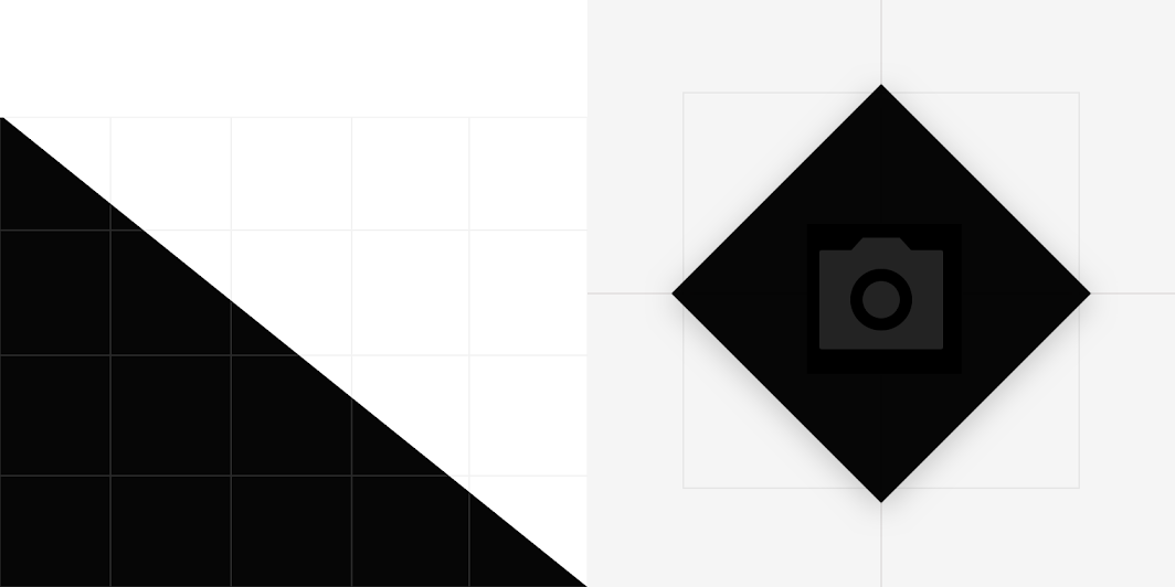
| Element | Category | Attribute | Value |
|---|---|---|---|
| Container | Override* | Family Size |
Cut 50% |
Shrine Material Theme
This retail app’s extended floating action button has been customized using Material Theming. Areas of customization include color, typography, and shape.
Shrine’s customized FAB
Color
Shrine’s extended FAB uses custom color on two elements: the container and text.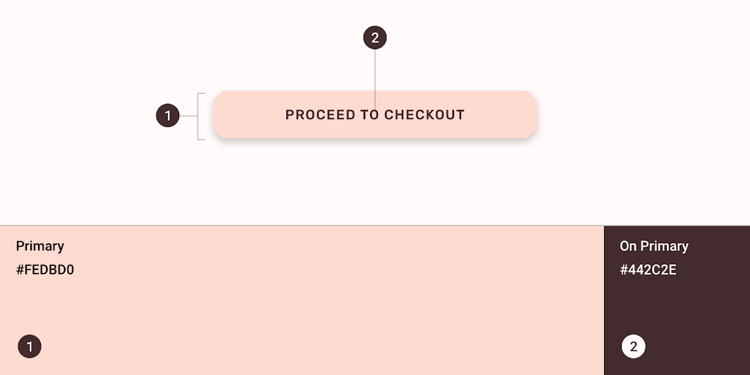
| Element | Category | Attribute | Value |
|---|---|---|---|
| Container | Primary | Color Opacity |
#FEDBD0 100% |
| Text | On Primary | Color Opacity |
#442C2E 100% |
Typography
Shrine’s extended FAB uses custom typography on its button text.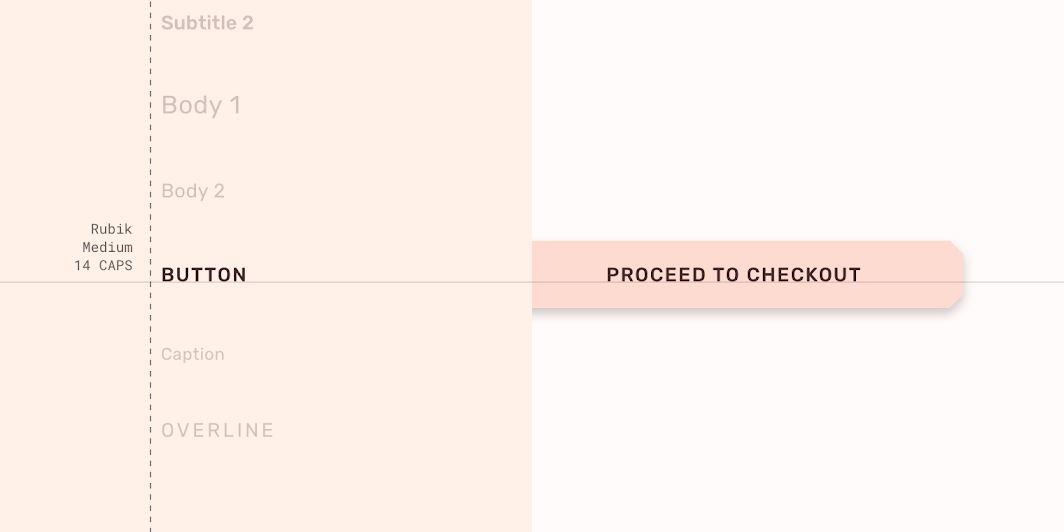
| Element | Category | Attribute | Value |
|---|---|---|---|
| Text | Button | Typeface Font Size Case |
Rubik Medium 14 All caps |
Shape
Shrine’s extended FAB uses a custom shape on its container.
| Element | Category | Attribute | Value |
|---|---|---|---|
| Container | Small component | Family Size |
Cut 4;4;4;4dp |
Specs
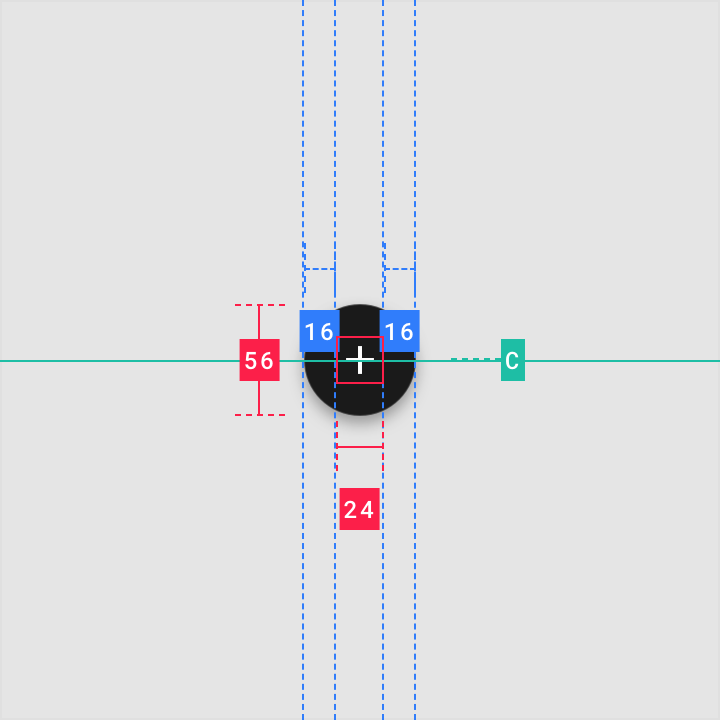
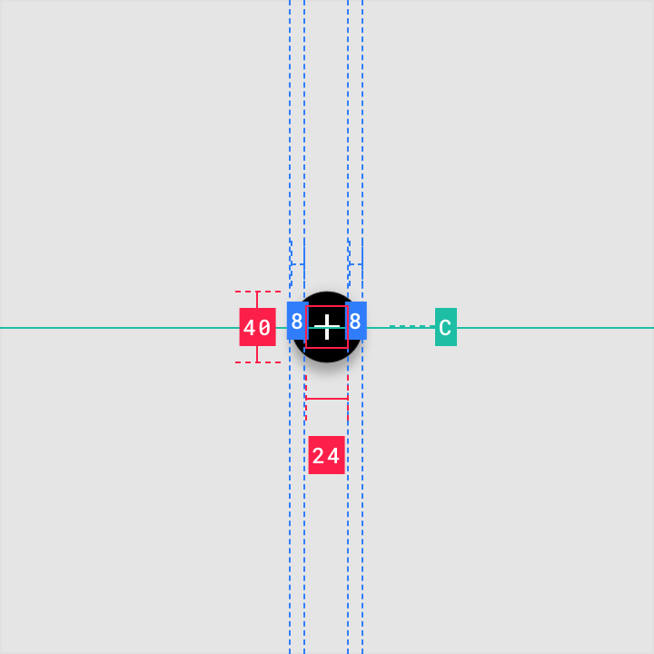
Floating action button
Regular
Mini FAB
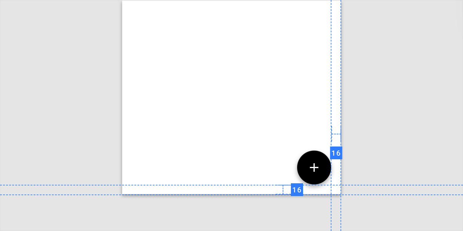
Placement
Extended floating action button

Placement

若有收获,就点个赞吧
0 人点赞
