Text fields let users enter and edit text.
Usage
Text fields allow users to enter text into a UI. They typically appear in forms and dialogs.
Principles
Discoverable
Text fields should stand out and indicate that users can input information.
Clear
Text field states should be clearly differentiated from one another.
Efficient
Text fields should make it easy to understand the requested information and to address any errors.
Types
Text fields come in two types:
- Filled text fields
- Outlined text fields
Both types of text fields use a container to provide a clear affordance for interaction, making the fields discoverable in layouts.
1. Filled text fields
2. Outlined text fields

Choosing the right text field
Both types of text fields provide the same functionality, so the type of text field you use can depend on style alone.
Choose the type that:
- Works best with your app’s visual style
- Best accommodates the goals of your UI
- Is most distinct from other components (like buttons) and surrounding content
Mobile form using filled text fields

The same mobile form using outlined text fields

Both types of text fields in one UI
If both types of text fields are used in a single UI, they should be used consistently within different sections, and not intermixed within the same region. For example, you could use outlined text fields in one section and filled text fields in another.
Do
When using both types of text fields in a UI, separate them by region.


Don’t
When using a both types of text fields, don’t use both next to each other, or within the same form.

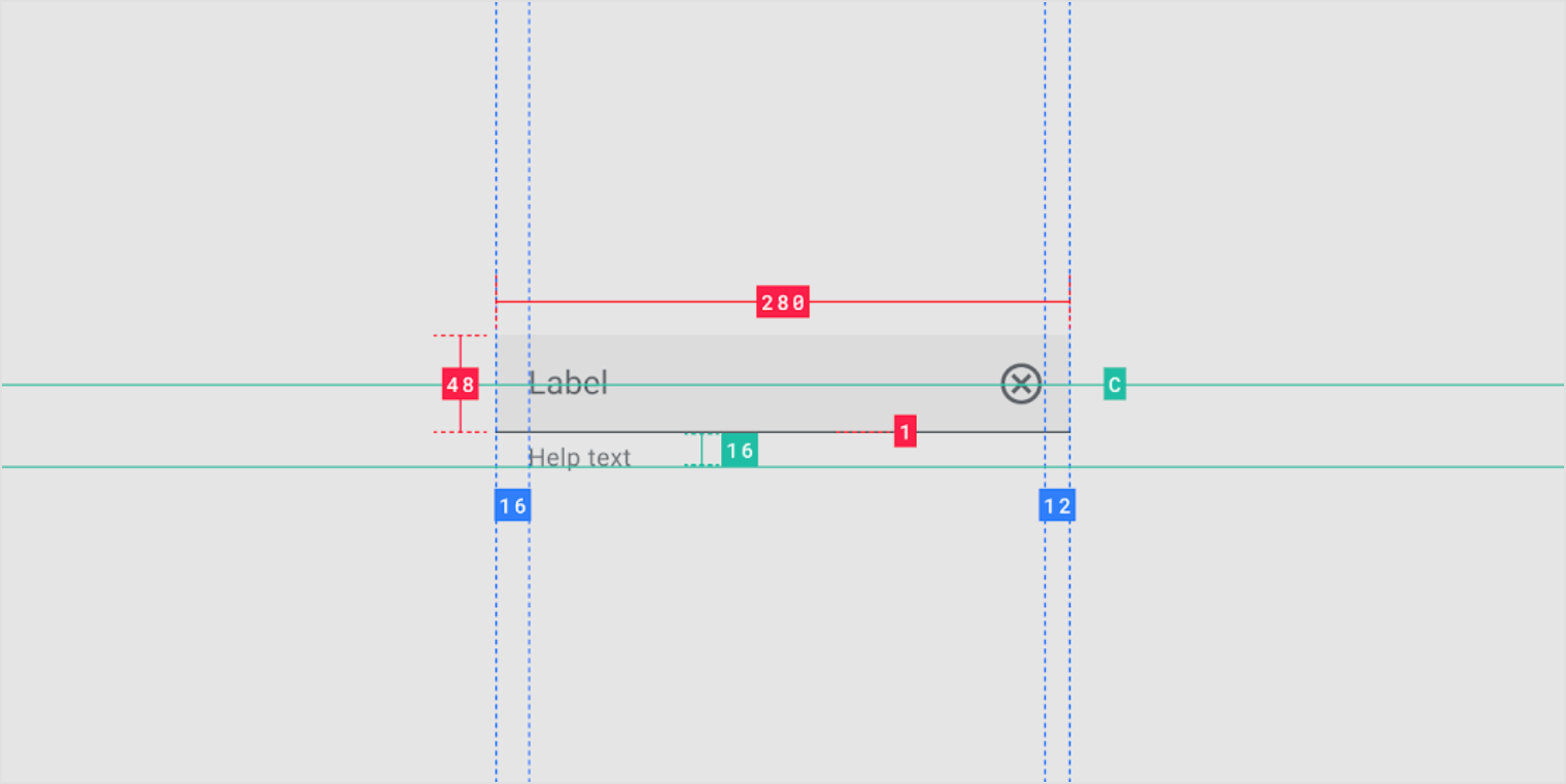
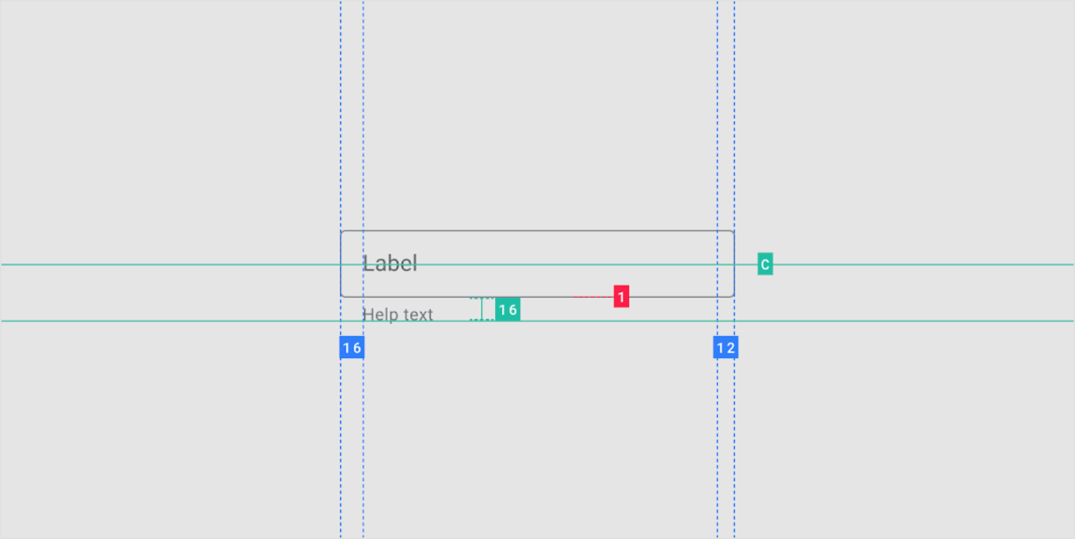
Anatomy
1. Container
2. Leading icon (optional)
3. Label text
4. Input text
5. Trailing icon (optional)
6. Activation indicator
7. Helper text (optional)

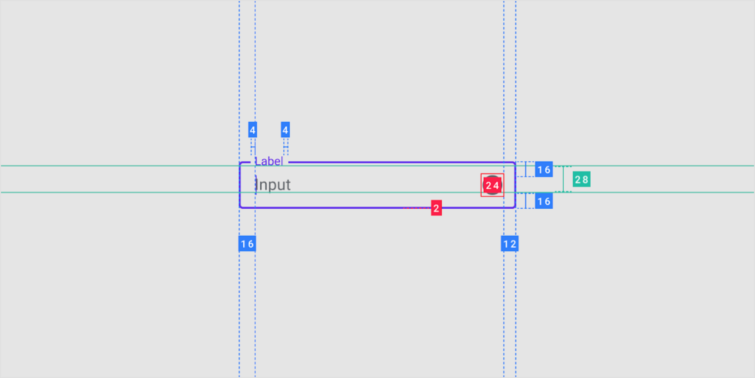
Container
Containers improve the discoverability of text fields by creating contrast between the text field and surrounding content.
Fill and stroke
A text field container has a fill and a stroke (either around the entire container, or just the bottom edge). The color and thickness of a stroke can change to indicate when the text field is active.
Rounded corners
The container of an outlined text field has rounded corners, while the container of a filled text field has rounded top corners and square bottom corners.
Text field containers

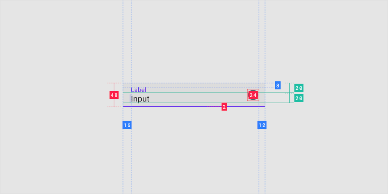
Label text
Label text is used to inform users as to what information is requested for a text field. Every text field should have a label.
Label text should be aligned with the input line, and always visible. It can be placed in the middle of a text field, or rest near the top of the container.


Do
Label text should always be visible, moving from the middle of the text field to the top (if the field is selected).

Don’t
Label text shouldn’t be truncated. Keep it short, clear, and fully visible.


Don’t
Label text shouldn’t take up multiple lines.

Required text indicator
To indicate that a field is required, display an asterisk (*) next to the label text and mention near the form that asterisks indicate required fields.
- If some fields are required, indicate all required ones
- If most fields are required, indicate optional fields by displaying the word “optional” in parentheses next to the label text
- If required text is colored, that color should also be used for the asterisk
Required text with asterisk

Input text
Input text is text the user has entered into a text field.

1. Input text
Input text is text entered by the user.
2. Cursor
A cursor indicates the current location of text input in a field.
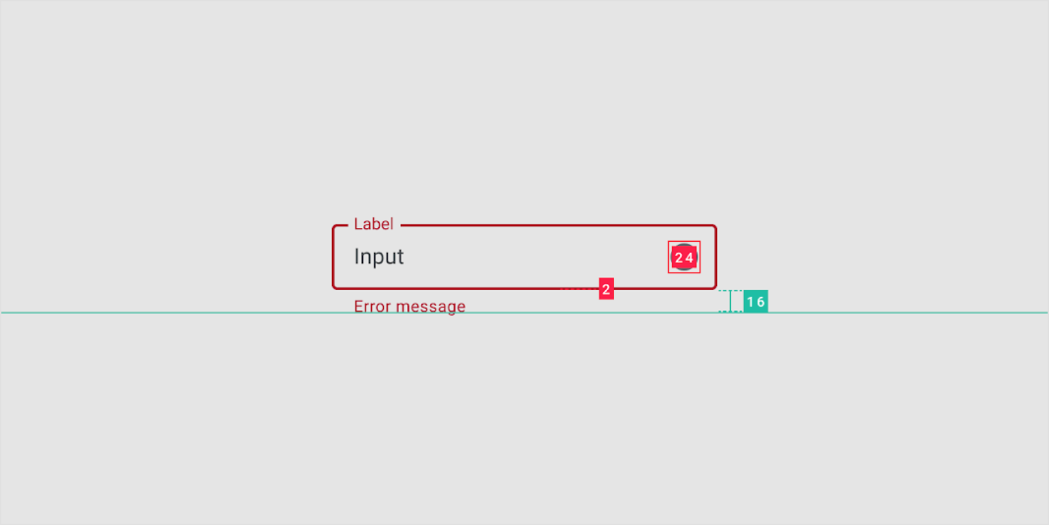
Assistive elements
Assistive elements provide additional detail about text entered into text fields.

1. Helper text
Helper text conveys additional guidance about the input field, such as how it will be used. It should only take up a single line, being persistently visible or visible only on focus.
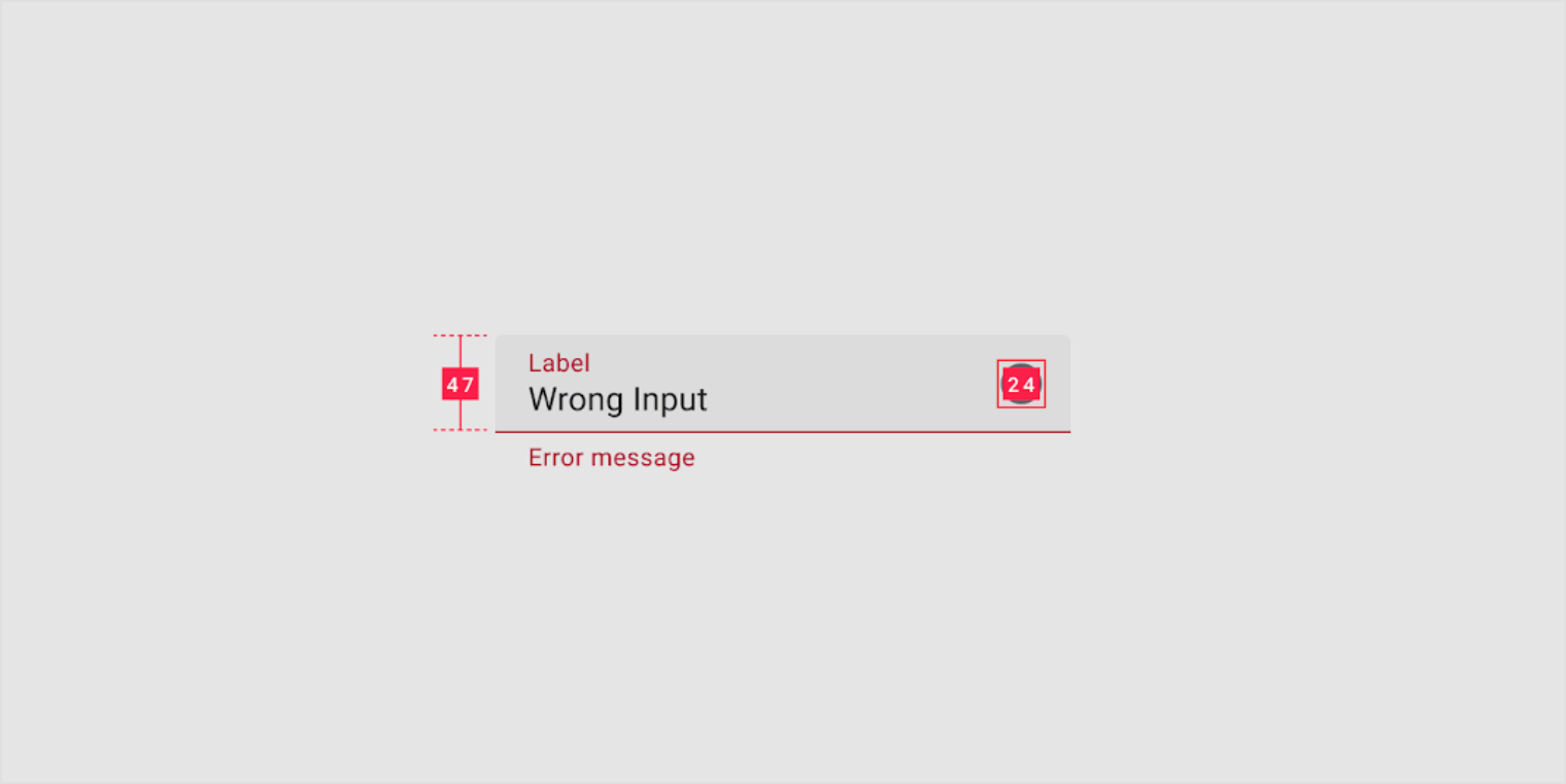
2. Error message
When text input isn’t accepted, an error message can display instructions on how to fix it. Error messages are displayed below the input line, replacing helper text until fixed.
3. Icons
Icons can be used to message alerts as well. Pair them with error messages to provide redundant alerts, which are useful when you need to design for colorblind users.
4. Character counter
Character or word counters should be used if there is a character or word limit. They display the ratio of characters used and the total character limit.
Error text
For text fields that validate their content (such as passwords), replace helper text with error text when applicable. Swapping helper text with error text helps prevent new lines of text from being introduced into a layout, thus bumping content to fit it.
- If only one error is possible, error text describes how to avoid the error
- If multiple errors are possible, error text describes how to avoid the most likely error

Do
Swap helper text with error text.

Don’t
Don’t place error text under helper text, as their appearance will shift content.

Caution
Long errors can wrap to multiple lines if there isn’t enough space to clearly describe the error. In this case, ensure padding between text fields is sufficient to prevent multi-lined errors from bumping layout content.

Icons
Icons in text fields are optional. Text field icons can describe valid input methods (such as a microphone icon), provide affordances to access additional functionality (such as clearing the content of a field), and can express an error.
Leading and trailing icons change their position based on LTR or RTL contexts.
1. Icon signifier
Icon signifiers can describe the type of input a text field requires, and be touch targets for nested components. For example, a calendar icon may be tapped to reveal a date picker.

2. Valid or error icon
Iconography can indicate both valid and invalid inputs, making error states clear for colorblind users.
3. Clear icon
Clear icons let users clear an entire input field. They appear only when input text is present.
4. Voice input icon
A microphone icon signifies that users can input characters using voice.
5. Dropdown icon
A dropdown arrow indicates that a text field has a nested selection component.
Behavior
Scaling and adaptation
As layouts adapt to larger screens and form factors, apply flexible container dimensions to text fields. Set minimum and maximum values for margins, padding, and container dimensions as layouts scale so that typography adjusts for better reading experiences.
Text fields can span the full width of the display on small screens, but should be bounded by flexible margins or other containers on larger screens.

As text fields expand within fluid layouts, avoid maintaining fixed margins and typography properties because this can lead to extra long text fields. Text fields should not, for example, span the full width of a large screen.
Filled text field
Usage
Filled text fields have more visual emphasis than outlined text fields, making them stand out when surrounded by other content and components.
A filled text field

Don’t
Don’t design text fields to look similar to buttons, as they could be mistaken for buttons.

Dense text fields
Dense text fields enable users to scan and take action on large amounts of information.
A form with dense text fields

1. Dense text field with a label
2. Dense text field without a label

Text fields without labels
A text field doesn’t require a label if the field’s purpose is indicated by a separate, adjacent label.
Text fields with adjacent labels

Prefix and suffix text
A text field with a currency symbol text prefix.

A text field with a unit of mass suffix.

Text field with a suffix expressing an academic grading scale.

Text field with an email domain address suffix.

States
Filled text fields (baseline)
Filled text fields can display the following states: inactive, activated, focused, hover, error, and disabled.

Filled text fields without labels
Filled text fields (without labels) can display the following states: inactive, activated, focused, hover, error, and disabled.

Filled text fields with prefix text
Filled text fields (with prefix text) can display the following states: inactive, activated, focused, hover, error, and disabled.

Filled text fields with suffix text
Filled text fields (with suffix text) can display the following states: inactive, activated, focused, hover, error, and disabled.

Outlined text field
Usage
Outlined text fields have less visual emphasis than filled text fields. When they appear in places like forms, where many text fields are placed together, their reduced emphasis helps simplify the layout.
An outlined text field
Dense text fields
Dense text fields enable users to scan and take action on large amounts of information.
A form with dense text fields

Dense text field, 40dp height

Text fields without labels
A text field doesn’t require a label if the field’s purpose is indicated by a separate, independent label.
Text fields with separate but clear labels can indicate what the fields are for (title, price, and location).

Prefix and suffix text
A text field with a currency symbol prefix

A text field with a unit of mass suffix

A text field with grading scale as suffix

A text field with an email domain address suffix

States
Outlined text field (baseline)
Outlined text fields can display the following states: inactive, activated, focused, hover, error, and disabled.

Outlined text field without labels
Filled text fields can display the following states: inactive, activated, focused, hover, error, and disabled.

Outlined text field with prefix text
Filled text fields can display the following states: inactive, activated, focused, hover, error, and disabled.

Outlined text field with suffix text
Filled text fields can display the following states: inactive, activated, focused, hover, error, and disabled.

Input types
Text fields can display user input in the following ways:
- Single line text fields display only one line of text
- Multi-line text fields grow to accommodate multiple lines of text
- Text areas are fixed-height fields
Single-line fields
In single-line fields, as the cursor reaches the right field edge, text longer than the input line automatically scrolls left.
Single-line fields are not suitable for collecting long responses. For those, use a multi-line text field or text area instead.
Multi-line fields
Multi-line text fields show all user input at once. Overflow text causes the text field to expand (shifting screen elements downward), and text wraps onto a new line.
These fields initially appear as single-line fields, which is useful for compact layouts that need to be able to accommodate large amounts of text.
Text areas
Text areas are taller than text fields and wrap overflow text onto a new line. They are a fixed height and scroll vertically when the cursor reaches the bottom of the field.
The large initial size indicates that longer responses are possible and encouraged.
These should be used instead of multi-line fields on the web. Ensure the height of a text area fits within mobile screen sizes.
Read-only fields
Read-only text fields display pre-filled text that the user cannot edit. A read-only text field is styled the same as a regular text field and is clearly labeled as read-only.
A filled read-only text field.

An outlined read-only text field.

Research
Material Design conducted two studies with around 600 participants to understand characteristics of text field usability and user preferences for text field design. The studies measured a user’s ability to scan and find a text field as well as the ability to identify the types of text fields.
Research showed the following are best practices that can be adopted to improve the usability of text fields:
- Use an enclosed text field with a rectangular box, rather than a single underline to indicate a text field
- Use either a semi-transparent fill with a bottom line or a fully transparent fill with an opaque stroke for the text field box
- Place label text within the boundary of a text field box
- Ensure text field outlines or strokes meet 3:1 minimum color contrast ratio to the background
Theming
Rally Material Theme
This personal finance app’s filled text fields have been customized using Material Theming. Areas of customization include color and typography.
Rally’s customized filled text fields

Color
Rally’s filled text fields use custom color on five elements: label text, input text, trailing icon, activation indicator, and container.

| Element | Category | Attribute | Value |
|---|---|---|---|
| Label text | Primary | Color Opacity |
#FFFFFF 100% |
| Input text | On Surface | Color Opacity |
#FFFFFF 100% |
| Trailing icon | On Surface | Color Opacity |
#FFFFFF 100% |
| Activation indicator | Primary | Color Opacity |
#FFFFFF 100% |
| Container | On Surface | Color Opacity |
#FFFFFF 4% |
Typography
Rally’s filled text fields use custom typography for input text and label text.

| Element | Category | Attribute | Value |
|---|---|---|---|
| Input text | Subtitle 1 | Typeface Font Size Case |
Eczar Regular 16 Title caps |
| Label text | Caption | Typeface Font Size Case |
Roboto Condensed Regular 12 Title caps |
Shape
Rally’s filled text fields use custom corner shapes.

| Element | Category | Attribute | Value |
|---|---|---|---|
| Container | Small component | Family Size |
Cut 0;0;0;0 dp |
Crane Material Theme
This travel app’s outlined text fields have been customized using Material Theming. Areas of customization include color and typography.
Crane’s customized outlined text fields

Color
Crane’s outlined text fields use custom color on three elements: the input text, label text, and container.

| Element | Category | Attribute | Value |
|---|---|---|---|
| Input text | On Surface | Color Opacity |
#000000 87% |
| Label Text | On Surface | Color Opacity |
#000000 60% |
| Container | On Surface | Color Opacity |
#000000 12% |
Typography
Crane’s outlined text fields use custom typography for the input text and label text.

| Element | Category | Attribute | Value |
|---|---|---|---|
| Input text | Subtitle 1 | Typeface Font Size Case |
Raleway Medium 16 Title case |
| Label Text | Caption | Typeface Font Size Case |
Raleway SemiBold 14 Title case |
Shape
Crane’s outlined text fields use custom corner shapes.

| Element | Category | Attribute | Value |
|---|---|---|---|
| Container | Small component | Family Size |
Cut 4;4;4;4 dp |
Specs
Filled text field
Outlined text field

若有收获,就点个赞吧
0 人点赞
